RSPB Newport – a mandala

Yesterday I took a short trip for a short visit to the RSPB reserve in Newport, Gwent.

With dark, leaden skies with golden sunshine pouring through gaps in the cloud cover the lighting was dramatic; it caused the winter colours to positively glow against the dark blue-grey of the sky.

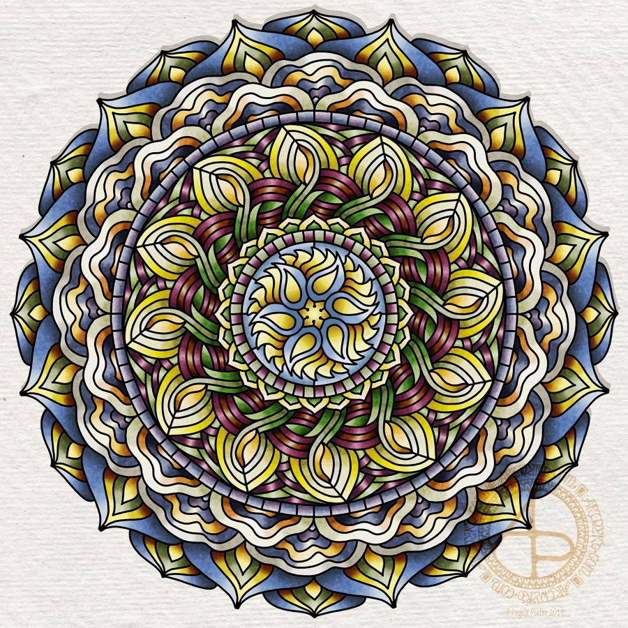
This mandala is my response to those colours, along with some very stylised motifs from the things I saw – arching branches, dancing golden grasses, fungi and more.

I took photographs as I took a walk around part of the reserve. I also stopped to record my observations, my thoughts, in words in my journal.

I surprised myself…

It was all a bit of a spur of the moment decision to head to the wetlands reserve. I was still feeling headachy and emotionally drained after my Time to Change Wales talk to the police yesterday. I needed to do something to help shift this and to lift my mood and getting out and about is something I do struggle with, hugely. Anxiety about being around people kicks in and I can become almost paralysed with it. However, today I didn’t. Perhaps because the reserve is familiar to me; I have been there a few times before. However, I’ve never really taken much of a walk around it. That has always been a problem for me.

But not today. Today, I walked along some paths that were unfamiliar to me. I didn’t go all that far, though my walk took an hour. I did fear getting lost there, but I kept my eye on some fairly obvious landmarks such as wind turbines, the lighthouse at Nash and the huge powerstation. Being able to see these gave me some confidence that I knew what direction to head in to return to the visitors centre. If I strayed from where I could see at least one of them, I backtracked and took a different route.

Most of the people walking and visiting the reserve smiled and said hello, as did I, and that helped me feel at ease too. That, and the rhythm of walking, the sounds of nature – birdsong, rustling leaves in the breeze – and I took pleasure in moving my body, which is something that is new to me.

It’s also something I need to remember and try to get a walk into my schedule most days, somewhere where there’s nature but also where I feel safe to walk. In the wilds by myself is not a good idea, but somewhere like RSPB Newport, with it’s structured. signposted paths is a good idea. Or the beach…somewhere I’ve not been since July, yet it’s only a 40 minute drive away from me.

I forget all too easily how good it is for my mental health to take a walk where there’s nature, birdsong, and not too many people.

As I walked, I could feel the tension leach from me, down through my feet into the forgiving and loving earth. With each step and each breath I felt the anxiety ease little by little. The headache began to lift as well. By the time my walk was over I felt much better. There were still cobwebs left by the headache, but they were manageable.

When I returned to the visitors centre, I browsed in the shop and finally managed to find a raven pin badge! I also bought a small guide to trees. I also had a nice lunch and a very welcome mug of tea in the cafe there, where I continued to write and reflect in my journal until it was time to return home ahead of the rush hour traffic.

Back to art…

I love the stained glass feel of this design. I did try working with the colours in the style of my latest mandalas, but it just didn’t seem to work out for me. Perhaps I was trying to work a step, or several steps, too far for me to be comfortable with that change.

There’s also something about the black lines that gives a definite form to the mandala and this reminds me of how in winter I can can see the underlying form, the architecture that usually is hidden beneath leaves and flowers.

As is my way, I used my Microsoft Surface Pen, Microsoft Surface Studio and Autodesk Sketchbook Pro to draw and colour this mandala.

I used my photos of my visit to get the colour palette I used. And for me this is an unusual colour palette, but it reflects very much nature’s palette on the day and time that I visited.

There’s a bit more about my visit on my other blog – Curious Stops and Tea Shops.

Hello Gorgeous – A dangle design card

©Angela Porter 2019

Friday is dangle day! Well, it is for me. I like to finish the working week off with a cute dangle design, and today I chose to do a greetings card or note card with a decorated envelope.

The media I used were :

  • pencil and ruler
  • 05 Uniball Unipin pen
  • Copic markers
  • Kuretake Zig Wink of Stella brush pen
  • Claire Fontaine mixed media paper
  • Distress ink and sponge applicator
  • Kraft card and envelope
  • Sticky foam squares
  • Two self-adhesive gems
  • White Uniball Signo gel pen

As it’s still winter I thought some snowdrops would be appropriate, along with some crocus buds along with an evergreen wreath. Stars and hearts are always favourites of mine to include, as well as some swirls and spirals.

I chose quite cool and pastel colours for the design, along with very simple shading. The Wink of Stella added a little sparkle to the hearts, stars, beads and snowdrops in the design. A couple of self-adhesive gems added a touch of interest to the ribbon banner.

I used faded jeans Distress Ink to edge the paper panel, which I adhered to another slightly larger panel which I found in my stash of Distress Ink coloured papers ready to use. This one was also edged with faded jeans Distress Ink.

I then used Tombow Mono glue to stick the panel to the card blank.

I drew a simple arrangement of snowdrops and buds on the envelope in white ink and added some spirals and swirls to ‘ground’ the pot. I’m not happy with the spirals/swirls though, but it’s only an envelope so if I send this card to someone I can always decorate another envelope!

Replace the wreath with a photo of the recipient and you’d have a lovely, personalised keepsake of a card.

This design would also make a lovely page in a bujo (bullet journal), planner, scrapbook, or journal too.

My hand lettering is a little rusty; I’ve not done much in the past week or so as my focus has been on mandalas and work for my next book.

My book ‘A Dangle A Day’ shows how you too can create lovely dangle designs like this one, with ideas of how to use them.

Holly Mandala – Version 2

© Angela Porter 2018

I woke early this morning, it was still dark. The night has now lifted to reveal a dull, grey, misty, damp morning here in the Valleys of South Wales.

I wanted to re-colour the holly mandala in a more traditional colour scheme of red, green and gold, and so I have done so.

The colours help to give an illusion of dimension to the concentric rings in the design. Of course, the colours are kind of my signature – bright and jewel-like. I chose to change the background colour from stark black to a very dark, inky night-sky blue. I did add some lighter texture to the background to break the colours up just a tad.

It’s worked out ok. I think I prefer it muchly to the green foil version. The foil images are fun to do, that’s for sure. And of course they’ve allowed me to work out another way of creating art digitally, which is essentially by removing black to reveal the design. This has resulted in me drawing my motifs in a slightly different way to how I’d usually do them. They definitely have more of that lino-cut feel to them with the simplification of designs and lines. I like that.

I also like how the holly berries in the outer ring seem to be floating above and below the leaves. That wasn’t intentional! It’s just how it’s all worked out.

Sprinkling stars everywhere is one of my favourite things to do it seems and they do add a little magic to this design for sure.

Which version do you prefer? This one or yesterday’s green foiled version?

Tools used – Microsoft Surface Pen and Surface Studio. Autodesk Sketchbook Pro.

Winter Mandala

©Angela Porter 2018

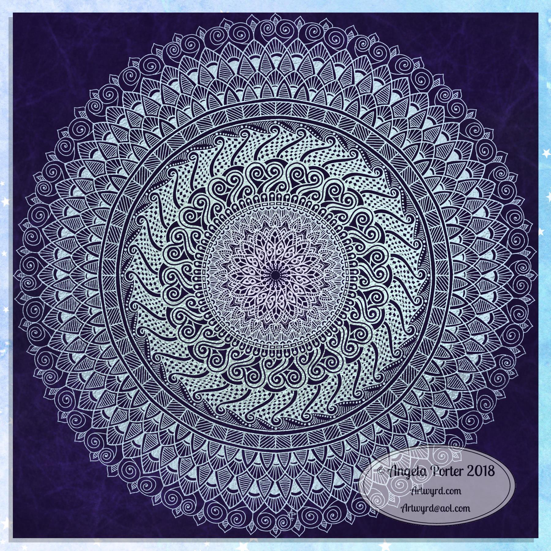
A mandala today. Cool, wintry colours over a white-pearl background for the mandala. Just something relatively simple for me to create, but quite complex looking in it’s final form.

I did draw this digitally using my Microsoft Surface Pen and Surface Studio along with Autodesk Sketchbook Pro. I also used a pearl white texture and starry backgroun I purchased via Creative Market.

I have also created a winter solstice dangle design for later in the week (Friday), as I know tomorrow I’ve got a bit of a busy day.

Today, though, is a quiet day for me. I’m not feeling too well. Nothing specific, but my appetite isn’t there, I’m a bit sniffly and I just feel more than a little ‘meh’. Mind you, I do feel a little better than I did yesterday.

Now, it’s time for me to go cuddle up and complete some more amigurumi tiny toys which will go to add to stockings for children spending Christmas in a women’s refuge local to me.

Snowflake Mandala – WIP

This one is very much a work in progress. Drawn using a Microsoft Surface Pen on the screen of a Microsoft Surface Studio, I made good use of the symmetry tools in Autodesk Sketchbook Pro.

When ice crystals form they have a symmetry based on hexagonal shapes, so my mandala is separated into 12 sections, though I’m choosing to bring out the six-pointed patterns in different colour schemes.

I’m not sure if that makes sense – I know what I mean!

Of course, there’s only so much pointy-ness I can have in anything I draw, so curves have to make an appearance. And this is very much apparent in the fine detailed patterns within each section. Here I’ve used simple line patterns to more complex pattern fills using spirals and swirls. I’ve played around with adding a drop shadow and a highlight to these patterns to add a sense of dimension, not that it’s easy to see in a low-resolution image for the web.

I do like my colour choices of cool purples, blues and aquas so far. I think I’ll go with a more blue-purple to complement the purple in the design so far.

I do have an idea or two as to what I can do about the black lines as well, though they may not work out. As I’ve said often before, I do like black lines in my art; I like the way they define spaces and patterns and often give that feel of ‘stained glass’ to my work. However, sometimes I think they look a tad childish too, but that’s mostly on days where I doubt myself an awful lot, rather than the usual little to a lot.

The design isn’t quite as open as perhaps a snowflake is considered to be, but I rather like filling spaces in, though I may leave some of these spaces open so the background, when I add one, can shine through. That means I may end up erasing some of the colour I’ve added already to created a more open feel to the design.

It’s a lovely way to spend a Sunday morning, especially now I’ve finished downloading all the Amazon invoiced for the last financial year in preparation to getting my accounts to my lovely accountant, Leah.

Wednesday Work In Progress

©Angela Porter 2018

Wednesday is #wipwednesday around the interwebs and sometimes it manifests itself on this blog.

This is my current work in progress, well just a part of it. I drew the design using various pens on paper and then scanned it in. I’m part way through colouring the image. It’s going to take me many hours to finish it, but that won’t be today. I have appointments this afternoon.

I am coloring it digitally with the usual tools – Microsoft Surface Studio, Microsoft Surface Pen and Autodesk Sketchbook Pro. I’m trying to keep to a winter/yule/christmas kind of colour scheme. That means the purple coloured ‘berries’ may have to be changed, but that’s easy enough to alter when working digitally.

#createdonsurface #quartoknows #autodesksketchbook

Winter Dangle Designs 3 December 2018

Winter Dangle Designs – 3 December 2018

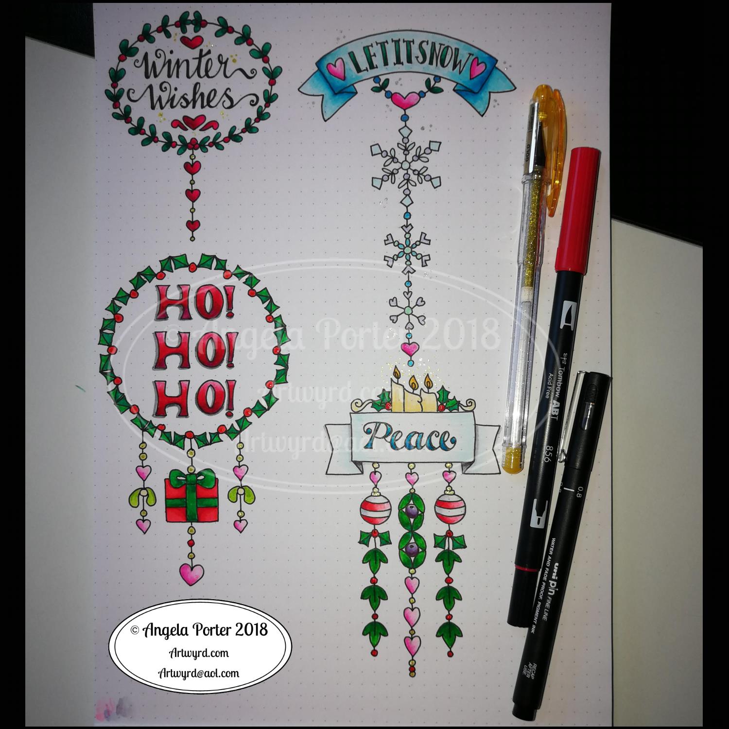
I have had some fun designing these, as always!

I did use some circle, oval and hexagon templates to help me design the wreaths and snowflakes. The dot grid paper helped me draw mostly straight lines for the dangles.

I did sketch them in pencil first before inking them in with a Uniball Unipin pen. Colouring was done with various Tombow dual brush pen markers and some sparkly elements added with Uniball signo sparkle gel pens.

These would look lovely as greetings cards. In fact, I’m thinking of redrawing them digitally and using them to make my own christmas cards this year. Printing out the black line work and then colouring them with traditional media. In the past couple of years I’ve designed my christmas/winter/yule cards digitally and had them printed professionally. This year, I think I’ll do it the way I suggest in my book ‘A Dangle A Day’.

They’d also look great as note cards or as pages in a BuJo, planner, scrapboook or journal. They’d lend themselves to cute bookmarks too.

These relatively simple and small dangle designs are perfect for practicing hand lettering too. And in these four dangles I’ve used four different lettering styles.

I’ve also kept the finished designs simple by not adding any drop shadows, except around the ‘HO! HO! HO!’. Not only that, a lot of the colouring is very simple too.

I do hope you’ll have a go at designing your own, maybe using these as a bit of a guide.  If you do, I’d love to see what you’ve created.

Winter design

I drew this a few days ago and have only got around to coloring it today. 

The hand lettering and drawing was done with Uniball Unipin pens on paper. In black and white it has an almost vintage linocut feel to it. 

I did scan it in and print it out on paper more suitable for alcohol markers. I used Chameleon Duo Tone and Duotop markers. Highlights were added with a white gelly roll pen from Sakura. I then added more black lines to add more dimension in places using a Staedler Mars Matic technical drawing pen.

Not sure I’ve done too good a job with the colours. Or line shading. Or the highlights in some places.

I’m quite pleased with the black and white line drawing however. 

I am going to make this template available on Friday 7 December 2018 in the Angela Porter’s Coloring Book Fans facebook group as an exclusive to members. Terms and conditions in it’s use apply.

Winter Wreath Coloured

The second of the templates I posted yesterday has been coloured.  I went with a cooler colour palette than I would usually choose.

Coloured using Caran D’Ache Luminance pencils and a blending solution was used, which actually brought out the colours beautifully!

I also forgot to mention that these wreaths were drawn in Autodesk Sketchbook on my Microsoft Surface Book.

Winter/Christmas Wreath Colouring Pages

I know that for most of you it’s a busy time of year.  So, I’d like to share a couple of colouring templates to help calm you, even if it’s for just a few minutes.

Many studies have been done that show colouring to be as relaxing and therapeutic as meditation, even if you do it for just a few minutes!

All I ask is that you don’t share the uncoloured images, and that if you share coloured images you provide a link back to either this page or my facebook page.  Oh, and the images are for personal use only, not for commercial use in any way.

Enjoy!


And here’s one I coloured!