Slowtember Prompt list

This morning I needed a quiet, slow, simple time with some arty stuff.

Firstly, I get so frustrated working in a bound sketchbook. The binding always gets in my way even though I like the paper. I much prefer working on loose sheets of paper. I want to keep a sketchbook, or series of sketchbooks. So, the pennies dropped that I needed to put together a discbound sketchbook filled with acid-free cartridge paper and bristol board, and other papers I may wish to draw on.

Yes, I know I’ve got a disc bound sketchbook filled with papers coloured in many ways to draw on. But, my recent forays into art, the realisation that black and white line art is my favourite way of working, needed a solution too.

So, after a while of sorting out such a discbound sketchbook, I thought I’d like a cover page for the Slowtember part of my this sketchbook. It gave me a chance to practice some hand lettering, and to mess around with Tombow Dual Brush markers.

I also added drawings for pancake plant, the prompt for days 10 to 12 which I missed out and went straight to rubber plant!

I suspect that by the end of the month I will have a visual reference for leaves of these indoor plants.

Naturally, I messed up the numbers for the dates for each prompt. My hand lettering isn’t wonderful, nor are the leaves around the title. Let’s not mention the colouring. However, it will do; after all it is a sketchbook page not a finished, polished piece of art. That means no pressure on myself to get it perfect, or as near as I’m happy with. It’s about trying things out and if they don’t work then it’s an opportunity to reflect and learn more about my skills and artistic voice. It’s also a chance to use media that I wouldn’t normally use, and possibly to remind myself why I don’t usually use them as well!

#Slowtember – Days 2, 3 & 4

Yesterday afternoon and this morning I’ve spent time catching up with #Slowtember by @megaelod on twitter. Here’s the sketchbook page I created for the prompts monstera (Swiss Cheese Plant), areca palm and rubber plant.

I took the opportunity to practice my hand drawn typography / hand lettering, as well as my use of line to add volume to a line drawing.

I’m not the best with colour, or with traditional media to add colour, but I think I’ve done OK with some of these. I like the simple washes of gradient colours in the areca and rubber plant leaves. The line work is nice, but the colour brings it to life. The monstera leaf done in coloured pencils works well as far as a sense of volume goes, but I’m not the best with coloured pencils, even using blending solution.

I even found some microscopic images of cells from monstera and rubber plant leaves and stems. So, I just had to do quick drawings of patterns from these, with some imaginary colour added to them.

It’s nice to do this challenge. It’s not as full on and intense as Inktober is, and even if I fall behind there’s not so much to catch up with. It’s also nice to work in a sketchbook (or digitally) as there’s no pressure to complete a finished piece of work. I like how I’ve left some of my drawings partly coloured so I can compare how colour adds (or not) to the design.

When I’m looking at my page and writing about it I always have ideas about how I could’ve approached an idea, or get new ideas. Time for me to go and jot them down before I forget them!

Slowtember 2020

I decided to do Slowtember. I like having prompts to challenge me, take me a little outside of my usual style. However, Inktober can be a bit full on with daily prompts. Slowtember gives that breathing space, and I can work it in around my other commitments.

Thanks to @megaelod on twitter for the idea and prompts!

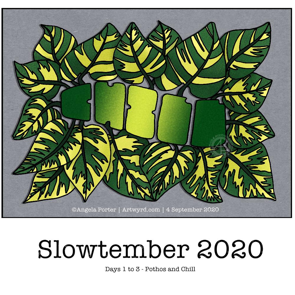
So, the first prompt was a choice betwixt pothos and chill. I decided to combine them! I like foliage, and the word gives me a chance to try out some hand drawn typography/hand lettering.

I sketched the quite stylised design on dot grid paper, inked it with Unipin pens and then scanned it in. after some digital clean up and slight adjustments, I added some simple colour and shadow.

You’d think adding simple colour would be easy, yes? Nope! Choosing the right greens wasn’t easy for me. And then there was the typography. I lost count of how many times I tried different ways to colour the letters. Eventually I decided enough was enough and the gradient I had was good enough.

As I think now, after breakfast and some mocha, I could’ve done the word as a flower pot, or used it to add shadow to a flower pot. Maybe I’ll give that a go for the next prompt (monstera and water).

Complex drawings are my stock in trade. Going simple and stylised is not quite so easy! Still, it was fun to do, a bit frustrating at times, but the result is perhaps good enough, though I’m not sure about that.