I had a lovely time this morning looking at Arts and Crafts Movement, Rennie Mackintosh and Art Nouveau designs. I’ve always love these styles of art with their organic lines and stylised motifs and it’s certainly influenced my style of art in some little way.
I got inspired as I looked at these styles and decided to use them as a start for my April BuJo page design, which you can see above.
The had lettering is a little heavy handed where the squares are concerned, but over all I’m fairly happy with it.
There’s definitely a touch of the Rennie Mackintosh’s there with the organic motifs and lines contrasted with the graphic squares and diamonds.
I chose warm and sunny yellows with light, fresh greens as they are so dominant in nature this early on in Spring.
A quick sketch on Rhodia Dot Grid paper followed by a scan and I inked it using some of my brushes in Autodesk Sketchbook Pro. Of course I wielded my Microsoft Surface Pen with some happiness on the screen of my Microsoft Surface Studio.
A simple but, I think, and elegant design. One which would look fab for any month in a BuJo (bullet journal), planner, diary, journal or even in a scrapbook. Of course it would make a lovely greetings or note card too. I’m sure there are many more instances of where this design would work beautifully.
It’s another beautiful, sunny, unseasonably warm late winter day. Daffodils are out, February is almost over and it’s time for me to turn my attention to a design for a BuJo monthly cover.
This is what I came up with today. A simple mandala of sunny yellow daffodils, bright fresh-green leaves and the lovely clear blue skies we’ve had here in the Welsh Valleys over the past few days.
Of course, 1st March is St David’s Day. St David is the patron saint of Wales, and daffodils are the flowers associated with this day.
As a child we used to have a half-day at school for St David’s Day. In the morning there was an Eisteddfod – a kind of concert and competition involving singing and poetry and music and clog dancing and all kinds of creative things. Much of this was done in the Welsh language. And of course My Hen Wlad Fy Nhadau would be the final song that all joined in with – the Welsh National Anthem that is still proudly sung at international rugby matches and other such occasions.
On this day, children went to school dressed in traditional Welsh costume, wearing either a daffodil or leek pinned to their clothing. The boys would try to show how big and tough they were by eating the whole leek raw.
I could’ve tried to draw a red Welsh Dragon for the mandala, but the daffodils are so pretty…maybe I’ll do another with a dragon in, or maybe a dangle design with a dragon as part of it.
This design would make a lovely monthly cover page for a BuJo, or in a planner, diary, journal or on a greeting card or note card.
A jolly day out
Yesterday I had a lovely jolly day out with my friend Liz.
We visited the stone circle at Stanton Drew. I’ve been there before, but Liz hadn’t. It’s bigger in diameter than Stonehenge but smaller than Avebury. It did have several concentric rings of timber posts inside the stones when it was in use, but they have long rotted away.
After that we headed to Wells. Again, I’ve been there but Liz never had. We had a walk through the town and spent some time buying lovely shoes from Moshulu, mine being rather sparkly and lovely!
Cake in the Cathedral cafe, with plenty of tea in my case, coffee in Liz’s, and then it was off to visit the Cathedral. Always nice to see the scissors arch there and the wobbly wonky steps going up to the chapter house.
It was sunny and warm and I managed to get sunburn! Mind you, that happens easily as I’m quite fair-skinned. In the past I’ve even managed to burn and blister through sunblock. I seem to be a bit more resilient. But who would’ve thought I’d’ve got sun burned in February in the UK!
The sunny, mild weather is helping my mood an awful lot. Leaving EMDR on monday having completed processing a trauma that was really painful to me has also helped. I’m still feeling a bit light headed from it today, but that’s a good thing – a change from the low moods, emotional distress and upset I have felt.
Being out and about and spending time with a friend was also a good thing for me. Lots of laughter and silly conversation along side more serious topics too. That’s what happens when you get two quirky, retired science teachers together.
Friday is dangle day! Well, it is for me. I like to finish the working week off with a cute dangle design, and today I chose to do a greetings card or note card with a decorated envelope.
The media I used were :
pencil and ruler
05 Uniball Unipin pen
Copic markers
Kuretake Zig Wink of Stella brush pen
Claire Fontaine mixed media paper
Distress ink and sponge applicator
Kraft card and envelope
Sticky foam squares
Two self-adhesive gems
White Uniball Signo gel pen
As it’s still winter I thought some snowdrops would be appropriate, along with some crocus buds along with an evergreen wreath. Stars and hearts are always favourites of mine to include, as well as some swirls and spirals.
I chose quite cool and pastel colours for the design, along with very simple shading. The Wink of Stella added a little sparkle to the hearts, stars, beads and snowdrops in the design. A couple of self-adhesive gems added a touch of interest to the ribbon banner.
I used faded jeans Distress Ink to edge the paper panel, which I adhered to another slightly larger panel which I found in my stash of Distress Ink coloured papers ready to use. This one was also edged with faded jeans Distress Ink.
I then used Tombow Mono glue to stick the panel to the card blank.
I drew a simple arrangement of snowdrops and buds on the envelope in white ink and added some spirals and swirls to ‘ground’ the pot. I’m not happy with the spirals/swirls though, but it’s only an envelope so if I send this card to someone I can always decorate another envelope!
Replace the wreath with a photo of the recipient and you’d have a lovely, personalised keepsake of a card.
This design would also make a lovely page in a bujo (bullet journal), planner, scrapbook, or journal too.
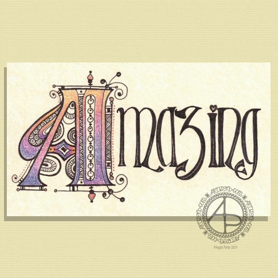
My hand lettering is a little rusty; I’ve not done much in the past week or so as my focus has been on mandalas and work for my next book.
My morning warm up art session today was this little bit of hand lettering. I had a completely different idea in mind when I started this off but, as often happens, the creative energy flowed in a different direction.
I had wanted to do a monogram, perhaps with a dangle or maybe one set into a pattern border as a drop capital to a quote.
As I worked on first the pencil outline of the A, and then inking it in using fine and extra fine fountain pens filled with black ink, the lines that flowed out dictated the form of the letter rather than me consciously trying to force it into what I thought I wanted to create.
I think I’ve over patterned the inner space of the monogram, or not used the right kind of patterns there. However, it’ll do.
I wanted to use some birdwing copper FW Pearlescent ink from Daler-Rowney to add metallic highlights with a dip pen. I soon found out that dip pens and parchment paper that has been coloured with black ink don’t work well together. So, I ended up with the copper highlights at the bottom of the letters that fade up naturally. Adding dots of metallic colour to the monogram was easier on the unworked parchment. Over the black ink dots it wasn’t so easy. I’m also not sure that the ‘string of beads’ in the monogram actually works but I know it’s missing something. I need some time to reflect on this. As I do about adding any more copper highlights to it. I may yet decide to add some dangles to the word.
On the whole, I’m quite happy with how this turned out. I could add ‘You are’ in small letters above the letters. Either way, I think this would make a lovely notecard. I also think it could be used in a bujo, planner, journal, scrapbook or as framed art. I think I need to review the card making and mixed media techniques I once knew and have sidelined to focus on other aspects of art and adapt them to my current needs/ideas.
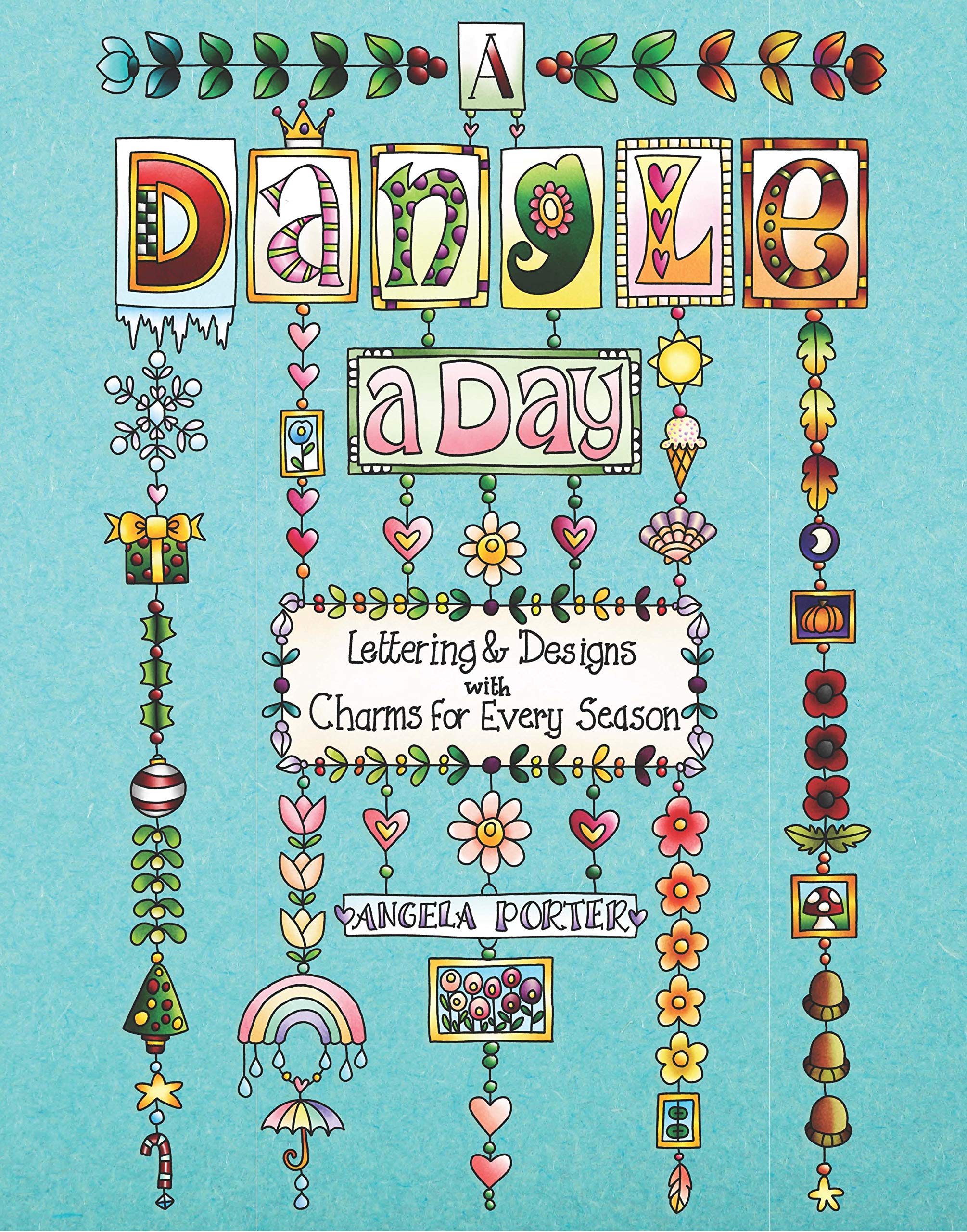
Today’s the day! A Dangle A Day is published in the US. Thursday is the day for the UK. It’s my very first tutorial book and the reviews I’ve seen so far are lovely!
Well over 100 dangle designs in the book with step by step instructions for each. Simple steps leading to even quite complex designs. Whimsical, cute charms. Funky monogram dangles. Plenty for each season and most occasions. I’ve also written encouraging words as everyone can draw dangles and they are perfectly imperfect which is what makes them personal and unique!
I’d love to see what dangles you create and how you use them – in your bujo, planner, journal, diary, scrapbook, or as greeting cards, note cards, book marks, gift bags, envelopes, framed art, or any other way you can think of! Tag me on twitter, instagram or facebook!
Naturally, I have a stinking, streaming cold and I feel rough as anything. I don’t think I’ll get much in the way of art done today. Coughing, sneezing, runny eyes and a thumping headache don’t do much for focus.
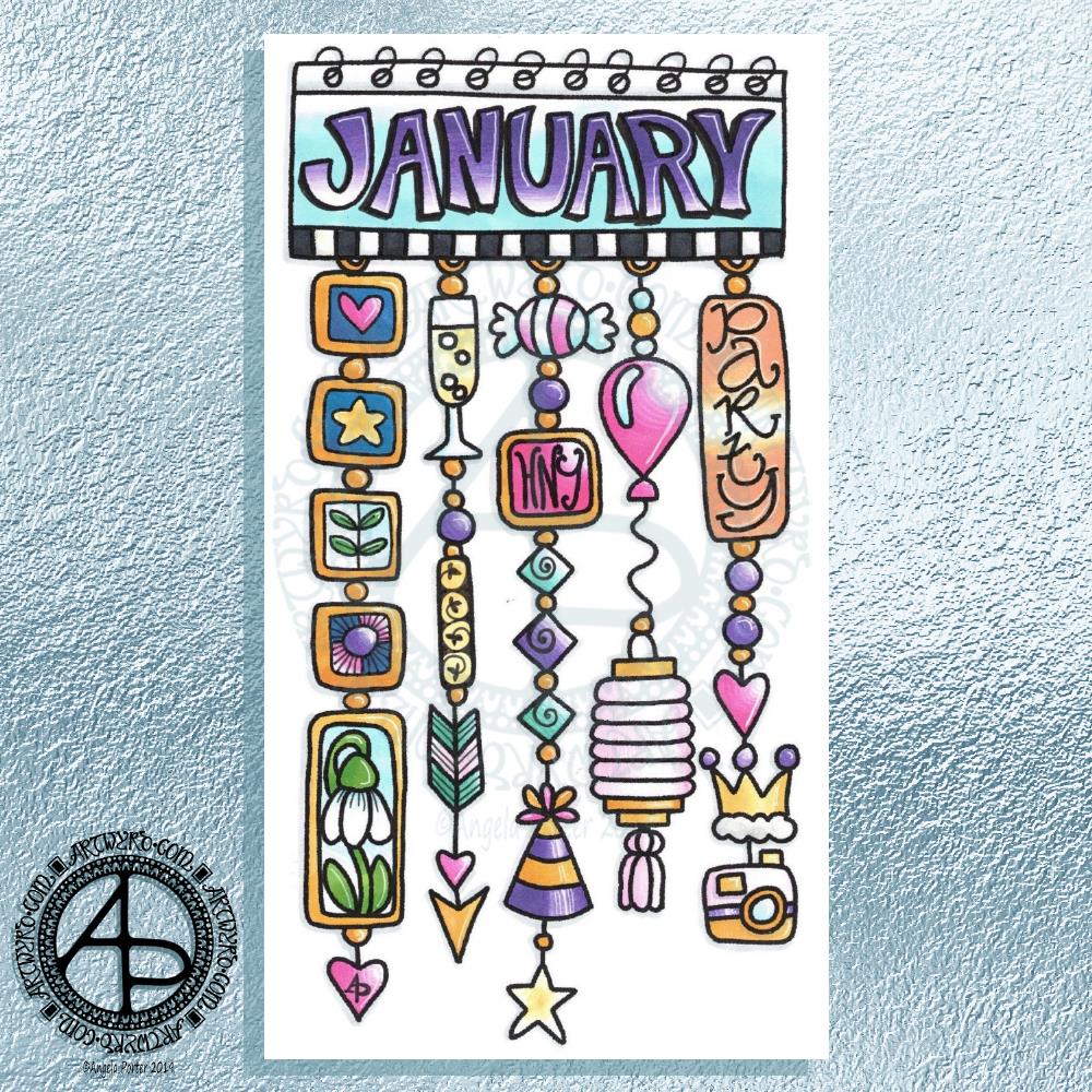
What a bright, sunshiny morning it is here in South Wales in the UK. The first sunshine of the new calendar!
I’ve been up for around 3 hours and have had a fairly artsy time.
My first job was to print out the lineart for this dangle design, which is one of many in my book ‘A Dangle A Day’ which is due for release on 8 January 2019 – just a week away!
In the book, I take you through how to draw this design, one step at a time. Not only this design, but well over 100 more – designs for all seasons and many, many celebrations and occasions.
This design I drew in Autodesk Sketchbook Pro using a Microsoft Surface Pen and Microsoft Surface Book. For the book, I coloured it digitally. Today, I printed out my black and white lineart and then coloured it using Chameleon Color Tones and Color Tops marker pens. I also added some details to some elements of the design using a 08 Uniball Unipin pen and a white Sakura Gelly Roll Pen.
Yesterday, I said I need to to spelunking through my stash of mixed media and cardmaking supplies to find forgotten supplies I could use to embellish my designs.
This dangle design would make a lovely monthly cover page for a BuJo (bullet journal), planner, diary or journal. It would also make a pretty greetings card or notecard to drop a line to a friend wishing them a wonderful January. Change the words and colours to suit the occasion or recipient! It would also be a lovely, whimsical, cute design for a winter party invitation.
I realised then that my old watermark wouldn’t do for this year. So I hand lettered a new one. I made my symbol, the one I hide away in my artwork, part of the design, along with a little intricate but simple geometric pattern around it. A little touch of the uncials for my blog address, along with a typed copyright statement and it’s done and saved! I may end up changing it a little, or having variations on the theme, as time goes on. But I’m fairly happy with it.
So, I’ve already had a productive morning! It may be a Bank Holiday in the UK, but I really do need to focus on those templates that need colouring for Entangled Forests…and I may venture forth into the peopley world later on today, maybe.
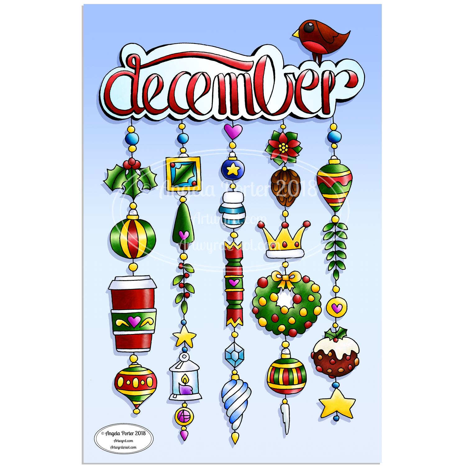
As one of my current goals is to improve my hand lettering I thought it would be fun to practice it with another dangle design.
For this one, I used some dangles from my book ‘A Dangle A Day’ to build the dangle designs with a wintry, Christmassy vibe to the finished design, thanks to the traditional Christmas colours of red, green and gold, along with with some blues, purples and cool pinks thrown in.
Of course, I could’ve chosen a non-traditional series of colours too, for fun. For example, the baubles on the dangles and the wreath could be done in pink, purple and blue. Whatever your decor at this time of the year it can be reflected in your colour scheme for your dangle design.
From the initial sketch to posting it on this blog it’s taken me around 6 hours to complete.
Yes, I started with a sketch and then inked it in traditionally, pen on paper. I scanned that drawing into GiMP so I could remove the dot grid and the faint echoes of erased pencil lines. This was followed by coloring the image. For this I used marker and blender brushes . The last steps were to add texture to the design, a coloured background, a drop shadow and then the watermarks.
I used a Microsoft Surface Pen, a Microsoft Surface Studio and Autodesk Sketchbook Pro to complete the digital colouring and so on.
The charms on the dangles are a lot easier to draw than they appear, it’s the colour that really brings them to life and gives them dimension.
It’s always fun to string charms together to make these dangles. I often tend towards more symmetrical designs, but ones like this are good to do too. They all have their own charm, pardon the dreadful pun there.
I take you designing dangles step by easy step in my book ‘A Dangle A Day‘. There are lots of examples of dangle designs in the book that are ready to use, but it’s easy to rearrange things to suit your particular needs. The release date is 8 January 2019, a new style of creativity to start in the New Year, and throughout the year as all the seasons and many different celebrations are covered in the book, along with suggestions for projects using dangle designs.
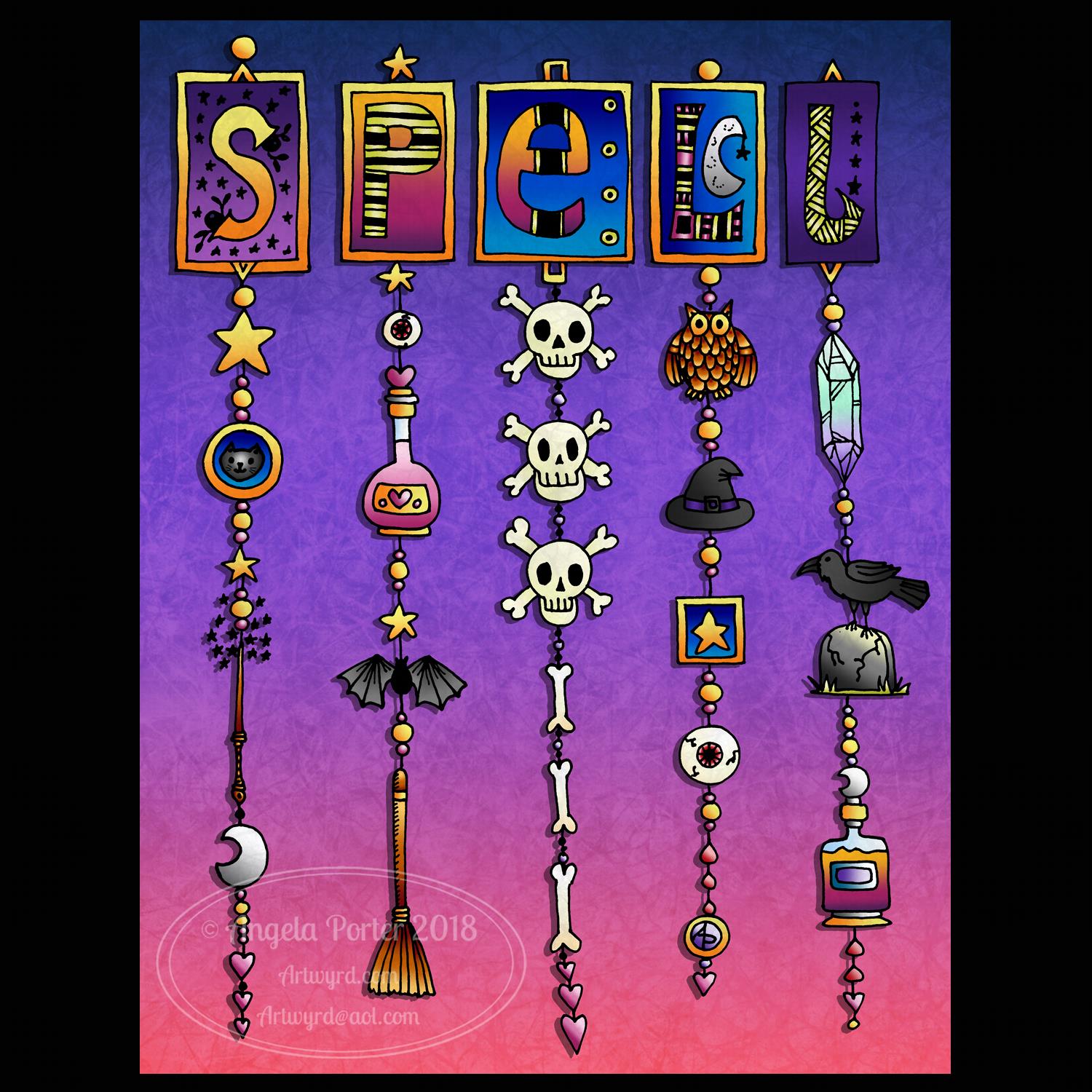
I’m a day behind in the Inktober Challenge as far as the calendar goes. Not that it’s all that important methinks.
One thing I’m sure of is that the prompt for day 4 – ‘spell’ – just spoke dangle design to me, and as I’ve made Friday #dangleday, well it was perfect that I worked on it today.
I started by drawing the black line art on dot grid paper with a black Papermate Ink Joy gel pen. These pens are a joy to use, often a bit too thick a line for much of my drawing, but perfect for this one. I drew the design in one go – no pencil lines for anything, even though my letter S is a bit squiffy and there’s a wonky dangle.
I scanned my ink drawing into GiMP so I could remove the dot grid and create a transparent background for the line art.
Next it was using Autodesk Sketchbook Pro to add simple colour to the design and background, then to add texture using brushes. Oh, and a drop shadow. That drop shadow helps to lift the design from the background just a bit.
I’m actually quite pleased with this design, though it was touch and go whether I’d finish it or show it at one point.
When I’d finished the line drawing I thought ‘oh no, how awful this looks!’. I didn’t give up, though. I was going to try to keep it monotone, adding shading in stipples and lines and so on, but I decided colour may be the thing that brings it to life.
I’m always doing my best to say thank you to members of the Angela Porter’s Coloring Book Fans Facebook page and other colorists for bringing my line art to life by wielding their magical coloured pens and pencils and other media, and commenting on how wonderful they make my line art/coloring template/illustrations look.
I often cringe at some of the drawings I did for books just a few years ago, and often at the work I do now, today’s dangle design in it’s line art version being an example of that.
Then, when colour is added it works like a magic spell in making the art look wonderful, even the simple colouring I’ve done with this dangle design.
So, all of you colorists out there, continue to work your magic spells on the black and white coloring templates and please show me the results of your color spells on my coloring templates by tagging me on Facebook, Instagram or twitter.
This would look really nice as a bujo, planner or scrapbooks spread for Hallowe’en. I think it would make a lovely greetings card or note card. It would look fabulous printed and framed in a spooky black, glittery frame and displayed as part of some Halloween decorations. In fact, it would look great all year round for fans of magical fiction, films or TV.
What would you do with it? Where do you think it could be used? Please leave comments.
Just a reminder that my book ‘A Dangle A Day’ is available for preorder and it’s due for publication in January 2019.
Yesterday, I had an enjoyable couple of hours drawing fairly cute designs that are 6cm x 6cm (approx. 2½” x 2½”).
I drew my little designs (twelve of them in total, and not all of them I’m all that fussed on at the moment) on Rhodia dot grid paper with a Uniball Unipin 05 pen. Then, I scanned them into the computer and did my usual magic to remove the dot grid and create a transparent background.
Finally, I used Autodesk Sketchbook Pro and a Microsoft Surface Pen, along with my Microsoft Surface Studio to colour the image.
I used various brushes and brush textures to achieve the colouring.
It’s really small, for me. A 6cm x 6cm size would look darling on a small greetings card or note card. I also think they’d make a lovely addition to a BuJo, Planner or Scrapbook page.
Here’s two dangle designs for dangle day Friday. Simple designs, perfect for getting into the weekend vibe.
These are both experiments where I’ve worked on vellum/parchment, the kind that is used for Pergamano.
The one on the left – the monogram A – is nowhere near as garish in colour in real-life; I really don’t know what the scanner has done to the colours. I drew the design with a metallic gold Sakura Gellyroll pen. I then used Tombow Dual brush pens to colour the design on the reverse. I used shades of yellow, orange, red and magenta, but the scanner seems to have removed much of the red. I also managed to smudge the colours too. I don’t think I’ll be using Tombows on Vellum again.
I do like the gold linework and I think I’ll draw this design out again and colour on the reverse with coloured pencils, like in the dangle design on the right.
You may recognise the design on the right as last weeks dangle design. I traced that design onto vellum using a white Uniball Signo pen. I altered some of the details and the style of lettering.
Next, I did a little bit of ‘whitework’ on the reverse. This gave the highlights on the design that help to give the illusion of dimension as well as some texture. I let the design rest under a heavy book for an hour or so.
Finally, I used my Chameleon coloured pencils to colour the design in, again doing this on the reverse.
I like the colours on this one. The vellum mutes the colours somewhat, but it also softens any imperfections in the colouring.
I’m not sure about the white lines though. I need to try this one with some coloured paper underneath to help the lines stand out a bit more. I’ll post an image of it if it works.
I’d like to draw this design in gold and see how that looks. I may try black too. As well as using coloured pencils, I want to try using Copic or Chameleon markers to colour the designs in, to see how they work on vellum.
These certainly were experiments, which I’ve learned from. Not only that, I’ve got some ideas to try out the next time I use vellum. I’m trusting I’ll find the combination of line colour and colouring medium that works for me and my style of working.
What would I do with these designs? Well, they would both work really well as spreads in Bujos, planners, journals and scrapbooks. I also think the monogram would make a lovely bookmark. They’d both make nice greetings cards or notecards. I’m sure there’s lots of other things they could be used for, such as framed pictures.
If you have any suggestions for how they could be used, leave a comment.