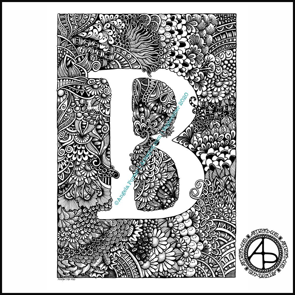
Finally finished it! It’s taken many hours to do – probably around 15 I think, and it’s taken some perseverance by myself to get it done.
Uniball Unipin pens (05, 03 and 01) on Claire Fontaine Paint-on mixed media paper. Two pen nibs now wrecked; the paper is velvety smooth to touch, but just too rough for the tips of the Unipin pens. Will move to Bristol board for the next monogram.
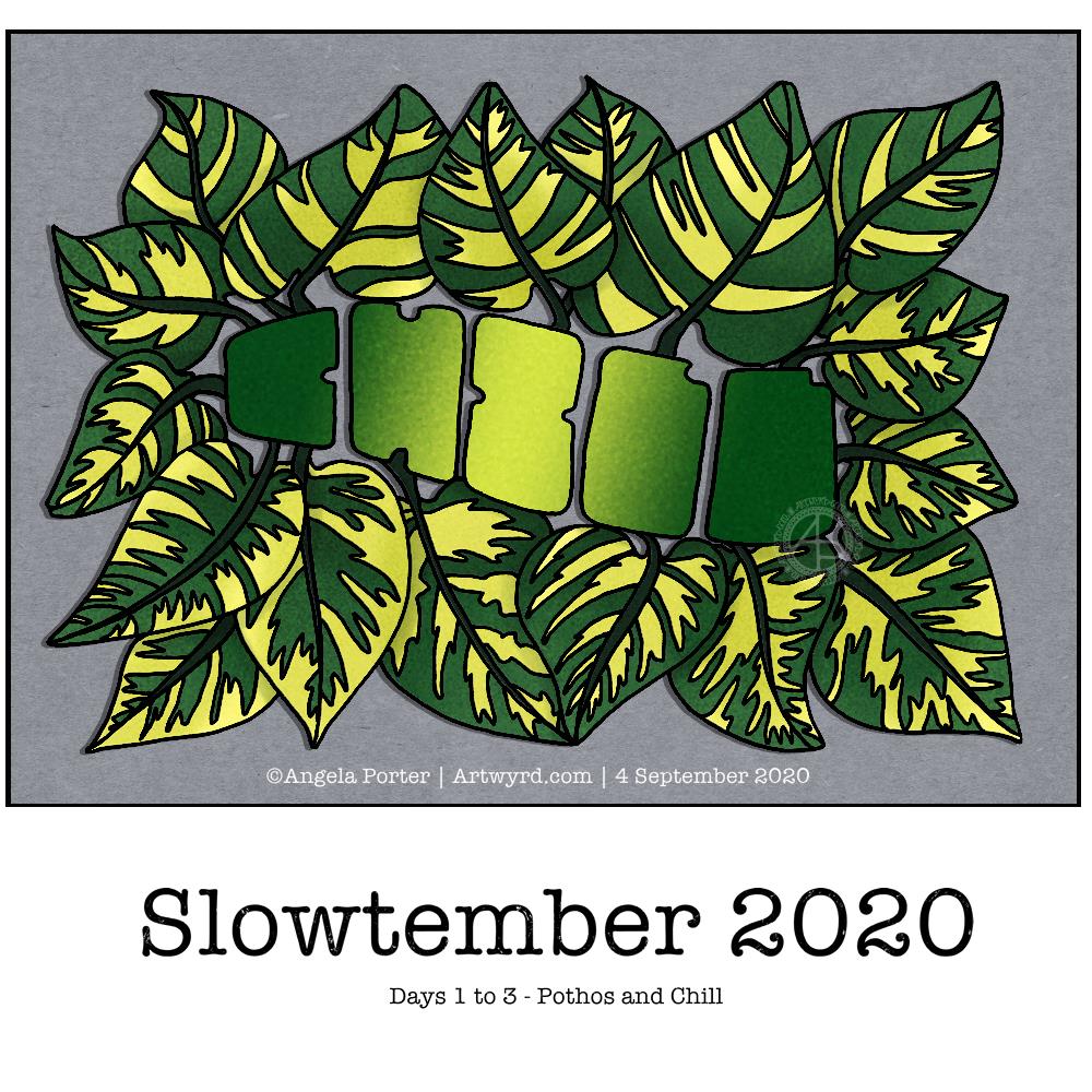
I decided to do Slowtember. I like having prompts to challenge me, take me a little outside of my usual style. However, Inktober can be a bit full on with daily prompts. Slowtember gives that breathing space, and I can work it in around my other commitments.
Thanks to @megaelod on twitter for the idea and prompts!
So, the first prompt was a choice betwixt pothos and chill. I decided to combine them! I like foliage, and the word gives me a chance to try out some hand drawn typography/hand lettering.
I sketched the quite stylised design on dot grid paper, inked it with Unipin pens and then scanned it in. after some digital clean up and slight adjustments, I added some simple colour and shadow.
You’d think adding simple colour would be easy, yes? Nope! Choosing the right greens wasn’t easy for me. And then there was the typography. I lost count of how many times I tried different ways to colour the letters. Eventually I decided enough was enough and the gradient I had was good enough.
As I think now, after breakfast and some mocha, I could’ve done the word as a flower pot, or used it to add shadow to a flower pot. Maybe I’ll give that a go for the next prompt (monstera and water).
Complex drawings are my stock in trade. Going simple and stylised is not quite so easy! Still, it was fun to do, a bit frustrating at times, but the result is perhaps good enough, though I’m not sure about that.
Wednesday is WIP day! WIP is work in progress, and this is one of my current one.
I’m working on A4 (29.7 cm x 21 cm) Claire Fontaine Paint-On mixed media paper with 05 and 01 Uniball Unipin pens.
It’s taken several hours so far, and there’s several yet to go! I’m enjoying creating such detailed drawing in just black and white. Lots of botanical elements, but there’s also arches and spirals and geometric patterns in there too.
I never have much of a plan in mind when I tackle a drawing like this. I know what patterns I like, and if I lack inspiration I can always refer to my visual dictionary or design motifs and patterns. It’s all about intuition. It’s not entirely mindless. I do make conscious decisions about what design element to use, how to use line and pattern to add volume and contrast.
I sometimes wonder, when I see my work like this, why I try to work with colour. I always feel I struggle with colour, but black and white, with or without grey, always seems to work so well for me.
I love to play with the illusion of volume in a drawing, and whether that is done with density and shape of line/pattern, or with colour (even though I really do feel I struggle with colour).
I will persevere with this illustration, drawing, artwork over the coming days. In fact, I may spend time on it today. I’ve completed my morning errands, so I can remain at home, which is where I need to be. I’m tired today; I didn’t sleep at all well last night, or for the past few nights and my mood and ability to concentrate is suffering as a result.
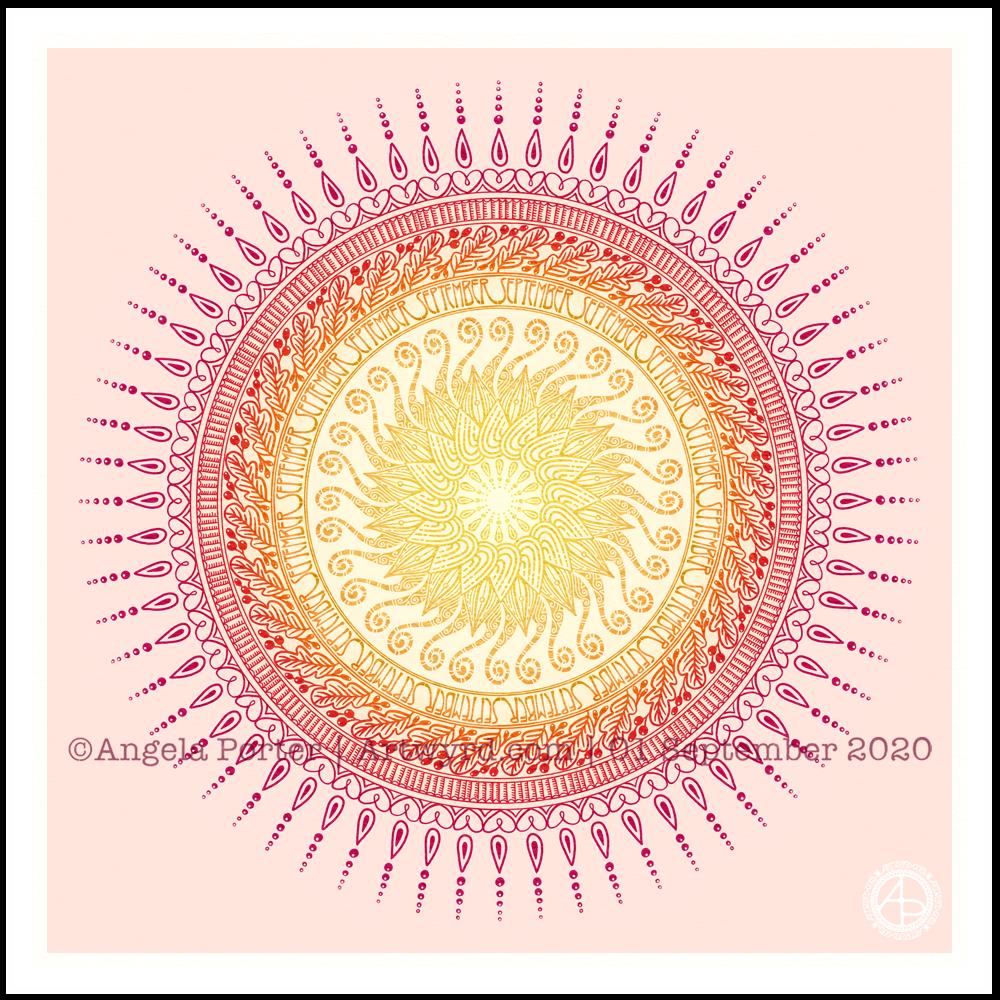
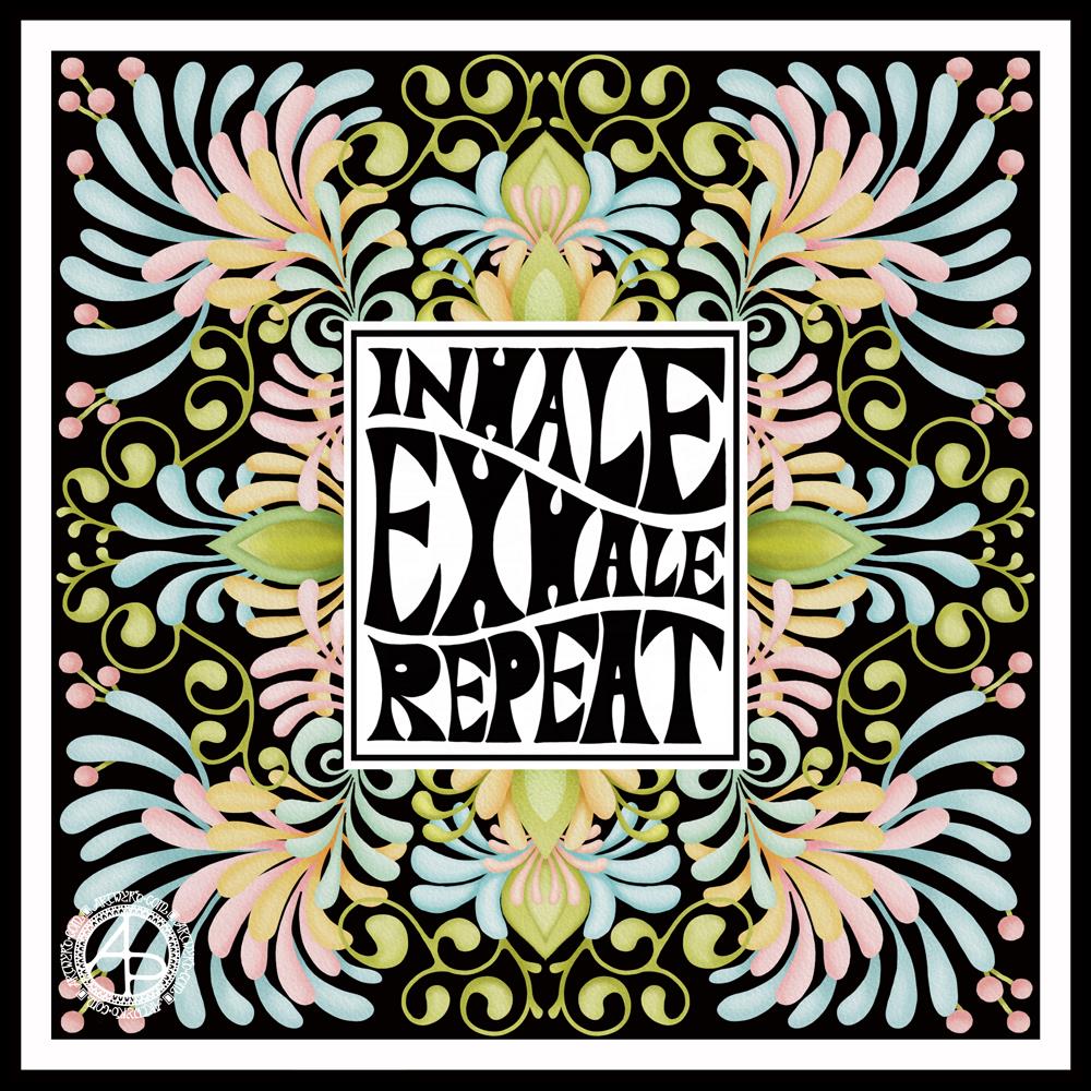
It’s a sunshiny, blue-sky morning with a distinctly cool and freshness to the air. It really feels like autumn is on it’s way. So, I’ve created a mandala to welcome the change of month, and the incipient change of season. I even practised my hand-drawn typography / hand-lettering.
What I missed out on doing was having a 9-fold symmetry for the ninth month. Ho hum. Perhaps I’ll just create another!
I’m also not at all sure of the background colour. It’ll do for now. After all, this is my morning warm up art.
Drawn in Autodesk Sketchbook Pro using Microsoft Surface Studio and Microsoft Surface Slim Pen.
Today, I’ve been practising my hand-drawn typography (hand lettering). I seem to have Aneurin Bevan on the brain at the moment, probably because I’m working on a typographic portrait of him. So, I chose a quote by him.
To create this, I started off with squared paper, a ruler and a pencil. I marked out an area that was 24 cm x 12 cm. Before doing any lettering, I drew in some wavy guidelines. Then, I added the lettering. It took three attempts before I ended up with a design I was happy with.
Next, I scanned the sketch into Autodesk Sketchbook Pro and re-drew and inked in the letters.
Black on white was very stark, very graphic. However, I had a hankering for some colour. So, I chose reds. I used some digital wizardry to invert the black letters and white background. I created the coloured and textures background, and then used some layer options to get the effect I wanted.
Final steps were to ad my little copyright notice and watermark. As well as resizing the image for social media.
Taking a break
It’s always nice to have a change of pace and intensity in art work. I spent a couple of hours this morning getting my mind around how I could change the shape of letters to give a feeling of volume to a portrait. The fist in my portrait of Aneurin Bevan was looking a tad too flat.
I didn’t want to do any more work on the portrait today, wanting to give myself a break from the changes I’ve made so I can go back to it with fresh eyes and fresh mind.
Thoughts ticking around my mind
I do have an idea for creating a more abstract kind of typographic art from quotes and descriptive words now I’ve completed this mini typographic art quote. Not today, though I will note my idea down in my journal.
I often wake up in the morning, with ideas for art projects, as well as suggestions for solutions of problems I’m having with a current artwork, such as the flatness of Nye’s fist in his portrait.
It seems my subconscious mind works on these issues while I rest and sleep.
Perseverence
I really am persevering with the typographic portrait. That’s a surprise to me. Not all that long ago, I would’ve easily given up on it and decided that it wasn’t for me.
But not this time.
This time, I’m sticking with it, as well as the use of typography in my other styles of art.
This one isn’t coming as easily to me as other forms of art have, but it’s one that I seem to want to really succeed at.
What is making the difference is being able to work digitally. That makes editing, altering, trying things out a breeze. I don’t have to completely start all over again, I can keep what I like, and then rework what I don’t like. I can even keep what I don’t like in case it turns out that it is actually what I do like!
Remembering to work in layers really does help this process. That’s something I don’t always remember to do. However, I will get there. Just not today.
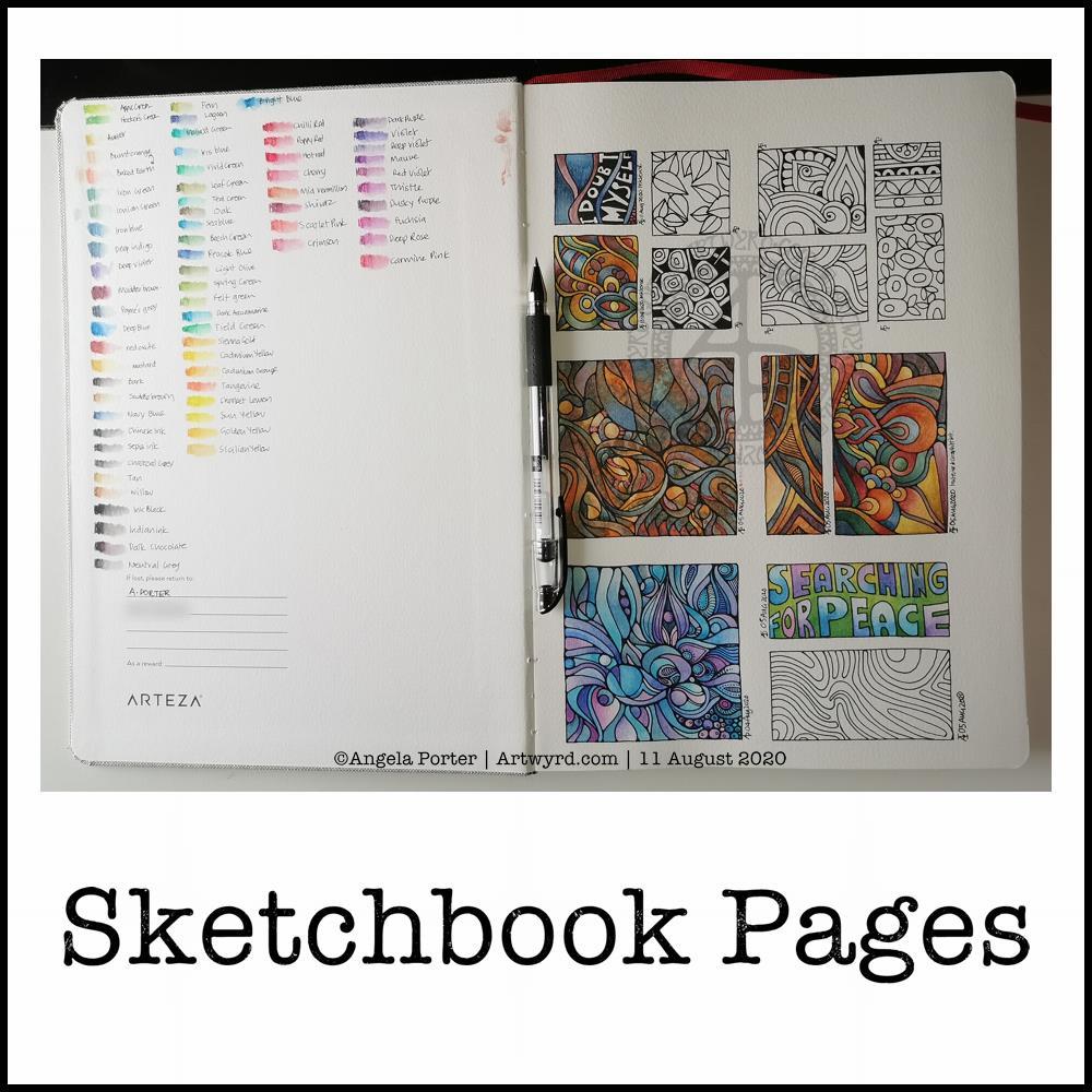
Today, I share a glimpse into my current sketchbook. It’s an Arteza watercolour A4 sketchbook.
I’ve completed all the drawings in boxes now, and am adding colour to them using watercolours, graphitint watercolours, graphitint pencils and/or inktense pencils.
The paper is rather nice to draw on with Faber-Castell Pitt artist pens or a Uniball Signo DX 0.38 pen.
On the cover page I swatched my collection of Inktense pencils, using a damp brush to bring their true colours out.
Inktense pencils are intense in colour when activated with water. Also, once activated with water and dry they are permanent.
I like all the media I’ve used so far on this page. Which I use does depend on my mood. Today, I wanted to choose an inktense palette of colours that is like the rusty colours I’ve been using with watercolours.
I really am drawn to this colour palette in my work at the moment. The dark blues, rich red-browns, blue-greys, earthy-dark greens and the vibrant mustards. One day I’ll look up the psychology of these colours and see how they relate to my mood/life at this time. But not today.
Today, I need to focus on adding colour to some templates for the Entangled Gardens colouring book that will be released early next year.
Drawing done with Faber-Castell Pitt Artist Pens. Arteza Mixed Media Paper coloured with Distress Oxide Inks (Stormy Skies, Chipped Sapphire, Dusty Concord, edged with Hickory Smoke). Paper measures 3″ x 8.25″ (8.3cm x 21cm).
“I make art to show my soul I am listening.” “This, too, shall pass.”
Art is my solace, my form of expressing my soul, my inner self.
This morning I created some tall, thin (or short and wide) backgrounds using Distress Oxides on some Arteza Mixed media paper. The paper is 8.25″ x 2.87″ (21cm x 7.2 cm) in size.
I chose this one to draw on for no other reason that it was the one that appealed to me at this time. I started with the seed pods and foliage at the bottom, and worked my way through some hand lettering / hand-drawn typography to more abstract line-art.
I drew with a M Pitt Artist Pen from Faber-Castell, though I added the stippling with an XS Pitt Artist pen.
No glitter or glitz on this one, nor any highlights. Not yet. I’m not in the mood for any, not today.
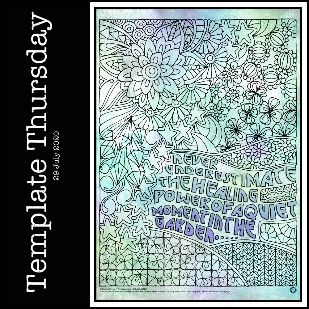
It’s Thursday again, so that means it’s time for a new coloring template for the members of the Angela Porter’s Coloring Book Fans facebook group. I said that during the pandemic, I’d create a template a week for group, free of charge, to help people relax, calm and take their mind off all the awful things that are happening in the world for a short time.
This week, I’ve combined some typography my familiar entangled style of drawing. Botanicals, crystals and stars along with some repeated ‘zentangle’ style patterns. Some of my favourite things to draw.
To draw this template, I used Faber-Castell Pitt Artist pens (F and S), Copic Fineliner SP pens (05 and 025) and a Uniball Signo DX 0.38 pen with Rhodia dot grid paper.
Although lockdown has largely lifted in the UK, we still need to practice social distancing and wear face coverings when it’s not possible to do that, or in enclosed spaces. The Covid-19 virus has not gone away, and though the number of cases are falling, as are deaths, that’s due to people being sensible and following the guidelines for limiting the spread of the virus.
I’m very, very anxious about going out and about, and I know I am far from the only one. I mostly stay safe at home. Mind you, that’s not unusual for me. Even before the pandemic I wasn’t someone who was out and about all the time. I did pop out and about more often than I realised, however. But I’m still usually quite happy to stay at home and focus on my arty, creative activities. But, I know that’s not the case for everyone, and not everyone is able to work from home either, nor wants to.