Exploring ways of adding shadow | 29 December 2021

Link to today’s video on YouTube.

I needed to add shadows to the drawing completed and given a colour wash yesterday. As I so often regret my choices of how I do this, I decided to make a test page of various methods for my sketchbook.

They all have their own charm and feel. However, putting them side by side so I can compare and contrast gave me a better idea of what I really like.

To add shadow/highlight to a drawing, I really like the hatching/contour lines created by a micron pen or a biro. The biro I particularly like as it is much softer and I’m able to get a tone variation with the lines.

I also worked out that for using gradations of colour, they just feel a bit … plain. So, like in the drawing of medieval flowers and leaves, the combination of lines and colour works for me.

I found when I was adding shadow below the drawings that using Distress Inks like watercolours just wasn’t going to work. The use of water results in weird boundary lines that I’m not fond of. Of course, if I’d not coloured the background in Distress Ink, a gradated wash of colour may have created a lovely shadow.

So, I think I’d prefer to use chalk pastels for adding shadow. The ability to blend them out gradually, with no harsh line, is a great advantage. It’s also easy to add more of the pastel if a darker colour is needed.

So, that’s what I chose to do. Not just with the drop shadows, but with darker areas on the leaves etc. I even found that the pastel can tint the gold I’d added in places, which is a really interesting twist.

Bit by bit, I’m working out colour, shadow, highlight and what works for me.

It’s also no bad thing to spend time trying out techniques with various media. Mixing and matching. Making a reference page for my sketchbook / zibaldone has proven to be a very valuable exercise.

When I’m quite happy with the drawing. I will do my best to take a good photograph of it. It’s worked out much better than I thought it could.

Inktober Tangles 2021 | Day 7 and 8

I’ve had a lovely tangle-y, arty, creative morning. Some good stuff. Some experiments that worked, some that didn’t quite. Either way, I have two more pages in my sketchbook filled with explorations of Zentangle patterns.

On the left is the page of explorations of Morrisseau by Cheryl Moote CZT. The white lines in the wavy border are just … too stark and a clear line/edge that I don’t like much, at the moment. I much prefer the dotty embellishments! Having said that, the white lines that turn areas of the design into shell-like fragments work rather nicely. The more I play around with Morrisseau, the more it’s becoming one of my favourite tangle patterns. I have a lot more exploring to do with it, no doubt too.

On the right is a page of explorations of today’s tangle, Zenith, by Zentangle Inc. This was kind of fun to play around with, some ideas more successful than others. less colour on this page, but plenty of dots and white highlights!

As these are pages in my sketchbook, I feel no need to finish them completely. They’re there as a reference for ideas growing forward. Also, they’re a record showing how I’m working at developing both patterns and addition of colour, shadow and highlight.

For colour, I’ve used Graphitint pencils with a damp brush to activate the colour and gently spread it out. I like the earthier tones much more than the bright and intense colours of the Ecoline pens at the moment.

For shadow and highlight on the Zenith page, I used charcoal pencils. Now, these I like far more than graphite pencils. They don’t add any shine at all. Hurrah!

For white highlights, a white Sakura Soufflé pen was used, both before and after adding colour/shadow/highlight. With the charcoal pencils it really needs to be added afterwards as the charcoal is abrasive enough to stick to the dry pen. With graphitint it doesn’t matter. Indeed, the way colour pools around the white dots/lines adds depth and interest to the colour.

I’ve also used some metallic paints that are fairly opaque in some of the drawings. I enjoyed doing this, especially as I could add different shades of gold to add a highlight. I think I’ll be using these more going forward; they give a much smoother finish in large-ish areas than a metallic gel pen would. I like smooth finishes with metallics. The uneven colour that results from spreading the graphitint pencils pleases me too.

Pink and Purple Entangled Art

Link to today’s vlog on YouTube.

I realised that the pinks and purples I added to this drawing were just a bit too bright and vibrant for my current tastes. I decided to use an aubergine Graphitint pencil with a waterbrush to tone them down somewhat. And I think it’s worked. I’m much happier with this now. I even like the areas where I’ve added just graphitint.

I’m not quite sure how I’ll finish adding colour. Do I add some Carbothello to the graphitint areas? Do I just continue with Graphitint alone? I don’t know for sure.

Entangled Frame – Part 4

This is the final installment of the frame/background I’ve been creating as my morning warm up art.

Today, I finish adding colour and also apply Distress Microglaze to bring out the colours.

Thanks to everyone who’s taken some time to watch my videos, leave a comment, like the videos and/or subscribe to my YouTube channel.

It’s nice to be able to share my art in process, but also to share insights into myself, my artistic processes. Indeed, giving voice to my thoughts makes me aware of them. As I work, I’m usually oblivious to the thoughts that happen as I create. Either they’re mostly in my subconscious, or so ephemeral and passing that I don’t notice them.

Entangled Frame – Part 3

I know, not another video. But yes, another. In this one I start to add colour to my drawing, and chat about my method and what makes me smile in terms of colour, and the struggles I have in coming to terms with that.

I’m going to go and work on a mandala now, for Mandala Monday of course!

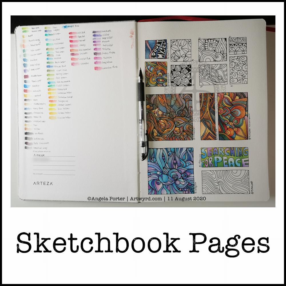
Sketchbook Pages

Today, I share a glimpse into my current sketchbook. It’s an Arteza watercolour A4 sketchbook.

I’ve completed all the drawings in boxes now, and am adding colour to them using watercolours, graphitint watercolours, graphitint pencils and/or inktense pencils.

The paper is rather nice to draw on with Faber-Castell Pitt artist pens or a Uniball Signo DX 0.38 pen.

On the cover page I swatched my collection of Inktense pencils, using a damp brush to bring their true colours out.

Inktense pencils are intense in colour when activated with water. Also, once activated with water and dry they are permanent.

I like all the media I’ve used so far on this page. Which I use does depend on my mood. Today, I wanted to choose an inktense palette of colours that is like the rusty colours I’ve been using with watercolours.

I really am drawn to this colour palette in my work at the moment. The dark blues, rich red-browns, blue-greys, earthy-dark greens and the vibrant mustards. One day I’ll look up the psychology of these colours and see how they relate to my mood/life at this time. But not today.

Today, I need to focus on adding colour to some templates for the Entangled Gardens colouring book that will be released early next year.