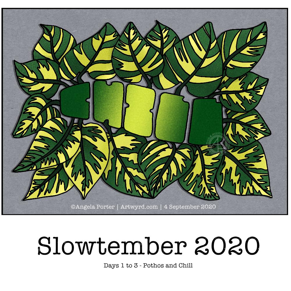
Yesterday afternoon and this morning I’ve spent time catching up with #Slowtember by @megaelod on twitter. Here’s the sketchbook page I created for the prompts monstera (Swiss Cheese Plant), areca palm and rubber plant.
I took the opportunity to practice my hand drawn typography / hand lettering, as well as my use of line to add volume to a line drawing.
I’m not the best with colour, or with traditional media to add colour, but I think I’ve done OK with some of these. I like the simple washes of gradient colours in the areca and rubber plant leaves. The line work is nice, but the colour brings it to life. The monstera leaf done in coloured pencils works well as far as a sense of volume goes, but I’m not the best with coloured pencils, even using blending solution.
I even found some microscopic images of cells from monstera and rubber plant leaves and stems. So, I just had to do quick drawings of patterns from these, with some imaginary colour added to them.
It’s nice to do this challenge. It’s not as full on and intense as Inktober is, and even if I fall behind there’s not so much to catch up with. It’s also nice to work in a sketchbook (or digitally) as there’s no pressure to complete a finished piece of work. I like how I’ve left some of my drawings partly coloured so I can compare how colour adds (or not) to the design.
When I’m looking at my page and writing about it I always have ideas about how I could’ve approached an idea, or get new ideas. Time for me to go and jot them down before I forget them!

