It’s Thursday again, and one more week of quarantine is behind us. That means one week of lockdown ahead of us. Feeling sad about all those who are sick or who have died as as a result of the sanctions, but the sanctions have kept others safe from Covid-19, thus reducing serious illness from the virus, or death.
As always, the template is available free to members of the group, which is also free to join. So, if you would like to colour it, meet some like-minded people, and share your colourings with us, pop over the the group and join in!
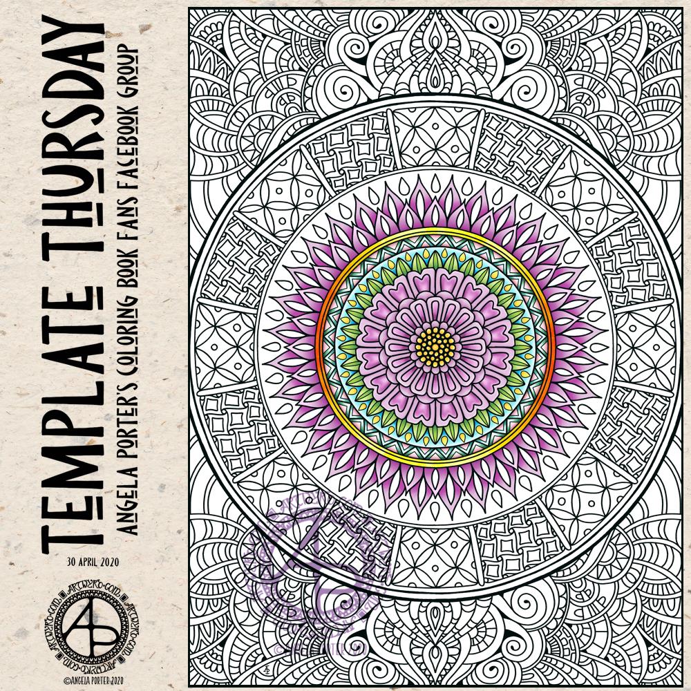
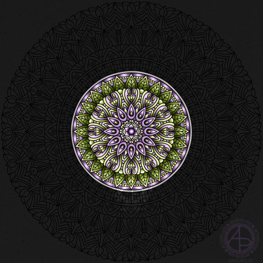
I drew and partially coloured today’s template digitally using Autodesk Sketchbook Pro. I needed to draw a mandala to soothe me. I’m tired today and feeling ‘meh’. That is reflected in my colour choices.
I’ve been awake since stupid o’clock, which roughly translates to 3:30am BST. While I was trying to get back to sleep I watched a youtube video about making pockets and tuck-ins for an altered book journal.
I thought that could be something good for my sketchbook-journal. I have worried a little about gluing my little artworks into it, but pockets, tuck-ins, see-through envelopes could be a good way to both show the work and store it in a non-permanent way.
So, with my mind now working and sleep eluding me, I decided to have a go at making my own pockets. You can see the result at the top right, with a journalling card popped in one of them for now.
How I made the pockets
I used some ordinary white card, cut it into what I thought would be good sizes to make a set of stacked pockets for the ATC sized cards I’ve been working on.
I then coloured the cards with Distress Oxide Inks. For one of them, I used a brayer to add ink to a gelli plate. Before pulling a print, I spritzed the gelli plate with water that had some white perfect pearls added to it.
For another panel, I used the brayer to add ink directly to the paper. It did that unevenly. So, I used a ball-tool to carve some texture into the black side of a piece of cut and try foam and used that to add colour. That worked really well! Dabbing the foam added a lovely textured layer of colour. A spritz of water activated the dusty, chalky, soft nature of the Distress Oxides.
I enjoyed the look I achieved with the distressed foam that I coloured the remaining pair of paper panels in the same way.
I then tore the top edge of each panel, for added interest, then used a piece of foam and Rich Mahogany Distress Ink to add grunginess to the edges of each panel.
I wanted to add some embellishments to each panel, so I used a copper sparkle Gelli pen to draw patterns on them.
Finally, I used Tombow Mono adhesive to stick the panels together.
When I put the panels on the page in my sketchbook-journal, I thought a panel behind them. So, I coloured a panel of the same card with Distress Oxide inks and the distressed piece of foam and used the same gelly roll pen to add some sparkly patterns. Then, I adhered the back panel and pockets to my sketchbook.
When I tested some ATC cards in the pockets, I realised I need to work out a way for some more ‘give’ in the pockets as they’re too tightly put together to slip more than one ATC card in them. Also, I placed them just low enough down the page so the ATC card doesn’t stick out of the sides of my sketchbook.
I’m not well known for my fore-planning projects like this, though I do try to learn as I go along.
Inchies and Twinchies
My mind was working in weird ways this morning. As I was making the pockets, my mind strayed to inchies and twinchies. I’ve not made any of these for a long, long time. I thought it could be fun to do so and add them to my sketchbook-journal.
I cut two 1″ wide, and one 2″ wide strips of card. I used the distressed foam to apply Distress Oxide inks to them, spritzing with water to add to the distressed look. Then, after drying with a heat tool, I cut them into squares – 1″ x 1″ inches and 2″ x 2″ twinchies.
I decided to use metallic watercolours from Cosmic Shimmer to add a sparkly, shimmery border to each tile. I used rich gold, pale gold or copper on each tile.
Then, I got to draw on the tiles. Teeny, tiny zentangle-style drawings. That was fun to do!
After adding some dots using a white Sakura Soufflé pen, I adhered the inchies into my sketchbook-journal. I’ve left the twinchies for decoration later.
Journaling cards
I realised that I could stored journalling cards in the pockets. All I needed to do was to colour the back of one of the ATC cards I coloured a few days ago. I also just realised that I could have added a layer of squared, dot grid or lined paper to write on too. That’s an idea for another time, maybe.
After drying the ink, I used a rollerball pen to add what notes I wanted to about this mornings creative sessions.
In fact, I’ve just created another journaling card to jot down ideas and notes to self as a result of reflecting on my pre-dawn arty activities!
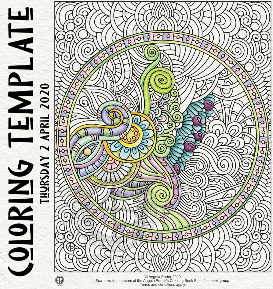
Floral designs, an entangled garden was my fancy this morning and this is the result, not fully coloured though.
Coloring is a great way to find some calm and peace during troubled times, such as the times we find ourselves in. Scientific studies have shown it has a similar effect on the brain as meditation.
I have a number of templates available for free in the facebook group, including this one.
This week, my offering harks back to my ‘Entangled’ style of drawing – abstract, with swirling lines, spirals and organic motifs. And fairly detailed with zero or little white space. It’s still a style I like to return to; it’s one of my comfort drawing styles.
For this one, I worked digitally – Autodesk Sketchbook Pro with a Surface Slim Pen and Surface Studio, both by Microsoft.
I started to add colour to it, and the colours are softer, more muted than is usually the case for me. I think those represent my mood at the moment, as well as it being spring time.
If you’d like to download a copy and colour this template, then you do need to become a member of the Angela Porter’s Coloring Book Fans facebook group. It’s free and all I ask is that you follow a few reasonable terms and conditions for use! I’d love to see how you’d colour this one in.
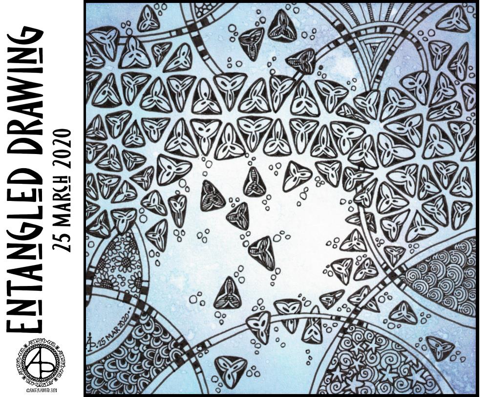
This morning, I used the random tangle pattern generator and it came up with ‘Tripoli’. This is a tangle pattern I’ve had trouble with so often in the past. For some reason I find it awkward to draw the triangular motifs that make up this pattern in a way that I find pleasing. I almost clicked the button to generate another tangle pattern. Instead, I chose to work with Tripoli and this is the result.
I used one of the tiles I’d coloured with Distress Inks at the weekend, along with Unipin Uniball pens. No pencil ‘string’ or guidelines. I also chose to use a variation of the classic Tripoli pattern (see it on Tangle Patterns or here).
It was an enjoyable and relaxing process to draw this 5½” x 5½” tile.
I’ve been ‘zentangling’ long before Zentangle was a thing. I love pattern. I love stylised motifs. I draw inspiration from architecture, nature, Prehistoric art, pottery, Celtic and La Tene, illuminated manuscripts, and more.
I’ve always been fascinated with deconstructing patterns in order to replicate them in my own way.
Well being check in…
Today I’m tired. I look like I have a pair of black eyes. I really didn’t sleep well last night, again. I may well nap this afternoon; I’m finding it hard to keep my eyes open even as I write this blog.
Even though I’m tired, more than bone tired, the sunshine and warmth of the rays of light finding their way to me through the windows really lifts my spirits.
As I went to put some recycling out this morning, a neighbour’s cat came to say hello. He’s a strange kitty, likes a fuss, but not too much and only in very specific places on his body, but he’s a friendly chap. It was nice to make a fuss of him in the sunshine, his black fur soft, silky and warm from absorbing infrared light.
I had two deliveries today. One an organic fruit and veg box along with some other goodies. Some things weren’t available though, but it’ll be just fine I’m sure. The other was a box containing some tea bags – English Breakfast tea bags containing rolled leaves of tea in biodegradable mesh. And a rather nifty tin to keep them in!
Tea, twice and thrice blessed tea! Always a pleasure and always one to look forward to.
Little things to be grateful for even when limited to home for the foreseeable future.
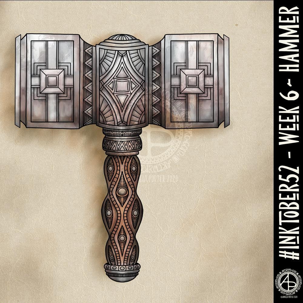
I’ve never drawn a hammer before, of any kind. I thought I’d have a go though and try my hand at a fantasy style, possibly dwarfish one.
Not only was designing one a problem for me, adding colour, dimension and texture were some other problems.
I think I’ve left areas a bit bare of line and pattern. Others I could’ve done a better job of creating highlights and shadows. However, overall I’m ok with this, especially as it’s not something I’d usually draw.
Next week’s prompt is ‘dinner’. Sheesh…
I made use of various tools in Autodesk Sketchbook Pro to help me design the hammer, some of the them tools I’ve not used before.
I did consider making a drawing of the hammer from a different angle, but this one has taken me so long that I now need to do some other stuff today.
Yesterday turned out to be a weirdly busy kind of day that meant I had no time for social media, nor much in the way of art. I did make a start on this mandala, however, and have continued to do a couple more hours work on it this morning.
I’m using just green and a pinky-purple for this mandala, but with a couple of pearly-grey rings. the main colours remind me purple spring crocuses. I like crocuses of all colours, but the purple ones just make me smile that little bit more.
I think I’ve done about 4 or 5 hours work on colouring it so far.
On another note, I’ve added a couple of designs to my Redbubble shop that you can purchase on a range of quality products including t-shirts, sweatshirts, phone cases, art prints, and more. #findmything
It took me some time, but I got the video edited and uploaded to YouTube. I’ve left it in real-time with the hopes that people will find it relaxing to watch.
I do have some things to learn about editing still. Not so much the mechanics but the aesthetics and flow of the video. I’m trusting that as time goes on and I make more videos that I’ll get to understand this a bit more.
I also need to try to control how I move the image around as I draw, and also placement of it on the screen. I created this mandala digitally, using Autodesk Sketchbook Pro, Microsoft Surface Pen and Microsoft Surface Studio.
One advantage of recording the screen, is that my hands and pen don’t get in the way of seeing what I’m doing.
I have to say that Movavi is quite simple to use, yet has plenty of features that are quite powerful. Cutting the video, adding music, intro and outro screens, as well as fades are really easy. I can also add transitions, which will help when I can focus long enough to edit out the crazy whirling bits of the video!
As with everything in life, learning to create videos is a work in progress.
I am hoping to get one video done a week. Well, that’s my aim. Life really can get in the way at times.
I’ve been busy this morning, working out how to video record the screen of my computer as I draw digitally.
I found a YouTube video about using OBS Studio to do this. I followed the instructions, problem solved, and after three attempts I had a poor quality video that I wasn’t happy with.
So, I went to Movavi, a video editor I’ve used previously. It has an app that will record the screen, easily. It’s a one button click to launch. A simple, small, and minimalist control panel sits in the bottom right corner of the screen. I can record, pause, start again easily.
I recorded myself drawing the mandala above. The video is currently processing and being saved. I’ll then need to edit it. The still of the video I can see while this is happening is of a fab quality it seems. So fingers crossed the video will be too!
I didn’t think to look at Movavi before Googling for advice on recording the screen. I did have to buy the software, but it wasn’t extortionately expensive and I’m sure that it will meet my needs.
So, once the video is saved, I can spend sometime today editing it and I hope to upload it tomorrow, as long as the recording is of a good quality.
Yesterday, I had a day out with my friend Liz. We visited Hay On Wye for a walk around and lunch. It was one of those glorious winter days where the sun shines warmly and the air is crisp and cool. It was mild enough for me to walk around without a bulky coat.
This is a drawing I did late last night as I settled down to sleep. It feels quite disjointed in places, which was how my mind felt in it’s state of tiredness. Even though I was tired, I wasn’t ready to sleep.
I thought I’d work with it, adding a background and colour to it. I wonder if adding colour will resolve the disjointed areas as it breathes life into the design.
I’ve only taken a short time this morning to ad some colour. I do have to do other things today. The colour certainly helps to lift it from the background, as well as adding dimension to the design.
I’ve chosen fairly dusky, dusty, pastel colours which seem to glow against the darker background. The pinks remind me of faded Victorian velvets.
I drew the design traditionally, using a Tombow Fudenosuke pen and ClaireFontaine dot grid paper. The flexible nib of the fudenosuke pen results in lines of varying thicknesses, and a drawing that reminds me of linocuts or woodcuts.
After scanning the drawing, I removed the dot grids and cleaned up the drawing digitally before adding a background.
I felt this needed quote to go with it, and this one spoke to me today. For the typography, I used Affinity Publisher. The rest of the digital work is being done in Autodesk Sketchbook Pro, using a Surface Pen and Surface Studio from Microsoft.
My art is always ‘pretty’, it’s how I express myself artistically. Some of my inspiration for patterns and motifs comes from things that other smay not consider ‘pretty’, such as rust, run down old industrial machines, ruined buildings.
My art does, I think, speak of who I am. It shows what I’m interested in, what patterns, motifs, shapes, textures, colours, and so on that I find aesthetically pleasing. It also shows, to those who look and think a bit deeper, what things interest me, from prehistoric art to Romanesque architecture to La Tene and Celtic art to Illuminated Manuscripts to flora, foliage, fungi, and lichen to fossils and shells to nature in general, and more besides.
I work very intuitively. It’s when I think too hard about what I want to do that things go to wrack and ruin.
By letting my intuition flow, then drawings have a way of coming together in a way that expresses how I’m feeling and what is fascinating me or soothing me at that time.
This drawing is an example of how my feelings come out. It’s only now I can recognise how disjointed I was feeling within myself last night, how I was out of sorts. I think that’s why the art jars with me today as that feeling has now passed by, like clouds in the wind. It’s a drawing that shows the weather my emotions were experiencing yesterday, weather that just happened and has no real source for it.