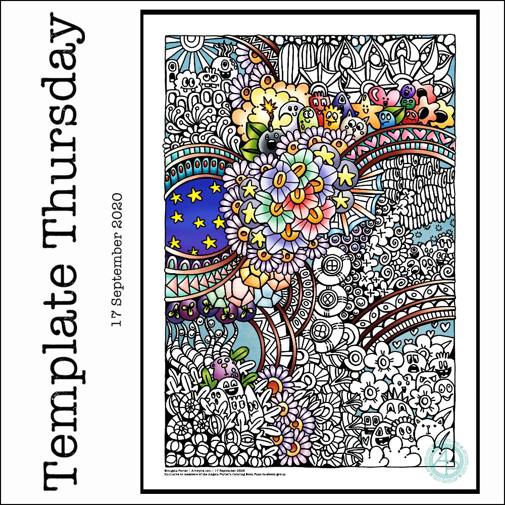
This week I have a mix of my entangled art along with some cute, whimsical, doodle-characters. Something fun, light hearted to lift the spirits somewhat.
I used a 05 Uniball Unipin pen to draw this design on Marker paper. I added some colour with Autodesk Sketchbook Pro.
As always, the weekly templates I draw throughout the pandemic are available from the facebook group to members of the group. They are free to members, and it’s free to join!
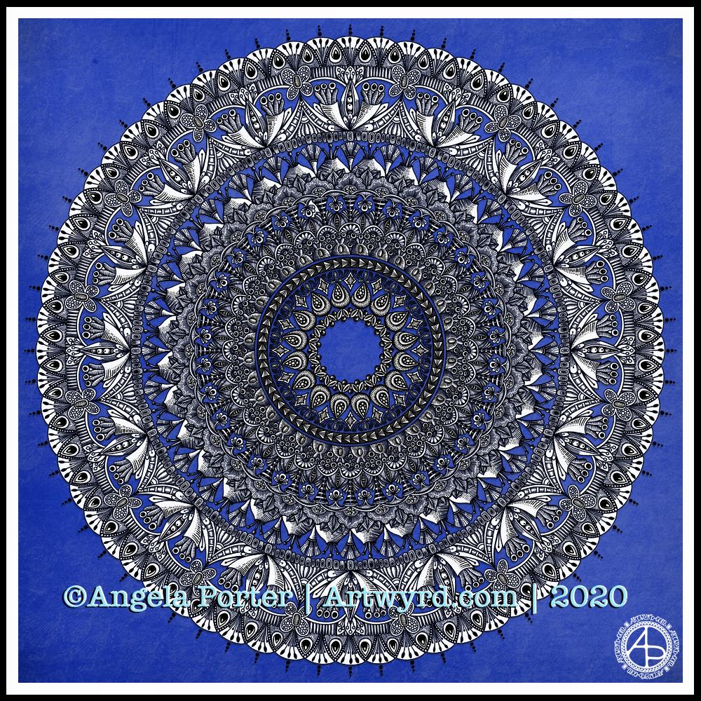
I have been awake since stupid o’clock, so rather than toss and turn for hours I decided to do some art. And another mandala appeared from the tip of my pen.
For this one, I thought I’d make the ‘white space’ areas in the design transparent so that the vibrant blue background could show through.
I’m not sure how well this works; I’m now too tired to think clearly. I do think it has potential for future mandalas, maybe.
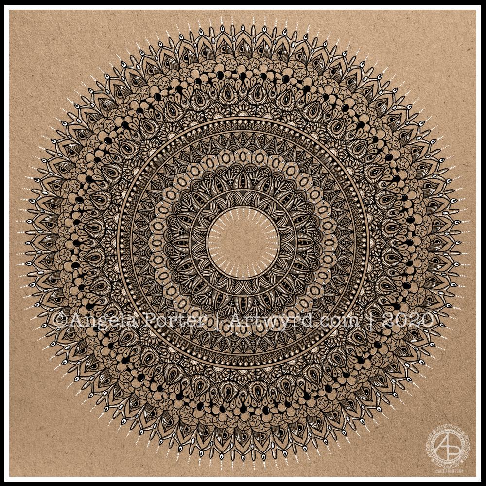
I really enjoyed creating this mandala this morning! I used some of my favourite motifs in this one. it was lovely to use white on the kraft background, to bring out some highlights and add dimension here and there.
I love to use Autodesk Sketchbook Pro to draw my mandalas in. It streamlines the process and allows me to focus on creating the design rather than the mechanics/geometrics. Of course the design is drawn by hand, just as it would be on paper. That’s the beauty of having a Microsoft Surface Studio and Surface Slim Pen – I can draw with the pen on the screen just as I would with pen on paper. The advantages are that if I mess up, it’s easy to correct, and the symmetry tool saves time, allowing me to focus on the fiddly details that I love so much.
Dimensions : 8cm x 8.5cm (3¼” x 3¾”) Smooth cartridge paper (acid free) Uniball Unipin pens (05 and 01) Digital editing and colour in Autodesk Sketchbook Pro
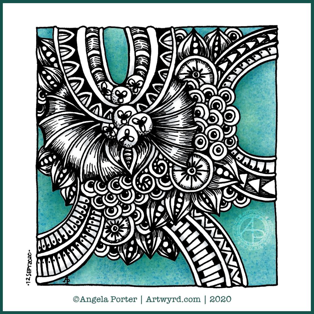
I drew this little drawing yesterday, but spent some time this morning scanning, cleaning and adding colour and shading digitally.
I deliberately left some ‘white space’ so I could fill it with colour. This contrasts rather well with the graphic black and white entangled art design. The coloured background adds depth to the image, and the subtle shading by grey and textural lines adds volume to the design elements and layers.
I often think I struggle with colour, unless I use a limited palette. This is a way to make use of colour in a way that adds interest to the design without detracting from the line work.
This week I chose to create a mandala, which I’ve partly coloured in fiery autumnal colours. Looking at it now, I can see where I’ve used colours that are too similar so that the layers are a little lost. But the warm colours warmed my heart and soul this morning.
The background to the mandala is really unusual for me; I’m not sure where it came from, but there it is. It has just a bit of an Art Deco feel – do you agree? I’m looking forward to seeing how people add colour to it.
Sunday morning is always a time to breathe, relax and create something easy and pleasurable to do. Comfort art. Today, that meant a mandala and a quote that is quite appropriate for this morning.
Mandala creation makes me smile inwardly. It’s a familiar process and I can create a mandala that is complex and detailed, or simple, and the calming, relaxing effect is the same.
I do draw my mandalas digitally. By using Autodesk Sketchbook Pro’s symmetry tools, it streamlines the process for me. There’s also the removal of the frustration that is caused by an error or a smudge. I can focus on the relaxing, soothing process and on being creative.
In that vein, I decided to draw the mandala in black on white. But when it was finished, I wanted to use a background and a monochrome colour scheme.
I love kraft paper. I don’t know why. I think it’s that colours seem to almost glow against it. So, I chose that for the background. Then, I created a layer of creamy, orange-yellow tones to highlight the line art. Nice warm, comforting, gently glowing colours.
Finally, I created some drop shadows for the text and mandala.
I look at the finished mandala and I smile, gently. I feel my heart fill with some warmth and a sense of lightness.
Creating art, including mandalas, lets my soul shine. What makes your soul shine? Take time today to indulge your soul in activities that let it do so.
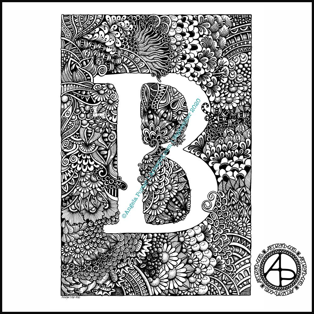
Finally finished it! It’s taken many hours to do – probably around 15 I think, and it’s taken some perseverance by myself to get it done.
Uniball Unipin pens (05, 03 and 01) on Claire Fontaine Paint-on mixed media paper. Two pen nibs now wrecked; the paper is velvety smooth to touch, but just too rough for the tips of the Unipin pens. Will move to Bristol board for the next monogram.
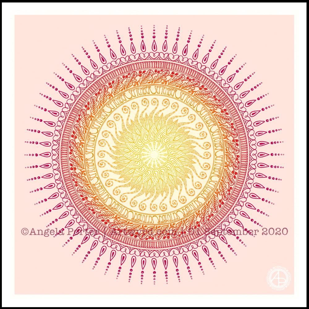
It’s a sunshiny, blue-sky morning with a distinctly cool and freshness to the air. It really feels like autumn is on it’s way. So, I’ve created a mandala to welcome the change of month, and the incipient change of season. I even practised my hand-drawn typography / hand-lettering.
What I missed out on doing was having a 9-fold symmetry for the ninth month. Ho hum. Perhaps I’ll just create another!
I’m also not at all sure of the background colour. It’ll do for now. After all, this is my morning warm up art.
Drawn in Autodesk Sketchbook Pro using Microsoft Surface Studio and Microsoft Surface Slim Pen.
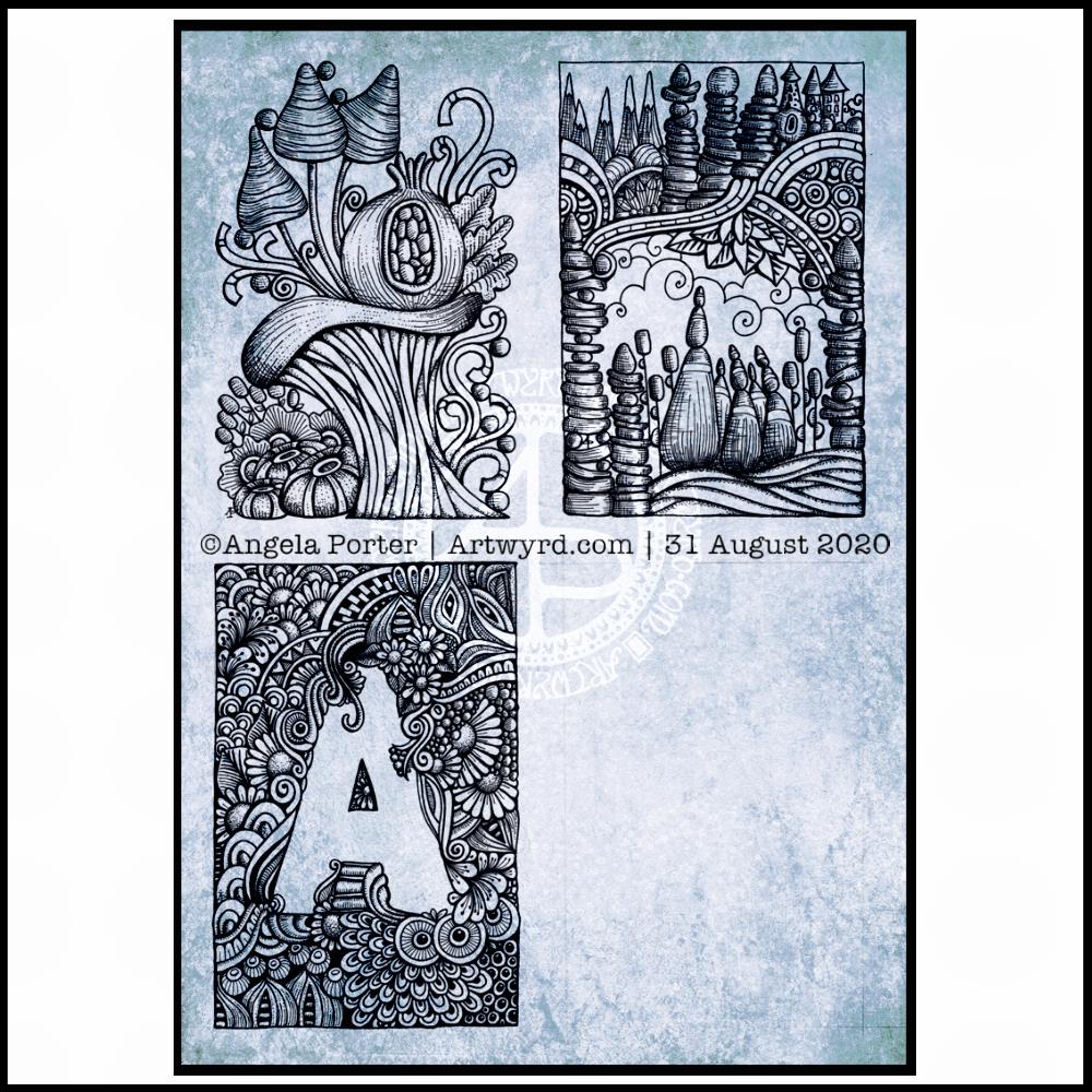
I finished the top right design, and have completed the ‘A’ illustration on the bottom left. That leaves one space to be filled, no doubt later today.
I’ve used either Faber-Castell Pitt Artist pens or Uniball Unipin pens to complete the drawings on ClaireFontaine’s Paint-On mixed media paper. This paper is fairly weighty (250g/m²) and has a lovely velvety feel to it.
The only pencil lines I’ve used have been to delineate the ‘boxes’ to draw in, and for a couple of the design elements in the top left image as well as the A.
Reflecting on the designs
The white space in the top left design works really well I think, and is quite an accomplishment for me. The same is true, to a lesser extent for the top right design. In both cases, the white space brings attention to the design.
In contrast, the densely pattered area helps to bring out the monogram A, making the white space the focus of the design.
I think I’m going to work on some more monograms in this style. They are fun to do, and dense, entangled patterns are one of my signature artistic voices. It’s been a long time since I’ve completed art like this, with a lot of detail to bring out dimension/volume in the design.
In fact, I’ve enjoyed using line and stipple to add volume in all the designs, exploring how I like to do this as I go. All the work I do with colouring books means I have put this to one side. It’s interesting how I’ve circled back to this style. It’s even more interesting to look at how my drawing skills have developed and evolved over time as well.
I found some peace, contentment and joy while drawing these, and feel a sense of accomplishment, particularly with the two on the left.
Do I prefer digital or traditonal drawing?
A difficult question to answer. I think it depends on what I’m creating.
I really do enjoy using pen on paper. I get a better sense of the overall design. Paper and pen is very portable too – whether I’m sketching when out and about, or drawing in different places at home.
Drawing on the screen of my Surface Studio with a pen is a lot like drawing on paper. The smoothness of the screen makes it a very different tactile experience. It also is great for inking in sketches. It also makes correcting mistakes or re-working areas a lot easier, and there are techniques I can use that are near impossible or very time consuming when working traditionally.
Sometimes, the lines produced digitally are too perfect. I’m still working on developing the brush styles that will mimic the unevenness of an inked line. I do have to use some element of line-smoothing as I draw; without it the lines are really wobbly, but with it they can be too perfect and I lose, to a degree, that personal and unique way that my pen moves on paper.
I also find it difficult to have a sense of proportion or detail when working digitally, even though I can look at the design at the same size as it will be printed. The ability to zoom in and work on a small area means I lose all sense of relative size and complexity/detail of a design. So, if I’m going to work on a drawing digitally, I prefer to start with a sketch to give me that sense of scale.
I rarely sketch out my design when I work on paper, except if I need the outlines of a design element as I’m drawing. I do tend to work very intuitively.
So the answer is, I prefer each for different purposes, and also to suit my different moods and purposes.
Of course, once I’ve drawn a design, I then have to decide if I want to add colour, and then what media I will use – traditional or digital!
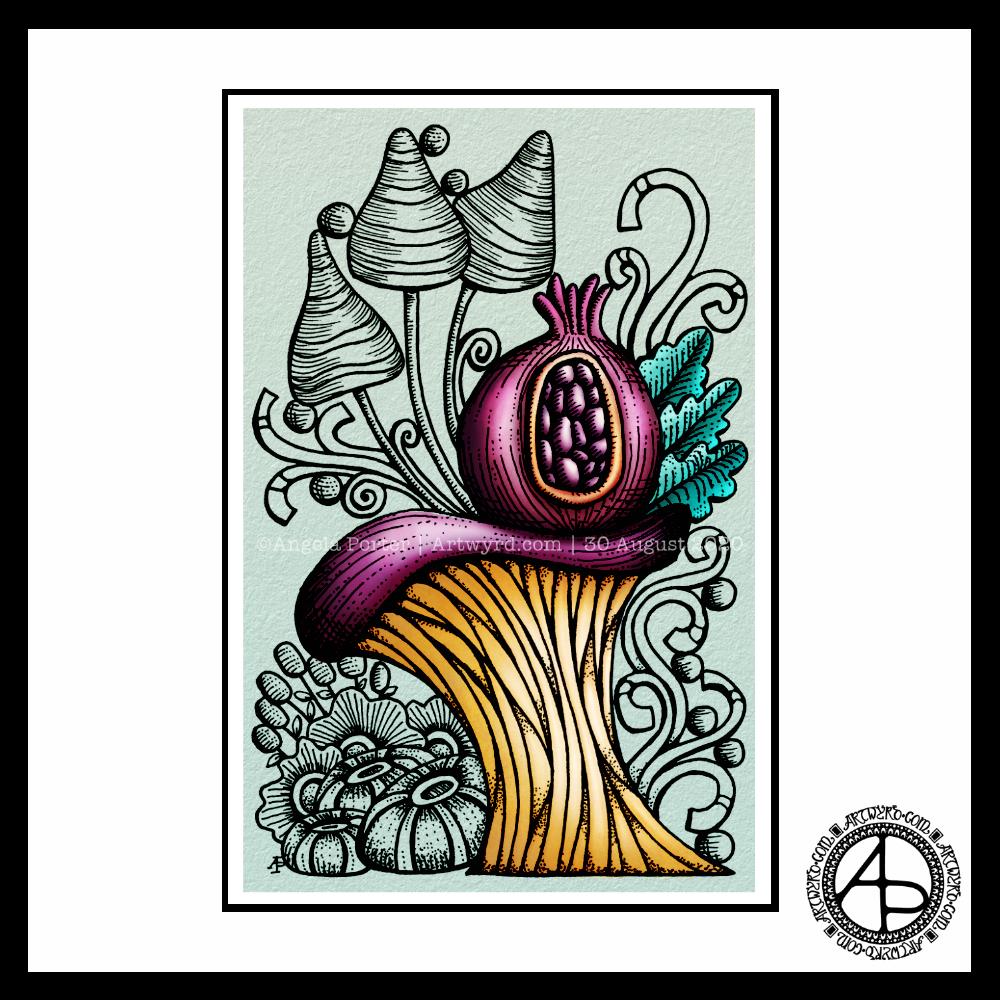
Today, I thought I’d digitally colour one of my recent drawings. I thought it would be nice to compare and contrast digital colouring with traditional colouring.
It’s been a while since I did much art digitally, I’ve been lost in traditional media this week as I slowly heal from some emotional wounds. Art helps with healing. Meditation helps too. But time is still needed for the healing to take place, and for rest to relieve the exhaustion that lingers still.
Any kind of art, digital or traditional, soothes my mind, emotions and body.
What I like about digital art is the way I can get such high contrast in colours to enhance the sense of volume the design elements have. I also like the vibrancy of colours. I also like the ability to add texture to the colour in so many different ways.
Of course, I like the ability to alter colours when they don’t work, without having to start over. I’m not sure if those leaves are going to stay that particular green-ish colour. Nor am I sure about the background colour.
As is my wont, I’ve used Autodesk Sketchbook Pro to add the colour and textures. My hardware is a Microsoft Surface Studio and Surface Slim Pen.