The ‘Aha!’ moment

Finding inspiration

Yesterday evening, I found a little oompf to play with colour in my watercolour sketchbook. The little blocks of colour on the right hand side are the result.

I dropped wet into wet, both watercolours and metallic watercolours, and just let the watercolour do their thing. I also tried similar with Inktense ‘watercolours’ too.

Just doing something simple like this, playing with colour for the sake of playing with colour, led me to want to try something different.

I had got frustrated and not all that happy with the designs on the left page over the past couple of days. Browsing through Pinterest, my attention was caught by illustrations that use black line drawings with a wash of colour. So, I thought I’d try those out.

I also wanted to try different pens to see how waterproof they are on watercolour paper. Unipin pens in grey and black, Pitt artist pens and a Signo DX pen were what I had to hand.

I used the pens to draw some of my favourite kinds of motifs, but rather than leaving just the outline, I used the pens to add shadow and the illusion of shape to the motifs. Once I was happy, I added watercolours. I did go back and add more lines where needed once the watercolours had dried. I also used a white gel pen to add highlights.

Reflections

Firstly, all of the pens were waterproof. The grey Unipin pen did bleed more as I was drawing with it initially than the others, which showed little bleeding at all. Anyway, I’m happy that I now know for sure they are waterproof.

I have used colours that are different for me. They have more of a vintage vibe to them. I actually like the colours, a lot.

Still developing my artistic voice(s)

I keep trying to move away from black line drawings with colour, to paintings made solely of colour. Each time I do this, I’m never really happy with what I produce, it never seems to feel it is ‘me’. I love to see how others use just pure colour to create art, it just never seems to work out quite right for me, not unless I work digitally. Even then, the digital artworks make me smile, but they still don’t feel right.

I like to draw colouring templates that help others express their creativity and to use for relaxing, meditative, calming activities. These are lovely in their own right and for the purpose they’ve been created for. However, they lack the details that I find satisfying.

That ‘Aha!’ moment

And there it is, I’ve worked out why things don’t feel ‘right’. Detailed line work. Using line and pattern to create shadow and volume in a drawing. There’s also a need for me to use line to define and structure artwork.

That was something I always used to love to do in my earlier artsy years, and something that has gone by the wayside as I’ve used my skills at stylising motifs for my work as a colouring book artist/illustrator.

Those skills will never be lost and will always be used. However, I have a need to find ways to express myself in ways that satisfy my artsy heart, and this revelation is one answer to that.

It’s obvious when I look back at my blog, that I’m constantly trying out new things, going back to old things.

Sometimes I return to old crafts and styles I’ve tried in the past as they are familiar to me and that familiarity comforts me when I need time to just create and feel some level of satisfaction in what I do. Comfort art I’ve described this in past, and it’s just as true for me now as then. There are times when I’m not up to challenging myself as I try or develop a new style to me. Then, I go to art and craft styles that I know I can do fairly easily.

At other times, I’m seeking for the new, different and to stretch myself artistically. Out of a lack of inspiration over the past day or so has come a style that will stretch me, and perhaps will sit easily with me so it becomes one of my ‘voices.

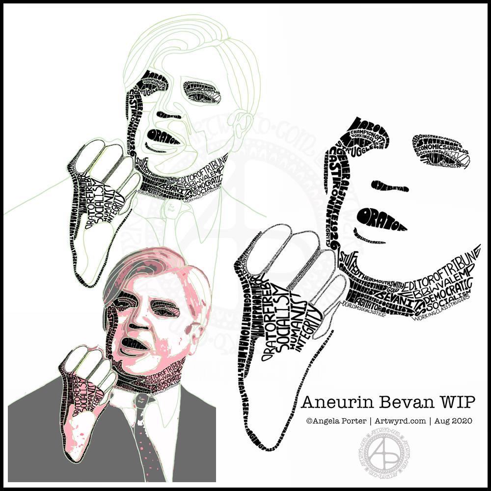
Oh, I’ve not abandoned my new-found passion for typographic portraits/art. In fact, my mind is ticking over how I can incorporate that along with this coloured detailed drawings. Before I try the idea, I need to get some drawings done! I’d like to try the idea out digitally to see if it will work. That way, any drawings I’m really pleased with won’t be messed up.

That Friday feeling …

Mandala

Today’s art is a simple mandala. A cool grey, black and white colour scheme on a soft, calming green background.

Drawn in Autodesk Sketchbook Pro using a Microsoft Surface Slim Pen and Microsoft Surface Studio.

Confusion

I am emotionally drained, confused and overwhelmed again today. I don’t have much in the way of focus. I was surprised I could complete even this quick and simple mandala.

I don’t have the focus or energy to reflect on the choices of colours and symbols in the mandala and how they relate to messages bubbling up from my unconscious mind.

I feel trapped, caught between a rock and a hard place. I’m damned if I do, damned if I don’t. The stress of it all is giving me a migraine, upset digestive system and is dragging my mood downwards.

Heck, even the mandala looks like it is either sinking down, pulling itself up or hanging on by the chains of teardrops. That is how I feel, and I had no idea that was how the mandala would appear when finished.

Clip Studio Paint vs Autodesk Sketchbook Pro

Yesterday, I thought I’d give Clip Studio Paint a go. The bottom part of the template above was coloured in Clip Studio, the top part in Autodesk Sketchbook Pro.

I spent yesterday afternoon, and a bit of this morning, colouring part of the template above in Clip Studio Paint. So, these are my first impressions of Clip Studio Paint and a comparison with Autodesk Sketchbook Pro.

I think it’s impossible to tell the difference between the colouring I’ve achieved with both programs. What is different is the user interface more than anything else.

I’ve long been a fan of Autodesk Sketchbook Pro, and that isn’t going to change. I love the intuitive and rather beautiful interface of the software, the menus on screen and the colour and brush ‘pucks’. Everything is done easily and simply through the quite minimalist, yet powerful, tool bars and menus. Keyboard shortcuts are available, but I prefer to use my pen directly on the screen as I work. It makes working digitally as natural as working with traditional media.

As I’m familiar with the Affinity suite of programs from Serif, working out what the different menus and tools,, which are similar to Photoshop, wasn’t as confusing as it would’ve been in the past. Thanks to working with Sketchbook Pro, I have a better understanding of what the various tools do.

While the tools and options are all accessible on the screen, I find it frustrating and time consuming as I seem to have to perform more steps in Clip Studio Paint to do the same task as I would in Sketchbook Pro. I’m sure there must be keyboard shortcuts, which may help streamline the process somewhat. However, I work directly on the screen with Sketchbook Pro and the only time I use my keyboard is name the file before saving it, or if I want to add text to the art. Usually, they keyboard is out of the way so that I can adjust the angle and distance of the screen to suit my comfort.

I do prefer the way I can choose colours in Autodesk Sketchbook Pro, as well as the ease of creating a custom palette. Sketchbook Pro also comes with a separate Copic color palette. Being able to move them around the screen means I can pop them where I like, make them easily and quickly accessible for me.

Don’t get me wrong, there’s a comprehensive colour palette and various options of viewing colours in Clip Studio Pro, but I like the more intuitive and streamline way of doing it in Autodesk Sketchbook Pro. It’s just personal preference more than anything.

Having the colour puck makes it easy to alter the saturation and tone of a chosen colour really quickly. The brush puck makes changing the size and opacity a breeze. I keep the pucks close to where I work for convenience.

Again, there’s nothing wrong with how all this is done in Clip Studio Paint, but I just prefer the ease with which I can do everything in Sketchbook Pro.

The Sketchbook brush palette is a great tool too; I have all my favourite brushes available in one, easily accessible place. A click on this palette and I can access all the brush sets I’ve either downloaded or created so I can add or remove brushes as I need to.

The zoom and rotate touch functions only work separately. I found this a clunky and awkward way to work. I think that’s because I’m used to doing both at the same time and at will in Sketchbook Pro.

What I did like are the many more choices of brush effects in Clip Studio Paint. However, I think I can replicate many of them in Sketchbook. There are some interesting brushes in Clip Studio Paint, but nothing that I couldn’t replicate if I found I really wanted to use them.

Anyway, I will persevere with Clip Studio, working with it from time to time to become more familiar with it. The ability to draw vectors may be helpful in the future, but then I have Affinity Designer on my ‘puter, which is Serif’s version of Adobe Illustrator.

Also, I’m hoping I can find a way in Clip Studio Paint to work in CMYK rather than RGB. When I convert files to CMYK for printing, the colours shift and I’d like to work in roughly the colours that would be printed.

Overall, I think it’s a good, affordable application. It’s a fraction of the cost of any Adobe Product. I paid £40 for the Clip Studio Paint version; that’s a one-off purchase and you have free upgrades for life. You also get access to online resources created by other Clip Studio Paint users.

This price is on a par with the price of each of the Affinity suite of programs (approx £50 each), and there are regular, free updates to the software.

You can get Autodesk Sketchbook for free, though I subscribe to the pro version monthly for approx. £12; it does have a few more features than the free version. Just because Sketchbook is free doesn’t mean it’s not professional; it is. It doesn’t look powerful, but it is.

How much will I use Clip Studio Paint? That I’m not sure. Perhaps with more use the frustrations I experienced with lessen as I become more familiar with the software. Perhaps I’ll gain fresh ideas on what effects I can try out in Autodesk Sketchbook Pro.

Do I think Clip Studio Paint is a bad program? Not at all. It seems to be powerful and similar to Adobe Photoshop and artists and illustrators are able to create fantastic artworks with it. I’m sure that if you are familiar with the way Photoshop works, you’ll find Clip Studio Paint an easy transition to make.

Personally, I find the way the menus are set up hard work and time consuming to use. I’ve been spoiled with the simple sophistication and intutive nature of the Autodesk Sketchbook interface, no matter which version you use. I find I spend less time clicking on menu after menu to get to what I want to use, and more time creating art in Sketchbook. That may be a function of my familiarity and comfort with the software. What I don’t want is to feel I’m struggling or working so hard to get an effect I’d like when I could do it so simply in Sketchbook.

One thing I know is that Autodesk Sketchbook Pro will be my go-to digital art program. It does all I want to do digitally, and most probably a lot more I’ve not worked out yet.

Typographic Portrait WIP

This morning I’ve been working on my typographic portrait of Aneurin Bevan. This portrait is the third iteration. I’m learning as I go along, trying out ideas as they occur to me.

I started with the photograph Nye Bevan and used the posterise tool in Affinity Photo to create areas of contrast. Then, I added colour to these areas to help me differentiate ‘twixt them. I completed this task in Autodesk Sketchbook Pro.

The next stage was to draw lines around these areas of colour, smoothing them out somewhat, and using artistic interpretation where necessary. These are the green lines that delineate the areas for different weights of text. I’ve decided to leave the white areas blank.

The green guidelines have been changed and edited as I work the portrait.

The area that was vexing me most were the fingers. However, I had an idea to use tiny lettering to add some deep shadow. I’m sure I’ll work out how to add some lighter shadow areas later on (my mind is already ticking over that issue) to give more volume to the fingers.

They typography is hand drawn and I’m having to come to terms with the struggle I’m having with my perfectionist side. This isn’t to do with the shapes of the letters, but the weight of them and making sure that they are consistent. As I’m hand-drawing the letters, then they are going to be imperfect, and I need to learn to accept when they are good enough.

Also, those imperfections and style of lettering are personal to me, and that is what will differentiate my work from others.

I’m also struggling with letting go of the desire to be as photographically accurate with the portrait as I can be. This is where learning to simplify the shapes of the different areas of contrast comes in, and recognising they don’t have to be a perfect copy of the photo in order for the resulting portrait to be recognisable as Aneurin Bevan.

One other thing I’ve done is to let go of trying to use full quotes in the portrait. I’m using repetitions of words and short phrases that represent Nye – personally, politically and in terms of achievements. I’ve realised the portrait doesn’t have to be a grammatically correct biography! I will, however, be using quotes to fill in his jacket.

I’m not sure what to do with his shirt and tie yet. It will fall into place soon enough I’m sure.

Working digitally helps me in so many ways. It takes away the frustration of starting over again if I make a mistake, and also minor frustrations. I gain a confidence to try things out, knowing that if they don’t work out I’ve not screwed up the rest of the work I’m happy with.

Working digitally, for me, is like working with pen and pencil on paper. I use a digital pen on the screen of my Surface Studio, just as I would pen on paper. It’s easy to undo and edit changes made. It removes from me the pressure to be perfect first time and helps me to persevere when things aren’t working as I’d like them to.

All the skills I’m learning digitally, in terms of the hand-drawn typography and being more patient with myself and allowing my work to be ‘perfectly imperfect’ is transferable to the work I do with traditional media too.

Template Thursday

It’s that time of the week once again – Template Thursday!

Each week during the pandemic, I’ve created a colouring template for members of the Angela Porter’s Coloring Book Fans facebook group.

This week, I’ve harked back to my Doodleworlds book with cute monsters and critters. I’ve included some family portraits which hang above a background of more monsters and critters and my signature entangled style drawing for coloring books.

I got lost in colouring this template this morning. It was fun to use different styles of digital brushes and colour combinations in this one. Sometimes it’s just nice to do art with no expectations other than enjoyment, relaxation and comfort.

I drew the template with a Pentel 07 Energel pen on Rhodia dot grid paper. I scanned it in to the Surface Studio and cleaned the image up digitally. Then, I partially coloured it digitally in Autodesk Sketchbook Pro, adding a background texture that isn’t present in the downloadable image.

Lightning storm

Last night, there was the most amazing lightning storm I think I’ve ever seen. It lasted for more than an hour and there were multiple flashes of lighting most minutes. I really need to learn how to use my camera to take photos of lightning – natures very own fireworks.

Sadly, I haven’t been able to see the Perseid meteor shower this year, and I missed the Neowise comet too. I have seen amazing photos of both, though, and of course the lightning storms of the past few days that have coruscated over the UK.

Heatwave

It’s a little cooler in the house today thanks to the clouds shrouding the sun. It’s humid though as the couple of brief showers last night have been evaporating slowly.

The heat meant I didn’t sleep well again last night. But, waking early meant I had plenty of time to edit the coloring template and add colour to a section of it.

I’m not sure if it’s cool enough to take a walk this afternoon. There seems to be a bit of a breeze picking up from time to time. I really don’t do well in the heat; I wilt very quickly. But I’ll see once I shower what it’s like outside.

Template Thursday

Another week of the Coronavirus Pandemic has passed us by, so it’s time for another colouring template/page for members of the Angela Porter’s Coloring Book Fans facebook group.

This week it’s a mandala. A more traditional kind of mandala at that.

Mandala’s are incredibly calming and soothing to draw and to colour.

Inhale. Exhale. Repeat.

Mandala

Black and white mandala.

This morning was a morning that I needed to do some art that was familiar, calming, soothing and intricate enough that I could lose myself in it. A mandala always fits that bill. Always. It doesn’t matter if it’s drawn with pen and ink on paper or digitally. The mindful, calming effect is the same. It’s the process that matters, the repetitive shapes and patterns that are drawn that contribute greatly to the soothing effect.

I do tend to gravitate towards digital art, and I find the symmetry tool in Autodesk Sketchbook Pro helps to save a lot of time. The ability to erase ink removes the frustration that a mistake creates for the hyperperfectionist part of me.

Other than those time-saving (and frustration-saving) tools, the process of mandala drawing is the same for me.

It starts by using a compass, protractor and ruler to set out the circular grid. Then, it’s digital pen on screen to draw the mandala in exactly the same way as I would on paper, just without so much repetition of sections.

However this was created, it has served it’s purpose – given me some time and space for inner peace and contentment.

Monday Mood

Drawing done with Faber-Castell Pitt Artist Pens.
Arteza Mixed Media Paper coloured with Distress Oxide Inks (Stormy Skies, Chipped Sapphire, Dusty Concord, edged with Hickory Smoke).
Paper measures 3″ x 8.25″ (8.3cm x 21cm).

“I make art to show my soul I am listening.”
“This, too, shall pass.”

Art is my solace, my form of expressing my soul, my inner self.

Hello August!

The calendar page turns over and we’re into a new month.

August always heralds the end of summer and start of autumn, my favourite season. It is the last full month of summer here in the Valleys of South Wales. The evenings come noticeably earlier, always a sign that the year is continuing on its endless cycle of seasons.

We have a grey, damp and blustery start to the first day of the month. There are shafts of sunlight finding their way through gaps in the clouds, but there’s a deliciously refreshing snap to the cool and fresh air after the night-time rain.

I thought I’d create a really simple mandala design for the start of this month, one that is full of warm colours, but that hint of autumnal tones in the background.

I kept things simply stylised in the design. If nothing else, working on it made me smile, inwardly as well as on my lips.

I woke early-ish today and did some work on one of the typographic portraits I’ve been doing. Then, in my rush to get to the shower, I clicked the wrong button and lost my work. Thankfully, it’ll be easy enough to do it again. I also think that with the version I’m working on, I’m finding my way with the process. I have a lot of the portrait left to do, but I feel less frustrated with it and have a clearer idea of what I’d like to achieve now I’ve taken a few days break from this kind of work.

Before I settle back to the typography, I am going to take a walk in the fresh air of the morning. Well, after I’ve done my social media posts!