Slowtember Prompt list

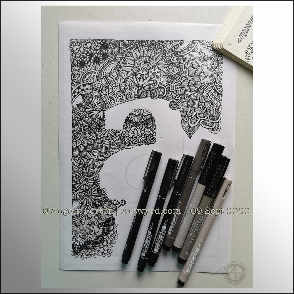
This morning I needed a quiet, slow, simple time with some arty stuff.

Firstly, I get so frustrated working in a bound sketchbook. The binding always gets in my way even though I like the paper. I much prefer working on loose sheets of paper. I want to keep a sketchbook, or series of sketchbooks. So, the pennies dropped that I needed to put together a discbound sketchbook filled with acid-free cartridge paper and bristol board, and other papers I may wish to draw on.

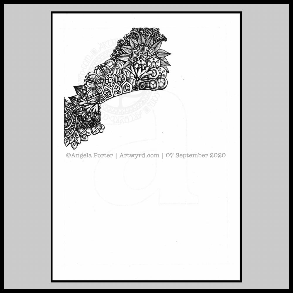
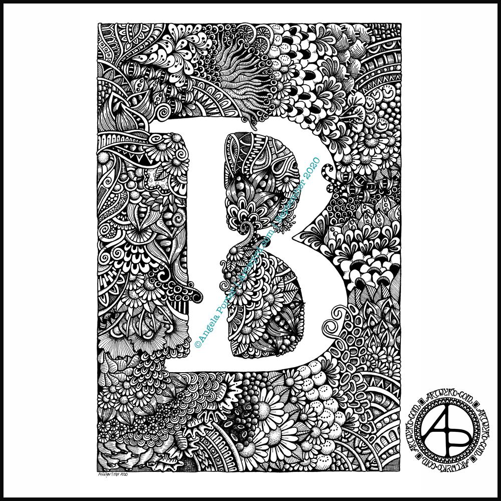
Yes, I know I’ve got a disc bound sketchbook filled with papers coloured in many ways to draw on. But, my recent forays into art, the realisation that black and white line art is my favourite way of working, needed a solution too.

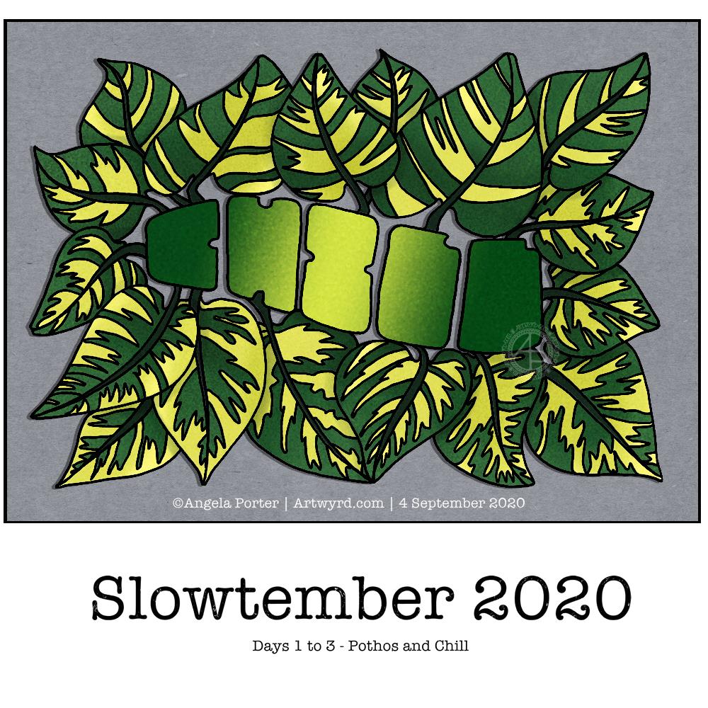
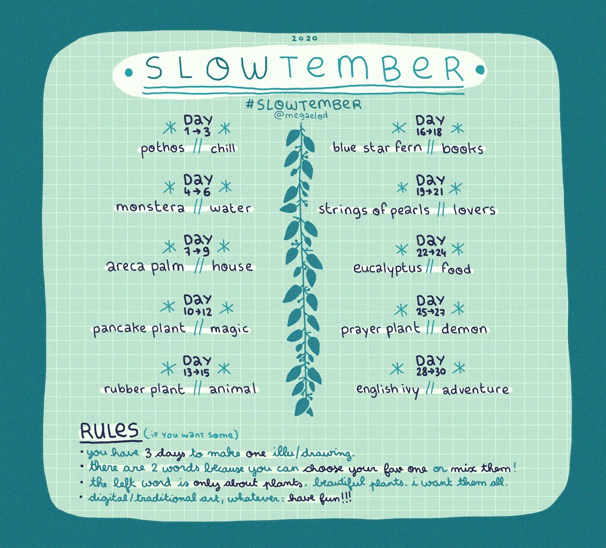
So, after a while of sorting out such a discbound sketchbook, I thought I’d like a cover page for the Slowtember part of my this sketchbook. It gave me a chance to practice some hand lettering, and to mess around with Tombow Dual Brush markers.

I also added drawings for pancake plant, the prompt for days 10 to 12 which I missed out and went straight to rubber plant!

I suspect that by the end of the month I will have a visual reference for leaves of these indoor plants.

Naturally, I messed up the numbers for the dates for each prompt. My hand lettering isn’t wonderful, nor are the leaves around the title. Let’s not mention the colouring. However, it will do; after all it is a sketchbook page not a finished, polished piece of art. That means no pressure on myself to get it perfect, or as near as I’m happy with. It’s about trying things out and if they don’t work then it’s an opportunity to reflect and learn more about my skills and artistic voice. It’s also a chance to use media that I wouldn’t normally use, and possibly to remind myself why I don’t usually use them as well!

#Slowtember – Days 2, 3 & 4

Yesterday afternoon and this morning I’ve spent time catching up with #Slowtember by @megaelod on twitter. Here’s the sketchbook page I created for the prompts monstera (Swiss Cheese Plant), areca palm and rubber plant.

I took the opportunity to practice my hand drawn typography / hand lettering, as well as my use of line to add volume to a line drawing.

I’m not the best with colour, or with traditional media to add colour, but I think I’ve done OK with some of these. I like the simple washes of gradient colours in the areca and rubber plant leaves. The line work is nice, but the colour brings it to life. The monstera leaf done in coloured pencils works well as far as a sense of volume goes, but I’m not the best with coloured pencils, even using blending solution.

I even found some microscopic images of cells from monstera and rubber plant leaves and stems. So, I just had to do quick drawings of patterns from these, with some imaginary colour added to them.

It’s nice to do this challenge. It’s not as full on and intense as Inktober is, and even if I fall behind there’s not so much to catch up with. It’s also nice to work in a sketchbook (or digitally) as there’s no pressure to complete a finished piece of work. I like how I’ve left some of my drawings partly coloured so I can compare how colour adds (or not) to the design.

When I’m looking at my page and writing about it I always have ideas about how I could’ve approached an idea, or get new ideas. Time for me to go and jot them down before I forget them!

Template Thursday

How are you all doing? Fine and well I trust.

Another week has passed us by during the global pandemic, so it’s time for another coloring template for members of the Angela Porter’s Coloring Book Fans facebook group.

This week I chose to create a mandala, which I’ve partly coloured in fiery autumnal colours. Looking at it now, I can see where I’ve used colours that are too similar so that the layers are a little lost. But the warm colours warmed my heart and soul this morning.

The background to the mandala is really unusual for me; I’m not sure where it came from, but there it is. It has just a bit of an Art Deco feel – do you agree? I’m looking forward to seeing how people add colour to it.

WIP Wednesday

Wednesday is work in progress (WIP) day. So, I thought I’d share my monogram “a” and the progress I’m making on it.

There’s a clutch of pens there! I decided to see if I could add grey to heop areas of the design stand out more, as well as adding some depth and dimension. I figured I had nowt to lose if I tried as the the design was becoming all much of a muchness to my eye. Looking at the image above, it seems to be working well in some areas!

I started using some grey unipin pens to add shades of grey to the design. They worked kind of well enough, but they were picking up pigment from the black and moving it around.

So, I thought I’d see what greys in Pitt Artist Brush pens I had and found some warm greys. They worked better as the colour could be laid down more smoothly.

I do have some new motifs to add to my visual dictionary, a corner of which you can see at the top right of the photo.

I’m not sure if I like adding the greys more than if I don’t add them. I suspect I’ll like them more as I work with them as I love the sense of volume that has appeared in various areas thanks to the contrast they confer on the design.

Let me know what you think – drop me a comment.

Sneak Peek

Yesterday and today my focus has been on colouring some templates for my Entangled Gardens coloring book that is due out next year – March 1st 2021 here in the UK to be precise.

This is just a small part of the second of three templates I need to colour. I thought I’d go with a night sky for this one. The first one I’ve given a sunshiny sky to, the third I’m going to go with a sunset colour scheme for the background.

It takes me quite a few hours to colour each template, which is a nod to how intricate and detailed my artwork usually is.

This template, like many in the book, was drawn with pen on paper. However, I like to colour the templates digitally, so I’m using Autodesk Sketchbook Pro along with my Surface Studio and Surface Slim pen to add colour.

I’ve spent so long working at my computer that I’m feeling a bit stiff and uncomfortable. I’m able to tilt the screen of my Surface Studio so that’s at a comfortable position to work at with pen on screen. Still, I’m feeling somewhat stiff. So as soon as I’ve finished my social media stuff for the day, I’m going to take a walk to ease some of the stiffness before I return to the task.

Monogram “a” WIP

Over the past couple of days I’ve started work on the next monogram. I took a fancy to a lower case ‘a’, so that’s what I’ve gone with!

Instead of working on the Claire-Fontaine Paint-On mixed media paper, which wrecks the nibs of my UniPin pens, I’m using some Daler-Rowney Marker paper. It has a smooth, soft texture and the pens glide over it and it’s a joy to use. The ink seems a lot darker on this paper, probably because of the way it’s treated to work well with marker pens and stop them bleeding. The paper is also quite thin and this makes it translucent enough that I can easily see the letter template below.

I’m trying to use some different motifs in this template instead of my go-to ones. Of course I’m still going to use some of my favourites, but it’s nice to branch out too.

It’s going to take me a while to get this one done in between contract work. But I will get it done.

Soul Shine

Sunday morning is always a time to breathe, relax and create something easy and pleasurable to do. Comfort art. Today, that meant a mandala and a quote that is quite appropriate for this morning.

Mandala creation makes me smile inwardly. It’s a familiar process and I can create a mandala that is complex and detailed, or simple, and the calming, relaxing effect is the same.

I do draw my mandalas digitally. By using Autodesk Sketchbook Pro’s symmetry tools, it streamlines the process for me. There’s also the removal of the frustration that is caused by an error or a smudge. I can focus on the relaxing, soothing process and on being creative.

In that vein, I decided to draw the mandala in black on white. But when it was finished, I wanted to use a background and a monochrome colour scheme.

I love kraft paper. I don’t know why. I think it’s that colours seem to almost glow against it. So, I chose that for the background. Then, I created a layer of creamy, orange-yellow tones to highlight the line art. Nice warm, comforting, gently glowing colours.

Finally, I created some drop shadows for the text and mandala.

I look at the finished mandala and I smile, gently. I feel my heart fill with some warmth and a sense of lightness.

Creating art, including mandalas, lets my soul shine. What makes your soul shine? Take time today to indulge your soul in activities that let it do so.

Monogram B

Finally finished it! It’s taken many hours to do – probably around 15 I think, and it’s taken some perseverance by myself to get it done.

Uniball Unipin pens (05, 03 and 01) on Claire Fontaine Paint-on mixed media paper. Two pen nibs now wrecked; the paper is velvety smooth to touch, but just too rough for the tips of the Unipin pens. Will move to Bristol board for the next monogram.

Slowtember 2020

I decided to do Slowtember. I like having prompts to challenge me, take me a little outside of my usual style. However, Inktober can be a bit full on with daily prompts. Slowtember gives that breathing space, and I can work it in around my other commitments.

Thanks to @megaelod on twitter for the idea and prompts!

So, the first prompt was a choice betwixt pothos and chill. I decided to combine them! I like foliage, and the word gives me a chance to try out some hand drawn typography/hand lettering.

I sketched the quite stylised design on dot grid paper, inked it with Unipin pens and then scanned it in. after some digital clean up and slight adjustments, I added some simple colour and shadow.

You’d think adding simple colour would be easy, yes? Nope! Choosing the right greens wasn’t easy for me. And then there was the typography. I lost count of how many times I tried different ways to colour the letters. Eventually I decided enough was enough and the gradient I had was good enough.

As I think now, after breakfast and some mocha, I could’ve done the word as a flower pot, or used it to add shadow to a flower pot. Maybe I’ll give that a go for the next prompt (monstera and water).

Complex drawings are my stock in trade. Going simple and stylised is not quite so easy! Still, it was fun to do, a bit frustrating at times, but the result is perhaps good enough, though I’m not sure about that.

Template Thursday

Coloring Template.

Seven more days of the pandemic over and done with and gone to the past. That means seven less days before it comes to some kind of end! Always trying to look on the plus side of things, not always succeeding.

In the past week we’ve also left August behind us and entered September.

As it’s Thursday once again, it’s time for a new coloring template for members of the Angela Porter’s Coloring Book Fans facebook group.

This week, I’ve created one of my signature ‘Entangled’ designs that includes seed pods, flowers, berries, foliage and plenty of arches with abstract, geometric patterns.

I drew this template on Canson Bristol Board with 05 and 03 Uniball Unipin pens. I’ve added colour digitally.

As I can feel autumn ready to burst forth soon, I’ve chosen colours that represent that season. Of course, any colour palette will work well. The aim is to have fun, relax, and take time out for creativity. There’s no coloring police to tell you you’ve done wrong, apart from our own inner critics.

As always, I look forward to seeing how everyone brings this template to life with colour!

To Inktober or Not?

We’ve been getting questions from our friends who don’t speak English about the word WISP.  It means a small thin or twisted bunch, piece, or amount of something.  "wisps of smoke rose into the air" “wisps of her hair danced in front of her eyes.”  Some might also notice a repeat of the word DIZZY from last year. Our internal editor here didn’t catch that, but we are rolling with it. It’s a fun word, and it would be cool to see you do a different interpretation of it this year.  Note: for #Inktober52 participants, prompts 1, 8, 15, 22, and 29 are ALSO the weekly prompts.

I started doing the Inktober52 challenge at the start of the year, but quickly fell off the wagon, so to speak.

I really enjoyed doing Inktober last year, though I didn’t use the official prompt list as it really didn’t do anything for me. Instead, I used two alternative lists – one of skulls, the other of fungi.

I’m thinking of using this year’s list to practice typographic art. Mind you, that depends on what alternative lists I stumble upon, as I may use one of them instead.

I also discovered this Slowtember challenge on twitter from @megaelod:

Image

I am tempted to use this for this month. I’ll see what happens!