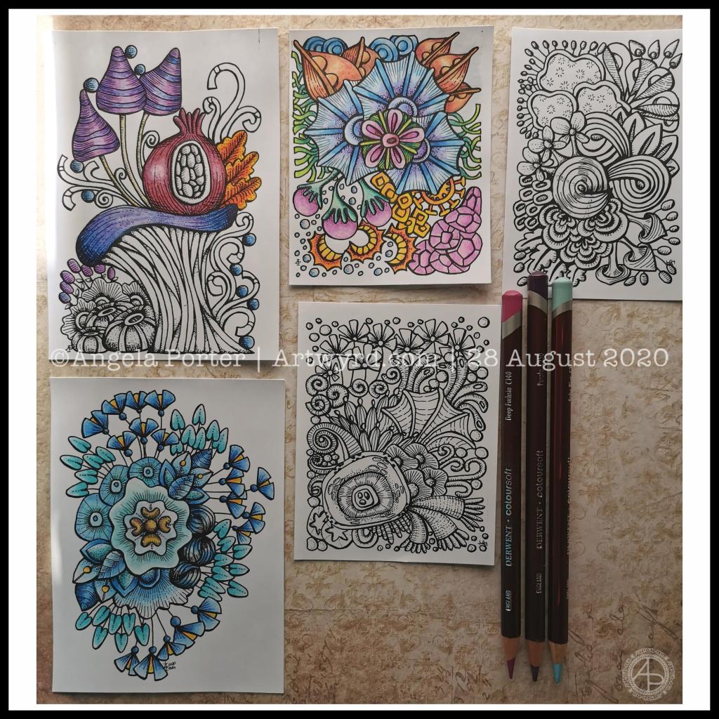
Lots of little drawings.
Over the past couple of days I’ve been drawing small designs in pen, including plenty of line detail to add volume and shadow.
Today, I scanned the drawings in and printed them out (after cleaning them up a tad digitally) so I could try colouring them.
I wanted to print them on mixed media paper, which I know my printer will take. However, even with clean scans, the prints were really messy. However, when printed on ordinary paper, the prints were pristine.
I wasn’t happy as I wanted to use a paper with a bit more ‘tooth’ so I could make use of the Derwent Colorsoft pencils. But, I persevered and the results are above.
The first I coloured is in the top middle. My colour sense isn’t always wonderful. Lots of colours, but it just doesn’t feel coherent in any kind of way.
So, I moved on to the next design. This time, I thought I’d use analogous colours (colours next to each other on the colour wheel), with a touch of a complementary colour to add brightness. Complementary colours are opposite each other on the colour wheel.
I like this second one much more. It feels cohesive, like everything belongs together. And the little bursts of yellow/orange just lift it all.
The third design I’ve been colouring is only partly done. I’ve veered away from entirely analogous colours, but I am trying to keep the colour palette simple and with, perhaps, an autumnal feel to it.
As I was working on printer paper, I needed to use some way to blend the colours. I remembered I had some ‘Zest-It’ blending solution and some paper torchons. They worked well. The big frustration was that I couldn’t lay down intense colour. However, as these are prints, I’m not too worried. I do need to find some toothy paper which will go in the main paper drawer of my printer. I do have some cartridge paper here somewhere which should go through it.
Of course, scanning the drawings in means I can also work on adding colour digitally. It means I can try things out until I’m happy with the results.
Pesky printers
I never have much luck with printers. Inkjet printers die on my quickly, even the more expensive professional ones. I thought I’d try a laser printer, but I seem to have problems with this one now not giving clean prints when I use the sheet feeder for specialist papers.
I don’t print much out, to be honest, but it’s frustrating when I want to print artwork out on specialist paper.
A note to self about colour.
What I have learned is that I like to watercolour the designs, but then the addition of coloured pencils to intensify the colours and add shadows works really well for me. I like the intense contrasts that I can get with coloured pencils that I just can’t seem to achieve with watercolours.
Of course, I can always colour digitally, which lets me play with colours, change them, until I get something I really like.
Today, I’ve had a reminder that limited palettes, particularly of analogous colours, seem to be working rather well for me, especially with those accents of complementary colours.
I really do need to put a big ‘note to self’ where I can see it to remind me of this. I can get carried away with colours

