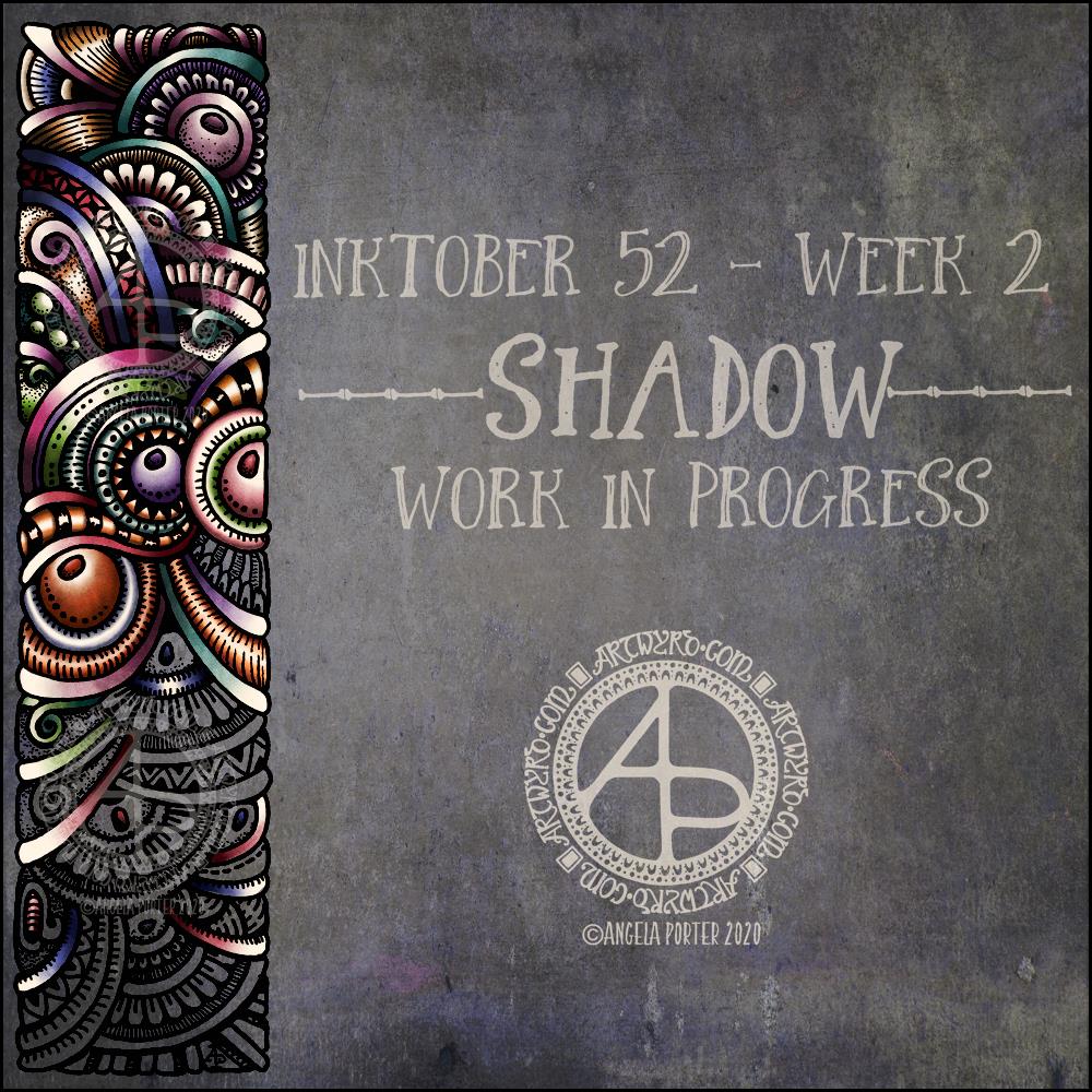
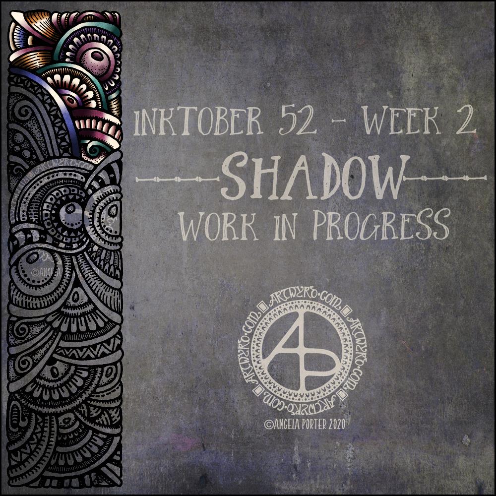
I managed to get a fair bit of colouring done yesterday and this morning. It never ceases to amaze me how colour can add so much dimension to the design, particularly as I use quite high contrast. It’s possible to see the dimension in the line art, but colour really brings it out.
There are areas that look a little flat, but I can sort those out later on by adding more shadow and highlight.
So far, I am pleased with how it’s working out. I’m also enjoying the hybrid art that results from traditional drawing and then the application of colour digitally.
I like this week’s prompt for #Inktober52 – Shadow. I like to work with quite high contrast colours/shades to give the illusion of dimension. So, I thought I’d take one of my borders, add it to a very shadowy background, add colour, light and shadow, and finally I’ll put a quote about shadow on to it. My only problem with adding a quote is which one to choose! There are so many fine quotes about shadow and light.
It’s nice to have a whole week to work on the prompt. I’ve already spent over two hours adding colour to that little section of the border design, just to give you an idea of how long it takes me to work in colour.
What this means is that I can use my Inktober52 project as ‘warm up’ or ‘comfort’ art over the next few days if I wish.
The colours I’m choosing are quite ‘dull’ for me – they are hues that have a lot of black/ in them and they do give a quite vintage or grungy feel. However, against the dark background they glow.
They’re not my usual choice of bright, pure colour. I think that’s simply because it’s taken me a long time to work with them and become comfortable with them too. That’s another reason why Inktober52, and Inktober, are so good – I end up trying things out that I wouldn’t necessarily do for my publishers.
I’ve enjoyed creating this sketchbook sampler page. I drew the designs with a mixture of Uniball Unipin pens, Faber-Castell Pitt Artist pens, a medium nib Schaeffer fountain pen, and an extra-fine nib Faber Castell fountain pen. I used dot grid paper from Claire Fontaine.
After scanning the page in, I removed the dot grid and added a grungy paper background. I then decided I’d like to add some colour and shadow/light to the designs. To do this, I used a messy chalk brush, so my colouring isn’t as precise as I usually like it. However, it’s loosened up my expectations of myself as I went with it.
Pastel colours were my palette of choice as I like the way they seem to almost glow against the grungy kraft background. I also like the way they help to enhance the 3-D appearance of the designs. I do enjoy playing with shadow and light.
Some of the designs are examples of my organic, entangled style of drawing. Others are repeating, geometric zentangle-style patterns. And then there’s some inspired by Medieval illuminated manuscripts.
I also enjoy working within a clear border. I like the sense of structure it brings to my work. It also satisfies some kind of aesthetic need within me. Every now and then I try work without a border, but the artwork I produce just never feels quite right to me. So, it’s time for me to accept the need for borders is part of my artistic voice.
There is a purpose for me creating these borders. I’m building up a library of them that I can use to embellish quotes and other projects.
Some of these borders would look fab as greeting cards note cards, bookmarks, and to use in other paper craft projects. They’d also work well as embellishments for BuJo, planner, diary, scrapbook and journal pages.
Others would be a great foundation for dangle designs (my book “A Dangle A Day” is a good place to start drawing dangle designs).
What I do know, is that I find drawing soothing and relaxing. So, I’m going to be spending the rest of my Sunday drawing more borders.
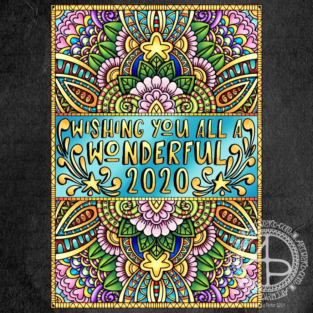
New Year coloring template (c) Angela Porter – Artwyrd.com
Today, I seem to have a lot of my focus back. I’m still not 100%; my appetite and taste buds are still way off, but my mind seems to be a bit less fuzzy.
Here is a section of the template, which I’ve been working on colouring. The gold background is just a temporary thing.
I used Affinity Publisher for the typography in the centre of the design. I then used Autodesk Sketchbook Pro to draw the design and to start colouring it. The template is in my entangled signature art style.
I’m enjoying adding colour to this design; this is a good sign that I’m recovering from the tummy bug that has laid me low for the the best part of a week now.
If you’d like to download a copy of the colouring template, you do need to be a member of the facebook group – it’s free to join and the template is free to members!
Of course, I’ll be posting my coloured version of the template to welcome in the new year.
Yesterday, as today, I wasn’t feeling too grand still. The stomach bug has laid me rather low it seems. I tire all too easily. Still, I wanted to create some art, so I thought working with flowers would be a nice thing to do.
So, I started with some pen drawings of flowers with three petals – that’s the top row. I used a Faber-Castell Pitt Artist pen on dot grid paper (the dots of which you can still see!).
After scanning that drawing in, I re-drew the same designs digitally using a technical drawing pen style brush (second row) and a flexible nib ink pen brush (third row).
The fourth row of flowers is the same as the third (using digital magic to copy the drawings), but with colour gradients and some details added in the last flower of the line.
The last row was done using the drawings as a guide, but using colour so I could try a variety of brushes and techniques out on them. I used the Copic colour palette that is part of Autodesk Sketchbook Pro’s options.
Looking at the last row of flowers with fresh eyes, I can see how I could’ve added some stamens to some of the flowers, particularly the green one.
I just wanted to be arty for the sake of being arty. What I’ve ended up with is a sketchbook page that is a mixture of traditional and digital art! And there was me saying a few blogs ago that I find it hard to do art just for the sake of creating with no goal or purpose in mind.
If you’d like to download and print the template to colour, then all you need to do is pop over to the group and join! It’s free!
I’m flagging at the moment. I didn’t sleep much last night; I’ve picked up some kind of stomach bug and so was back and forth the bathroom. My tummy is still not well today. I was, however, determined to get a seasonal greeting out to one and all.
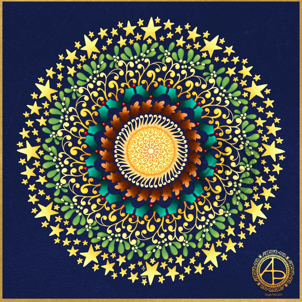
Drawn with Faber Castell Pitt Artist pens. Typography and colouring done digitally.
I’ve been awake since way before dawn drawing this mandala to celebrate the Winter Solstice. I’m looking forward to the increased hours of daylight, though it will be a couple of weeks, or so, before there’s any noticeable difference in the length of day.
It’s been a lovely way to spend the hours as night gradually gives way to the sun. Not that I can see the Sun itself; grey skies and patches of rain obscure the golden wonder of that glowing ball of nuclear fusion.
I created the mandala using Autodesk Sketchbook Pro, Microsoft Surface Pen and Microsoft Surface Studio.
Is it a snowflake, or a stained glass window? I think it depends on the colour palette used! I started off with blues and purples to give this design a wintry, snowflake feel. However, other colours crept in. Not sure how much I like the finished coloured mandala.
If you’d like to colour this design in, then a black and white template is available exclusively to members of the Angela Porter’s Coloring Book Fans facebook group. Pop along and join in – they’re a really lovely bunch of people!