Today, I thought I’d digitally colour one of my recent drawings. I thought it would be nice to compare and contrast digital colouring with traditional colouring.
It’s been a while since I did much art digitally, I’ve been lost in traditional media this week as I slowly heal from some emotional wounds. Art helps with healing. Meditation helps too. But time is still needed for the healing to take place, and for rest to relieve the exhaustion that lingers still.
Any kind of art, digital or traditional, soothes my mind, emotions and body.
What I like about digital art is the way I can get such high contrast in colours to enhance the sense of volume the design elements have. I also like the vibrancy of colours. I also like the ability to add texture to the colour in so many different ways.
Of course, I like the ability to alter colours when they don’t work, without having to start over. I’m not sure if those leaves are going to stay that particular green-ish colour. Nor am I sure about the background colour.
As is my wont, I’ve used Autodesk Sketchbook Pro to add the colour and textures. My hardware is a Microsoft Surface Studio and Surface Slim Pen.
Yesterday, I thought I’d give Clip Studio Paint a go. The bottom part of the template above was coloured in Clip Studio, the top part in Autodesk Sketchbook Pro.
I spent yesterday afternoon, and a bit of this morning, colouring part of the template above in Clip Studio Paint. So, these are my first impressions of Clip Studio Paint and a comparison with Autodesk Sketchbook Pro.
I think it’s impossible to tell the difference between the colouring I’ve achieved with both programs. What is different is the user interface more than anything else.
I’ve long been a fan of Autodesk Sketchbook Pro, and that isn’t going to change. I love the intuitive and rather beautiful interface of the software, the menus on screen and the colour and brush ‘pucks’. Everything is done easily and simply through the quite minimalist, yet powerful, tool bars and menus. Keyboard shortcuts are available, but I prefer to use my pen directly on the screen as I work. It makes working digitally as natural as working with traditional media.
As I’m familiar with the Affinity suite of programs from Serif, working out what the different menus and tools,, which are similar to Photoshop, wasn’t as confusing as it would’ve been in the past. Thanks to working with Sketchbook Pro, I have a better understanding of what the various tools do.
While the tools and options are all accessible on the screen, I find it frustrating and time consuming as I seem to have to perform more steps in Clip Studio Paint to do the same task as I would in Sketchbook Pro. I’m sure there must be keyboard shortcuts, which may help streamline the process somewhat. However, I work directly on the screen with Sketchbook Pro and the only time I use my keyboard is name the file before saving it, or if I want to add text to the art. Usually, they keyboard is out of the way so that I can adjust the angle and distance of the screen to suit my comfort.
I do prefer the way I can choose colours in Autodesk Sketchbook Pro, as well as the ease of creating a custom palette. Sketchbook Pro also comes with a separate Copic color palette. Being able to move them around the screen means I can pop them where I like, make them easily and quickly accessible for me.
Don’t get me wrong, there’s a comprehensive colour palette and various options of viewing colours in Clip Studio Pro, but I like the more intuitive and streamline way of doing it in Autodesk Sketchbook Pro. It’s just personal preference more than anything.
Having the colour puck makes it easy to alter the saturation and tone of a chosen colour really quickly. The brush puck makes changing the size and opacity a breeze. I keep the pucks close to where I work for convenience.
Again, there’s nothing wrong with how all this is done in Clip Studio Paint, but I just prefer the ease with which I can do everything in Sketchbook Pro.
The Sketchbook brush palette is a great tool too; I have all my favourite brushes available in one, easily accessible place. A click on this palette and I can access all the brush sets I’ve either downloaded or created so I can add or remove brushes as I need to.
The zoom and rotate touch functions only work separately. I found this a clunky and awkward way to work. I think that’s because I’m used to doing both at the same time and at will in Sketchbook Pro.
What I did like are the many more choices of brush effects in Clip Studio Paint. However, I think I can replicate many of them in Sketchbook. There are some interesting brushes in Clip Studio Paint, but nothing that I couldn’t replicate if I found I really wanted to use them.
Anyway, I will persevere with Clip Studio, working with it from time to time to become more familiar with it. The ability to draw vectors may be helpful in the future, but then I have Affinity Designer on my ‘puter, which is Serif’s version of Adobe Illustrator.
Also, I’m hoping I can find a way in Clip Studio Paint to work in CMYK rather than RGB. When I convert files to CMYK for printing, the colours shift and I’d like to work in roughly the colours that would be printed.
Overall, I think it’s a good, affordable application. It’s a fraction of the cost of any Adobe Product. I paid £40 for the Clip Studio Paint version; that’s a one-off purchase and you have free upgrades for life. You also get access to online resources created by other Clip Studio Paint users.
This price is on a par with the price of each of the Affinity suite of programs (approx £50 each), and there are regular, free updates to the software.
You can get Autodesk Sketchbook for free, though I subscribe to the pro version monthly for approx. £12; it does have a few more features than the free version. Just because Sketchbook is free doesn’t mean it’s not professional; it is. It doesn’t look powerful, but it is.
How much will I use Clip Studio Paint? That I’m not sure. Perhaps with more use the frustrations I experienced with lessen as I become more familiar with the software. Perhaps I’ll gain fresh ideas on what effects I can try out in Autodesk Sketchbook Pro.
Do I think Clip Studio Paint is a bad program? Not at all. It seems to be powerful and similar to Adobe Photoshop and artists and illustrators are able to create fantastic artworks with it. I’m sure that if you are familiar with the way Photoshop works, you’ll find Clip Studio Paint an easy transition to make.
Personally, I find the way the menus are set up hard work and time consuming to use. I’ve been spoiled with the simple sophistication and intutive nature of the Autodesk Sketchbook interface, no matter which version you use. I find I spend less time clicking on menu after menu to get to what I want to use, and more time creating art in Sketchbook. That may be a function of my familiarity and comfort with the software. What I don’t want is to feel I’m struggling or working so hard to get an effect I’d like when I could do it so simply in Sketchbook.
One thing I know is that Autodesk Sketchbook Pro will be my go-to digital art program. It does all I want to do digitally, and most probably a lot more I’ve not worked out yet.
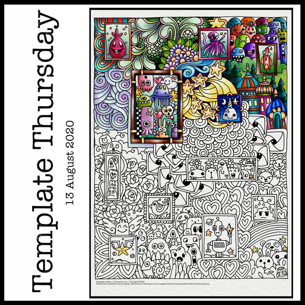
This week, I’ve harked back to my Doodleworlds book with cute monsters and critters. I’ve included some family portraits which hang above a background of more monsters and critters and my signature entangled style drawing for coloring books.
I got lost in colouring this template this morning. It was fun to use different styles of digital brushes and colour combinations in this one. Sometimes it’s just nice to do art with no expectations other than enjoyment, relaxation and comfort.
I drew the template with a Pentel 07 Energel pen on Rhodia dot grid paper. I scanned it in to the Surface Studio and cleaned the image up digitally. Then, I partially coloured it digitally in Autodesk Sketchbook Pro, adding a background texture that isn’t present in the downloadable image.
Lightning storm
Last night, there was the most amazing lightning storm I think I’ve ever seen. It lasted for more than an hour and there were multiple flashes of lighting most minutes. I really need to learn how to use my camera to take photos of lightning – natures very own fireworks.
Sadly, I haven’t been able to see the Perseid meteor shower this year, and I missed the Neowise comet too. I have seen amazing photos of both, though, and of course the lightning storms of the past few days that have coruscated over the UK.
Heatwave
It’s a little cooler in the house today thanks to the clouds shrouding the sun. It’s humid though as the couple of brief showers last night have been evaporating slowly.
The heat meant I didn’t sleep well again last night. But, waking early meant I had plenty of time to edit the coloring template and add colour to a section of it.
I’m not sure if it’s cool enough to take a walk this afternoon. There seems to be a bit of a breeze picking up from time to time. I really don’t do well in the heat; I wilt very quickly. But I’ll see once I shower what it’s like outside.
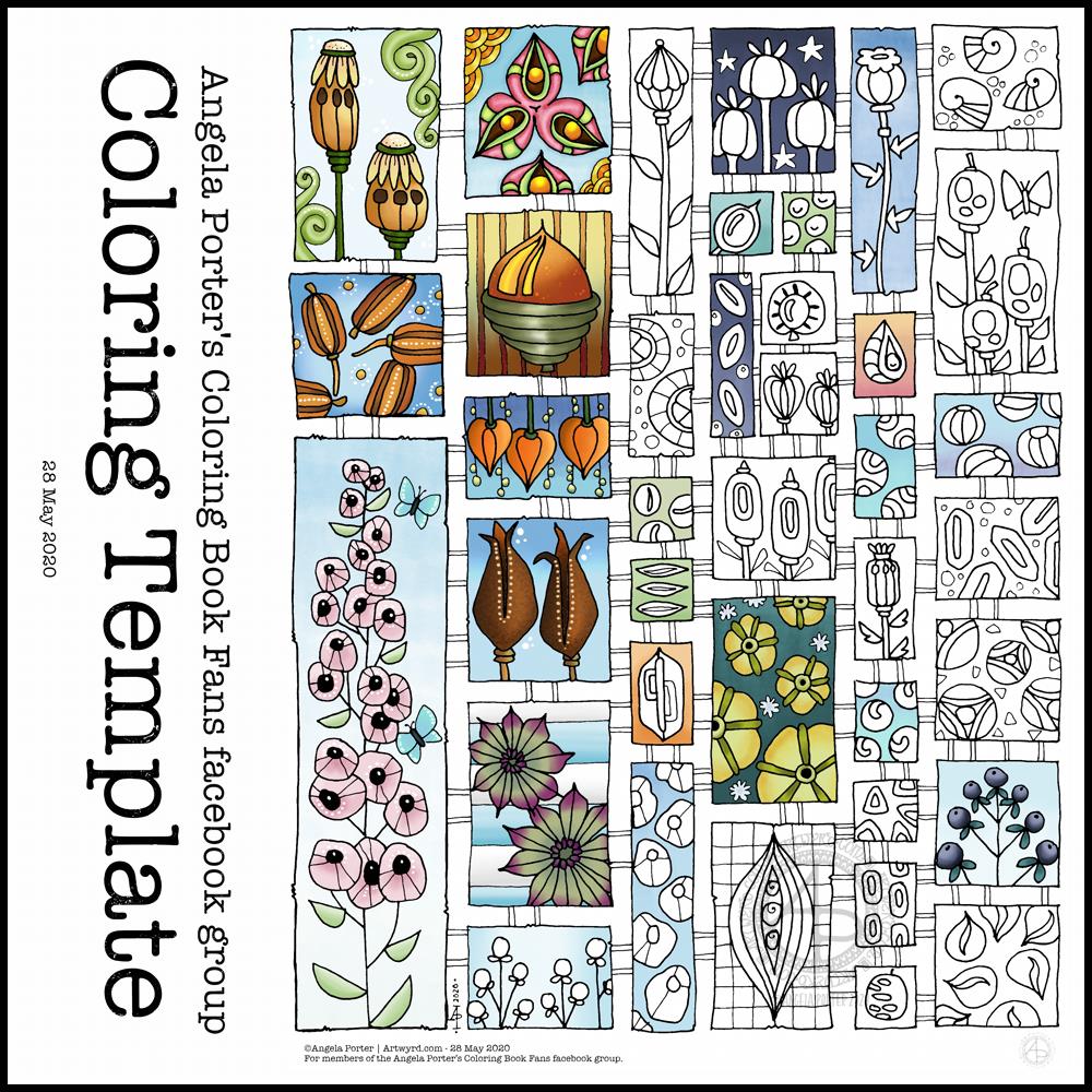
Another week in lock-down has passed us by here in the UK, as well as many places around the world. That means it’s time for another weekly coloring template.
This week, the inspiration for this template has come from the pages full of capsules, pods and seeds in my sketchbook. Lots of opportunity to experiment with colour, but also adding little details to each tiny picture.
Drawn using Sakura Pigma micron pens (05 and 01) on ClaireFontaine dot grid paper. Clean up of drawing, colouring and typography done digitally using Autodesk Sketchbook Pro along with a Microsoft Surface Studio and Microsoft Surface Slim Pen.
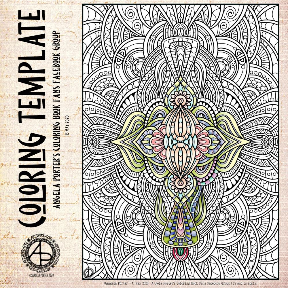
The weeks are flying by! It seems like hardly any time at all since I posted last week’s coloring template. I decided at the start of the Covid-19 quarrantine that I’d design a weekly coloring template for the members of the Angela Porter’s Coloring Book Fans facebook group. And so far I’ve managed to do that.
And here, partly coloured, is this week’s offering. I look forward, as always to seeing the coloured templates by members of the group. I love the way that they use different colours and interpret the design differently!
The template is only available in the facebook group, and is for free. I know how much colouring and creativity can help people manage their emotional and mental health. Creating art and being creative certainly helps me, especially if I have a good audiobook on or uplifting music!
I created this design digitally in Autodesk Sketchbook using a Microsoft Surface Slim Pen and Microsoft Surface Studio.
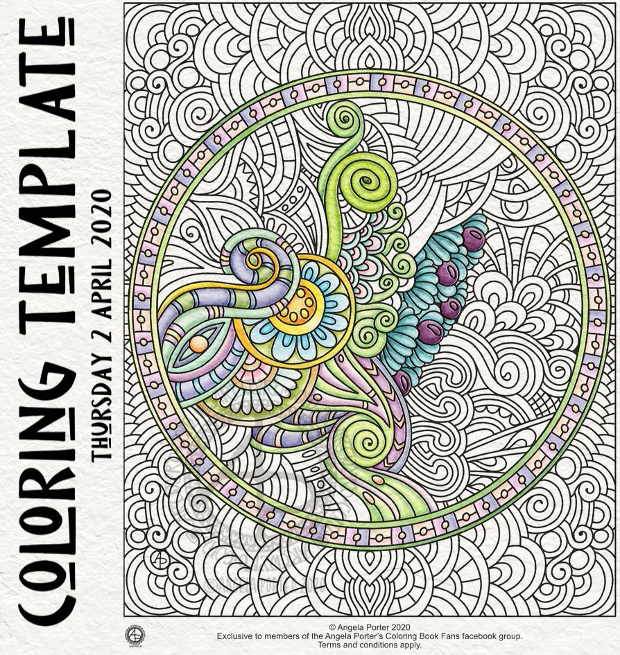
This week, my offering harks back to my ‘Entangled’ style of drawing – abstract, with swirling lines, spirals and organic motifs. And fairly detailed with zero or little white space. It’s still a style I like to return to; it’s one of my comfort drawing styles.
For this one, I worked digitally – Autodesk Sketchbook Pro with a Surface Slim Pen and Surface Studio, both by Microsoft.
I started to add colour to it, and the colours are softer, more muted than is usually the case for me. I think those represent my mood at the moment, as well as it being spring time.
If you’d like to download a copy and colour this template, then you do need to become a member of the Angela Porter’s Coloring Book Fans facebook group. It’s free and all I ask is that you follow a few reasonable terms and conditions for use! I’d love to see how you’d colour this one in.
What else could I do for dinner other than have the etymology of the word along with a collage of just a few of my favourite foods! And I do mean only some.
I looked up the etymology of ‘dinner’ on Etymology Online, did a little bit of typography using Affinity Publisher.
I then drew the foods on Claire Fontaine dot grid paper using an 0.8 Uniball Unipin pen.
I scanned the drawing in and removed the dot grid and removed smudges and so on in Autodesk Sketchbook Pro.
My next step was to add a coloured background and some colour to some of the drawings. Only to some, as this was a ‘for fun’ project as part of the #Inktober52 challenge organised by Jake Parker, the founder of Inktober.
Missing in action…
It’s been a couple of days since my last blog. It seems that life and demands on me have taken over arty pursuits. And when I wasn’t seeing to the life demands, I was taking some time out by needlefelting.
I managed to needlefelt a cute rabbit and owl over the last two or three days. I’ll post pictures of them in another post.
This is a drawing I did late last night as I settled down to sleep. It feels quite disjointed in places, which was how my mind felt in it’s state of tiredness. Even though I was tired, I wasn’t ready to sleep.
I thought I’d work with it, adding a background and colour to it. I wonder if adding colour will resolve the disjointed areas as it breathes life into the design.
I’ve only taken a short time this morning to ad some colour. I do have to do other things today. The colour certainly helps to lift it from the background, as well as adding dimension to the design.
I’ve chosen fairly dusky, dusty, pastel colours which seem to glow against the darker background. The pinks remind me of faded Victorian velvets.
I drew the design traditionally, using a Tombow Fudenosuke pen and ClaireFontaine dot grid paper. The flexible nib of the fudenosuke pen results in lines of varying thicknesses, and a drawing that reminds me of linocuts or woodcuts.
After scanning the drawing, I removed the dot grids and cleaned up the drawing digitally before adding a background.
I felt this needed quote to go with it, and this one spoke to me today. For the typography, I used Affinity Publisher. The rest of the digital work is being done in Autodesk Sketchbook Pro, using a Surface Pen and Surface Studio from Microsoft.
My art is always ‘pretty’, it’s how I express myself artistically. Some of my inspiration for patterns and motifs comes from things that other smay not consider ‘pretty’, such as rust, run down old industrial machines, ruined buildings.
My art does, I think, speak of who I am. It shows what I’m interested in, what patterns, motifs, shapes, textures, colours, and so on that I find aesthetically pleasing. It also shows, to those who look and think a bit deeper, what things interest me, from prehistoric art to Romanesque architecture to La Tene and Celtic art to Illuminated Manuscripts to flora, foliage, fungi, and lichen to fossils and shells to nature in general, and more besides.
I work very intuitively. It’s when I think too hard about what I want to do that things go to wrack and ruin.
By letting my intuition flow, then drawings have a way of coming together in a way that expresses how I’m feeling and what is fascinating me or soothing me at that time.
This drawing is an example of how my feelings come out. It’s only now I can recognise how disjointed I was feeling within myself last night, how I was out of sorts. I think that’s why the art jars with me today as that feeling has now passed by, like clouds in the wind. It’s a drawing that shows the weather my emotions were experiencing yesterday, weather that just happened and has no real source for it.
Today, I’ve been drawing little flower motifs and borders to go along with a lovely quote about flowers and hope.
The line art was drawn using Tombow Fudenosuke pens on ClaireFontaine dot grid paper. Colour, typography and background texture have been added digitally using Autodesk Sketchbook Pro, Microsoft Surface Pen and Microsoft Surface Studio.
Flowers are some of my favourite things to draw, whether they be highly stylised or more realistic.
My snowdrops and crocus have the feel of being wood cut or lino cut and printed, that kind of vintage feel. The flexible nibs on the Fudenosuke pens help me achieve this look. Also, the fairly simple colouring and addition of texture help too.
I’ve left the colouring as is, maybe for now. However, I now have these motifs ready to use in other projects, as they occur to me. Colour certainly helps to lift them off the background and bring them to life.
A new month and a new coloring template, exclusive to members of the Angela Porter’s Coloring Book Fans facebook group. If you’d like to download and print this template for your personal use, then pop along to the group.
The days are slowly lengthening here in the Northern Hemisphere. The first signs of nature waking up can be seen in the form of snowdrops and crocuses. It can also be heard in the raucous and beautiful birdsong.
To the template. I drew this on Rhodia dot grid paper using a Sakura Pigma PN pen. For my partially coloured version, I added a coloured background and colour digitally.