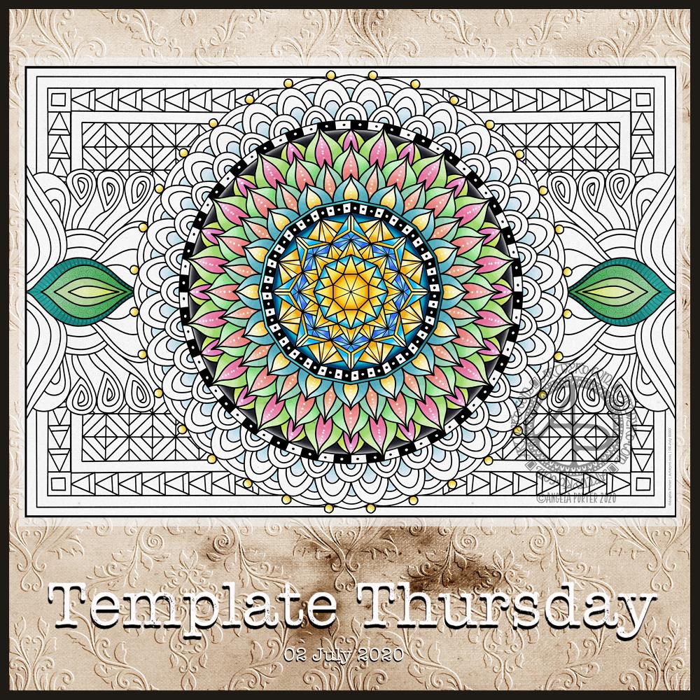
This week, I’ve decided to do a mandala. Mainly because I find mandalas incredibly soothing and calming to draw. I have drawn and coloured the mandala digitally in Autodesk Sketchbook Pro.
As always, the template is only available to members of the group. It’s free to join the group, and free to download the template. All I ask in return is that you follow the terms and conditions, don’t share the uncoloured template, and credit me with the artwork when you post your wonderful colourations online.
This week, it’s another of my collections of little windows. Yesterday was a day where I needed to draw a template that wouldn’t overwhelm me, and a collection of tiny drawings and patterns is a way to break the task down into bite-size, cute, whimsical pieces. As I result, I enjoyed the process and found some contentment and peace too.
In fact, some of the colorists in the group have told me that the really like the way the page is broken down into pieces that can be finished quickly if they are limited for time. The different sizes allow them to choose something that can be coloured in the time they have available. That part can then be left finished, freeing them of the worry of leaving something unfinished.
Coloring, like any creative activity, can help calm, relax, soothe and give a break from negative self-talk, to name a few of the benefits. I know that scientific studies have shown this to be the case and that losing yourself in coloring has a similar effect on brain activity as mindfulness meditation.
I use art to help me with times when my emotional weather is stormy, dull, unsettled. As I said earlier, drawing a collection of small designs was far less overwhelming than drawing a full page illustration yesterday. Yet, I still end up with a full page of mini-templates to colour.
I feel I struggle with colours. I tend to try to put all colours available to me into one template. Every now and then I do work with a limited palette, which also has it’s own problems. My window templates take away any pressure I put on myself regarding colour. Each window is a unique image in it’s own right and I can use whatever colours I wish in it without worrying about the overall cohesiveness of the project.
These window templates are also great fun for trying out different colour combinations, for blending colours, and even for trying out new techniques. You could make notes on the template, or cut out the pictures you want to keep and start an art journal where you note down the media, colours and techniques used to get the effects/blends you like. No longer any need to remember what they are, just refer to the journal!
Talking of cutting the designs out, that is a perfect way to make use of a finished coloring page like this one. The individual images, or groups of them, can be used to make greeting cards, bookmarks or to embellish art journals, journals, scrapbooks, diaries, planners and bullet journals!
As always, I love to see what people create using my templates – share with and/or tag me on social media : f: @artwyrd t: @artwyrd i: @artwyrd
A simple, monochrome mandala today, using some of my favourite patterns (plus a couple that are entirely mine).
Drawing mandalas is so soothing, mindful, meditative. The repetitive nature of drawing patterns is part of that relaxing experience.
It was also nice to use some of the patterns from my ‘visual dictionary‘ or ‘visual zibladone’ in some art.
I have some new patterns and motifs to add to my visual dictionary; they spontaneously appeared as I was drawing. I like when this happens, when I don’t over-think things and just go with my instincts.
I wanted to add a colour gradient to the mandala. However, when I tried to do so, it just didn’t feel right. So monochrome it is.
Drawn digitally using Autodesk Sketchbook Pro, Microsoft Surface Pen and Microsoft Surface Studio.
I’ve often mentioned my ‘visual dictionary’, so today I thought I’d show you a two-page spread from it.
I’ve kept a visual dictionary for a few years now. It’s where I keep a record of my favourite patterns, motifs, lettering styles and anything else of use to me when I need a little inspiration or to add something a little different to my art.
My original one is now just about full, and I thought it was time for a bit of a cull of patterns and motifs I wouldn’t use as I start a new dictionary. At the moment I’m working my way through zentangle patterns before I add my patterns and motifs. TanglePatterns.com is a fantastic online resource for zentangle patterns.
I’m using an A5 notebook with 5mm squared paper from WHSmith. It has quite a lot more pages in it than a Leuchtturm, Midori, or other A5 dot grid or squared notebooks, which is why I went with it. The paper seems to be pretty bleed-proof, and any ghosting is relatively minimal.
The past few days have had me needing some quiet time doing comforting, soothing art. I’ve had a very ‘people-y’ time of late, and it has left me quite drained. So, sifting through and drawing patterns and motifs and adding them to my new visual dictionary was just what my arty soul and overwrought emotions needed.
Doing this has the bonus of refreshing my creativity. Not only am I being reminded of patterns I like that I’ve not used for a very long time, but I’m also creating my own variations, either deliberately or as the result of some ‘happy accidents’.
Even though I’m trying to keep the pages neat and ordered and the patterns mistake-free, I find I’m not stressing if I make any mistakes. I find a way to either create a new pattern or to incorporate it into the design in some way. This is good for me as I tend to be hyper-perfectionistic if I’m not too careful.
One of the things that is really nice about being between contracts is the opportunity to create art just for the fun of creating art and not having to stay within the limits of the contract. Not that drawing to fulfil contracts isn’t fun, it is. It’s just that I have to work within the remit of the contract.
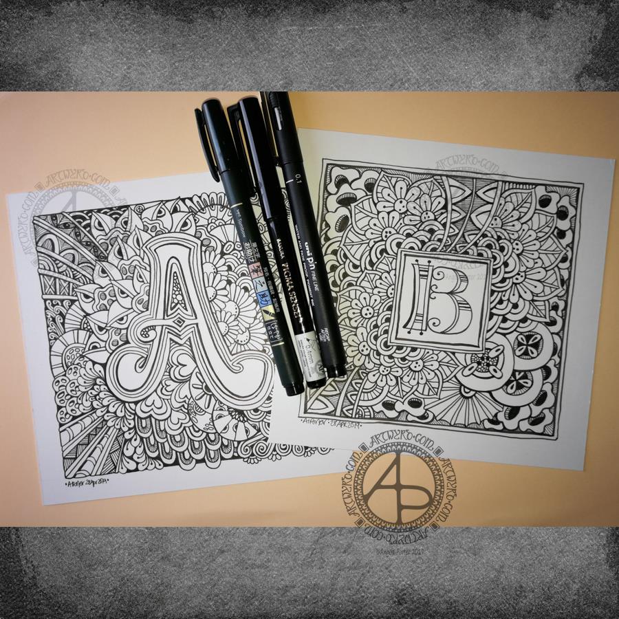
Yesterday evening and this morning I’ve been having a contented time creating some entangled monograms. I’ve cut some Winsor and Newton Bristol Board down to approx 15cm x 15cm (approx 5.75″ x 5.75″).
I penciled in some guidelines for the edges of the artwork and for the position of the monogram.
First job was to hand letter the monogram. I did start with pencil guidelines for each letter, then used a hard Tombow Fudenosuke pen to ink them in.
Then, the real fun begins, which is the entangling of the space around the monogram. I used the Fudenosuke pen along with a Sakura Pigma Sensei 04 and Uniball Unipin 0.2 and 0.1 pens.
All done in plain black and white, with just the weight and concentration of lines adding depth and dimension to the finished design.
I do want to add colour to these at some point. I love pure black and white artwork, but colour can bring them to life as well. Digital colouring is my favourite way of adding colour these days, but I may print copies out on to marker friendly paper and then use Chameleon Duotones and Color Tops to add colour. I’ll see how I feel about that.
As is my wont, I had no preconceptions of how the entangling would unfold. I just let it flow. Some of my favourite motifs and patterns have been used. I did refer to my visual BuJo for ideas/inspiration from time to time too.
Visual BuJo
Yes, a visual BuJo (bullet journal). Or, rather, it’s a collection of motifs and patterns that are being organised using ideas from the Bullet Journal system of keeping a journal. It works for me. I have a way to help me find continuations of collections, or to start a new one, and not worry about a collection being on consecutive pages.
My visual BuJo is an A5 sized, dot grid notebook from Claire Fontaine. It’s a soft back one so isn’t quite as weighty as Leuchtturms and the like. It is also a little less bulky in size, which helps when I want to travel light on a day out.
Mind you, when fill this present visual BuJo I may use a Leuchtturm for my next one. We’ll see…
It is also something that encourages me to seek out new patterns and motifs to add to it, as if I didn’t have enough already! Doing this is a good way to just practice my drawing skills and observation skills, as well as analysing a motif or pattern, breaking it down into simple shapes and steps to draw a stylised version.
I do tend to favour more stylised motifs and patterns in my art, that’s for sure.
So, I now no longer feel the need to try new ideas out for keeping my reference material, constantly redrawing them again and again. The visual BuJo is working for me for sure.
When I’m having a tough time emotionally/mentally with my CPTSD and/or EMDR it can be soothing, comforting for me to use the familiar, and of course I can still do that. I just don’t need to spend a lot of time drawing and redrawing and redrawing again the same things in my search for a perfect record keeping system for patterns and motifs.
The BuJo inspired system may not be perfect, but it works for me.
One other positive that has come from me using a BuJo is that I’ve had to learn to let mistakes go and just leave them in the notebook. The mistakes are what I need to make in order to understand how to draw a pattern or motif. Sometimes, though, a new pattern or motif arises from the mistakes.
Something else I’m starting to do is to make notes alongside the patterns with where to start, the order in which to draw the parts of the pattern or motif, and ideas for varying it.
Yesterday was very much a quiet, self-care day. Today, I’m feeling better in terms of energy and concentration.
This mandala was a product of yesterday’s quiet downtime doing art for arts sake. Though it was this morning I thought I’d like golden outlines to the design rather than the usual black. It took me a while to get my head around doing that!
I like the way I’ve repeated the simple spiral pattern in three layers. Keeping the colour palette simple has also worked nicely for me, even though the combination of colours is an unusual one for me. The colours remind me of cacti with flowers and a soft, golden sun.
I could mention that green is about achieving balance, the red is the energy I need to stoke up on, but a softer, more gentle kind of motivational energy. Golden sunshine is the healing I see. The way the spirals flow outwards and are unfurling suggests growth , springing forth from seeds long lain dormant in the ground of my soul. There’s hints of buds ready to bloom there too. Maybe the golden background and lines are suggesting that I am worth more than I think I am, that I do deserve better.
Oops, I have mentioned that! But somehow this mandala seems to show how I’m progressing in my recovery from cPTSD.
Now how’s that for an insightful piece of art?
No matter whether you agree with the interpretation of the mandala or not, it was definitely a calming and soothing experience, both the drawing and colouring.
It is a piece of digital art. I used my usual Microsoft Surface Pen, Microsoft Surface Studio and Autodesk Sketchbook Pro to create this mandala.