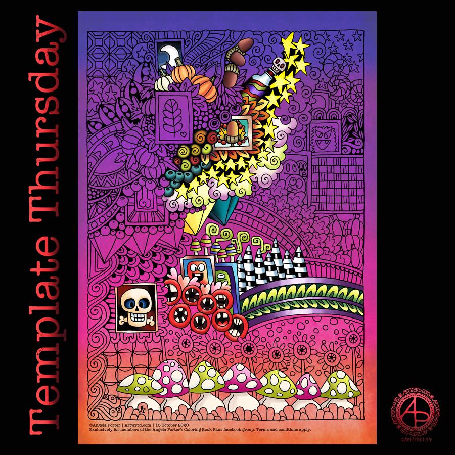
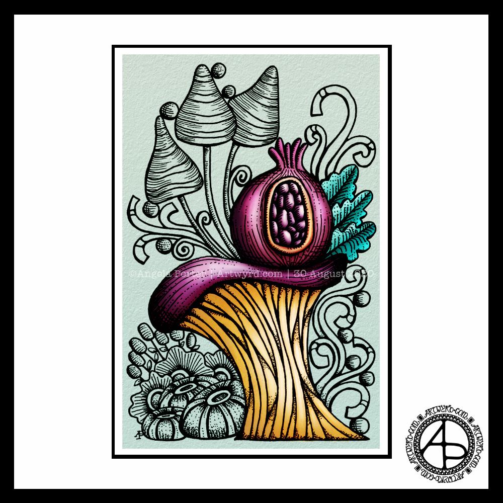
Here, in the Valleys of South Wales, the sun is shining, autumn is gradually taking over the land and Hallowe’en is fast approaching. So, this week’s template has some Hallowe’en elements to it. It’s also a cute and whimsical template for people to have fun with colour.
A week more of the pandemic has passed us by, and it’s one week closer to Hallowe’en! So, this week’s template for members of the Angela Porter’s Coloring Book Fans facebook group is Hallowe’en themed.
I always have fun drawing these cute and whimsical templates. They’re the kind of art that I don’t have to worry too much about my colour choices, which I’m never quite happy with.
As always, I look forward to seeing how people bring my templates to life with colour in their own way.
This week I’ve done a pretty yeuchy job on the colour scheme. It happens. I do struggle with colours, more at some times than others, and today is one of those days.
The template itself has lots of my favourite motifs in – pumpkins, leaves, flowers, seedpods, seeds, berries, shells, mushrooms and stones. Not to mention arches and geometric patterns along with a sprinkling of stars.
I’ve gone with a weirdly autumnal colour scheme, but I think this would work for any kind of colour scheme you’d like. I may revisit this template and add linework and keep it monochrome at some point in the future. It would be good practice to redraw it digitally and work on my digital linework skills at the same time.
I used Unipin pens and Canson Marker paper to draw the template. Next, I used Autodesk Sketchbook Pro to clean up the image and then add the colour.
To Inktober or not Inktober? Nah, let’s Paleotober instead!
I may do an Inktober challenge this year, but again choosing an alternative prompt list. I enjoyed last year’s month of daily drawings focusing on art I’d not usually do, particularly the skulls. However, I found the pressure to draw every day a bit much and a bit manic to work in around everything else I needed to do.
I like that each theme covers a few days, so less pressure. I have been thinking of working on drawings of fossils, dinosaurs and so on in the way I have my recent drawings of moths. So, this is the push I need to get me to follow those thoughts!
I must admit, the sight of an ammonite, icthyosaur and pterodactyl, three of my favourite fossils, on the prompt list just did it for me!
I think I’m going to struggle with the imagined and speculative prompts, but I may just use those days to add to one of the others. We’ll see.
In other times, I’d visit my local musuems to view fossils and such like for myself, sketchbook and camera in hand. But not now.
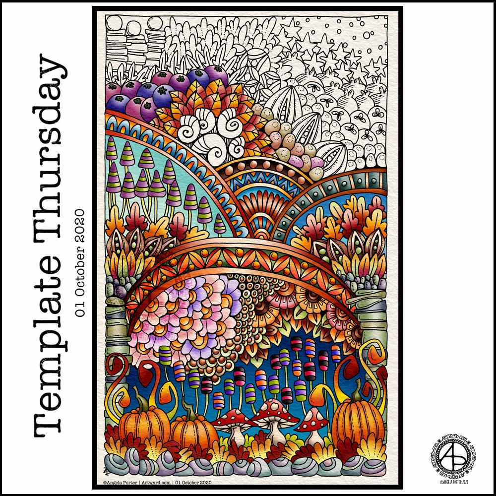
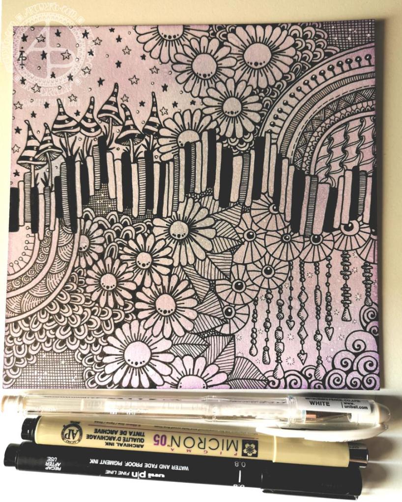
I spent the morning, before running some errands, drawing tomorrows colouring template for the members of Angela Porter’s Coloring Book Fans facebook group. On my return, I scanned it in, cleaned it up and started adding some colour to it.
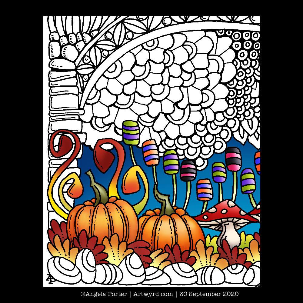
So, today, I thought I’d share a sneak peek of part of the template. Tomorrow, it’ll be revealed in all it’s, ermm, entangledness, and will be available for members of the facebook group to print and colour.
Drawn with Unipin pens on Canson marker paper. Colour added digitally using Autodesk Sketchbook Pro.
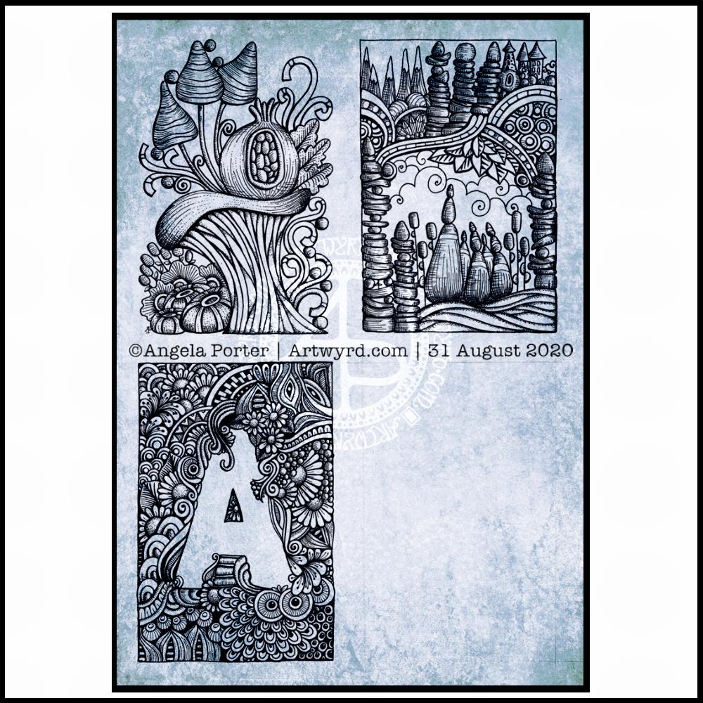
I finished the top right design, and have completed the ‘A’ illustration on the bottom left. That leaves one space to be filled, no doubt later today.
I’ve used either Faber-Castell Pitt Artist pens or Uniball Unipin pens to complete the drawings on ClaireFontaine’s Paint-On mixed media paper. This paper is fairly weighty (250g/m²) and has a lovely velvety feel to it.
The only pencil lines I’ve used have been to delineate the ‘boxes’ to draw in, and for a couple of the design elements in the top left image as well as the A.
Reflecting on the designs
The white space in the top left design works really well I think, and is quite an accomplishment for me. The same is true, to a lesser extent for the top right design. In both cases, the white space brings attention to the design.
In contrast, the densely pattered area helps to bring out the monogram A, making the white space the focus of the design.
I think I’m going to work on some more monograms in this style. They are fun to do, and dense, entangled patterns are one of my signature artistic voices. It’s been a long time since I’ve completed art like this, with a lot of detail to bring out dimension/volume in the design.
In fact, I’ve enjoyed using line and stipple to add volume in all the designs, exploring how I like to do this as I go. All the work I do with colouring books means I have put this to one side. It’s interesting how I’ve circled back to this style. It’s even more interesting to look at how my drawing skills have developed and evolved over time as well.
I found some peace, contentment and joy while drawing these, and feel a sense of accomplishment, particularly with the two on the left.
Do I prefer digital or traditonal drawing?
A difficult question to answer. I think it depends on what I’m creating.
I really do enjoy using pen on paper. I get a better sense of the overall design. Paper and pen is very portable too – whether I’m sketching when out and about, or drawing in different places at home.
Drawing on the screen of my Surface Studio with a pen is a lot like drawing on paper. The smoothness of the screen makes it a very different tactile experience. It also is great for inking in sketches. It also makes correcting mistakes or re-working areas a lot easier, and there are techniques I can use that are near impossible or very time consuming when working traditionally.
Sometimes, the lines produced digitally are too perfect. I’m still working on developing the brush styles that will mimic the unevenness of an inked line. I do have to use some element of line-smoothing as I draw; without it the lines are really wobbly, but with it they can be too perfect and I lose, to a degree, that personal and unique way that my pen moves on paper.
I also find it difficult to have a sense of proportion or detail when working digitally, even though I can look at the design at the same size as it will be printed. The ability to zoom in and work on a small area means I lose all sense of relative size and complexity/detail of a design. So, if I’m going to work on a drawing digitally, I prefer to start with a sketch to give me that sense of scale.
I rarely sketch out my design when I work on paper, except if I need the outlines of a design element as I’m drawing. I do tend to work very intuitively.
So the answer is, I prefer each for different purposes, and also to suit my different moods and purposes.
Of course, once I’ve drawn a design, I then have to decide if I want to add colour, and then what media I will use – traditional or digital!
Today, I thought I’d digitally colour one of my recent drawings. I thought it would be nice to compare and contrast digital colouring with traditional colouring.
It’s been a while since I did much art digitally, I’ve been lost in traditional media this week as I slowly heal from some emotional wounds. Art helps with healing. Meditation helps too. But time is still needed for the healing to take place, and for rest to relieve the exhaustion that lingers still.
Any kind of art, digital or traditional, soothes my mind, emotions and body.
What I like about digital art is the way I can get such high contrast in colours to enhance the sense of volume the design elements have. I also like the vibrancy of colours. I also like the ability to add texture to the colour in so many different ways.
Of course, I like the ability to alter colours when they don’t work, without having to start over. I’m not sure if those leaves are going to stay that particular green-ish colour. Nor am I sure about the background colour.
As is my wont, I’ve used Autodesk Sketchbook Pro to add the colour and textures. My hardware is a Microsoft Surface Studio and Surface Slim Pen.
I have been really enjoying drawing tiny botanicals in little ‘windows’. So, I combined drawing with watercolor practice.
The image on the left involved me using a pencil to draw the boxes and their contents, then watercoloring. For some, I tried painting the image in sections and with layers of colour. I really wasn’t happy with the results. I painted the rest of the boxes with washes of watercolour and then either inked or re-drew the designs in pencil. I felt happier with these.
I used Daler-Rowney Smooth watercolour paper and I’ve been struggling to get the paper to stay wet enough for long enough to mix colours wet in wet. Not even on these tiny little windows. It was becoming very frustrating.
A couple of days ago, I’d ordered a pack of 100% cotton rag paper and it arrived early evening. I used a small piece of it for the illustration on the right.
I started by painting rectangles of colour on the paper. I used a waterbrush rather than a paintbrush for this. I used the same kind of transparency of watercolour for each as I did for the illustration on the left. Oh my gosh, did the colours shine and show up so much more vibrantly! Not only that, it was so easy to mix colours, wet in wet. The cotton rag paper is an absolute joy to work with!
I was beginning to get frustrated with myself and watercolors once again. This has been a common feature of my love-hate affair with them over many years. This paper may change that totally.
This morning, after letting the paper dry, I drew tiny botanicals in each window. I used, as in the image on the left, a 005 Sakura Pigma Micron pen to draw with. I was worried it would struggle with the paper’s rough texture. The lines aren’t as uniform as they’d be on, say, smooth Bristol board. I just went with the rougher nature of the lines and was surprised at how much I enjoyed them. They meant I loosened up my drawing style a little.
I really enjoyed creating these little artworks (the one on the left is approx. 5″ x 5″, the on on the right 4″ x 4.75″). There is something I find really satisfying about creating teeny tiny drawings, in the same way I find drawing intricate designs makes something inside me smile.
What I do want to try later on today is adding some more colour to some of the design elements on both drawings using both watercolours and watercolour pencils or inktense pencils. On second thoughts, I think I’ll do some samples to experiment on, annotate and add to my journal, just in case I don’t like what transpires.
Before I do any of that, I woke with a headache. It’s beginning to shift, but as it lifts it’s leaving me feeling really tired.
Another day on lock-down, and I started the day by colouring a Strathmore Bristol Board tile with Distress Inks, then drawing. You can see the result above, sorry for the poor photo.
The random generated tangle pattern for today is ‘BB‘, and it’s the wavy set of blocks across the middle of the design. The rest of the design is made up from some of my favourite patterns and motifs, as well as a few dangle designs.
The overall design doesn’t feel as if it flows. That may be a reflection of my emotional state, which is a mixture of anxiety, fear, being overwhelmed and exhausted.
So, self-care is in order. So that’s doing things that won’t frustrate me, or that won’t having me feel that whatever I do is rubbish.
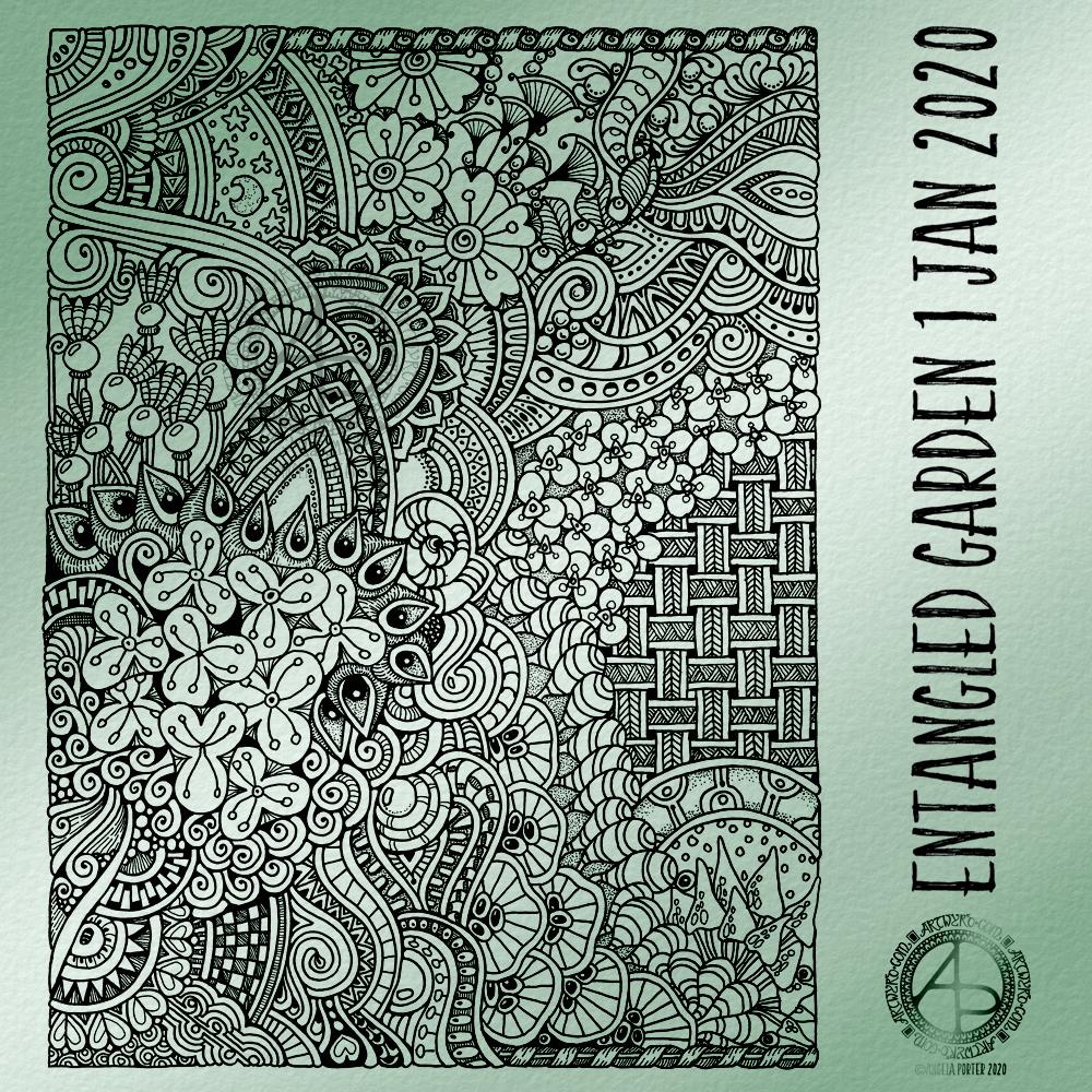
Today, I have another entangled drawing for you to enjoy. I worked on it over the past couple of days. I think it’s taken me around six or seven hours to complete.
Because of all the floral and botanical motifs I’ve called it an Entangled Garden. A garden that has grown from my intuition and imagination.
I’m enjoying drawing these kind of illustrations at the moment. I really do have a fondness for botanical motifs, but also for arches and patterns inspired by Romanesque and Gothic architecture. There’s also some influence from Zentangle patterns too.
I’ve not added any shading to increase depth and dimension. There are places in the design that could benefit from a hint of shadow. However, I’m happy with it as it is.
As a drawing, it is a bit too fussy with intricate details to work as a coloring page as far as traditional media are concerned. However, I do know some colourists who would love the challenge of colouring a design like this!
Having said that, this kind of design, with less details, would be perfect for my next coloring book which I do need to start work on soon. I need the cover done for the publishers by the end of this month. So, I can take inspiration from the drawings I’ve been doing recently, though I do have some other ideas rattling around my brainbox too.
I used Uniball Unipin pens, along with ClaireFontaine dot grid paper. The size of the drawing is approx. 7.5″ x 10″.
I added the background colour and texture digitally, after removing the dots from the dot grid paper.
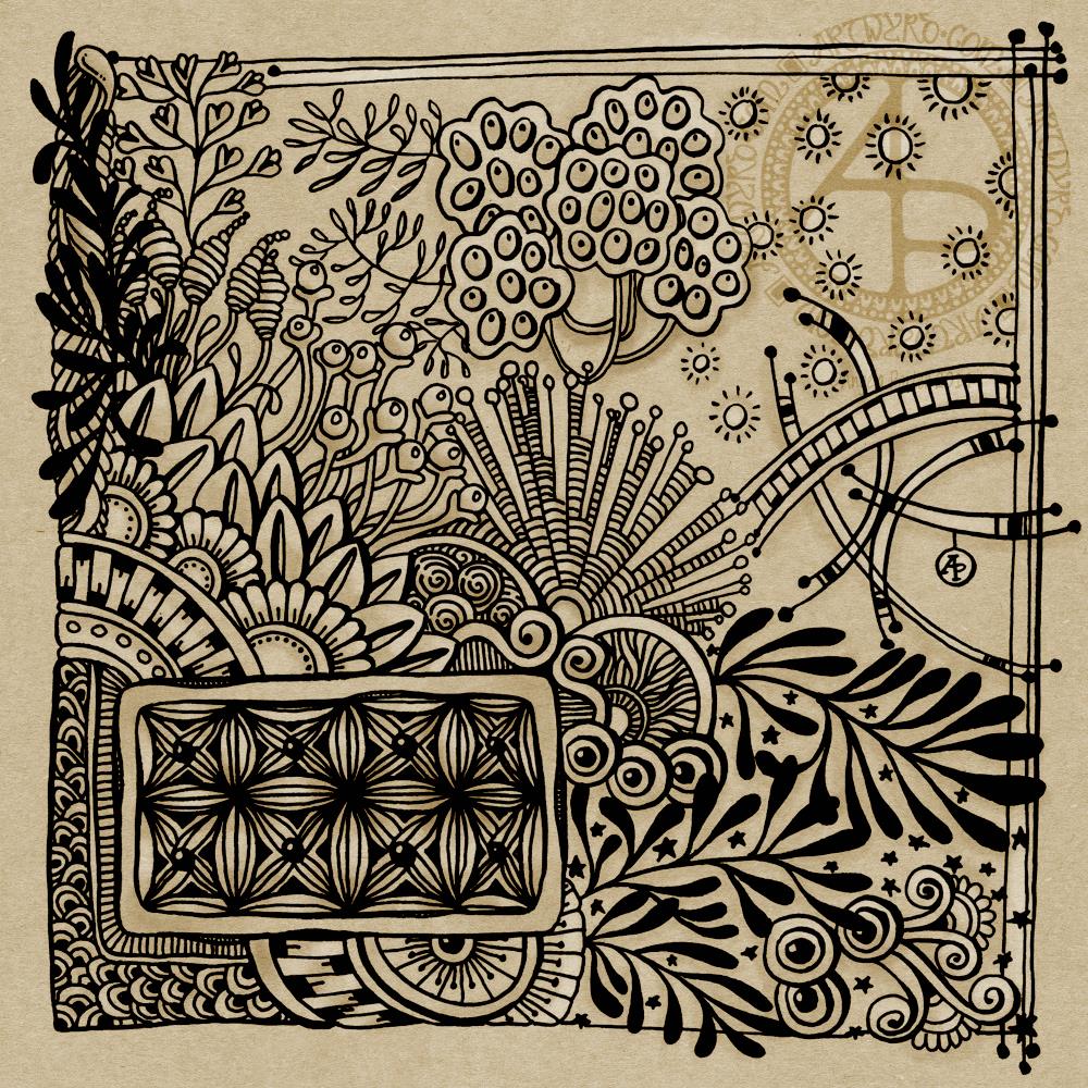
Yesterday evening, I took a combination of Tombow Fudenosuke, Sakura Pigma Micron and Faber-Castell Pitt Artist pens to a 6″ x 6″ piece of Strathmore vellum surface Bristol Board. I ended up with a black and white entangled drawing. This morning, I scanned the image in and added a kraft paper background and then some subtle shading and highlights in Autodesk Sketchbook Pro.
After Inktober and my focus on digital art, it was nice to draw traditionally for a change. My mood and energy levels were such that I needed to slip back into the familiar, comforting entangled style of art to soothe my emotions once again.
This drawing worked out OK. However, I don’t feel it flows at all well, though that does reflect yesterday’s mood and mindset.
The part I really like is the rectangle towards the bottom left. I’m also fond of the arcs to the right. Actually, I like all the design elements, I’m just not happy with how they’ve been lumped together. Maybe I’m just being overly self-critical here.
It’s a sunny Sunday morning in the Valleys of South Wales. I think it’s going to be a quietly artsy day, with a trip out for some essential groceries in a short while I think.