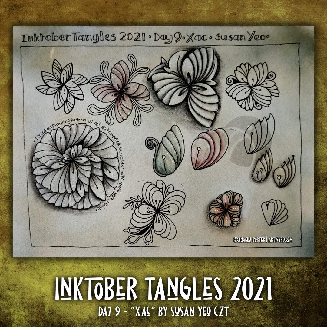
Today’s tangle is ‘Xac’ by Susan Yeo CZT. It’s another floral kind of pattern, which has plenty of possibilities for variations. This sketchbook page contains just a few. The spiral variation reminds me of a succulent. I particularly like the individual leaves/petals; they look like odd seedpods, and that is something I’d like to explore more, maybe.
Sketchbook Saturday | My week in art.
In this vlog, I look back at the first nine days of Inktober.
I’ve had a lovely tangle-y, arty, creative morning. Some good stuff. Some experiments that worked, some that didn’t quite. Either way, I have two more pages in my sketchbook filled with explorations of Zentangle patterns.
On the left is the page of explorations of Morrisseau by Cheryl Moote CZT. The white lines in the wavy border are just … too stark and a clear line/edge that I don’t like much, at the moment. I much prefer the dotty embellishments! Having said that, the white lines that turn areas of the design into shell-like fragments work rather nicely. The more I play around with Morrisseau, the more it’s becoming one of my favourite tangle patterns. I have a lot more exploring to do with it, no doubt too.
On the right is a page of explorations of today’s tangle, Zenith, by Zentangle Inc. This was kind of fun to play around with, some ideas more successful than others. less colour on this page, but plenty of dots and white highlights!
As these are pages in my sketchbook, I feel no need to finish them completely. They’re there as a reference for ideas growing forward. Also, they’re a record showing how I’m working at developing both patterns and addition of colour, shadow and highlight.
For colour, I’ve used Graphitint pencils with a damp brush to activate the colour and gently spread it out. I like the earthier tones much more than the bright and intense colours of the Ecoline pens at the moment.
For shadow and highlight on the Zenith page, I used charcoal pencils. Now, these I like far more than graphite pencils. They don’t add any shine at all. Hurrah!
For white highlights, a white Sakura Soufflé pen was used, both before and after adding colour/shadow/highlight. With the charcoal pencils it really needs to be added afterwards as the charcoal is abrasive enough to stick to the dry pen. With graphitint it doesn’t matter. Indeed, the way colour pools around the white dots/lines adds depth and interest to the colour.
I’ve also used some metallic paints that are fairly opaque in some of the drawings. I enjoyed doing this, especially as I could add different shades of gold to add a highlight. I think I’ll be using these more going forward; they give a much smoother finish in large-ish areas than a metallic gel pen would. I like smooth finishes with metallics. The uneven colour that results from spreading the graphitint pencils pleases me too.
Taking part in Inktober Tangles 2021 is spilling over into this week’s coloring page for the Angela Porter’s Coloring Book Fans facebook group. The result is a rather geometric design which has a very tiled floor or stained glass feel to it. The quadrants could be coloured in separate colour schemes to, say, represent the four seasons, four favourite colours … well anything really. I’ve just completed one quadrant as an example.
The tangle pattern for today is ‘Morisseau’ by Cheryl Moore CZT. I’ve included it, and a couple of other tangle patterns, in my typically entangled artwork to the right. I’ve started to add colour in rusty browns and oranges with blues. The brighter colours are Ecoline Brush pens. The more muted areas are Graphitint pencils with a damp brush. I think I prefer the Graphitint areas. They have a much more aged, vintage, weathered feel to them.
A sneak peek of part of this week’s coloring template for the Angela Porter’s Coloring Book Fans facebook group.
As I’ve been immersed in Zentangle patterns as part of the Inktober Tangles 2021 challenge, it’s no surprise that this template is full of tangle patterns.
Oh, I enjoyed creating this page so much! I absolutely love botanical patterns, but I also have great affection for grid-based, repeating, symmetrical patterns.
Brrst, by Kelly Barone CZT, is one of those grid-based patterns. It’s based on a square ‘fragment’ that is rotated around a central point. The final pattern has so many possibilities for adding shadow and highlight.
I used the original Brrst in a ‘crazy’, assymetrical grid, which was a lot of fun to do.
However, what I loved the most was playing with the basic idea and modifying, exploring the possibilities. The ones I like best are where I’ve added spirals in the ‘tucked under’ circular area.
I think the triangular variations could be interesting to work with, but I’m not at all fussed on the circular ones.
My internal debate is whether I go back to sleep, or whether I work on this week’s coloring template. I’ve been awake since before 4am (it is Wednesday, so my grocery delivery arrives around 5am most weeks!), so it won’t be long before I can’t keep my eyes open.
I do know that this sketchbook page is all I’ll do today for the Inktober Tangles 2021 challenge. I think I’ll be putting aside the official Inktober challenge for now. I find I’m enjoy the Tangle challenge far more. Also, I do need to turn my attention soon to the templates for the Adorable Dogs book for Creative Haven, due out April 2022.
Well, I pushed on yesterday and finished this particular drawing. Lots of texture/patterning has been added. I’ve also temporarily added a pale grey-blue background until I decide how I want to add shadow/highlight/colour to this particular drawing.
I won’t be doing that today, however. I’m still feeling all out of sorts and I really don’t trust myself with colour, shadow and highlight. I’ll get frustrated and irritated with myself. I also woke with a headache that isn’t clearing up anytime soon it seems.
So, today is likely to be another day of binge watching stuff. Yesterday it was The Killing on Disney+. A dark tale of murder and the crazy awful ways humans tangle their lives with others it seems.
It’s an American version of a Danish noir murder/mystery series. I started watching the Danish version, with subtitles, quite a few years ago, but mislaid the DVDs. It’s full of twists and turns in the story line, and a surprising ending to the first story line – the murder of Rosie Larsen. And it’s nice to be surprised by such a tale for a change.
So, I think I’ll spend a fair amount of today finishing watching season 3 and making a start on season 4, the final season.
Once the headache clears, I may turn my attention to some arty stuff. I’ll see how it goes. Self-care is important, not just physically but emotionally too. I know from bitter past experiences that if I push myself to do things when I’m not up to it, whatever I do usually ends up disastrously. I still feel the guilt of giving myself time and space to return back to a point of balance, but I know that when I do return to that point the guilt will fade away and be replaced with relief and a sense of gratitude that I didn’t give into to the guilt. There’ll also be a touch of pride that I’m strong enough, now, to recognise when I need this time to just lose myself in fiction, do nothing else, and let whatever is the cause of the imbalance work itself through.
I suspect the headache is an expression of that imbalance and is the way my mind, body and soul have of telling me, “Woah there Angela! You have to stop and take a break from this, now! You’ve pushed yourself too far, so I’m going to get you to stop and do other things for a while.”
I am learning to listen to what I need, rather than what I think I should be doing. So, today, I will listen to them.
Dimensions : 8cm x 8.5cm (3¼” x 3¾”) Smooth cartridge paper (acid free) Uniball Unipin pens (05 and 01) Digital editing and colour in Autodesk Sketchbook Pro
I drew this little drawing yesterday, but spent some time this morning scanning, cleaning and adding colour and shading digitally.
I deliberately left some ‘white space’ so I could fill it with colour. This contrasts rather well with the graphic black and white entangled art design. The coloured background adds depth to the image, and the subtle shading by grey and textural lines adds volume to the design elements and layers.
I often think I struggle with colour, unless I use a limited palette. This is a way to make use of colour in a way that adds interest to the design without detracting from the line work.
I have been really enjoying drawing tiny botanicals in little ‘windows’. So, I combined drawing with watercolor practice.
The image on the left involved me using a pencil to draw the boxes and their contents, then watercoloring. For some, I tried painting the image in sections and with layers of colour. I really wasn’t happy with the results. I painted the rest of the boxes with washes of watercolour and then either inked or re-drew the designs in pencil. I felt happier with these.
I used Daler-Rowney Smooth watercolour paper and I’ve been struggling to get the paper to stay wet enough for long enough to mix colours wet in wet. Not even on these tiny little windows. It was becoming very frustrating.
A couple of days ago, I’d ordered a pack of 100% cotton rag paper and it arrived early evening. I used a small piece of it for the illustration on the right.
I started by painting rectangles of colour on the paper. I used a waterbrush rather than a paintbrush for this. I used the same kind of transparency of watercolour for each as I did for the illustration on the left. Oh my gosh, did the colours shine and show up so much more vibrantly! Not only that, it was so easy to mix colours, wet in wet. The cotton rag paper is an absolute joy to work with!
I was beginning to get frustrated with myself and watercolors once again. This has been a common feature of my love-hate affair with them over many years. This paper may change that totally.
This morning, after letting the paper dry, I drew tiny botanicals in each window. I used, as in the image on the left, a 005 Sakura Pigma Micron pen to draw with. I was worried it would struggle with the paper’s rough texture. The lines aren’t as uniform as they’d be on, say, smooth Bristol board. I just went with the rougher nature of the lines and was surprised at how much I enjoyed them. They meant I loosened up my drawing style a little.
I really enjoyed creating these little artworks (the one on the left is approx. 5″ x 5″, the on on the right 4″ x 4.75″). There is something I find really satisfying about creating teeny tiny drawings, in the same way I find drawing intricate designs makes something inside me smile.
What I do want to try later on today is adding some more colour to some of the design elements on both drawings using both watercolours and watercolour pencils or inktense pencils. On second thoughts, I think I’ll do some samples to experiment on, annotate and add to my journal, just in case I don’t like what transpires.
Before I do any of that, I woke with a headache. It’s beginning to shift, but as it lifts it’s leaving me feeling really tired.
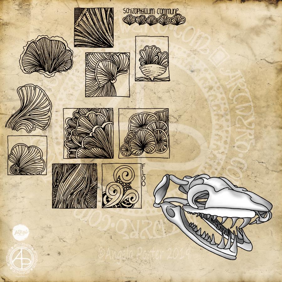
I’m a day late posting this Inktober drawing. My plans for yesterday went somewhat awry as I went to help out a friend in need. So, no beating myself up for the tardiness!
The prompts of the day were a snake skull, the Schizophyllum commune fungus and the Floo tangle pattern (from Instagrammers @book_polygamist, @nyan_sun and @havepen_willdraw respectively).
I started with the fungus as I really wasn’t really enthused by snake skulls. The caps and gills of the Schizophyllum c. formed lovely shapes and lines, and so I focused on areas of them to do some small drawings using a Sakura Pigma Sensei 04 pen on dotgrid paper. All I wanted to do was capture the flow of the lines and the interesting shapes and patterns too. I wanted to keep it simple, so no shading or highlights – just pure pattern.
As I was drawing the squares filled with line and pattern I was reminded of how I used to create sketchbooks while doing my AS and A level Art exams around 15 or so years ago. I used to colour the pages or use interesting paper to draw on and collect the patterns and shapes that really interested me. I often focused on small areas of the object of interest and drew the details in squares and rectangles. I added an example of the Floo tangle pattern to a rectangle, just to make sure I’d included that challenge for the day.
So, it was a natural segue for me to add the grungy, vintage paper to the background as I turned Inktober Day 12 into more of a sketchbook page.
I was also reminded of how I used to use charcoal and white pastel or chalk to draw on coloured papers, and I thought I’d do that with the skull, but with my signature black outlines. I drew this digitally, and mimicked the process of laying down charcoal and chalk and blending the colours. I think I’ve managed to do that quite successfully digitally, though, yet again, I could have done with a bit more contrast in places.
So, rather than an illustration that combines all three prompts for the day, I’ve ended up with an interesting melange of images.
If I were to spend more time on this page, I’d add some highlights/shadows and maybe colour to some of the drawings of fungi. I’d also overlay some dot grid paper to the background. I’d also add some hand-lettered information and commentary on the drawings.
However, if I did that it would eat into my time to take on Day 13 of Inktober today, as well as get some work done for commissions/contracts.
This one has taken many hours to do, and I’m not quite happy with the background colour/texture, but I need a break from it.
I drew the black and white line art on paper with Sakura Pigma Micron pens, scanned it in, created a transparent background and then coloured it digitally.
I used Autodesk Sketchbook Pro with a Microsoft Surface Pen on my Microsoft Surface Studio.
Fun to do. A nice way to spend time, jut playing. And it’s unusual for me to colour in one of my black and white pieces of line art.