I drew this design in my latest YouTube video, which premieres today, 16 July 2023, at 21:00 UK time.
It’s a draw with me video, where I show you how to draw this design, step by step. I also do some colouring, shading, highlighting and addition of texture patterns. I don’t, however, complete the drawing in the video.
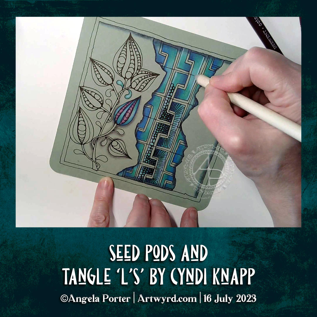
Currently, I really enjoy drawing designs where there are layers included, like a collage or a break and the floor or wall to see what lies beneath or behind them.
Seed pods are one of my favourite things to draw. There are so many different kinds, both based on reality and imagination. Today, I stuck with the familiarity of plump, teardrop-shaped pods. The tangle pattern between the faux ripped edges is called L’s, and it’s by Cyndi Knapp. It is a bit of a challenge to draw, well, for me at least. It does result in a curious interweaving pattern, however, and is worth the time spent mastering it.
I used a piece of grey-green PaintOn mixed media paper from Claire Fontaine. The colours almost glow against the paper. To add colour, I used Derwent Coloursoft pencils along with tortillons and Gamsol to blend them.
Although I haven’t finished this drawing yet, I’m quite happy with how it’s working out.
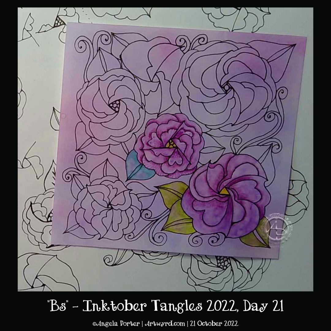
I have needed a couple of days of quiet time this weekend. I over-stretched myself last week in some ways. When I find inspiration lacking, I know I’ve overdone it. Hopefully, these two quiet days will give me renewed energy to carry on with the illustrations for Daydreams, my next colouring book. The self-doubt and fear that I’m not good enough – imposter syndrome – has awakened for some reason, and it robs me of my oompf. I will push through it, however. I always do.