This week’s colouring page (or template) is drawn and I’ve added a little colour to it. I decided to feature some of the tangle patterns I’ve been exploring in the last couple of days. These are Ginili, Gingo and Fragment D3.
It’s really unusual of me to stick to a fairly limited number of patterns/motifs in my drawings. It was a really good experience!
I was so tempted to use the space between the stems of the Gingo leaves to add various blues, making it a bit like stained glass. I didn’t this time. Maybe for tomorrow. I’m not too keen on my colour choices today. Perhaps I really do need to get to grips with the idea that a limited colour palette is best for me and to stick to it!
That’s if I can drag myself away from the hand lettering course and practice that I’m so enthused about. I quickly show the pages completed so far in my lettering sketchbook in today’s video.
This week, a little more than usual, my thoughts have been on peace.
Mother Theresa said, “I will never attend an anti-war rally. If you have a peace rally, invite me.” The essence of this is that if we want peace, our thoughts, words and actions need to be on peace. That resonates with me a great deal, and I did before I’d heard of this particular quote!
However, if anyone wishes to send me an email to Artwyrd at AOL dot com, I can send them to you.
I was born in the early 1960s and have a sister who is ten years older than me. I was, from my birth, surrounded by music and imagery of the hippy era. So, it’s natural that some of the symbols of that time can be seen in my drawings.
Art is my way of not just expressing my creativity but is a way to take my mind off worries and troubles and to focus on more positive thoughts. Any creative activity that you can lose yourself in, not being aware of your thoughts, brings a sense of peace and calm, relaxation and pleasure. Colouring has the same effect on the mind as mediation, something else that I do.
Both templates were drawn with fineliner pens on paper. Colours and coloured backgrounds have been added digitally using ClipStudio Paint.
I started this drawing yesterday evening. It’s not finished yet and, as always, I’m not entirely sure where it’s going. Intuitive art is me it seems!
This is being drawn on A4 marker paper with a Fountain Pentel pen – which is a disposable fountain pen with a plastic nib that allows different thicknesses of lines to be drawn. It’s actually rather nice to draw with.
I’ve added a light creamy-brown background digitally.
I realised that I haven’t drawn a mandala in quite a while. So, that’s what I did! Intricate, geometric and organic repeating patterns. It was a pleasure to do.
I’m quite happy with the highlights and shadows on this one, and keeping it all monochrome works for me today as well. A calm and soothing green – just what I need today as I’m still recovering from the stress from earlier in the week.
Tools – Microsoft Surface Slim Pen, Microsoft Surface Studio, Autodesk Sketchbook Pro.
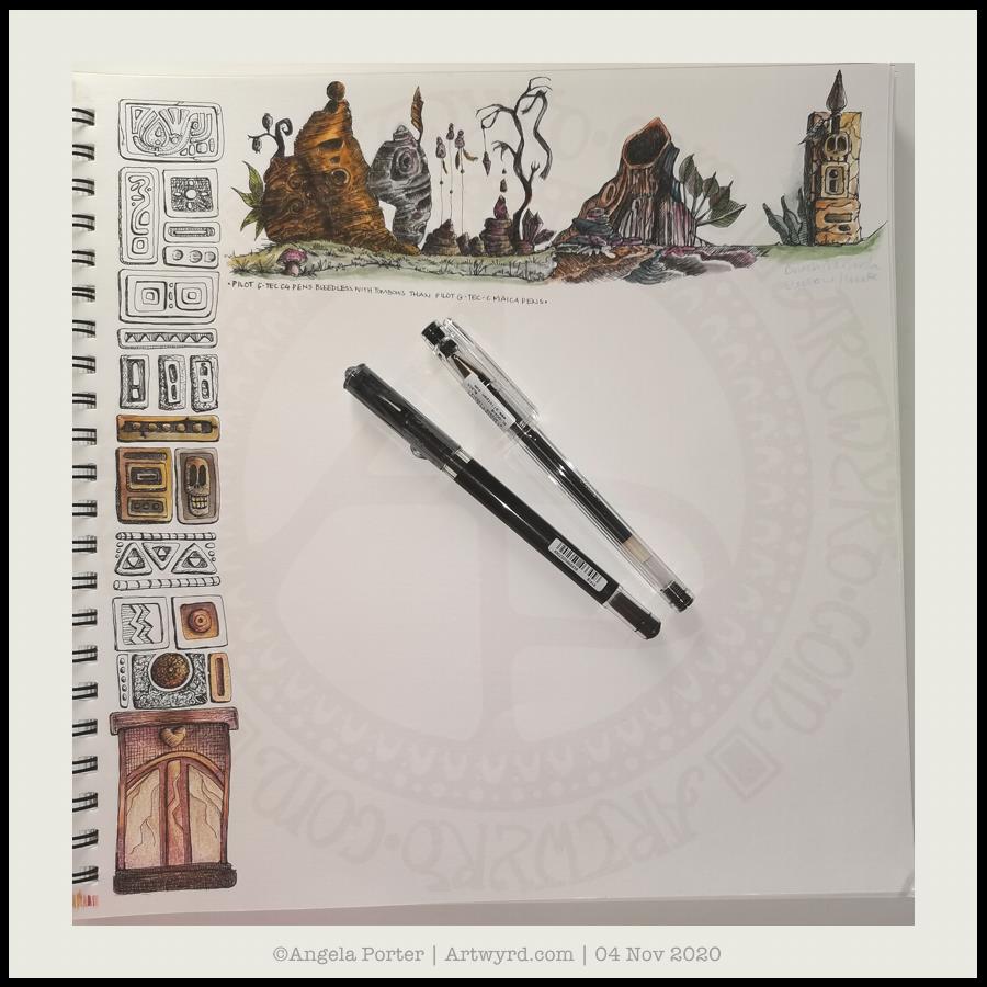
As it’s work in progress (WIP) Wednesday, I’m sharing my current sketchbook page. A sketchbook is always a work in progress.
At the moment, I’m being inspired by a couple of books : “Fantasy Genesis” by Chuck Lukacs “Fantasty World Building” by Mark A. Nelson
I’m using an Art Gecko sketchbook that is almost 12″ square along with Pilot Hi-Tec C and Pilot G-Tec Maica pens and Tombow Dual Brush Pens.
I’ve said it before – I’m not really into characters (unless they’re cute, whimsical, fun ‘doodle’ kinds of characters, usually non-humanoid). However, I’ve always loved to draw plants and patterns as well as designs from architecture, nature, machines and even animals (patterns, textures and such more than the animal itself).
My ‘Entangled’ drawings bring together these various elements to create more abstract or whimsical designs. But to put them together to create entirely new things isn’t something I’d ever thought of.
I’ve always admired fantasy and sci-fi artists, but never considered myself capable of anything like that. However, trying new stuff out is how you grow and develop as an artist.
Not that I’m going to become a fantasy artist, but maybe exploring these avenues will allow me to add new things to my art in ways I never expected. In much the same way my adventures in cardmaking, mixed-media journaling, watercolour and other such things have helped me to develop my digital art and drawing.
I’m also realising how important sketches are for my digital art – be it drawing or painting or just colouring in line-art of mine. I think it has to do with me being able to have a good overview of the whole design, something I seem to be unable to do when working digitally, even when I zoom out entirely. I’ve mentioned it before, but I do have a bit of a problem relating to size and scale even in everyday life.
There’s a different kind of sensory pleasure in working on paper – the tactile and sensory feedback is quite different to that gained from digital work. That’s not to say I don’t get pleasure from working digitally, it’s just different.
There’s also the fact that each page doesn’t have to be a complete or finished piece of work. It’s a place to try things out, explore, experiment, and just let the pen/pencil/brush take a walk across the paper to see what happens. Serious work and not so serious work all have a place in a sketchbook.
As do written notes, ideas, observations, sources of inspiration, lists, reflections and more.
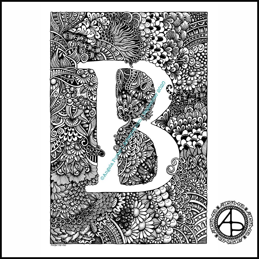
Finally finished it! It’s taken many hours to do – probably around 15 I think, and it’s taken some perseverance by myself to get it done.
Uniball Unipin pens (05, 03 and 01) on Claire Fontaine Paint-on mixed media paper. Two pen nibs now wrecked; the paper is velvety smooth to touch, but just too rough for the tips of the Unipin pens. Will move to Bristol board for the next monogram.
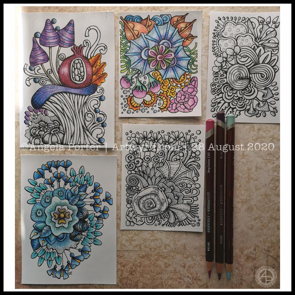
Over the past couple of days I’ve been drawing small designs in pen, including plenty of line detail to add volume and shadow.
Today, I scanned the drawings in and printed them out (after cleaning them up a tad digitally) so I could try colouring them.
I wanted to print them on mixed media paper, which I know my printer will take. However, even with clean scans, the prints were really messy. However, when printed on ordinary paper, the prints were pristine.
I wasn’t happy as I wanted to use a paper with a bit more ‘tooth’ so I could make use of the Derwent Colorsoft pencils. But, I persevered and the results are above.
The first I coloured is in the top middle. My colour sense isn’t always wonderful. Lots of colours, but it just doesn’t feel coherent in any kind of way.
So, I moved on to the next design. This time, I thought I’d use analogous colours (colours next to each other on the colour wheel), with a touch of a complementary colour to add brightness. Complementary colours are opposite each other on the colour wheel.
I like this second one much more. It feels cohesive, like everything belongs together. And the little bursts of yellow/orange just lift it all.
The third design I’ve been colouring is only partly done. I’ve veered away from entirely analogous colours, but I am trying to keep the colour palette simple and with, perhaps, an autumnal feel to it.
As I was working on printer paper, I needed to use some way to blend the colours. I remembered I had some ‘Zest-It’ blending solution and some paper torchons. They worked well. The big frustration was that I couldn’t lay down intense colour. However, as these are prints, I’m not too worried. I do need to find some toothy paper which will go in the main paper drawer of my printer. I do have some cartridge paper here somewhere which should go through it.
Of course, scanning the drawings in means I can also work on adding colour digitally. It means I can try things out until I’m happy with the results.
Pesky printers
I never have much luck with printers. Inkjet printers die on my quickly, even the more expensive professional ones. I thought I’d try a laser printer, but I seem to have problems with this one now not giving clean prints when I use the sheet feeder for specialist papers.
I don’t print much out, to be honest, but it’s frustrating when I want to print artwork out on specialist paper.
A note to self about colour.
What I have learned is that I like to watercolour the designs, but then the addition of coloured pencils to intensify the colours and add shadows works really well for me. I like the intense contrasts that I can get with coloured pencils that I just can’t seem to achieve with watercolours.
Of course, I can always colour digitally, which lets me play with colours, change them, until I get something I really like.
Today, I’ve had a reminder that limited palettes, particularly of analogous colours, seem to be working rather well for me, especially with those accents of complementary colours.
I really do need to put a big ‘note to self’ where I can see it to remind me of this. I can get carried away with colours
After trying out watercolours with my line art, I thought I’d try using coloured pencils.
I dug out some Derwent Professional coloured pencils, and found their leads very hard; my finger joints don’t like working with media that need a lot of pressure.
I then remembered the Derwent Coloursoft pencils that I had somewhere. Their leads are softer and more easily laid down. So, I dug them out and rediscovered how lovely they are to use!
That means I went to town adding colour to the uncoloured motifs, and also to some that had been finished to add contrast and depth.
And it’s another ‘aha!’ moment. I love the Coloursoft pencils, and they work well when combined with watercolour it seems.
I panicked a little when I wondered if Derwent still made them. They do! So phew! So, I get to use coloured pencils again, coloured pencils that my finger joints like.
I went on to draw some more designs, working out how to add depth and dimension with line work. They are drawn in my sketchbook – colour gradient and texture added to try to protect my artwork. These are much more my ‘entangled’ style of art.
Once that page is complete, I will scan the drawings in so that I can, if I wish, add colour digitally, or print them out to try out different colour palettes or different media.
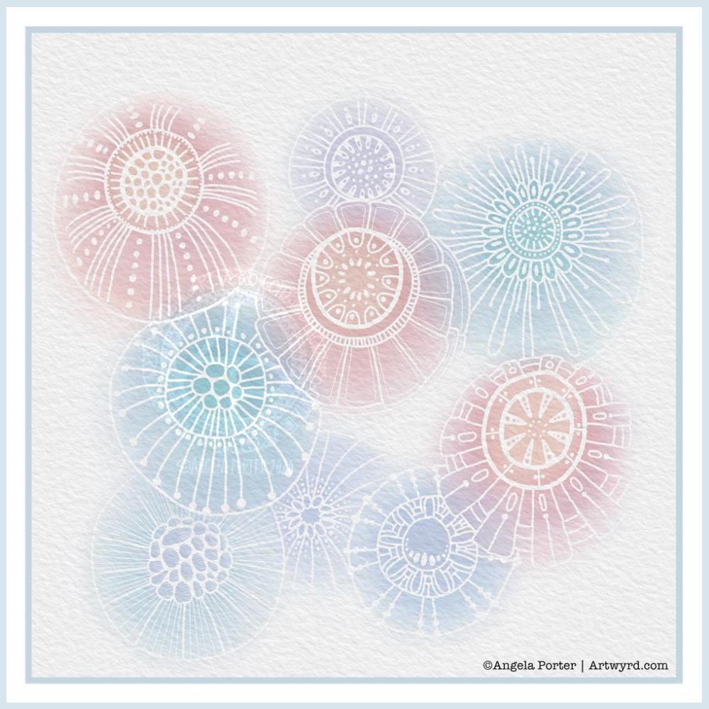
Another morning, another play around with watercolours, this time digitally.
Soft balls of watercolour, fuzzy edges, with white ink details added on top. Layers of transparent colour.
I overlaid a watercolour paper texture, which helps give the right ‘feel’.
This is my favourite attempt at digital ‘watercolours’ so far. I definitely like using white ink in this instance; black ink was just too harsh, hard and jarred uncomfortably with the softness of the watercolours.
I tried lots of ways of adding colour; not just brushes, but different brush effects. In the end I was happiest with white ink.
A nice way to spend a couple of hours as I wake up.