Template Thursday

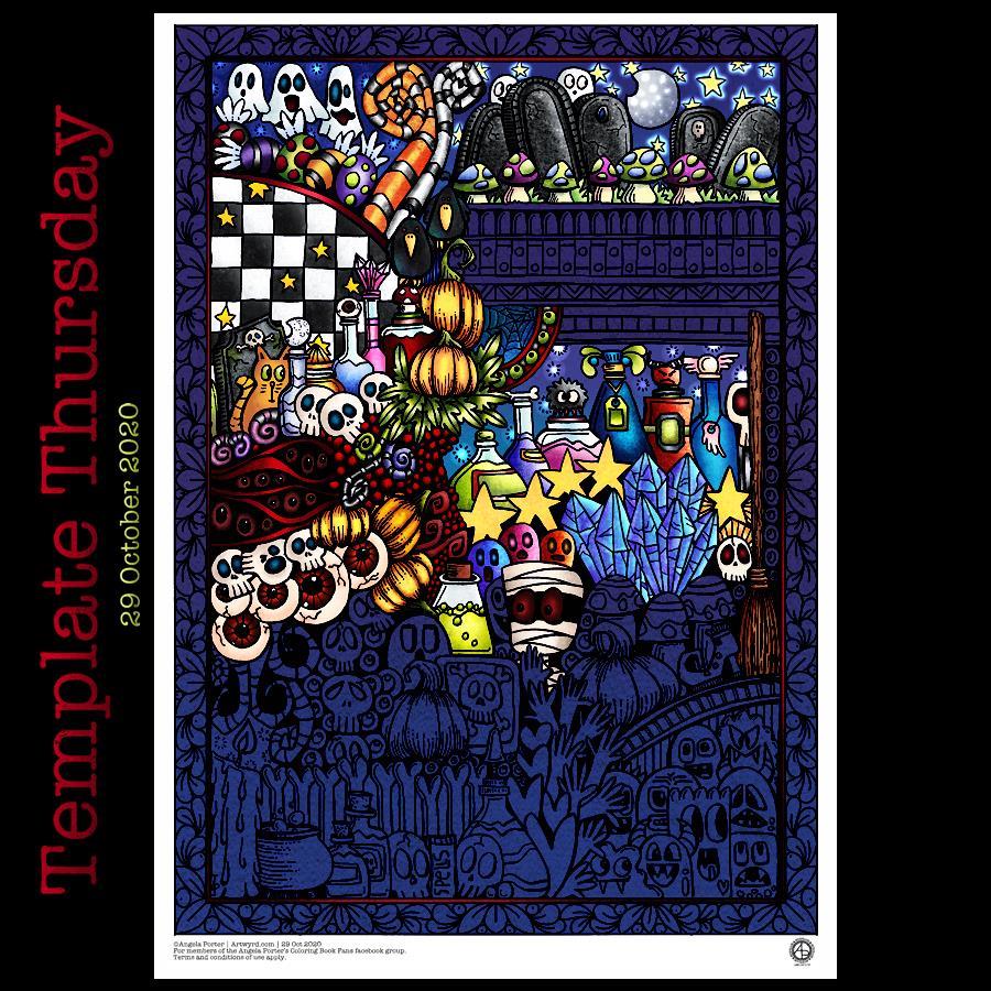
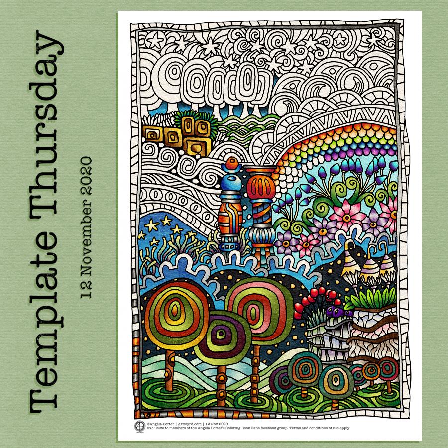
It’s that time in the week where I post a coloring template for the members of the Angela Porter’s Coloring Book Fans facebook group.

This week’s offering is a typically Entangled design, with some inspiration from Hundertwasser – the lollipop trees and pillars particularly.

I bore in mind my musings yesterday about me and straight lines and left a wiggly, wriggly, wobbly border around the design. I also made some of my arches deliberately wonky and wobbly too.

I drew the design with Rotring pens on cartridge paper. After scanning in, I edited and coloured the design in Autodesk Sketchbook Pro.

It was a nice way to spend some time yesterday. I didn’t feel too good when I woke up, but as the day went on I distinctly felt unwell. The recurrence of the fatigue, upset tummy, lack of focus. Overnight, my sleep was really disturbed by dashing back and forth the loo.

As I’m finding it hard to focus for a couple to a few days at a time, thanks to these recurring bouts of illness, I’ve decided to take a break from the weekly templates until the end of the month. The book I’m working on is due to be finished by then and I need to use what energy and focus I have on that.

I’ll try to blog daily, perhaps with sneak peeks or sketchbook work, or blasts from the past. But if I miss a day, it’s because I’m either overwhelmed by work or fatigue as I go through another cycle of this illness.

I do think it has everything to do with the illness I had back at the end of December 2019. Sickness, diarrhoea, extreme fatigue, loss of taste and smell, brain fog, loss of appetite. I get repeats of the illness, albeit it much less severe.

I know it’ll pass in a day or two and I’ll be back to my usual self. But for now, I need to look after myself, and make sure I get my work done too.

Sketchbook Musings

Over the past week or so I’ve been gradually adding to this sketchbook page. It is entirely what a sketchbook should be, in my opinion. Pages full of ideas, sketches, unfinished drawings, practice of techniques, written notes… a visual zibladone for the creative soul!

It is a reflection of what is catching my attention in my world. That world encompasses the inner worlds of imagination and emotion, as well as the outer world of books, nature, architecture, photographs, and so on.

This page includes inspiration from Mayan glyphs/sculpture, rocks, nature, mushrooms, magic wands/staves/sceptres, pen textures and some inspiration from Hundertwasser.

Everything on the page is a bit wonky (not perpendicular), and I’m OK about that – it’s a sketchbook! But then wonky art, particularly colouring pages, seems to be part of my signature style. Perfectly straight lines just don’t look right to me, nor do sharp corners. Perhaps that’s why I like Hundertwasser so much.

The English gardener William Kent said, “Nature abhors a straight line”. Hundertwasser said, ” The straight line is godless and immoral.”

A sketchbook is always a work in progress (WIP), even when every page is full, it’s full of incomplete drawings and ideas, sketches and notes, jottings and doodlings. Nothing has to be perfect. Not a single thing.

A sketchbook is a place to try things out, experiment, just see what happens. With that comes an acceptance that not everything will work out, and where surprising things happen and discoveries are made that may otherwise never happen.

Sometimes the gems of ideas and colour combinations and ways of using media remain hidden until much later. A sketchbook is a place to practice and learn, to note down what is of interest at this time, what needs to be expressed, without any pressure to produce a finished, polished artwork.

That doesn’t mean, however, that a sketchbook can’t be something interesting to look at, even with it’s own kind of beauty. They are a reflection of the artist that creates them and so is a window into their arty heart and feelings. They are very personal things.

A sketchbook encourages me to use media that are gathering dust because I do so much art digitally. In a physical sketchbook, if I want any colour, then I have to use some of these media.

On this one page I’ve used Pilot Hi-Tec C4, Pilot Maica, Rotring Rapidograph and Uniball Unipin pens. To add colour, watercolours, Tombow Dual Brush pens, Derwent ColorSoft pencils, Derwent Procolour pencils, Derwent Inktense pencils have been used.

Quote

If the quote applies, I have no idea what my morning drawing says about what my art says about the world! Perhaps it says more about my inner world – imagination and emotions. I’ll let you decide that one.

All I know is that my Tuesday morning art has been influenced by the drawing I’ve been doing for the coloring book I’m currently working on. Cute. Doodle-y. Fun. Using colour for the sake of colour. Lots of colour.

I drew the design with an 0.5 Rotring Rapidograph pen on Rhodia dot grid paper. Next, I scanned it in, cleaned the drawing up and added colour digitally. Finally, background, texture and quote were added.

A nice way to spend the first three hours or so of my day before I turn to other things, like breakfast, shower and maybe even a walk if the weather keeps dry.

Remembrance Mandala

In Flanders Fields – John McCrae

In Flanders fields the poppies blow
Between the crosses, row on row,
  That mark our place; and in the sky
  The larks, still bravely singing, fly
Scarce heard amid the guns below.

We are the Dead. Short days ago
We lived, felt dawn, saw sunset glow,
  Loved and were loved, and now we lie
      In Flanders fields.

Take up our quarrel with the foe:
To you from failing hands we throw
  The torch; be yours to hold it high.
  If ye break faith with us who die
We shall not sleep, though poppies grow
      In Flanders fields.

Today is Remembrance Sunday, the closest Sunday to Armistice Day, 11 November 1918.

Armistice Day marks the end of World War I, at eleven minutes of the eleventh hour of the eleventh day of the eleventh month, 1918.

In the UK it is held to commemorate the contributions of British and Commonwealth military and civilian service men and women during both World Wars, as well as in later conflicts.

In the pink

It’s funny how colours seem just right one day, and the next day I wonder what on earth I was thinking at the time.

Yesterday’s mandala, with it’s kind of yellow-brown background just doesn’t seem ‘right’ today.

I often mention about how I feel I really struggle with colour at times, but feel much better if I stick with simple color palettes, even monochrome ones, more or less.

So, this morning I wanted to draw a mandala, as is so often the case. They give me a chance to practice drawing digitally and using pattern and texture within them too.

The drawing was just fine and dandy, nearly always a pleasurable experience and I end up with a design I like well enough.

Then, there’s the coloured background. Today I wanted a soft pink colour. I like the colour I’ve chosen. Black lineart would look start on it, to my mind, but a soft, warm, cream was just perfect. It looks almost like lace.

And I can breathe a sigh of relief as my faith in my colour sense is restored somewhat. Monochrome is the way to go, unless it’s coloring templates. Though perhaps I should try a monochrome colour scheme for them, or at least analogous colours with a pop of complementary here and there. I’ll see what happens.

For the rest of my day, I’m going to be gathering sketches of ideas and elements for the coloring book I’m working on, and creating a mandala has got me somewhat in the right frame of mind to do this.

WIP Wednesday

As it’s work in progress (WIP) Wednesday, I’m sharing my current sketchbook page. A sketchbook is always a work in progress.

At the moment, I’m being inspired by a couple of books :
“Fantasy Genesis” by Chuck Lukacs
“Fantasty World Building” by Mark A. Nelson

I’m using an Art Gecko sketchbook that is almost 12″ square along with Pilot Hi-Tec C and Pilot G-Tec Maica pens and Tombow Dual Brush Pens.

I’ve said it before – I’m not really into characters (unless they’re cute, whimsical, fun ‘doodle’ kinds of characters, usually non-humanoid). However, I’ve always loved to draw plants and patterns as well as designs from architecture, nature, machines and even animals (patterns, textures and such more than the animal itself).

My ‘Entangled’ drawings bring together these various elements to create more abstract or whimsical designs. But to put them together to create entirely new things isn’t something I’d ever thought of.

I’ve always admired fantasy and sci-fi artists, but never considered myself capable of anything like that. However, trying new stuff out is how you grow and develop as an artist.

Not that I’m going to become a fantasy artist, but maybe exploring these avenues will allow me to add new things to my art in ways I never expected. In much the same way my adventures in cardmaking, mixed-media journaling, watercolour and other such things have helped me to develop my digital art and drawing.

I’m also realising how important sketches are for my digital art – be it drawing or painting or just colouring in line-art of mine. I think it has to do with me being able to have a good overview of the whole design, something I seem to be unable to do when working digitally, even when I zoom out entirely. I’ve mentioned it before, but I do have a bit of a problem relating to size and scale even in everyday life.

There’s a different kind of sensory pleasure in working on paper – the tactile and sensory feedback is quite different to that gained from digital work. That’s not to say I don’t get pleasure from working digitally, it’s just different.

There’s also the fact that each page doesn’t have to be a complete or finished piece of work. It’s a place to try things out, explore, experiment, and just let the pen/pencil/brush take a walk across the paper to see what happens. Serious work and not so serious work all have a place in a sketchbook.

As do written notes, ideas, observations, sources of inspiration, lists, reflections and more.

Monday Mandala

Weird, weird art.

I have absolutely no idea what I was thinking as this mandala was created, nor why on Earth I chose these colours.

As it’s digital art, I could use digital tools to re-colour the image, but I’ve decided to leave it as is.

I know I wanted to do something that used similar techniques to the digital abstract paintings I’ve been exploring lately.

Similar. Perhaps. But definitely not the same kind of thing.

It’s like something out of a weird nightmare, or some bizarre, manufactured virus.

I think I can safely say my artistic mind is out of sorts today!

Fantasy Genesis

I think it may have had something to do with a book I briefly scanned yesterday. It’s called “Fantasy Genesis – A creative game for fantasy artists.” by Chuck Lukacs.

This is the introduction to the book:

Welcome fantasy geneticists! Here is a practice place of the imagination, a place where infinitely diverse forms and patterns will create concepts in infinite combinations, which you will bring to light with pencil and paper. One of the most important jobs we have as artists is to create inventive new ways of watching and documenting this beautifully diverse planet that allows us to live on it. We’re expected to see the world—from our cultures, habitats and technologies to the vast diversity of wildlife and plant life to the pores in our skin—in a slightly different light. Like scientists, we’re expected to experiment with new ways of expression, new sounds, new interpretations of old ideas, new solutions to old problems and new inspirations for images and change.

Fantasy Genesis – Chuck Lukacs

It caught my attention. As did the use of dice and tables for combinations of features appealed to me.

Not that I’m a fantasy artist. But it has sections to do with plants and landscapes and machinery and buildings. Things I am interested in. Creatures and characters not so much. I admire people who can draw such things, and create amazing artworks. However they really don’t have much interest for me artistically, apart from pattern, shape and texture.

I thought it may be a way for me to extend my drawing and imagination, as well as making more use of a sketchbook. I also thought that once I get my head around this kind of thing, I could create my own lists, incorporating patterns and favourite kinds of motifs to use too. I’ll see about that.

I know that my signature style of art is ‘entangled’ with some cute and whimsical elements from time to time and mandalas. I like working with abstract patterns and colours too. But exploring other genres, ideas, styles can only develop and add to my artistic skills and visual vocabulary. Even if I discover that some things are not for me, they will lead me down artistic avenues I may never have traversed.

So, one of my tasks today is to take time to properly read this book and work out how I can make the ‘game’ work for me!

Template Thursday

This week’s template for the Angela Porter Coloring Fans facebook group is another Hallowe’en themed one, the last one this year.

I always have a lot of fun with Hallowe’en themed designs, and this one is no exception. Lots of skulls, potion bottles, eyeballs, ghosts, monsters, pumpkins, toadstools, gravestones, and more!

It’s taken me several hours to colour in just a portion of the design. I’m going to try to finish this one off in time for Hallowe’en.

Drawn with pen on paper, digitally coloured.

The template is available for members of the Angela Porter’s Coloring Book Fans facebook group – free to join, and free to download. Terms and conditions for use apply.

Strata

Arty musings

I’ve been awake since silly o’clock. I have a delivery due before midday, so while awaiting it I have been arting.

This started off as a simple line drawing of patterns from the strata of rock formations of Raplee Ridge, Utah. Then, I added some patterns between them, zentangle or entangled style. I used fineliner pens on paper to do this drawing (left image).

My next job was to scan the drawing in and tidy it up digitally. Then, I thought I’d colour the design in. I kept to fairly earthy tones for this (middle image).

Finally, I thought I’d do a pure colour study of the line art. And I really like this one. I’ve played with shadow and light to give a sense of dimension to the artwork (right image).

I’m really pleased with the pure colour image. Not just for choosing a fairly pleasing palette, but for finally discovering how to use textured brushes to draw, colour and texture the different areas.

I’ve done work like this with traditional media, but have never really had much success digitally. It seems I have found some confidence here.

It does remind me of work I did some 15 or so years ago while studying for A level art as an adult, and how much pleasure I got from that. Now, as back then, I used simple colour palettes.

I suspect I’ll be doing more work like this – line art of patterns, followed by a coloured interpretation of those patterns. My mind is ticking over whether I could include some typography in these kinds of artwork too.

Moody mutterings

My mood is better today, I’m pleased to say. I’m not sure if it’s rest, self-care, Star Wars, knitting, art, or a combination of all these things that has helped lift it.

I know that my mood has weather, just as the world does. And in Wales, the weather can be changeable and varied! But like all weather, the gloom passes and sunshine returns. Though I wouldn’t say I’m sunshiny, I am content with a soft glow within. That is good enough for me, and for today as it’s rather wet and gloomy outdoors.

Saturday arty day

Artsy ramblings

Today I’m feeling a tad ‘meh’ to say the least. I’m tired despite sleeping plenty last night and yesterday. The weather is gloomy – leaden grey skies and rain. At least the autumn colours are glowing a little in the gloom.

So, today I just needed some arty fun. Nothing too big and overwhelming, something with a little whimsy, and no pressure for anything other than making art for art’s sake.

Hallowe’en is my favourite festival, so that’s where I started, along with pen and paper.

The drawing isn’t all that big – 8cm x 10 cm approx (3.25″ x 4″),s o it was relatively quick to complete. I scanned it in to tidy it up, but decided to add a spooky border around it, which I did digitally.

Then, I set to colouring the image, in Hallowe’en colours, mostly.

I played with texture brushes and how I can work with colour. I’m pleased to get some areas that seem to glow eerily. My brain won’t let me fully process that or go back to the image to add this effect to other design elements.

It was, after all, a few hours of fun, arting for art’s sake, and to do what I can to lift my mood.

Polymer clay

I spent sometime yesterday afternoon playing with polymer clay. The Sculpey clay I purchased is soft enough to work with almost straight out of the packet, which is a good thing.

I’m not entirely sure how I’m going to work with it. What I thought would work just didn’t for me. So, I’m going to let the ideas rumble around my subconscious and come up with how I could work with the clay my way.

I was disappointed with myself, but worked hard be easy on myself as this is a new skill to learn and develop. It won’t happen overnight. Also, there’s no rush or panic to get it done either.

In the meantime, I’m wrangling with myself as to whether I should invest in a pasta machine to roll out the clay or whether that’s a decision that can wait until I work out if polymer clay is for me or not.