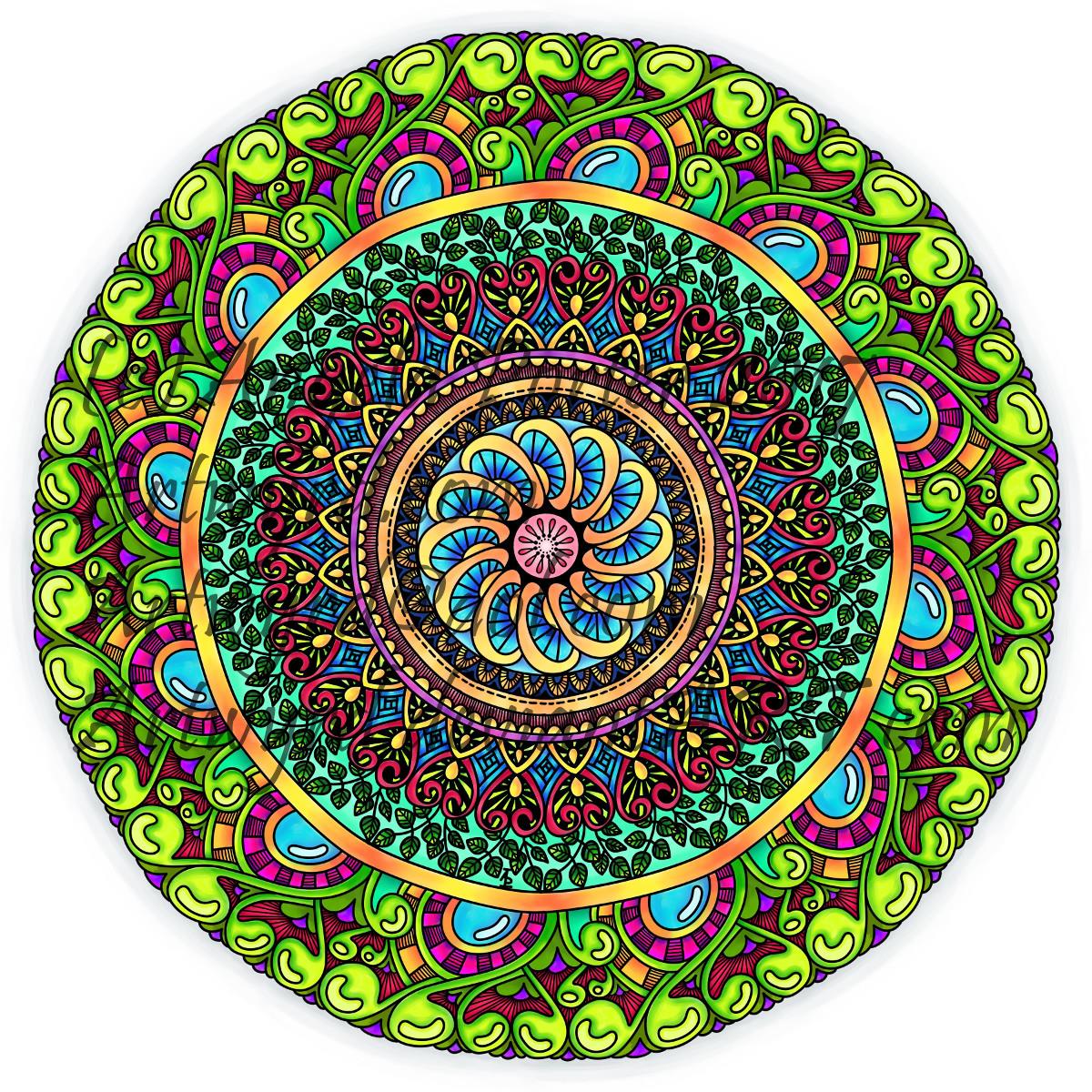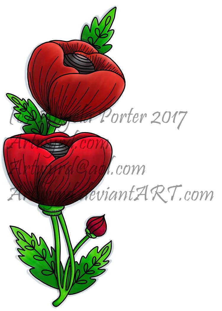
As you know, I’ve been spending quite a lot of time developing a good relationship with both my Microsoft Surface Book and Autodesk Sketchbook Pro.
I’m fairly happy with drawing on the surface, though I’ve yet to get the texture of the ‘pen’ I use to be a little less perfect and a bit more ‘human’. There’s also the issue of not quite getting how big patterns will be when printed out, and then finding out that a powerful magnifying glass along with microscopically fine pointed pens/pencils will be needed to colour the patterns if not done digitally.
Now, I have mostly been printing my designs out and then colouring them with traditional media; particularly my Chameleon Color Tones and Color Tops marker pens. I do love doing this – it’s a very sensory experience.
However, I am aware I have a different tool for colouring viz. Sketchbook Pro and it’s suite of brushes and textures and so on.
Believe it or not, it takes me longer to colour an image in digitally than it does with traditional media, and I mean a LOT longer.

I love the way the colours are clean, almost glowing, when I use the marker pen ‘brush’ or one of the watercolour brushes. I’m getting to grips with which particular kind of blending or smudging ‘brush’ I like to use. I’m starting to get the idea of working with layers.
What is vexing me, is how ‘perfect’ the finish is, and how simple it looks. I wonder if it is way too simple a finish. It also frustrates me that I’m kind of trying to replicate the effects of traditional media but with digital tools, and failing as everything either works out almost perfectly blended with bright, clear colours, or ends up as a bit of a mess as I try to use different brushes or textures.

A dear friend of mine pointed out to me that I’m trying to compare apples and oranges, that perhaps I should treat digital colouring as an art medium all of it’s own instead of trying to make it like traditional media.
It was also pointed out that I do have a tendency to give myself a hard time when things seem too easy to me, or end up too perfect.
All of the images in this post have been coloured digitally, and the colours have shading/gradation in colours, but there’s no texture in them. But then, there’s little texture in the colouring when I use marker pens, such as my Chameleons or Copics, unless I deliberately add it, which I’m always disappointed with. I much prefer to add texture with black lines, which I need to bear in mind now as I work with digital colour.
I also recognise that I need to do a bit more to make more ‘contrast’ between the paler and darker shades of colours, as well as making sure there’s good deep shadows to add that illusion of 3D to the drawings.
I will continue to experiment and explore the other digital media and brushes, as well as special effects, and in time I may work out how it can all work for me in a way that I’m happy with.


