I’m now feeling a little better this evening and I thought I’d create a dangle mandala (dangle-dala?) to mark the publication of ‘A Dangle A Day’ today.
I drew this using my Microsoft Surface Pen on the digital paper that is my Microsoft Surface Studio screen using Autodesk Sketchbook Pro. I then coloured it using the same tools.
If you’d like to print and colour this design in, please follow the link and join the group. You’ll find some other coloring templates there too that are only available to members of the group.
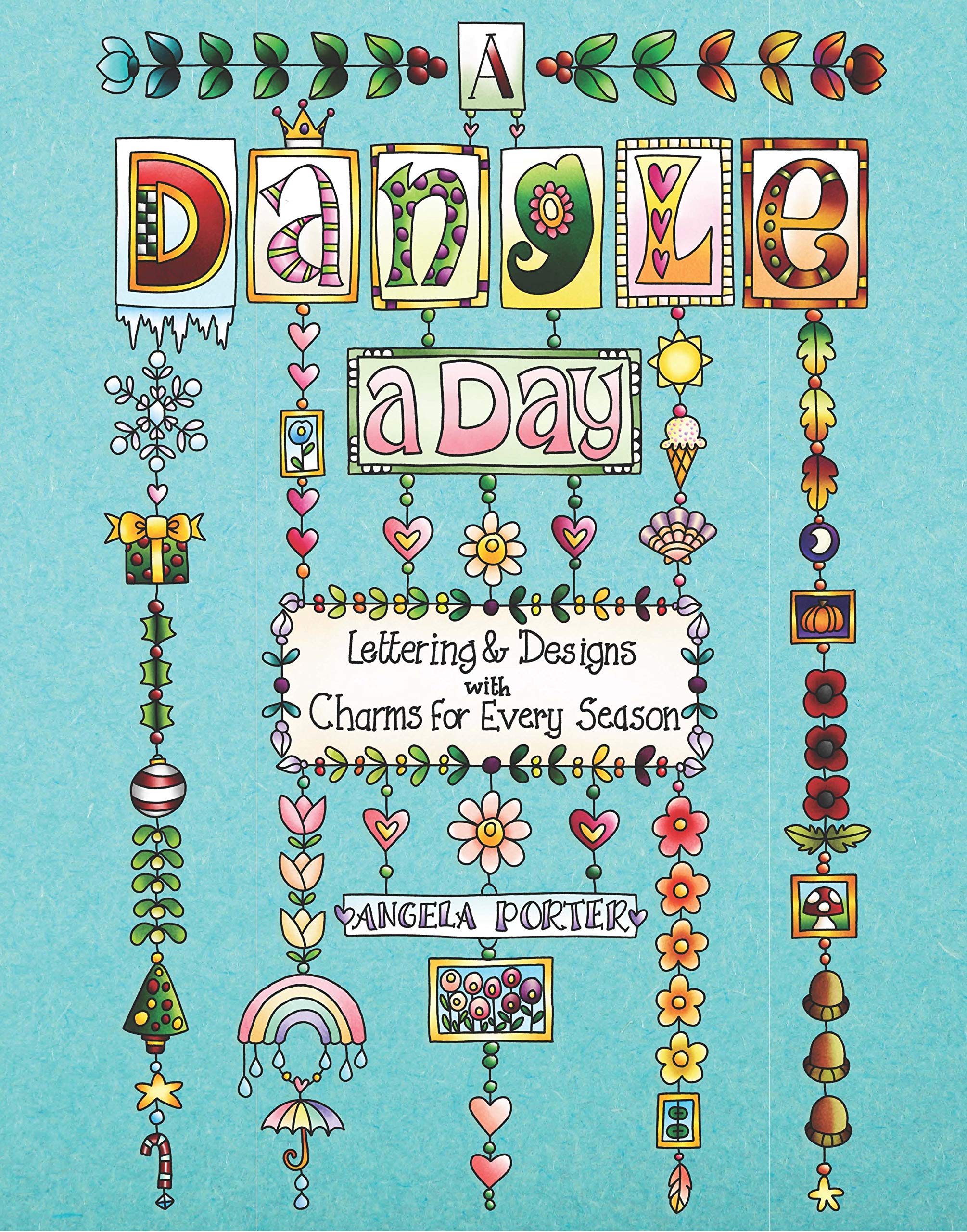
Dangle designs are a lot of fun to create. They’re whimsical, cute and a lot simpler to draw than they look! I take you one step at a time through how to draw well over 100 different dangle designs in the book, as well as making suggestions about where you can use dangle designs and with words of encouragement.
If you do have a go at drawing dangle designs, and colouring them of course, I’d love to see what you create and how you use them!
Today’s the day! A Dangle A Day is published in the US. Thursday is the day for the UK. It’s my very first tutorial book and the reviews I’ve seen so far are lovely!
Well over 100 dangle designs in the book with step by step instructions for each. Simple steps leading to even quite complex designs. Whimsical, cute charms. Funky monogram dangles. Plenty for each season and most occasions. I’ve also written encouraging words as everyone can draw dangles and they are perfectly imperfect which is what makes them personal and unique!
I’d love to see what dangles you create and how you use them – in your bujo, planner, journal, diary, scrapbook, or as greeting cards, note cards, book marks, gift bags, envelopes, framed art, or any other way you can think of! Tag me on twitter, instagram or facebook!
Naturally, I have a stinking, streaming cold and I feel rough as anything. I don’t think I’ll get much in the way of art done today. Coughing, sneezing, runny eyes and a thumping headache don’t do much for focus.
Today has been a funny kind of day. I have a stinking cold and I had an appointment late morning. When I came home this afternoon, I decided I’d do another mandala made up of dangle designs and design elements from my book ‘A Dangle A Day’.
I just let the design flow from the tip of my Microsoft Surface Pen and onto the virtual paper that is my Microsoft Surface Studio screen. As always, Autodesk Sketchbook Pro is the app that lets me draw and colour naturally on the Surface Studio screen.
I incorporated some of my favourite design elements – hearts, stars, sun, moon, flowers, leaves – into the mandala. A big mug of tea and a nicely sweet cake could be most welcome, though I’m not entirely sure the cold would let me enjoy them.
I also included some of those graphic black and white squares that I like so much, as well as a rainbow pattern of little arches. A morning sky and a night sky as backgrounds to the rings in the mandala completes this rather cutely whimsical mandala design.
Although I don’t show how to create dangle-dalas in the book, they are easy enough to do using dangles and design elements from the book.
It goes without saying that I’m all excited about my book being published tomorrow. I’m really hoping some of you will share your dangle designs with me – I really am curious and interested in how you use dangle designs!
Following on from yesterday’s blog post (One dangle design, four colourways) I thought I’d do another monogram dangle design, but this time adding some embellishments.
The design for the Q monogram comes from my book ‘A Dangle A Day’ (published on 15 Jan 2019). I printed the design out on heavyweight printer paper and used a combination of Chameleon markers, Copic Markers and Chameleon pencils to colour the designs. The original drawing was hand drawn using a Microsoft Surface Pen on a Microsoft Surface Studio using Autodesk Sketchbook Pro.
Once I’d finished the colouring, I then added some embellishments. I’m not a good photographer and sparkly and shiny elements are not easy to photograph, and even worse to scan!
Here’s the details of the embellishments I added:
Aqua coloured Nuvo Glitter drops can be seen dotted around and within the design. These really sparkle and catch the light; they also dry raised, like a sparkly water drop. I also used a Wink of Stella brush pen to add subtle sparkle to the hearts and flower. Then, I realised that the Q was lost in the blue background which was similar in tonal value to the letter. So, I used an extra fine fountain pen to add a pattern made of various sizes of tiny circles to the background.
I just used gold Nuvo drops to embellish the design as well as Wink of Stella to add some subtle shimmer to the hearts and flower.
I used a Spectrum Noir clear sparkle pen to add shimmer and shine to the letter and the hearts. Dots of silver Nuvo glitter drops were added around the design. I also used a gold glitter Uniball Signo pen to add dots to the letter and the centre of the flower. Finally, I used an extra fine fountain pen with black ink to add the patterns in the frame. This helps the letter to stand out in the design. I also used Sakura Stardust Gelly Roll pens to colour in the arrow feathers. These pens allow the underlying colour to show through in a subtle way.
Orange-gold Nuvo glitter drops were added around the design. The clear Spectrum Noir sparkle pen was used to add shimmer and shine to the letter and the dark blue ‘bars’ in the frames around the Q. Finally, I used the extra fine fountain pen with black ink to add patterns to the bars and the letter as well as a solid drop shadow to the left and bottom of the design elements to help them stand out.
These designs could be used for note cards or greetings cards, bookmarks and more. However, they’d make a beautiful ‘drop capital’ at the start of a quote or message.
Of course, it would be easy to substitute the Q for another letter or numeral, or even a cute doodle drawing. Instead of a drawing, you could affix an object such as a dried flower, a metal charm, a dimensional sticker, an inchie, or anything else you can think of. You could even put a small photograph in the frame instead of the letter, and this would make a unique, charming card or feature on a scrapbook, journal or bujo page.
Your options are only limited by your imagination and creativity!
While checking out the release date (which I’ve been getting a tad wrong, oops!) I noticed there were some reviews of the book. I’d like to say thank you to all the reviewers who wrote such lovely words about the book! It’s filled me with a bit more confidence and belief in myself as this is my very first art tutorial book.
There’s some hand lettering with the letter A. The letter A has dangles forming the inner part of the mandala. Then, the outer ring has simple and cutely whimsical doodle designs and yet another dangle forming it.
Of course, hearts and stars had to appear; they are my favourite design elements for many of my projects. I also like beads and gems too. Flowers and foliage are also favourite motifs, as are spirals.
I decided the ring of A’s need to be in a rainbow colour scheme and I chose a bright colour scheme for the design elements.
It looks complicated, but if you look at just one A and follow the dangle towards the centre and the design out to the outer rim you’ll see that it really isn’t all that complex.
Of course, drawing mandalas on paper can be time consuming. I usually draw mine digitally.
Autodesk Sketchbook Pro is now free and it’s my drawing software of choice. It has a symmetry tool that is really easy to use. You only draw one segment of the mandala which is then automatically repeated around the circle. I find Autodesk Sketchbook intuitive to use, and it’s easy to use almost straight away. It also has some rather sophisticated features on it and it does all that I need it to do, and more. I use a Microsoft Surface Pen along with Microsoft Surface Studio to draw and colour digitally, and they work wonderfully with Autodesk Sketchbook Pro.
I do colour my designs digitally. However, sometimes I will print out the black line art and then use traditional media (often Chameleon markers) to bring the line art to life with colour.
I do hope you will have a go at creating your own dangle designs. They look complicated, but they really aren’t! If you do have a go, then please share your designs with me on any of my social media homes – facebook, instagram, twitter or here!
Today has been a bit of a busy day. I woke still drained from yesterday’s EMDR therapy session. No EMDR though as I was just too emotional and ‘raw’ to go through it, so it was a lot of talking around how one trigger event had caused several trauma ‘streams’ to rise and flood and confluence. I was stuck at that confluence where white water rapids had formed and I was being buffeted about in the eddies and currents and waves.
So, it was self-care last night when I got home, which involved a bag of chips from a local chippy, with curry sauce, Harry Potter and the Goblet of Fire and starting to crochet an amigurumi ‘dumpling cat’ from a new book that was delivered yesterday. Then, there was the journal writing before I went to bed.
This morning I had to be up early to go give an anti-stigma talk to a group of police officers. That drained me emotionally once again. However, it was a good thing to do as they all found my talk really interesting and useful. My Time To Change Wales champions hat was polished up a little bit once again.
I came home and finally had some breakfast and ended up in bed to sleep. That’s one of my coping strategies when I’m so emotionally drained. I still feel dazed and dazzled by it all, but am on a bit of a more even keel now.
I didn’t want to let the day pass without doing something with pen and paper or screen. Hand lettering seems to be my thing at the moment so I thought I’d have a go at hand lettering some of the days of the week.
For reference I used the Lombardic Capitals set in ‘Decorated Lettering’ by Jan Pickett.
They appeal to me partly because the space inside the letters lends itself so much to adding patterns, but because of their oldy-worldy nature. I love Anglo-Saxon, Celtic and Medieval illuminated manuscripts and this style of lettering, in a slightly more modern form, appeals to me.
I discovered it’s a lot easier to form the letters when you draw them big – hence why their size increased from Monday to Wednesday.
Dot grid paper is a godsend as it helps with the consistency of size of the letters, though I suspect that as I become more comfortable with my skills that I may experiment more with that.
A nice way to spend an hour or so this afternoon, and I have the rest of the days to look forward to doing, along with adding patterns to the open letters.
Mind you, the letters without patterns would look lovely just coloured with colour gradients, and I’d love to add metallic highlights/accents too.
First, I need to get a bit more proficient at hand lettering and working on plain paper.
Of course, I can always scan my lettering in and remove the background and dotgrid so I can print it out on paper suitable for a colouring medium such as watercolours and metallic paints.
Cheating? No. I don’t think so. I would’ve already done the work in the first place. Printing and colouring is, to me, perfectly acceptable.
But that’s for another day. For now, I had to get myself sorted to pop out for the evening.
I’m also musing about adding some dangles to the letters – dangles with charms that are reminiscent of medieval ornament or jewellery, for example.
A knock at the door, a Fed-Ex delivery driver asking me for a signature before handing over a parcel. I saw it was from Lydia at Quarto so knew it would be a copy of ‘A Dangle A Day’. So excited to open the package and see the book in a solid, tangible form.
I’ve seen the pdf versions of the book as it was put together before going to print. But, it’s never, ever the same as having that book in my hands.
Even more so today as this is my first book with words and art done by myself. I trust it won’t be the last.
About the book
I had a lot of fun creating this book. I’m so excited about helping others to create their own dangle designs and to gain confidence that they, too, can create lovely designs for use in all kinds of ways – BuJo pages and spreads, greetings cards, note cards, framed pictures, scrapbooks, planners, journals, bookmarks, place cards, and more.
I’ve done my best to show you how to create monograms and dangle designs in easy steps both visually and with some supporting words.
Suggestions about how to approach hand lettering is scattered throughout the step by step instructions for the dangle designs.
Examples of dangle designs in use in bullet journals and more are included – with all their imperfections. Remember, work created by each of us will be perfectly imperfect. It’s those imperfections that make it uniquely ‘you’.
There’s lots and lots of examples of designs and dangles and charms that you can use as they are or as inspiration for other designs. There are designs for all seasons and many, many different events throughout the year.
I’ve included suggestions for color palettes, media to use.
A short primer for bullet journals is included; I’m no expert on bullet journaling but I do make use of one and find it very useful not just in organising my tasks for the day but in recording ideas, reflections, memories and more.
This has put a big smile on my face this morning, and that smile will continue for a long while. I never thought I’d write and illustrate an art tutorial book. I’d thought I’d like to, but didn’t have the confidence to think it would be so.
Why I chose to use digital tools
I made great use of my Microsoft Surface Book and Microsoft Surface Studio along with a Microsoft Surface Pen and Autodesk Sketchbook Pro to draw many of the designs. Working digitally made editing designs, breaking the design process down into simple steps so easy.
I used to think, as many do, that digital art is simpler, easier than traditional forms of art.
It’s not.
The skill set required is different. I wanted my digital drawing and coloring to look like I’d done it with traditional media.
Digital drawing is no easier than drawing on paper.
What is easier is correcting mistakes, smudges and removing pencil lines. It removes the frustration I experience in scanning images in and spending a lot of time cleaning the image up for the publishers. Scanning can be a frustration for me too, which would’ve been worse if I’d had to scan in step after step after step. And having to re-draw if I’d missed a step out, or re-scan would’ve driven me nuts.
What I didn’t want was artwork that looked too perfect, too inhuman. I wanted digital drawings that looked like I’d drawn them on paper. So, I worked hard to set up pen ‘brushes’ that would mimic how my favoured drawing pens would look when drawn on paper.
Also, I rarely used any line smoothing tools for any of the work so it has that slightly ‘wobbly’ line appearance that my pen and ink linework has. I also kept the design elements, called charms, imperfect just as they would be if I’d drawn them with pen on paper.
In fact, each and every design started out as either a pen or pen drawing on paper which was scanned in so I could re-create it, step by step, digitally, saving a file for each step to the computer.
There were plenty of revisions/edits required and colour changes. Again, working digitally make this a less onerous task than if I’d had to do everything with pen and ink on paper, scanning in each step all the while worrying I hadn’t missed a step as I got engrossed in the process of drawing.
Working digitally did not make the drawing any easier or simpler, what it did was allow me a different way to draw the steps.
Coloring the designs digitally was no quicker than with traditional media, in fact it took me longer! I learned a lot about this process by doing this book, and I think it was the book that allowed me to become more comfortable with digital art and how to make it look like I’d drawn with pen on paper, in my own style.
Of course, I can print out the line art and colour it with any media I choose. I also can redraw any using traditional media. And of course, adjusting the size is so easy.
I decided to use mongrams with dangles to form today’s prompt ‘Jolt’ for Inktober 2018. I also wanted to use a bright colour scheme to jolt eyes awake, perhaps.
I started by sketching the design out on Clairefontaine Grafit dot grid paper. I scanned the sketch in then inked it in and coloured it digitally using my trusty trio of Microsoft Surface Studio, Microsoft Surface Pen and Autodesk Sketchbook Pro.
I have absolutely no idea what the designs in the dangles have to do with the prompt ‘jolt’. They just came to me as I was drawing them out, and today that’s good enough for me!
Inktober 2018 is almost over and it’s perhaps time to reflect on it all.
It’s the first time I’ve taken up any art challenge, apart from contracts for work that is. I thought it could be a bit of an onerous thing to do, time consuming and so on. Well there have been days where it has been a bit like that, but I’ve also had days where it’s been a relatively quick process too.
I have enjoyed having a daily prompt to get the creative juices flowing and to encourage me to draw every day. Not that I don’t draw everyday. However drawing with a prompt is different for me.
Well, I do draw with a theme, such as when working on a book. But that theme is the overarching focus for a series of illustrations. To have a different prompt each day and without the drawings having to fit to a particular size or format and just for fun is something that is different.
It’s had me thinking outside of my artsy box at times, at others it has let me draw styles that don’t usually make it into my books. With that, my mind is working on what I can do with these kinds of images. My mind is working on that…slowly.
I have been wondering if I’m going to take up another challenge in the coming month(s) and I’m not sure about that at the moment. If anyone has any suggestions, please feel free to leave a comment!
I certainly have some ideas listed in my BuJo to think about and work on in the coming days/weeks/months.
It’s been a good thing to do, this Inktober thing, and part of me is sad to see it come to an end.
Will I do Inktober 2019? I don’t know. It will all depend on what’s going on in my life in a year’s time, but if possible I think I will.#
Just a reminder, my book about how to design and draw dangle designs and monograms – ‘A Dangle A Day’ – is available for preorder
Yesterday I was shattered both from the trip to Worcester the day before and by giving and anti-stigma talk for Time To Change Wales. The talk left me very emotionally exhausted and I was good for nothing the rest of the day.
This morning when I thought of the prompt for yesterday – Chop – I just had this vision of a cute Viking kitten with a big axe (the chop!). It seemed quite natural I should turn that little image into a bit of a dangle design. I tried to draw a round shield beneath the Viking kittie, not sure that’s worked out at all. I like the way the ears poking out of the helmet have ended up looking like horns with some protection around the ears!
In keeping with the theme, I did a prickly looking-cat along with a bunch of cacti. Again another dangle design.
I drew these, with some rough pencil sketchlines, on Clairefaintaine Graf it dotgrid paper using Uniball Unipin pens.
I’ve not cleaned the images up or removed the dot grid. I’ve just left them black and white line art.
Of course, these are quite simple dangle designs in terms of the dangles used. If you’d like to learn more about dangle designs and get loads of ideas on how to draw your own and designs and dangles and charms you can use, you’ll find my book ‘A Dangle A Day’ most helpful. It’s available for preorder and is due out early in 2019.
I know that colour would bring them to life; maybe I’ll do that later on.
It’s not often I get ideas for funny cats to draw. Or funny critters and so on – ones that relate to a particular theme like these. They’re actually fun to draw, give me a smile. and perhaps it’s something I can work on developing as time goes on.
I think everyone knows I love cats and I still miss my companion of over 16 years – the white purrfurrball called Cuffs. I’m not ready to let another pusscat into my life for many reasons, but I do donate the money I would’ve spent on Cuffs’ food, kitty-litter, medication and regular vets bills to the Cats Protection League so that I help other kitties to be looked after until they find their forever homes. It’s the best I can do at this time.
Dear goodness, I’m crying about that now. I’m still emotionally tired out after yesterday and so today is likely to be a day of some self-care.
Bullet Journals
Earlier this week, I had Ryder Carroll’s book ‘The Bullet Journal Method’ – delivered to my Kindle on it’s release day. I’ve spent some time reading it and have found it a really interesting read so far, not just about bullet journalling.
As I’d started a new bullet journal at the weekend, I thought I’d try out some things, particularly the daily log and the system of symbols used for notes, events and tasks. It all finally makes sense to me, well the daily logs do and seem to be something that will be useful.
I’ve also worked out that dividing pages for the daily logs up into pretty sections and so on isn’t going to work well for me if I use a bullet journal as it’s meant to be used by me. The sections limit the space available for daily notes etc – Some days I need to jot down a lot, other days not so much.
I’m certainly still going to pretty up the Monthly logs and the future log for sure, as well as any collections I create. But the daily logs are going to be far more basic, though I suspect colour will become involved at some point!
I finally get the idea of ‘threading’ after seeing examples in the book.
I certainly can recommend this book (it’s available in other formats) – not just for people wanting to learn about bullet journalling for the first time, but for more seasoned/experience bullet journallers.
I can also see my viking kittie being redrawn in my bullet journal as a cute page I can look at to make me smile. The same for any other cute kitties I have – and I do have a few drawn already! Mind you, they’d be quite nice printed out, coloured and used as markers/inserts in the BuJo too. But I’d like them as greetings cards and notes cards.
Ooooh… I need to make some notes about these ideas in my BuJo!
Here’s two dangle designs for dangle day Friday. Simple designs, perfect for getting into the weekend vibe.
These are both experiments where I’ve worked on vellum/parchment, the kind that is used for Pergamano.
The one on the left – the monogram A – is nowhere near as garish in colour in real-life; I really don’t know what the scanner has done to the colours. I drew the design with a metallic gold Sakura Gellyroll pen. I then used Tombow Dual brush pens to colour the design on the reverse. I used shades of yellow, orange, red and magenta, but the scanner seems to have removed much of the red. I also managed to smudge the colours too. I don’t think I’ll be using Tombows on Vellum again.
I do like the gold linework and I think I’ll draw this design out again and colour on the reverse with coloured pencils, like in the dangle design on the right.
You may recognise the design on the right as last weeks dangle design. I traced that design onto vellum using a white Uniball Signo pen. I altered some of the details and the style of lettering.
Next, I did a little bit of ‘whitework’ on the reverse. This gave the highlights on the design that help to give the illusion of dimension as well as some texture. I let the design rest under a heavy book for an hour or so.
Finally, I used my Chameleon coloured pencils to colour the design in, again doing this on the reverse.
I like the colours on this one. The vellum mutes the colours somewhat, but it also softens any imperfections in the colouring.
I’m not sure about the white lines though. I need to try this one with some coloured paper underneath to help the lines stand out a bit more. I’ll post an image of it if it works.
I’d like to draw this design in gold and see how that looks. I may try black too. As well as using coloured pencils, I want to try using Copic or Chameleon markers to colour the designs in, to see how they work on vellum.
These certainly were experiments, which I’ve learned from. Not only that, I’ve got some ideas to try out the next time I use vellum. I’m trusting I’ll find the combination of line colour and colouring medium that works for me and my style of working.
What would I do with these designs? Well, they would both work really well as spreads in Bujos, planners, journals and scrapbooks. I also think the monogram would make a lovely bookmark. They’d both make nice greetings cards or notecards. I’m sure there’s lots of other things they could be used for, such as framed pictures.
If you have any suggestions for how they could be used, leave a comment.


 I decided to use mongrams with dangles to form today’s prompt ‘Jolt’ for Inktober 2018. I also wanted to use a bright colour scheme to jolt eyes awake, perhaps.


