Yesterday, after taking a walk and getting a few bits and bobs done, I settled down to spend some time with watercolours.
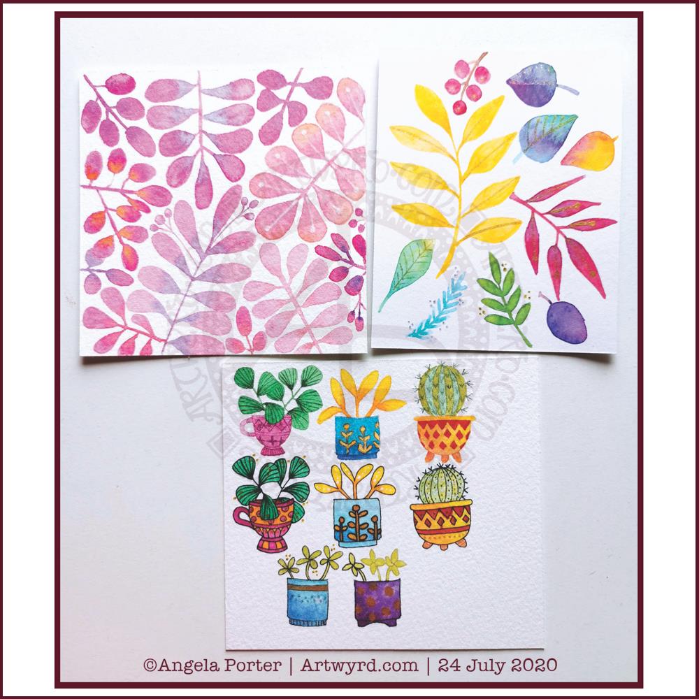
Each piece of paper is approx 4″ square. The top ones were just playing around with foliage, wet into wet, and adding some details with metallic ink, a gold glitter gel pen and a white Souffle pen. I just wanted to see how the different details could add to, or mess up, the watercolours.
I do like the one on the top left. It satisfies my inner need to not leave much in the way of white space.
The bottom image was me trying out painting plants in pots – the top row with very faint pencil guidelines and the middle with Pitt Artist pen outlines in black. The bottom two were comparing like ot like with black outline and pencil outline.
I had trouble with the details in the first two plants in pots on the top row. That was when I thought I’d try the black outlines.
I’m really not sure which I like most, or if either of them really work out.
I’m rather tired and headachy, again, today. I think that I’ll soon be going out for a walk. It’s another overcast and cooler day with a breeze. I love to walk on days like this.
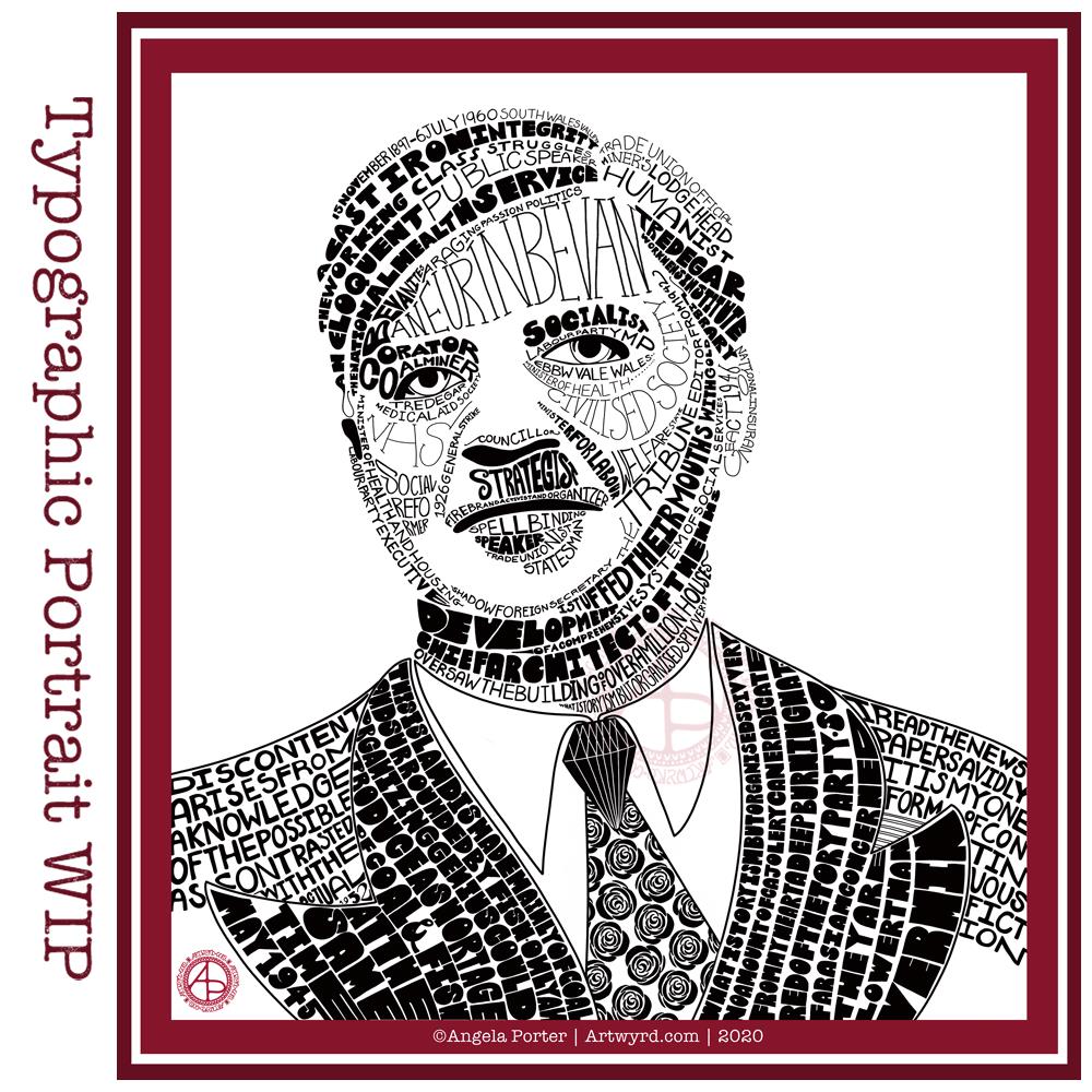
I’m not entirely sure that I’ve fully succeeded. I seem to have a lot of white space, and that is all to do with the photograph I used. I thought it had enough detail in terms of tones of light and dark. I guess not! Or maybe this is just part of my style.
There are areas on his jacket to the bottom left and right that need pattern or image put there. I have yet to work out what to do about the shirt. Also, I need to try removing the lines around the jacket and collar too.
Aneurin “Nye” Bevan was the main architect of the UK’s National Health Service after WWII. He’s also considered one of the best political orators of all time. There’s an Aneurin Bevan website if you’d like to know more.
While this is hand-drawn, I chose to work digitally. My Surface Studio allows me to work with a digital pen directly on the screen as if I was drawing on paper. This makes it easy to edit as I work.
I now need a break from this particular artwork, so I can look at it with fresh eyes (and any feedback people offer on it) and then return to it another day.
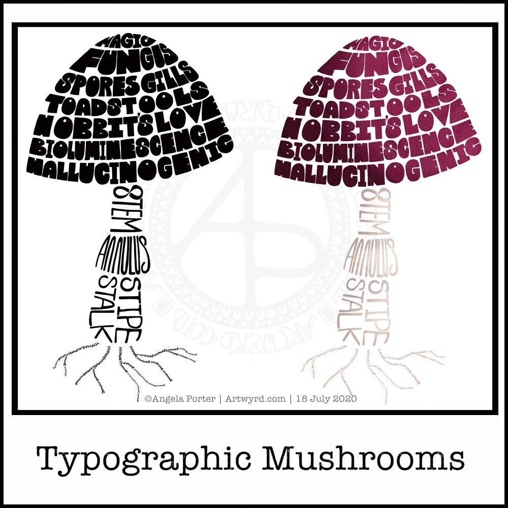
Just a little something I wanted to try out – using hand-drawn typography to create illustrations. I chose a mushroom, for no other reason than I like mushrooms.
It’s more about practising the hand-drawn typography or hand lettering than anything else.
What I realised, when I completed the black and white version, is that I could’ve varied the weight of the letters to produce highlights. That’s for another day, I think.
I also had to try adding colour, and in that way adding highlight and shadow.
I like both versions, but I think I like the coloured one a bit more.
I mentioned I’m following the Sarah King Domestika course – Hand-Drawn Typographic Portraits. I have started work on my first portrait, but it’s going to take me a while to do. In the meantime, little projects, like the mushroom, will give me plenty of practice as well as a chance to work out my process and way of working, as well as how I’d like to use it so it adds a note of harmony to my artistic song.
I started with a pencil sketch of the mushroom. Then, I added the words in rough with pencil. I scanned the sketch into Autodesk Sketchbook Pro. I then used my Microsoft Surface Slim Pen, to hand-draw the typography. Even though I’m using digital media. Autodesk Sketchbook Pro is a lot like working on paper, but it streamlines the process and allows me to skip a lot of the tedious steps. It also lets me take a black and white drawing and add colour quite easily.
I’ve done this while I’m waiting for a migraine-type headache to subside enough that I can return to bed and sleep the dregs of it away. I’m nearly at that point now as I’m beginning to feel tired and sleepy. So, I’ll get the rest of the social media postings done, and then crawl back into bed to sleep.
This week, it’s another of my collections of little windows. Yesterday was a day where I needed to draw a template that wouldn’t overwhelm me, and a collection of tiny drawings and patterns is a way to break the task down into bite-size, cute, whimsical pieces. As I result, I enjoyed the process and found some contentment and peace too.
In fact, some of the colorists in the group have told me that the really like the way the page is broken down into pieces that can be finished quickly if they are limited for time. The different sizes allow them to choose something that can be coloured in the time they have available. That part can then be left finished, freeing them of the worry of leaving something unfinished.
Coloring, like any creative activity, can help calm, relax, soothe and give a break from negative self-talk, to name a few of the benefits. I know that scientific studies have shown this to be the case and that losing yourself in coloring has a similar effect on brain activity as mindfulness meditation.
I use art to help me with times when my emotional weather is stormy, dull, unsettled. As I said earlier, drawing a collection of small designs was far less overwhelming than drawing a full page illustration yesterday. Yet, I still end up with a full page of mini-templates to colour.
I feel I struggle with colours. I tend to try to put all colours available to me into one template. Every now and then I do work with a limited palette, which also has it’s own problems. My window templates take away any pressure I put on myself regarding colour. Each window is a unique image in it’s own right and I can use whatever colours I wish in it without worrying about the overall cohesiveness of the project.
These window templates are also great fun for trying out different colour combinations, for blending colours, and even for trying out new techniques. You could make notes on the template, or cut out the pictures you want to keep and start an art journal where you note down the media, colours and techniques used to get the effects/blends you like. No longer any need to remember what they are, just refer to the journal!
Talking of cutting the designs out, that is a perfect way to make use of a finished coloring page like this one. The individual images, or groups of them, can be used to make greeting cards, bookmarks or to embellish art journals, journals, scrapbooks, diaries, planners and bullet journals!
As always, I love to see what people create using my templates – share with and/or tag me on social media : f: @artwyrd t: @artwyrd i: @artwyrd
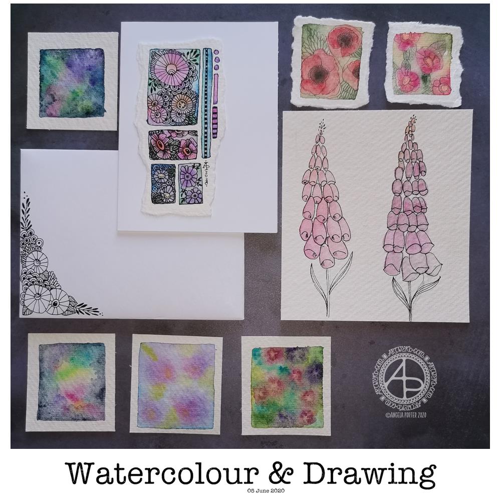
Today’s image is a collection of watercolors and drawings I’ve done over the past couple of days.
There’s a coordinating card and envelope (mail art), along with some small panels of watercolouring (approx 1.5″ x 1.5″, so a bit bigger than inchies). I’ve also included my foxglove experiments, which I did this morning.
Sometimes, black pen looks too harsh against the delicate but vibrant watercolours, so for the poppies, I tried pencil instead. I’m really not at all sure about them.
The foxgloves are symptomatic of how I feel today – out of shape, wobbly, ill-defined with harsh edges. I woke with a stinker of a headache again, definitely stress/anxiety/worry induced, as well as a lack of sleep last night. It will pass. In the meantime, I’m watching The Clone Wars on Disney+.
I don’t know if I’ll be doing any art for a few hours; my head and emotions are all bent out of shape at the moment. I’m dissatisfied with all the above; I know that’s me being so frustrated at the moment and it stops me seeing my art for how it really is. When I’m like this, I know that drawing will frustrate me, and the fact I’m not drawing will frustrate me more, especially as I have deadlines looming. However, I logically know that if I try to do things now, I’ll just prolong the feeling of frustration and I’ll end up having to do much more in the long run than if I’m kind with myself until the headache goes and my mood lifts.
The weird thing, however, is that I can sense that touchstone of contentment inside me. It’s very confusing; on one hand my emotions are really unsettled, yet there’s contentment within. My EMDR therapist mentioned that it’s a peculiarly Western view that you can only experience one feeling at a time when I mentioned this kind of thing to her. So I know it’s possible to be both discontent and content at the same time – discontent with some parts of life yet still have an inner contentedness.
So, I wander off now to sit with these paradoxical feelings, to try to relax and let the headache ease off enough that I can sleep off the extreme tiredness it will leave me with.
Yesterday turned out to be a funny old day. Funny as in not what I’d planned.
I got most of my recent experiments into watercolour added to the journal I’m making/working on, with brief notes. That journal is now getting a partly open ‘crocodile mouth’ look, which is fine by me. Before adding the experiments to the journal, I needed to colour some pages with Distress Ink.
As I was adding the little pieces of art to the journal, I realised that the background colours tied in rather nicely with the artwork placed on them – all completely by chance.
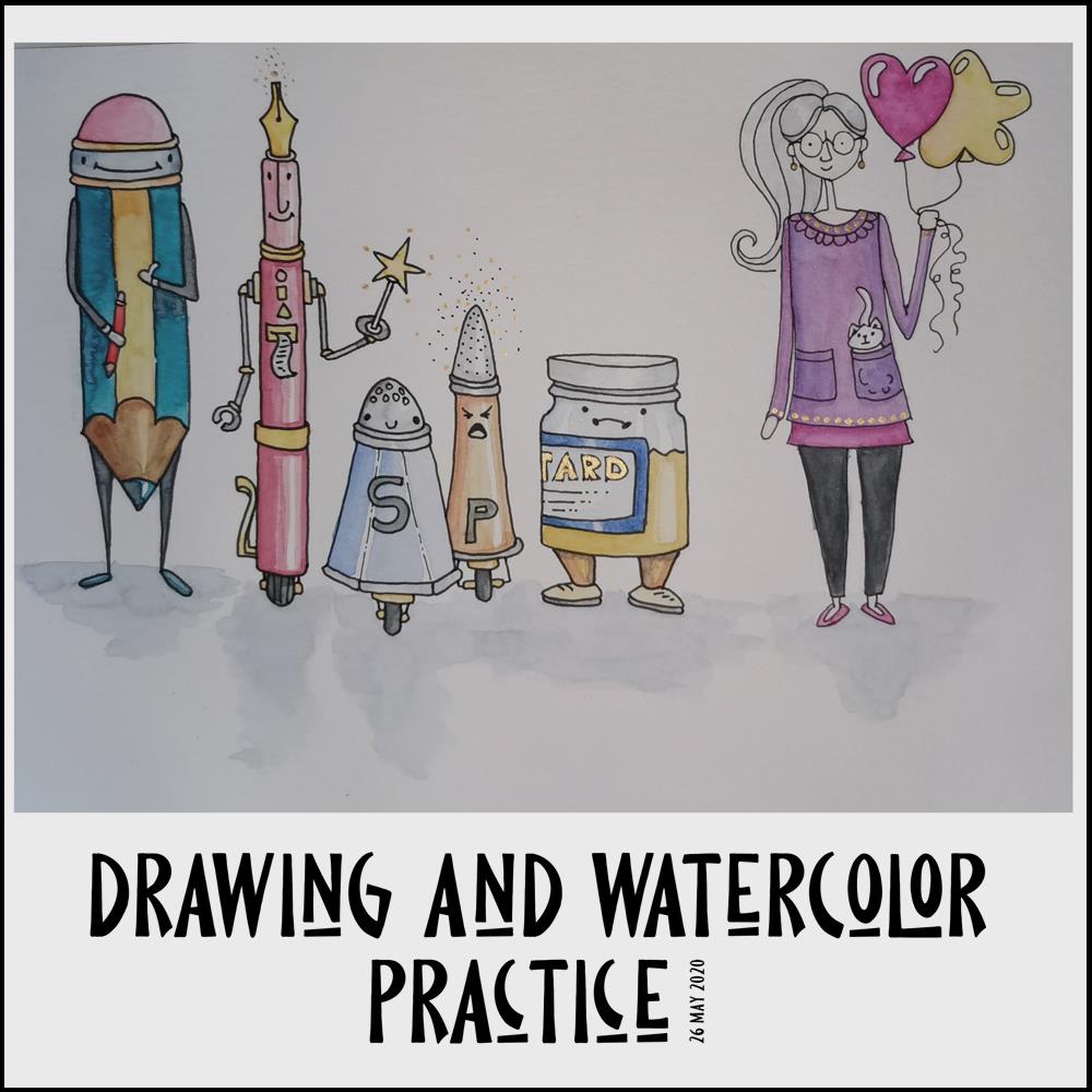
After that, I had some tasks around the house to do, and had phone calls that disrupted my flow of work somewhat. In the evening, though, I decided to continue with the Mattias Adophsson Domestika course, and the drawing/painting above was the result.
I’d already done some sketches of the anthropomorphic items in my sketchbook, and I re-drew the character drawing of myself, again. I made myself too thin by far! Ho hum. More practice is required for sure.
Anyways, after drawing the characters, I used flat, controlled watercolour washes followed by glazes to colour them in. This I felt more confident with – and more controlled about.
I can see how the kitty needs some shading, both on it’s body and on my top. I also need to add a line to the hand holding the balloons to make it more like a closed hand.
I’ll be following Mattias’ course, well parts of it. People and characters aren’t quite my thing. I don’t have the imagination it seems, or maybe I just don’t have the need to draw them. However, it’s nice to explore other ways of artistic expression. Those explorations are never wasted as it may just be that I find out that a particular style isn’t for me, no matter how much I admire it! Also, there’s always new things to learn that can be incorporated into my own art going forward.
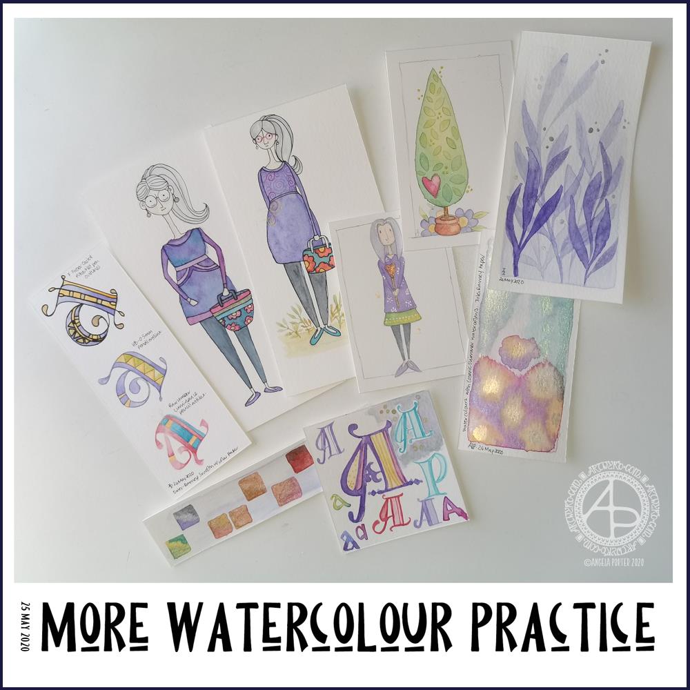
Over the past couple of days I’ve been playing around with watercolours. Apart from fun, it’s trying to work out how I can get them to work for me, and here you can see some of my experiments.
As well as continuing with the Domestika course, I found a book on my Kindle called “The Art of Creating Watercolor : Inspiration & Techniques for Imaginative Drawing and Painting” by Danielle Donaldson.
I’d forgotten I’d bought this, but on rediscovering it and looking at it I found it inspired me, particularly when it comes to drawing people.
What was reassuring, is that Danielle Donaldson is someone else who likes to work on a small scale! She also uses a very fin (0.3mm) pencil to draw with, but also to add line and pattern to her drawings instead of pen. I wanted to try that out.
I also really like the whimsical nature of her art, and her people inspired me to have a go. The three people in the collection of images above are inspired by her work, one more than the others. The one that is most directly like Danielle’s work is the person to the right of the trio. I used a pencil to draw the design as well as outline it after it was painted.
With the other two, I used a very fine Pitt Artist pen to outline them once the paint was dry.
Looking at them all together, I quite like the softer quality of the pencil line.
Oh, these trio are also my way of developing a version of myself. Unfortunately I look pregnant in the middle one (I’m not!), though I rather like my hair in this one – I wish my own hair was as thick and long! I really need to work on feet and foot positions.
Watercolours have vexed me, and continue to do so though I will persevere with them. Drawing people has vexed me for longer!
I’m not entirely sure that watercolour will be the best medium for me to use…I’ll try others, including digital, to see what I can get to work for me and is in my style.
I also spent sometime experimenting with monograms and botanical themes. I really like the blue foliage, and the cute tree too.
Yesterday my art and other stuff was put on hold for much of the day; I woke with a migraine and couldn’t do much until painkillers had kicked in and I could sleep away the remnants of it. Once I woke, that’s when I found the book and did some art inspired by it.
I slept quite well last night, and woke just fine and dandy today.
All these bits of art will find my way into the journal I’m making, including notes and reflections on them.
One of my ideas is to create a digital library of designs of things that interest me and that may be useful in my journal making, card making, or just other kinds of art.
For some reason, I decided on dragonflies. So, I sketched out some ideas and then inked the drawings in digitally. I also added details and patterns ot the designs that weren’t present in the sketches. The dragonflies are in my signature entangled style for sure.
I still have a few sketches to work on, and some alternatives of the wing shapes and body designs. I also want to do them as silhouettes. I like silhouettes on coloured backgrounds, like the one I’ve used today.
I used Autodesk Sketchbook Pro to ink in the designs. I also used it to add the background, shadows and typography.
The background is one of my own made using Distress Oxide inks and water. I love that I can recolour the image digitally; the original was in shades of pink and purple, but I thought that blues and greens would suit the dragonflies much more.
I’ve left the dragonflies uncoloured, for now, though adding colour will bring the designs to life and add some dimension to them.
I don’t have a colour printer anymore, just a black and white laser printer. I may consider getting a colour printer in the future, however, as I think being able to print my own digital art would be useful, especially for using in journal making. An inkjet printer would be the most useful; it would allow me to print on many different kinds of paper and lightweight card.
I’m also thinking of putting together digital collections of backgrounds and ephemera and/or digi stamps for sale via my Etsy shop. Let me know if you think that’s a good idea by dropping a comment.
Yesterday, I said I’d like to make simple pockets for my sketchbook-journal to hold my artwork rather than gluing it to the pages. So, this morning, I started my day looking on YouTube for some ideas and this video by joie de fi was the top of the list.
While I was watching it, I thought I’d make an instruction sheet to go in my sketchbook (or my virtual one I’m making in One Note).
I picked up some quadrille paper and wrote and drew as I watched the method for the first pocket. I worked in ink without pencil sketches and I made quite a few mistakes. A Tipp-Ex mini pocket mouse was my friend.
When I’d finished the instruction sheet, I scanned it in and used Autodesk Sketchbook Pro to remove the square grid from the paper, clean up some smudges, and correct minor errors.
Then, I added some colour to help bring out the drawings, but also to help with the instructions.
I’ve yet to make this kind of pocket, but I’m sure I’ll be able to do so quite easily now.
Reflecting on the artwork/illustration
This was a lot of fun for me to do. It’s something I’ve not done much since my days as a science teacher, or a learner in school and university myself. I’d forgotten how much I enjoy creating instruction sheets with my own drawings on them.
Back in those days, I would’ve used a ruler to draw straight lines, pencil for the diagrams, pen for the words, and little or no colour. Here, I free-handed the drawings, wobbly lines and all. The colour also adds life and dimension to the diagrams/drawings/illustrations.
The layout of the instructions may not be the best and easiest to follow through. That’s because I did this as I was watching the first part of the video. I think that for the next one, I need to sketch out the steps and notes first, and then work on organising them more clearly.
Yes, I’m going to do some more instruction sheets like this!
I also really need to do more hand lettering! I’ve lapsed in my writing practice, that’s for sure.
Today, I’ve been drawing little flower motifs and borders to go along with a lovely quote about flowers and hope.
The line art was drawn using Tombow Fudenosuke pens on ClaireFontaine dot grid paper. Colour, typography and background texture have been added digitally using Autodesk Sketchbook Pro, Microsoft Surface Pen and Microsoft Surface Studio.
Flowers are some of my favourite things to draw, whether they be highly stylised or more realistic.
My snowdrops and crocus have the feel of being wood cut or lino cut and printed, that kind of vintage feel. The flexible nibs on the Fudenosuke pens help me achieve this look. Also, the fairly simple colouring and addition of texture help too.
I’ve left the colouring as is, maybe for now. However, I now have these motifs ready to use in other projects, as they occur to me. Colour certainly helps to lift them off the background and bring them to life.