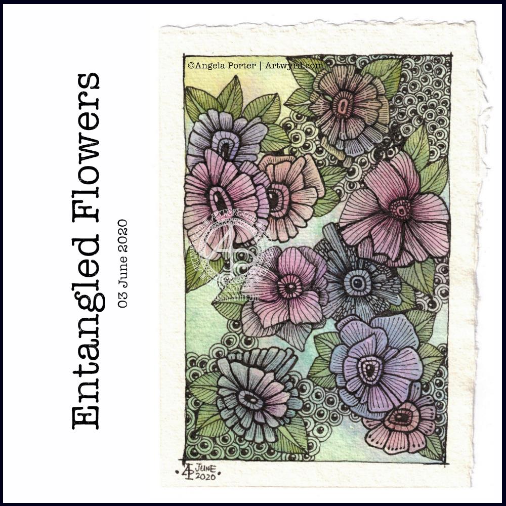
I was awake before 6 am today, so I settled to do some ‘warm up’ art. I water-coloured a couple of pieces of 100% cotton rag paper. I lightly wet the paper and then added watercolour to it and let it work it’s magic – to spread and mingle as it will. The coloured area is approx 3.5″ x 5.25″, so it’s still quite a small drawing in size, but large in detail.
After letting the paper dry, I set to it with some Sakura Pigma Micron pens (01, 03 and 05) to draw the flowers and leaves. I added some more watercolor to these areas to help them stand out a bit, as well as to add a bit of extra ‘dimension’ to them. Finally, I added an outline and the ‘bubble pattern to some areas.
Mindful. Meditative. Calming. Soothing. Just the kind of activity I needed this morning. I was really irritable and frustrated and sad yesterday, all at once. I think I’ve just been overwhelmed by the events in the world over the past few days and yesterday it boiled over somewhat.
I do feel better today, so far, the cooler temperature and the refreshing rain is helping too. I hope I continue to feel better, emotionally; yesterday was was even angry at the templates I was creating for the Entangled Gardens book. Rather, I was angry and frustrated with myself as nothing seemed to be working out well. Hopefully I’ll feel better about it today.
Last night, I carried on with the Domestika Course – Modern Watercolor Techniques by Ana Victoria Calderon. The last sections are all about painting ‘galaxy’ style backgrounds. Scientific pedantry here – they’re not really ‘galaxies’, more nebulae. Just had to say that and get it off my chest.
I painted along with her, and the first background I created was really not at all good, perhaps. I used White Knights watercolours, Cosmic Shimmer metallic gold watercolour and salt. Way too much salt and probably way too much water, and trying to work how someone else does. Still, you learn by doing, even if it doesn’t work out as you’d want it to.
I let the paper dry, did my best to remove the salt and then decided to use a 0.1 Sakura Pigma Micron pen to draw on the background.
I allowed the shape and flow of patterns in the colour to inform me as to how I could draw shapes and patterns, and the end result is today’s image!
As disappointing as my first attempt at a ‘galaxy’ background was, I actually rather like the end product that includes drawing, a typically ‘Angela’ entangled design.
What I am also kind of pleased with, is that I chose to leave some areas of colour without any drawing on them. That is something unusual for me to do.
I started with the floral motifs and let the rest of the design flow from there. As it flowed, the patterns became more and more of an abstract nature.
What you can’t see in the scan, are the subtle areas of gold shimmer that resulted from the spreading of the Cosmic Shimmer metallic watercolour paint. It gives a very subtle sheen in some areas.
While the first background was drying, I had a go at creating another, using what I’d learned from creating the first. Instead of the White Knights, I used Kuretake Gansai Tambi watercolours and I had a bit more success. I’m not entirely happy with the overall balance of the colour areas, but when I’ve decided what to do with it, I’ll share it.
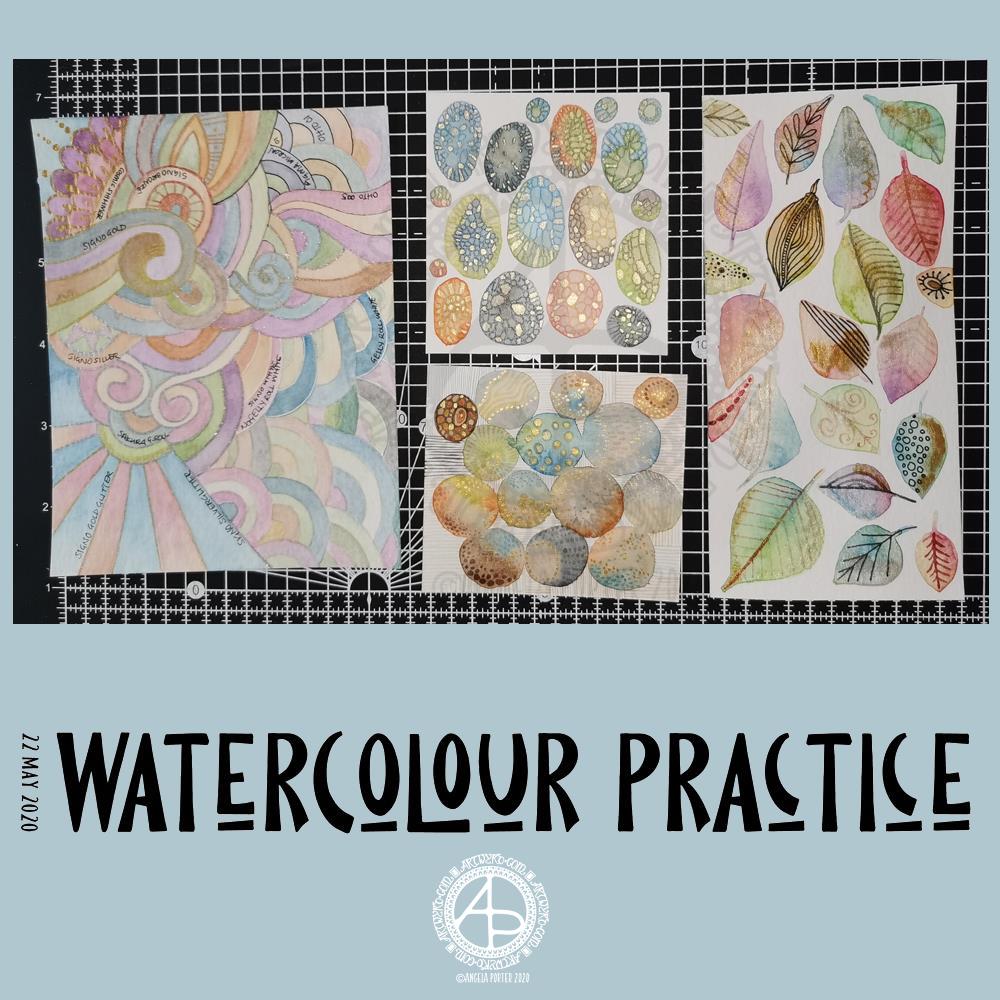
Yesterday was another day where I got lost in watercolour practice – unintentionally! I had planned to do some editing of drawings for ‘Entangled Gardens’. However, time ran away with me.
Panel 1
The first panel I completed was the one with leaves on. They do have plenty of gold metallic/iridescent watercolour paint along with traditional paint, though it doesn’t show up in the photo.
I tried different ways of adding details to the leaves – Faber-Castell Pitt Artist Pen (F) and metallic watercolour and brush. I find the black pen either too black or I used too thick a point. The metallics in a red-copper, gold and grey-black were more sympathetic to the colours of the leaves, in my opinion.
Panel 2
The next panel I created is the one at middle bottom. I made circles of watercolour and let them touch while wet so there was some flow of colour from one to another. After they’d dried I used a fine brush and both watercolours and metallic watercolours to add line and pattern to it.
I enjoyed making this one very much. I used some quite earthy colours that are unusual for me. The line and pattern added a lot of interest, though I did wonder if I’d covered up too much of the underlying watercolours.
Looking at this with fresh eyes today, I think it shows through just fine. I want to try using metallic paints that are complementary to the main colours in the watercolour to see how that works out.
Panel 3
This is the one at the middle top. I created ovals of watercolour, again using unusually muted, earthy tones.
Once they’d dried I used some Caran D’Ache Luminance coloured pencils, well sharpened, to add patterns to each oval. I used the variation in colour/tone to help me add the patterns, as well as to choose the colours of pencils I used on each oval.
Finally, I used a yellow-green metallic/iridescent watercolour paint to fill in some of the patterned areas.
I enjoyed making this panel too. Again, I thought when I finished it that the pencil lines were a bit thick. However, after a night’s sleep and with fresh eyes I can see that it’s worked out well. I think that using coloured fineliner pens may work out better than coloured pencils – something I’ll try another time.
Panel 4
The last panel I created yesterday was the fourth panel. I used a different kind of watercolour paper, by Tim Holtz. The paint just dried so quickly on it I couldn’t really drop colours in, though the paints would re-wet and I could blend colours that way. I didn’t really enjoy using this paper.
Anyway, I thought I’d make a typically ‘Angela’ entangled style painting. I did use a raw umber Caran D’Ache Luminance pencil to draw the design on the paper. This was such a pale colour it disappeared into the watercolour sections. Again, I used uncharacteristically earthy, muted colours.
The final panel was nice enough, however, it was lacking in pattern and interest. So, I decided to use it to experiment with different ways of adding outlines and pattern to the various sections. I also noted on the panel what method I’d used next to each one.
The metallic paints and pens worked nicely and were practically or totally opaque. I prefer using a pen rather than a brush, though I’d not be averse to adding line and pattern using a fine brush and watercolour.
The gold and silver Uniball Signo glitter pens worked really nicely, and because the glitter is suspended in a transparent ink, there’s interesting effect where the watercolour shows through. I actually really like this a lot.
I couldn’t find a gold Sakura Gelly Roll pen, so I used a silver one instead. This, surprisingly, wasn’t as shiny as the Signo silver pen, but it worked just as well in terms of opacity.
I tried two white gel pens – a Uniball Signo and Sakura Gelly Roll. Both seemed to be fairly opaque, the Sakura being very slightly more so.
Finally, I dug out some really fine black pens – 005 and 01 OHTO Graphic Liners and a 01 Sakura Pigma Micron. These worked much nicer than the thicker pen I’d used on the leaf panel.
Of course, I left some areas of the panel without any lines added for comparison.
Of all the pens I tried, I like the metallic and glitter gel pens the best for this.
On reflection…
I’ve found I really like to work on a smaller scale. I feel like I’m creating small ‘treasures’ full of interest and fascination. I’m happier working smaller and more detailed than I am working on a larger scale.
I want to try coloured fineliner pens to draw patterns on watercolours.
Another experiment will be for me to use metallic and plain acrylic and other inks to draw with. I do have a glass pen that will work nicely with indian ink and writing ink. I’ll have to dig some dip-nib pens out to try with the metallic acrylic paints as well as a brush. I think that ball tools could be used to dot spots of ink onto the work rather than a brush; something else to try.
I also need to find a way of leaving a border on the page! When I draw a colouring template or other piece of lineart, I start by drawing a pencil line to demarcate the area I want to draw in, leaving a border around the line. I need to do the same for watercolour panels, either using a pencil or masking or washi tape.
Something else I’ve worked out is that I tend to use too much water when I paint, and I need to experiment with using less and trying dropping colours in when the area is at different levels of dryness.
Lots of things to try and consider.
Doodling? Really?
I see a lot of people calling the addition of line, texture and pattern as part of an artwork ‘doodling’. I don’t like doodling being used in that way.
Here are the definitions for ‘doodle’ from Dictionary.com
verb (used with or without object), doo·dled, doo·dling. *to draw or scribble idly: He doodled during the whole lecture. *to waste (time) in aimless or foolish activity. noun *a design, figure, or the like, made by idle scribbling.
When I add line or pattern to my drawing, it’s not an idle or unconscious activity. I deliberately choose what patterns and textures I want to use and where to place them. The process of adding the lines, patterns and textures may be a more mindful process if the pattern is familiar to me.
The lines, textures and patterns are used to add interest to elements of the overall design. But they are not meaningless, as implied in the words scribble and doodle, and they are anything but idle or mindless scribbles. There is purpose in them, and this is why the use of the word ‘doodle’ irks me!
What am I going to do with the panels?
The leafy panel I created to add to a tag to put in my journal. The other panels will also live in my journal, even the one with annotations, possibly with a pocket behind it for my notes and reflections!
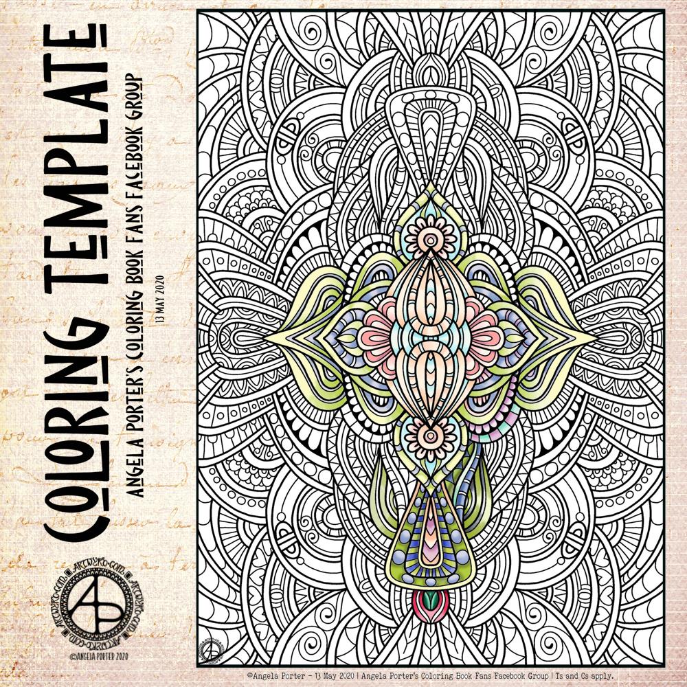
Another lock-down week has passed us by, so it’s time for another coloring template for members of the Angela Porter’s Coloring Book Fans facebook group. Here’s my partly coloured version. I’ve gone for rather soft yet glowing colours for this one.
As always, if you’d like to print and colour it, then pop over to the facebook group and join up. It’s free, it’s a lovely community of people who love my artwork and share their amazing colorations with each other. You’d be made most welcome.
I used one of the dragonfly designs from yesterday’s posting as the focal point for this design. Mandalas are something I love, so to place one behind the dragonfly felt the natural thing to do. I’ve used my signature style of entangled art to fill the space around the mandala.
This is digital art, drawn and coloured using Autodesk Sketchbook Pro, along with Microsoft’s Surface Studio and Surface Slim Pen.
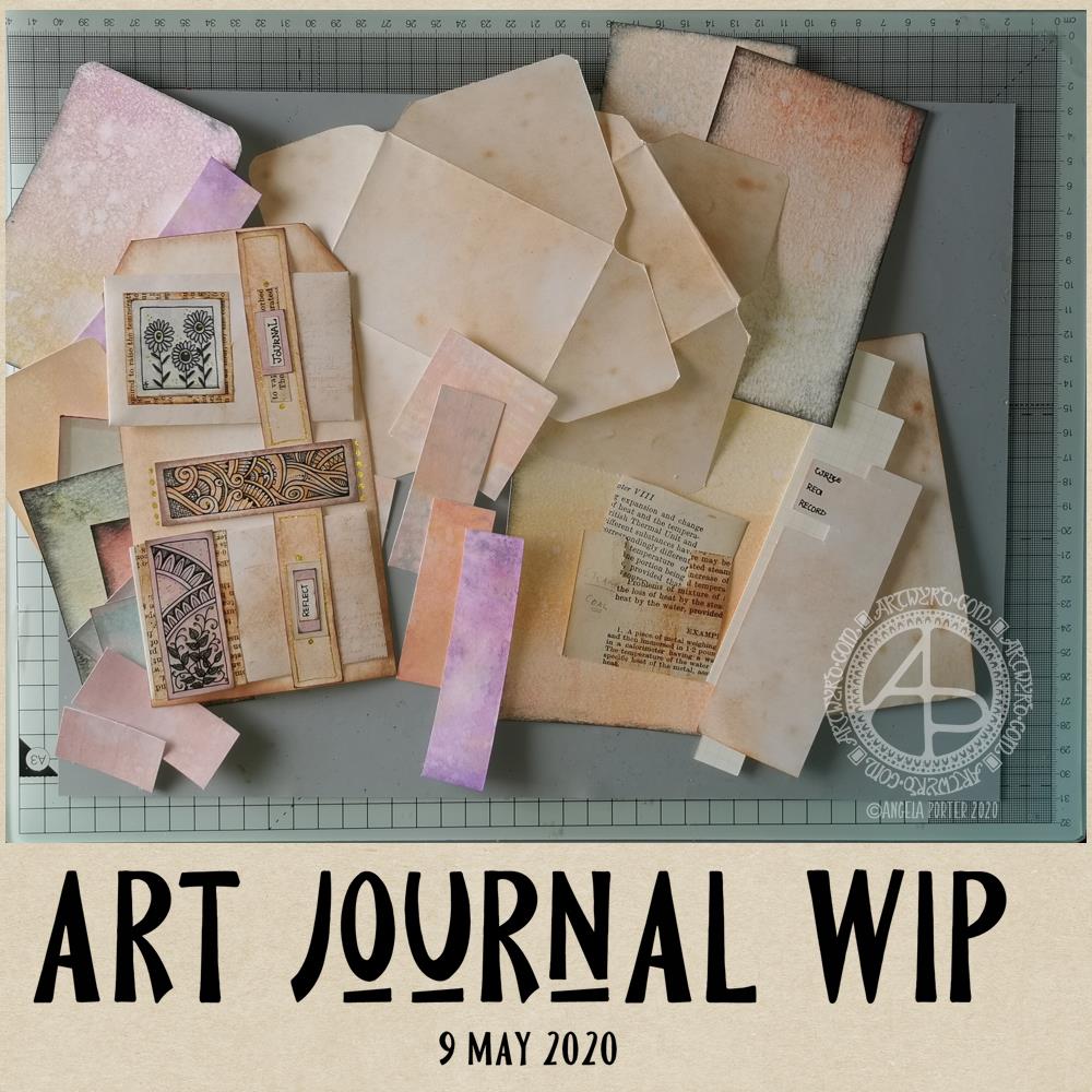
This morning, I woke early-ish and thought I’d spend a little time on my journal.
On page 2 I’ve added one of my silhouette irises backed onto some pearlescent card that i coloured with Chameleon Color Top marker pens. I’ll be adding a quote beside the flower, when I find the perfect quote to go there!
Above the flower you can see a little tag with a semi-circular bottom that has a little pocket in it. The tag will flip up so I can hide some journaling or quote or something pretty and surprising behind it.
On both pages you can see paperclips that have inchies embellishing them. This is a fab way for me to use my inchies in a practical way.
Finally, you can see three mini paintings – two floral, one abstract – that I can use in future pages.
Unusually for me I started by painting the basic shapes of flowers and leaves. Then, I added stems and details using various colours of fineliner pens as well as a white Sakura Gelly Roll pen. I added some sparkly dot details with Sakura Stardust and Uniball Signo glitter gel pens.
For the abstract pattern, I painted arcs on the watercolour paper and when they were dried I added curved lines using a white Sakura Gelly Roll pen and a gold glitter Uniball Signo pen.
I’m not at all sure how I’ll use these, other than the colours of the three cards go really well together so they’ll help me with the colour scheme for another pair of pages further on in the journal, as well as making other ephemera and so on for it.
I do like relatively straight edges, neatly regimented bits and bobs in my journal. I’m not one for lace and frills and frothy additions. It’s not completely clean and simple; I do like old book paper that’s been torn. It’s like I need to control shapes and positions and arrange things ‘just so’, neat and tidy like. That may very well be my way with journal creation, which is in juxtaposition with those I see on youtube.
Being confident with something new, like making my own journal, is something that takes time, perseverance and patience – the patience mostly being with myself until I gain enough confidence.
It’s also the confidence that doing something different to others is perfectly fine.
Yesterday
I was missing in action yesterday. I was unsettled, dissatisfied with anything I tried to do, and needing a lot of sleep it seems. I kept away from the ‘puter and social media. So, no art was done (other than a couple of templates for Entangled Gardens) and no blog post was written (nor any other social media).
One lesson I have learned from my time in counselling/therapy was the importance of knowing when to exercise self-care. I try my best to do this, though sometimes it’s difficult as I know there are expectations and pressures I place on myself.
However, I have learned that if I try to push myself to do things when I’m just not in the right place to do them, I just get more and more frustrated and fed up. If I give myself the time and space to do what I need to do to take care of my emotional and mental health, when I settle down to work, the work flows more easily and I’m more satisfied with what I create.
Although I did draw two templates yesterday, I started three or four others and just threw them as I really wasn’t at all happy with them, and they really were nonredeemable.
Once those two were complete, I felt better about my deadline for the book, a bit more settled in myself. However, any other artistic things I tried I was just frustrated with. So, a complete break away was needed. So, it was crochet while binge watching American Gods on Amazon Prime Video.
I don’t know if I’m feeling any better today as far as art goes, I do know I need breakfast before I consider doing any!
On waking this morning, I wanted to work on the cover of my journal.
Yesterday evening, I managed to get a coat of gesso on to the cover and painted edge closest to the wire binding with gold. In hindsight, that may not have been the best idea.
I knew I wanted to use my silhouette iris drawing on the cover. Irises are my favourite flowers. Also, my aim for my journal is to use my own art as much as possible.
So, I printed out an arrangement of three irises, tore them out and coloured the paper with Distress Inks.
For the background, I used a piece of Claire Fontaine mixed media paper. I coloured it with Distress Inks – Old Paper, Tea Dye, a touch of Iced Spruce and a dusting of Vintage Photo around the edges and here and there on the main sheet.
This I adhered to the cover. I’d cut it narrower than the cover so that I didn’t have to butt it up against the wire binding. That’s why I wanted a gold border there.
Anyway, I decided to put some old book paper behind the irises. I added some ink to the edges of this paper too. I then glued them in place, along with the flowers.
I drew a border around this page with a copper-coloured Sakura Metallic gelly roll pen. Then, I used a gold glitter Uniball Signo pen to fill the background with tiny spirals.
I wanted to add the definition of ‘journal’ to the front cover. So, I did the typography in Affinity Publisher and printed it. After tearing the meaning out, I used Old Paper and Tea Dye Distress Inks to colour the paper, followed by Vintage Photo to ink the edge.
I then glued this to an old book page, tore that out and edged the paper with ink once again.
Before adhering the page to the cover, edged the paper with Ground Espresso Distress Ink as I didn’t think the edge was dark enough. I also coloured the edge of the journal cover with the same ink to hide the white.
An application of Distress Micro-glaze to seal the page and I could stick it to the cover.
I love the subtle sparkle of the spiral pattern on the cover. The micro-glaze picked up some of the fine glitter. It also makes the cover sheet feel very smooth.
I’m not happy with the gold edge to the journal, but I will, no doubt, find a way to make it look much better. Otherwise, I’m quite happy with the cover. I think it needs something else there, but I’ll work out what that is in the fullness of time.
The first three pages.
Page 1 I’ve shown before, and it’s now complete (apart from me adding journaling to the envelopes and other spaces.)
On page 2, I’ve added an experiment I did with Tombow Dual Brush Pens and a blender pen to draw designs on paper. I have some ATC cards coloured in the same blues/purples as the background of this page, so I’ll be finding a way to display them on the page when I’ve finished them.
Page 3 is a tiered series of simple pockets. I made them by tearing the paper of each page and layering them to create the pockets. The inserts are pieces of Claire Fontaine Mixed media paper that have been coloured in the same colours of Distress Inks as the pockets have been. I used Distress Oxide Inks for the pockets.
I’m not really sure what I’m going to do with the third page, yet. It will come to me, I’m sure!
Adobe Spark
I thought that I’d use Adobe Spark to make a short video rather than posting a montage of photos. I uploaded it to my channel on youtube so I could share it via social media more easily.
Adobe Spark is straightforward to use, and it does have a free option, though I pay about £10 per month for it. It makes creating simple content for social media really easy.
How am I feeling
I’m feeling much better today. The headache and light-headed/dizzy/drowsy feelings were with me for the whole day, including upset tummy and digestive system. I had weird pains in my right eye too. I slept a lot during the day, and just took it easy when I was awake. I wanted to crochet in the evening but found it hard to do even something familiar to me.
My digestive system is still uncomfortable and not quite right today, and I’m now beginning to feel rather tired. Like I’ve already done too much today. So, I’m going to be taking it easy for the rest of the day.
The weeks are flying by! It seems like hardly any time at all since I posted last week’s coloring template. I decided at the start of the Covid-19 quarrantine that I’d design a weekly coloring template for the members of the Angela Porter’s Coloring Book Fans facebook group. And so far I’ve managed to do that.
And here, partly coloured, is this week’s offering. I look forward, as always to seeing the coloured templates by members of the group. I love the way that they use different colours and interpret the design differently!
The template is only available in the facebook group, and is for free. I know how much colouring and creativity can help people manage their emotional and mental health. Creating art and being creative certainly helps me, especially if I have a good audiobook on or uplifting music!
I created this design digitally in Autodesk Sketchbook using a Microsoft Surface Slim Pen and Microsoft Surface Studio.
I woke this morning with the desire to make a little box to store ephemera in. So I did.
I used a video from PootlesPaperCraft to help me make the box, which is 4″ square with a depth of 2″, so sizeable enough for some of my smaller ephemera such as inchies and little shrink plastic charms (you can just see them peeking out from under the envelopes to the left of the photo).
I used plain, white card for the box base, which I coloured with Tea Dye, Rusty Hinge and Vintage Photo Distress Inks. For the top, I used a piece of Tim Holtz card from my stash that I’ve had for a number of years. This I grunged up with Vintage Photo and Rusty Hinge Distress Inks.
Once I made the box up, I used Aged Mahogany to distress the edges of the box.
I coloured a square piece of white card with Aged Mahogany and Rusty Hinge Distress Inks and then used a light brown pen to draw a zentangle design on it. This panel was layered on a piece of the same Tim Holtz card I used to make the lid, and then I adhered it to the box.
The box really needed a label to identify it’s contents. Now, I could’ve printed the label out, but I thought this would be an opportunity to practice my hand lettering, which I did.
Then, I aged the label with Aged Mahogany Distress Ink, applied lightly over the face and a bit darker around the edges. Next, I layered the label on another piece of the Tim Holtz paper. Before adhering the label to the box lid, I edged the panel with some Rich Gold Starlights paint from Imagination Crafts.
It’s been a long time since I made any boxes, but they really are easy enough to do. I need to make a longer, thinner box to store tags and other bits and bobs in, once I work out the size I need to make.
I’ve become a bit obsessed with making art journal bits and bobs over the last couple of days. This morning has been no exception, other than the more I do and watch, the more ideas that come to me.
Inchies
Yesterday, I created some blank, printable, templates for inchies, twinches and tea cards. I printed them out on plain paper so I could draw in them. I also made a list of themes I could tackle for them too.
I spent an hour or two filling in a sheet of inches with various designs. Then, I printed them on plain paper and also vellum for calligraphy. The vellum has a rough texture, interesting colours and subtle patterns in them. I have a laser printer, so wasn’t sure if it would print on the vellum; it did, however the print does come off if I’m a bit rough with it.
Nevertheless, I coloured some of the inches with Distress Inks and then adhered them to some 1″ tiles of thick chipboard card. I edged them with tresure gold wax from Imagination Crafts. Then, I gently applied a thin layer of Ranger’s gloss multi-media medium, to see if it would seal the laser printing; it did! It also brought out the colours of the Distress Inks.
Seed packets/envelopes
These are simple enough to make. There are plenty of tutorials online for them. I made them from ordinary printer paper, then coloured them with Distress Inks.
Next, I added some dot embellishments using a small ball tool with Imagination Crafts’ Starlights metallic paint in rich gold. This is a beautiful, glittery, shiny paint that leaves some dimension when applied this way.
Finally, I adhered the inchies I’d made, along with some vintage book paper, to the envelopes.
I’m not sure if these envelopes are finished. I do want to use them to store either journaling notes in, or little pieces of art or mementos in them.
Tags
I haven’t been at all sure about tags and using them. However, I thought I’d see what I could do with them after yesterday’s mucking about with a tri-fold tag that turned into one single tag.
I wanted to make some templates for cutting the corners at the top of the tags, so I did that, using various widths of paper and slopes to remove the top corners.
I then realised I needed something to store them in, so I made an envelope for them.
The envelope has a more rectangular top flap and a plain front, perfect for embellishments.
Backgrounds
Something occurred to me this morning while watching someone make tags using background paper. I thought that I could use my colouring sheets and entangled designs as my own background paper. So, I thought I’d try to use some.
I found some old designs on my computer and printed a couple of them both as the black line originals and with a grey line.
I made a tag and cut out a piece of one of the designs. I coloured the design with Distress Inks and used them to subtly colour the tag.
I didn’t like the way the neatly cut out background pattern looked when I placed it on the tag. So, I tore the edges. I still wasn’t happy, so I tried tearing it into strips. That looked better, but I still wasn’t happy with it, but I stuck the pieces down.
I used a gold glitter gel pen to add lines and patterns between the torn pieces, which created some pattern and interest.
Finally, I added a distress ink coloured belly band along with a word, “creativity” to the tag. For now, I tucked one of the seed packets behind the belly band.
The background drawing may be just too busy, detailed, and varied to work well. I need to bear this in mind going forward.
Notebook
I am keeping notes of how I make tags, pockets, and other bits and bobs in an A5 dot grid notebook, along with ideas for other things to do or try. It’s turning out to be rather useful as a reference.
Acceptance
I’m struggling with accepting that what I’m creating for my art journal is “good enough”, “attractive enough”, “pretty”. It’s not like others I’ve seen, which is part of my problem.
I seem to like, mostly, neat edges, borders on work, very organised, neat, and carefully, geometrically arranged elements in my designs. I know I want to use my own artwork to create a journal, but I’m not sure it’s going to be successful in any kind of way. I have no idea if I’m on a wild goose chase.
I know I enjoy making these bits and bobs, I just don’t know if the overall end products actually work, so I’m doubting myself. I’m not sure I like what I’m creating. I mean, I really like individual elements such as the inchies and little panels on the envelopes. It’s when I start to actually combine them or put them into a journal that it all seems to go more than a bit skew-iffy.
I’m at that uncomfortable place I often find myself in when I’m creating a mandala or drawing or digital painting; partway through I want to give up as I think that what I’m creating is awful and not working. With the mandalas, drawings and digital art, I’ve learned to work through that point and, mostly, to complete the work. I’ve learned by experience and perseverance that I can produce art I’m happy with.
I’m not at all sure of that with this art journal type stuff. I’m not sure at all if I can find my own creative ‘voice’ with this, or whether I have to accept that as much as I’d like it to be one of my ‘things’ it’s not meant to be and that I can continue to watch and admire others for what they create.
Maybe, I’ll end up making digital elements for journals for others to use in their creations. Maybe, I’ll find that collections of inchies are my thing (along with twinchies and tea cards and other little designs).
For now, I’ll take a bit of a break from it all, and come back to it with fresh eyes and a fresh mind.
I had an idea that I can use the little drawings I like to do as ephemera and embellishments and focal points in my art journal, rather than using ephemera from other sources like books, printables, and so on. I’m sure I’ll find more uses for them if I persevere with this project.
So, back to the tri-fold tag. It was my plan to make such a tag for my art journal. However, as usual, my plans often take a slightly different route!
I started by working out the size of tri-fold tag I wanted to make – to fit an A5 sized art journal.
I settled on a piece of mixed media paper cut down to 11.5″ x 7″, which I scored at 3.75″, 4″, 7.75″ and 8″ to create the three tags joined by hinges. I cut the top corners off each tag panel.
I coloured the front and back of the paper using Distress Oxide inks and sprayed water to distress the surface more. Then, I used vintage photo Distress ink to edge all the sides and folds to frame the panels .
I’d chosen colours that would go with some ATC s I was drawing last night while attending a webinair and listening to the speakers. However, the Distress Oxide inks resulted in a much brighter colour and I really wasn’t happy with the result. I will use this panel to use as a reference in future, not so much for sizes but for ideas for pockets and panels and envelopes and so on.
So, I started again. I used Distress Oxide inks, but this time I used tea dye and vintage photo, applying them as lightly as I could. I also coloured some copier paper using the same colours in Distress Inks, with a hint of rusty hinge added to the mix.
I was much happier with the colours this time around.
I liked the idea of using a ‘belly band’ with little envelopes tucked into it. So, I used 5″ square pieces of the coloured copier paper to make some little envelopes (2.5″ x 3″). Two of these would fit neatly on one of the panels. So, I made a 0.75″ x 7″ belly band, and coloured it with the same inks as the panels. I applied thin beads of glue to the ends and centre of the belly band and then adhered it to the panel, off-set to the right of the centre line.
When the glue dried, I had two sections that would hold one envelope each.
My next job was to rummage through my stash of coloured papers to find ones that would go together and were sympathetic with the background.
I drew some panels to add to the envelopes and also the space between them. I backed the panels with vintage book paper. Then, I hand lettered some words on a piece of coloured copier paper. I chose ‘Journal’ and ‘Reflect’ from the selection, cut them out. I used both vintage book paper and a piece of coloured paper behind them to make labels that I attached to the belly band above each envelope.
Finally, for now, I used a gold glitter Signo gel pen by Uniball to add dots and highlights.
It was then that I realised I really wasn’t happy with the tri-fold tag as I’d made it. So, I set about cutting the tags apart so I had three individual tags. I want to join them together in a different way, using hinges of some kind.
But for now, tiredness has caught up with me, as well as the need for some breakfast. So, I will put my project to one side for now and return to it later.
Reflections
I’m not entirely sure where I’m going with this, not yet anyway. I kind of like what I’ve seen other people do as far as ideas go for pockets, tags, labels, envelopes, pouches and all kinds of ephemera for art journals. However, they’re also not really ‘me’. I’d like to find a way of expressing ‘me’ in an art journal.
The one I have, in an A4 sketchbook is fine, and a perfect place to try things out. But, I’d like to do a smaller art journal that has sturdier, mixed media paper in it.
I do know I want to make use of my own artwork. Today, I drew the designs onto the coloured card. However, I quite like the idea of building up a digital library of my own drawings and designs that I could print out on paper and colour accordingly.
Although I hand lettered the words I used today, part of me isn’t happy with them and wants to create them in Affinity Publisher.
All the paper I start with is bright white in colour. Perhaps I could look at using different papers and colours of paper for future projects.
One other thing I’m doing, is keeping notes and diagrams showing templates and dimensions for various ephemera.
I’m babbling here, now. The early morning and lack of enough sleep last night is really catching up with me now. Time to post this then go get breakfast and more tea!