Last night, I carried on with the Domestika Course – Modern Watercolor Techniques by Ana Victoria Calderon. The last sections are all about painting ‘galaxy’ style backgrounds. Scientific pedantry here – they’re not really ‘galaxies’, more nebulae. Just had to say that and get it off my chest.
I painted along with her, and the first background I created was really not at all good, perhaps. I used White Knights watercolours, Cosmic Shimmer metallic gold watercolour and salt. Way too much salt and probably way too much water, and trying to work how someone else does. Still, you learn by doing, even if it doesn’t work out as you’d want it to.
I let the paper dry, did my best to remove the salt and then decided to use a 0.1 Sakura Pigma Micron pen to draw on the background.
I allowed the shape and flow of patterns in the colour to inform me as to how I could draw shapes and patterns, and the end result is today’s image!
As disappointing as my first attempt at a ‘galaxy’ background was, I actually rather like the end product that includes drawing, a typically ‘Angela’ entangled design.
What I am also kind of pleased with, is that I chose to leave some areas of colour without any drawing on them. That is something unusual for me to do.
I started with the floral motifs and let the rest of the design flow from there. As it flowed, the patterns became more and more of an abstract nature.
What you can’t see in the scan, are the subtle areas of gold shimmer that resulted from the spreading of the Cosmic Shimmer metallic watercolour paint. It gives a very subtle sheen in some areas.
While the first background was drying, I had a go at creating another, using what I’d learned from creating the first. Instead of the White Knights, I used Kuretake Gansai Tambi watercolours and I had a bit more success. I’m not entirely happy with the overall balance of the colour areas, but when I’ve decided what to do with it, I’ll share it.
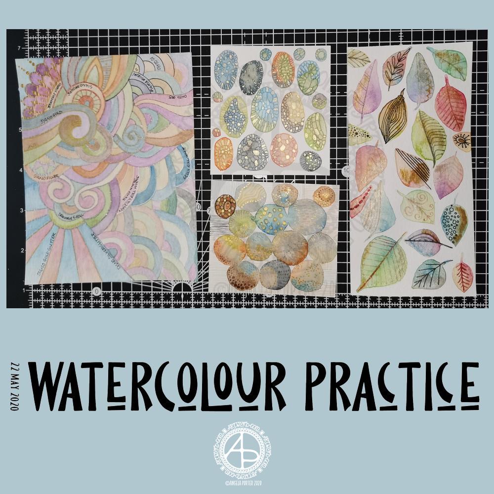
Yesterday was another day where I got lost in watercolour practice – unintentionally! I had planned to do some editing of drawings for ‘Entangled Gardens’. However, time ran away with me.
Panel 1
The first panel I completed was the one with leaves on. They do have plenty of gold metallic/iridescent watercolour paint along with traditional paint, though it doesn’t show up in the photo.
I tried different ways of adding details to the leaves – Faber-Castell Pitt Artist Pen (F) and metallic watercolour and brush. I find the black pen either too black or I used too thick a point. The metallics in a red-copper, gold and grey-black were more sympathetic to the colours of the leaves, in my opinion.
Panel 2
The next panel I created is the one at middle bottom. I made circles of watercolour and let them touch while wet so there was some flow of colour from one to another. After they’d dried I used a fine brush and both watercolours and metallic watercolours to add line and pattern to it.
I enjoyed making this one very much. I used some quite earthy colours that are unusual for me. The line and pattern added a lot of interest, though I did wonder if I’d covered up too much of the underlying watercolours.
Looking at this with fresh eyes today, I think it shows through just fine. I want to try using metallic paints that are complementary to the main colours in the watercolour to see how that works out.
Panel 3
This is the one at the middle top. I created ovals of watercolour, again using unusually muted, earthy tones.
Once they’d dried I used some Caran D’Ache Luminance coloured pencils, well sharpened, to add patterns to each oval. I used the variation in colour/tone to help me add the patterns, as well as to choose the colours of pencils I used on each oval.
Finally, I used a yellow-green metallic/iridescent watercolour paint to fill in some of the patterned areas.
I enjoyed making this panel too. Again, I thought when I finished it that the pencil lines were a bit thick. However, after a night’s sleep and with fresh eyes I can see that it’s worked out well. I think that using coloured fineliner pens may work out better than coloured pencils – something I’ll try another time.
Panel 4
The last panel I created yesterday was the fourth panel. I used a different kind of watercolour paper, by Tim Holtz. The paint just dried so quickly on it I couldn’t really drop colours in, though the paints would re-wet and I could blend colours that way. I didn’t really enjoy using this paper.
Anyway, I thought I’d make a typically ‘Angela’ entangled style painting. I did use a raw umber Caran D’Ache Luminance pencil to draw the design on the paper. This was such a pale colour it disappeared into the watercolour sections. Again, I used uncharacteristically earthy, muted colours.
The final panel was nice enough, however, it was lacking in pattern and interest. So, I decided to use it to experiment with different ways of adding outlines and pattern to the various sections. I also noted on the panel what method I’d used next to each one.
The metallic paints and pens worked nicely and were practically or totally opaque. I prefer using a pen rather than a brush, though I’d not be averse to adding line and pattern using a fine brush and watercolour.
The gold and silver Uniball Signo glitter pens worked really nicely, and because the glitter is suspended in a transparent ink, there’s interesting effect where the watercolour shows through. I actually really like this a lot.
I couldn’t find a gold Sakura Gelly Roll pen, so I used a silver one instead. This, surprisingly, wasn’t as shiny as the Signo silver pen, but it worked just as well in terms of opacity.
I tried two white gel pens – a Uniball Signo and Sakura Gelly Roll. Both seemed to be fairly opaque, the Sakura being very slightly more so.
Finally, I dug out some really fine black pens – 005 and 01 OHTO Graphic Liners and a 01 Sakura Pigma Micron. These worked much nicer than the thicker pen I’d used on the leaf panel.
Of course, I left some areas of the panel without any lines added for comparison.
Of all the pens I tried, I like the metallic and glitter gel pens the best for this.
On reflection…
I’ve found I really like to work on a smaller scale. I feel like I’m creating small ‘treasures’ full of interest and fascination. I’m happier working smaller and more detailed than I am working on a larger scale.
I want to try coloured fineliner pens to draw patterns on watercolours.
Another experiment will be for me to use metallic and plain acrylic and other inks to draw with. I do have a glass pen that will work nicely with indian ink and writing ink. I’ll have to dig some dip-nib pens out to try with the metallic acrylic paints as well as a brush. I think that ball tools could be used to dot spots of ink onto the work rather than a brush; something else to try.
I also need to find a way of leaving a border on the page! When I draw a colouring template or other piece of lineart, I start by drawing a pencil line to demarcate the area I want to draw in, leaving a border around the line. I need to do the same for watercolour panels, either using a pencil or masking or washi tape.
Something else I’ve worked out is that I tend to use too much water when I paint, and I need to experiment with using less and trying dropping colours in when the area is at different levels of dryness.
Lots of things to try and consider.
Doodling? Really?
I see a lot of people calling the addition of line, texture and pattern as part of an artwork ‘doodling’. I don’t like doodling being used in that way.
Here are the definitions for ‘doodle’ from Dictionary.com
verb (used with or without object), doo·dled, doo·dling. *to draw or scribble idly: He doodled during the whole lecture. *to waste (time) in aimless or foolish activity. noun *a design, figure, or the like, made by idle scribbling.
When I add line or pattern to my drawing, it’s not an idle or unconscious activity. I deliberately choose what patterns and textures I want to use and where to place them. The process of adding the lines, patterns and textures may be a more mindful process if the pattern is familiar to me.
The lines, textures and patterns are used to add interest to elements of the overall design. But they are not meaningless, as implied in the words scribble and doodle, and they are anything but idle or mindless scribbles. There is purpose in them, and this is why the use of the word ‘doodle’ irks me!
What am I going to do with the panels?
The leafy panel I created to add to a tag to put in my journal. The other panels will also live in my journal, even the one with annotations, possibly with a pocket behind it for my notes and reflections!
This morning, I woke early-ish and thought I’d spend a little time on my journal.
On page 2 I’ve added one of my silhouette irises backed onto some pearlescent card that i coloured with Chameleon Color Top marker pens. I’ll be adding a quote beside the flower, when I find the perfect quote to go there!
Above the flower you can see a little tag with a semi-circular bottom that has a little pocket in it. The tag will flip up so I can hide some journaling or quote or something pretty and surprising behind it.
On both pages you can see paperclips that have inchies embellishing them. This is a fab way for me to use my inchies in a practical way.
Finally, you can see three mini paintings – two floral, one abstract – that I can use in future pages.
Unusually for me I started by painting the basic shapes of flowers and leaves. Then, I added stems and details using various colours of fineliner pens as well as a white Sakura Gelly Roll pen. I added some sparkly dot details with Sakura Stardust and Uniball Signo glitter gel pens.
For the abstract pattern, I painted arcs on the watercolour paper and when they were dried I added curved lines using a white Sakura Gelly Roll pen and a gold glitter Uniball Signo pen.
I’m not at all sure how I’ll use these, other than the colours of the three cards go really well together so they’ll help me with the colour scheme for another pair of pages further on in the journal, as well as making other ephemera and so on for it.
I do like relatively straight edges, neatly regimented bits and bobs in my journal. I’m not one for lace and frills and frothy additions. It’s not completely clean and simple; I do like old book paper that’s been torn. It’s like I need to control shapes and positions and arrange things ‘just so’, neat and tidy like. That may very well be my way with journal creation, which is in juxtaposition with those I see on youtube.
Being confident with something new, like making my own journal, is something that takes time, perseverance and patience – the patience mostly being with myself until I gain enough confidence.
It’s also the confidence that doing something different to others is perfectly fine.
Yesterday
I was missing in action yesterday. I was unsettled, dissatisfied with anything I tried to do, and needing a lot of sleep it seems. I kept away from the ‘puter and social media. So, no art was done (other than a couple of templates for Entangled Gardens) and no blog post was written (nor any other social media).
One lesson I have learned from my time in counselling/therapy was the importance of knowing when to exercise self-care. I try my best to do this, though sometimes it’s difficult as I know there are expectations and pressures I place on myself.
However, I have learned that if I try to push myself to do things when I’m just not in the right place to do them, I just get more and more frustrated and fed up. If I give myself the time and space to do what I need to do to take care of my emotional and mental health, when I settle down to work, the work flows more easily and I’m more satisfied with what I create.
Although I did draw two templates yesterday, I started three or four others and just threw them as I really wasn’t at all happy with them, and they really were nonredeemable.
Once those two were complete, I felt better about my deadline for the book, a bit more settled in myself. However, any other artistic things I tried I was just frustrated with. So, a complete break away was needed. So, it was crochet while binge watching American Gods on Amazon Prime Video.
I don’t know if I’m feeling any better today as far as art goes, I do know I need breakfast before I consider doing any!
I woke at stupid o’clock with a migraine/stress-come-down-headache. It took a couple of hours before I could get back to sleep. I’m still headachy and so tired. However, before I try to sleep off the dregs of the migraine-headache I wanted to do something artistic, and this is what I started. Digital art – Autodesk Sketchbook Pro, Microsoft Surface and Surface Slim Pen.
No idea of what to create, just went with the flow.
Today’s arty offering is this little bit of entangled art. It measures 4″ x 3″, so is small in size, but big in detail, I think.
Distress Oxide inks were used to colour a 4″ x 3″ piece of Claire Fontaine mixed media paper, with water to add extra texture to it.
I drew the design using 08 and 02 Unipin pens. To bring the design out of the background, I used Faber-Castell Pitt Artist Brush pens. Dots of gold and white finished the embellishment.
My final step was to apply some Distress Microglaze to add a subtle sheen that brings out the colours and layers of texture, not just to the Distress Oxide ink, but to the Pitt Artist Pens too.
I thought I’d try the Pitt Artist pens with this background as it seemed more dull and dusty, and that’s how I find the colours in the Pitt Artist Pens. Initially, I was going to keep it monochrome. However, I liked the nature of the colours in the pens, so experimented with them.
I enjoyed creating this little work of art. Now, it’ll find its way into my sketchbook-journal, with reflective notes for future reference.
Background – Distress Oxide inks and water spray on Daler-Rowney mixed media paper.
Flowers and background foliage – digital art using Autodesk Sketchbook Pro.
I had a lovely time creating this artwork. Flowers are something I love and find in my art an awful lot. It took a few iterations to get the drawing of the flowers and leaves as I wanted them. A lot more iterations were needed to get the colour and texture of the flowers and leaves so that I was happy with them.
I wanted a bit more interest in the background, so I drew a leafy, simple mandala that was coloured with shades of green. I then replicated it, resized it, and applied different layer effects to each copy of the mandala.
As I was doing this, it was reminding me of the mixed media work I did a few years ago, particularly using stencils to add interest to a background.
Digital mixed-media … without the mess! I’ve said it before – I’m averse to creating a mess!
Anyway, this has been an interesting experiment in the realms of digital art and my brain is now ticking over with ideas for the future. All I have to do is make a note of them!
Gosh, Thursdays seem to come around so quickly these days! Thursday is the day I post a new colouring template for the members of the Angela Porter’s Coloring Book Fans facebook group, and above is this weeks offering.
I drew the line art on mixed media paper from Claire Fontaine with Tombow Fudenosuke flexible nib brush pens. I like to use variable line widths in my art from time to time. They give instant depth to the drawing and increase the graphic nature of the design.
I’ve used some really weird colours, for me, in my sample coloration. They’re really quite muted. That’s a hint to me that something is awry with my emotions/mood. I feel quite subdued and ‘meh’ at the moment, which is reflected in my colour choices.
Anyway, if you’d like to colour this, or any of many others in the archives, please pop along and join the Angela Porter’s Coloring Book Fans facebook group. I create these exclusive templates as a way of saying thank you to those who like my coloring books.
The aim of art is to represent not the outward appearance of things, but their inward significance.
-Aristotle
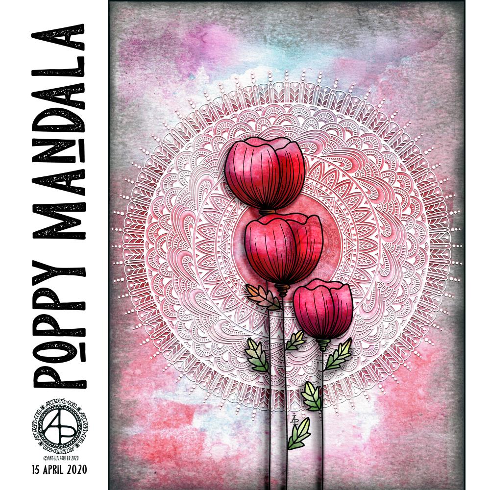
Today is World Art Day. It is meant to be an international celebration of the fine arts which was declared by the International Association of Art (IAA) in order to promote awareness of creative activity worldwide.
Each year, on 15 April (Leonardo da Vinci’s birthday), World Art Day celebrations help reinforce the links between artistic creations and society, encourage greater awareness of the diversity of artistic expressions and highlight the contribution of artists to sustainable development. (UNESCO)
“Our Organization would thus like to pay tribute to the solidarity shown by artists and institutions at a time when art is suffering the full force of the effects of a global health, economic and social crisis.”
— Audrey Azoulay, Director General of UNESCO
About today’s art
I started by choosing one of my Distress Oxide backgrounds to use for today’s art.
I woke knowing I wanted to do an arrangement of stylised poppies with a mandala for a background, and this is the result.
Poppies symbolise, among other things, a lively imagination, messages delivered in dreams, beauty and success, as well as remembrance. They, along with their seed heads, often appear in my art.
It took me many iterations of colour, shadow and highlight to get the mandala appearing as I wanted it to – lacy, light, in the background but still standing out. I think I’ve managed to achieve that fairly well.
Overall, I’m pleased with the finished artwork. I do think the poppies and mandala could be moved towards the top of the background, something that is easy enough to do as I have the layers saved. However, the artwork is good enough for now.
I suspect I’ll be creating more art using a couple of the backgrounds I’ve created through the day. It’s a satisfying process to use backgrounds I’ve created myself rather than using ones that I have purchased.
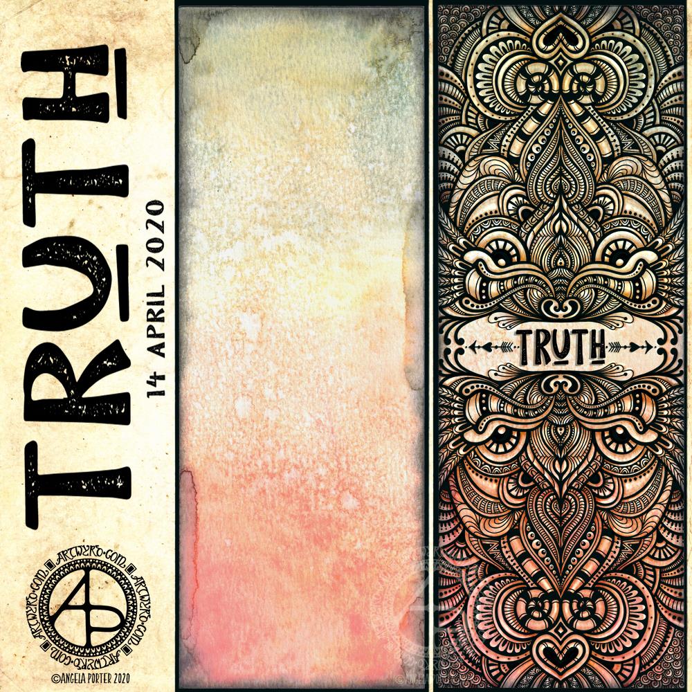
I like to use a word in my artwork from time to time. Truth was the word I knew I had to use as the central point for some artwork, and that’s where I started, along with one of the Distress Oxide backgrounds I made yesterday (in the middle of the image).
After I’d decided on the typography and placed it centrally, I then started to draw digitally. I made use of the symmetry tools in Autodesk Sketchbook Pro, along with a flexible nib and fineliner brushes.
I had no idea what kind of design would result, I just went with the flow and intuition and thoroughly enjoyed doing so and losing myself in the art.
I added shadows and highlights once the drawing was finished for that sense of dimension and ‘life’.
I am really pleased with the finished artwork. There’s something about symmetry, spirals, repeating patterns, and intricate, abstract designs like this that just makes my arty heart smile and sing. I always return to this style, it seems to be at the core of my being.
I also love to draw on coloured and textured backgrounds. I also think I’ve found a way to combine more traditional media (making the backgrounds) with digital art (drawing and adding shadows and highlights) in a way that really works for me.
My only problem is that I do tend to try to branch out into other kinds of art and never seem quite so satisfied with them. This doesn’t mean I’m going to abandon them; they need a lot more work and thought and maybe structure.
Perhaps that’s why I like this particular piece of art so much – it has clearly defined structure. The colour palette is defined by the background and so I’m not struggling with what colours to use. Having the black line structure defines clearly where shadows and highlights need to go.