Blue Mandala

©Angela Porter 2019

I have had an artsy kind of day so far. A lot of the gloom, anxiety and troubled thoughts that descended on me have lifted, but not all. Once provoked the beasties that are my cPTSD take a while to settle down again. I also feel tired – mentally, physically and emotionally tired, despite a fairly good nights sleep.

I managed to get some work done on a template for my next book for Creative Haven by Dover. I got to a point, however, where I wasn’t happy with how it was going so I thought a break was in order.

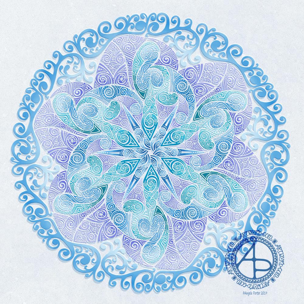
So, for my break I thought I’d work on a mandala, and this is the one I’ve created today.

I didn’t consciously choose the colours or patterns I used in this mandala. However, the blues bring to mind water, rivers, the sea. I love to be near the sea. I find the rhythm of the waves calming, no matter how gentle or wild they are. The salty wind helps to blow away cobwebs in the mind, cobwebs that not so good thoughts have stuck to. I love to look at the patterns in the sand, rocks, pebbles. There’s so much more I love. So perhaps by choosing blue I’ve identified an unconscious need to visit the sea soon.

A lot of the patterns that have found their way into this mandala remind me of waves or shells. They’re all organic and flowing. Though there are some rather architectural arches and patterns there, lending some form to the design.

The ocean is used as metaphor in mindfulness meditations. I am the ocean. The waves are my emotions that ruffle the surface of that deep, calm body of water. Meditation is about finding that calm and being in touch with it in daily life.

Carl Jung believed that drawing a mandala daily helped to reveal what was going on in the subconscious mind, the things we need to bring into awareness and work on in order to heal.

Curious that this one speaks to me of water, the ocean.

Yesterday’s meditation stirred up the waves for sure. A veritable tsunami resulted of emotional, mental and physical pain. It’s freaked me out a little and I’ve been reluctant to meditate today, well not until I’ve done everything I need to do today.

I did draw this mandala digitally. In fact, returning to digital art let me exhale a little and relax a bit more into art. I also didn’t want to revisit my frustration with traditional media that I had yesterday.

I find working digitally wonderfully liberating in many ways. I know that I’m no expert in the use of mechanics of digital art – I use it more like I would traditional media. However, whereas I feel I struggle with colour and techniques with traditional media these days, I feel none of that with digital art.

Now that’s a surprise to me! I never, ever thought I’d feel that way about working digitally.

My digital tools are my Microsoft Surface Pen, Microsoft Surface Studio and Autodesk Sketchbook Pro. The screen of the Surface Studio is my paper, the Surface pen is a multitude of pens, pencils, brushes and colours in one instrument. Autodesk Sketchbook Pro is the software that allows me to work so intuitively, so naturally as I would with pen on paper, but with other tools and techniques I can use that I wouldn’t be able to reproduce with traditional media – I don’t have the skills to do that.

So, some insights about myself from the mandala, and also some realisations about myself and my relationship with digital art and how much that relationship has strengthened and deepened – and there’s still a lot more to learn and discover about digital art and myself.

An ‘A’ Dangle Mandala…

©Angela Porter 2019

I’m definitely on a mandala kick at the moment! This one, though, includes some dangle designs!

A Dangle A Day’ is released on 15th January 2019, and I just wanted to get yet another dangle design out in the interwebs to inspire you.

While checking out the release date (which I’ve been getting a tad wrong, oops!) I noticed there were some reviews of the book. I’d like to say thank you to all the reviewers who wrote such lovely words about the book! It’s filled me with a bit more confidence and belief in myself as this is my very first art tutorial book.

There’s some hand lettering with the letter A. The letter A has dangles forming the inner part of the mandala. Then, the outer ring has simple and cutely whimsical doodle designs and yet another dangle forming it.

Of course, hearts and stars had to appear; they are my favourite design elements for many of my projects. I also like beads and gems too. Flowers and foliage are also favourite motifs, as are spirals.

I decided the ring of A’s need to be in a rainbow colour scheme and I chose a bright colour scheme for the design elements.

It looks complicated, but if you look at just one A and follow the dangle towards the centre and the design out to the outer rim you’ll see that it really isn’t all that complex.

Of course, drawing mandalas on paper can be time consuming. I usually draw mine digitally.

Autodesk Sketchbook Pro is now free and it’s my drawing software of choice. It has a symmetry tool that is really easy to use. You only draw one segment of the mandala which is then automatically repeated around the circle. I find Autodesk Sketchbook intuitive to use, and it’s easy to use almost straight away. It also has some rather sophisticated features on it and it does all that I need it to do, and more. I use a Microsoft Surface Pen along with Microsoft Surface Studio to draw and colour digitally, and they work wonderfully with Autodesk Sketchbook Pro.

I do colour my designs digitally. However, sometimes I will print out the black line art and then use traditional media (often Chameleon markers) to bring the line art to life with colour.

I do hope you will have a go at creating your own dangle designs. They look complicated, but they really aren’t! If you do have a go, then please share your designs with me on any of my social media homes – facebook, instagram, twitter or here!

Another cool-toned mandala

© Angela Porter 2019

I’ve spent another quiet, calm and contented few hours drawing this mandala. Admittedly some of the shapes look a bit weird around the edges. However, it’s all about me learning and embedding new skills when it comes to drawing digital art.

Microsoft Surface Pen, Microsoft Surface Studio and Autodesk Sketchbook Pro were my tools for this one.

Some of the areas have patterns in them that remind me of Celtic, La Tene art, or of illuminated manuscripts such as the Book of Kells. These are art forms I’ve loved for as long as I remember and I think there are times when those patterns bubble up to the surface of my mind and find their way out through the tip of my pen! It’s nice when that happens and it surprises me!

One Frosty Morning – a mandala design

©Angela Porter 2019

I’ve had a very pleasant two or three hours this afternoon creating this mandala.

It’s quite different to my usual styles of mandalas and I rather like it. I also rather like the monochrome colour scheme which inspired the title of this mandala.

Drawing in colour is a departure for me from the usual black line drawings which are then filled in with colour and/or pattern. I’m uncomfortable drawing other things in colour without that black line to define their shape/form. But mandalas are a whole different thing. They are a way for me to explore this way of working with colour.

What is exciting is that I carve into bold shapes, removing colour and adding more designs and interest. This is something that working digitally has allowed me to both discover and to begin to explore. The ability to add colour, remove colour, refine by adding more colour, and so on is what makes creating something like this a little easier than with traditional media, but it is what is allowing me to express my creativity in different ways.

I am really pleased with this design. It’s one of those that makes me smile for two main reasons. The first is I like it, lots. The second is the satisfaction of exploring something new and discovering a new, different and personally satisfying way to work.

My drawing tool was a Microsoft Surface Pen. My paper was the screen of my Microsoft Surface Studio. Autodesk Sketchbook Pro provided my colours and other tools so I could create this mandala design, which I think is lovely.

Monogram D entangled design (with some little dangles)

I had a day or two of subconscious reflection on how to pattern around a letter after not being all that happy with the lower case b design. So, I wanted to put my vague ideas into practice.

Yes, they were vague ideas, no clear idea of how I wanted things to look, but I just wanted to try them out and see where they led.

I started with a faint pencil outline of an uncial style letter d, and then used a fine nibbed Rotring Art Pen with black ink to draw the design with.

I used the pencil line as a guide to where the entangled designs would either butt up to the edge, spill over the edge or curl over it and I just let the designs flow and grow. I also left the design in an organic shape rather than working to a square or rectangular shape.

I did work on a piece of A4 paper, but the design is a little over a quarter of the size of the paper. I can’t believe I did such teeny-tiny drawings again! I really enjoyed it!

In some places I’ve made the edge too hard, too linear. In one place I tried to correct that (lower left of the d) by adding more bits to the pattern, but that linear line is still evident. However, it’s all learning.

After scanning in, I wanted to add some texture and a bit of colour to that letter to help it stand out more. I may try doing the reverse as in colouring the design in and leaving the letter plain later. I may even try using some watercolour brushes in Autodesk Sketchbook Pro, using my Microsoft Surface Pen and Microsoft Surface Studio.

I have designated friday as #dangleday, and I did add some tiny, fine danglesto the design. Dangles don’t always have to be big and fancy or a prominent feature of designs, like in my book ‘A Dangle A Day‘.

Entangled Art ‘b’

© Angela Porter 2-19

Yesterday, I just felt the need to do a bit of an entangled drawing. So, I started with the lower case b and added designs around it.

Not at all sure this works. The letter just looks ‘plonked’ on top of the design rather than part of it.

I do like the entangled stuff though.

Always something to learn – that’s my piece of Wednesday Wisdom. If you don’t try something, you never know if you can either do it or if it’ll work out. This one isn’t one of my better lettering adventures, but, I can reflect on what I like and what I don’t like and then try again another time.

I’m not at all sure I can ‘fix’ this one, but I can try again.

For this one I used Daler Rowney Bristol Board along with 08 Unipin Uniball and 04 Sakura Pigma Sensei pens.

Snowflake Mandala – WIP

This one is very much a work in progress. Drawn using a Microsoft Surface Pen on the screen of a Microsoft Surface Studio, I made good use of the symmetry tools in Autodesk Sketchbook Pro.

When ice crystals form they have a symmetry based on hexagonal shapes, so my mandala is separated into 12 sections, though I’m choosing to bring out the six-pointed patterns in different colour schemes.

I’m not sure if that makes sense – I know what I mean!

Of course, there’s only so much pointy-ness I can have in anything I draw, so curves have to make an appearance. And this is very much apparent in the fine detailed patterns within each section. Here I’ve used simple line patterns to more complex pattern fills using spirals and swirls. I’ve played around with adding a drop shadow and a highlight to these patterns to add a sense of dimension, not that it’s easy to see in a low-resolution image for the web.

I do like my colour choices of cool purples, blues and aquas so far. I think I’ll go with a more blue-purple to complement the purple in the design so far.

I do have an idea or two as to what I can do about the black lines as well, though they may not work out. As I’ve said often before, I do like black lines in my art; I like the way they define spaces and patterns and often give that feel of ‘stained glass’ to my work. However, sometimes I think they look a tad childish too, but that’s mostly on days where I doubt myself an awful lot, rather than the usual little to a lot.

The design isn’t quite as open as perhaps a snowflake is considered to be, but I rather like filling spaces in, though I may leave some of these spaces open so the background, when I add one, can shine through. That means I may end up erasing some of the colour I’ve added already to created a more open feel to the design.

It’s a lovely way to spend a Sunday morning, especially now I’ve finished downloading all the Amazon invoiced for the last financial year in preparation to getting my accounts to my lovely accountant, Leah.

Noel – Entangled Design

©Angela Porter, Artwyrd.com

I always have fun when drawing and creating, including this design. In it I’ve combined some of my entangled design elements along with winter/Christmas doodles. 

To start, I hand lettered ‘Noel’ using a guide for the shape of the lettering I wanted. Then, I printed it out so I could add the black and white line art using a 0.8 Uniball Unipin pen.

Once that was done, the finished lineart was scanned back into the Microsoft Surface Studio, a transparent background created and some smudges cleaned up. 

Finally, I could colour it. Today, I chose to use the color gradient tools, which does make the job of colouring a bit quicker, but it also results in a rather ‘shiny’ look too. Or perhaps that’s simply due to the colours I choose for the gradients.

I had fun adding the glowing stars and sparkles to this one, though I’m not sure I’ve got that right.A nice way to spend the morning and early afternoon as the weather has been wet and very windy at times here. 

Inktober 2018 Day 22 ‘Expensive’

Angela Porter Inktober 2018 Day 22 Expensive

Clumsy hand lettering again, but it is practice…always practice.

The pattern is rather bare and sparse of detail today too, though some colour would help with that for sure. However, I wanted to limit my time spent on Inktober today so I have time to turn my attention to other things.

I did draw this digitally surface pen on virtual paper on the surface studio screen.

#createdonsurface #inktober #inktober2018

The peace referred to is peace of mind and having peace of mind is priceless and so important.

Part of my CPTSD is the shame and embarrassment that accompanies many, many traumatic experiences throughout the whole of my life. The emotional flashbacks cause me to relive these traumas and the shame I feel about so many events, many I can’t even remember as the mind dissociates from the event, but can’t seem to do so from the trauma that’s stored in the emotions and body.

Add to that the belief I grew up with that I was always, always to blame for everything that everyone else did, even if I had no part in it, means that I can slip into the self-blame mode quite easily where I go over and over and over something trying to find out what I did wrong and what I can do to not make that mistake again. That’s even when I did nothing wrong or even had anything at all to do with the event being picked to pieces in this way. Even when I wasn’t even present for the event. It’s the root cause of my hyperperfectionism. I worry constantly that what I do is never good enough, even when the objective evidence is to the contrary.

So, for me to let some clumsy hand lettering remain. For me to show a piece of work that I’m not entirely happy with is incredibly difficult, leaves me open to the self-blame thing and shame and embarrassment, yet still I do this.

Why? Well, it’s nice to show that along the way to a finished drawing/artwork that I have stages where things aren’t so polished, that I have things to work on, even though I do tend to work intuitively.

Although I may be hypercritical of what I create and see every tiny flaw – real or imagined – in it, having others look at my work and comment and/or like it with either positive or constructive comments helps me to get glimpses of how others see my art. This then helps to stem the hypercritical self-blame and self-criticism by providing objective evidence that the inner critic isn’t always right.

So, even though the hand lettering isn’t right. Even though the drawing is bare of colour. Even though I can see flaws with the drawing,  I’m able to put this here, on instagram, facebook, twitter so others can see what I’m doing.

I also show my imperfect work to show people that we all make mistakes, we all start as novices and have to practice, practice, practice some skills to improve them, and this can take a lot of time. Hand lettering is difficult for me at any scale other than tiny.

It’s also so I can show that even though I don’t do wonderfully well at something, I don’t give up easily with it, and neither should you.

However, that doesn’t mean I’m going to persevere with something that I have no skills at such as silver smithing, which I have tried and am an absolute nightmare at! However, the experience of silver smithing led me to trying other ways to create jewellery and led me to my experimenting with textiles, wire, beads and so on to create unusual jewellery. This is something I’ve not done for years.

However, it was part of my creative journey. It gave me some peace of mind at the time I was doing it.

Peace of mind is so important. That’s why I’ve spent years in therapy in one form or another, with EMDR providing the biggest steps forward in helping me to release the stored trauma so it doesn’t return and cause problems.

This is my past. My present is I have a choice about what I do or don’t do. I’d like to think I’d make choices that will cause me to keep my peace of mind, losing that little I’ve gained would be a price to high to pay .


Inktober 2018 Day 15 Weak

Angela Porter Inktober 2018 Day 15 Weak

Another day in Inktober and another hand lettered and illustrated quote.

My hand lettering really does need work/practice!

I just had to include a rude little monster tucked away in the intricate pattern around the quote.

I drew this on dot grid paper using Faber Castell Broadline and Fineline pens. I then scanned it in, removed the dot grid and created a transparent background in GiMP. I then used Autodesk Sketchbook to add a colour background and my watermark.

The drawing took a couple of pleasurable hours to do; it is smaller than my previous ones,being a round 17cm x 17cm in size (the overspills make it awkward to measure!

The design reminds me of the work I used to do before I became so immersed in coloring book design. I know this creeps out from time to time, and when I get a chance to do it I really enjoy drawing this kind of detail.

One thing I’d do, perhaps, if I were to go back and do this again I would definitely pay more attention to the hand lettering and I’d add some shadows to the line art to add some more depth/dimension to the design.