Today I thought I’d create a monogram dangle design for ‘F’ with some cute fish, as well as a couple of shells. Of course a whimsical crown with golden foliage tops the design off just nicely!
Fish means a water theme, so I used blues, and blue-greens quite liberally. However, golds and shades of red and magenta really give a tropical feel to the jolly little fish.
Fairly simple gradient colouring this week. No drop shadows, other than the one around the whole design.
Looking at it now, I think the monogram might benefit from a drop shadow or two. However, it’ll do just fine as it is I think.
It would be lovely on a card for someone with the initial F, especially if they love fish or fishing. Of course the colours can be adjusted accordingly, as can the particular kind of fish. I’m particularly fond of cute, whimsical, happy little fish.
It could happily find a place in a BuJo, scrapbook, planner, journal or diary. Making the monogram narrower and the dangles longer, it would make a lovely bookmark too, I think.
Just a little mention here about my book “A Dangle A Day”. It’s a dangle design tutorial book, Angela -style dangles that is. Lots of monograms as well as dangle designs for use around the year. It’s a good place for beginners, but is also full of ideas for the more experienced among you. And, of course, I add a new dangle design on this blog most Fridays which you can use for inspiration. I’d love to see what you create! Tag me on social media!
Congratulations to you all as you’ve made it through another week and the weekend is upon us!
I made it a cute and simple design today. Easy motifs to draw. Simple hand lettering. Even the colouring is simple as I used flat colours with the only gradient being behind the sentiment.
My first step is to write the sentiment; I use this as the anchor for the rest of the design. I just used simple letters today; I made them all the same height. Actually, this is my favourite way of lettering sentiments; I think it looks quite cute and whimsical.
Also, I used squared paper as a guide for my design. It helps to keep my lettering on the level (and the letters the same height in this case). It also helps to keep the dangles vertical and the design symmetrical.
My sketch was really basic. I used concentric semi-circles for the leafy bush the flowers are growing out of. I used circles for the flower placement. I drew really sketchy butterflies. I drew lines for the dangles and placed the main motifs on them.
Once I was happy with the sketch, I inked it in using a digital brush pen in Autodesk Sketchbook Pro. Varying pressure on the pen varies the line width. I think it adds a bit more human character to the drawing, and a bit more interest.
During the inking phase, I refined my sketch – adding petals to the flowers, detail to the leaves and groups of beads to complete the dangle.
Once I was happy with the inked design, it was time to add colour.
I chose fairly pastel colours with a summery feel for the design. Also, I used the same colours above and below the sentiment to give a more coherent design. I did add two extra colours to the dangles to give some more variety in the beads that join the dangles.
My final task was to add a bit of colour behind the dangle design. This is a simple gradient from a pale yellow, to aqua to blue.
I didn’t add any drop shadows this week – I wanted to keep the design simple.
And it really is simple to draw, honestly! Have a go! I’d love to see what you create using this as inspiration, be it a card, BuJo page, journal page, in a scrapbook, diary or any other way you can think of to use dangles. Post on my facebook page or tag me on Instagram!
Just a little reminder that I have a book called ‘A Dangle A Day‘ if you’d like to find out a little more about drawing and using dangle designs.
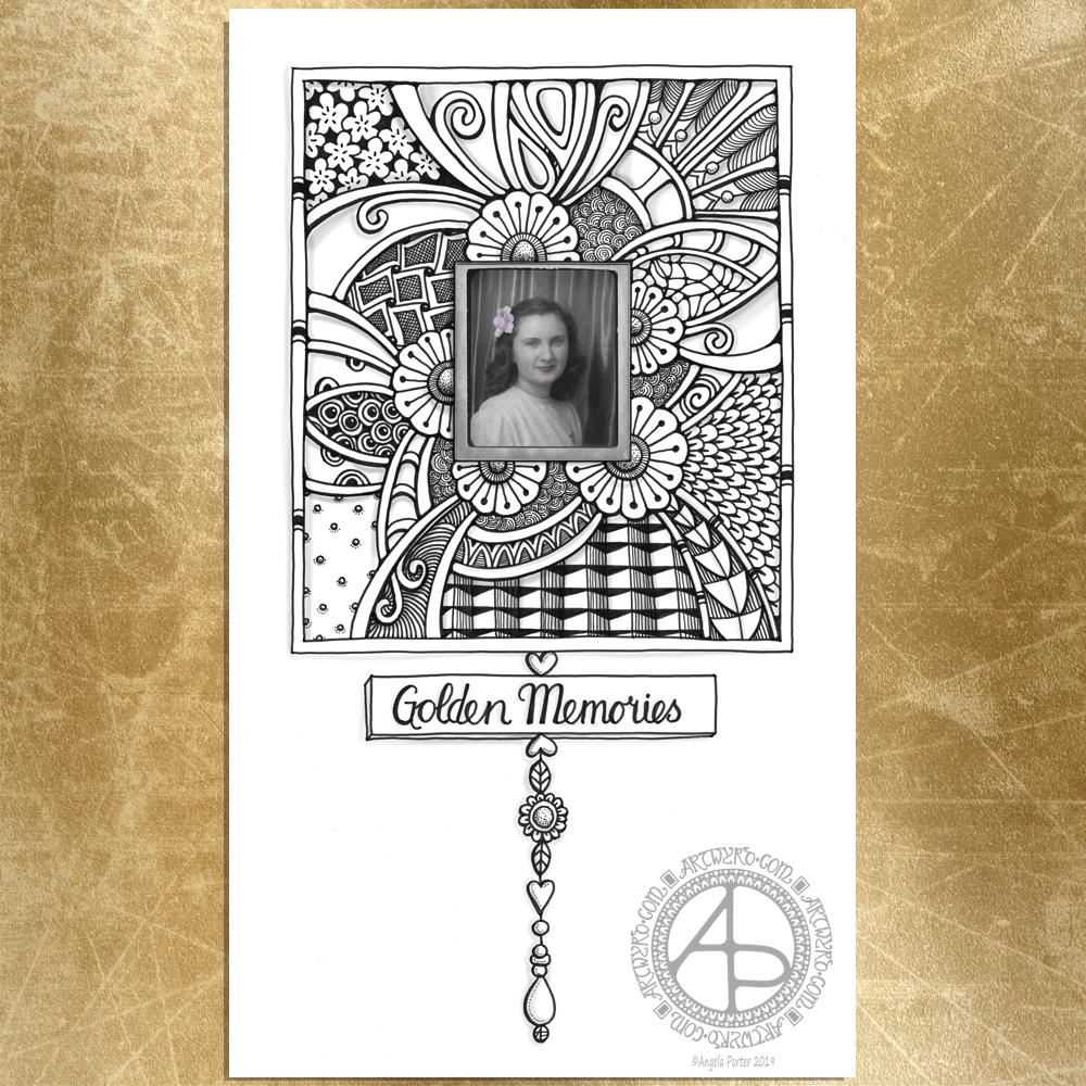
As it’s Friday it’s time for a dangle design, and here it is. All in monochrome, well nearly. I added some subtle colour to the photograph.
If you’d like some ideas and step by step instructions on drawing your own dangle designs then my book “A Dangle A Day” is a good place to start. Just saying like.
I decided to use one of the images from the ‘Photobooth’ collection in the Idea-ology range by Tim Holtz. I thought that around it it would be nice to create an entangled frame, and to add a simple dangle design to this frame.
With the vintage nature of the photo I thought that the hand lettered sentiment of ‘golden memories’ would be a good one to add.
In keeping with the vintage design I thought a monochrome colour scheme would be appropriate. Mind you, a color palette of subtle vintage colours would work quite nicely too. It would be nice if I’d changed the colours from greys and blacks to sepia tones.
I drew the design and did the hand lettering with Unipin pens on Winsor and Newton Bristol board. I then cleaned up the scanned image, and added the subtle colours to the photo, using Autodesk Sketchbook Pro, Microsoft Surface Pen and Microsoft Surface Studio. I also added some subtle grey shadows to the design.
This would look absolutely charming framed, a lovely way to display cherished photo-booth images. I drew this image on a sheet of A4 paper (approx. letter size).
However, this would work on a smaller scale for a scrapbook, journal or even a BuJo. It would also make a lovely greeting card or note card for someone too.
It’s also an idea that can easily be altered for a more masculine tone, perfect for father’s day or a male birthday.
Elsewhere on the interwebs it’s #furbabyfriday, but here, in the tiny corner of the web that is Artwyrd.com it’s dangle day.
It’s getting close to the end of May, so I thought today I’d create a dangle design for June. This would work really well as the monthly cover page for a BuJo or in a scrapbook, journal, planner, diary, greeting card, or anything else you can image it being used.
I did sketch this out in pencil on paper, but then I re-drew, hand lettered and coloured digitally using my usual trifecta of Microsoft Surface Pen, Microsoft Surface Studio and Autodesk Sketchbook Pro.
On Wednesday I had a trip to Hereford for a meeting in the evening. On the way I stopped at my most favourite Romanesque church in Kilpeck to do some drawing. I included some patterns based on this visit in the charms and also the border under the plant pots.
As the Summer Solstice occurs in June, I wanted to include a lovely golden Sun, as well as plenty of golden tones. Also, the clear blues of summer skies and the aquas of sea and lake were a must as well. Cacti, succulents and flowering plants reside in the simple plant pots, with simple monograms on each pot. Of course I have beads and a heart as part of the design too.
I added a textured background upon which I layered a drop shadow for the dangle design.
So many ways that this design could be coloured. I’m quite happy with my design. I’m certainly happy with the line art, but I’m really not confident about my choices of colours. I do feel I’m struggling with colour at the moment.
Wednesday I was surprisingly content and managed to stop at Kilepeck Church, just outside Hereford. I usually visit the church once a year to soak up the awe and wonder and joy I feel looking at the Romanesque sculpture of this tiny three celled church.
I had my Dingbats quadrille A5 notebook with me, which is my current sketchbook. I spent a happy or or so inside the church taking my time to look at patterns and textures and to deconstruct then reconstruct them in thumbnail sketches.
It was really quiet and serene there; just what I needed.
Also, I’d packed up a light meal in a cool bag so I could have a late tea before going on to my meeting in the evening. I thought this was wise as the problems I have eating out when on my own could preclude me getting something to eat/drink. I found somewhere quiet with lovely views to park up and enjoy my light meal and some more quiet time.
My evening was long and I didn’t return home until nearly midnight. The stress being around people I don’t know also took its toll on me. So yesterday I was wiped out yet again.
I had to find my strength to get out to go and vote in the EU elections and to do some shopping, but this absolutely drained me.
When I’m this tired it is all too easy for me to be emotionally fragile and for this to impact on my mental health.
I caught myself having thoughts that were very unkind and hateful towards myself at times yesterday.
I’m still tired today, but feeling a bit more emotionally resilient. I’ve found the confidence to create art, something I didn’t have yesterday.
The ripples from EMDR and other stuff over the past couple of weeks still have energy, sometimes they’re more like storm waves. Storms pass. Waters calm eventually, with ripples that are easy to ride.
I think I’ve had a couple of storm waves approaching the size of tsunamis in the past couple of weeks and they’ve really drained me.
However, it’s all part of the healing journey. After all, I am a lot better now than I was a few weeks ago, a few months ago, a year ago, a few years ago …
A cute, whimsical dangle design today to say hello Friday, the gateway to the weekend.
Sunshine and grey clouds fill the skies today in the Valleys of South Wales, so if it rains there’s a good chance of rainbows. That’s why I chose a rainbow and sun design to hang the dangles from today. I love rainbows!
A bit of hand lettering in the ribbon banner to proclaim Friday is welcomed. Hearts feature simply because I like hearts and i used little gold beads as spacers.
I also included a bluebell. The hedgerows, shady spaces and woodlands are coloured blue at the moment with all the bluebells that are still flowering. It’s a beautiful thing to see, and every year I’m always wowed by their appearance.
Behind I’ve put pale blue and a little drop shadow so the dangle designs appears to float a little.
A lovely little design that would look rather pretty in a BuJo, planner, journal, diary, scrapbook, greeting card, notecard…the list is as endless as your imagination or needs!
I did draw and hand letter this one using digital media – Microsoft Surface Pen, Microsoft Surface Studio and Autodesk Sketchbook Pro. However, it’s a cute and simple design that would be easy to draw on dot grid paper for sure.
Just a little reminder that my book ‘A Dangle A Day’ is available from various outlets. It’s my tutorial book that takes you step by step through creating your own dangle designs.
A year has passed me by …
A year ago today I picked up Binky, my then brand new Smartfortwo SmartCar. Just five days before that I said goodbye to my furbaby companion of just over sixteen years – Cuffs the whoosh kittencat.
A year. One whole year. We have so many days in our lives that mark the end of one cycle of time and the start of another.
I still have and greatly enjoy driving Binky.
I still miss Cuffs. I’m still not ready to have another cat yet, for lots of complex reasons, a lot to do with me becoming so attached to my furbaby companion that I’d not do the exploring and travelling that I want to be able to do as I progress in my CPTSD healing journey.
It’s Friday so it’s dangle day! Today I’ve chosen to share with you my May dangle design from my book ‘A Dangle A Day‘
I’ve used the line-art design and just recoloured it. Different colours give a different ‘feel’ to the dangle design!
The design itself is made up of simple, repeating motifs added in chains of charms. Simple, cute, charming, whimsical and pretty too, even if I say so myself.
This would be lovely as the monthly cover page in a BuJo (bullet journal), planner, journal, diary.
A different sentiment could be used in the banner to make it a perfect greeting card or note card.
One of the dangles would look rather cute as a bookmark; it’s easy to lengthen the designs.
Yesterday
I took a little trip out on my own yesterday. It’s one of my goals as I progress along my healing journey from CPTSD to get out and about more. I chose to go somewhere familiar to me, the little town of Glastonbury in Somerset.
I was able to wander around shops, but when it came for lunch I totally balked at going into any cafe at all. Issues surrounding my body size rose up and I just couldn’t go into them.
So I went home.
The whole trip exhausted me. More of an emotional exhaustion though from being brave and keeping it together and interacting with people in shops.
When I got home I had something to eat, which then resulted in an upset stomach/digestive system.
I then went to bed and slept.
I’m still exhausted today.
But I did it. I went somewhere a bit further afield (a round trip of nearly 180 miles is a little further afield to me!) by myself.
I’m surprised at how much the trip has exhausted me given I went somewhere I know, that is familiar, and I used to feel quite comfortable there.
All the same, it’s highlighted some issues I have with how I view myself.
Don’t get my wrong, I am overweight, but my mind seems to think I’m the size of a small elephant and I won’t fit anywhere. I have no idea of my body size other than the size of clothes I wear, which tend to be larger than I need as I think I’m larger than I am.
Is this body dysmorphia? I don’t know.
So, when a cafe or shop is busy I tend to walk away fearing there’ll be nowhere I can fit into, as well as me being overwhelmed in crowds and crowded places.
The complex layers of how CPTSD affects my daily life and activities a lot of people take for granted. It also shows some more of the barriers I need to overcome in order to finally live the kind of life I’d like to, one that isn’t quite as limited by CPTSD as it has been through most of my life.
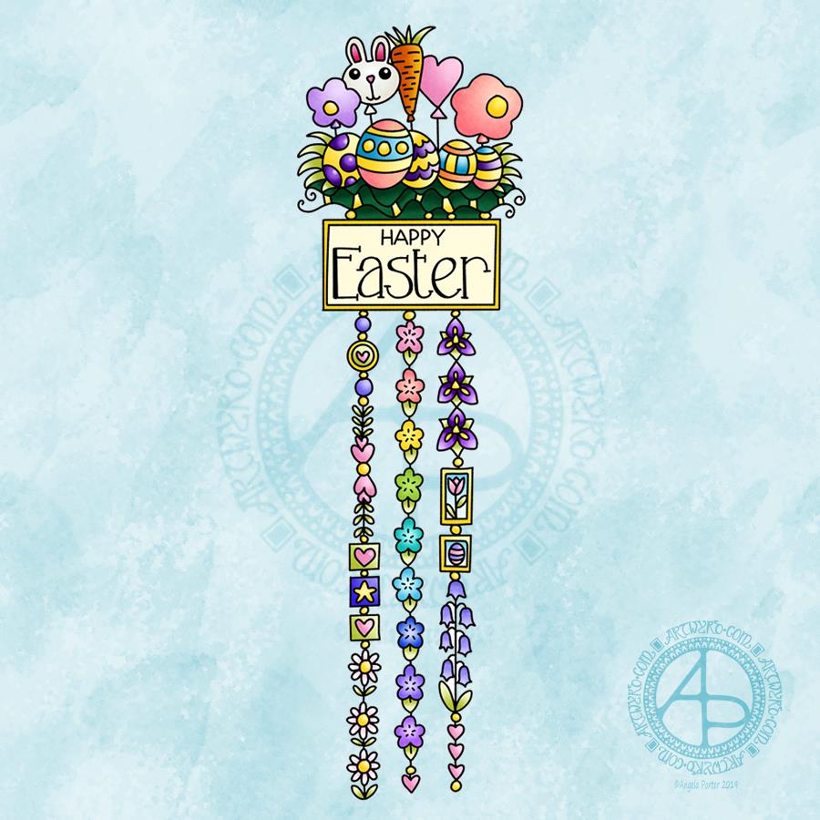
This cutely whimsical dangle design is from my tutorial book ‘A Dangle A Day’, which has the step-by-step instructions for drawing this design. They really are simple to draw, and the hand lettering is based on your own writing style too.
For this design, I chose spring-time colours, more pastel than bright. Of course Easter eggs and a bunny balloon had to feature, along with all the lovely spring flowers and a sprinkling of hearts. I even snuck a star in, hearts and stars being some of my favourite motifs to include.
This design would make a really cute greetings card or notecard. The dangles can easily be drawn shorter. It would also make a lovely bookmark. As a BuJo page, planner page or an element on a scrapbook page it would be lovely.
Using Nuvo drops or Ranger’s Stickles or similar to make dots where the beads are as well as a sprinkling of them around the top of the design would add some lovely dimension and sparkle for sure.
I do hope you give drawing dangle designs a go. They are so much fun and a lot easier to do than you think they are. They can also be used in many, many ways, especially when it comes to sharing love with others at different times and events throughout the years of our lives.
About the drawing…
When it came to designing the dangle designs and monograms for A Dangle A Day, I started off by sketching the idea out on dot grid paper using either a pencil or a pen. I could then adjust the lines and draw guidelines in to help me with the design quite easily.
When I was happy with the sketch, I scanned it in and then re-drew it in a digital form. For drawing digitally I use a Microsoft surface pen directly on the screen of a Microsoft surface book or surface studio. This is like drawing with pen or pencil on paper, or even painting or colouring.
So, although my designs were created in a digital environment, they were still very much drawn by hand.
I used very little in the way of smoothing lines – only enough to remove the wobbliness that comes from the great sensitivity of the pen and screen position sensoring stuff, and never used the predictive line tools available in Autodesk Sketchbook Pro. I worked out how to set up pens that would leave a line texture similar to the pens I like to use to draw on paper with. I determined I wouldn’t make everything perfect, that there would be that perfectly imperfect human touch to everything that I created. I also made sure I included examples of dangles drawn and coloured on paper and turned into cards, bookmarks and BuJo pages too.
Working digitally to draw and then colour the designs allowed me to edit, erase, adjust and keep the image free of smudges and blots that would require re-drawing. It also made it a lot easier to make the edits my lovely editors suggested to improve the work.
It certainly saved a lot of time scanning image after image in – something I find extremely tedious.
Although I may have used digital tools to draw with, the techniques I used were the same as if I’d drawn on paper with pen and then coloured with various traditional media.
I also have to say that the year to year and a half ago when I was colouring these I was only just starting to explore the realms of digital colouring and I hadn’t quite worked out exactly how I’d like to do it. They worked out good enough, but now I think I’d approach it a bit differently.
I had such a lot of fun creating the dangle designs season by season, month by month, celebration by celebration and I hope you have the same amount of fun doing this too.
I had a lovely time this morning looking at Arts and Crafts Movement, Rennie Mackintosh and Art Nouveau designs. I’ve always love these styles of art with their organic lines and stylised motifs and it’s certainly influenced my style of art in some little way.
I got inspired as I looked at these styles and decided to use them as a start for my April BuJo page design, which you can see above.
The had lettering is a little heavy handed where the squares are concerned, but over all I’m fairly happy with it.
There’s definitely a touch of the Rennie Mackintosh’s there with the organic motifs and lines contrasted with the graphic squares and diamonds.
I chose warm and sunny yellows with light, fresh greens as they are so dominant in nature this early on in Spring.
A quick sketch on Rhodia Dot Grid paper followed by a scan and I inked it using some of my brushes in Autodesk Sketchbook Pro. Of course I wielded my Microsoft Surface Pen with some happiness on the screen of my Microsoft Surface Studio.
A simple but, I think, and elegant design. One which would look fab for any month in a BuJo (bullet journal), planner, diary, journal or even in a scrapbook. Of course it would make a lovely greetings or note card too. I’m sure there are many more instances of where this design would work beautifully.
It’s another beautiful, sunny, unseasonably warm late winter day. Daffodils are out, February is almost over and it’s time for me to turn my attention to a design for a BuJo monthly cover.
This is what I came up with today. A simple mandala of sunny yellow daffodils, bright fresh-green leaves and the lovely clear blue skies we’ve had here in the Welsh Valleys over the past few days.
Of course, 1st March is St David’s Day. St David is the patron saint of Wales, and daffodils are the flowers associated with this day.
As a child we used to have a half-day at school for St David’s Day. In the morning there was an Eisteddfod – a kind of concert and competition involving singing and poetry and music and clog dancing and all kinds of creative things. Much of this was done in the Welsh language. And of course My Hen Wlad Fy Nhadau would be the final song that all joined in with – the Welsh National Anthem that is still proudly sung at international rugby matches and other such occasions.
On this day, children went to school dressed in traditional Welsh costume, wearing either a daffodil or leek pinned to their clothing. The boys would try to show how big and tough they were by eating the whole leek raw.
I could’ve tried to draw a red Welsh Dragon for the mandala, but the daffodils are so pretty…maybe I’ll do another with a dragon in, or maybe a dangle design with a dragon as part of it.
This design would make a lovely monthly cover page for a BuJo, or in a planner, diary, journal or on a greeting card or note card.
A jolly day out
Yesterday I had a lovely jolly day out with my friend Liz.
We visited the stone circle at Stanton Drew. I’ve been there before, but Liz hadn’t. It’s bigger in diameter than Stonehenge but smaller than Avebury. It did have several concentric rings of timber posts inside the stones when it was in use, but they have long rotted away.
After that we headed to Wells. Again, I’ve been there but Liz never had. We had a walk through the town and spent some time buying lovely shoes from Moshulu, mine being rather sparkly and lovely!
Cake in the Cathedral cafe, with plenty of tea in my case, coffee in Liz’s, and then it was off to visit the Cathedral. Always nice to see the scissors arch there and the wobbly wonky steps going up to the chapter house.
It was sunny and warm and I managed to get sunburn! Mind you, that happens easily as I’m quite fair-skinned. In the past I’ve even managed to burn and blister through sunblock. I seem to be a bit more resilient. But who would’ve thought I’d’ve got sun burned in February in the UK!
The sunny, mild weather is helping my mood an awful lot. Leaving EMDR on monday having completed processing a trauma that was really painful to me has also helped. I’m still feeling a bit light headed from it today, but that’s a good thing – a change from the low moods, emotional distress and upset I have felt.
Being out and about and spending time with a friend was also a good thing for me. Lots of laughter and silly conversation along side more serious topics too. That’s what happens when you get two quirky, retired science teachers together.
Friday is dangle day! Well, it is for me. I like to finish the working week off with a cute dangle design, and today I chose to do a greetings card or note card with a decorated envelope.
The media I used were :
pencil and ruler
05 Uniball Unipin pen
Copic markers
Kuretake Zig Wink of Stella brush pen
Claire Fontaine mixed media paper
Distress ink and sponge applicator
Kraft card and envelope
Sticky foam squares
Two self-adhesive gems
White Uniball Signo gel pen
As it’s still winter I thought some snowdrops would be appropriate, along with some crocus buds along with an evergreen wreath. Stars and hearts are always favourites of mine to include, as well as some swirls and spirals.
I chose quite cool and pastel colours for the design, along with very simple shading. The Wink of Stella added a little sparkle to the hearts, stars, beads and snowdrops in the design. A couple of self-adhesive gems added a touch of interest to the ribbon banner.
I used faded jeans Distress Ink to edge the paper panel, which I adhered to another slightly larger panel which I found in my stash of Distress Ink coloured papers ready to use. This one was also edged with faded jeans Distress Ink.
I then used Tombow Mono glue to stick the panel to the card blank.
I drew a simple arrangement of snowdrops and buds on the envelope in white ink and added some spirals and swirls to ‘ground’ the pot. I’m not happy with the spirals/swirls though, but it’s only an envelope so if I send this card to someone I can always decorate another envelope!
Replace the wreath with a photo of the recipient and you’d have a lovely, personalised keepsake of a card.
This design would also make a lovely page in a bujo (bullet journal), planner, scrapbook, or journal too.
My hand lettering is a little rusty; I’ve not done much in the past week or so as my focus has been on mandalas and work for my next book.