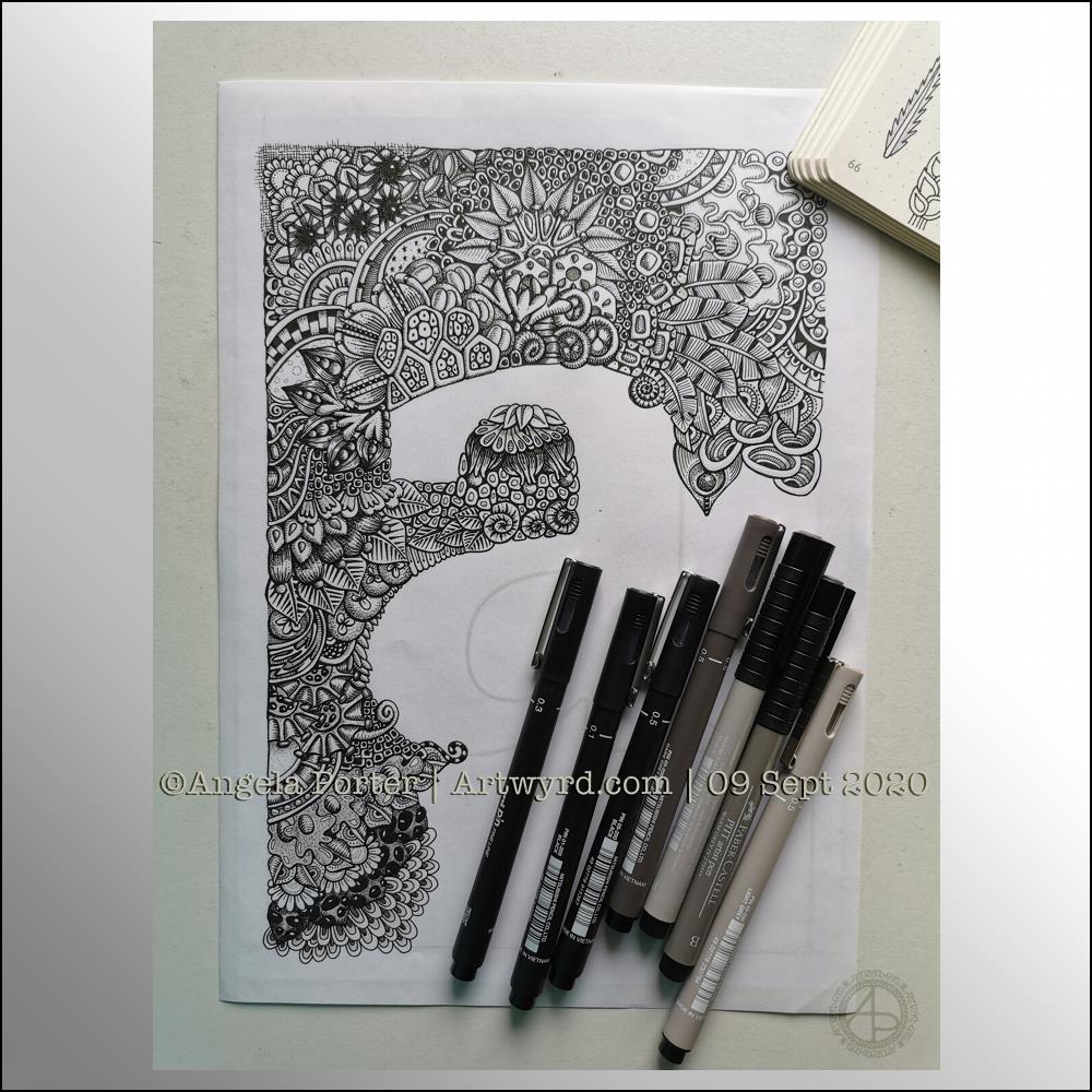
I’ve completed more of this WIP this morning. It’s coming along, but it’s at that point where I’m starting to think, “What the heck was I thinking?” about various sections.
I know from lots of past experience that I often get this feeling as I work on some art, and all I need to do is to trust my instincts and intuition and to carry on working on it. And so I shall. This is the way.
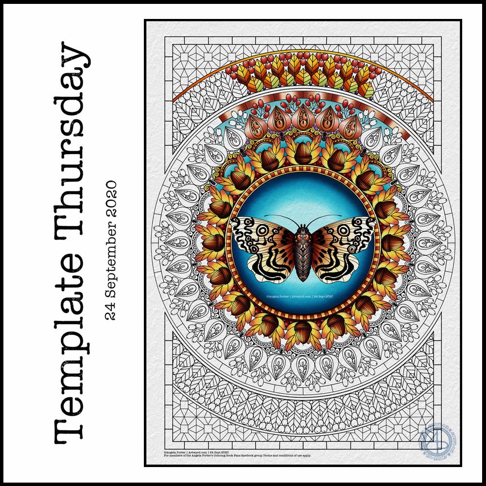
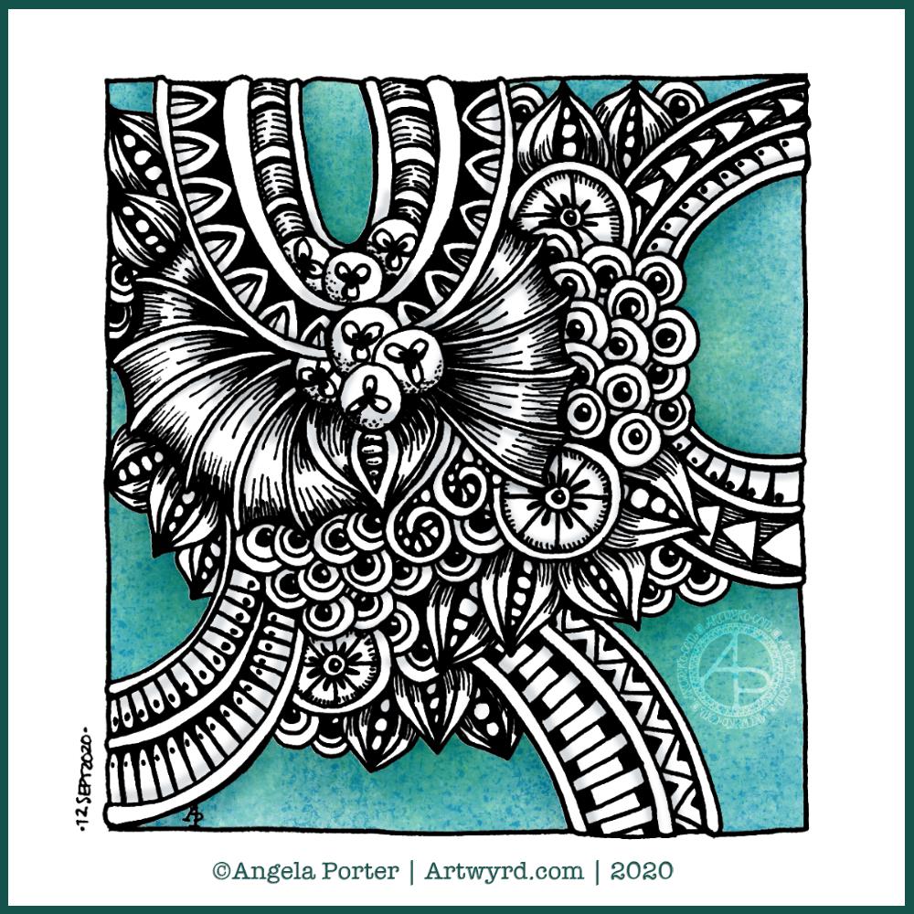
‘Tis coloring template day for members of the Angela Porter’s Coloring Book Fans facebook group. Each Thursday throughout the pandemic, I’ve created a coloring page for members of this facebook group. The template is free to members, and it’s free to become a member!
This week’s features an iteration of one of my moth drawings, this time drawn with colouring books in mind. I just had to pair the moth with a mandala as that’s been my ‘thing’ for a few days now. Naturally, the mandala is less detailed than my drawings and the page is mostly filled with pattern and interest, as is my style for colouring templates.
I have autumn on my mind and in my heart, so the motifs reflect that – acorns, seed pods, berries and leaves. I’ve chosen autumnal colours to partly colour the template, but any colour scheme would work – a good thing for those of you in the southern hemisphere where spring is on it’s way.
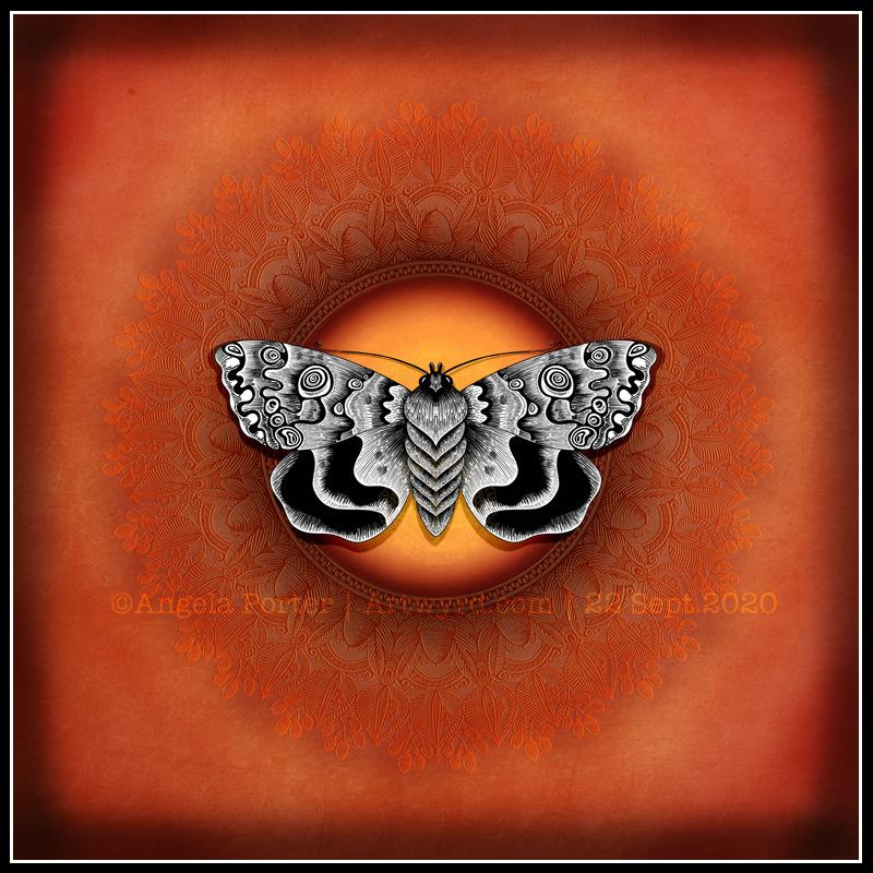
‘Tis the first day of autumn in the northern hemisphere, astronomically speaking. The day started bright and sunny, but the clouds have closed in, the breeze has picked up and the temperature has dropped a little.
Even though today may not be a typically autumn day, today’s arty offering has warm, fiery tones reminiscent of autumn leaves and bonfires. Of course there’s a black and white, graphic moth illustration.
This moth is an iteration of the first moth I drew a few days ago. it’s fun to work with images, alter and change them and create something new and different each time. It’s also a good way for me to experiment with line to achieve volume and texture in the illustration.
Having the mandala of acorns, leaves and berries become a texture upon the background means it doesn’t detract from the moth. It does add interest and another hint that I created this with autumn in mind.
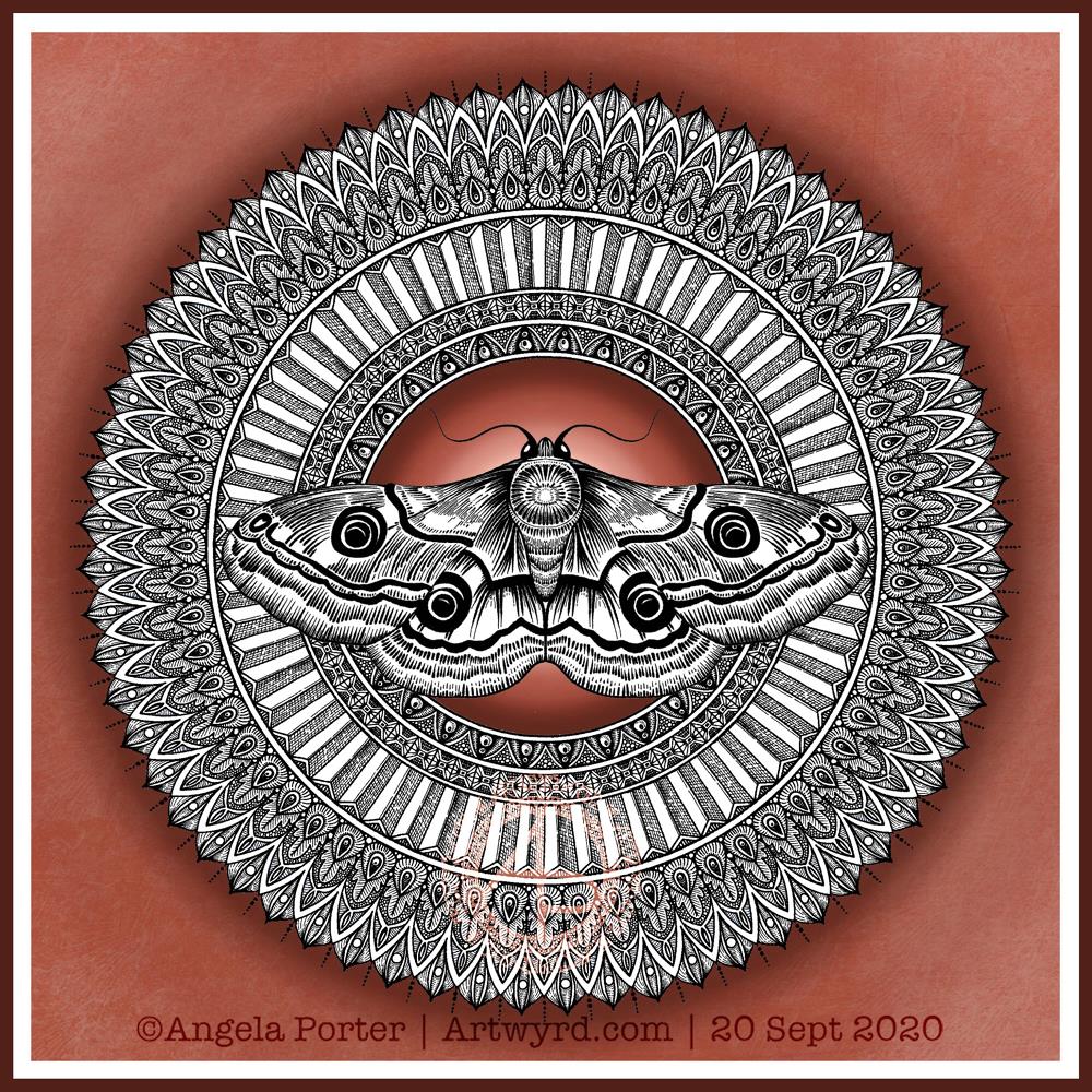
Moths are becoming a bit of a thing with me at the moment. They’re great for practicing my line work. They’re also surprisingly cute, in a buggy kind of way.
Of course, I’m still working on the first moth entangled drawing/illustration, so adding a mandala behind this drawing is a quick and easy way of adding to the moth. Mandalas are kind of my thing to do.
Again, I’ve used that spot of highlight behind the moth to draw attention to the centre of the design along with the main motif.
Today, a terracotta background seemed to be just right. Perhaps because it’s quite an autumnal colour. This morning there’s a definite nip in the air that I associate with autumn and we are just a couple of days away from the equinox.
Terracotta is a deeper shade of orange and is comforting in it’s warmth and earthiness. I find it quite soothing.
I’m also enjoying floating the graphic black and white elements of my artwork above a simple coloured background. That way I have some colour in my art, but the colour doesn’t distract from the design elements.
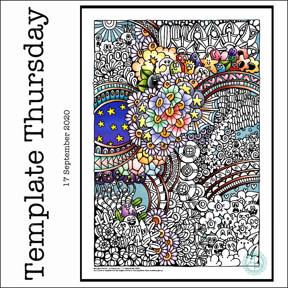
This week I have a mix of my entangled art along with some cute, whimsical, doodle-characters. Something fun, light hearted to lift the spirits somewhat.
I used a 05 Uniball Unipin pen to draw this design on Marker paper. I added some colour with Autodesk Sketchbook Pro.
As always, the weekly templates I draw throughout the pandemic are available from the facebook group to members of the group. They are free to members, and it’s free to join!
Dimensions : 8cm x 8.5cm (3¼” x 3¾”) Smooth cartridge paper (acid free) Uniball Unipin pens (05 and 01) Digital editing and colour in Autodesk Sketchbook Pro
I drew this little drawing yesterday, but spent some time this morning scanning, cleaning and adding colour and shading digitally.
I deliberately left some ‘white space’ so I could fill it with colour. This contrasts rather well with the graphic black and white entangled art design. The coloured background adds depth to the image, and the subtle shading by grey and textural lines adds volume to the design elements and layers.
I often think I struggle with colour, unless I use a limited palette. This is a way to make use of colour in a way that adds interest to the design without detracting from the line work.
I got this monogram finished yesterday evening. I think I may have been a bit heavy handed with shading in some places. However, overall I like it and I like the volume or dimension that the shading adds.
I definitely enjoy working in such a detailed, intricate and organically intuitive kind of way. Having the monogram as a design to work around does help quite a bit.
On a kind of related point, I had a new A5 dot grid notebook delivered yesterday so I can start to make a collection of motifs and patterns as I use them or create them. The idea is I can winnow out those that I never/rarely use. The reason for this is that the dot grid notebook I’ve kept as a visual dictionary for the last couple of years is just about full! I will keep it as a reference, but it’s time to start a new, more relevant one I think.
I have a snazzy, teal coloured notebook, covered in vegan faux-leather. It has 218 numbered white pages that are a tad thicker than the usual dot grid notebook pages, The paper is velvety smooth and a pleasure to write/draw on. It’s made by Wordsworth & Black and I came across it on Amazon. Oh, the ink doesn’t feather, bleed through or ghost on the pages. I paid £15 for it and I’m very happy with it so far.
Wednesday is work in progress (WIP) day. So, I thought I’d share my monogram “a” and the progress I’m making on it.
There’s a clutch of pens there! I decided to see if I could add grey to heop areas of the design stand out more, as well as adding some depth and dimension. I figured I had nowt to lose if I tried as the the design was becoming all much of a muchness to my eye. Looking at the image above, it seems to be working well in some areas!
I started using some grey unipin pens to add shades of grey to the design. They worked kind of well enough, but they were picking up pigment from the black and moving it around.
So, I thought I’d see what greys in Pitt Artist Brush pens I had and found some warm greys. They worked better as the colour could be laid down more smoothly.
I do have some new motifs to add to my visual dictionary, a corner of which you can see at the top right of the photo.
I’m not sure if I like adding the greys more than if I don’t add them. I suspect I’ll like them more as I work with them as I love the sense of volume that has appeared in various areas thanks to the contrast they confer on the design.
Yesterday and today my focus has been on colouring some templates for my Entangled Gardens coloring book that is due out next year – March 1st 2021 here in the UK to be precise.
This is just a small part of the second of three templates I need to colour. I thought I’d go with a night sky for this one. The first one I’ve given a sunshiny sky to, the third I’m going to go with a sunset colour scheme for the background.
It takes me quite a few hours to colour each template, which is a nod to how intricate and detailed my artwork usually is.
This template, like many in the book, was drawn with pen on paper. However, I like to colour the templates digitally, so I’m using Autodesk Sketchbook Pro along with my Surface Studio and Surface Slim pen to add colour.
I’ve spent so long working at my computer that I’m feeling a bit stiff and uncomfortable. I’m able to tilt the screen of my Surface Studio so that’s at a comfortable position to work at with pen on screen. Still, I’m feeling somewhat stiff. So as soon as I’ve finished my social media stuff for the day, I’m going to take a walk to ease some of the stiffness before I return to the task.
Seven more days of the pandemic over and done with and gone to the past. That means seven less days before it comes to some kind of end! Always trying to look on the plus side of things, not always succeeding.
In the past week we’ve also left August behind us and entered September.
This week, I’ve created one of my signature ‘Entangled’ designs that includes seed pods, flowers, berries, foliage and plenty of arches with abstract, geometric patterns.
I drew this template on Canson Bristol Board with 05 and 03 Uniball Unipin pens. I’ve added colour digitally.
As I can feel autumn ready to burst forth soon, I’ve chosen colours that represent that season. Of course, any colour palette will work well. The aim is to have fun, relax, and take time out for creativity. There’s no coloring police to tell you you’ve done wrong, apart from our own inner critics.
As always, I look forward to seeing how everyone brings this template to life with colour!
I started doing the Inktober52 challenge at the start of the year, but quickly fell off the wagon, so to speak.
I really enjoyed doing Inktober last year, though I didn’t use the official prompt list as it really didn’t do anything for me. Instead, I used two alternative lists – one of skulls, the other of fungi.
I’m thinking of using this year’s list to practice typographic art. Mind you, that depends on what alternative lists I stumble upon, as I may use one of them instead.
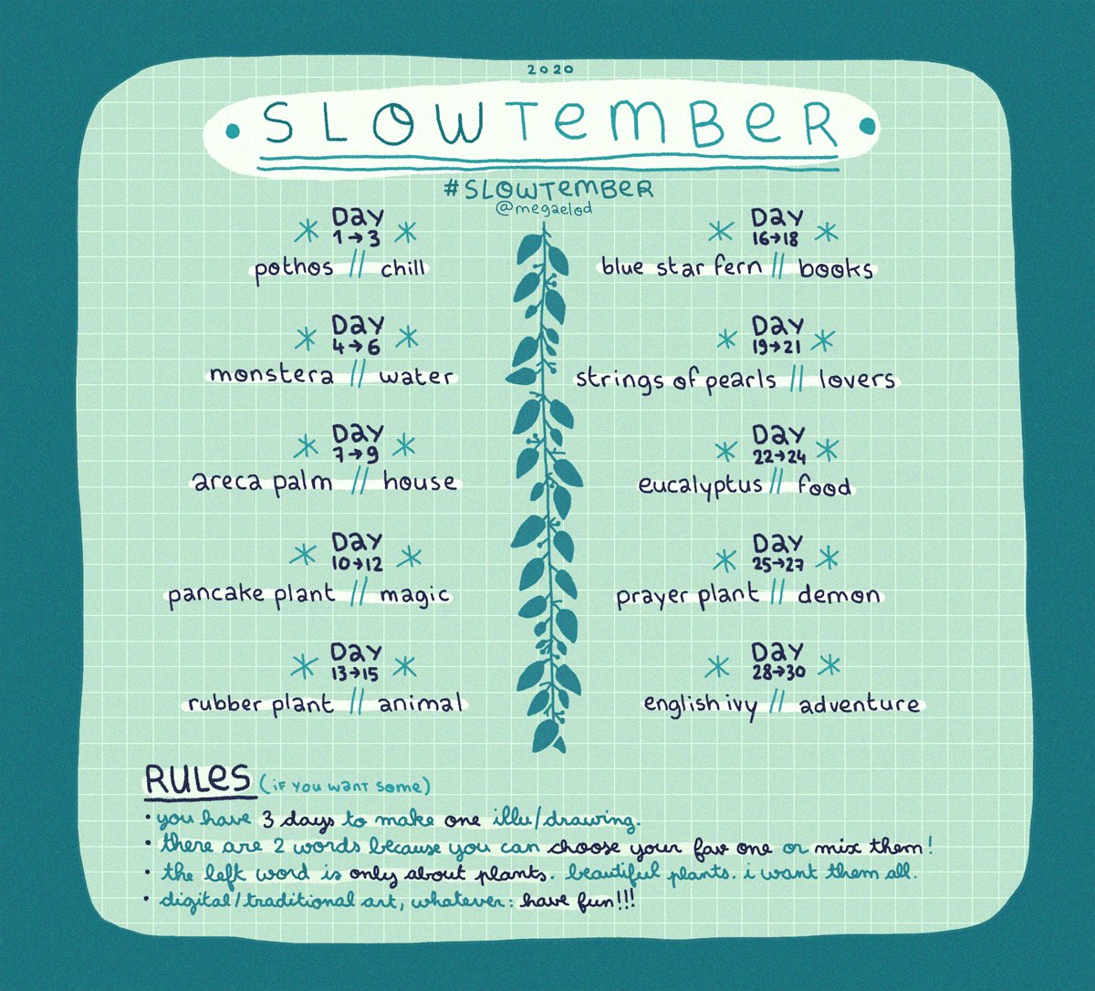
I also discovered this Slowtember challenge on twitter from @megaelod:
I am tempted to use this for this month. I’ll see what happens!