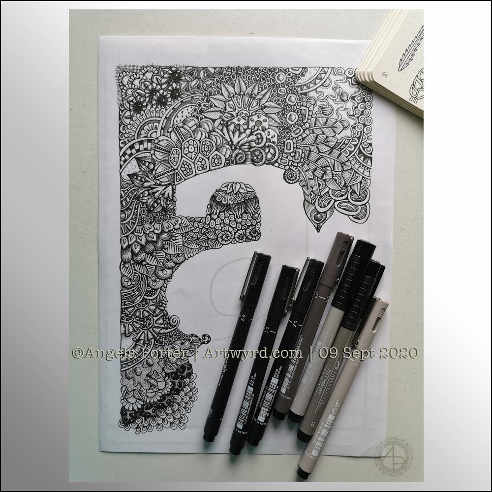
Wednesday is work in progress (WIP) day. So, I thought I’d share my monogram “a” and the progress I’m making on it.
There’s a clutch of pens there! I decided to see if I could add grey to heop areas of the design stand out more, as well as adding some depth and dimension. I figured I had nowt to lose if I tried as the the design was becoming all much of a muchness to my eye. Looking at the image above, it seems to be working well in some areas!
I started using some grey unipin pens to add shades of grey to the design. They worked kind of well enough, but they were picking up pigment from the black and moving it around.
So, I thought I’d see what greys in Pitt Artist Brush pens I had and found some warm greys. They worked better as the colour could be laid down more smoothly.
I do have some new motifs to add to my visual dictionary, a corner of which you can see at the top right of the photo.
I’m not sure if I like adding the greys more than if I don’t add them. I suspect I’ll like them more as I work with them as I love the sense of volume that has appeared in various areas thanks to the contrast they confer on the design.
Sunday morning is always a time to breathe, relax and create something easy and pleasurable to do. Comfort art. Today, that meant a mandala and a quote that is quite appropriate for this morning.
Mandala creation makes me smile inwardly. It’s a familiar process and I can create a mandala that is complex and detailed, or simple, and the calming, relaxing effect is the same.
I do draw my mandalas digitally. By using Autodesk Sketchbook Pro’s symmetry tools, it streamlines the process for me. There’s also the removal of the frustration that is caused by an error or a smudge. I can focus on the relaxing, soothing process and on being creative.
In that vein, I decided to draw the mandala in black on white. But when it was finished, I wanted to use a background and a monochrome colour scheme.
I love kraft paper. I don’t know why. I think it’s that colours seem to almost glow against it. So, I chose that for the background. Then, I created a layer of creamy, orange-yellow tones to highlight the line art. Nice warm, comforting, gently glowing colours.
Finally, I created some drop shadows for the text and mandala.
I look at the finished mandala and I smile, gently. I feel my heart fill with some warmth and a sense of lightness.
Creating art, including mandalas, lets my soul shine. What makes your soul shine? Take time today to indulge your soul in activities that let it do so.
Seven more days of the pandemic over and done with and gone to the past. That means seven less days before it comes to some kind of end! Always trying to look on the plus side of things, not always succeeding.
In the past week we’ve also left August behind us and entered September.
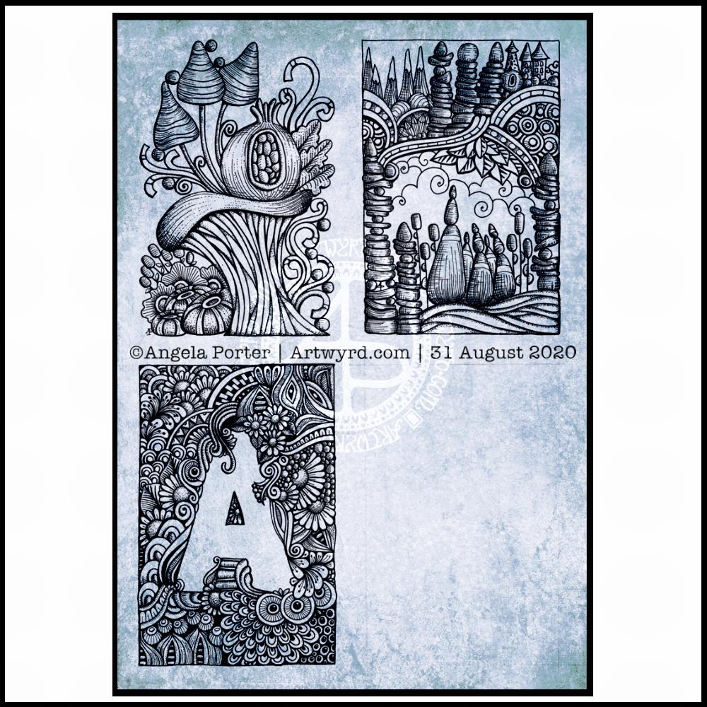
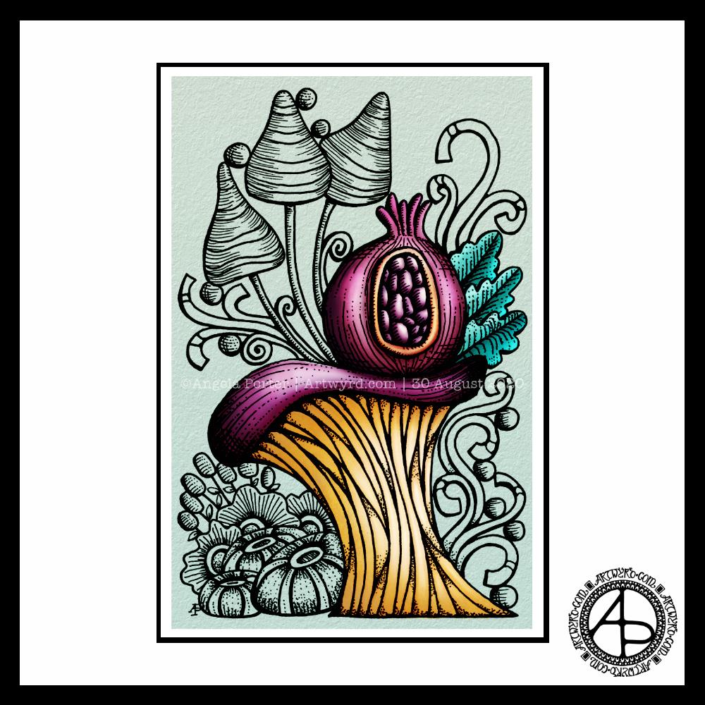
This week, I’ve created one of my signature ‘Entangled’ designs that includes seed pods, flowers, berries, foliage and plenty of arches with abstract, geometric patterns.
I drew this template on Canson Bristol Board with 05 and 03 Uniball Unipin pens. I’ve added colour digitally.
As I can feel autumn ready to burst forth soon, I’ve chosen colours that represent that season. Of course, any colour palette will work well. The aim is to have fun, relax, and take time out for creativity. There’s no coloring police to tell you you’ve done wrong, apart from our own inner critics.
As always, I look forward to seeing how everyone brings this template to life with colour!
I started doing the Inktober52 challenge at the start of the year, but quickly fell off the wagon, so to speak.
I really enjoyed doing Inktober last year, though I didn’t use the official prompt list as it really didn’t do anything for me. Instead, I used two alternative lists – one of skulls, the other of fungi.
I’m thinking of using this year’s list to practice typographic art. Mind you, that depends on what alternative lists I stumble upon, as I may use one of them instead.
I also discovered this Slowtember challenge on twitter from @megaelod:
I am tempted to use this for this month. I’ll see what happens!
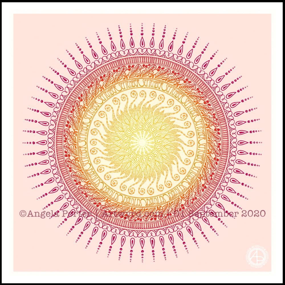
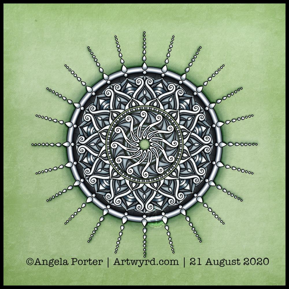
It’s a sunshiny, blue-sky morning with a distinctly cool and freshness to the air. It really feels like autumn is on it’s way. So, I’ve created a mandala to welcome the change of month, and the incipient change of season. I even practised my hand-drawn typography / hand-lettering.
What I missed out on doing was having a 9-fold symmetry for the ninth month. Ho hum. Perhaps I’ll just create another!
I’m also not at all sure of the background colour. It’ll do for now. After all, this is my morning warm up art.
Drawn in Autodesk Sketchbook Pro using Microsoft Surface Studio and Microsoft Surface Slim Pen.
I finished the top right design, and have completed the ‘A’ illustration on the bottom left. That leaves one space to be filled, no doubt later today.
I’ve used either Faber-Castell Pitt Artist pens or Uniball Unipin pens to complete the drawings on ClaireFontaine’s Paint-On mixed media paper. This paper is fairly weighty (250g/m²) and has a lovely velvety feel to it.
The only pencil lines I’ve used have been to delineate the ‘boxes’ to draw in, and for a couple of the design elements in the top left image as well as the A.
Reflecting on the designs
The white space in the top left design works really well I think, and is quite an accomplishment for me. The same is true, to a lesser extent for the top right design. In both cases, the white space brings attention to the design.
In contrast, the densely pattered area helps to bring out the monogram A, making the white space the focus of the design.
I think I’m going to work on some more monograms in this style. They are fun to do, and dense, entangled patterns are one of my signature artistic voices. It’s been a long time since I’ve completed art like this, with a lot of detail to bring out dimension/volume in the design.
In fact, I’ve enjoyed using line and stipple to add volume in all the designs, exploring how I like to do this as I go. All the work I do with colouring books means I have put this to one side. It’s interesting how I’ve circled back to this style. It’s even more interesting to look at how my drawing skills have developed and evolved over time as well.
I found some peace, contentment and joy while drawing these, and feel a sense of accomplishment, particularly with the two on the left.
Do I prefer digital or traditonal drawing?
A difficult question to answer. I think it depends on what I’m creating.
I really do enjoy using pen on paper. I get a better sense of the overall design. Paper and pen is very portable too – whether I’m sketching when out and about, or drawing in different places at home.
Drawing on the screen of my Surface Studio with a pen is a lot like drawing on paper. The smoothness of the screen makes it a very different tactile experience. It also is great for inking in sketches. It also makes correcting mistakes or re-working areas a lot easier, and there are techniques I can use that are near impossible or very time consuming when working traditionally.
Sometimes, the lines produced digitally are too perfect. I’m still working on developing the brush styles that will mimic the unevenness of an inked line. I do have to use some element of line-smoothing as I draw; without it the lines are really wobbly, but with it they can be too perfect and I lose, to a degree, that personal and unique way that my pen moves on paper.
I also find it difficult to have a sense of proportion or detail when working digitally, even though I can look at the design at the same size as it will be printed. The ability to zoom in and work on a small area means I lose all sense of relative size and complexity/detail of a design. So, if I’m going to work on a drawing digitally, I prefer to start with a sketch to give me that sense of scale.
I rarely sketch out my design when I work on paper, except if I need the outlines of a design element as I’m drawing. I do tend to work very intuitively.
So the answer is, I prefer each for different purposes, and also to suit my different moods and purposes.
Of course, once I’ve drawn a design, I then have to decide if I want to add colour, and then what media I will use – traditional or digital!
Today, I thought I’d digitally colour one of my recent drawings. I thought it would be nice to compare and contrast digital colouring with traditional colouring.
It’s been a while since I did much art digitally, I’ve been lost in traditional media this week as I slowly heal from some emotional wounds. Art helps with healing. Meditation helps too. But time is still needed for the healing to take place, and for rest to relieve the exhaustion that lingers still.
Any kind of art, digital or traditional, soothes my mind, emotions and body.
What I like about digital art is the way I can get such high contrast in colours to enhance the sense of volume the design elements have. I also like the vibrancy of colours. I also like the ability to add texture to the colour in so many different ways.
Of course, I like the ability to alter colours when they don’t work, without having to start over. I’m not sure if those leaves are going to stay that particular green-ish colour. Nor am I sure about the background colour.
As is my wont, I’ve used Autodesk Sketchbook Pro to add the colour and textures. My hardware is a Microsoft Surface Studio and Surface Slim Pen.
Yesterday evening, I found a little oompf to play with colour in my watercolour sketchbook. The little blocks of colour on the right hand side are the result.
I dropped wet into wet, both watercolours and metallic watercolours, and just let the watercolour do their thing. I also tried similar with Inktense ‘watercolours’ too.
Just doing something simple like this, playing with colour for the sake of playing with colour, led me to want to try something different.
I had got frustrated and not all that happy with the designs on the left page over the past couple of days. Browsing through Pinterest, my attention was caught by illustrations that use black line drawings with a wash of colour. So, I thought I’d try those out.
I also wanted to try different pens to see how waterproof they are on watercolour paper. Unipin pens in grey and black, Pitt artist pens and a Signo DX pen were what I had to hand.
I used the pens to draw some of my favourite kinds of motifs, but rather than leaving just the outline, I used the pens to add shadow and the illusion of shape to the motifs. Once I was happy, I added watercolours. I did go back and add more lines where needed once the watercolours had dried. I also used a white gel pen to add highlights.
Reflections
Firstly, all of the pens were waterproof. The grey Unipin pen did bleed more as I was drawing with it initially than the others, which showed little bleeding at all. Anyway, I’m happy that I now know for sure they are waterproof.
I have used colours that are different for me. They have more of a vintage vibe to them. I actually like the colours, a lot.
Still developing my artistic voice(s)
I keep trying to move away from black line drawings with colour, to paintings made solely of colour. Each time I do this, I’m never really happy with what I produce, it never seems to feel it is ‘me’. I love to see how others use just pure colour to create art, it just never seems to work out quite right for me, not unless I work digitally. Even then, the digital artworks make me smile, but they still don’t feel right.
I like to draw colouring templates that help others express their creativity and to use for relaxing, meditative, calming activities. These are lovely in their own right and for the purpose they’ve been created for. However, they lack the details that I find satisfying.
That ‘Aha!’ moment
And there it is, I’ve worked out why things don’t feel ‘right’. Detailed line work. Using line and pattern to create shadow and volume in a drawing. There’s also a need for me to use line to define and structure artwork.
That was something I always used to love to do in my earlier artsy years, and something that has gone by the wayside as I’ve used my skills at stylising motifs for my work as a colouring book artist/illustrator.
Those skills will never be lost and will always be used. However, I have a need to find ways to express myself in ways that satisfy my artsy heart, and this revelation is one answer to that.
It’s obvious when I look back at my blog, that I’m constantly trying out new things, going back to old things.
Sometimes I return to old crafts and styles I’ve tried in the past as they are familiar to me and that familiarity comforts me when I need time to just create and feel some level of satisfaction in what I do. Comfort art I’ve described this in past, and it’s just as true for me now as then. There are times when I’m not up to challenging myself as I try or develop a new style to me. Then, I go to art and craft styles that I know I can do fairly easily.
At other times, I’m seeking for the new, different and to stretch myself artistically. Out of a lack of inspiration over the past day or so has come a style that will stretch me, and perhaps will sit easily with me so it becomes one of my ‘voices.
Oh, I’ve not abandoned my new-found passion for typographic portraits/art. In fact, my mind is ticking over how I can incorporate that along with this coloured detailed drawings. Before I try the idea, I need to get some drawings done! I’d like to try the idea out digitally to see if it will work. That way, any drawings I’m really pleased with won’t be messed up.
I wasn’t in the mood to continue with the watercolour work in my sketchbook, soI made some Distress Oxide backgrounds on some Bristol board (5.5″ x 4″). I thought I’d do some intuitive drawing on them using metallic gold ink. So much for what I thought I’d do.
Brush and FW pearlescent Mazuma gold liquid acrylic and a brush didn’t work for me. I was getting frustrated with it. So, I tried a gold metallic Gelly Roll pen, which also didn’t feel right. I followed this by a white Gelly Roll pen, a gold glitter Signo gel pen, and finally a black Pitt Artist pen, none of which allowed me to feel I could settle into some art.
Whatever I did I just wasn’t happy with. It seems that this morning I’m not meant to be doing any art.
Feeling Meh
I am feeling meh this morning, meh meaning a lack of enthusiasm, interest and lacking in inspiration. I feel flat, fed up and still emotionally exhausted. This is finally expressing itself in my art today.
So, today is a day to do something different I think. I’ll most probably do some crochet and read.
I started reading a book yesterday by Rupert Sheldrake – “Science and Spiritual Practices”. I’ve long enjoyed reading Sheldrake’s books, after discovering his theory of Morphic Resonance (thanks to the ‘It’s morphic, innit?’ statements in the Discworld books of Terry Pratchett). I also have an interest in what consciousness is, where it resides, and so I find books that tie science into spirituality and a non-mechanistic approach to consciousness and life quite interesting.
For a number of years, I’ve found it difficult to read and focus on reading for any length of time. I experienced burnout, and with it the depression and anxiety related to CPTSD all my life, had become almost unbearable. With these, my ability to read and process written information mostly vanished. That happened nearly seven years ago now. Slowly, my ability to read and understand and retain what has recovered to where I can now enjoy reading, though it’s not always a natural activity to return to.
Today, however, may be the perfect day to snuggle down with a good book, decent mugs of tea, as it’s grey and damp outside. Nice music on would be good too.
Feeling uninspired
This happens to me on a fairly regular basis. I need a break from art and to do something different. I may do some quick, easy, familiar and comforting types of art just to keep my hand and eye in. I do, however, give myself a break from trying to work at any challenging projects. It’s like a short holiday from art. In time my energy, enthusiasm and inspiration returns anew and off I go again.
Learning to be kind to myself, giving myself permission to take a break, hasn’t been easy. It’s taken a long time. On days like this, though. Days when I feel flat, sad, exhausted, it’s easy to beat myself up about being ‘lazy’.
It’s not being lazy at all; I’m busy taking care of myself. I have to work hard at reminding myself of this. And busy taking care of myself means slowing right down and doing activities that soothe, calm, relax and allow my energy to recharge. Today that means rediscovering the joy of reading, something I used to take for granted, and now it’s something that I will appreciate so much more.
Today’s art is a simple mandala. A cool grey, black and white colour scheme on a soft, calming green background.
Drawn in Autodesk Sketchbook Pro using a Microsoft Surface Slim Pen and Microsoft Surface Studio.
Confusion
I am emotionally drained, confused and overwhelmed again today. I don’t have much in the way of focus. I was surprised I could complete even this quick and simple mandala.
I don’t have the focus or energy to reflect on the choices of colours and symbols in the mandala and how they relate to messages bubbling up from my unconscious mind.
I feel trapped, caught between a rock and a hard place. I’m damned if I do, damned if I don’t. The stress of it all is giving me a migraine, upset digestive system and is dragging my mood downwards.
Heck, even the mandala looks like it is either sinking down, pulling itself up or hanging on by the chains of teardrops. That is how I feel, and I had no idea that was how the mandala would appear when finished.
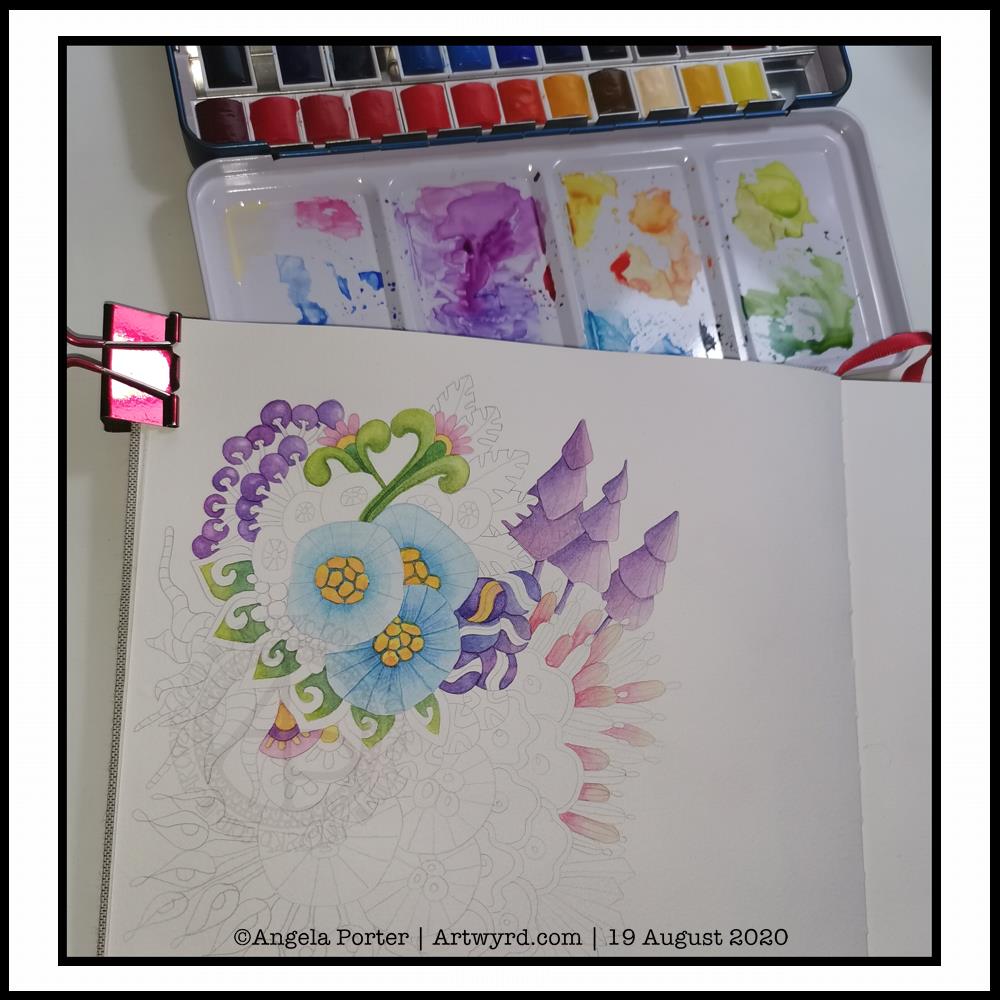
It’s WIP Wednesday, so here’s a work in progress I started this morning.
I woke thinking it was about time I tackled rendering one of my abstract, stylised, imaginary botanical designs in watercolour.
I think I’ve gained a bit of experience with watercolours, kind of have a feel for them and how I like to work with them. Or so I thought.
Anyways, I started by drawing the design lightly in pencil. I used a 0.5mm mechanical pencil by mistaked; I had intended to use a 0.3 mm one instead. No matter, this is an experiment, a trial in my Arteza watercolour sketchbook.
Once I was happy with the drawing, knowing I can always add more to it or alter it before painting it, I started to add colour.
I started with the bottom right blue seed-poddy/stylised flower motif. I thought I’d use two different shades of blue alternately around it, adding shadow and depth. That didn’t work out too well. I tried dry brushing on the ‘spokes’ of the motif. My reaction was ‘yeuch! Angela what were you thinking???’.
I didn’t give up at this point, though it would’ve been easy to do so. I continued on, reminding me this is an experiment, I’m trying something out that I’ve not had much success with in the past; just keep going.
So I did. And I know I have work to do to recognise when the wet paint has dried enough for a different wet colour to spread nicely, but not too much, when dotted into the first colour.
As time was going on, I was becoming more comfortable with how I was adding colour. I was working out that adding glazes was a way to darken areas, and that I could gently blend the edges out while the glaze layer was still damp so I didn’t get harsh lines.
Slowly but surely I coloured in different motifs, careful not to do wet next to wet.
All in all, I’ve worked on this painting for around three hours. There’s a lot more to do, but I can pick at it from time to time.
What I have noticed is, however, how much I want to add colour in the same way I do when working digitally. An interesting observation, the implications of which I have not even started to unpack yet.
Therapeutic art once again…
Once again, I turn to art to help me manage my unsettled emotions and thoughts. I am so tired, again. The stress of the past week or so has taken it’s toll. However, like the heavy rain and rather windy weather we’re experiencing here in the Valleys of South Wales, these will eventually blow over and I’ll be able to focus on my contracted work.
I’ve learned that when I’m all out of balance, it’s best for me to focus on art that is soothing, that no one expects anything from me, that I don’t have to worry about messing up. If I try to do art that others need to be happy with too, then I get frustrated and negative about myself, doubt myself.
So, for today at least, I will be creative in ways that will give me the time and space to heal my frazzled emotions and gradually work my way back to mental and emotional well-being once again.
After a life-time of putting everyone else’s needs and happiness first, I’m gradually learning to take care of my own needs first.
I felt guilty and selfish to say ‘my own needs first’. But it isn’t selfish to look after myself. It’s a recognition of being responsible for myself and my own needs and well-being.
And so, today I art, for art’s and heart’s sake.
I just wish it wasn’t so darned rainy and blowy. The rain alone I’d be happy to go and walk in, or the wind alone. But not both together. It is forecast to ease off in a couple of hours, so maybe I’ll get a walk this afternoon, with brolly and waterproof jacket. I’d like that. But for now, I’m going to go and drink tea, draw the design for Template Thursday, and have the quiet time I need to heal, recharge and refresh.