Yesterday, I just felt the need to do a bit of an entangled drawing. So, I started with the lower case b and added designs around it.
Not at all sure this works. The letter just looks ‘plonked’ on top of the design rather than part of it.
I do like the entangled stuff though.
Always something to learn – that’s my piece of Wednesday Wisdom. If you don’t try something, you never know if you can either do it or if it’ll work out. This one isn’t one of my better lettering adventures, but, I can reflect on what I like and what I don’t like and then try again another time.
I’m not at all sure I can ‘fix’ this one, but I can try again.
For this one I used Daler Rowney Bristol Board along with 08 Unipin Uniball and 04 Sakura Pigma Sensei pens.
What a bright, sunshiny morning it is here in South Wales in the UK. The first sunshine of the new calendar!
I’ve been up for around 3 hours and have had a fairly artsy time.
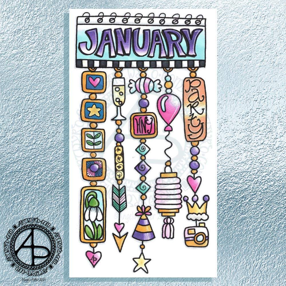
My first job was to print out the lineart for this dangle design, which is one of many in my book ‘A Dangle A Day’ which is due for release on 8 January 2019 – just a week away!
In the book, I take you through how to draw this design, one step at a time. Not only this design, but well over 100 more – designs for all seasons and many, many celebrations and occasions.
This design I drew in Autodesk Sketchbook Pro using a Microsoft Surface Pen and Microsoft Surface Book. For the book, I coloured it digitally. Today, I printed out my black and white lineart and then coloured it using Chameleon Color Tones and Color Tops marker pens. I also added some details to some elements of the design using a 08 Uniball Unipin pen and a white Sakura Gelly Roll Pen.
Yesterday, I said I need to to spelunking through my stash of mixed media and cardmaking supplies to find forgotten supplies I could use to embellish my designs.
This dangle design would make a lovely monthly cover page for a BuJo (bullet journal), planner, diary or journal. It would also make a pretty greetings card or notecard to drop a line to a friend wishing them a wonderful January. Change the words and colours to suit the occasion or recipient! It would also be a lovely, whimsical, cute design for a winter party invitation.
I realised then that my old watermark wouldn’t do for this year. So I hand lettered a new one. I made my symbol, the one I hide away in my artwork, part of the design, along with a little intricate but simple geometric pattern around it. A little touch of the uncials for my blog address, along with a typed copyright statement and it’s done and saved! I may end up changing it a little, or having variations on the theme, as time goes on. But I’m fairly happy with it.
So, I’ve already had a productive morning! It may be a Bank Holiday in the UK, but I really do need to focus on those templates that need colouring for Entangled Forests…and I may venture forth into the peopley world later on today, maybe.
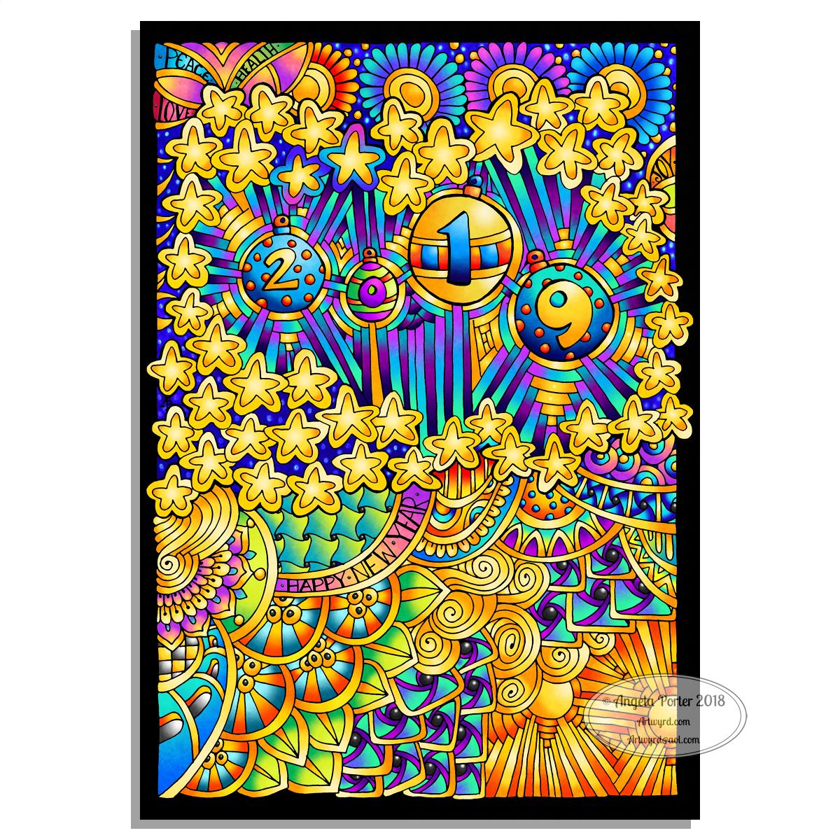
Two colourful pictures to mark the changing of the calendars and dairies!
I created both for members of the Angela Porter’s Coloring Book Fans facebook group, and the colour explosion has already started over there! These coloured templates are set to be added to the group at midnight, so in around 40 minutes time as I tippy tap this blog post!
I drew the top one digitally using Autodesk Sketchbook Pro, Microsoft Surface pen and Microsoft Surface Studio. The bottom one I drew on dot grid paper, then coloured digitally using the same tools.
In both I went for a kind of psychedelic colour scheme – I needed a bit of brightening up today.
However you spend your New Year’s Eve and Day, May I wish you all the very best for each and every day ahead of you.
Yesterday I said I wanted to turn one of the J monograms into a dangle design, and that’s exactly what I’ve done here!
I do seem to be favouring teals and pink as a colour combination for these letters lately. The colours were added using a combination of Copic markers and Chameleon Color Tones pencils. Again, I chose to use Copics simply because I wanted a ‘wash’ of pale colour to which I could add shading with the pencils. I also used a metallic silver pencil to add some subtle silver elements as well as a white Sakura Gelly Roll pen to add some white dot embellishments.
For the charms in the dangle, I drew inspiration from my recent delving into things Medieval to create some that are a bit different to my usual kind. A heart seemed to be an obligatory charm for me to include.
I worked on Daler Rowney Marker paper and used Uniball Unipin pens for the black lines.
There’s quite a nice juxtaposition between the sharp, angular lines of the monogram and the rather softer, rounded shapes of the charms.
I also could’ve dug into my neglected stash of media from my days of mucking about with mixed media and card making and so on to find Stickles, NUVO drops, foil glue and foil, sequins, sparklies and so on to add more sparkle and shine to the design. Something I need to think about again in the future. I’d also have to work on sturdier paper than the Marker paper.
I feel that the dangle could be a bit longer to give a more elongated and elegant design. However, I ran out of paper! I may have been able to squeeze one more charm in at the bottom … but it would’ve been a squeeze!
Note to self – when doing monogram dangle designs on A4 paper, make the letter a little smaller so the dangle(s) can be longer!
Today, my attention must turn to colouring the 2019 templates I designed for members of the Angela Porter’s Coloring Fans facebook group for the New Year’s Day Color Explosion event, starting at midnight as 2018 turns into 2019. I think some may jump the gun on that though! Still, it’s a bit of colourful fun.
It’s only just over a week until ‘A Dangle A Day’ is published. In the book, I take you step by step how to create over 100 dangle designs for yourself, as well as giving some advice about hand lettering, using dangle designs, and creating your own using elements in the book, or your own too. I really do hope you will all give drawing dangle designs a go – they look complex, but, as I show in the book, they only take a few simple steps. They also suit my rather intuitive way of designing, drawing, creating. However, they also work for those who like to plan things out first.
What a troublesome letter J is! Well, as far as creating a monogram. Early sketches showed me that if I add too much fanciness outside of the letter, the letter gets lost in the embellishments! So, here are a few that I’m vaguely pleased with.
I used Daler Rowney Marker Paper to draw these letters on, with a mixture of black pens. I used Copic Markers to colour some of the letters. Others I used to experiment with Tombow Dual brush pens and a blender pen. Chameleon Color Tones pencils were used on a couple more.
The Copics work really well on the marker paper – no surprises there!
The Tombows tend to cause the pen I use to draw the designs with – Uniball Unipin and Sakura Pigma Sensei pens – to smear. I keep forgetting the Tombows do that. So, I tried drawing a J with the Tombow Dual Brush pen and then add the lines and patterns after it had dried. That worked. But white space needs to be created outside of the letter, and again, if I got too intricate, entangled, ornate with the embellishments I would’ve lost the letter. Or perhaps not if it was only the letter that was coloured in.
I was surprised at how easily colour from the Chameleon Color Tones coloured pencils laid down on the marker paper. Surprised because I’d forgotten how nice it is to colour on the marker paper! I did need a good layer of padding paper beneath the 70g/m² or 48lb marker paper.
I foresee similar problems with the letters I, L, and S. Not sure about the other letters I’ve not tried this kind of decorating with yet. Time will show!
What I can see here is that the style of embellishment I’ve used, while not always successful, such as the heart and arrow one (where did that idea come from? Sheesh!), it is different to the previous letters I’ve played around with. That is all down to the shape of the letter and the edges I have to play around with, while keeping clarity of the letter too.
What to do today? Well, I do have the 2019 template to colour for the colour explosion over on the Angela Porter’s Coloring Book Fans facebook group set to run through New Year’s Day. I’m also aware that I haven’t done a cutely whimsical cat monogram dangle design for a few weeks. I also have three templates to colour for ‘Entangled Forests’ so that book can be put to rest ready for publication, before I start on the next one.
Yesterday’s black and white, graphic monograms of the letter R now coloured, with added lines and metallic highlights.
For all of the letters I used a combination of Copic markers and Chameleon Color Tones colored pencils to add the colours.
I chose Copics over Chameleon Markers as I really wanted soft, gentle, almost pastel colours for these letters. The only way to get these with the Chameleon markers is through gradients with the colourless blending chambers. I wasn’t at all confident I could get the soft, gentle colours with slight blending. So, I went with something I knew that would work for me – Copic Markers with Chameleon Color Blends pencils .
I think I got way too fancy with the added lines on the lower letter R, but it’s all a learning process.
I am really pleased with the others. The colours I chose or, rather, the pastel nature of the the colours, isn’t characteristic of me, but I think they work really well here.
Of course I had to add some metallic highlights. For the smaller Rs I used Uniball Signo metallic gold and silver gel pens.
I started work on these early this morning – around 7am. And I’ve finished for now – it’s around 9am. I’ll return to them later today or tomorrow as I have a lil trip out for lunch with a friend.
Some different kinds of styles appearing in this little bunch!
The big R at the top is mostly done – it just needs some colour I think. It’s also similar in style to the previous monograms, starting with the yellow K did a couple of days ago. It’s been drawn with 08 Unipin and 04 Sakura Pigma Sensei pens. Green metallic embellishments have been added with a metallic Sakura Gelly Roll pen.
The R at the bottom, with the thick lines, was drawn using a Tombow Fude brush pen. Not easy to control the thickness of lines, so I used a Uniball Unipin pen to tidy up the lines and add the bits on the end. Not sure how I’m going to progress with this one.
The two in the middle row have been drawn with the Unipin and Sensei pens.
The R to the right was drawn with a Uniball Unipin brush pen, which is a bit easier to control the line thickness than the Tombow Fude pen. I did neaten up the lines and ad more using the Unipin and Sensei pens.
The bigger the letter, the more space for embellishments – the paper size is A4 (approx 8″ x 10.5″) in size and it’s white and very smooth Daler-Rowney Bristol Board. The smoothness of the paper makes it so easy to draw smooth, even lines on it. It won’t take water colours or watercolour washes, but markers and coloured pencils work fine on it. Tombow Dual Brush pens and similar tend to cause the paper to pill. Of course, I can always use a scanned image to colour them digitally.
Yes, I could also add dangles to each monogram. However the purpose of this exercise is to practice my hand lettering, particularly in this rather ornate and embellished style. Dangles can be added in the future.
I cover drawing monogram dangle designs in my book ‘A Dangle A Day’, which is due to be published in just over a week! Exciting!
Three variations on a theme! All hand lettered and hand drawn on Daler-Rowney Bristol board (A4 in size).
For each I used black 08 Uniball Unipin and 04 Sakura Pigma Sensei pens. Here’s the other media I used for each monogram:
Top – Copic markers, Herbin Copper ink with a glass pen.
Bottom left – Copic Markers for the base colour, Chameleon color tone pencils for added depth of colour, gold metallic Sakura Gelly Roll pen.
Bottom right – Chameleon color tone pencils for the colour and a silver Uniball Signo pen for the metallic highlights.
It’s taken me around 5 hours or so to complete the set of three. I’m still feeling my way with this style of hand lettering.
For the monograms coloured with Copic markers I started by drawing the letter with the Copic markers and then added the black line work before adding the metallic highlights and Chameleon pencil shadows. I love having a solid shape to embellish with line, pattern and metallics. However, white space is only possible by adding lines outside of the main shape. Which is fine. I could add white space inside the letters either by leaving some in the design before coloring, or using white ink to cover up the copic colours. These two letters look a lot more solid and heavy.
For the L coloured with the Chameleon pencils I drew the black line work first. The advantage of this is that I can leave white space within the letter. this gives a bit of a lighter, airier feel to the letter, which is helped with the less dense colour of the Chameleon coloured pencils.
I’m not sure if I like the metallic petals in the top monogram; the ink spilled over the black lines and I tried to add them back in to define the petals but it just seemed to sink beneath the metallic pigments.
Also, the glass pen with copper ink that I used to add the metallic highlights to the top monogram was a lot finer than the Sakura gelly roll so it was easy for me to add tiny patterns and shapes. The Uniball Signo silver pen gave a much finer line than the Sakura Gelly Roll so it was easier to add highlights to the bottom left monogram, but I knew I’d not be able to get as much fine details or patterning with it as with the glass pen.
Overall, I’m fairly pleased with the finished results. I’ve learned that I’d like to leave white space in my monograms when I’m hand lettering them in this way. Maybe if I want to use Copics in future I should use a pale colour to draw the shape of the letter and then use darker tones to add dimension and depth to the design, allowing the lighter colour to act a bit more like white space. Of course, I can always draw the design with black lines first and then add the colour. Each has it’s advantages and disadvantages.
I’m not sure which is my favourite. I rather like the one on the bottom right. As it’s smaller in size I’ve not quite managed to go over the top with the embellishment. I like the white space within the letter. I also like the more subtle colours I’ve used.
I think I’ll take my attention to a different letter now, another I’ve not done a monogram for before, well not outside of my soon to be released book ‘A Dangle A Day‘. Of course, the monograms in the book are all dangle designs too. It would be easy enough to add dangles to these designs for sure, well it would be if I’d left enough space for them!
However, my reason for doing these monograms is to add to my repertoire of hand lettering styles. These may not be entirely unique in the realms of hand lettering, but I do want to work with them and find my own way through this to something that people can look at and say ‘that’s Angela Porter’s work that is’ in the same way they do when they’re familiar with my coloring books and my style of drawing there.
This is what I’ve spent the last 2 or 3 hours doing – I lose track of time when engrossed in an artsy project.
After the K monogram yesterday I wanted to try my hand at another letter and I just chose my own initial. I really do need to do some different letters though!
For this one I started by drawing the letter in colour using Copic markers on Daler-Rowney Bristol board. I did do a vague sketch of the letter with pencil very lightly which I then erased.
Black lines to define the letter were next, followed by the lines outside of the letter and the sectioning of the spaces inside the letter.
I wanted to finish some of the lines with some interesting shapes, so naturally I defaulted to hearts and beads!
I used some of my favourite geometric and abstract patterns to fill some of the spaces, along with dots and lines.
The penultimate step was to colour in some of the blank spaces, the hearts and beads using Copic markers.
Finally, I used a glass pen and metallic gold ink from Herbin.
I worked with traditional media to do this one, so I could use gold ink, which is something I’ve not quite worked out how to do digitally.
Having said that, my process for creating this monogram is the same whether I work with traditional media or digitally. The only difference is that some of my ‘overspills’ with the lines in the tiny patterns I have to leave here and accept as it being ‘perfectly imperfect. Also, the colours aren’t as bright and vibrant as they would be digitally, but they’ll do!
Yes, I could add a dangle or three to this design, but, again, I’m happy with how it is…for now! I’m just happy exploring hand lettering in a different way to what I’ve been doing.
If anything, this hand lettering is more about shapes and patterns than it is about letters themselves. I know this is a step forward for me in finding my hand lettering style (or one of my styles at least), and I also know that as I become more comfortable with it and don’t have to work quite so hard at it (working hard is thinking about the lines and working out how to add the embellishments so they feel part of the design and not just plonked there for the sake of plonking them there) I’ll work out how to add to them in a sympathetic way.
What letter will I do next? You’ll have to wait and see!
On looking at the monogram K I posted earlier with slightly rested eyes and mind, I’ve decided to leave it as it is. For now at least. I may try to add a dangle design to it in the coming days.
So, I thought I’d post my page of various hand lettered styles of the letter K. I used a 0.4 Sakura Pigma Sensei pen to draw them. No pencil lines were used for any of these letters, just the dot grid to help me keep things vaguely organised and vertical where they need to be.
I like the 0.4 Pigma Sensei pens. You may notice that I do tend to vacillate in my choices of pens – I just like to change things around from time to time! The Pigma Sensei 0.4 has a solid plastic tip, a bit like the Pigma PN pens. That means it’s not quite so easy for heavy handed me to wreck the nib as quickly as I do on the Sakura Microns or Uniball Unipins or Faber-Castell Pitt artist pens or the Copic Multiliners.
That doesn’t mean I’ve managed to use them until the ink runs out – the nib gets wrecked long before then – but they do seem to last longer.
I’ve spent the 3 hours or so that I’ve been up adding patterns/motifs to my lovely new A4 Leuchtturm dot grid ‘Master’ notebook. It’s a rather comforting activity for me. I don’t know how many times I’ve tried to do this in various formats in order to create my own reference book of patterns/designs/motifs and so on. However, realising that my use of a bullet journal is working for me on a more or less daily basis, at least as far as organising myself and making notes ot what to do, what’s been done and so on, I wanted to use a very, very basic form for this visual reference for me.
The A4 notebook will also take up a lot less space than the ring binder I’m currently using. It is a bit cumbersome working in the hardback notebook compared to loose leaf paper, but it should help to keep things all in one place. It’s the method of tracking collections in a index in bullet journal fashion that will make it most useful for me.
So, this morning I’ve started to add my small collection of medieval motifs inspired by jewellery and floor tiles.
I suspect I’ll be having a bit of a quietish day today. I’m practically nodding off here as I type! Maybe a short nap later will help me a bit – but not too long otherwise I’ll be up at stupid o’clock once again!