I realised that I haven’t drawn a mandala in quite a while. So, that’s what I did! Intricate, geometric and organic repeating patterns. It was a pleasure to do.
I’m quite happy with the highlights and shadows on this one, and keeping it all monochrome works for me today as well. A calm and soothing green – just what I need today as I’m still recovering from the stress from earlier in the week.
Tools – Microsoft Surface Slim Pen, Microsoft Surface Studio, Autodesk Sketchbook Pro.
I had a couple of relatively good night’s sleep. But last night was a broken night’s sleep, waking around 3am and drawing until I was ready to sleep again – around 6am. No point tossing and turning as it just makes matters worse for me.
I’d started this drawing yesterday afternoon, after I’d completed the coloured templates for Entangled Starry Skies. I got a fair amount of it done when I woke in the night. I completed it this morning, after I woke around 8:30am, with a threatening migraine-type headache. I’ll be back to bed soon once the headache pills have kicked in; I often feel very tired with this kind of headache.
I think that fuzzy headed, weird-mind-set shows in some of the drawing. The weird texture on the bottom right face. The very organised, block-like areas of organic textures at the top.
As I’ve now scanned this in, I may take some time to add shading and highlights, perhaps some subtle colour, to the drawing in the sketchbook. If I do use colour, I’m going to keep it monochrome, maybe with a complementary colour for some little pops here and there. If I use too many colours I feel it loses cohesiveness and… some elegance, I think that’s the word I’m hunting around in my headache addled brain for.
I may try printing it out on some coloured paper. Not sure how the laser printer will cope with that, but if I don’t try, I’ll never know!
Oh, I used 05 and 01 Unipin pens in an A4 Artway Enviro sketchbook to create this art.
In the past few years, there’s been a flurry of coloured templates appearing on the page throughout New Year’s Day, always something beautiful and wonderful to behold. Many members post their templates close to midnight when the year changes.
I’ve not coloured the template yet. I hope my focus continues over the next couple of days so I can get it done to join in.
I had a right ‘mare of a time getting the image above done. I think I tried four times in total, with Autodesk Sketchbook Pro crashing before I could save it. Sketchbook pro has always been very, very stable, so I guess the gremlins of 2020 got to it today. But I finally got it done. That could be a very perfect metaphor for 2020, perhaps.
Drawn with a fine Uniball Eye pen on acid-free cartdridge paper. Backgrounds added digitally.
Last night, I carried on with the Domestika Course – Modern Watercolor Techniques by Ana Victoria Calderon. The last sections are all about painting ‘galaxy’ style backgrounds. Scientific pedantry here – they’re not really ‘galaxies’, more nebulae. Just had to say that and get it off my chest.
I painted along with her, and the first background I created was really not at all good, perhaps. I used White Knights watercolours, Cosmic Shimmer metallic gold watercolour and salt. Way too much salt and probably way too much water, and trying to work how someone else does. Still, you learn by doing, even if it doesn’t work out as you’d want it to.
I let the paper dry, did my best to remove the salt and then decided to use a 0.1 Sakura Pigma Micron pen to draw on the background.
I allowed the shape and flow of patterns in the colour to inform me as to how I could draw shapes and patterns, and the end result is today’s image!
As disappointing as my first attempt at a ‘galaxy’ background was, I actually rather like the end product that includes drawing, a typically ‘Angela’ entangled design.
What I am also kind of pleased with, is that I chose to leave some areas of colour without any drawing on them. That is something unusual for me to do.
I started with the floral motifs and let the rest of the design flow from there. As it flowed, the patterns became more and more of an abstract nature.
What you can’t see in the scan, are the subtle areas of gold shimmer that resulted from the spreading of the Cosmic Shimmer metallic watercolour paint. It gives a very subtle sheen in some areas.
While the first background was drying, I had a go at creating another, using what I’d learned from creating the first. Instead of the White Knights, I used Kuretake Gansai Tambi watercolours and I had a bit more success. I’m not entirely happy with the overall balance of the colour areas, but when I’ve decided what to do with it, I’ll share it.
I’ve enjoyed creating this sketchbook sampler page. I drew the designs with a mixture of Uniball Unipin pens, Faber-Castell Pitt Artist pens, a medium nib Schaeffer fountain pen, and an extra-fine nib Faber Castell fountain pen. I used dot grid paper from Claire Fontaine.
After scanning the page in, I removed the dot grid and added a grungy paper background. I then decided I’d like to add some colour and shadow/light to the designs. To do this, I used a messy chalk brush, so my colouring isn’t as precise as I usually like it. However, it’s loosened up my expectations of myself as I went with it.
Pastel colours were my palette of choice as I like the way they seem to almost glow against the grungy kraft background. I also like the way they help to enhance the 3-D appearance of the designs. I do enjoy playing with shadow and light.
Some of the designs are examples of my organic, entangled style of drawing. Others are repeating, geometric zentangle-style patterns. And then there’s some inspired by Medieval illuminated manuscripts.
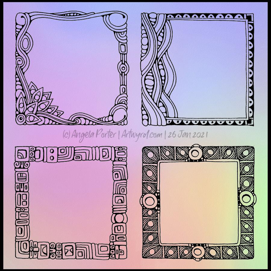
I also enjoy working within a clear border. I like the sense of structure it brings to my work. It also satisfies some kind of aesthetic need within me. Every now and then I try work without a border, but the artwork I produce just never feels quite right to me. So, it’s time for me to accept the need for borders is part of my artistic voice.
There is a purpose for me creating these borders. I’m building up a library of them that I can use to embellish quotes and other projects.
Some of these borders would look fab as greeting cards note cards, bookmarks, and to use in other paper craft projects. They’d also work well as embellishments for BuJo, planner, diary, scrapbook and journal pages.
Others would be a great foundation for dangle designs (my book “A Dangle A Day” is a good place to start drawing dangle designs).
What I do know, is that I find drawing soothing and relaxing. So, I’m going to be spending the rest of my Sunday drawing more borders.
Art really does wash the dust of everyday life from my soul. That’s why it’s something I do nearly every day. Creating art soothes my soul, my emotions, my mind. It helps me find balance when life has me all topsy-turvy. It helps me find the touchstone of contentment that now resides inside my chest, within my heart. I know that if I can’t settle to doing something artsy, then I’m seriously out of kilter.
I finished this drawing this morning. I think it’s taken me around 6 hours to do, give or take an hour or so. It’s a little smaller than A4 in size (6.75″ x 10.25″). The design was drawn with Faber-Castell Pitt Artist pens (F and S). I added shadows with grey Pitt Artist Brush pens.
I was rather clumsy with the shading in some places, so I took advantage of digital tools to smooth and blend the grey out.
My final digital task was to add a background texture to the artwork, which also added some colour. I do have a bit of a thing for grungy, distressed backgrounds.
On the whole, I’m pleased with this, though I must admit I didn’t think I was going to be so, especially with the heavy-handed shading really bothering me.
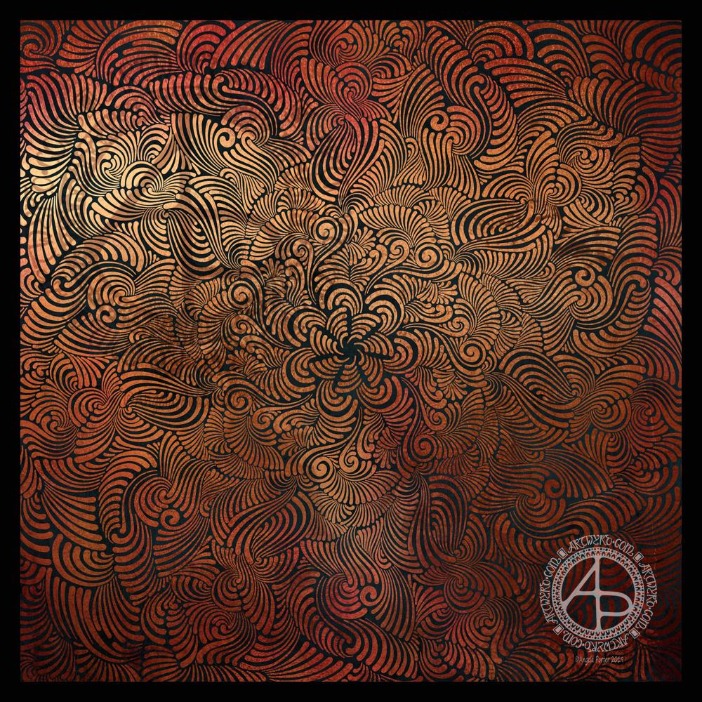
Seven plane symmetry, using a flexible nib pen to carve through black to reveal the design in copper. Done digitally using Autodesk Sketchbook Pro, Microsoft Surface Pen and Surface Studio.
I really have been enjoying creating this kind of design lately and I make no apologies for showing so many that seem to be similar. I find creating these so soothing and calming.
Here, I wanted to see how a metallic background texture would work, and it does really well, just not on WordPress and how the website shows images. The colours never seem to be as vibrant as they do elsewhere.
What I love about this process is that I have no idea of what the end product will be. It’s all about being in the flow, working intuitively, and trusting my skills and creativity.
Often, I’m so zoomed in to the section I’m drawing I’m not aware of how the overall design is looking and working. That means I really do have to trust my instincts, and trust that it will all fit together to create a satisfying end result, and I am happy with it.
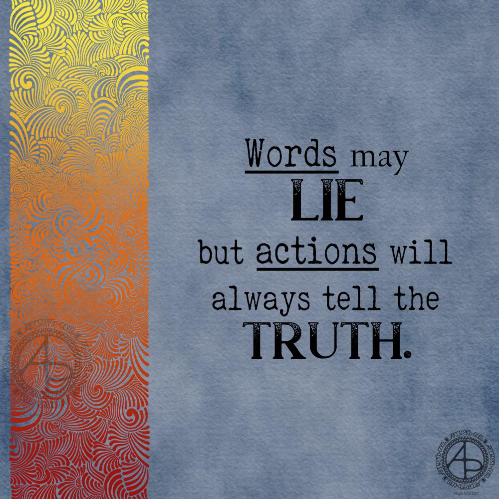
I had some arty fun creating a similar, but different background for a quote. This time I went for a blue-grey background with the patterned border in fiery shades of red, orange and yellow.
Rather than hand letter the quote, I chose to use fonts.
I’m not sure I’e developed this particular style of creating abstract patterns much, but I do like the results.
I woke up this morning with an idea for a background for quotes, and this is the result!
I thought the kind of abstract, organic, swirling patterns I’ve been drawing would work well as a border, and I’m happy with what I’ve created. However, I do think there’s just too much purple, perhaps.
In hindsight, I wish I’d taken a bit more care with the laying out of the quote. I would like to emphasise the key words and phrases. Maybe, if I have time later I’ll do just that.
Sometimes, maybe often, I don’t really see the flaws in my work until I’m writing my blog. A lesson to be learned here I think. Today, however, I am under a lot of time pressure and I feel I may have spent too much time on this already.
However, despite the flaws I can see in my work, particularly the typography/hand-lettering, this is good enough for now.
Something a bit different from me today. It took me a lot of fiddling and faffing around to decide on the blue colour scheme for the intricate drawing that envelopes the crocodile skull.
My natural instinct is to use black for such drawings. However, black looked a bit too stark and dominant; the skull felt lost amongst the drawing. So, I tried out shades of blue and white, making the fill colours transparent so that they faded into the background a little and giving the ‘feel’ of water plants.
Overall I’m pleased with this, though I’m not sure I’ve got the colours for the line art right. Still, I’ve not really done anything quite like this before and it is something I want to do again in the future. Maybe with tomorrows Inktober prompts.
Today’s prompts were a crocodile skull and slime mould from Inktober lists by Instagrammers @book_polygamist and @nyan_sun respective.