RSPB Newport – a mandala

Yesterday I took a short trip for a short visit to the RSPB reserve in Newport, Gwent.

With dark, leaden skies with golden sunshine pouring through gaps in the cloud cover the lighting was dramatic; it caused the winter colours to positively glow against the dark blue-grey of the sky.

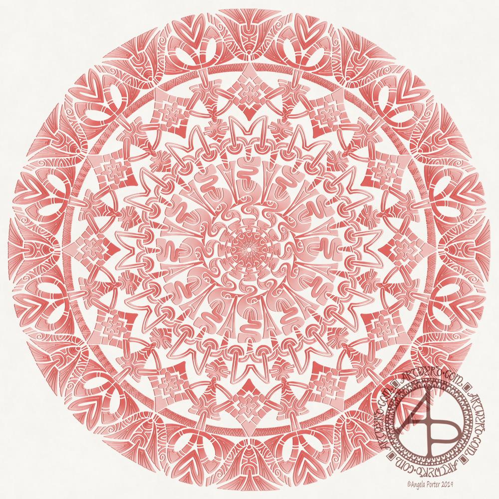
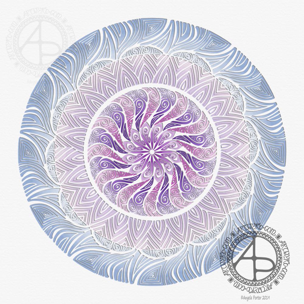
This mandala is my response to those colours, along with some very stylised motifs from the things I saw – arching branches, dancing golden grasses, fungi and more.

I took photographs as I took a walk around part of the reserve. I also stopped to record my observations, my thoughts, in words in my journal.

I surprised myself…

It was all a bit of a spur of the moment decision to head to the wetlands reserve. I was still feeling headachy and emotionally drained after my Time to Change Wales talk to the police yesterday. I needed to do something to help shift this and to lift my mood and getting out and about is something I do struggle with, hugely. Anxiety about being around people kicks in and I can become almost paralysed with it. However, today I didn’t. Perhaps because the reserve is familiar to me; I have been there a few times before. However, I’ve never really taken much of a walk around it. That has always been a problem for me.

But not today. Today, I walked along some paths that were unfamiliar to me. I didn’t go all that far, though my walk took an hour. I did fear getting lost there, but I kept my eye on some fairly obvious landmarks such as wind turbines, the lighthouse at Nash and the huge powerstation. Being able to see these gave me some confidence that I knew what direction to head in to return to the visitors centre. If I strayed from where I could see at least one of them, I backtracked and took a different route.

Most of the people walking and visiting the reserve smiled and said hello, as did I, and that helped me feel at ease too. That, and the rhythm of walking, the sounds of nature – birdsong, rustling leaves in the breeze – and I took pleasure in moving my body, which is something that is new to me.

It’s also something I need to remember and try to get a walk into my schedule most days, somewhere where there’s nature but also where I feel safe to walk. In the wilds by myself is not a good idea, but somewhere like RSPB Newport, with it’s structured. signposted paths is a good idea. Or the beach…somewhere I’ve not been since July, yet it’s only a 40 minute drive away from me.

I forget all too easily how good it is for my mental health to take a walk where there’s nature, birdsong, and not too many people.

As I walked, I could feel the tension leach from me, down through my feet into the forgiving and loving earth. With each step and each breath I felt the anxiety ease little by little. The headache began to lift as well. By the time my walk was over I felt much better. There were still cobwebs left by the headache, but they were manageable.

When I returned to the visitors centre, I browsed in the shop and finally managed to find a raven pin badge! I also bought a small guide to trees. I also had a nice lunch and a very welcome mug of tea in the cafe there, where I continued to write and reflect in my journal until it was time to return home ahead of the rush hour traffic.

Back to art…

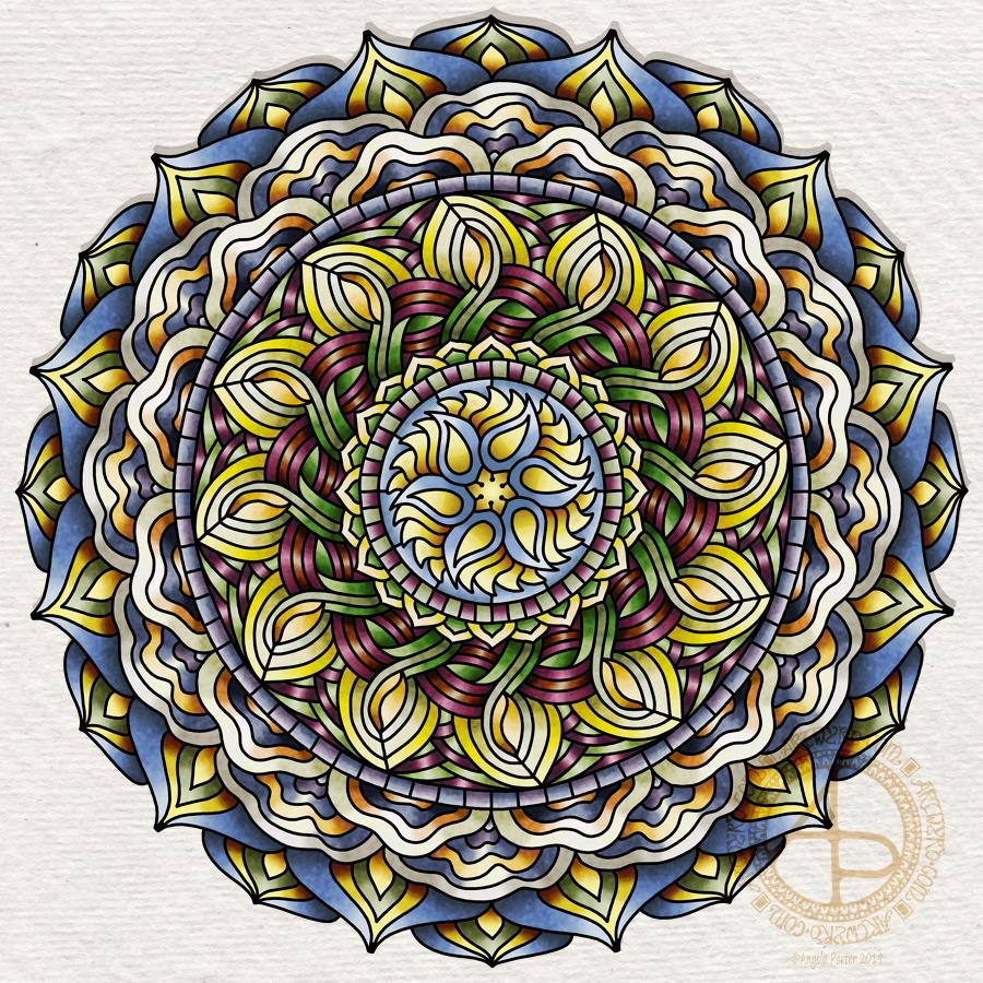
I love the stained glass feel of this design. I did try working with the colours in the style of my latest mandalas, but it just didn’t seem to work out for me. Perhaps I was trying to work a step, or several steps, too far for me to be comfortable with that change.

There’s also something about the black lines that gives a definite form to the mandala and this reminds me of how in winter I can can see the underlying form, the architecture that usually is hidden beneath leaves and flowers.

As is my way, I used my Microsoft Surface Pen, Microsoft Surface Studio and Autodesk Sketchbook Pro to draw and colour this mandala.

I used my photos of my visit to get the colour palette I used. And for me this is an unusual colour palette, but it reflects very much nature’s palette on the day and time that I visited.

There’s a bit more about my visit on my other blog – Curious Stops and Tea Shops.

Hello Gorgeous – A dangle design card

©Angela Porter 2019

Friday is dangle day! Well, it is for me. I like to finish the working week off with a cute dangle design, and today I chose to do a greetings card or note card with a decorated envelope.

The media I used were :

  • pencil and ruler
  • 05 Uniball Unipin pen
  • Copic markers
  • Kuretake Zig Wink of Stella brush pen
  • Claire Fontaine mixed media paper
  • Distress ink and sponge applicator
  • Kraft card and envelope
  • Sticky foam squares
  • Two self-adhesive gems
  • White Uniball Signo gel pen

As it’s still winter I thought some snowdrops would be appropriate, along with some crocus buds along with an evergreen wreath. Stars and hearts are always favourites of mine to include, as well as some swirls and spirals.

I chose quite cool and pastel colours for the design, along with very simple shading. The Wink of Stella added a little sparkle to the hearts, stars, beads and snowdrops in the design. A couple of self-adhesive gems added a touch of interest to the ribbon banner.

I used faded jeans Distress Ink to edge the paper panel, which I adhered to another slightly larger panel which I found in my stash of Distress Ink coloured papers ready to use. This one was also edged with faded jeans Distress Ink.

I then used Tombow Mono glue to stick the panel to the card blank.

I drew a simple arrangement of snowdrops and buds on the envelope in white ink and added some spirals and swirls to ‘ground’ the pot. I’m not happy with the spirals/swirls though, but it’s only an envelope so if I send this card to someone I can always decorate another envelope!

Replace the wreath with a photo of the recipient and you’d have a lovely, personalised keepsake of a card.

This design would also make a lovely page in a bujo (bullet journal), planner, scrapbook, or journal too.

My hand lettering is a little rusty; I’ve not done much in the past week or so as my focus has been on mandalas and work for my next book.

My book ‘A Dangle A Day’ shows how you too can create lovely dangle designs like this one, with ideas of how to use them.

Letter mandala

©Angela Porter 2019

This mandala grew from a letter A, and just a letter A. I extended the letter ends to create an interesting shape that filled much of the space. Then, I spent a lot of time removing parts of the shape and adding patterns and so on. When I was happy with the result, I added shades of the teal colour I’d used for the letter.

I’m fairly happy with this, though there are things I’d want to look at doing again or changing. Luckily, I thought to save the very basic letter A before starting to mess around with it.

Now I’ve done one, however, I wonder if I’ll manage to create a mandala for each letter of the alphabet…maybe, maybe.

Very soon I’ll be heading off to Ton Pentre to give an anti-stigma talk to a group of South Wales Police officers in my role as a Time to Change Wales Champion.

Time to Change Wales is all about ending the stigma and discrimination that surrounds mental illness. My talk covers some aspects of stigma and discrimination and the main part is me telling my story of my mental illness and the stigma and discrimination I’ve faced.

I have cPTSD and it’s taken me a long time to recognised I have problems with my mental health as cPTSD is all I’ve ever known.

I never know how I’ll feel after one of these talks. Often I’m emotionally exhausted and in need of self-care, which often involves a good nap. So, I wanted to make my daily blog post before the talk, just in case I’m out for the rest of the day.

Being self-employed means I can schedule a quiet day so I can look after myself should I need to.

And on that note I’d better get this posted and get myself sorted to head up to Ton Pentre.

Another blue mandala

©Angela Porter 2019

Yes, another mandala, but I enjoy creating them so much! I’m also exploring how to create them in a different way than I would usually; instead of drawing with black ink then colouring, I’m drawing in colour itself.

An unusual choice of colour for me too – a navy blue. I must admit, I’m enjoying working in monochrome for these mandalas. The colours are always harmonious and while I love a riot of colour, it’s much harder for me to incorporate that into mandalas like this. Well, at this time it is. Who knows how this is going to evolve.

Yesterday was a busy kind of day that had me away from my workspace from mid-morn. It was fierce chilly out with wintry showers of sleet and heavy-duty hail interspersed with bright, clear winter sunshine which did little to raise the temperature but did raise the spirits.

I was still feeling quite calm after my therapy session on Monday, still having that gentle, subtle inner smile, which I’m doing everything I can to hold on to, gently of course!

It’s always nice when I can find a sense of some kind of balance within me. I sense that these periods are getting longer and longer. However, that means that any downward blips in my mood and state of my mind feel more extreme in comparison. I do have to mention though that the downward blips, though sometimes scary and worrying, don’t seem to last as long as they used to.

Back to my mandala. I used my usual tools trifecta – Microsoft Surface Studio, Microsoft Surface Book and Autodesk Sketchbook Pro. I love that I’ve discovered that I love to carve basic colour shapes into these intricately patterned mandalas.

Shades of pinky-red mandala

©Angela Porter 2019

I created this mandala after I returned home from EMDR therapy yesterday. I knew that my time today would be limited, so thought a bit of chill-time would be good for me before heading out for another commitment in the evening.

As is my way, I sat down with a blank concentric circle grid for mandala drawing on the screen of my Microsoft Surface Studio, Surface Pen in hand, and chose a colour to draw with. I had no idea how this mandala would unfold as I started to draw the first shape at the centre of the mandala.

As always, the lines and shapes just flowed from the centre out, one by one. In this case interlocking in a way that is a first for me.

I drew the whole design in one colour, before adding lighter and darker shades and blending them out to give some interest and dimension to the design.

As I worked, as the lines and colours flowed, even where I had to make adjustments or erase and start again, I could feel myself relax and my whole body started to breathe.

The whole mandala took a little less than 2 hours to complete, thanks to the magic of Autodesk Sketchbook Pro which does the work of repeating my motifs around the circle and makes it so easy for me to fluidly, organically develop and adapt the design elements as I go.

I firmly believe that digital art is allowing me to create art I wouldn’t have created for a very long time, if ever, if I were still using pen and paper. I’ve said it before, I say it now and no doubt I will say it again – digital art is opening doors to my creative expression I never thought would be possible, especially with the styles of mandalas I’ve been creating of late.

Drawing really does help me to relax, except when I’ve become overwrought as last Saturday and then nothing I do seems good enough to me and just serves to compound the unsettled nature. Finally, I’m aware of this part of my cPTSD and in future I can, hopefully, manage it better by doing something other than art to help to shift the mood.

Therapy yesterday was a combination of a loving-kindness meditation so my therapist could see what happens to me during one and then we used the physical pain I experienced to do an EMDR session. Lots of body stuff went on during that session – lots of pain and sensation. But by the end of the session I wore a gentle smile – not just on my face but throughout the whole of my being.

I felt content, at ease, for the first time in a few days.

I still feel that way this morning.

I had recommendations from my therapist for some loving kindness meditation cds to try by Tara Brach. So, two are downloaded into Audible for me to use later today!

Monday Mandala

©Angela Porter 2019

Monday morning.

I am so grateful that I work at home and don’t have to face the rush hour traffic any more. Rush hour traffic? That’s an oxymoron if ever there was one! Anyways, I digress.

Working at home means that I can take my time to come around, organise my days as I need to in order to satisfy the needs of contracts, appointments and self-care for myself. Including taking my time to fully wake up in the morning. I do wonder when was that point when I no longer woke totally alert and dashing to the shower was replaced by a slow, gradual ascent from sleep to awake enough to find my way to the bathroom. I

Today is one of those days where my day is peppered with things – my weekly therapy appointment, a commitment this evening, a prescription to pick up and have filled – that the day seems broken.

On days like this there are some things I do to help me balance myself. I sort out my BuJo for the day. I catch up in my journal. I do some art for the sake of doing art, for pleasure, for relaxation, for peace and calm.

Over the past week I’ve been doing loving kindness meditations at 11am. However, given the way I reacted to the last couple and how they affected my mood for the whole day I’m going to try scheduling them at the end of my day when all I need to do without being affected by any triggering of the cPTSD inner beasties is done and I have time to sit with the results of the meditation rather than try to fight them so I get done what needs to be done.

Talking of cPTSD, my mood is ok this morning, though I do have my EMDR therapy in a little while. That can unsettle me so I’ve decided to put off the loving kindness meditation until later today.

Art really can help me manage my mental health. Art can soothe me when I’m having a troublesome day. When it doesn’t, like on Saturday, I know that there’s stuff there that needs to be worked with. And that’s difficult because it’s difficult for me to even think about these things let along talk about them. However, I do know I can do ‘blind’ processing where my therapist doesn’t need to know what has triggered me, just what I’m noticing during the therapy.

So, that’s ahead of me in a little while.

This morning I felt I needed to create a mandala. So I did. Soft purples, lilacs, lavenders and a grey-ish blue. Not sure the colours work, but I enjoyed the process of creating this one, as I do all my mandalas.

Mandalas do seem to be one of my ‘things’ when it comes to creating stuff.

Of course, my Microsoft Surface Studio screen as my paper, Microsoft Surface Pen as my drawing tool and Autodesk Sketchboook Pro as my source of colour and texture media are more of my ‘things’ that help me to express my creativity. And they were used to help me create this mandala.

Blue Mandala

©Angela Porter 2019

I have had an artsy kind of day so far. A lot of the gloom, anxiety and troubled thoughts that descended on me have lifted, but not all. Once provoked the beasties that are my cPTSD take a while to settle down again. I also feel tired – mentally, physically and emotionally tired, despite a fairly good nights sleep.

I managed to get some work done on a template for my next book for Creative Haven by Dover. I got to a point, however, where I wasn’t happy with how it was going so I thought a break was in order.

So, for my break I thought I’d work on a mandala, and this is the one I’ve created today.

I didn’t consciously choose the colours or patterns I used in this mandala. However, the blues bring to mind water, rivers, the sea. I love to be near the sea. I find the rhythm of the waves calming, no matter how gentle or wild they are. The salty wind helps to blow away cobwebs in the mind, cobwebs that not so good thoughts have stuck to. I love to look at the patterns in the sand, rocks, pebbles. There’s so much more I love. So perhaps by choosing blue I’ve identified an unconscious need to visit the sea soon.

A lot of the patterns that have found their way into this mandala remind me of waves or shells. They’re all organic and flowing. Though there are some rather architectural arches and patterns there, lending some form to the design.

The ocean is used as metaphor in mindfulness meditations. I am the ocean. The waves are my emotions that ruffle the surface of that deep, calm body of water. Meditation is about finding that calm and being in touch with it in daily life.

Carl Jung believed that drawing a mandala daily helped to reveal what was going on in the subconscious mind, the things we need to bring into awareness and work on in order to heal.

Curious that this one speaks to me of water, the ocean.

Yesterday’s meditation stirred up the waves for sure. A veritable tsunami resulted of emotional, mental and physical pain. It’s freaked me out a little and I’ve been reluctant to meditate today, well not until I’ve done everything I need to do today.

I did draw this mandala digitally. In fact, returning to digital art let me exhale a little and relax a bit more into art. I also didn’t want to revisit my frustration with traditional media that I had yesterday.

I find working digitally wonderfully liberating in many ways. I know that I’m no expert in the use of mechanics of digital art – I use it more like I would traditional media. However, whereas I feel I struggle with colour and techniques with traditional media these days, I feel none of that with digital art.

Now that’s a surprise to me! I never, ever thought I’d feel that way about working digitally.

My digital tools are my Microsoft Surface Pen, Microsoft Surface Studio and Autodesk Sketchbook Pro. The screen of the Surface Studio is my paper, the Surface pen is a multitude of pens, pencils, brushes and colours in one instrument. Autodesk Sketchbook Pro is the software that allows me to work so intuitively, so naturally as I would with pen on paper, but with other tools and techniques I can use that I wouldn’t be able to reproduce with traditional media – I don’t have the skills to do that.

So, some insights about myself from the mandala, and also some realisations about myself and my relationship with digital art and how much that relationship has strengthened and deepened – and there’s still a lot more to learn and discover about digital art and myself.

Doodly Saturday

©Angela Porter 2019

It’s been a weird kind of day today for me. I’m quite open about my mental health, and today has been one where it’s not been completely tickettyboo. I’m out of sorts. Unsettled. Nothing I’ve done seems good enough to me. I’m quite teary and that really set in during a loving kindness meditation this morning.

Loving kindness meditations are always difficult for me. It’s easy for me to send out love and good wishes to all people. It’s not easy for me to accept the same for myself. Today, it was more difficult than usual, including some physical pain along with it. Traumas from my past kept rising up. Things I didn’t think were traumas, just stupid decisions made by myself. Seems I have work to do on those too in EMDR therapy.

I did colour some mixed media paper with distress inks and quite small pieces at that. I drew on two of them, as above. I’m really not happy with either of them. I really don’t know why I put the words on the left hand one. Growth is a funny word there.

I’ll just put it all down to me being out of sorts. Perhaps tomorrow will be a better day for me to focus on art.

This is odd for me as drawing or creating usually helps me to feel better. Today it hasn’t.

I received a book in the post today – “The Wild Remedy’ by Emma Mitchell. It’s a diary she’s written over a year of how she finds being in nature and drawing and painting helps her with her low moods. She’s subtitled the book ‘How Nature Mends Us – A Diary’. I’ve read the introduction and the first month in the diary, which is October. Both interesting reads.

I almost was inspired to go out for a walk, but I just couldn’t pull myself together to do this during the daylight hours. The Sun has just set here in South Wales in the UK. Perhaps tomorrow I’ll manage to get out for a walk at some point.

I know my moods don’t linger for long. I do have low days which can linger for a couple or few days. Nowhere near as bad as they used to be, but enough to result in me being unsettled and out of sorts and hypercritical of myself and anything I do. I’ve become aware enough that it’s best to do other things that draw for publishers on days like today as I’ll just get more and more frustrated with myself and my efforts.

On other days, whatever I draw I may consider good enough. But on days like today …

Still, the sun will rise again in the morning and it’ll be a new day. My mood may be better then and I’ll accomplish work I consider to be good enough. Now all I need to do is try to find something that I can settle down to do today. I’ve been back and forth all day between drawing, reading, knitting, fussing around. The only creative thing I’ve enjoyed today has been colouring paper with distress inks. Not sure I want to spend the evening doing that though.

Maybe I need to go out for a drive. Sometimes driving with upbeat music on can shift my mood, especially when I feel anxious and restless as I do now, for no reason either.

Thinking of you – a dangle design card

© Angela Porter 2019

This little card and envelope took me around 3 hours to make. I had to remember how to do various things and find my supplies to do them with!

My first task was to make the sentiment banner. I had the idea for this one after someone asked me for recommendations of good books for learning hand lettering as they’re not at all happy with their handwriting.

Hand lettering and handwriting are not the same thing. Hand lettering is something you unconsciously do. Hand lettering is the conscious and deliberate drawing of letters, one by one. Practice, like everything else you want to learn and become good enough at, is important. I suggested that they try printing the sentiments out on their computer or using words cut out of books or magazines or stickers or stamps and ink pads used by card makers until they’re comfortable with their own lettering style.

That led me to thinking that rather than writing the sentiment directly onto the paper that I’m going to draw the dangle design on, what about if I hand lettered it on paper again and again until I’m happy with it and then cut that version out. I could then layer it onto coloured card to make a border, or onto the paper or or or…

So, that’s what I wanted to use here. A variation on what I’ve done in previous cards. I cut two trips of mixed media paper, one around 1cm wide, the other around 0.7cm wide.

On the narrow strip I wrote my sentiment. I did this confidently as I knew if I got it wrong I could always write it again – I’d not ruin my dangle design in any way. I then trimmed the strip close to the start and end of the sentiment.

Next, I coloured the wider strip of paper with victorian velvet Distress Ink. I trimmed one piece so it was just a little longer than the sentiment. Then, I cut two rectangles from the coloured strip. I cut triangular notches into one end of each of the rectangles. I used the sponge applicator to make sure the edges of the coloured pieces, including inside the notches, and the sentiment strip coloured. By doing this, there’s a darker edge to the pieces and this defines them against the background. The final step in making the banner was to glue the pieces together as shown in the photo.

I cut two pieces of mixed media paper for the front of the card. The smaller one I made a little narrower than the sentiment banner; I wanted the ribbon to hang over the edge a little. I used a pencil to mark where I wanted the banner to sit on the card. I then used a pencil to mark out the centre of the card so I could position my dangle centrally.

Above where the ribbon would sit I wanted to place an arrangement of pot plants – succulents and a cacti. Below I wanted a fairly simple dangle, but one that had elements that appeared in the arrangement of pot plants. I drew these with a 05 Uniball Unipin Pen.

I then wanted to colour the two pieces of mixed media paper before I coloured the designs in.

For the larger one I used Peacock Feathers, Bundled Sage, Weathered Wood and Tumbled Glass Distress Inks to colour the whole of the paper panel. I edged this panel with Faded Denim Distress Ink. Then, I lightly sprayed the panel with water so that I’d get some faded watermarks as a texture in the colour.

For the upper panel, I used a very light hand to add the same Distress Inks to the paper, but in a much paler shade. I also edged this panel with the Faded Denim Distress Ink. I realised it hadn’t erased the pencil guidelines before I added the Distress Ink so when I went to erase them they wouldn’t fully erase. I’d forgotten that I had to do that! Still, it adds a bit to the distressed feel of the cards, that and the damage marks that were on the larger panel too.

To colour the dangle design I used Mitsubishi Uni coloured pencils. I used a fairly limited palette across the design.

The last two steps before assembling the card were add dots of gold ink and some shiny adhesive crystal gems.

To assemble the card I used glue to adhere the lower panel directly to the card. I then used foam squares to adhere the dangle design panel to the lower panel and the sentiment ribbon to the dangle design panel. This card has quite a bit of dimension to it.

My final job was to decorate the envelope. I decided to draw some pot plants and some of the daisies along the bottom. I added some butterflies to the left as the area above the pot plant seemed empty, unbalance. I haven’t coloured the envelope in as I’m in two minds whether to or not. Also, it would be nice to edge the envelope with the Faded Jeans Distress ink too, maybe even colouring the envelope with the same Distress Inks as the card. There’s also the back flap of the envelope that would benefit from a little potted succulent drawing I think.

Distress Inks are water-reactive, so if I do this, once the envelope is addressed a light application of Micro Glaze would seal the colour in so it wouldn’t be damaged in the mail.

I’m actually quite pleased with this card. It’s got me thinking about how to do more of this kind of stuff – card making the ‘Angela’ way!

If you give making cards like this a go, I’d love to see what you create! Happy art-ing, lettering and crafting!

Lots of ideas for dangle designs are shown in my book
‘A Dangle A Day’.

‘Amazing’ – Hand Lettering

© Angela Porter 2019

My morning warm up art session today was this little bit of hand lettering. I had a completely different idea in mind when I started this off but, as often happens, the creative energy flowed in a different direction.

I had wanted to do a monogram, perhaps with a dangle or maybe one set into a pattern border as a drop capital to a quote.

As I worked on first the pencil outline of the A, and then inking it in using fine and extra fine fountain pens filled with black ink, the lines that flowed out dictated the form of the letter rather than me consciously trying to force it into what I thought I wanted to create.

I think I’ve over patterned the inner space of the monogram, or not used the right kind of patterns there. However, it’ll do.

I wanted to use some birdwing copper FW Pearlescent ink from Daler-Rowney to add metallic highlights with a dip pen. I soon found out that dip pens and parchment paper that has been coloured with black ink don’t work well together. So, I ended up with the copper highlights at the bottom of the letters that fade up naturally. Adding dots of metallic colour to the monogram was easier on the unworked parchment. Over the black ink dots it wasn’t so easy. I’m also not sure that the ‘string of beads’ in the monogram actually works but I know it’s missing something. I need some time to reflect on this. As I do about adding any more copper highlights to it. I may yet decide to add some dangles to the word.

On the whole, I’m quite happy with how this turned out. I could add ‘You are’ in small letters above the letters. Either way, I think this would make a lovely notecard. I also think it could be used in a bujo, planner, journal, scrapbook or as framed art. I think I need to review the card making and mixed media techniques I once knew and have sidelined to focus on other aspects of art and adapt them to my current needs/ideas.