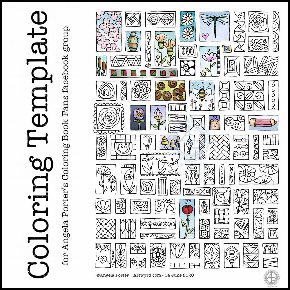
I enjoyed drawing last week’s one so much that I thought I’d do a similar one this week. Lots of tiny templates, or windows, in each one.
I drew the designs on dot grid paper using a 04 Sakura Pigma Sensei pen and scanned it in to clean it up. I used Autodesk Sketchbook Pro to colour some of the little drawings in.
I had a very fitful night’s sleep (or non-sleep) last night. So, around 5:30am I decided to get up and ‘art’.
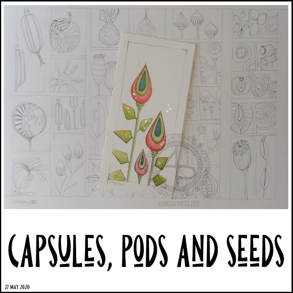
I finished off the watercolour of some seed capsules.
I’m really, really happy with this watercolour illustration, with an unusual color palette for me. I smile when I look at it! I decided to use a 0.5mm HB pencil to add heavier lines to the more shadowed parts, as well as a little bit of subtle line to help give the pods some volume. It’s difficult to see on the image.
I am so happy I drew a ‘window’ on the paper to draw within. I’m never happy drawing without a frame to keep within and the edge of the paper just never feels right for me. I also like the way that it feels like you’re looking through a window and that it’s OK to cut things off (apart from one cheeky leaf that I just had to have overlying the frame!).
There may be a bit too much white space above the seed capsules, I don’t know for sure. It’s so unusual for me to leave space around the various elements in a design that it feels a bit weird. However, I do like the space in this illustration.
Once I finished the watercolour, I turned my attention to drawing more capsules, pods and seeds in my A4 sketchbook. I completed two pages of small drawings, one of which you can see in the background.
Unusually for me, I drew in pencil. I’d usually use pen straight away. I have no idea what that is about, but it was a pleasant and soothing experience for me. I now have plenty of sketches I can use to create more watercolour paintings from, small ones as I really enjoy working on a small scale. Creating my own little treasures, complete with some precious, metallic details.
Painting little treasures will have to wait though. My eyelids are becoming leaden with a need to sleep. This frustrates me as I had things I wanted to get done today, things that need focus and concentration. So, I’ll soon be back in the land of nod.
Yesterday turned out to be a funny old day. Funny as in not what I’d planned.
I got most of my recent experiments into watercolour added to the journal I’m making/working on, with brief notes. That journal is now getting a partly open ‘crocodile mouth’ look, which is fine by me. Before adding the experiments to the journal, I needed to colour some pages with Distress Ink.
As I was adding the little pieces of art to the journal, I realised that the background colours tied in rather nicely with the artwork placed on them – all completely by chance.
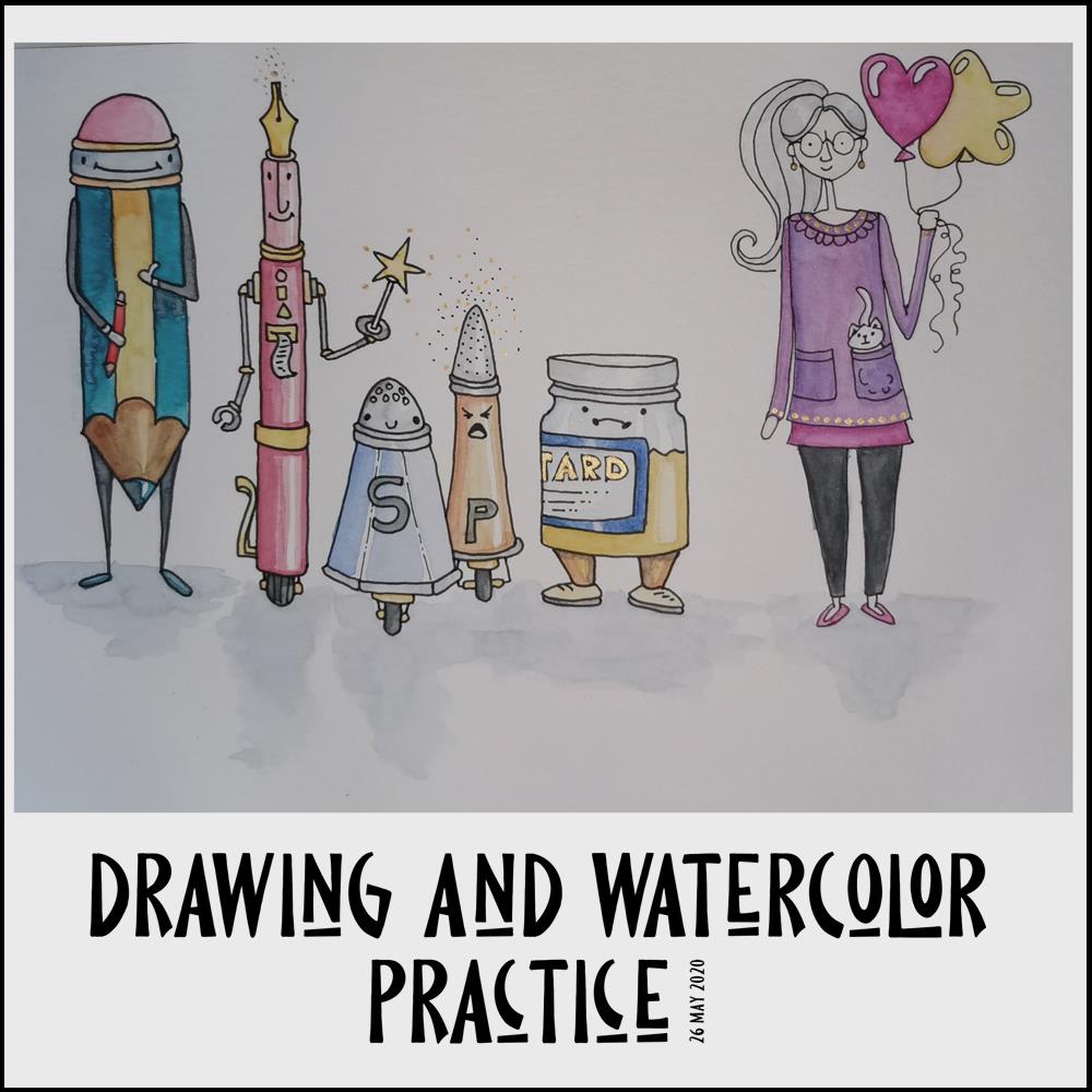
After that, I had some tasks around the house to do, and had phone calls that disrupted my flow of work somewhat. In the evening, though, I decided to continue with the Mattias Adophsson Domestika course, and the drawing/painting above was the result.
I’d already done some sketches of the anthropomorphic items in my sketchbook, and I re-drew the character drawing of myself, again. I made myself too thin by far! Ho hum. More practice is required for sure.
Anyways, after drawing the characters, I used flat, controlled watercolour washes followed by glazes to colour them in. This I felt more confident with – and more controlled about.
I can see how the kitty needs some shading, both on it’s body and on my top. I also need to add a line to the hand holding the balloons to make it more like a closed hand.
I’ll be following Mattias’ course, well parts of it. People and characters aren’t quite my thing. I don’t have the imagination it seems, or maybe I just don’t have the need to draw them. However, it’s nice to explore other ways of artistic expression. Those explorations are never wasted as it may just be that I find out that a particular style isn’t for me, no matter how much I admire it! Also, there’s always new things to learn that can be incorporated into my own art going forward.
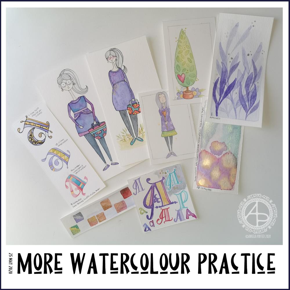
Over the past couple of days I’ve been playing around with watercolours. Apart from fun, it’s trying to work out how I can get them to work for me, and here you can see some of my experiments.
As well as continuing with the Domestika course, I found a book on my Kindle called “The Art of Creating Watercolor : Inspiration & Techniques for Imaginative Drawing and Painting” by Danielle Donaldson.
I’d forgotten I’d bought this, but on rediscovering it and looking at it I found it inspired me, particularly when it comes to drawing people.
What was reassuring, is that Danielle Donaldson is someone else who likes to work on a small scale! She also uses a very fin (0.3mm) pencil to draw with, but also to add line and pattern to her drawings instead of pen. I wanted to try that out.
I also really like the whimsical nature of her art, and her people inspired me to have a go. The three people in the collection of images above are inspired by her work, one more than the others. The one that is most directly like Danielle’s work is the person to the right of the trio. I used a pencil to draw the design as well as outline it after it was painted.
With the other two, I used a very fine Pitt Artist pen to outline them once the paint was dry.
Looking at them all together, I quite like the softer quality of the pencil line.
Oh, these trio are also my way of developing a version of myself. Unfortunately I look pregnant in the middle one (I’m not!), though I rather like my hair in this one – I wish my own hair was as thick and long! I really need to work on feet and foot positions.
Watercolours have vexed me, and continue to do so though I will persevere with them. Drawing people has vexed me for longer!
I’m not entirely sure that watercolour will be the best medium for me to use…I’ll try others, including digital, to see what I can get to work for me and is in my style.
I also spent sometime experimenting with monograms and botanical themes. I really like the blue foliage, and the cute tree too.
Yesterday my art and other stuff was put on hold for much of the day; I woke with a migraine and couldn’t do much until painkillers had kicked in and I could sleep away the remnants of it. Once I woke, that’s when I found the book and did some art inspired by it.
I slept quite well last night, and woke just fine and dandy today.
All these bits of art will find my way into the journal I’m making, including notes and reflections on them.
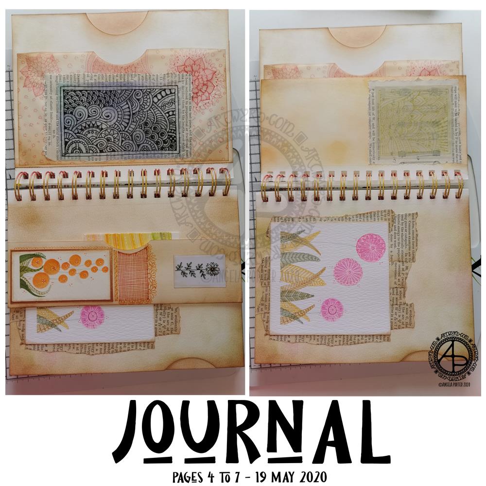
Over the past day or so, I’ve done some work on my journal and have pages 4 to 7 mostly complete. I’ve included lots of pockets to slip paper or artwork or other surprises into. I’ve also used some artwork I created as ephemera and embellishments.
Page 4 – top left.
This page has three pockets. One made by adhering two pages together, with a thumb notch punched out. Another is made from a sheet of tracing paper. The third is behind one of my signature entangled drawings; it’s a fairly secret pocket, unless I add something that peeks out from it.
I coloured the reverse of the drawing with Distress Inks as I didn’t know how they’d react with the pen drawing. Then, I adhered the tracing paper to some old book paper, and then adhered this to the tracing paper pocket, applying glue along three sides to create the pocket.
Once the glue was dry, I added some zentangle style patterns to the tissue paper pocket, just for fun. I used one of the Chameleon Fineliner pens to do this, using a colour that went well with the colours I’d used to ink the paper.
Page 5 – bottom left.
Page 5 is a little bit bigger than half the width of a page. I folded up the bottom of the page and adhered it along the edges to make a tuck-in. I punched out the thumb notch with a circle paper punch.
I decorated the tuck in with flower art at that I created myself. I also added some zentangle style patterns in between the flowers. I used Chameleon Fineliner pens, this time using a red and orange to get a gradient.
Page 6 – top right.
Again, a page that is a little more than half the width.
The drawing was done in gold ink on tracing paper. I used Distress Oxide inks to colour the reverse of the tracing paper before adhering it to some old book paper. The text and diagrams on the book page shows through faintly, as it does with the drawing on page 5.
Page 7 – bottom right.
This page just has a flower painting I created along with old book paper that have been collaged onto the journal page.
You can see the thumb notch on the edge of the page, showing I created a pocket by adhering two pages in the journal together.
Next steps…
None of the pages are fully completed. I’d like to add quotes or meaningful words or phrases. Some pages have gaps where I can add ephemera or pockets and so on. There’s certainly many spaces on the pages where I can draw patterns and designs.
I’m going to let the pages rest for a while as I turn my attention to other things today.
I’ve been feeling a bit ‘off’ or ‘meh’ in the last couple or so days. I’m finding it hard to settle to work of any kind. That I’ve been able to focus on getting some little bits and bobs done for the journal shows I’m feeling a bit more focused than of late.
Yesterday, I said I’d like to make simple pockets for my sketchbook-journal to hold my artwork rather than gluing it to the pages. So, this morning, I started my day looking on YouTube for some ideas and this video by joie de fi was the top of the list.
While I was watching it, I thought I’d make an instruction sheet to go in my sketchbook (or my virtual one I’m making in One Note).
I picked up some quadrille paper and wrote and drew as I watched the method for the first pocket. I worked in ink without pencil sketches and I made quite a few mistakes. A Tipp-Ex mini pocket mouse was my friend.
When I’d finished the instruction sheet, I scanned it in and used Autodesk Sketchbook Pro to remove the square grid from the paper, clean up some smudges, and correct minor errors.
Then, I added some colour to help bring out the drawings, but also to help with the instructions.
I’ve yet to make this kind of pocket, but I’m sure I’ll be able to do so quite easily now.
Reflecting on the artwork/illustration
This was a lot of fun for me to do. It’s something I’ve not done much since my days as a science teacher, or a learner in school and university myself. I’d forgotten how much I enjoy creating instruction sheets with my own drawings on them.
Back in those days, I would’ve used a ruler to draw straight lines, pencil for the diagrams, pen for the words, and little or no colour. Here, I free-handed the drawings, wobbly lines and all. The colour also adds life and dimension to the diagrams/drawings/illustrations.
The layout of the instructions may not be the best and easiest to follow through. That’s because I did this as I was watching the first part of the video. I think that for the next one, I need to sketch out the steps and notes first, and then work on organising them more clearly.
Yes, I’m going to do some more instruction sheets like this!
I also really need to do more hand lettering! I’ve lapsed in my writing practice, that’s for sure.
March the 1st is St David’s Day, the patron saint of Wales, which is where I live. The daffodil is one of his emblems and so it was fitting I included some in this month’s template. As we are heading towards the spring equinox and the official start of spring here in the Northern Hemisphere, I’ve also included plenty of flowers that would be lovely coloured in spring colours. They’d be lovely in colours of all the seasons, however. Flowers are beautiful no matter what season we’re in.
The template is drawn in my signature ‘Entangled’ style of line art, with very stylised flowers, foliage, and even butterflies and shells, along with patterns derived from architecture, sculpture, pottery, and more. Lots of my favourite things all in one abstract image.
If you’d like to print and colour this template, then please pop along to the facebook group where the members, and I, would love to see how you bring it to life with your own kind of colour magic.
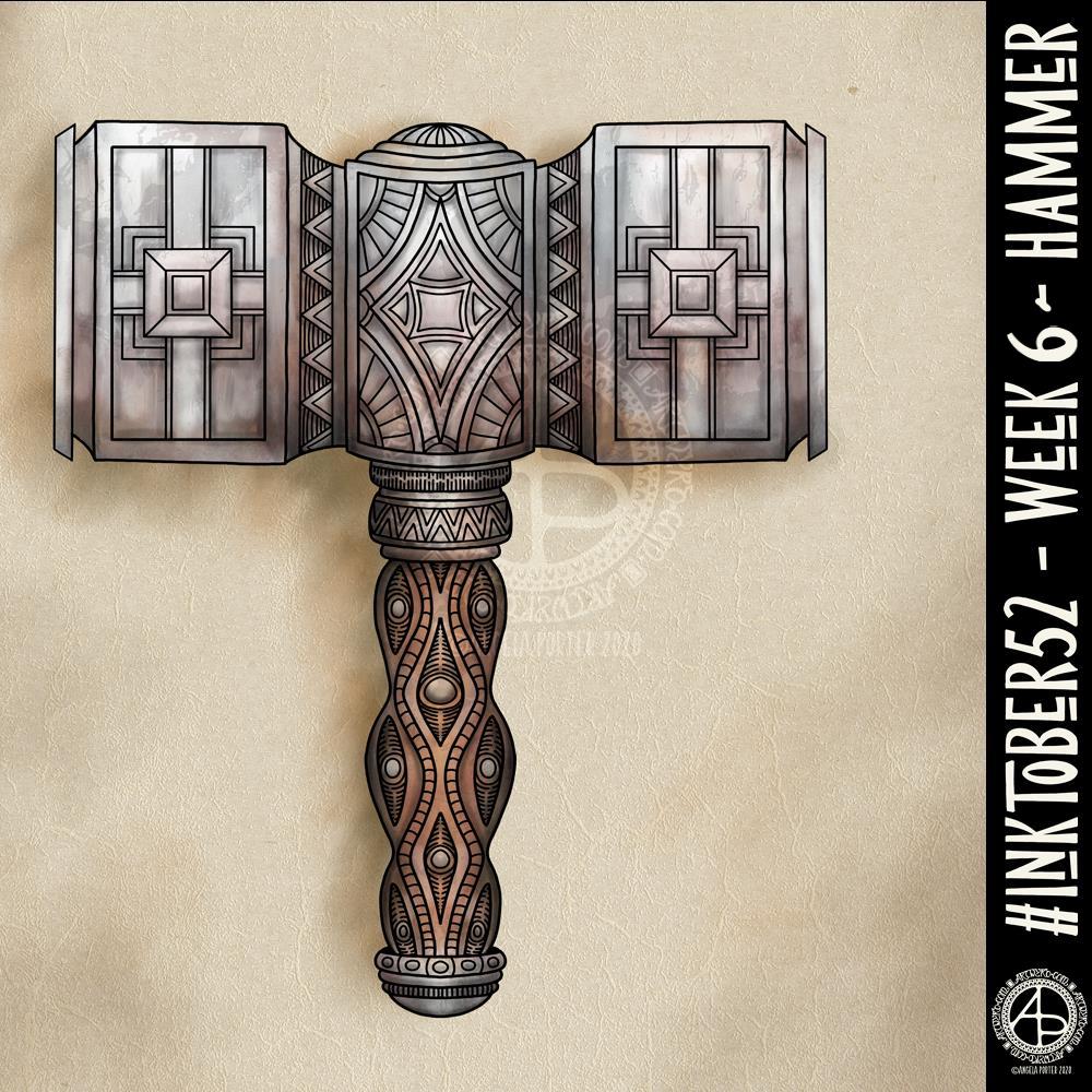
I’ve never drawn a hammer before, of any kind. I thought I’d have a go though and try my hand at a fantasy style, possibly dwarfish one.
Not only was designing one a problem for me, adding colour, dimension and texture were some other problems.
I think I’ve left areas a bit bare of line and pattern. Others I could’ve done a better job of creating highlights and shadows. However, overall I’m ok with this, especially as it’s not something I’d usually draw.
Next week’s prompt is ‘dinner’. Sheesh…
I made use of various tools in Autodesk Sketchbook Pro to help me design the hammer, some of the them tools I’ve not used before.
I did consider making a drawing of the hammer from a different angle, but this one has taken me so long that I now need to do some other stuff today.
I have a life-long fascination with words and facts that appeal to my curious, squirrel-y mind. I like unusual words. I also like etymology – the origins of words.
Since my first episode of severe mental ill-health due to burnout and cPTSD, I’ve found it difficult to read and retain information as I once used to as well as to recall information that was once on the tips of my neurons.
I’m finding it much easier to read and retain some of what I’ve read, thank goodness! And with that comes a desire to seek out interesting words and facts once again.
Lalochezia comes from the Greek ‘lalia’, meaning speech, and the Latin ‘chezo’, meaning to relieve oneself.
I admit, quite freely, to lalochezia. Not just for physical pain, but emotional pain too. There’s nothing quite like a swear word full of hard consonants to express the pain, frustration or upset verbally.
A friend of mine is constantly amused by my use of swear words even though I sound ‘quite posh’, according to her anyway. I thought of her when I found this particular word and just knew I had to use it for one of my ‘quote’ artworks.
The floral motif is influenced by Art Nouveau. It is highly stylised but there’s also the influence of Celtic knotwork in the way the foliage intertwines and overlaps.
The typography was completed using Affinity Publisher. The artwork was completed in Autodesk Sketchbook Pro. In both cases I used a Microsoft Surface Studio and Microsoft Surface Pen.
Today, I’ve been drawing little flower motifs and borders to go along with a lovely quote about flowers and hope.
The line art was drawn using Tombow Fudenosuke pens on ClaireFontaine dot grid paper. Colour, typography and background texture have been added digitally using Autodesk Sketchbook Pro, Microsoft Surface Pen and Microsoft Surface Studio.
Flowers are some of my favourite things to draw, whether they be highly stylised or more realistic.
My snowdrops and crocus have the feel of being wood cut or lino cut and printed, that kind of vintage feel. The flexible nibs on the Fudenosuke pens help me achieve this look. Also, the fairly simple colouring and addition of texture help too.
I’ve left the colouring as is, maybe for now. However, I now have these motifs ready to use in other projects, as they occur to me. Colour certainly helps to lift them off the background and bring them to life.