Another ‘A’ monogram…

©Angela Porter 2018

This is what I’ve spent the last 2 or 3 hours doing – I lose track of time when engrossed in an artsy project.

After the K monogram yesterday I wanted to try my hand at another letter and I just chose my own initial. I really do need to do some different letters though!

For this one I started by drawing the letter in colour using Copic markers on Daler-Rowney Bristol board. I did do a vague sketch of the letter with pencil very lightly which I then erased.

Black lines to define the letter were next, followed by the lines outside of the letter and the sectioning of the spaces inside the letter.

I wanted to finish some of the lines with some interesting shapes, so naturally I defaulted to hearts and beads!

I used some of my favourite geometric and abstract patterns to fill some of the spaces, along with dots and lines.

The penultimate step was to colour in some of the blank spaces, the hearts and beads using Copic markers.

Finally, I used a glass pen and metallic gold ink from Herbin.

I worked with traditional media to do this one, so I could use gold ink, which is something I’ve not quite worked out how to do digitally.

Having said that, my process for creating this monogram is the same whether I work with traditional media or digitally. The only difference is that some of my ‘overspills’ with the lines in the tiny patterns I have to leave here and accept as it being ‘perfectly imperfect. Also, the colours aren’t as bright and vibrant as they would be digitally, but they’ll do!

Yes, I could add a dangle or three to this design, but, again, I’m happy with how it is…for now! I’m just happy exploring hand lettering in a different way to what I’ve been doing.

If anything, this hand lettering is more about shapes and patterns than it is about letters themselves. I know this is a step forward for me in finding my hand lettering style (or one of my styles at least), and I also know that as I become more comfortable with it and don’t have to work quite so hard at it (working hard is thinking about the lines and working out how to add the embellishments so they feel part of the design and not just plonked there for the sake of plonking them there) I’ll work out how to add to them in a sympathetic way.

What letter will I do next? You’ll have to wait and see!

Merry and Bright

©Angela Porter 2018

A Christmas Greeting

Wishing everyone who visits this little space on the interwebs all the very best blessings and wishes of the season.

I also wish to thank you for visiting, for sharing my posts.

However you spend this day, whether with friends, family, at work, or by yourself, I wish you well and the best.

About this image

I woke early-ish this morning and had an idea that involved creating this mandala/wreath design, so I had to do it!

Unusually, I drew the motifs in colour! Yup. No black line, just colour.

They’re all very simple with simple colour gradations. The black lines were created by removing colour so the dark background would show through.

I think the outer ring of leaves could be a little lighter, but then it does give a sense of the outer ring bending away, with the hearts and mistletoe on the high point of the ‘wreath’.

Adding texture to the design helped to scuff up the perfection of the colours.

I really enjoyed doing this, as simple as it is.

I am really grateful that I used an insulated mug for my gingerbread mocha latte this morning – I forgot all about it for over 3 hours, so engrossed in my art as I was, and it’s now just the perfect temperature for drinking!

My tools were Microsoft Surface Pen, Microsoft Surface Studio and Autodesk Sketchbook Pro. Yes, this is a digital piece of art.

The rest of the day I intend to spend in arty/creative pursuits, including finishing off my knitted cuddly triceratops (yes, I know yesterday I incorrectly said it was a stegosaurus).

Yuletide dangle design

©Angela Porter 2018

Tomorrow is the Winter Solstice, or Yule. So, I wanted to create a dangle design for Yuletide, and wish you all the blessings of the season.

On the Winter Solstice here in the Northern Hemisphere, it is the shortest day and from here on in the amount of daylight begins to increase once again, albeit very slowly at first.

People gather at prehistoric monuments, such as Stonehenge, Newgrange and Avebury, to watch the sunrise on this day. These monuments have Winter Solstice alignments. That’s why I’ve got a pair of big stones framing the sun.

Of course I had to include holly, mistletoe and some evergreens in the design, along with stars, hears and a couple of cute robins.

It is a digital piece of art which started life as a pencil drawing on dot grid paper. The design was scanned in and re-drawn using a Microsoft Surface pen on the screen of my Microsoft Studio in Autodesk Sketchbook Pro. I did make use of the mirror symmetry tool to help me with the symmetrical nature of the design. I hand lettered the sentiment in the ribbon.

I did colour this quickly using gradient fills – yesterday I really wasn’t up to doing much. I am feeling a bit better today, though drained after a quick visit to my local town to run a couple of errands. I’m really easy to startle at the moment and me being jumpy at every noise and the number of people out and about was something I kind of expected but hoped I wouldn’t experience today.

I’m safely back home now and am starting to calm down a little, though I feel exhausted. So, the rest of the day will be spent quietly for sure.

I do have a Winter Solstice mandala to share tomorrow, and I’m rather pleased with this one. So, do pop back tomorrow.

‘A Dangle A Day’ is published on 8 Jan 2019.

Noel – Entangled Design

©Angela Porter, Artwyrd.com

I always have fun when drawing and creating, including this design. In it I’ve combined some of my entangled design elements along with winter/Christmas doodles. 

To start, I hand lettered ‘Noel’ using a guide for the shape of the lettering I wanted. Then, I printed it out so I could add the black and white line art using a 0.8 Uniball Unipin pen.

Once that was done, the finished lineart was scanned back into the Microsoft Surface Studio, a transparent background created and some smudges cleaned up. 

Finally, I could colour it. Today, I chose to use the color gradient tools, which does make the job of colouring a bit quicker, but it also results in a rather ‘shiny’ look too. Or perhaps that’s simply due to the colours I choose for the gradients.

I had fun adding the glowing stars and sparkles to this one, though I’m not sure I’ve got that right.A nice way to spend the morning and early afternoon as the weather has been wet and very windy at times here. 

Christmas Dangle Design

©Angela Porter
Design from ‘A Dangle A Day’, authored and illustrated by Angela Porter

It’s Friday so it’s #dangleday. Today, I wanted to share a Christmas Dangle with you from my book ‘A Dangle A Day’. In the book I show how this design was drawn, step by step.

When I created this design, I first drew it in pencil on dot grid paper. The next step for me was to scan it in to the computer and then re-draw it step-by-step, saving each step as I went. For the book, the final step was to colour the design and then write the instructions to go with the images. My tools for this were a Microsoft Surface Book, a Microsoft Surface Pen and Autodesk Sketchbook Pro.

I wanted to include as many Christmas-themed charms to create the dangles as I could and still keep the design balanced. I also kept the length of the dangles uneven. The waviness in the ends of the dangles echoes the waviness of the fairy lights above the hand lettered word ‘Christmas’.

What I did this morning was to print the black and white line art design on an A4 sheet of paper. Then I used Chameleon Duo Tones and Color Tops markers to colour it in.

These pens make it easy to create gradations of colour, such as on the hand lettering. These gradations add ‘dimension’ to the charms and dangles. I keep the darker shades to the left and bottom of the designs so that there’s a consistency across the whole image. I also used a pale grey marker to add drop shadows to the left and bottom of the design elements; again this helps to add dimension to the design.

Finally, I added some highlights with a white Sakura Gelly Roll pen. I also added some sparkles around the fairy lights and individual stars with a gold glitter Uniball Signo gel pen. After all, it wouldn’t be Christmas without some sparkle!

Used individually with a monogram or Christmassy image the dangles would make lovely book marks. Printed at A5 in size, the design would make a fabulous BuJo page for the big day itself. It would also make a lovely design for greetings cards or note cards.

Of course, it would be easy to change the word at the top to, perhaps, Winter or Yule and use fewer dangles to suit the length of the word. Personally, I like to use an odd number of dangles wherever possible – it gives a more balanced design.

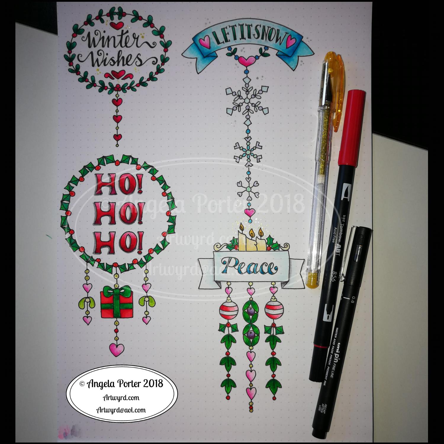
Winter Dangle Designs 3 December 2018

Winter Dangle Designs – 3 December 2018

I have had some fun designing these, as always!

I did use some circle, oval and hexagon templates to help me design the wreaths and snowflakes. The dot grid paper helped me draw mostly straight lines for the dangles.

I did sketch them in pencil first before inking them in with a Uniball Unipin pen. Colouring was done with various Tombow dual brush pen markers and some sparkly elements added with Uniball signo sparkle gel pens.

These would look lovely as greetings cards. In fact, I’m thinking of redrawing them digitally and using them to make my own christmas cards this year. Printing out the black line work and then colouring them with traditional media. In the past couple of years I’ve designed my christmas/winter/yule cards digitally and had them printed professionally. This year, I think I’ll do it the way I suggest in my book ‘A Dangle A Day’.

They’d also look great as note cards or as pages in a BuJo, planner, scrapboook or journal. They’d lend themselves to cute bookmarks too.

These relatively simple and small dangle designs are perfect for practicing hand lettering too. And in these four dangles I’ve used four different lettering styles.

I’ve also kept the finished designs simple by not adding any drop shadows, except around the ‘HO! HO! HO!’. Not only that, a lot of the colouring is very simple too.

I do hope you’ll have a go at designing your own, maybe using these as a bit of a guide.  If you do, I’d love to see what you’ve created.

Another December Dangle Design

As one of my current goals is to improve my hand lettering I thought it would be fun to practice it with another dangle design.

For this one, I used some dangles from my book ‘A Dangle A Day’ to build the dangle designs with a wintry, Christmassy vibe to the finished design, thanks to the traditional Christmas colours of red, green and gold, along with with some blues, purples and cool pinks thrown in.

Of course, I could’ve chosen a non-traditional series of colours too, for fun. For example, the baubles on the dangles and the wreath could be done in pink, purple and blue. Whatever your decor at this time of the year it can be reflected in your colour scheme for your dangle design.

From the initial sketch to posting it on this blog it’s taken me around 6 hours to complete. 

Yes, I started with a sketch and then inked it in traditionally, pen on paper. I scanned that drawing into GiMP so I could remove the dot grid and the faint echoes of erased pencil lines. This was followed by coloring the image. For this I used marker and blender brushes . The last steps were to add texture to the design, a coloured background, a drop shadow and then the watermarks.

I used a Microsoft Surface Pen, a Microsoft Surface Studio and Autodesk Sketchbook Pro to complete the digital colouring and so on.

The charms on the dangles are a lot easier to draw than they appear, it’s the colour that really brings them to life and gives them dimension.

It’s always fun to string charms together to make these dangles. I often tend towards more symmetrical designs, but ones like this are good to do too. They all have their own charm, pardon the dreadful pun there.

I take you designing dangles step by easy step in my book ‘A Dangle A Day‘. There are lots of examples of dangle designs in the book that are ready to use, but it’s easy to rearrange things to suit your particular needs. The release date is 8 January 2019, a new style of creativity to start in the New Year, and throughout the year as all the seasons and many different celebrations are covered in the book, along with suggestions for projects using dangle designs.

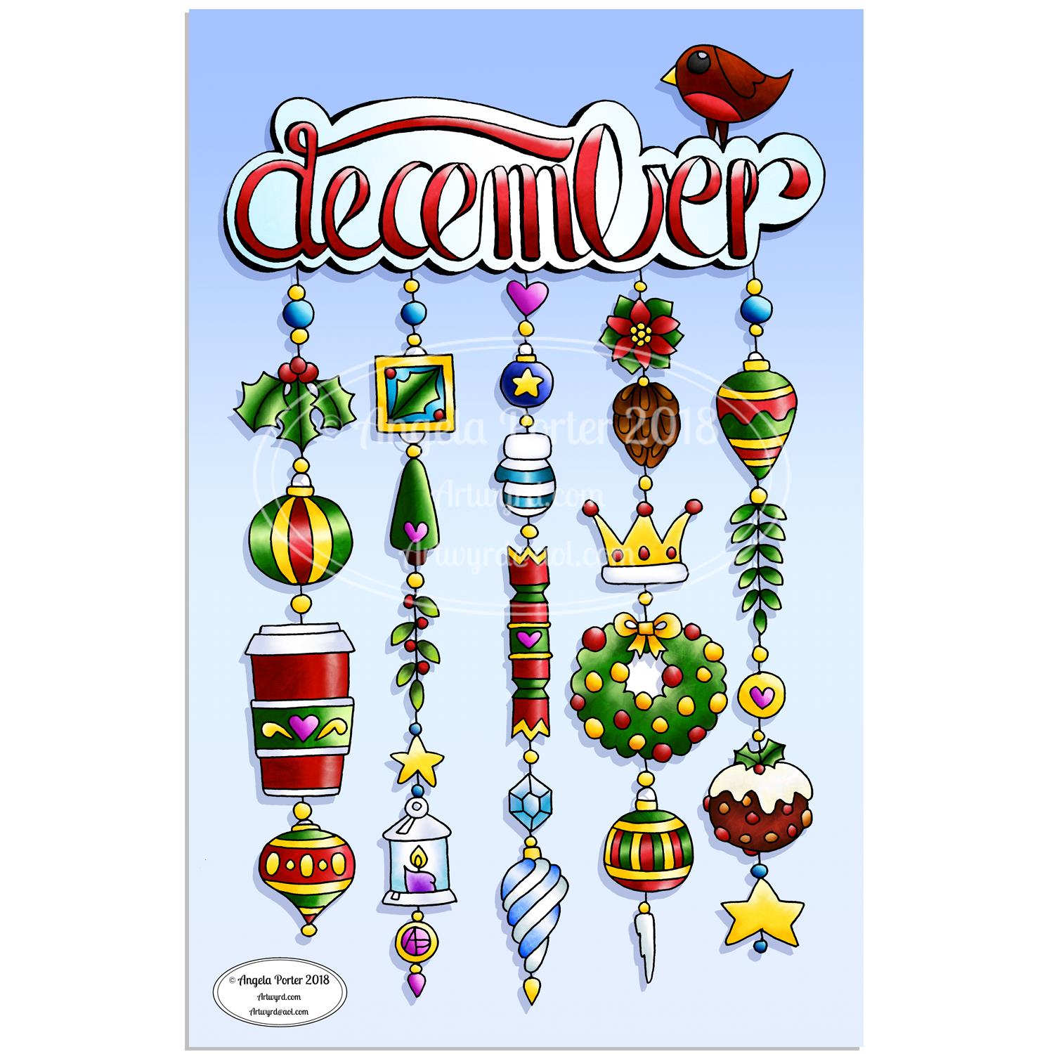
December Dangle Design for BuJo

It’s Friday, so that means it’s #dangleday! As it’s the last day of November it seems appropriate that I design a dangle design that would look fantastic as the monthly title page for a BuJO, journal, planner or just a fun design to color and frame or, printed out smaller, used on a greetings card.

As usual these days, I sketched the design out on dot grid paper and then scanned it in. I used Autodesk Sketchbook Pro and a technical drawing pen ‘brush’ to ink the design, as well as make adjustments to the design.

The final steps were to add a background colour and watermark it for sharing on the internet.

Naturally, I used my Microsoft Surface Pen along with my Microsoft Surface Studio to do the digital drawing. I think I’m going to print this design out so it will fit in my BuJo and colour it with traditional media.

I’m going to make this available as a coloring template in the Angela Porter’s Coloring Book Fans facebook group. So, if you’d like to download and print the template, pop along to the group and join in!

This is quite a complex dangle design to look at, but it’s not that complex to create. In my book ‘A Dangle A Day’, released on 8 January 2019, I take you step by step through the process with loads and loads of examples of monograms and dangle designs for all seasons and all occasions, along with ideas of how to use them. There’s also a fair number of tips and encouraging words within the book.

If you do download, print and colour this design, I’d love to see how you’ve coloured and used it! You can find me on twitter, Instagram and facebook.

E is for … Dangle design

It’s Friday so it’s #dangleday! E is for … echinacea (cone flower), envelope, earphones, Earth, eight (or eleven, or eighteen or eighty – you get the idea), eight-sided octagon, eighth-notes (semiquavers).

Purple and gold are complementary colours so I chose them for the pusscat, the monogram and the octagon with my initials in it. I chose silver as the colour for the frame around the monogram simply because it’s my favourite metal and I fancied a change from gold beads and so on. Pink hearts and earphone accents. Yes, the headphones had to have cat ears on them, and yes, I have a pair like this, but the ears are blue.

Cute kitties, cute charms and letters. Looking at the monogram now, the letter could do with a shadow around it, but it’ll do as is.

I sketched the design on dot grid paper. After scanning the sketch in, I inked it in using a Microsoft Surface Pen on my Microsoft Surface Studio screen. When I was happy with the line art, I added colour and texture to the dangle design. The final steps were to create a coloured and textured background and a drop shadow for the design.

A nice way to spend a couple of hours on a cool, grey, damp Friday morning.

If you like dangle designs and would like to try your hand at drawing your own then my upcoming book ‘A Dangle A Day’ is available to preorder ahead of it’s release in January 2019. In the book I take you through drawing monograms and dangle designs in easy steps. The book includes lots and lots of examples and ideas for designs too.

It’s also #furbabyfriday across the interwebs, including on Angela Porter’s Coloring Book Fans facebook group. Why not pop over and share pictures of your fur babies with the group members.

Doodleworlds design 12 November 2018

Angela Porter 12 November 2018

After the emotions surrounding Remembrance Day and all the heart-tugging posts on social media concerning issues around veterans and families and so on, I needed to create something that was a little fun.

I drew the design yesterday and I’ve spent the past 4 hours colouring it using my set of Chameleon Color Tones and Color Tops.

Not digital art this time, just some fun doodleworlds style critters and monsters and objects, along with some geometric designs as well as my trademark arches and swirls and spirals.

I love how all my critters are different and yet close together getting along, even if some of them look a bit grumpy, fierce or angry. We all have emotions, a whole range of them from ecstatic, happy to sad, angry, miserable. It’s like a weird kind of family, friendship photo. Even the single kitty to the left of the tower is part of this group, even though it’s keeping its distance.

Sometimes I need that distance from people, even groups of people I care for. I get overwhelmed so easily. I then need some quiet alone time and space to rest, recoup and recharge. I enjoy time with people I care about; the trade off is feeling drained and tired and exhausted afterwards.

It’s the same with overly emotional days. When I need to rest, recoup and recharge sometimes drawing overly whimsical, cute, simple designs with cheesily cute critters and monsters helps to soothe what’s going on inside me.

I really need a bit of that before I head out for EMDR therapy later on today.