Lettering practice, 23 July 2022

I’ve had a funny couple of days, not necessarily in the funny ha-ha way, though!

I had a migraine yesterday, so no video nor post was possible. I’m feeling better today, just still very, very tired.

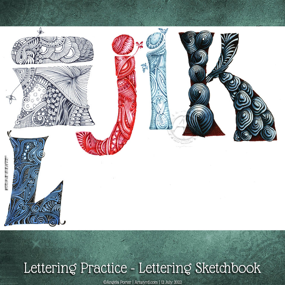
Today, I had plans. I was awake around 5am, again, and so did some pencil lettering ‘sketches’; the finished result of one is in the photo.

I thought I’d start to digitally ink the lettering in and add colour before turning my attention to a YouTube video. And the phone rang, and it was a friend. So, during the over two-hour-long chat, I managed to mostly get this done! Yup, I can ink in a sketch and so on while chatting. I just can’t chat and sketch, generally.

My plans to record a video this afternoon were then scuppered as I couldn’t keep my eyes open! So, on waking, I completed this particular piece of lettering and doodling.

It really is practice for me. I’m not only practising my lettering skills, but I’m also trying out new brushes and tools and so on in Clip Studio Paint. That is a constant practice for me. I tend to learn how to do something when I need to do that something!

This one is probably as good as it’s going to get. Time to move along to the next mini-lettering project and learn and practice more!

Sunday Morning had lettering and doodles.

Sunday morning, I drew this in pencil. Today I finally got it inked in by hand and colour added.

I’m quite pleased with how this turned out. I may actually be finding my way with this hand lettering lark!

Lettering practice

My latest page in my lettering sketchbook. I’m still working on finding how lettering can work for me. It seems that these kinds of letters are something I keep circling back to.

All drawn with various fineliners and some coloured with Arteza Everblend markers. Some highlight dots of white gel pen too.

Start of a new page in my lettering sketchbook

Again, I woke before 5am today, even though I didn’t go to sleep until nearly midnight. This is getting ridiculous!

What else to do until I’m either ready to sleep again or give up on sleep and start my day proper? Oh, art of course!

So, I decided to divide a page up in my lettering sketchbook. Then, I coloured the vertical sections with distress inks. The colour themes from left to right are blue, pink and green, with bits of crossover.

Next step? Collage some papers to create areas for hand lettering to go. That squared paper needs to be toned back a bit – white gesso will be just the ticket!

Then, I did some hand lettering and added some patterns. I thought I’d use some fineliners – Inktonic Pens from Arteza to be exact. the collaged paper does like to soak the ink up when just the edge of the pen nib touches it.

Fineliners are not my favourite pens to colour in with. But, they usually have water-soluble ink in them. So, on the lower panel, I used a damp brush to move the ink around to even out the colour.

On the upper panel, I splattered some water on it and used a paper towel to lift the water up. That created a nice splatter pattern. Then I had a thought, “What would happen if I sprayed water on it, lightly and used a paper towel to pick the water up?” I lost the pretty water-bleached spatter patterns. But, some of that ink really bled into the edge of the collaged paper. That was unexpected and rather interesting.

So, some more interesting experiments with this idea I’m working with.

Oh, the letters of lacuna had colour added with a deep indigo Inktense pencil, brush and water.

Oh, I did use a pencil to write out the letters and position them, and I still made a pig’s ear of the ‘And still I rise”. Sheesh! Perhaps I’m being way too critical of my own lettering and what is there. I focus on all the imperfections I perceive, rather than taking a step back and trying to see what I’ve drawn and lettered through someone else’s eyes.

Time for tea and breakfast it is, I think.

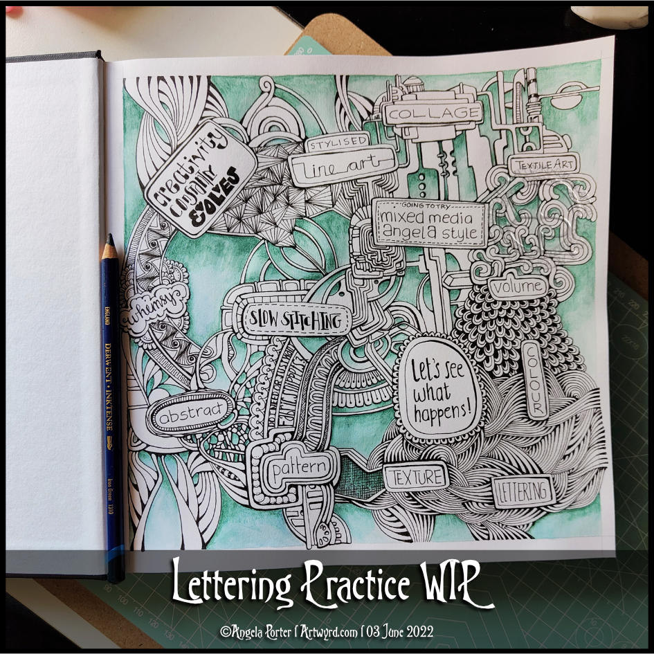
More lettering practice … WIP

I managed to get myself totally engrossed in creating these small designs in my lettering sketchbook.

I much prefer the quote in a band across the whole design, though I do have to work on weight of line, the arrangement of words and so on.

This leaves, of course, plenty of space for bands of patterns and different colours and so on. which has been fun and kind of interesting to do.

I don’t know how many of these I had to redo the quote as I misspelt ‘believe’ in ink. Another note to self – pencil in the quote first and then check the spelling and adjust the arrangement of the words!

The one at the bottom left isn’t finished yet.

My two favourites, I think, are the top two. Monochrome colour schemes, no surprises there!

Lettering Practice WIP

Lettering WIP

I woke before 5am today and so I did what I do until I’m ready to go back to sleep – letter and/or draw.

Today, this quote from the wonderful Maya Angelou appeared on my Facebook newsfeed. So, it deserved to be used in some way.

This lettering thing is still vexing me. Today I thought I’d try using some vintage, grungy lined paper from a digital download from WhichCraft Do You Do.

Yes, lined paper. Because, why not! Not that it’s made much of a difference to me feeling a bit better about my lettering. But, you gotta keep trying things out until you find what just sits right, yes?

Next step, after gluing the quote in what seems a suitable space on my sketchbook page, was to add patterns to the background. I started with the border of the Zentangle pattern Crescent Moon around the quote. Then, I added the river of Diva Dance upon which the quote floats. The tangle pattern at the bottom is Crazy ‘Nzeppel.

It seem that looking at and creating some work inspired by Rebbeca Blair has influenced me here. Instead of splitting the background up into smaller sections, like a quilt, I’ve worked in layers that look a bit like torn paper. Now that is an idea to explore further.

I’ve started to add colour with Inktense pencils – Red Oxide and Deep Indigo so far, but I will use some Mustard too. I also intend to add some gold to design, probably in the narrow channels either side of the rusty red section and a few ‘Nzeppel ‘pebbles’.

I think I prefer the torn paper edge of the quote panel, though I may re-try this with straight cut edges.

Digital Downloads

Using digital downloads is a bit new to me. Well, in this fashion at least. I have used digital backgrounds a lot in my digital art, and still do. But printing them out is something I’ve not considered before.

I do think I could make my own papers, going forward, to use in this way. All I need to do is remember to scan them in before using the paper! Easier said than done though. We’ll see.

Having some papers already in my digital stash is a worthwhile start to experiment and see where this leads me.

Lettering Practice WIP

How I spent my afternoon – adding colour to this particular design. The colour isn’t even, but I’m fine with that as I do want to add subtle patterns in the coloured sections eventually, I think.

I’m now taking a break from this as I just don’t know what to do next. Do I add more colour? Or is it time to add more pattern or texture? Or, do the patterned areas need shadows and highlights added rather than colour. Dare I add any sparkle and shimmer in places?

I just don’t know at the moment. What I do know is I quite like this way of combining words and patterns – two things I love very much.

A second thing I know is that it’s time for a mug of tea, a biscuit, maybe, and some slow stitching. Oh, and watch episode 3 of Obi-Wan Kenobi!

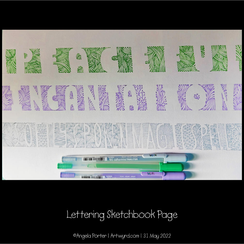
A Page from my Lettering Sketchbook

I finally finished this experimental page a few minutes ago. I’ve been working on it over the past four days as I continue to experiment with the use of patterns with hand lettering.

To complete these particular examples of hand lettering I used a selection of Sakura Gelly Roll Moonlight pens. Working out which patterns work best for me is going to be quite a task. Still, it’s always fun to experiment!

Lettering Practice – 29 May 2022

Finishing my work quota for the day deserves a treat, and that involved some hand lettering practice and exploration. So, these two pages from my A4 lettering sketchbook have been worked on over the past couple of evenings.

I still haven’t found a way of lettering that resonates with me, though both of these pages resonate with me more than other lettering work I’ve done. I really want to combine lettering and my love of patterns and abstract design. Working out how to do that in a way that feels right and makes my heart smile, is proving to be a difficult task!

I think, however, that I may be circling in on some ways of achieving this. One style that may bear fruit I stumbled upon several days ago and I blogged about it then (Hand Lettering and Entangled Art). Thoughts and quotes and words in shapes with entangled, zentangle inspired, patterns connecting them and creating a background pattern. I’m still not sure about this particular mode of expression. But I’ll work with it and see where it leads me in time.

Another way of lettering I stumbled upon was in lettering an alphabet in the style of “Hand-lettered capital I”. That was the inspiration for the image on the left above.

Last weekend, I bumbled my way through “Choose to Shine”, and the abstract patterns in the background gave me an idea to try out. Which I did in the right-hand image above.

There’s a fair amount for me to think about with these experiments. I’ve finally found a way to make use of Gelly Roll Moonlight pens – both for drawing patterns in letters, but also as patterns that flow over or behind letters – as in Shine and Because in the right-hand image. I also used the Moonlight pens, along with some Zig Writers and some vintage coloured gel pens in the left-hand image and the “A Curious Pattern” and “Never give up” designs in the right-hand image.

It’s so unusual for me to draw in colour. I usually stick to black ink for drawing, but suddenly I may have found a way for colour to appear in my whimsical and entangled worlds.

At the moment, though, I’m still not at all sure about this. My head hurts (another migraine feels like it’s on the way) and I’m not able to think clearly or write all that coherently, or so it seems to me.

One last thought to share. For both of these pages, the only thing I may have looked back on was my own work. I didn’t look in books or at work online for inspiration, I only used my lettering sketchbook and my love of abstract patterns. Learning not to compare my work to others, trusting myself that what I produce is good enough because it is an expression of myself, is not an easy thing to do. But I’m working on it and here it may have paid off with examples of lettering by me that I kind of like.

“Choose to Shine”

I’ve finished it, I think. I’m feeling a bit happier with it now. I really like the abstract, curvy, swirly bits that remind me of La Tene (early Celtic) art. I’m still not happy with that central ‘moat’, though.

Oh, I’m also really pleased I stuck to an analogous colour scheme, mostly. Having the words in an almost complementary colour to the blues and purples makes them stand out. But I still rather like the swirly abstract patterns, and I’m so glad I added them!

I’ve not quite found my way with hand-lettering. I keep trying new and different things out, but nothing seems to sit well with me yet. Although I like the more formal lettering layouts, I don’t think that’s for me. I tend to work fairly instinctively and intuitively with little forethought or planning. When I do think my way through something, that’s when disaster tends to strike!

I suspect a looser, expressive, intuitive kind of style is going to work for me, along with my style of entangled, abstract art. Probably. Possibly. Perhaps…