How are you all doing and coping with the continuing pandemic and the public health restrictions in place?
Here in Wales, our Senedd (Welsh Parliament) has been slowly easing the restrictions, pausing after each one to see how it affects the rate of transmission before easing more restrictions.
I, like many others, don’t leave my home often. I did go out for a walk in the fresh, sunshiny and windy morning. It was so nice out and moving my body around. I am still very nervous of being around people, so I go to a big cemetery near me where I know I will encounter few people. It’s a very quiet, serene space too, and nature flourishes quite wonderfully there as well.
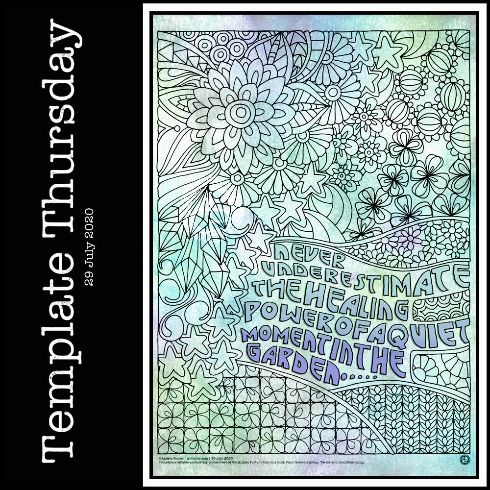
Template Thursday
Each Thursday marks another week of the continuing Covid19 crisis, and so I make a new freebie colouring template available in the Angela Porter’s Coloring Book Fans facebook group. There are some terms and conditions relating to the use of the template.
This week, I have a typically ‘entangled’ style of template for people to colour. As well as some cute winged stars, botanicals, arches, spirals, feathers, crystals and clouds, I’ve also included some hand drawn typography. Let me know what you think of using typography as a way of adding pattern to the arches.
If you download the template and colour it, don’t forget to tag me in your coloured version if you share it on social media! I always love to see how people colour my templates and bring them to life.
Over the past couple of days I’ve been doing some work in a new Arteza Watercolour Sketchbook, slightly larger than A4 in size.
I am really happy with Arteza’s professional watercolour paper, though I do wish it was whiter in colour. So, I thought I’d try out their watercolour sketchbooks. They’re sturdier than my custom discbound sketchbook, so easier to cart around with me as I need.
I rarely do huge works of art, unless it’s digital work, so I like to work in little boxes on the page. I have drawn all the designs with Faber-Castell Pitt Artist pens as they are waterproof. Like all watercolour papers, there’s a texture to them and this does wear the fibre-tip of the pen away. I can live with that as I tend to wreck them quickly as I am a bit heavy handed when it comes to pens.
Talking of texture, this paper is less textured than the cotton professional watercolour paper. It is also double sided, with the other side being smooth in texture. This smoother texture is much more to my liking.
Although this paper isn’t 100% cotton, I find it so much easier to work on than the other pulp watercolour papers I have. The paint doesn’t dry too quickly so I can work wet in wet. The pigments also stick to the paper so that successive glazes don’t shift the underlying layers, something I’m only just discovering the magic of working with.
As I don’t really wet huge areas of paper, there is no warping. Also, though I’ve worked in layers of colour in some areas, there is no breakdown of the paper surface.
All in all, as a watercolour beginner, I like the paper. It works with me and the way I like to apply watercolours, whereas other papers I’ve tried definitely work against me!
It’s also quite affordable, with two 64 page sketchbooks come in at £26.99 on Amazon. This means I can experiment with watercolour to my hearts content without feeling I’m destroying the lovely 100% cotton watercolour paper.
Black lines, or no black lines? That is the question…
I keep switching between black line-art that I colour with watercolour and using light pencil outlines so my designs are worked in pure colour. I can’t seem to settle on one way of working. I like both, but my mood changes from day to day it seems.
At the moment, it seems I need that clear, firm structure in my designs, clear boundaries within which I lay down colour. This is, I think, a reflection of my inner self and the issues I’m working through at this time. Issues that I have no words for.
Even though my art is usually rather controlled with clear structure in it, it still allows me to work through emotions and thoughts that are troubling me.
My mind is ever active, but not with self-talk most of the time. Art allows me to express things I can’t in words. It may be choices of colours, the style of art I gravitate to, the media I choose to use at any time.
On this page, some words have appeared, and those are like bullet points from what I’m working through. Other words are noted in my journal and aren’t shared with others.
Rusty, corroded colours.
There is one design that I have filled with colours that remind me of rust. When I get the right consistency of wet into wet colours, I get these delicious, spiky blooms of colour that really do remind me of rusty textures.
Taking time to look closely at rust, there are lots and lots of beautiful colours, some of which sparkle as they catch the light. It never ceases to amaze me how interesting it is, when examined closely.
Nice, shiny, pristine metallic structures and sculptures are lovely, but how much more interesting they become as they weather and corrosion subtly changes them, adds interest and a different kind of beauty to them.
I can’t tell you how happy I am that I have discovered how to create these rusty colours and textures. They are a completely different colour palette to what I would usually use, but I actually love it! Now I know what I’m doing, I can work on understanding the exact consistency of wet on wet I need, and how to get all the various colours I’d like to incorporate.
As I write this, raku glazes come to mind too. All those glorious colours that various copper oxides produce – magenta, rusty orange, purples, greens, blues, and more. I think I’ll be spending time looking at raku again and working out colour palettes to use in my work going forward.
Typographic portraits update
I’m quietly working at the third iteration of my Nye Bevan portrait. My mind is ticking away with what I need to do, and taking a break allows me to return to it with fresh eyes and a fresh mind.
This morning I created some tall, thin (or short and wide) backgrounds using Distress Oxides on some Arteza Mixed media paper. The paper is 8.25″ x 2.87″ (21cm x 7.2 cm) in size.
I chose this one to draw on for no other reason that it was the one that appealed to me at this time. I started with the seed pods and foliage at the bottom, and worked my way through some hand lettering / hand-drawn typography to more abstract line-art.
I drew with a M Pitt Artist Pen from Faber-Castell, though I added the stippling with an XS Pitt Artist pen.
No glitter or glitz on this one, nor any highlights. Not yet. I’m not in the mood for any, not today.
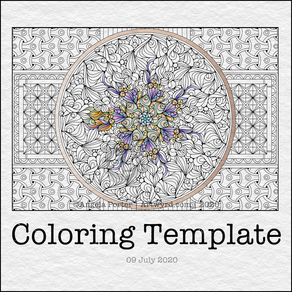
It’s Thursday again, so that means it’s time for a new coloring template for the members of the Angela Porter’s Coloring Book Fans facebook group. I said that during the pandemic, I’d create a template a week for group, free of charge, to help people relax, calm and take their mind off all the awful things that are happening in the world for a short time.
This week, I’ve combined some typography my familiar entangled style of drawing. Botanicals, crystals and stars along with some repeated ‘zentangle’ style patterns. Some of my favourite things to draw.
To draw this template, I used Faber-Castell Pitt Artist pens (F and S), Copic Fineliner SP pens (05 and 025) and a Uniball Signo DX 0.38 pen with Rhodia dot grid paper.
Although lockdown has largely lifted in the UK, we still need to practice social distancing and wear face coverings when it’s not possible to do that, or in enclosed spaces. The Covid-19 virus has not gone away, and though the number of cases are falling, as are deaths, that’s due to people being sensible and following the guidelines for limiting the spread of the virus.
I’m very, very anxious about going out and about, and I know I am far from the only one. I mostly stay safe at home. Mind you, that’s not unusual for me. Even before the pandemic I wasn’t someone who was out and about all the time. I did pop out and about more often than I realised, however. But I’m still usually quite happy to stay at home and focus on my arty, creative activities. But, I know that’s not the case for everyone, and not everyone is able to work from home either, nor wants to.
Yesterday, I spent some time adding colour to paper to add to my custom sketchbook. This is one of the papers that I created, with an abstract drawing on it, that is finished enough for the sketchbook.
The artwork measures approx 4″ x 6½”. I used a piece of ClaireFontaine Paint-on mixed media paper which I coloured with Distress Oxide Inks followed by some sprays and splatters of water to create a distressed look. The colours used were Seedless Preserves and Fossilised Amber.
I first drew the basic outline of the design with a M Pitt Artist pen from Faber-Castell. To add colour to the design, I used Distress Inks in Seedless Preserves, Fossilised Amber and Ripe Persimmon like watercolours.
Then, I started to add patterns, lines and stippling to the design to bring out the patterns and add depth, interest and dimension.
I think it’s worked out fairly well. I may well go back to yesterday’s ‘Blessings’ artwork and add colour and more patterns to it at a later date.
I went out!
My blog post is a little later as I decided to go out for a walk this morning. This was a big deal for me. Especially after the effects of the high anxiety/stress I experienced last week.
I went to my local cemetery, Glyntaff Crematorium. It’s fairly large, with lots of paths and roads sectioning the cemetery up. I wandered around the older section, which is full of fascinating funereal sculpture. I had my DSLR camera with me, and managed to take over 100 photos this morning, not just of gravestones, but textures too.
It was so nice to be out in fresh air, moving my body around more than I have done for nearly four months. I had nice music on earphones so that any loud sounds wouldn’t startle me. There was work going on around the crematorium as well as grounds work.
It was also nice to drive my car again. It’s been a week, and I really miss the freedom of just being able to take a drive. It’s important that we still stay home as much as possible and to limit our time where there are people. I think my choice to visit the cemetery was a good one. Very few people, alive or dead, haunt cemeteries!
I think I fall into the group of people known as tapophiles – people who are interested in cemeteries, gravestones and funerals. It’s not a morbid interest, just an interest about the changing styles of funerals, funerary sculpture , practices and how they change over time with society and culture.
I discovered the fascination with gravestones when I walked to and from school through this cemetery. It took me longer to get home than it did to get to school. On the way home I had the time to linger and explore and indulge my curiosity. I remember being too scared to look in the chapels there, but enjoyed popping into the columbarium, which has recently been renovated and reopened.
I think I’ll be looking for other cemeteries fairly local to me to visit in the weeks ahead, ones that offer me a good walk as well as interesting graves to look at.
Wibbly-wobbly sculptural columns and arches surrounded by layers and layers of abstract bubbles, ripples and swirls of thoughts, wishes, blessings. Well, that’s what came to my mind as I added the architectural details.
No highlights, no sparkle, limited pattern and texture. Just flowing line work, for the most part. I’ve even left some ‘white space’ in the design, which is becoming less unusual for me.
Rounded arches with patterns reminiscent of Romanesque architecture. The columns are, however, more delicate, which is more reminiscent of the move towards Gothic architecture. Both forms or architecture have long been a source of artistic inspiration for me.
Soothing, relaxing and meditative to draw. Circles and spirals, arches and patterns are always comforting and endlessly fascinating to me.
Drawn using Faber-Castell Pitt artist pens on paper coloured by PaperArtsy Fresco paints. The drawing is approx. 2½” x 6¾”.
It’s free to join the group, and the template is a freebie for members of the group.
This week, I created a mandala design with a background of geometric, repeating patterns.
I’m still recovering from the stress of my first trip out since March 2020. Drawing (and colouring) mandalas is an incredibly peaceful, relaxing and mindful activity. So, it was natural that I drew one.
The mandala design is based on some of the abstract art I’ve been doing of late. It’s a bit unusual for my mandalas, but I really do like the organic flow of the lines.
Even though the design is abstract, the repeating symmetry of a mandala bring some structure to the design. I am looking forward to seeing how members of the group add colour to the design.
The geometric patterns in the background also result in a soothing, repetitive rhythm for colouring; a rhythm that results in soothing and calming ones mind and emotions.
De-stressing
I have been totally shaken by the level of anxiety/stress that resulted from my trip out on Tuesday. I am beginning to feel more my contented and calm self. However, I find I’m still irritable and grumpy and have withdrawn from social media and the like for most of the day.
It was a sobering thought when I realised I’d lived most of my life constantly at elevated stress levels, often as higher than what I experienced in the past couple of days.
It’s also a wonderful realisation that I can recognise this now, and I also am able to allow myself self-care time to let all the stress hormones leach from my body. It’s been a long time since they peaked in this way.
It makes me extremely grateful to my therapist for her years of patient work with me. Experiences like the Tuesday Trip remind me of how I used to be and show me how far I have come in recovery from cPTSD.
Yesterday, after my social media post, I binged watched the Harry Potter films from The Order of the Phoenix. I found I was irritated by crochet. I tried cross-stitch, which irritated me too. Eventually, I settled on knitting, which, oddly, soothed me. I think it’s because I could knit and watch the film. Knitting allowed me to channel my irritability into something creative. As I can knit without looking at the knitting, I could also watch and immerse myself in the films at the same time.
My fingers are itching to knit again, now I’ve thought about it.
Even though I slept well last night, I’m still feeling really tired today. This happens as part of the post-stress come-down. It can last a few days. I’ll not be rushing to nap, however. Napping has a knock-on effect on my ability to sleep at night when I’m like this. My naps tend to end up as periods of deep sleep, so I try not to take them unless it’s absolutely necessary.
Tonight, at 10:43 BST, the Sun appears to enter Cancer, as viewed from the Earth. Of course, it’s the Earth that is moving around the Sun. Today, marks the official start of summer, but it also marks the time when we have the days of most light here in the Northern Hemisphere, and we’ll soon notice there’s not quite so much daylight at the end of our days.
This year, English Heritage are live-streaming the solstice sunrise tomorrow morning on their facebook page. You’ll have to be up early (or just not go to bed!) as they start streaming from 04:07BST, with sunrise at 04:52BST. I’m certainly going to do my best to watch it. This is one of the good things to come out of the pandemic. The live stream hasn’t been done before. I would never go to Stonehenge on either Solstice as there would be too many people and far too much noise and bustle for me, but this is a nice way to see it as it happens, not recorded and shown after the fact.
I’ve always felt an affinity with the cycle of the seasons and marking the solstices and equinoxes has felt far more natural to me than any religious celebrations. The scientist in me appreciates the facts around these dates in the calendar, my heart and soul appreciate them in different ways that are personal to me.
I found this quote about the solstices, and it sums up a little bit about how I feel about them.
The artwork shows a lot more about how I’m feeling today – not quite with it, spaced out, emotional and well out of sorts. I had an idea in mind, but I just couldn’t execute it to my satisfaction today. It looks like I need another self-care day. Which is fine. I’ve learned that sometimes it’s best to go slow in order to go fast. By taking time out from commitments, I return to them in a better frame of mind and emotional state and I’m more able to fulfil them to my satisfaction for sure.
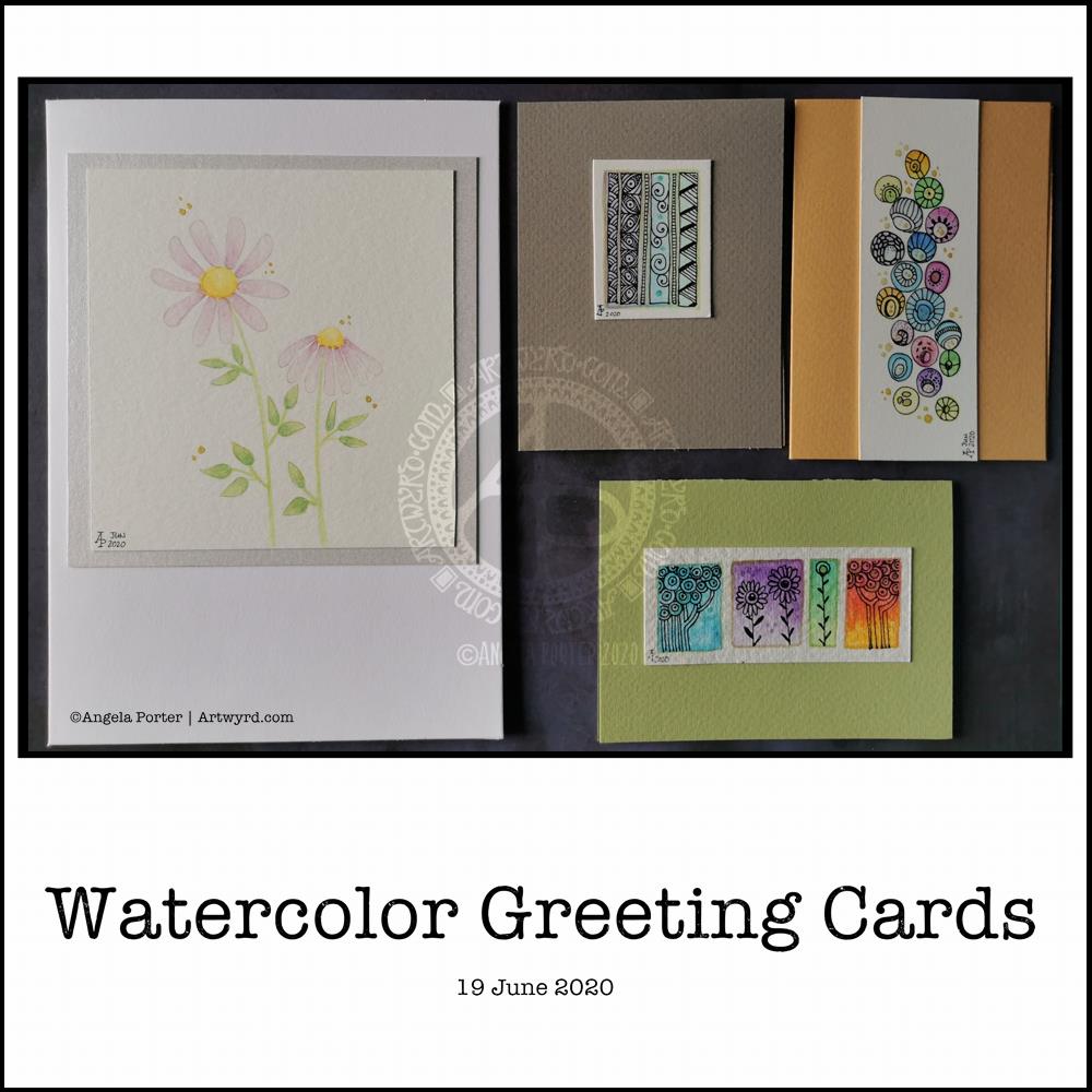
I needed a quiet morning, again, today. So, I thought I’d dig out my Caran D’Ache Supracolor Soft watercolour pencils and try some stuff with them.
I wanted to use them to draw a flower, or two, and then use water to create a watercolour effect. The result you can see on the left-hand side card. I’ve left loads of white space on this card, which is unusual for me. I couldn’t resist, however, adding some gold dots around the flowers. The colour of the petals was so delicate that I used a 2H 3mm pencil to outline them and the leaves. Just for info, the piece of watercolour paper measures 4″ x 4″.
For the other cards, I just wanted to work with the pencils to create gradients and abstract patterns in colour. I drew on the little panels using a 0.25 Copic Multiliner SP pen and added some lines and details with metallic gold watercolour. These cards are approx 3″ x 4″ in size.
Watercolor pencils are nice to use when it comes to drawing in colour with them, then activiating the colour with water. They really glow on 100% cotton rag paper (bottom right) compared to the other cellulose papers.
Cute and whimsical cards, some very detailed, one not quite so. But a nice way to spend my morning.
Self-care time, again.
There’s a situation going on around me that is draining my emotions greatly at this time. I’m doing my best to not become overly emotionally involved in it, but it’s difficult when it’s to do with people you care about.
It all has a knock on effect with me. I’m anxious, tired verging on exhausted, really grumpy, irritable, and lacking patience at this time. I’m also not able to concentrate too well. These are all behaviours I could do without in dealing with this situation. Yet I’m exhausted by it.
I have been meditating, making sure I take time to do self-calming and self-soothing activities, such as my morning art, Though I have work to do for contracts, I need to take a day away from everything, if I can.
I know there are lessons for me to learn about myself in how I’m reacting ot the situation, stuff from my past that wasn’t processed during my EMDR therapy. If I can work out what it is, I can work through it myself now. Organising EMDR therapy isn’t possible at this time, with lockdown still very much in operation and me being very nervous of going out into the world as well.
So, I’m going to make time today to drink tea, meditate, journal and try to get to the bottom of my own issues and start doing what I can to work through them and heal the past traumas that are causing my reactions at this time.
I think I’ll also take time to crochet (I started a mosaic blanket earlier this week) and watch films or crafting shows on the TV. Eat healthily – I have a yearning for brussel sprouts, of all things! And take time away from social media and news. I may even pick up my flute and play it, for the first time in months and months.
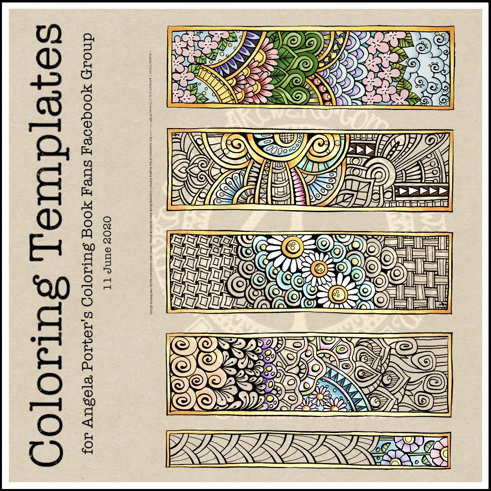
This week’s coloring template is a series of bookmarks. A member of the Angela Porter’s Coloring Book Fans facebook group said they’d like some designs that could be used as bookmarks, and so I went with the suggestion.
The designs are typically ‘Angela’ and ‘entangled’. I used a Tombow Fudenosuke along with an 04 Pigma Sakura Sensei pen to draw the designs. After scanning and cleaning up, I’ve partially coloured the designs, as well as adding a pale kraft paper background.
To use them as bookmarks, I suggest printing them on some card. If that’s not possible, then gluing the whole sheet to some card and then cutting out the book marks would make them sturdier. Of course, a laminator could prove most useful in preserving your beautiful coloring, as well as making really long lasting book marks that could be given as beautiful gifts, or used to mark the coloring page you’re working on too.