Coloring Template

Coloring Template 16 April 2020 © Angela Porter | Artwyrd.com

Coloring Template

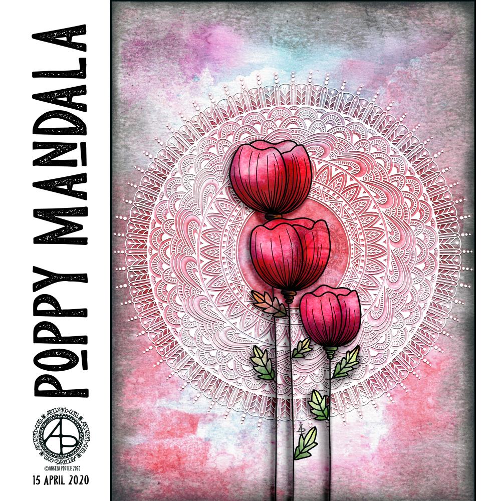
Gosh, Thursdays seem to come around so quickly these days! Thursday is the day I post a new colouring template for the members of the Angela Porter’s Coloring Book Fans facebook group, and above is this weeks offering.

I drew the line art on mixed media paper from Claire Fontaine with Tombow Fudenosuke flexible nib brush pens. I like to use variable line widths in my art from time to time. They give instant depth to the drawing and increase the graphic nature of the design.

I’ve used some really weird colours, for me, in my sample coloration. They’re really quite muted. That’s a hint to me that something is awry with my emotions/mood. I feel quite subdued and ‘meh’ at the moment, which is reflected in my colour choices.

Anyway, if you’d like to colour this, or any of many others in the archives, please pop along and join the Angela Porter’s Coloring Book Fans facebook group. I create these exclusive templates as a way of saying thank you to those who like my coloring books.

World Art Day 2020

Poppy Mandala ©Angela Porter | Artwyrd.com

The aim of art is to represent not the outward appearance of things, but their inward significance.

-Aristotle

Today is World Art Day.  It is meant to be an international celebration of the fine arts which was declared by the International Association of Art (IAA) in order to promote awareness of creative activity worldwide.

Each year, on 15 April (Leonardo da Vinci’s birthday), World Art Day celebrations help reinforce the links between artistic creations and society, encourage greater awareness of the diversity of artistic expressions and highlight the contribution of artists to sustainable development. (UNESCO)

“Our Organization would thus like to pay tribute to the solidarity shown by artists and institutions at a time when art is suffering the full force of the effects of a global health, economic and social crisis.”

— Audrey Azoulay, Director General of UNESCO

About today’s art

I started by choosing one of my Distress Oxide backgrounds to use for today’s art.

I woke knowing I wanted to do an arrangement of stylised poppies with a mandala for a background, and this is the result.

Poppies symbolise, among other things, a lively imagination, messages delivered in dreams, beauty and success, as well as remembrance. They, along with their seed heads, often appear in my art.

It took me many iterations of colour, shadow and highlight to get the mandala appearing as I wanted it to – lacy, light, in the background but still standing out. I think I’ve managed to achieve that fairly well.

Overall, I’m pleased with the finished artwork. I do think the poppies and mandala could be moved towards the top of the background, something that is easy enough to do as I have the layers saved. However, the artwork is good enough for now.

I suspect I’ll be creating more art using a couple of the backgrounds I’ve created through the day. It’s a satisfying process to use backgrounds I’ve created myself rather than using ones that I have purchased.

Truth

“Truth” ©Angela Porter | Artwyrd.com

I like to use a word in my artwork from time to time. Truth was the word I knew I had to use as the central point for some artwork, and that’s where I started, along with one of the Distress Oxide backgrounds I made yesterday (in the middle of the image).

After I’d decided on the typography and placed it centrally, I then started to draw digitally. I made use of the symmetry tools in Autodesk Sketchbook Pro, along with a flexible nib and fineliner brushes.

I had no idea what kind of design would result, I just went with the flow and intuition and thoroughly enjoyed doing so and losing myself in the art.

I added shadows and highlights once the drawing was finished for that sense of dimension and ‘life’.

I am really pleased with the finished artwork. There’s something about symmetry, spirals, repeating patterns, and intricate, abstract designs like this that just makes my arty heart smile and sing. I always return to this style, it seems to be at the core of my being.

I also love to draw on coloured and textured backgrounds. I also think I’ve found a way to combine more traditional media (making the backgrounds) with digital art (drawing and adding shadows and highlights) in a way that really works for me.

My only problem is that I do tend to try to branch out into other kinds of art and never seem quite so satisfied with them. This doesn’t mean I’m going to abandon them; they need a lot more work and thought and maybe structure.

Perhaps that’s why I like this particular piece of art so much – it has clearly defined structure. The colour palette is defined by the background and so I’m not struggling with what colours to use. Having the black line structure defines clearly where shadows and highlights need to go.

Microbial

Microbial © Angela Porter | Artwyrd.com

I started this yesterday before I hurt my back. I started with a Distress Ink background. Next, I used water and a brush with Tombow Dual Brush pen ink to create the circles and splashes. Finally, I added some line and pattern to the ‘blobs’. As I was finishing it up this morning, they reminded me of microbes, so that’s why I’ve named it ‘Microbial’. A classic bit of abstract, intuitive Angela art, and a bit of a blast to the past as well, but fun.

My back is a bit better today, but as well as painful I’m now stiff and with pain down my thighs. Hot gel pads really work with the pain/stiffness and I’ll be sorting that out very soon, as soon as I’ve finished posting this in fact!

Poppies

© Angela Porter | Artwyrd.com

I’ve had a play around with Distress Ink backgrounds, painting on the basic shapes of flowers, leaves and stems, and then adding black line art to it.

And, as I got up to put this on the scanner, I hurt my back. So, today I’ll be finding somewhere to sit/lie where my back doesn’t hurt and most probably crocheting and hoping the pain/stiffness eases off soonest. My back was a bit niggly as I woke up – I’d slept in a different position to usual and I wonder if that’s what had started it off.

Ho hum, so no arty stuff today, it’s too painful to sit at my studio desk and work.

Coloring Template 09 April 2020

©Angela Porter | Artwyrd.com

Another week in lock-down and quarrantine has passed us by. How long this will last, who knows. But with another week gone, it has to be one week closer to the end of it.

Another week gone also means a new coloring template for the Angela Porter Coloring Book Fans facebook group!

Fancy bringing this template to life with colour? Just pop over to the facebook group and join! It’s free, as is the template!

I drew the template with pen on paper (Pentel ‘Fountain’ pen and Frisk Bristol Board), scanned it in, cleaned it up, and then added some colour digitally.

This is a very typical ‘Angela’ kind of design – abstract with stylised motifs and geometric patterns. The arches are often used as a way of providing little windows into other world.

I do love to see how people use different color palettes to bring my templates to life. If you choose to join in, then I’d love to see, as would the members of the group too!

The purpose of art…

©Angela Porter | Artwyrd.com

I often wonder about the purpose of art, the purpose of my art, and can never find the words or ideas to express. So, I’ve fallen back on a favourite quote of mine from Picasso.

It embodies how I feel about creating art. Being creative helps me to dust myself off, find myself back in the present, and to find my sense of balance and contentment. Being creative is so important to me each and every day, more so during the Covid-19 crisis and lock down.

I unashamedly make art that is a reflection of what makes my heart sing – line, pattern, abstract shapes, stylised forms, colour, intricacy. I soak up inspiration from all kinds of things and process it all unconsciously and intuitively to draw and paint things that are pretty and show what I find fascinating visually and that give me a sense of wonder and awe.

My art is, and will always be, a reflection of my heart, soul and mind.

I do, however, sometimes worry that my art hasn’t anything to say about the world, that makes people think about things. That my art is just … pretty.

What the world needs now, however, is some prettiness and beauty in it to dilute the worry and fear and ugliness that abounds. I’d like to think that my art helps in that process just a little.

Today’s mandala and typography were created digitally. I usually use a background from one of the collections I’ve purchased online, but today I used one I created. I used Affinity Publisher to produce the typography and Autodesk Sketchbook Pro for the artwork. My tools are by Microsoft – Surface Slim Pen and Surface Studio.

So much fun!

So Much Fun ©Angela Porter | Artwyrd.com

I had so much fun making these little abstract art creations! They really do go back to my roots, but in the way I like to create now.

To give you an idea of size, the purple one is 3″ x 4″, the other two are 2½” x 4″ in size. I have mounted them on cards that are 4½” x 5″ in size, made from some white Daler-Rowney mixed media paper, and I love how they look!

I started by creating the backgrounds using Distress Inks, a mini foam blending tool and a spritz of water.

Then, I painted on some basic shapes using a brush, water and either colour from Zig Clean Real Brush pens or Distress Inks, followed by some splatters of colour.

The the real fun began. Taking some things I really wasn’t happy with and adding line and pattern to them to give them form, definition, and some dimension.

I used Sakura Pigma Micron pens (05 and 02). I also used a glass pen and gold ink in the top right design. For all designs, I used a gold Sakura Gelly Roll pen to add gold highlights, which haven’t shown up well in the scans.

There was something so satisfying and pleasing in working with vague shapes and patterns, the random nature of the background, and using them to inform how my art would develop in each case.

I really, really enjoyed creating these, and I will do more in the future.

I’m not sure how I could create similar digitally – the randomness of wet media isn’t something I’ve worked out how to do…yet. Maybe I never will. Maybe it’s the case of me creating the backgrounds separately using traditional media, then adding the lines digitally. I don’t know yet, however. It may be that this is something I reserve solely for traditional media.

What I do know, is that each design is a work of art in it’s own right and these would look fab framed. In fact, I had a huge inner smile as I mounted them on the card blanks, giving them a simple frame, and saw how finished they then looked. Teeny, tiny pieces of art, by me, Angela.

Mail Art

Mail Art ©Angela Porter | Artwyrd.com

Yet again I woke with my mind swimming with an idea I wanted to try out. I’d had a problem when I was trying to add colour to drawings I’d done on distress ink backgrounds. Whether I used water and a brush or a Tombow Blender pen, the pigment from the Sakura Micron and Uniball Unipin pens bled, and I really wasn’t happy with that.

I spent some time yesterday trying different pens out, with no luck in finding any that didn’t smear/bleed. So, I put this to one side until I had a chance to think about it.

I slept on it and woke with an idea to try.

Why not use the Tombow blender to draw the basic shapes of my design in colour and then add black lines afterwards. Seed pods seem to be my default design when I’m experimenting, but I’m fine with that.

So that’s what I did. And this card is the result.

As I was starting to add the black lines to the design I thought I’d made a horrible mistake, had a bad idea. However, as I added more and more detail, I realised it would work out, and I think it did.

I added some gold to the seeds in the seed pod with a glitter gel pen. I also splattered some gold watercolour paint over the design.

The envelope is really simple; three seed pods, black line art with golden seeds.

Not a unique artistic approach, but it is something that has never worked for me before.

It’s not a dissimilar approach I take to my digital art, where I start with the basic shapes and then add shading and detail. I do use line art as a guide for my design, and that is an approach I can apply to traditional art in that I may need to pencil in the design, then colour, then add the line art.

Who would’ve thought it – working digitally is helping me develop my traditional art methods and skills.

Zentangle ‘toppers’ for cards

©Angela Porter | Artwyrd.com

I’ve been awake way too long already today. I just couldn’t settle to get back to sleep when I woke around 4am. I gave up trying just before 6am and thought I’d do some drawing to see if it would settle me.

The soothing style of choice at the moment is zentangle, so I made use of some of the coloured ’tiles’ I made yesterday, and these are the result. I’ve yet to decide whether I will actually turn them into cards, or whether I’ll just keep them as references for the future.

I thought plain black line looked a bit ‘flat’. That may be a consequence of me working digitally so much and the way I achieve dimensionality in my art.

So, in the top design, I used brush, water and some colour from Zig Clean Colour Real Brush Pens by Kuretake. I enjoyed adding shading with colour, though it was hard work with the fine brush I’d chosen, especially when I turned my attention to the one on the bottom left. So, I used a Tombow Blender pen with the colour for the third card on the bottom right. I’m much happier with the smoothness of the gradients here, compared to the other two.

What I’m not happy with is the way the pigment from the black lines seems to move, particularly when I used the brush. I’m not sure whether this is a result of me drawing on top of the distress ink coloured paper, or whether it’s to do with the friction of brush on the lines. I did get a little bit of movement of the pigment with the Tombow blender pen, but not so much it seems.

As I’m digging into my stash of media from past times, I remembered I had some Nuvo Drops from Tonic. So, instead of using a metallic gel pen to add some embellishments, I added some of these drops.

I’m not entirely sure they work. I think I’ll have to look at these cards again after I’ve had a good sleep and a break from them

I am glad I tried adding more saturated colour to the designs to give that illusion of dimension, even though I had to rediscover the joys of using a blender pen. I do find pens so much easier to work with than brushes, that’s for sure. That may be a knock on effect of me using pen ‘brushes’ so much in digital art.

I’m exhausted now, but I won’t go back to bed until my grocery deliveries have arrived.