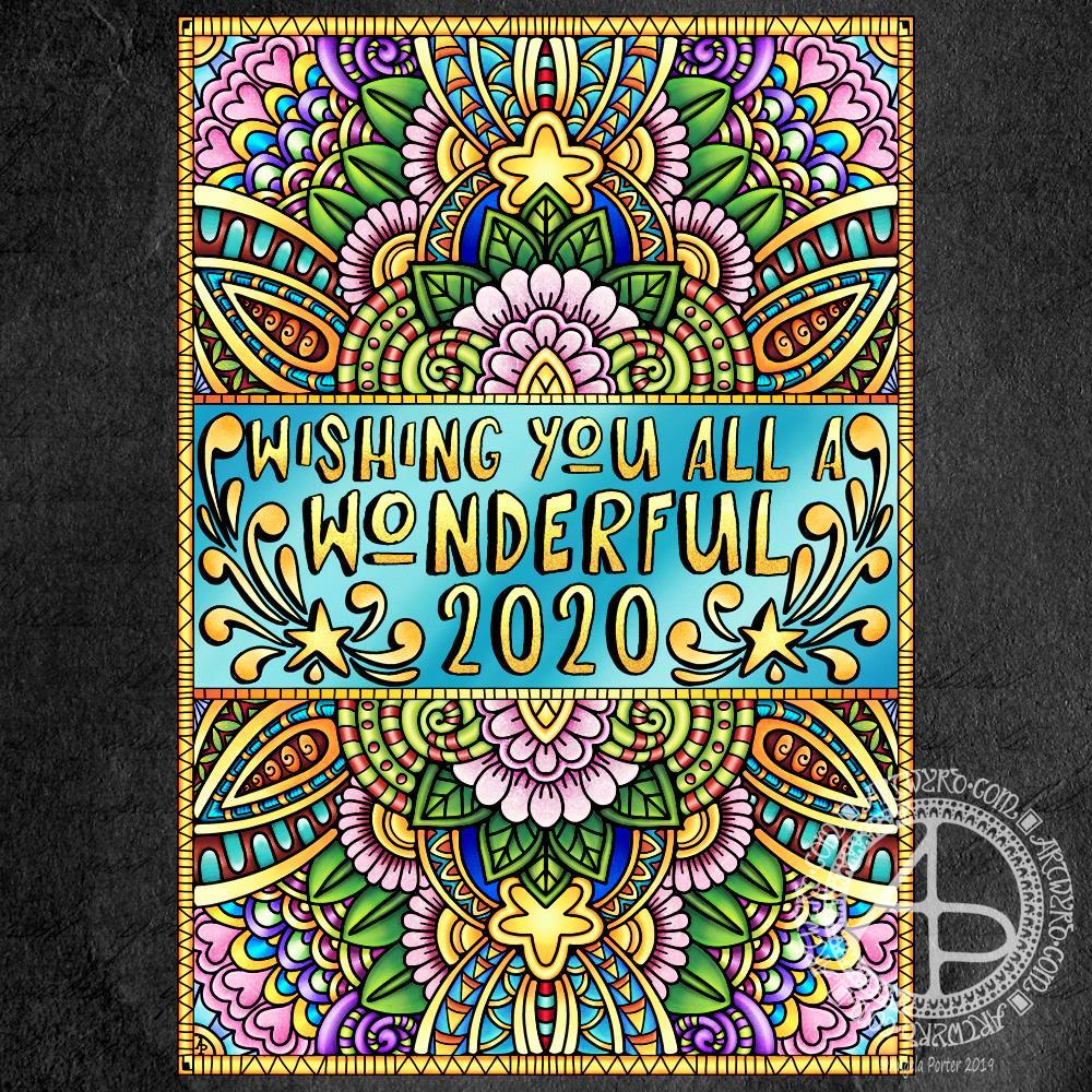
Wishing each and everyone of you the most wonderful wishes for 2020!
Wishing each and everyone of you the most wonderful wishes for 2020!

Art really does wash the dust of everyday life from my soul. That’s why it’s something I do nearly every day. Creating art soothes my soul, my emotions, my mind. It helps me find balance when life has me all topsy-turvy. It helps me find the touchstone of contentment that now resides inside my chest, within my heart. I know that if I can’t settle to doing something artsy, then I’m seriously out of kilter.
I finished this drawing this morning. I think it’s taken me around 6 hours to do, give or take an hour or so. It’s a little smaller than A4 in size (6.75″ x 10.25″). The design was drawn with Faber-Castell Pitt Artist pens (F and S). I added shadows with grey Pitt Artist Brush pens.
I was rather clumsy with the shading in some places, so I took advantage of digital tools to smooth and blend the grey out.
My final digital task was to add a background texture to the artwork, which also added some colour. I do have a bit of a thing for grungy, distressed backgrounds.
On the whole, I’m pleased with this, though I must admit I didn’t think I was going to be so, especially with the heavy-handed shading really bothering me.

This is my current work in progress (WIP), where drawing is concerned anyway.
I’m sure I’ve used this quote before, but I stumbled upon it again and it seemed appropriate I should used it again.
I’ve often blogged about how one of my self-soothing, self-caring activities on days where life has overwhelmed me is art. And so it is the case at the moment as I recover from a tummy bug and from a busy time during November and into December too.
So, I printed out the quote, along with some framing lines, using Affinity Publisher to do the typography, on a piece of Bristol Paper from Frisk.
I’m using F and S Faber-Castell Pitt Artist Pens to draw the design and a grey Pitt Artist brush pen to add some shadow to the design.
I’ve added the coloured and textured background, along with my watermarks, digitally.
I’m almost half way through this drawing and it’s taken me around two and a half hours so far.
My other main WIP is the New Year coloring template for the Angela Porter’s Coloring Book Fans facebook group. These should keep me busy for the next day or so for sure.

Yesterday, as today, I wasn’t feeling too grand still. The stomach bug has laid me rather low it seems. I tire all too easily. Still, I wanted to create some art, so I thought working with flowers would be a nice thing to do.
So, I started with some pen drawings of flowers with three petals – that’s the top row. I used a Faber-Castell Pitt Artist pen on dot grid paper (the dots of which you can still see!).
After scanning that drawing in, I re-drew the same designs digitally using a technical drawing pen style brush (second row) and a flexible nib ink pen brush (third row).
The fourth row of flowers is the same as the third (using digital magic to copy the drawings), but with colour gradients and some details added in the last flower of the line.
The last row was done using the drawings as a guide, but using colour so I could try a variety of brushes and techniques out on them. I used the Copic colour palette that is part of Autodesk Sketchbook Pro’s options.
Looking at the last row of flowers with fresh eyes, I can see how I could’ve added some stamens to some of the flowers, particularly the green one.
I just wanted to be arty for the sake of being arty. What I’ve ended up with is a sketchbook page that is a mixture of traditional and digital art! And there was me saying a few blogs ago that I find it hard to do art just for the sake of creating with no goal or purpose in mind.
This morning, I made a video of me drawing and colouring this festive dangle design and turning it into a card.
This video shows me drawing in real time, and I hope you enjoy it, despite the wobbliness in places.
Here’s a list of materials I used:
I hope you have a go at drawing this dangle design and making your own papercraft or craft projects with it. If you do, I’d love to see them!
If you’d like to know more about drawing dangle designs, or would like more inspiration, step by step instructions, and encouraging words, then my book “A Dangle A Day” is a good place to start.
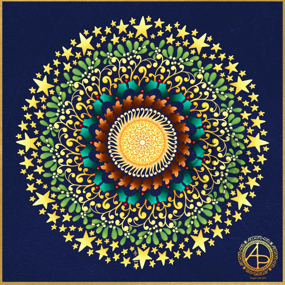
I’ve been awake since way before dawn drawing this mandala to celebrate the Winter Solstice. I’m looking forward to the increased hours of daylight, though it will be a couple of weeks, or so, before there’s any noticeable difference in the length of day.
It’s been a lovely way to spend the hours as night gradually gives way to the sun. Not that I can see the Sun itself; grey skies and patches of rain obscure the golden wonder of that glowing ball of nuclear fusion.
I created the mandala using Autodesk Sketchbook Pro, Microsoft Surface Pen and Microsoft Surface Studio.
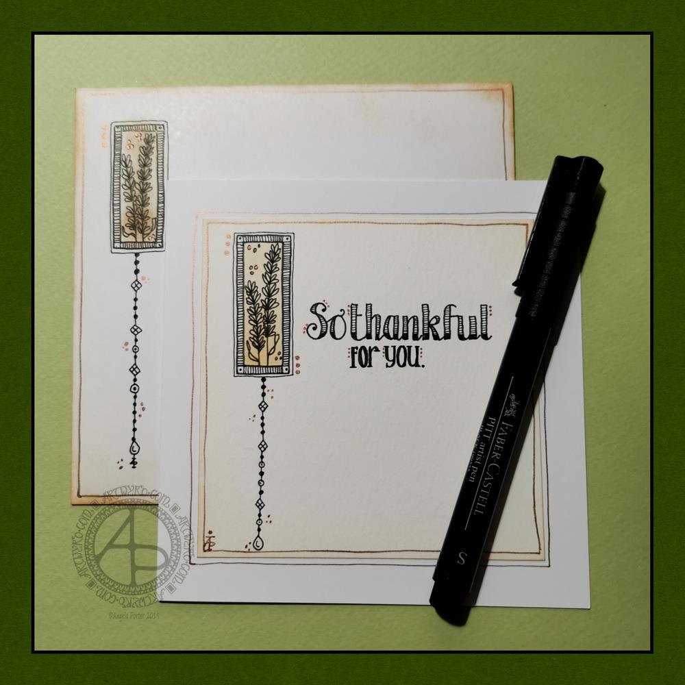
Today, I have a simple dangle design greeting card along with a coordinating envelope. If you’d like some more ideas, inspiration and step by step instructions for drawing dangle designs then my book, A Dangle A Day, is a good place to start.
4″ x 4″ Strathmore Bristol paper with a vellum finish
5″ x 5″ acid-free white card blank
White envelope that card will fit in
Distress inks in Tea Dye and Rusty Hinge
Small piece of foam and a mini foam blending tool
A piece of card with a 1.5″ x 0.75″ window cut in it to use as a stencil.
Faber-Castell Pitt artist pens in F, S and XS
Ruler and pencil
Adhesive
Glass pen and coppper ink by J Herbin
Once I’ve addressed the envelope, I’d apply a thin layer of Distress MicroGlaze to the front and back of the envelope to protect the Distress Ink and drawing from the elements. I’ve done this to other cards and they have traversed the UK and US postal systems with no problems.
Although I’ve presented this dangle design as a greeting card, which is, I think, a lovely way to share a little bit of artistic loveliness with others, there are many other ways the design could be used, with or without any hand lettering.
In a BuJo, journal, planner or diary it would make a lovely little design to fill in a blank space.
This is a design that would work really well as a bookmark.
I’m sure it would look charming as part of a scrapbook spread.
I also think it would look lovely on a ‘with compliments’ slip or decorating the edge of a hand-written letter.
I’m sure there are many other ways and media that this design would be suited to.
I’m really enjoying drawing these kinds of dangle designs. They’re simple and elegant, to my mind anyway. They’re also quite easy to draw.
I do prefer to free-hand the lines and let the wobbliness be part of my signature style. It gives that human, hand-made, hand-crafted feel to the finished project, and a warmth to the finished project.
I work hard at finding a way of drawing digitally that lets me keep this uniquely ‘Angela’ way of expressing myself through line and pattern. I’m still working on it and sometimes get frustrated that, to my eye, my digital art seems too, well digitally perfect.
It’s all part of the process though – learning, developing, experimenting, trying out new ideas, techniques and methods. That’s what helps me grow as an artist.

I’ve had a busy day learning new things to do with video and so on. The concentration has taxed my brain just a bit, and I needed some time in an arty happy place.
My first task was to find a quote that appealed to me today. This one is quite apt I think, for many reasons. I’m not entirely sure my typography is right for the quote, but it will do for now.
I then knew I wanted to do a mandala as a background. I find this style of mandala very soothing to draw, and soothing was just what I needed today.
Once I’d finished the mandala, I added colour in greens and teal. Calming, soothing, balancing colours for today. Colours of calm contentment, which is just how I feel at the moment. Also hopeful colours. That green reminds me a lot like the first leaves showing themselves at the tail end of winter, spreading hope that the warmer, lighter days will soon be here.
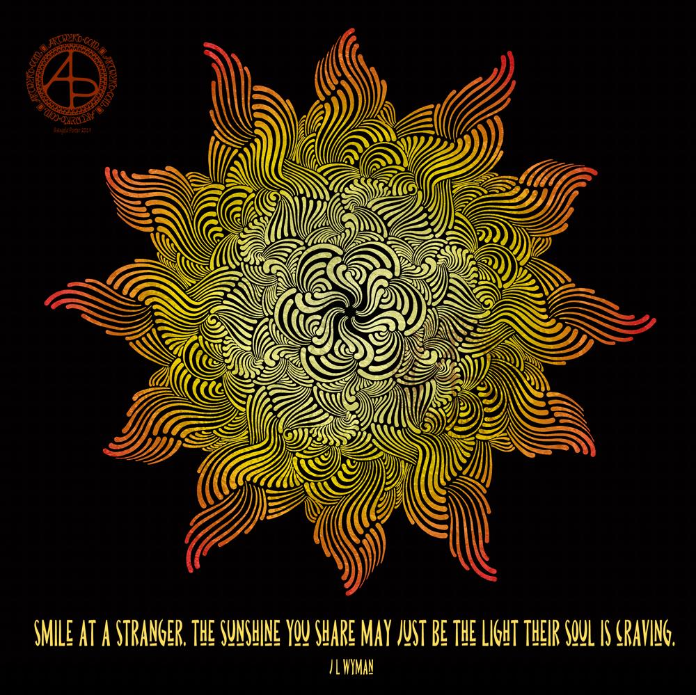
Quote by J L Wyman, art by myself.
I read this and knew I just had to create a mandala sun to go with it. So I have.
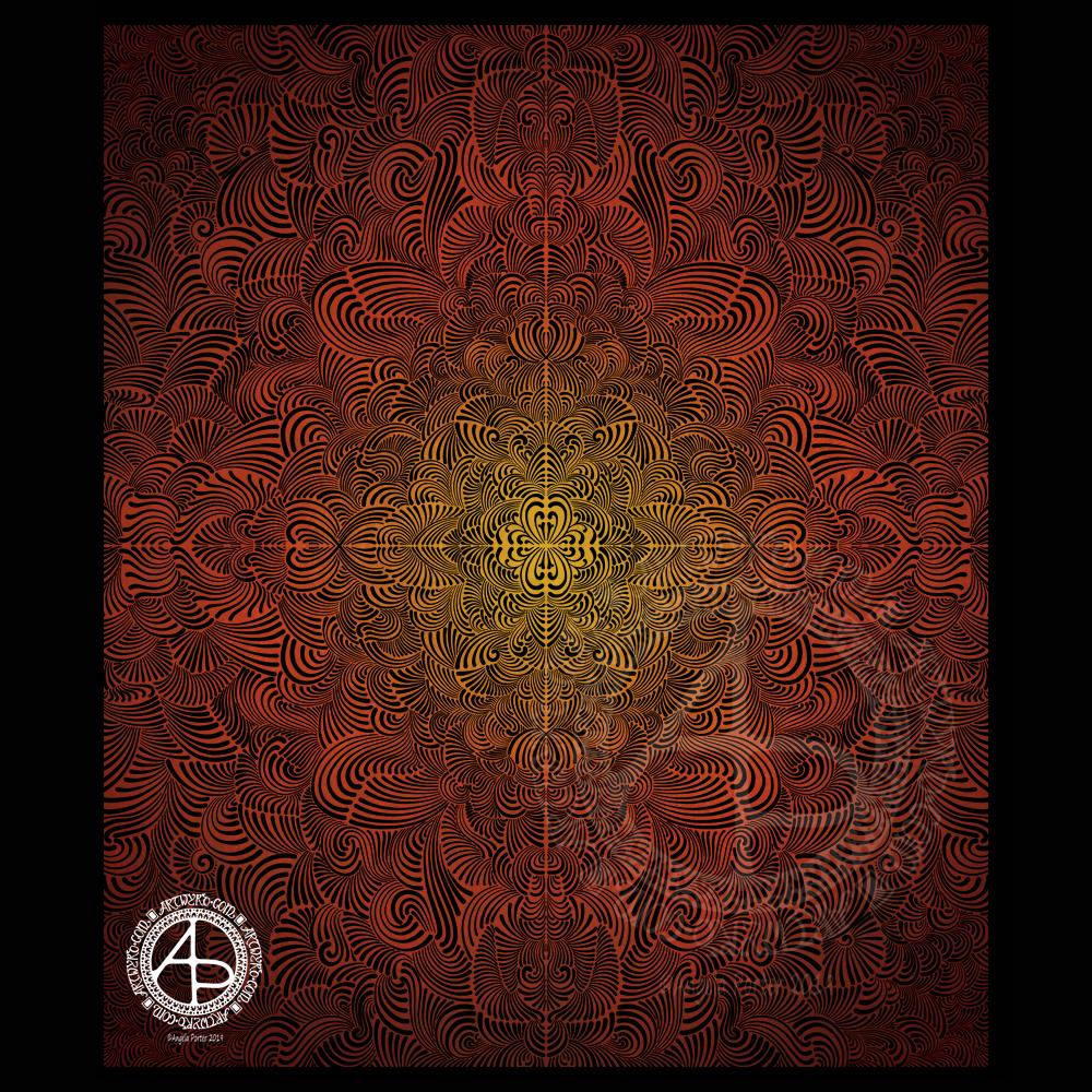
This is the result of a few hours spent drawing this morning. I like it, but not the central vertical and horizontal ‘lines’ that have appeared.
I wanted to create a design to upload to Redbubble. However, it won’t be this one as I really don’t like those lines! Ho hum…
Still, I draw, I reflect, and I learn, perhaps.
Fiery, warm colours for a grey, dull and rainy day.


