Monday Mandala WIP

Monday Mandala WIP 02/03/2020
©Angela Porter | Artwyrd.com

I woke a bit earlier than usual this morning, and while I was coming around I watched an Autodesk Sketchbook Pro tutorial by Trent Kaniuga – Sketchbook Pro for Absolute Beginners and came across an explanation and use of a tool I’d not worked out for myself.

This is the selection tool, and it’s a great way to select areas for adding colour, texture and/or effects to as well as copying, pasting, moving, rotating, resizing and so on. It does mean I need to use my keyboard along with my Microsoft Surface Slim Pen and Microsoft Surface Studio. That means using the screen at a different angle to my usual, which is a good thing I think as I now can’t hunch over the screen.

It was the way that when an area is selected and colour or texture is applied, the colour/texture only applies to that selected area, or areas. It masks the rest of the image from the selected areas.

This is going to be so useful for me going forward, now I’ve played with the techinique. It’s given me an elegant way to do something I’ve previously achieved by the use of layer after layer after layer.

I’ve been working with it to add colour to this mandala design from a collection of mandalas I’m working on.

The colours and textures remind me of polished stones, perhaps mosaic pieces. I’ve used fairly complementary colours, but they don’t quite play off each other as much as I’d like. I am, however, going to work with these colours going forward to complete the mandala.

Dydd Gwyl Dewi Hapus! Happy St David’s Day!

March 2020 Coloring template for Angela Porter’s Coloring Book Fans facebook group
© Angela Porter | Artwyrd.com

A new month means a new coloring template exclusive to members of the Angela Porter’s Coloring Book Fans facebook group.

March the 1st is St David’s Day, the patron saint of Wales, which is where I live. The daffodil is one of his emblems and so it was fitting I included some in this month’s template. As we are heading towards the spring equinox and the official start of spring here in the Northern Hemisphere, I’ve also included plenty of flowers that would be lovely coloured in spring colours. They’d be lovely in colours of all the seasons, however. Flowers are beautiful no matter what season we’re in.

The template is drawn in my signature ‘Entangled’ style of line art, with very stylised flowers, foliage, and even butterflies and shells, along with patterns derived from architecture, sculpture, pottery, and more. Lots of my favourite things all in one abstract image.

If you’d like to print and colour this template, then please pop along to the facebook group where the members, and I, would love to see how you bring it to life with your own kind of colour magic.

#Inktober52 Week 7 – Dinner

#Inktober52 Week 7 – Dinner ©Angela Porter | Artwyrd.com

The art…

What else could I do for dinner other than have the etymology of the word along with a collage of just a few of my favourite foods! And I do mean only some.

I looked up the etymology of ‘dinner’ on Etymology Online, did a little bit of typography using Affinity Publisher.

I then drew the foods on Claire Fontaine dot grid paper using an 0.8 Uniball Unipin pen.

I scanned the drawing in and removed the dot grid and removed smudges and so on in Autodesk Sketchbook Pro.

My next step was to add a coloured background and some colour to some of the drawings. Only to some, as this was a ‘for fun’ project as part of the #Inktober52 challenge organised by Jake Parker, the founder of Inktober.

Missing in action…

It’s been a couple of days since my last blog. It seems that life and demands on me have taken over arty pursuits. And when I wasn’t seeing to the life demands, I was taking some time out by needlefelting.

I managed to needlefelt a cute rabbit and owl over the last two or three days. I’ll post pictures of them in another post.

Kindness

Kindness © Angela Porter | Artwyrd.com

I’m really not sure the colours work.

The border was a design I drew back in January using Uniball Unipin and/or Sakura Pigma micron pens on dot grid paper. I’ve added colour and texture digitally, as well as the typography.

Poppy Pods WIP

Poppy Pods WIP ©Angela Porter | Artwyrd.com

I’ve had a lovely, soothing, creative Saturday morning drawing, and this is the result so far.

I’m working digitally as I really wanted to give my new Microsoft Surface Slim Pen a workout. I have to say that I love it as it is so much lighter than the original Surface pen. It also has a different shape, which surprisingly sits well between my fingers. The lightness of the pen really does make it a pleasure to hold and use.

I am also in love with the way the nib glides across the screen. That’s one of hte issues I have with the interchangeable nibs that come with the original Surface pen – all but the ‘2H’ one is just too sticky for me to find pleasurable to use. I also don’t like the way the wear down relatively quickly either.

The Slim Pen is as responsive as the original Surface Pen and just as accurate.

All in all, it gives me a drawing experience that is very much akin to drawing on paper with a Sakura Micron, Uniball Unipin or Faber Castell Pitt artist pen. Having said that, the Surface pen does so too, except that it is much heaver than these pens and I prefer a lighter weight pen. Indeed, my arthritic-y joints seem to be happier with the Slim pen.

So, I’m a happy bunny with the purchase.

Unusually, I did a quick sketch to lay out where I wanted the pods and stems. And by quick sketch I mean the basic shapes using a digital brush.

Once I inked in the basic outlines of the poppy seed pods, I deleted the sketch layer and started to add detail with a flexible nib digital brush/pen. I still have a lot to add to this, but I’m quite happy with how it’s progressing.

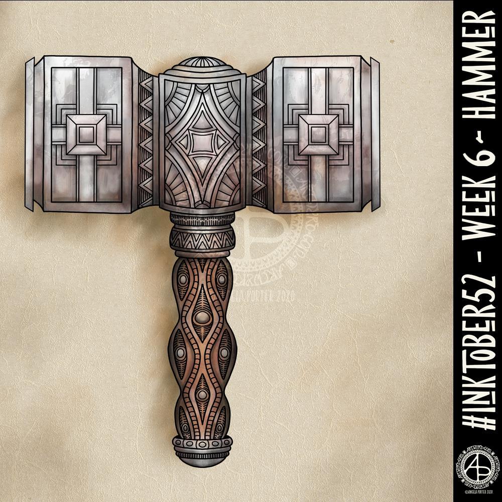
#Inktober52 – Week 6

#Inktober52 – Week 6 – Hammer ©Angela Porter | Artwyrd.com

I’ve never drawn a hammer before, of any kind. I thought I’d have a go though and try my hand at a fantasy style, possibly dwarfish one.

Not only was designing one a problem for me, adding colour, dimension and texture were some other problems.

I think I’ve left areas a bit bare of line and pattern. Others I could’ve done a better job of creating highlights and shadows. However, overall I’m ok with this, especially as it’s not something I’d usually draw.

Next week’s prompt is ‘dinner’. Sheesh…

I made use of various tools in Autodesk Sketchbook Pro to help me design the hammer, some of the them tools I’ve not used before.

I did consider making a drawing of the hammer from a different angle, but this one has taken me so long that I now need to do some other stuff today.

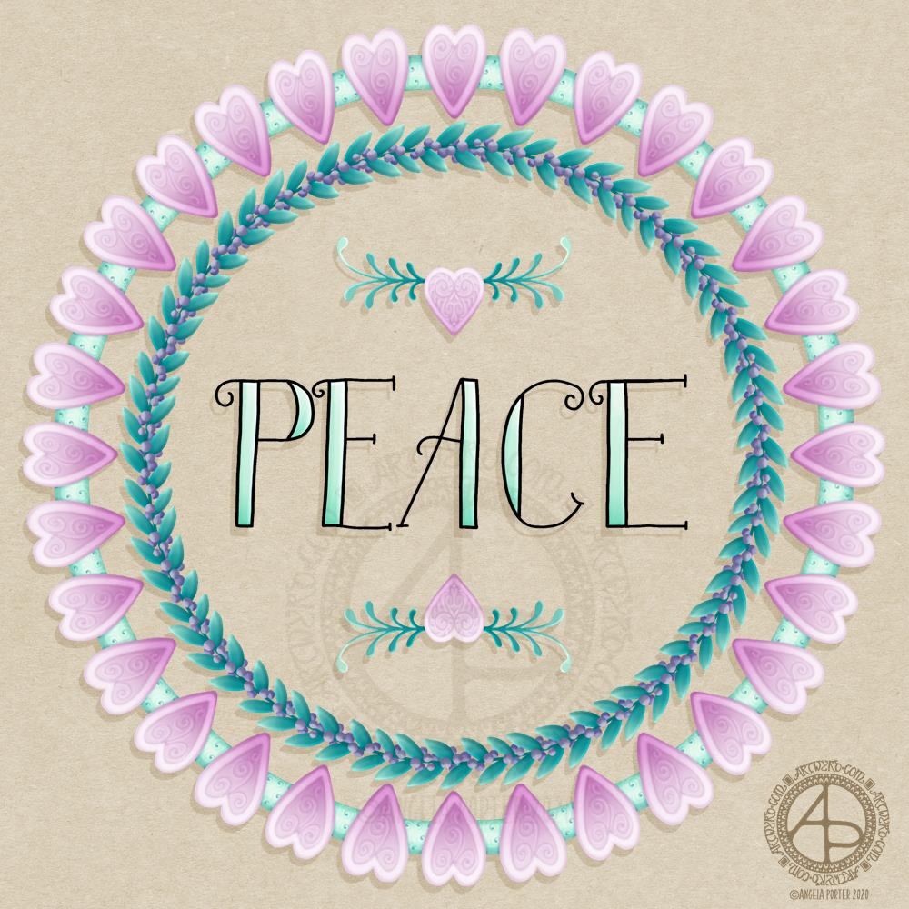
Peace

Peace © Angela Porter | Artwyrd.com

Artistically, I’m feeling cute and whimsical this morning. So a little bit of hand lettering along with some simple, cute and whimsical wreaths have satisfied this feeling.

Pretty hearts with some spiral details that remind me of iced biscuits (cookies to you lovely people in America). Soft pink for love. Evergreen foliage for peace and compassionate love to grow and flourish around this planet. Purple berries to create a harmonious balance of awareness and peace.

Perhaps there’s more symbolism and messages in my art, something that belies my belief I’m just creating pretty things.

I did create this art digitally using Autodesk Sketchbook Pro, Microsoft Surface Studio and a Microsoft Surface Pen.

Art Quote

Artwork (c) Angela Porter | Artwyrd.com

This is a drawing I did late last night as I settled down to sleep. It feels quite disjointed in places, which was how my mind felt in it’s state of tiredness. Even though I was tired, I wasn’t ready to sleep.

I thought I’d work with it, adding a background and colour to it. I wonder if adding colour will resolve the disjointed areas as it breathes life into the design.

I’ve only taken a short time this morning to ad some colour. I do have to do other things today. The colour certainly helps to lift it from the background, as well as adding dimension to the design.

I’ve chosen fairly dusky, dusty, pastel colours which seem to glow against the darker background. The pinks remind me of faded Victorian velvets.

I drew the design traditionally, using a Tombow Fudenosuke pen and ClaireFontaine dot grid paper. The flexible nib of the fudenosuke pen results in lines of varying thicknesses, and a drawing that reminds me of linocuts or woodcuts.

After scanning the drawing, I removed the dot grids and cleaned up the drawing digitally before adding a background.

I felt this needed quote to go with it, and this one spoke to me today. For the typography, I used Affinity Publisher. The rest of the digital work is being done in Autodesk Sketchbook Pro, using a Surface Pen and Surface Studio from Microsoft.

My art is always ‘pretty’, it’s how I express myself artistically. Some of my inspiration for patterns and motifs comes from things that other smay not consider ‘pretty’, such as rust, run down old industrial machines, ruined buildings.

My art does, I think, speak of who I am. It shows what I’m interested in, what patterns, motifs, shapes, textures, colours, and so on that I find aesthetically pleasing. It also shows, to those who look and think a bit deeper, what things interest me, from prehistoric art to Romanesque architecture to La Tene and Celtic art to Illuminated Manuscripts to flora, foliage, fungi, and lichen to fossils and shells to nature in general, and more besides.

I work very intuitively. It’s when I think too hard about what I want to do that things go to wrack and ruin.

By letting my intuition flow, then drawings have a way of coming together in a way that expresses how I’m feeling and what is fascinating me or soothing me at that time.

This drawing is an example of how my feelings come out. It’s only now I can recognise how disjointed I was feeling within myself last night, how I was out of sorts. I think that’s why the art jars with me today as that feeling has now passed by, like clouds in the wind. It’s a drawing that shows the weather my emotions were experiencing yesterday, weather that just happened and has no real source for it.

Flowery

Flowery© Angela Porter | Artwyrd.com

Today, I’ve been drawing little flower motifs and borders to go along with a lovely quote about flowers and hope.

The line art was drawn using Tombow Fudenosuke pens on ClaireFontaine dot grid paper. Colour, typography and background texture have been added digitally using Autodesk Sketchbook Pro, Microsoft Surface Pen and Microsoft Surface Studio.

Flowers are some of my favourite things to draw, whether they be highly stylised or more realistic.

My snowdrops and crocus have the feel of being wood cut or lino cut and printed, that kind of vintage feel. The flexible nibs on the Fudenosuke pens help me achieve this look. Also, the fairly simple colouring and addition of texture help too.

I’ve left the colouring as is, maybe for now. However, I now have these motifs ready to use in other projects, as they occur to me. Colour certainly helps to lift them off the background and bring them to life.

Inktober52 – Weeks 3, 4 and 5

Inktober52-Weeks 3, 4 & 5 © Angela Porter | Artwyrd.com

I managed to miss #Inktober52 weeks 3 and 4 so I thought I’d combine them into a sketchbook page along with week 5.

The prompts were
*week 3 – brick
*week 4 – snake, and
*week 5 – balloon.

I’ve not been imaginative with those prompts. I’ve included some sinuous snake borders and bricks. Some classic brick patterns. I’ve only added a smattering of balloons, and a repeating balloon pattern.

Of course, I’ve also practised my hand lettering.

I hand lettered and drew this page on ClaireFontaine dot grid paper and I used Uniball Unipin pens to do so.

I added the kraft paper background and colour digitally. It never ceases to amaze me that, as much as I love my line art, colour really brings it to life. I especially like the way the colours seem to glow against the kraft paper.

I’ve just had a giggle. I realised I coloured the balloon that is hanging down in leaden greys, almost like it’s filled with mercury. That was a totally unconscious decision of mine!