Eeek! I’ve finally gone and done it – recorded a video of me drawing. It’s a little video of a little drawing. And that means I now have a YouTube channel – Angela Porter, oddly enough.
I used my mobile phone with a swan neck holder, stand, thingy. That was stable, but my desk was a little wobbly.
The drawing itself took me around 11m30s to do, but I’ve sped the video up somewhat and added some music too.
I’ve had to do some work with social media for an organisation over the past few weeks, and being thrown in the deep end of editing videos, subtitling, turning stills into videos and so on, meant I really couldn’t put off trying this myself.
I have a lot to learn it seems. However, my toes have been dipped in the waters of videoing me ‘arting’, and they haven’t been burned too badly, yet.
I hope you find it interesting to watch me draw (with or without the music). I have no idea where this will take me – only time will tell.
For the past six or so hours I’ve been busy with various social media video creation for something I’m involved in. I needed a break from it, and that meant some arty stuff.
I had this coloured ’tile’ in my stash. It’s a 4″ x 4″ piece of ClaireFontaine mixed media paper coloured with various green Distress Inks.
I used Faber-Castell Pitt Artist Pens to draw the design to create a border. To add some contrast to the background, I used water, Distress Ink and a brush to add darker shades to the design. I also thought some shimmer and shine was needed on the berries and flowers. So, I used some Perfect Pearls gold spray as well as some gold and silver Cosmic Shimmer Iridescent watercolour paints.
Finally, I added some spatters of the pearlescent colour to distress the background a bit more.
One thing I didn’t do was to add some shadows to lift the border from the background. I often say that I forgot to add shadows. One day I may remember!
All the same, I’m happy with this little design. The space is perfect for a quote or sentiment I think.
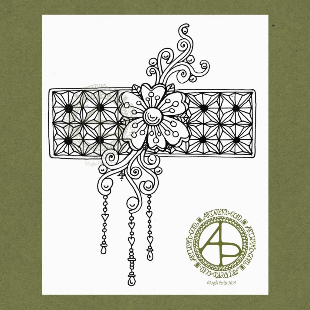
I’ve had a nice couple of hours this morning playing around with drawing and paper coloured (and not coloured) with Distress Ink.
I started with drawing the border with the flower straight onto the coloured square of mixed media paper (top right).
For the middle design, I cut a rectangular panel of Distress Ink coloured mixed media paper and glued it to another piece of coloured paper. Then, I decorated the panel along with some simple patterns spilling onto the background.
The bottom right design uses a square piece of plain paper with a small rectangle cut from some Distress Inked paper. I used a die with a stitched detail to cut this panel out along with a Sizzix Big Shot die cutting machine.
I’m not at all fussed on the stitched detail in this case. However, I do like the contrast of the coloured panel against the white background.
I do have a fair few pieces of paper coloured with Distress Inks, so I think some fairly quick, simple and soothing designs will be done over the next day or several.
Not sure what I’ll do with them yet. If you have any helpful suggestions, leave a comment! Also, leave a comment to let me know which design is your favourite.
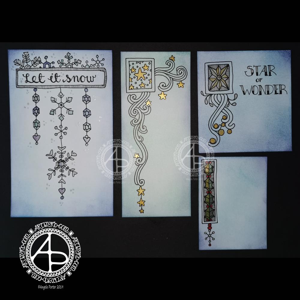
Yesterday was a crazy busy day with no time for art, let alone blogging!
This morning, I finally had some time to myself. As it’s Friday I wanted to do a dangle design, and I ended up doing four!
I cut the card into the wrong dimensions to create a card, so I thought I’d just make use of the pieces I had and make some custom card blanks and envelopes for them another time.
I coloured the pieces of card with Distress Inks in shades of blue and green. I used Chipped Sapphire, Tumbled Glass, Broken China, Evergreen Bough, Cracked Pistachio and Salty Ocean in various combinations.
These colours gave the card a frosty kind of feel, so I went with some snowy, icy, wintry designs.
I drew the designs and completed the hand lettering with Faber-Castell Pitt Artist pens, which are waterproof.
Plain black lines on the coloured background did look a tad lacking. So, I added some shimmer and colour using Cosmic Shimmer watercolour paints.
I’m not so fussed on the ‘Let it snow’ design. However, I am quite pleased with the others.
I am going to mount them as greeting or note cards. However, the designs would look charming in a BuJo, journal, planner, diary or scrapbook. They could easily be adapted to make bookmarks too, or place cards for a special meal.
I hope you’ll give drawing these designs a go, or use them as inspiration for your own projects. I’d love to see what you create – please tag me on social media so I don’t miss them!
If you’d like to know more about dangle designs and have some guidance and inspiration for them, then my book ‘A Dangle A Day’ is a good place to start.
It’s been nice to have a couple of hours to indulge myself in art. The past four weeks or so have been crazy busy with other projects being quite demanding of my time, mind and energy. However, they will soon be over and my focus can return, properly, to art.
I started by colouring a 6″ x 6″ piece of Strathmore Bristol paper with various shades of green Distress Ink (Peeled Paint, Shabby Shutters, Crushed Olive, Bundled Sage and Iced Spruce) and edged it with some Aged Mahogany.
Then, I drew the design using a metallic bronze Uniball Signo gel pen. Finally,I added some shading and depth with an olive green Chameleon Fineliner pen.
My photography skills aren’t good, which is why there’s two photos. The top one is a bit truer to and you can see the design more clearly on it. The bottom one shows the shiny bronze ink I used.
I think you’ll get the idea of what I’ve created.
It’s been a busy day here in the Angela studio/office. I’ve been focused on social media stuff for something I’m involved with at the moment. I had to get things done this morning and afternoon, so it wasn’t until quite late in the day I could turn my attention to art.
By then, I just wanted to draw something that was comforting, familiar, soothing. Which is why I ended up with another entangled design.
It did it’s job in soothing and calming me somewhat. Now, I can settle down, after I finish off a couple of things. I think time away from technology is required this evening.
This morning I thought it would be nice to use some Distress Inks to colour a 6″ x 6″ piece of Strathmore Vellum Bristol Paper and then draw a more traditional kind of zentangle design.
Before drawing on the coloured paper I scanned it in to use as a background for digital art at some point.
Anyway, I used Tattered Rose, Victorian Velvet and Rich Mahogany Distress inks with a foam blender to colour the paper.
Then, I used Pitt artist pens to draw the design. To help parts of the design stand out a bit more, I used some Chameleon coloured pencils to gently shade in the floral elements.
Finally, I couldn’t resist adding a little sparkle to the stamen of the flowers in the top right!
It’s always nice to relax with some familiar styles of art, and this morning I needed a bit of a relaxing time as I have a busy day ahead of me, which I must now go and sort myself out for!
I woke this morning, refreshed after a long, deep sleep, and wanted to draw something relatively simple, something I could work on in the future.
I used a Uniball Vision Elite pen on a sheet of dot grid paper from Claire Fontaine. If you zoom in, you can still see the dots of the dot grid.
I had no idea of what I was going to draw. All I knew was I wanted to draw, and I wanted to start with a flower. Which I did.
I then started to grow the design by adding the swirls. Those swirls had shapes in them perfect to add some round seeds.
Next, I thought a rectangular background panel, filled with a geometric design, would be a good counterpoint to the more organic flower and swirls. So, I did draw in a pencil grid to use as a guide for my inked lines.
After adding a narrow border to the panel, I decided to add some simple dangles to the lower swirls. I thought the design needed to be lengthened a little.
When I’d finished the dangles, I knew the design was complete. I felt no need to add anything more to it, despite having a lot of white space! So, I scanned it in and prepared it for posting to social media.
I’d like to work this one with some colour to the flower and swirls, maybe the dangles too. The geometric pattern I’d like to add shading to bring out a more dimensional appearance to it. I may add that shading as shades of grey, or maybe as lines.
If you’d like more ideas about drawing dangles, then my book “A Dangle A Day” is a good place to start.
That’s where I have to leave it for now as I have a busy day away from home today.
I’ve created a simple bit of line art to celebrate the day, and it’s available exclusively to members of the Angela Porter’s Coloring Book Fans facebook group. It’s free to join and I have a number of templates that are exclusive and free to members of the group.
I love to see how people use colour to bring my drawings to life. I provide the bones, the colorists add the flesh in the form of colour.
I wanted to try out an idea I had, and it’s worked out fine, I think. Mind you, I’m not thinking well today – I’m experiencing an ‘introvert hangover’ from being in a large group of people last night. I come across as quite an extrovert to people, but that is a well practiced mask and to keep it up is rather exhausting. It’s also tiring to be around people with all the noise, various emotions, and just the number of people there.
I have a couple of things that I need to get done this afternoon, and I also need to take care of myself and this ‘hangover’ of a headache and tiredness. I really need a good amount of alone and self-caring time. Maybe when I get home this evening I’ll manage to do that.
Anyways, the arty idea I had has ended up as a rather ghostly, faded design, which actually describes how I feel at the moment.
I like the softness of both the contrast but also of the lines that form the mandala. I do have a bit of a thing for grungy backgrounds at the moment. The texture really appeals to me and I like the contrast between the more orderly mandala designs and the chaotic grungy-ness.
I’ve had a busy day learning new things to do with video and so on. The concentration has taxed my brain just a bit, and I needed some time in an arty happy place.
My first task was to find a quote that appealed to me today. This one is quite apt I think, for many reasons. I’m not entirely sure my typography is right for the quote, but it will do for now.
I then knew I wanted to do a mandala as a background. I find this style of mandala very soothing to draw, and soothing was just what I needed today.
Once I’d finished the mandala, I added colour in greens and teal. Calming, soothing, balancing colours for today. Colours of calm contentment, which is just how I feel at the moment. Also hopeful colours. That green reminds me a lot like the first leaves showing themselves at the tail end of winter, spreading hope that the warmer, lighter days will soon be here.