
Last two of the six Distress Oxide coloured 14 x 10 cm sheets of paper.

This morning, I spent time with pens and paper coloured with Distress Oxides, and this entangled creation appeared. I may need to add some shading to it … but that can wait as I think I have a big vector drawing to do and that will take all of my concentration.
This is the reason I’ve been learning about vector files! Janet has done a fantastic job with my art on this loom!

I’ve had a busy couple of days with this and that and the other.
Yesterday and today it’s been learning about vector files, images, graphics and how to get my artwork done as that kind of file and to a maker so she can use them to laser etch her products – more about this when I have photos of the projects!
Lots of head scratching, googling, and finally settling on downloading a program that works in vector graphics. So, a lot of learning to do with that, but it’s easy, intuitive and makes a lot more sense than Adobe Illustrator; I chose Serif’s Affinity Designer. I don’t know if it is as sophisticated as Illustrator, but I can’t see me wanting to get to that kind of level – I love Autodesk Sketchbook Pro way too much for that!
Certainly a different skill set is needed, but I’ll get there as I usually do.
After all the time on the ‘puter, I had the need to return to traditional media, and the photo above is what I’ve spent my evening doing.
First, the paper (approx. 14cm x 21cm), along with a few other sheets, was coloured with distress oxide inks. Then I drew on it using a mixture of pens.
It was really nice to do, the colours of all the sheets are rather autumnal, and I’m looking forward to drawing on the others over the coming days.

The day be soon upon us! National Coloring day in the USA, but that can apply to the whole world!
In celebration, I’ve created a free coloring template, a partly coloured version of which you can see above. You can get the template by visiting my facebook page, just click on this link to go directly to the post – Angela Porter Illustrator.
Have fun! I have been – lost several hours colouring in the template, and it’s only about half done, if that! Yes, I’ve been doing this one digitally, well partly. The mandala was drawn using Autodesk Sketchbook Pro, printed out, and then the doodles and zentangles and so on were drawn using a Sakura Micron Pen. Scanned the finished image in, cleaned it up in Sketchbook Pro, then started to colour it digitally, and I actually like how the colouring is turning out. I’m finally getting to a stage where I can say I like what I’m doing … for this style of drawing at least. Somehow, I think that bold, bright colours with high contrast shadows and highlights to create a strong illusion of depth/dimension is me, and I perhaps need to forgo the desire to do ‘watercolours’…we’ll see in the fullness of time!


I used Autodesk Sketchbook Pro on my Microsoft Surface Book along with my Surface Pen to add patterns and shading to two of the butterfly outline designs I drew yesterday. I’m happy with the results.
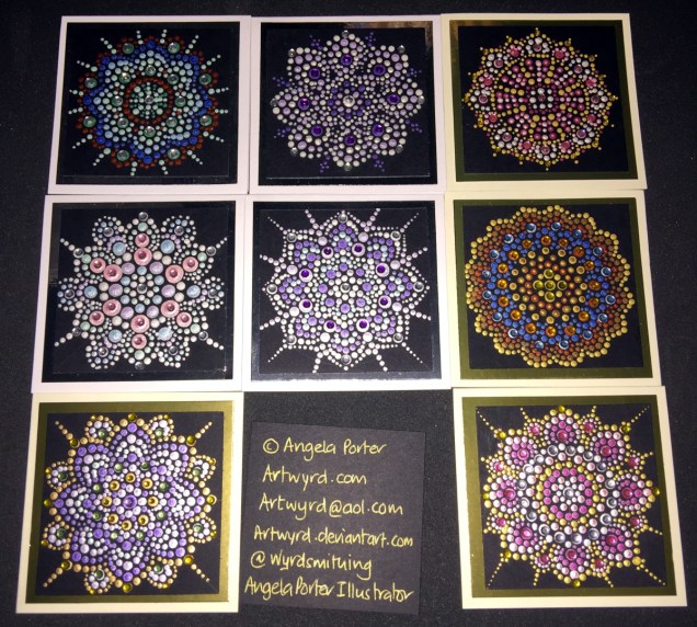
Today I’ve also created two more dot mandalas, each around 5″ in diameter. I added some gems to those, as well as to the small dot mandalas I created over the last couple of days. The sparkle really adds something special to them, and helps to emphasise the circularity of mandala designs.


Over the past couple of days I’ve continued working on my Microsoft Surface Book using Autodesk Sketchbook Pro to create digital images for used in card making and mixed media projects. IFungi and butterflies have been my chosen subjects, and you can see some of them in the images above. They’ve also been digitally coloured, though I’ve still got dots and lines to add to them to give more depth and dimension to them.
They’re all now cut out and sitting waiting to be used in various projects. There’s still more drawings carefully filed away on the Surface Book for future uses…


I’ve also have a bit of fun creating some teeny-tiny dot mandalas. Each card base is just 3″ x 3″ (approx. 7.5cm x 7.5cm). The black card I used as the substrate is 2½” square (approx. 6.25cm).
The acrylic paints I used are either metallic or pearlescent, so they do catch the light rather nicely.

This is a little bit of a different blog post from me.
As I’ve mentioned before, I experience CPTSD (complex post-traumatic stress disorder), which presents itself in many ways, including anxiety, depression, and a low self-esteem.
I’ve had lots of counselling over the past eight years or so, and for the last two and a half years I’ve had a lovely therapist who specialises in EMDR therapy. It’s taken a long while for me to get to the point where I believe that such a gentle kind of therapy works, and works for me. It’s still a slow process…but progress is being made. A major change in employment nearly a year ago seriously helped with that.
Last week, my counsellor suggested I read a book called ‘Tapping In’ by Laurel Parnell. In the book, Laurel Parnell describes how the process of bilateral stimulation by means of tapping the knees or outer thighs can be used to reinforce a safe place, helpful guardians and other tools to help during both therapy and everyday life. My own therapist has successfully used it to reduce anxiety during a dental appointment as well as aiding in sleep.
She suggested I read the book and we do some work on the resources I need before continuing with EMDR as the last few sessions have left me rather upset, fragile, and, unsually for me, unable to find my ‘safe place’ at the end of a session, so that I can leave the fragile and upset state behind.
So, yesterday we worked on my safe place, with me coming up with a new one and ‘tapping in’ the contentment, peace and safety I feel when I imagine myself there. The bilateral stimulation from alternating taps to the outer knees, helps to reinforce the feeling of the place, and actually helps to intensify it.
I have no problem imagining places I can go to in my imagination; I’ve used guided meditations over the years for various purposes. When it comes to me coming up with my own imaginary places, it never ceases to surprise me what these places are like!
The other thing that was suggested after I’d verbally described my place, was to spend time over the week drawing/painting/creating images of this place, as well as practicing the process of tapping in my safe place and using it to help me manage my current high anxiety levels. (My anxiety intensified greatly yesterday, not as a result of counselling, but by the decision to hold a ‘snap general election’ and my worries about what is happening in this country, in the world, which then gets transferred to worrying about finances as I’m now self-employed, and so on and the constant chatter of anxiety winds itself up if I’m not careful).
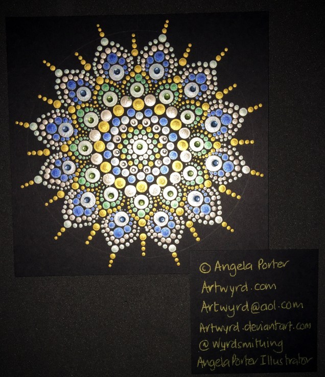
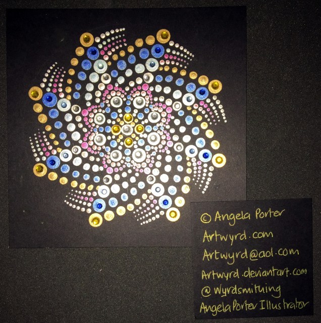
Me being me, I get to it almost straight away…starting with these mandalas

Carl Jung used mandalas to represent/express the current state of the self:
“My mandalas were cryptograms concerning the state of the self which was presented to me anew each day…I guarded them like precious pearls….It became increasingly plain to me that the mandala is the center. It is the exponent of all paths. It is the path to the center, to individuation. ” – Carl Jung
So, I started with some abstract, intuitive mandalas to try to express the feelings I have when I think of my safe place, when I remember the feelings I have when I’m there.
Next, I wanted to draw some kind of representation of a view from one of the windows of my place. And this is what I came up with, though the view changes all the time!
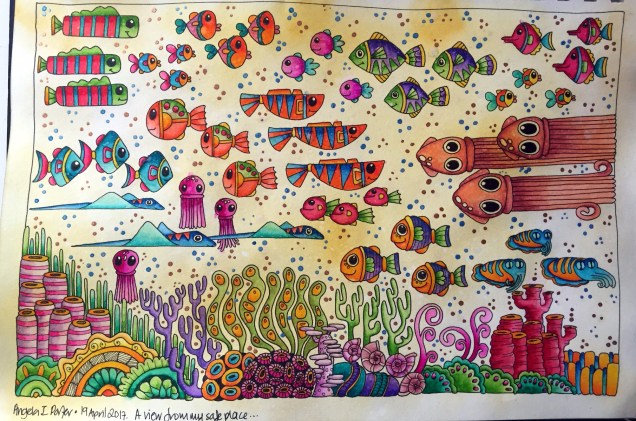
Yes, I know water isn’t yellow, but in my inner world it can be! It also shimmers with gold and has lots of shining gold and blue ‘dots’ in it. Lots of happy creatures and colours there, all entertaining me … diverting my attention away from my anxiety.
Yes, I use art to help me manage my mental health. When anxious, doing art helps me become less so; when depressed, art lifts my mood. I’m sure the inner critic chatters away even when I’m ‘arting’, but the art takes my attention so the critic’s voice can be ignored.
Oh, before I drew anything, I took time to write a clear description of my safe place, as words are how I build up mind images.
I’m looking forward to ‘tapping in’ help for creativity, amongst other things… I’m also looking to intuitively drawing and creating some more of the living things that I can see from my safe place – all friendly and protective of course, nothing scary allowed there! Which suits my tendency to rather whimsical, cutesy, artistic style.
So, I’ve shared a little of my ‘safe place’, but I’m keeping a lot of details to myself – no offence, but I don’t want any gate crashers there!
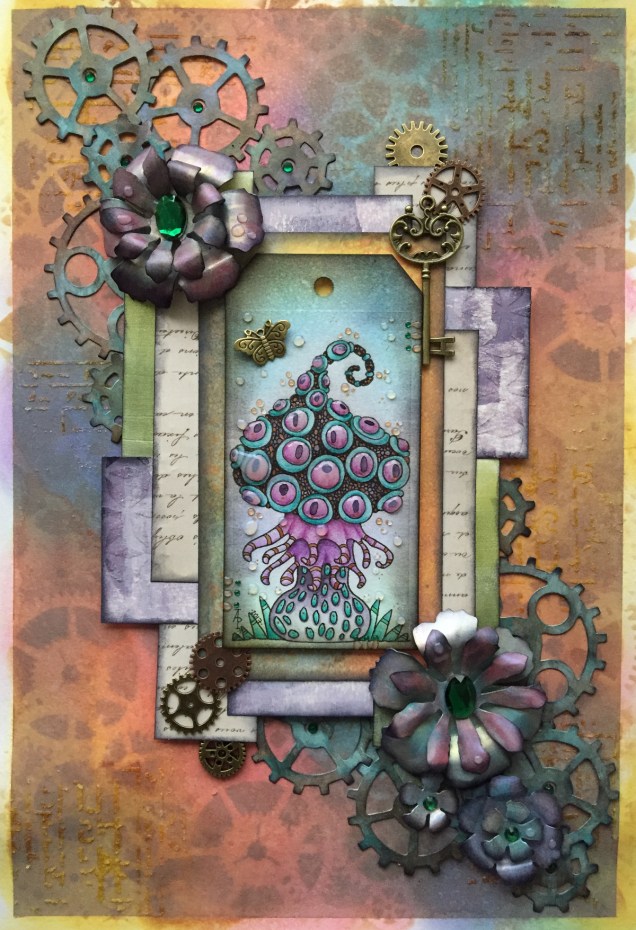
This one is mostly finished. I need to add shadows around the elements and some shiny patterns to the layers I think. Oh, and the hole in the tag needs something added.
The fungus I drew and coloured myself. That was enjoyable to do! In fact, the whole thing has been satisfying.

Another mixed media piece just finished, I think. I may add glossy accents or 3D crystal lacquer to the bubbles/drops and parts of the flowers, or maybe not.
The image has been scanned so the iridescence and glimmer doesn’t show up, sadly. Also, I’ve been a bit heavy handed with the shadows around the flowers and bubbles/raindrops.
Here’s the list of media I used:


