Medieval Monogram Dangle Design ‘C’ – 18 December 2018

©Angela Porter 2019

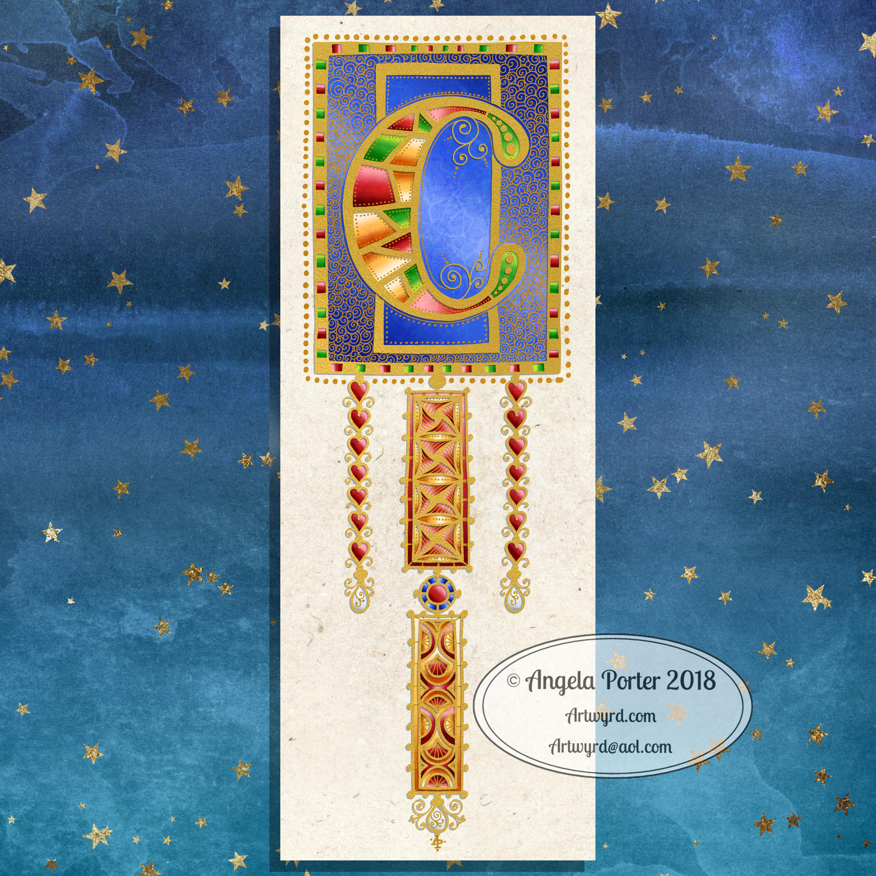
I’ve spent around two and a half hours on this monogram. I’m still playing with metallic/glitter textures rather than black line work.

I still haven’t ‘cracked’ how to achieve a more dimensional look to the gold lines/beads. No doubt I’ll have a bright idea to try sometime soon.

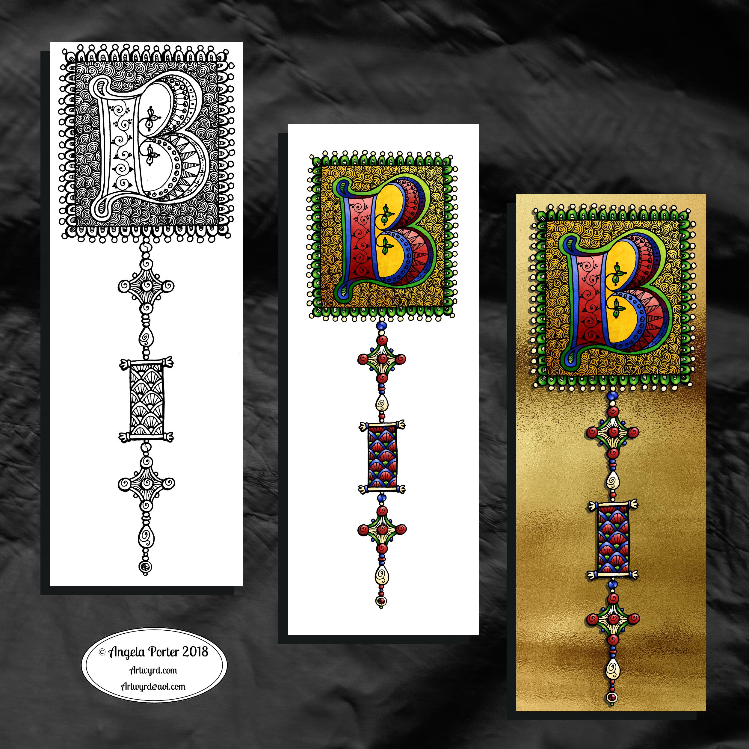
Medieval, Anglo-Saxon, Celtic and Romanesque art and architecture has long been an inspiration for me, though it’s not often I express it in such an obvious way. This definitely has a medieval ‘feel’ about it, but there’s also a more modern take with the rectangular dangle charms and the very  contrasting gradient colours that fill the patchwork pattern inside of the letter.

I was thinking of adding more complex patterns inside some of these patchwork sections. However, I decided that could be way too busy and went with the dots.

Dots are  a very common embellishment in Anglo-Saxon and Celtic manuscripts. After adding dots to those patchwork panels, I had to go and add them elsewhere. Such a simple thing, the humble dot, but how much it can add to a design.

I love the plain blue panel behind the C, so the letter doesn’t get entirely lost in the background pattern – my favourite little spirals. I like the thicker lines around the letter too, but they’re too ‘flat’ for my liking at the moment. The little square-ish gems in the main outline help to break that thick gold line up, adding a bit more opulence in the process.

I love the dimension in those rectangular panels, particularly the lower one. The high contrast gradations in colour really give it some dimension. I wasn’t at all sure about using the pale yellow to orange color gradations anywhere in the design, but once I’d completed this particular ‘charm’ I absolutely loved it!

Although I don’t show such complex monogram dangle designs in my book ‘A Dangle A Day‘, this design really isn’t all the complex to do. 

Talking of ‘A Dangle A Day’, Lydia at #quartocreates sent me a link to a nice review of the book by Funky Frugal Mommy.

This is a piece of digital art using my Microsoft Surface Pen and Surface Studio along with Autodesk Sketchbook Pro and some texture files purchased via Creative Market.  I did start with a pencil sketch of the monogram and dangle design which was then redrawn digitally.

Another, possibly the last, version of ‘B’ monogram dangle design

©Angela Porter 2018

The previous and latest version of the monogram dangle design. The variation is the background paper colour as well as a drop shadow for the design.

I had a lot of fun as well as some frustration when I found it difficult to do what I wanted to do, though I got there in the end, I think.

I certainly have a few more tools in my digital art toolbox.

Autodesk Sketchbook Pro really makes it easy to create art like this. Though this may have been simpler for more accomplished, learned digital artists, for me it was a bit of a process. However, I have managed to create something I could only dream about doing in traditional media, I think. 

The skills required are, in my opinion, equally as demanding, whether working digitally or traditionally. Don’t forget, this started out as pen and ink line art on paper – very traditional! I just made use of digital tools to develop it into something that definitely has a medieval feel to it but in a modern medium. Indeed, all the lines/patterns were re-drawn digitally using a pen and the screen as ‘paper’ to arrive at these final versions. I did make use of the color-fill tools to colour these ones in, but the addition of textures makes them less digitally perfect and more ‘perfectly imperfect’.

This certainly has inspired me to create a whole series of such monograms over the coming days, weeks or months. Goodness alone knows what I can do with the digital versions as having them printed wouldn’t result in any sparkle where there’s sparkle. However, I do have an idea about foiling my line art, as well as working with metallic inks once more. Indeed, I had a deliver of Encres A Decorer by Herbin yesterday and dug out my glass pen to use with them. So some experimentation with those is likely (as well as digging out my dip pens and nibs too). I think I have some calligraphy ‘parchment’ or ‘vellum’ paper lurking somewhere in my stash as well.

Finally, I think I’m getting comfortable with my style of hand lettering. It sure ain’t perfect. It’s sure ain’t as slick as that of others. But it’s mine, not theirs.

Of course, some of the ideas/tools/techniques I’ve used here I can make use of in my more usual style of art. For today, I want to work on a design for the Angela Porter’s Coloring Book Fans facebook page to help celebrate the changing over of the calendars at midnight on New Year’s Eve as it turns into New Year’s Day. A liminal point of time between one thing and another. A boundary between the old year and the new. 

So, finish my toffee nut latte mocha morning drink I will, then it’s to some hand lettering and drawing, while keeping warm and dry on a chilly, rainy and windy day.

‘A Dangle A Day’ is released on 8 Jan 2019.

Monogram B – another version

©Angela Porter 2018

This version is totally digital. I used the pen and ink drawn version to re-draw the design in Autodesk Sketchbook Pro, making use of a glitter texture.

I think I got my head around how to do this, and colour the images in and I’m kind of pleased with it, though I’d like a bit more of a highlight/shadow on the glitter bits. That will take some thought and experiments as to how to achieve that, but for now my head is overloaded with working in layers and with digital art techniques I’ve barely used before.

I’m pleased with how it looks rather medieval in style – medieval drawn using modern technology. This version doesn’t even exist in physical form, which is crazy!

I have no idea how this would print out as, say, a book mark or note card. As it’s a fairly high resolution file on my computer it would print as a photograph. Of course, there wouldn’t be any real glittery sparkle and shine.

Yes, I’m fairly pleased with this and for myself for figuring it out how to do it, though there’s lots of improvements that could be made.

I think I’d like finer ‘glitter’ on the texture background I used – that’s just a matter of creating another tiled image via GiMP. However, until I do something I never quite know how it’s going to work out, nor do I know if it’s going to be a good idea.

It certainly satisfies a part of me that likes glitter and sparkle and shiny things.

All I have to do now is try to remember how I did this so that I can repeat it in the future, if I’m so inclined.

I am waiting for some metallic inks to be delivered today, so no doubt I’ll be drawing with them on paper.

Mongram B

© Angela Porter 2018

One monogram dangle design, three different versions.

The first is just the black and white line art. This was drawn with Uniball Unipin pens on dot grid paper then scanned in so the dot grid and faint marks could be removed as well as making a transparent background. This dangle design is much more ornate in terms of pattern than is in my book ‘A Dangle A Day’ but is still easy to do if a bit time consuming.

The second is the line art coloured digitally with some texture added.

The third has the coloured line art floating on a golden sheet.

I’ve not quite managed to get my head around how to convert the black and white line art into golden line art where I can add colour. I suspect it’ll have to be re-drawn, which I’ll most probably do while I’m waiting for a delivery.

I kind of like the gold background, but it is a bit too much as well.

Which version do you like best? Let me know your thoughts!

E is for … Dangle design

It’s Friday so it’s #dangleday! E is for … echinacea (cone flower), envelope, earphones, Earth, eight (or eleven, or eighteen or eighty – you get the idea), eight-sided octagon, eighth-notes (semiquavers).

Purple and gold are complementary colours so I chose them for the pusscat, the monogram and the octagon with my initials in it. I chose silver as the colour for the frame around the monogram simply because it’s my favourite metal and I fancied a change from gold beads and so on. Pink hearts and earphone accents. Yes, the headphones had to have cat ears on them, and yes, I have a pair like this, but the ears are blue.

Cute kitties, cute charms and letters. Looking at the monogram now, the letter could do with a shadow around it, but it’ll do as is.

I sketched the design on dot grid paper. After scanning the sketch in, I inked it in using a Microsoft Surface Pen on my Microsoft Surface Studio screen. When I was happy with the line art, I added colour and texture to the dangle design. The final steps were to create a coloured and textured background and a drop shadow for the design.

A nice way to spend a couple of hours on a cool, grey, damp Friday morning.

If you like dangle designs and would like to try your hand at drawing your own then my upcoming book ‘A Dangle A Day’ is available to preorder ahead of it’s release in January 2019. In the book I take you through drawing monograms and dangle designs in easy steps. The book includes lots and lots of examples and ideas for designs too.

It’s also #furbabyfriday across the interwebs, including on Angela Porter’s Coloring Book Fans facebook group. Why not pop over and share pictures of your fur babies with the group members.

A is for … Angel Kitty. A monogram dangle design.

Angela Porter 3 Nov 2018 A is for

I got lost in drawing and coloring this dangle design this morning!

I had it in the back of my mind that I’d like to do a series of monogram dangle designs with a kitty or critter theme along with following the letters of the alphabet.

For A it just had to be an angel kitty!

I started with a pencil sketch, then, after scanning the sketch in, I inked it in using my trusty tool trio – Autodesk Sketchbook Pro, Microsoft Surface Pen and Microsoft Surface Studio. Colour and texture was added and a lot of use of layers has been made and a couple of new ‘tricks’ for my digital art spellbook have been learned.

The first was about making solid areas without the black lines by using the fill tool, first in white to block out the sections, then using it as transparent to remove the black.

The second was figuring out how to use layers so I could use a natural blend brush on these sections without messing up bits I was happy with. This may seem an easy thing to those of you who are digital art experts, but I’m slowly learning what I need as I need to learn it!

Finally, I explored the use of a natural blend brush and really enjoyed working with it, once I’d figured out how it works.

I really, really enjoyed doing this one. Cats as a subject for my more whimsical, doodley type art are something I want to do more of. Maybe other critters too; I also have a soft spot in my heart for ravens, koalas, badgers, and many others!

I wonder what B is for… will turn out to be? Birthday Badger? Bookworm Kitty? Baker koala? Any suggestions? Leave me a comment here, or on facebook, on twitter (@artwyrd), or on instagram (@angela_porter_illustrator). I’d welcome suggestions and maybe I’ll draw your particular one, not just for the letter B, but for any other letter of the alphabet.

Of course this is a dangle design, and monograms, handlettering and dangle designs are some of the topics I cover in my tutorial book ‘ A Dangle A Day ‘ which is published in January 2019, but can be pre-ordered now.


Dangle Day Friday

Angela Porter Dangle Day 14 September 2018

Here’s two dangle designs for dangle day Friday. Simple designs, perfect for getting into the weekend vibe.

These are both experiments where I’ve worked on vellum/parchment, the kind that is used for Pergamano.

The one on the left – the monogram A – is nowhere near as garish in colour in real-life; I really don’t know what the scanner has done to the colours. I drew the design with a metallic gold Sakura Gellyroll pen. I then used Tombow Dual brush pens to colour the design on the reverse. I used shades of yellow, orange, red and magenta, but the scanner seems to have removed much of the red. I also managed to smudge the colours too. I don’t think I’ll be using Tombows on Vellum again.

I do like the gold linework and I think I’ll draw this design out again and colour on the reverse with coloured pencils, like in the dangle design on the right.

You may recognise the design on the right as last weeks dangle design. I traced that design onto vellum using a white Uniball Signo pen. I altered some of the details and the style of lettering.

Next, I did a little bit of ‘whitework’ on the reverse. This gave the highlights on the design that help to give the illusion of dimension as well as some texture. I let the design rest under a heavy book for an hour or so.

Finally, I used my Chameleon coloured pencils to colour the design in, again doing this on the reverse.

I like the colours on this one. The vellum mutes the colours somewhat, but it also softens any imperfections in the colouring.

I’m not sure about the white lines though. I need to try this one with some coloured paper underneath to help the lines stand out a bit more. I’ll post an image of it if it works.

I’d like to draw this design in gold and see how that looks. I may try black too. As well as using coloured pencils, I want to try using Copic  or Chameleon markers to colour the designs in, to see how they work on vellum.

These certainly were experiments, which I’ve learned from. Not only that, I’ve got some ideas to try out the next time I use vellum. I’m trusting I’ll find the combination of line colour and colouring medium that works for me and my style of working.

What would I do with these designs? Well, they would both work really well as spreads in Bujos, planners, journals and scrapbooks. I also think the monogram would make a lovely bookmark. They’d both make nice greetings cards or notecards. I’m sure there’s lots of other things they could be used for, such as framed pictures.

If you have any suggestions for how they could be used, leave a comment.

A monogram

Angela Porter 29 June 2018 watermarked

Carrying on my theme of playing with ideas and paper and pen, I decided to do a monogram, and here’s the result.

If I’d thought ahead and either made this smaller or made the paper bigger, I could’ve added dangles to it.

I’m not at all sure of the coloured patterns I added around the outside of the monogram display; I didn’t choose some of the colours wisely. I do like the subtle grey “feathers” there though.

I also think I may need to thicken the outlines of the letter and/or create shadows on the design behind the letter so it looks like it’s standing a bit proud of the design.

All the same, I’m enjoying creating and exploring and experimenting with my art again, and it definitely gets the #weekendvibes going!

It’s also #furbabyfriday across the interwebs, and more particularly at the facebook group ‘Angela Porter’s Coloring Book Fans’. Why not pop over, join in and share your furbabies with the lovely people there!

Watch out for an exclusive giveaway related to my book, “A Dangle A Day”, which is due to be released in September and is available to pre-order right now. It’ll be announced, along with details of how to get your free dangle design here, on twitter @wyrdsmithing, on facebook @angelaporterartist.

Friday is Dangle Day!

Angela Porter Artwyrd 29 March 2018 Dangle Cards

Angela Porter Artwyrd 29 March 2018 Dangle Cards1

That’s right!  From henceforth Friday shall be known as Dangle Day.  Well, on my blog and the other places I can be found on the interwebs.

As you may know, I have a book coming out later this year that’s all about drawing dangle designs; it’s called A Dangle A Day and is available to preorder now.  In it, I’ll be leading you through, step by step, drawing dangle designs, amongst other things, so you too can create dangle designs like these!  Yes, you can do it!

So, I plan to post at least one completed dangle project each Friday, and this week there’s a bumper crop of five of them.

The cards I’ve made over the last day or two are dangle designs, but not ones to be found in the book. These are all drawn with pen on paper and coloured with either Tombow Dual Brush pens or Kuretake’s Zig Clean Colour Brush Pens.  I’ve also added dots and highlights using Sakura’s Metallic and Stardust Gelly roll pens, not that you can easily see them in the photos.

I will, in the near future, have an announcement to make about a giveaway.