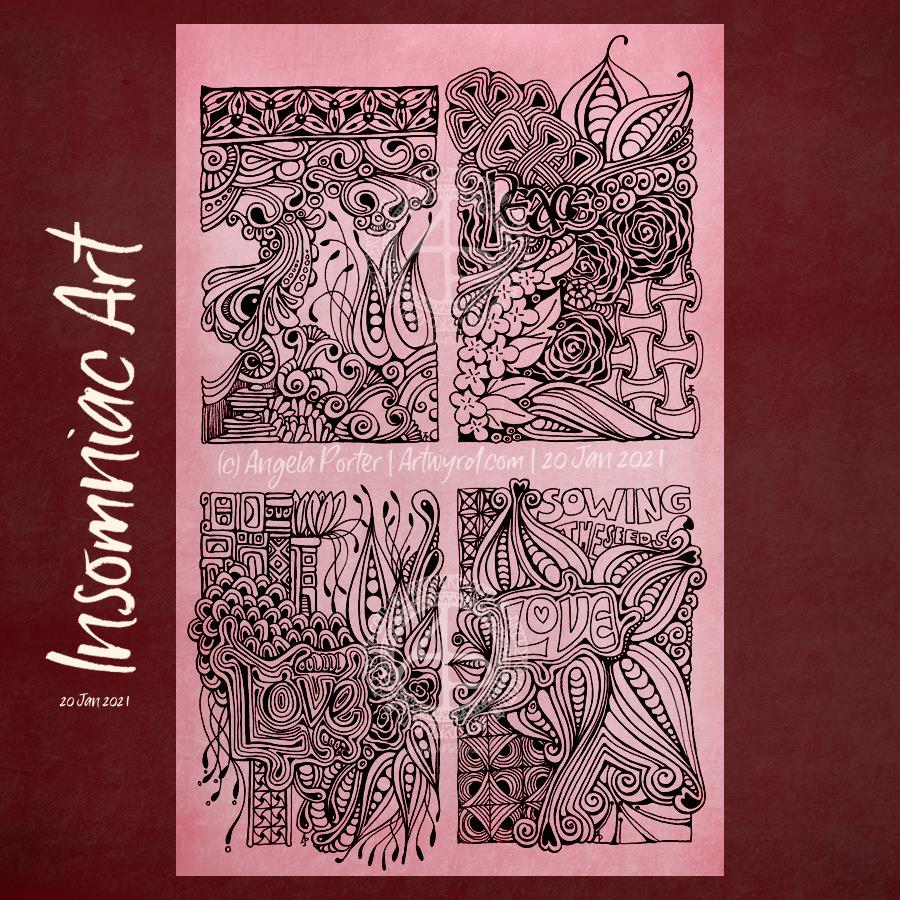
It was one of those nights. I woke way too early feeling way too hot, even though the windows were open in the Welsh Winter. Hot flashes, again. So, the only thing to do was to draw until I was cool enough to get back to sleep. That took until nearly 8 am, GMT.
These are the little drawings I completed during my insomniac hours. My Sakura Pigma Sensei 04 pen is nearly done – either the nib is too worn to work properly or the ink is mostly gone, I’m not entirely sure which. I know I have a heavy hand with pens and tend to wreck them before all the ink has gone.
Anyway, I witter. I’m still trying to figure out how to add words into my drawings. I’m not entirely sure I’m being successful in this. No doubt I’ll keep on trying though!
These were drawn on A4 acid-free cartridge paper in one of my current sketchbooks. I added the background colour digitally.
I’ve been busy indulging myself in comfort art over the past couple of weeks. So, I thought I’d share some of the pages in one of my A4 sketchbooks that relate to zentangle.
I’m no photographer, just saying!
I used a whole host of different media to complete the drawings -pens, including Pigma Micron, Unipin, Uni Emott, Chameleon Fineliners, Pitt Artist Pens, Staedtler Triplus fineliners, Tombow Fudenosuke and a Zebra fudenosuke -a range of pencils including Prisma Ebony graphite, Daler-Rowney sketching pencils, white graphite pencil, Derwent coloured drawing pencils and ordinary drawing pencils and a ruler to give guidelines for dividing the pages up – tortillons and paper stumps, along with sandpaper to clean the tips! – Inktense, Tombow Dualbrush pens, Faber Castell Pitt artist pens and a waterbrush for the more intensely coloured patterns
Some of the work has been done on days where I just needed to lose myself in something familiar, comforting. The rest of it during my nights of broken sleep.
The newest stuff are the pages of ’embedded’ letters – the monograms. Definitely a tad on the weird side as I’ve not found my way with this idea. But I will persevere over time.
I create templates for the members of the group as my way of saying ‘thank you’ for supporting my work. I am thankful that I am able to bring some joy and peace into others’ lives through my colouring books and my art.
If you’d like to download and print the template for personal use, head on over to the facebook group. Some simple terms and conditions of use apply.
I’ve chosen warm, autumn colours for my version of the template. How would you bring yours to life with colour? I love to see how people colour my templates, and I can be tagged on twitter and instagram as @artwyrd.
Today in South Wales
It’s a beautiful late autumn day. A hard frost this morning has now melted. The dragons-breath mist flowing down the valley has dissipated leaving the air filled with a silvery mist that diffuses the bright sunlight beaming from the pale blue sky. Trails of smoke and steam trickle through the fairly still atmosphere, making a statement that the colder months are now upon us.
Once I’ve completed all my social media posts, I’m going to put some sunblock and boots on, wrap up warm, and go for a much needed and long-put off walk. It’s time for me to face some of the social anxiety that has built up in me during another lockdown.
Then, it’ll be settling down to ink in some coloring templates for Entangled Starry Skies. I was going to do some yesterday. Unfortunately, I was overcome by the intense fatigue that plagues me from time to time, which hasn’t been helped by a few insomniac nights. I slept lots yesterday, and fairly well last night, so feel better today than I have done for a while.
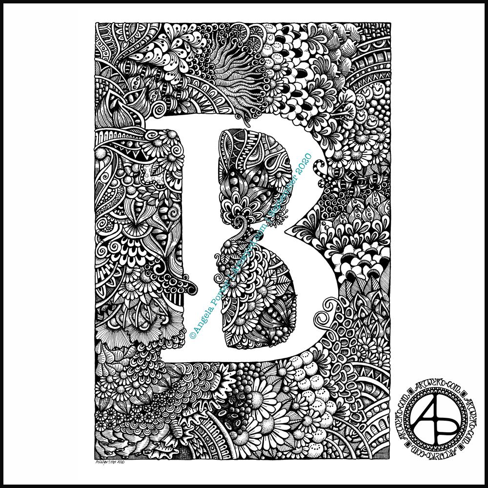
I had to take a totally different approach to completing this piece of typographic art – pencil drawing the design and letter outlines on paper before inking and scanning into the computer.
Once scanned in, I could clean the image up, fill the shapes with black. I learned how I could use some of the tools in Autodesk Sketchbook Pro to do this. However, in black and white the artwork looked just so flat and dull.
So, I added a chalkboard background in a lovely sea blue (ammonites were denizens of the oceans after all!), and added a colour gradient to the typography.
It then looked a bit better. But I thought I’d try adding highlights and some shadows. And that just did the trick and I was finally happy with what I’d produced. It was good enough for another step on my typographic art apprenticeship.
That doesn’t mean there are things I wouldn’t do differently the next time I try something like this. My hand lettering needs a lot of work on, as does my attention to the letter weights too. I’ve just realised that I meant to draw tiny ammonites in the dark blocks between words as spacers. Also, I could’ve spent a lot of time tidying up the lettering digitally.
I also learned that working on paper gives me a much better overall view of the design and how things sit together. For some reason I struggle with this when working digitally. It may be that digitally I can zoom in and out and often work unaware of what is around the design. With paper, that overall perspective is ever present.
Digital art is something I love to work with, but I’m realising that I do need to work on paper too, even if it’s a sketch or drawing that can then be enhanced, edited and completed digitally.
This morning I needed a quiet, slow, simple time with some arty stuff.
Firstly, I get so frustrated working in a bound sketchbook. The binding always gets in my way even though I like the paper. I much prefer working on loose sheets of paper. I want to keep a sketchbook, or series of sketchbooks. So, the pennies dropped that I needed to put together a discbound sketchbook filled with acid-free cartridge paper and bristol board, and other papers I may wish to draw on.
Yes, I know I’ve got a disc bound sketchbook filled with papers coloured in many ways to draw on. But, my recent forays into art, the realisation that black and white line art is my favourite way of working, needed a solution too.
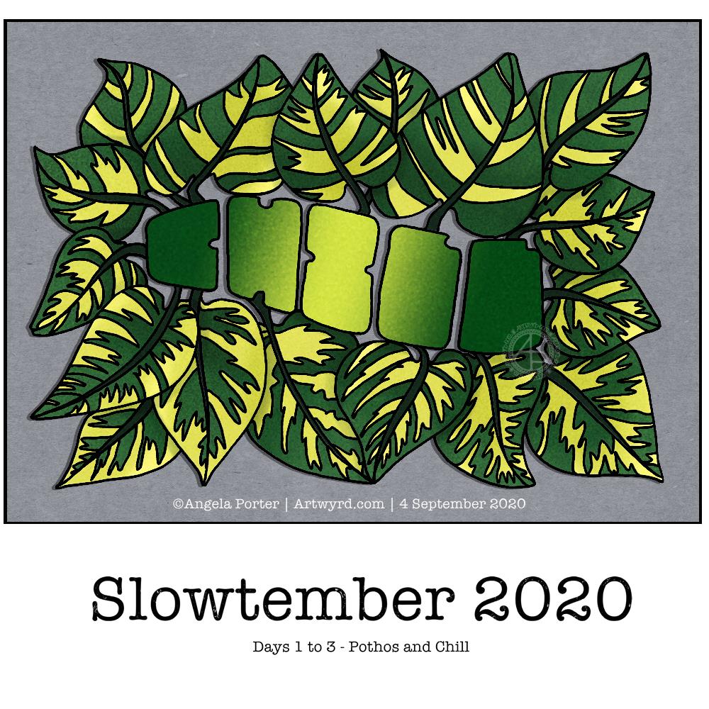
So, after a while of sorting out such a discbound sketchbook, I thought I’d like a cover page for the Slowtember part of my this sketchbook. It gave me a chance to practice some hand lettering, and to mess around with Tombow Dual Brush markers.
I also added drawings for pancake plant, the prompt for days 10 to 12 which I missed out and went straight to rubber plant!
I suspect that by the end of the month I will have a visual reference for leaves of these indoor plants.
Naturally, I messed up the numbers for the dates for each prompt. My hand lettering isn’t wonderful, nor are the leaves around the title. Let’s not mention the colouring. However, it will do; after all it is a sketchbook page not a finished, polished piece of art. That means no pressure on myself to get it perfect, or as near as I’m happy with. It’s about trying things out and if they don’t work then it’s an opportunity to reflect and learn more about my skills and artistic voice. It’s also a chance to use media that I wouldn’t normally use, and possibly to remind myself why I don’t usually use them as well!
Yesterday afternoon and this morning I’ve spent time catching up with #Slowtember by @megaelod on twitter. Here’s the sketchbook page I created for the prompts monstera (Swiss Cheese Plant), areca palm and rubber plant.
I took the opportunity to practice my hand drawn typography / hand lettering, as well as my use of line to add volume to a line drawing.
I’m not the best with colour, or with traditional media to add colour, but I think I’ve done OK with some of these. I like the simple washes of gradient colours in the areca and rubber plant leaves. The line work is nice, but the colour brings it to life. The monstera leaf done in coloured pencils works well as far as a sense of volume goes, but I’m not the best with coloured pencils, even using blending solution.
I even found some microscopic images of cells from monstera and rubber plant leaves and stems. So, I just had to do quick drawings of patterns from these, with some imaginary colour added to them.
It’s nice to do this challenge. It’s not as full on and intense as Inktober is, and even if I fall behind there’s not so much to catch up with. It’s also nice to work in a sketchbook (or digitally) as there’s no pressure to complete a finished piece of work. I like how I’ve left some of my drawings partly coloured so I can compare how colour adds (or not) to the design.
When I’m looking at my page and writing about it I always have ideas about how I could’ve approached an idea, or get new ideas. Time for me to go and jot them down before I forget them!
Finally finished it! It’s taken many hours to do – probably around 15 I think, and it’s taken some perseverance by myself to get it done.
Uniball Unipin pens (05, 03 and 01) on Claire Fontaine Paint-on mixed media paper. Two pen nibs now wrecked; the paper is velvety smooth to touch, but just too rough for the tips of the Unipin pens. Will move to Bristol board for the next monogram.
I decided to do Slowtember. I like having prompts to challenge me, take me a little outside of my usual style. However, Inktober can be a bit full on with daily prompts. Slowtember gives that breathing space, and I can work it in around my other commitments.
Thanks to @megaelod on twitter for the idea and prompts!
So, the first prompt was a choice betwixt pothos and chill. I decided to combine them! I like foliage, and the word gives me a chance to try out some hand drawn typography/hand lettering.
I sketched the quite stylised design on dot grid paper, inked it with Unipin pens and then scanned it in. after some digital clean up and slight adjustments, I added some simple colour and shadow.
You’d think adding simple colour would be easy, yes? Nope! Choosing the right greens wasn’t easy for me. And then there was the typography. I lost count of how many times I tried different ways to colour the letters. Eventually I decided enough was enough and the gradient I had was good enough.
As I think now, after breakfast and some mocha, I could’ve done the word as a flower pot, or used it to add shadow to a flower pot. Maybe I’ll give that a go for the next prompt (monstera and water).
Complex drawings are my stock in trade. Going simple and stylised is not quite so easy! Still, it was fun to do, a bit frustrating at times, but the result is perhaps good enough, though I’m not sure about that.
Wednesday is WIP day! WIP is work in progress, and this is one of my current one.
I’m working on A4 (29.7 cm x 21 cm) Claire Fontaine Paint-On mixed media paper with 05 and 01 Uniball Unipin pens.
It’s taken several hours so far, and there’s several yet to go! I’m enjoying creating such detailed drawing in just black and white. Lots of botanical elements, but there’s also arches and spirals and geometric patterns in there too.
I never have much of a plan in mind when I tackle a drawing like this. I know what patterns I like, and if I lack inspiration I can always refer to my visual dictionary or design motifs and patterns. It’s all about intuition. It’s not entirely mindless. I do make conscious decisions about what design element to use, how to use line and pattern to add volume and contrast.
I sometimes wonder, when I see my work like this, why I try to work with colour. I always feel I struggle with colour, but black and white, with or without grey, always seems to work so well for me.
I love to play with the illusion of volume in a drawing, and whether that is done with density and shape of line/pattern, or with colour (even though I really do feel I struggle with colour).
I will persevere with this illustration, drawing, artwork over the coming days. In fact, I may spend time on it today. I’ve completed my morning errands, so I can remain at home, which is where I need to be. I’m tired today; I didn’t sleep at all well last night, or for the past few nights and my mood and ability to concentrate is suffering as a result.
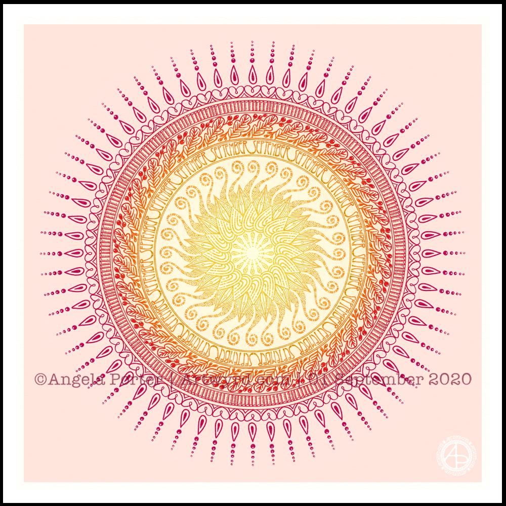
It’s a sunshiny, blue-sky morning with a distinctly cool and freshness to the air. It really feels like autumn is on it’s way. So, I’ve created a mandala to welcome the change of month, and the incipient change of season. I even practised my hand-drawn typography / hand-lettering.
What I missed out on doing was having a 9-fold symmetry for the ninth month. Ho hum. Perhaps I’ll just create another!
I’m also not at all sure of the background colour. It’ll do for now. After all, this is my morning warm up art.
Drawn in Autodesk Sketchbook Pro using Microsoft Surface Studio and Microsoft Surface Slim Pen.