Wednesday Wisdom | Paleotober | Drawtober

Wednesday is a day when I’m up extra early for an organic food delivery. I usually spend the time awaiting the knock at the door drawing. Today was no different.

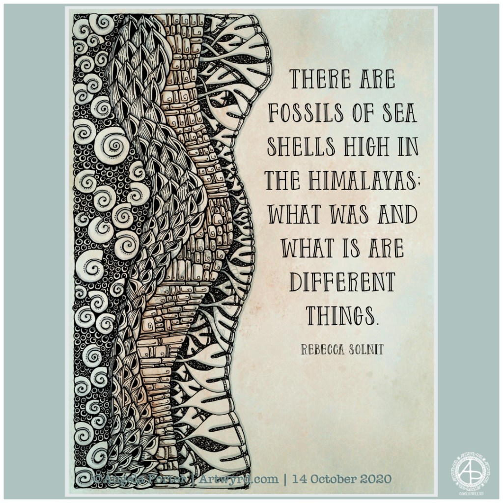
I had an idea to try to work in layers of patterns and to add a quote to one side. The first layer contained some ammonite-style shells, surrounded by little bubbles that could represent the sediment.

The next layer has seed pods, but the pattern they create reminds me of the fossilised stems of plants found in the carboniferous coal of the South Wales coalfield.

The third layer reminds me of the limestone beds exposed on the Glamorganshire Heritage Coast, particularly Southerndown and Nash Point.

The fourth layer reminds me of some kind of fossils or sea plants, the name of which I just can’t bring to mind.

I thought a quote about fossils would finish this off nicely.

Drawn with 05 Pentel Energel and 0.38 Uni-ball Signo DX pens on marker paper. Background, shadows and quote added digitally.

Paleotober 2020 – Fossils

An entangled smorgasbord of fossils, stylised fossils, and some of my favourite patterns and motifs.

I enjoyed creating this one, though I feel I rushed the highlights and shadows a bit. However, I can always go back and edit or re-work them. I’m so much happier adding those highlights and shadows digitally than I am with Copics or other media.

Today, my colour scheme is monochrome, with many shades of grey, along with black and white. Those colours echo a conversation I’ve been having about how life isn’t always black and white, that sometimes no matter how you try to find the right path, make the right decisions, not everyone will agree, either totally or in part.

Art is something I do mainly for my own pleasure. Yes, I do work on adult colouring books, but within the broad topic it’s up to me what I create. I guess enough people like my art as I’m asked time and again to create another book and another.

My biggest problem is believing in myself, recognising that what I do is good enough, and that my own way of expressing myself, in drawings like this one, is good enough too. This way of drawing comes all too easy to me, and that lack of struggle makes me think it’s not worthy of consideration.

That is why I end up experimenting with different media, different ways of creating art, of expressing myself. Yet I always return to this style.

In the past, I’ve described it as my ‘comfort art’. I’m beginning to understand that it is my main artistic voice, the tune. Everything else is me just trying to find harmonies that add to that voice. Perhaps the voice itself is enough, as with Gregorian chants.

That is an insight that I need to dwell upon for a while, but it feels right to me.

Drawn with Unipin pens on marker paper. Background, highlights and shadows added digitally.

Tuesday Typography for Paleotober

I had to take a totally different approach to completing this piece of typographic art – pencil drawing the design and letter outlines on paper before inking and scanning into the computer.

Once scanned in, I could clean the image up, fill the shapes with black. I learned how I could use some of the tools in Autodesk Sketchbook Pro to do this. However, in black and white the artwork looked just so flat and dull.

So, I added a chalkboard background in a lovely sea blue (ammonites were denizens of the oceans after all!), and added a colour gradient to the typography.

It then looked a bit better. But I thought I’d try adding highlights and some shadows. And that just did the trick and I was finally happy with what I’d produced. It was good enough for another step on my typographic art apprenticeship.

That doesn’t mean there are things I wouldn’t do differently the next time I try something like this. My hand lettering needs a lot of work on, as does my attention to the letter weights too. I’ve just realised that I meant to draw tiny ammonites in the dark blocks between words as spacers. Also, I could’ve spent a lot of time tidying up the lettering digitally.

I also learned that working on paper gives me a much better overall view of the design and how things sit together. For some reason I struggle with this when working digitally. It may be that digitally I can zoom in and out and often work unaware of what is around the design. With paper, that overall perspective is ever present.

Digital art is something I love to work with, but I’m realising that I do need to work on paper too, even if it’s a sketch or drawing that can then be enhanced, edited and completed digitally.