Over the week I’ve been adding to my sketchbook- notes and images, ideas and reflections.
Each page has been coloured with combinations of Distress Inks, applied using the black side of a piece of Cut and Dry foam, followed with a spritz of water to bring out some water-staining grungy loveliness.
All the little drawings have been done on either Daler-Rowney Smooth watercolour paper (300gsm) or mixed media paper, either from Claire Fontaine or Daler-Rowney. The papers have been coloured with Distress Oxide Inks, Distress Inks, or a combination of them. Most of the pieces have had the inks applied with the foam, but some were made by brayering Distress Oxide inks onto a gelli plate and taking a print of them.
The reflection about what I like, what I don’t like, and ideas that arise is important to me in my sketchbook/journal. I do reflect on my art, a bit too much in my head. When I write it down, it forces my sometimes abstract and swirling thoughts into some kind of order. When I make these thoughts a material manifestation by writing them down, it helps me to recognise the thoughts, sift through that which is useful, and still record those that are not particularly useful at this moment but may be in the future.
I think I need to find a way to do this with my digital art. My mind goes to using One Note to do this. I shall think on this one, and make a note of it in my physical sketchbook/journal.
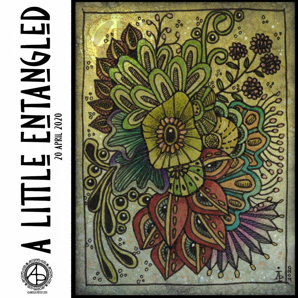
Today’s arty offering is this little bit of entangled art. It measures 4″ x 3″, so is small in size, but big in detail, I think.
Distress Oxide inks were used to colour a 4″ x 3″ piece of Claire Fontaine mixed media paper, with water to add extra texture to it.
I drew the design using 08 and 02 Unipin pens. To bring the design out of the background, I used Faber-Castell Pitt Artist Brush pens. Dots of gold and white finished the embellishment.
My final step was to apply some Distress Microglaze to add a subtle sheen that brings out the colours and layers of texture, not just to the Distress Oxide ink, but to the Pitt Artist Pens too.
I thought I’d try the Pitt Artist pens with this background as it seemed more dull and dusty, and that’s how I find the colours in the Pitt Artist Pens. Initially, I was going to keep it monochrome. However, I liked the nature of the colours in the pens, so experimented with them.
I enjoyed creating this little work of art. Now, it’ll find its way into my sketchbook-journal, with reflective notes for future reference.
As I’m pretty much an introvert, I’m usually happy in my own company and happy at home. There are times when even I get and a huge desire to visit somewhere else, where the feeling of wanderlust becomes so strong I have to act on it, even if it’s just a drive in my car.
I, like us all, have no idea when I’ll be able to do this again, just like us all. The Covid19 crisis has changed everything and liberties I took for granted are not not available now and shows how much I enjoyed them even if I didn’t use them all the time. I had the choice.
Yesterday was one of those days where wanderlust overwhelmed me. With it came a huge dose of frustration and sadness, as well as a loneliness I rarely feel.
Also, I was over-tired. I know that when I’m over-tired, my emotional resilience is low. So, all of these things bubbled up and I ended up in bed in the afternoon. I felt a bit better on waking, and my attention went to creating some art.
As I couldn’t indulge my wanderlust physically, I thought I’d try to find a way to express it artistically, and the above is the result.
Words always interest me, and their meanings and origins too. So, I wanted to include the definition of wanderlust in my art. I wanted to make it look like torn paper, or a rip in the background, so I created a messy edge for the typography panel. I actually like how this turned out; I felt like I was being torn apart, emotionally, by the feeling of wanderlust, and a darkness was welling up from that tear.
I used one of my Distress Oxide background textures and drew an entangled art design on a layer above it.
Once I was happy with the design, I coloured the line art, created a copy of it, and applied various effects to these two layers.
I’m really happy with this artwork. It made me smile inwardly and helped to lift my mood some more.
I’m still tired today, over-tired, exhausted. I woke up, however, with the idea of creating some ATC card backgrounds using Distress Oxide inks, and these are the results.
Except for the middle and right cards in the bottom row. I wanted to try out using Distress Microglaze to see if it brings out the colours and layers of colour and texture. It does, though it’s not easy to see on the scan. I do need to do before and after scans. I also need to see if I can draw on the panels treated this way too.
So, ATC cards are 2½” x 3½” in size and were started as a collaborative art project where artists and crafters could swap the cards with others, sharing inspiration and creativity in the process.
I just think they could be a lovely size to work on and mount on greeting cards.
All of these cards were cut from 300gsm watercolour paper, which is very thick and sturdy.
I’m still playing around with Distress Oxide Inks to get a feel of how I can get them to work for me as well as creating backgrounds for my traditional and digital art.
My mind is ticking over various things I’d like to do with these, both traditionally and digitally.
If you have any suggestions what I could do, leave a comment!
Background – Distress Oxide inks and water spray on Daler-Rowney mixed media paper.
Flowers and background foliage – digital art using Autodesk Sketchbook Pro.
I had a lovely time creating this artwork. Flowers are something I love and find in my art an awful lot. It took a few iterations to get the drawing of the flowers and leaves as I wanted them. A lot more iterations were needed to get the colour and texture of the flowers and leaves so that I was happy with them.
I wanted a bit more interest in the background, so I drew a leafy, simple mandala that was coloured with shades of green. I then replicated it, resized it, and applied different layer effects to each copy of the mandala.
As I was doing this, it was reminding me of the mixed media work I did a few years ago, particularly using stencils to add interest to a background.
Digital mixed-media … without the mess! I’ve said it before – I’m averse to creating a mess!
Anyway, this has been an interesting experiment in the realms of digital art and my brain is now ticking over with ideas for the future. All I have to do is make a note of them!
The aim of art is to represent not the outward appearance of things, but their inward significance.
-Aristotle
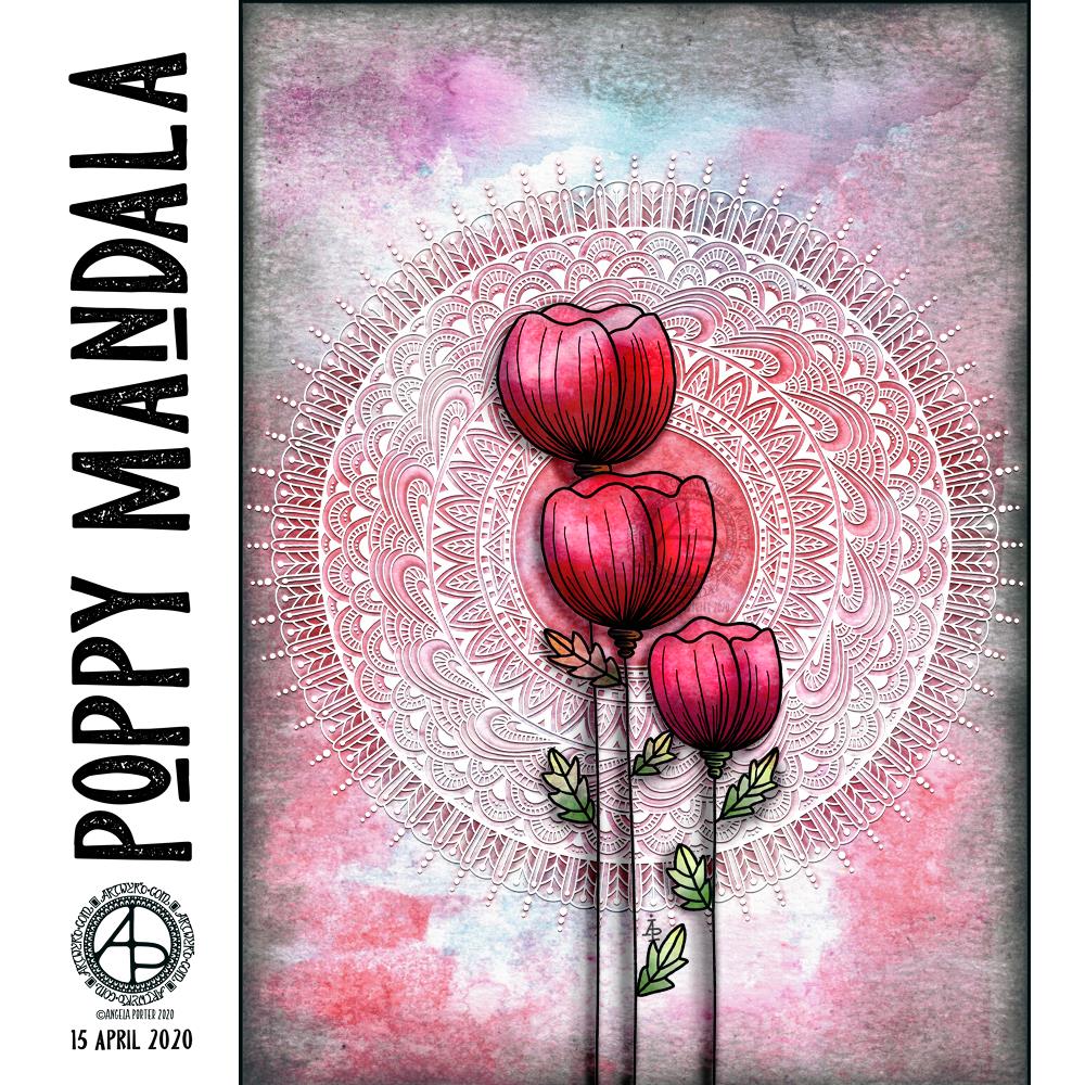
Today is World Art Day. It is meant to be an international celebration of the fine arts which was declared by the International Association of Art (IAA) in order to promote awareness of creative activity worldwide.
Each year, on 15 April (Leonardo da Vinci’s birthday), World Art Day celebrations help reinforce the links between artistic creations and society, encourage greater awareness of the diversity of artistic expressions and highlight the contribution of artists to sustainable development. (UNESCO)
“Our Organization would thus like to pay tribute to the solidarity shown by artists and institutions at a time when art is suffering the full force of the effects of a global health, economic and social crisis.”
— Audrey Azoulay, Director General of UNESCO
About today’s art
I started by choosing one of my Distress Oxide backgrounds to use for today’s art.
I woke knowing I wanted to do an arrangement of stylised poppies with a mandala for a background, and this is the result.
Poppies symbolise, among other things, a lively imagination, messages delivered in dreams, beauty and success, as well as remembrance. They, along with their seed heads, often appear in my art.
It took me many iterations of colour, shadow and highlight to get the mandala appearing as I wanted it to – lacy, light, in the background but still standing out. I think I’ve managed to achieve that fairly well.
Overall, I’m pleased with the finished artwork. I do think the poppies and mandala could be moved towards the top of the background, something that is easy enough to do as I have the layers saved. However, the artwork is good enough for now.
I suspect I’ll be creating more art using a couple of the backgrounds I’ve created through the day. It’s a satisfying process to use backgrounds I’ve created myself rather than using ones that I have purchased.
I’ve spent a very enjoyable few hours this morning creating a plethora of gloriously coloured and distressed backgrounds for use with my drawings and art. I will be scanning them in to create digital backgrounds too, but only when I’m going to draw on one. I’d get overwhelmed if I tried to do that task all in one go!
How I created the backgrounds.
The papers I used are all mixed media – either ClaireFontine or Daler-Rowney. They were cut to sizes that would be suitable for mounting on cards. They’re a mixture of the following approximate sizes: 9″ x 3″; 8″ x 2″; 4″ x 4″; 3″ x 5″; 2.5″ x 4.5″; 4.5″ x 2″; 3″ x 4″; 4.5″ x 1.5″ just in case you’re curious.
They are all coloured with Distress Oxide Inks. I only have the first two collections released by Ranger; I do intend to complete the collection in the future.
For some, I used a soft Brayer roller to add the Distress Oxide to a gel printing plate. I then either sprayed water on the plate in a fine spray, or I splattered drops of water colour on to it before pulling the print with a piece of paper.
I tried brayer-ing the Ink directly to paper, but wasn’t all that happy with the results until I sprayed them with water.
My favourite way of adding colour, however, was to use a piece of Cut and Dry foam to add the ink. I tapped the black, denser foam side onto the ink pad and used that to spread the colour around the paper. I then sprayed with water.
Sometimes I’d go back and add another layer of colour, and then spray with water.
I used a heat gun to dry the paper after spraying with water or colour, which helps the distress oxide inks to ‘bleach’.
I’d add some more colour if I thought the background needed it, and then spray again, until I was happy with the end product.
My final task was to frame the backgrounds by adding a black edging. I used a foam finger dauber and black soot Distress Ink to do this, spraying the papers once more to let the edging ‘bleed’ a little.
I’m really happy with most of the backgrounds I’ve made and I’m looking forward to using them to create little pieces of art, and adding to my library of digital backgrounds I can use for my digital art. These are a little small, maybe. However, Now I’ve found out how I like to create a background with the cut and dry foam I’ll be making some A4 sized backgrounds.
Update on my back and other things.
My back is feeling a lot better today. However, I still get stiff all too easily and I still have pain down the sides of my thighs.
My mosaic crochet wrap is coming along – it’s all I’ve been focusing on while my back has been too painful to sit and draw.
The world is greening quickly. I’ve not spent much time at my studio area while my back has been sore, so I’m surprised to see the trees that were bare just a couple of days ago are now clothed in spring hues. That cheers my heart!
I’m coping quite well with the ‘lock-down’. I am trying not to get sucked into the whirling maelstrom of news and views about Coronavirus and other events going on in the world.
The virus crisis is happening, even though it’s not touched me personally. It will occur whether I pay attention to it or not. I know being stressed, anxious, fearful will have a negative impact on my immune system, so the calmer I can stay, the better. That doesn’t mean I don’t care. I do. Deeply. The only thing I can do is to stay home and not be a vehicle for transmission of the virus from person to person.
I now need a fresh mug of tea, so that’s all the words I have…for now.
Distress Inks in Bundled Sage, Weathered Wood and Stormy Sky.
Distress Oxide Inks in Iced Spruce and Peeled paint.
Small paint brushes – I used a 0 for the details and a 4 for the circles.
Mini foam blending tool.
A spray bottle containing a mixture of gold Perfect Pearls and water.
Tim Holtz’s Distress Micro Glaze and a dedicated foam blending pad. (or just your fingers!).
A glass pen or other fine nib dip pen.
Gold and Silver inks from J Herbin
White Sakura Glaze pen.
Gold glitter Uniball Signo Pen.
Light grey 05 Unipin pen by Uniball.
Glue or strong tape to adhere the card layers (I used Tombow Mono glue)
Method:
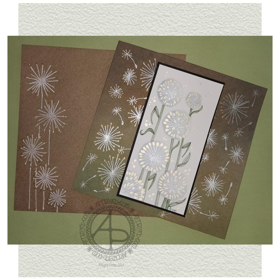
I started with a 2.5″ x 5″ piece of watercolour paper and a brush. I used water to draw circles where I wanted the dandelion heads to be. I then used the brush to add Stormy Skies and Weathered Wood Distress Inks into the water, letting it spread as it liked. To ensure I had a darker area of the seedhead, I dropped the watered-down inks to the bottom and left of the circles.
While the circles were drying, I worked on the card base. I applied Peeled Paint and Iced Spruce Distress Oxide Inks with a mini foam blending tool. Then, I sprayed the card with a mixture of gold Perfect Pearls and water and let it dry. Finally, I used Tim Holtz’s Micro Glaze to seal in the Distress Oxides – they react all too quickly with the sweat in fingers.
By the time I’d set the card base aside to dry I could return to the dandelion seed heads. I used a fine paintbrush, and some Titanium Iridescent Watercolour paint from Cosmic Shimmer to add the stems of the seeds. Once they had dried, I added dots of Enchanted Gold Iridescent Watercolour paint to the stems and set the panel aside to dry.
I wanted to add some dandelion heads and seeds to the card base. I used a glass pen along with silver and gold inks from J Herbin. I didn’t think these would adhere to the micro glaze treated surface, but they did. On a darker background, I could really see how these inks look like liquid metals as they flow onto the paper. They didn’t dull as they dried, thanks to the micro glaze acting as a barrier to the Distress Oxide ink.
Next, I wanted to add the stems and leaves to the dandelions on the watercolour paper panel. I used some Bundled Sage, Weathered Wood and Stormy Skies Distress inks for this. I pressed them onto a sheet of plastic, diluted and mixed them with water and a brush and then used the mixture to add the stems and leaves. I started with a lighter colour wash, adding darker colours to the left of the stem and also under the dandelion heads to add some dimension.
Once I was reasonably happy with the stems, I worked on the leaves. Again, I started with a pale-coloured wash to get the shape of the leaves in place. Then I gradually added darker tones to give a sense of dimension.
When I’d finished this, I looked at the panel, and I wasn’t happy with the stems and leaves. They looked unfinished. So, I dug out a light grey Uniball Unipin pen and proceded to outline the stems and leaves. This improved matters greatly to my mind. I like the way the stems and leaves are now defined and how they contrast nicely with the airy, ephemeral feel of the seedheads.
I then set about adding some dots of the gold watercolour around the arrangement of dandelion seedheads, added my symbol and year, and that completed the top panel.
I cut a piece of black card that was approx. 5.25″ x 2.75″ and adhered the top panel to it. I then adhered these layers to the card base.
My last task was to decorate the envelope. I used a white Sakura Glaze pen to draw some dandelion seedheads. When the Glaze pen lines had dried, I used a gold glitter Uniball Signo gel pen to add dots.
My reflections.
I started with a 2.5″ x 5″ piece of watercolour paper and a brush. I used water to draw circles where I wanted the dandelion heads to be. I then used the brush to add Stormy Skies and Weathered Wood Distress Inks into the water, letting it spread as it liked. To ensure I had a darker area of the seedhead, I dropped the watered-down inks to the bottom and left of the circles.
While the circles were drying, I worked on the card base. I applied Peeled Paint and Iced Spruce Distress Oxide Inks with a mini foam blending tool. Then, I sprayed the card with a mixture of gold Perfect Pearls and water and let it dry. Finally, I used Tim Holtz’s Micro Glaze to seal in the Distress Oxides – they react all too quickly with the sweat in fingers.
By the time I’d set the card base aside to dry I could return to the dandelion seed heads. I used a fine paintbrush, and some Titanium Iridescent Watercolour paint from Cosmic Shimmer to add the stems of the seeds. Once they had dried, I added dots of Enchanted Gold Iridescent Watercolour paint to the stems and set the panel aside to dry.
I wanted to add some dandelion heads and seeds to the card base. I used a glass pen along with silver and gold inks from J Herbin. I didn’t think these would adhere to the micro glaze treated surface, but they did. On a darker background, I could really see how these inks look like liquid metals as they flow onto the paper. They didn’t dull as they dried, thanks to the micro glaze acting as a barrier to the Distress Oxide ink.
Next, I wanted to add the stems and leaves to the dandelions on the watercolour paper panel. I used some Bundled Sage, Weathered Wood and Stormy Skies Distress inks for this. I pressed them onto a sheet of plastic, diluted and mixed them with water and a brush and then used the mixture to add the stems and leaves. I started with a lighter colour wash, adding darker colours to the left of the stem and also under the dandelion heads to add some dimension.
Once I was reasonably happy with the stems, I worked on the leaves. Again, I started with a pale-coloured wash to get the shape of the leaves in place. Then I gradually added darker tones to give a sense of dimension.
When I’d finished this, I looked at the panel, and I wasn’t happy with the stems and leaves. They looked unfinished. So, I dug out a light grey Uniball Unipin pen and proceded to outline the stems and leaves. This improved matters greatly to my mind. I like the way the stems and leaves are now defined and how they contrast nicely with the airy, ephemeral feel of the seedheads.
I then set about adding some dots of the gold watercolour around the arrangement of dandelion seedheads, added my symbol and year, and that completed the top panel.
I cut a piece of black card that was approx. 5.25″ x 2.75″ and adhered the top panel to it. I then adhered these layers to the card base.
My last task was to decorate the envelope. I used a white Sakura Glaze pen to draw some dandelion seedheads. When the Glaze pen lines had dried, I used a gold glitter Uniball Signo gel pen to add dots.
Reflections on this project.
When I started, I only had a rough idea of what I’d like to do. I knew I wanted to use watercolour media and stylised dandelion heads.
At first, I tried to make the circles for the seed heads by using a Tombow Dual Brush pen to draw the outer circle. Then, I used water and a brush to get the ink to bleed into the circle.
The result wasn’t pretty.
So, I regrouped and tried Distress Inks and water, and I was much happier with the result, and the card grew from there.
I’m pleased that I ran with a more stylised dandelion head than I’d initially considered. One of my artistic strengths is my ability to create stylised motifs. I certainly think I managed to do that with the dandelion heads and their leaves, especially as watercolour media is not a strength of mine.
I’m also glad I used the iridescent paints to add the details. That makes my inner raven very happy. The use of metallic inks on the card base increased the happiness of the raven even further!
I was about to give up on the card when I’d added the stems and leaves with just Distress Inks; I wasn’t happy with them. However, trying the grey line made all the difference in the world. The dandelions went from almost being consigned to the waste bin to being good enough.
I’m now happy with the card and the envelope; it’s something I’ll try again in the future, maybe. After all, I do have a few more watercolour paper panels that need to be used!
So, Angela, how are you today?
Yesterday, I had EMDR therapy. The session was quite painful, physically, and a bit distressing emotionally. I felt content and optimistic going to the appointment, and I left feeling pretty much the same. However, I suddenly became exhausted when I was half-way home. And I do mean exhausted. I felt my eyes trying to cross and close.
I made it safely home and, after having a little something to eat, I collapsed into bed and slept until early evening.
I was still really tired when I woke, but a random chancing upon crochet patterns for hyperbolic surfaces and ammonites kept me up for a while. Indeed, I lost myself in crocheting hyperbolic forms.
This morning I woke feeling content and optimistic and cheerful. The sun was shining, which always helps my mood for sure.
Even though I was feeling sunny inside, I wanted to spend time on a little project or two today. I didn’t want to push myself after what turned out to be a gruelling EMDR session yesterday. So, that’s why I threw myself into creating this little card.
Now, it’s nearly 7 pm here in the UK, and I’m bone-tired once again. I’ll spend the evening either creating another card or crocheting. Either way, it’s self-care time.
The image shows some of the backgrounds I’ve made using a Speedball Brayer, a Gelli Arts Gelli Plate, white card and Tim Holtz’s Distress Oxide Inks.
I’ve been taking a little break from the work for the A Dangle a Day book, a change freshens up the creative part of my mind.
The process is quite simple.
Press the oxide ink down onto the Gelli plate.
Use the brayer to spread the ink over the Gelli plate. The Gelli plate acts as a blending mat.
Use the brayer to add ink to the white card. I find it helpful to have just printer paper under the card and to move the brayer from the paper onto the card.
Build up layers of inks until you’re happy with the look. Using one colour of ink you can quite easily build up an ombre background.
Spray or dot water onto the paper and let the inks ‘oxidise’ if you wish.
I clean the brayer off on the copy paper between inks. I also use the copy paper to lift off any residual ink from the Gelli plate between different ink colours. Sometimes, I dab the Gelli plate with a baby wipe and then use copy paper to clean the plate, especially if the residual ink and the new ink will make a nasty brown sludgy colour. In this instance, I wipe the brayer with a baby wipe and then clean and dry it on copy paper too.
Sometimes, the copy paper becomes a beautiful background paper too, so I store those away for future use, sometimes.
I’m going to scan some of these backgrounds in to use as backgrounds to my digital art, but then I’m going to draw on them. I’m using quite a few in my Sketchbook Project sketchbook for 2018.
I woke up the other morning, Thursday I think it was, and had the overwhelming desire to try my hand at carving stamps from rubber blocks again.
I enjoyed doing lino cuts when I was doing my A level in art over a decade ago, well apart from the way my finger and wrist joints would hurt after doing this. So, I thought I’d have a go with soft rubber, and above you can see the first of my efforts.
The weird flower was the first, and I’m not happy with it, though I think it would be fine as a background stamp in mixed media work, maybe.
The leaf, heart and geometric patterns I carved this morning from a different kind of pink rubber: Speedy Carve from Speedball.
Both kinds of carving material were easy to work with, perhaps a little too soft for my liking, but only time will tell. The only other tools I used were a pencil to draw the designs on the stamp carving material and a craft knife to cut the Speedy Carve. Oh, and some sepia Archival Ink from Ranger, and an acrylic stamp block for the circular discs to adhere to while I stamped with them.