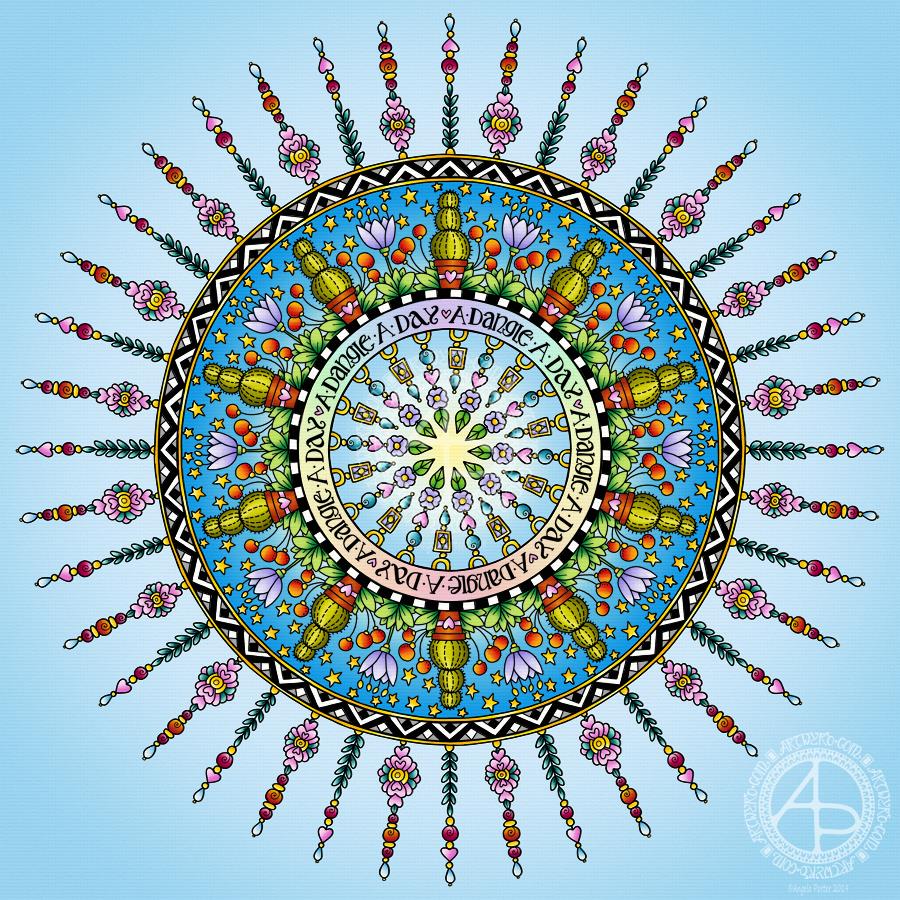
Today has been a funny kind of day. I have a stinking cold and I had an appointment late morning. When I came home this afternoon, I decided I’d do another mandala made up of dangle designs and design elements from my book ‘A Dangle A Day’.
I just let the design flow from the tip of my Microsoft Surface Pen and onto the virtual paper that is my Microsoft Surface Studio screen. As always, Autodesk Sketchbook Pro is the app that lets me draw and colour naturally on the Surface Studio screen.
I incorporated some of my favourite design elements – hearts, stars, sun, moon, flowers, leaves – into the mandala. A big mug of tea and a nicely sweet cake could be most welcome, though I’m not entirely sure the cold would let me enjoy them.
I also included some of those graphic black and white squares that I like so much, as well as a rainbow pattern of little arches. A morning sky and a night sky as backgrounds to the rings in the mandala completes this rather cutely whimsical mandala design.
Although I don’t show how to create dangle-dalas in the book, they are easy enough to do using dangles and design elements from the book.
It goes without saying that I’m all excited about my book being published tomorrow. I’m really hoping some of you will share your dangle designs with me – I really am curious and interested in how you use dangle designs!
Dangles can be turned into mandalas! And ‘dangle-dalas’ satisfy my love of symmetry in an unusual way.
In this one, I have two rings to which dangles are attached. In the centre ring, they point towards the centre of the mandala. On the outer ring, they point out into space.
Then, there’s two central rings. One, I coloured in a pastel rainbow and added ‘A Dangle A Day’ in my weird take on hand-lettered uncials. The lettering isn’t perfect, but then neither am I, and neither were celtic/anglo-saxon/medieval manuscripts.
Ok, the manuscripts are more perfect than my hand lettering, but it’ll do. It’s perfectly imperfect. That is an idea I’m becoming to embrace more and more easily as time goes on, and an idea that I encourage you to adopt in my book ‘A Dangle A Day’.
I used rather graphic black and white geometric designs to separate the three main rings of the design. This contrasts nicely with the brightly colourful design elements.
I felt the need to draw cacti, flowers and some weird seeds today, so that’s what I did. Of course it goes without saying that I’d have to include stars and hearts in my design! There’s some beads in there too, particularly those teardrop shaped ones that remind me so much of medieval jewellery.
Mind you, medieval in character this design is not. It is rather cute and whimsical, which is one of my signature styles – the other is intricacy.
For this design, I hand drew and coloured it digitally using a Microsoft Surface Pen on the screen of my Microsoft Surface Studio. As always, my chosen art software was Autodesk Sketchbook Pro.
Yes, I really do draw on my Surface Studio with the Surface Pen as if I’m drawing with, say, a fountain pen on paper. Colouring I often do as if I’m colouring with traditional media, though sometimes I do use gradient fills. It just depends on the feel I want in the final artwork.
Being able to work in layers means I can do things that would be very difficult or time-consuming working traditionally. It also means that I can play with colour combinations – I love colour, but I don’t always make good choices of colour palettes, see yesterday’s Q monograms for evidence of that!
Of course, there’s so much more to digital art than this, and I’ve not discovered everything yet. But over time my experience is that I discover, workout or learn how to do what I need to do at that time when I’m ready to do that.
While checking out the release date (which I’ve been getting a tad wrong, oops!) I noticed there were some reviews of the book. I’d like to say thank you to all the reviewers who wrote such lovely words about the book! It’s filled me with a bit more confidence and belief in myself as this is my very first art tutorial book.
There’s some hand lettering with the letter A. The letter A has dangles forming the inner part of the mandala. Then, the outer ring has simple and cutely whimsical doodle designs and yet another dangle forming it.
Of course, hearts and stars had to appear; they are my favourite design elements for many of my projects. I also like beads and gems too. Flowers and foliage are also favourite motifs, as are spirals.
I decided the ring of A’s need to be in a rainbow colour scheme and I chose a bright colour scheme for the design elements.
It looks complicated, but if you look at just one A and follow the dangle towards the centre and the design out to the outer rim you’ll see that it really isn’t all that complex.
Of course, drawing mandalas on paper can be time consuming. I usually draw mine digitally.
Autodesk Sketchbook Pro is now free and it’s my drawing software of choice. It has a symmetry tool that is really easy to use. You only draw one segment of the mandala which is then automatically repeated around the circle. I find Autodesk Sketchbook intuitive to use, and it’s easy to use almost straight away. It also has some rather sophisticated features on it and it does all that I need it to do, and more. I use a Microsoft Surface Pen along with Microsoft Surface Studio to draw and colour digitally, and they work wonderfully with Autodesk Sketchbook Pro.
I do colour my designs digitally. However, sometimes I will print out the black line art and then use traditional media (often Chameleon markers) to bring the line art to life with colour.
I do hope you will have a go at creating your own dangle designs. They look complicated, but they really aren’t! If you do have a go, then please share your designs with me on any of my social media homes – facebook, instagram, twitter or here!
What a bright, sunshiny morning it is here in South Wales in the UK. The first sunshine of the new calendar!
I’ve been up for around 3 hours and have had a fairly artsy time.
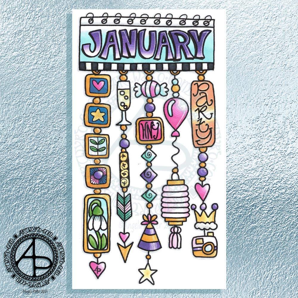
My first job was to print out the lineart for this dangle design, which is one of many in my book ‘A Dangle A Day’ which is due for release on 8 January 2019 – just a week away!
In the book, I take you through how to draw this design, one step at a time. Not only this design, but well over 100 more – designs for all seasons and many, many celebrations and occasions.
This design I drew in Autodesk Sketchbook Pro using a Microsoft Surface Pen and Microsoft Surface Book. For the book, I coloured it digitally. Today, I printed out my black and white lineart and then coloured it using Chameleon Color Tones and Color Tops marker pens. I also added some details to some elements of the design using a 08 Uniball Unipin pen and a white Sakura Gelly Roll Pen.
Yesterday, I said I need to to spelunking through my stash of mixed media and cardmaking supplies to find forgotten supplies I could use to embellish my designs.
This dangle design would make a lovely monthly cover page for a BuJo (bullet journal), planner, diary or journal. It would also make a pretty greetings card or notecard to drop a line to a friend wishing them a wonderful January. Change the words and colours to suit the occasion or recipient! It would also be a lovely, whimsical, cute design for a winter party invitation.
I realised then that my old watermark wouldn’t do for this year. So I hand lettered a new one. I made my symbol, the one I hide away in my artwork, part of the design, along with a little intricate but simple geometric pattern around it. A little touch of the uncials for my blog address, along with a typed copyright statement and it’s done and saved! I may end up changing it a little, or having variations on the theme, as time goes on. But I’m fairly happy with it.
So, I’ve already had a productive morning! It may be a Bank Holiday in the UK, but I really do need to focus on those templates that need colouring for Entangled Forests…and I may venture forth into the peopley world later on today, maybe.
This is what I’ve spent the last 2 or 3 hours doing – I lose track of time when engrossed in an artsy project.
After the K monogram yesterday I wanted to try my hand at another letter and I just chose my own initial. I really do need to do some different letters though!
For this one I started by drawing the letter in colour using Copic markers on Daler-Rowney Bristol board. I did do a vague sketch of the letter with pencil very lightly which I then erased.
Black lines to define the letter were next, followed by the lines outside of the letter and the sectioning of the spaces inside the letter.
I wanted to finish some of the lines with some interesting shapes, so naturally I defaulted to hearts and beads!
I used some of my favourite geometric and abstract patterns to fill some of the spaces, along with dots and lines.
The penultimate step was to colour in some of the blank spaces, the hearts and beads using Copic markers.
Finally, I used a glass pen and metallic gold ink from Herbin.
I worked with traditional media to do this one, so I could use gold ink, which is something I’ve not quite worked out how to do digitally.
Having said that, my process for creating this monogram is the same whether I work with traditional media or digitally. The only difference is that some of my ‘overspills’ with the lines in the tiny patterns I have to leave here and accept as it being ‘perfectly imperfect. Also, the colours aren’t as bright and vibrant as they would be digitally, but they’ll do!
Yes, I could add a dangle or three to this design, but, again, I’m happy with how it is…for now! I’m just happy exploring hand lettering in a different way to what I’ve been doing.
If anything, this hand lettering is more about shapes and patterns than it is about letters themselves. I know this is a step forward for me in finding my hand lettering style (or one of my styles at least), and I also know that as I become more comfortable with it and don’t have to work quite so hard at it (working hard is thinking about the lines and working out how to add the embellishments so they feel part of the design and not just plonked there for the sake of plonking them there) I’ll work out how to add to them in a sympathetic way.
What letter will I do next? You’ll have to wait and see!
Tomorrow is the Winter Solstice, or Yule. So, I wanted to create a dangle design for Yuletide, and wish you all the blessings of the season.
On the Winter Solstice here in the Northern Hemisphere, it is the shortest day and from here on in the amount of daylight begins to increase once again, albeit very slowly at first.
People gather at prehistoric monuments, such as Stonehenge, Newgrange and Avebury, to watch the sunrise on this day. These monuments have Winter Solstice alignments. That’s why I’ve got a pair of big stones framing the sun.
Of course I had to include holly, mistletoe and some evergreens in the design, along with stars, hears and a couple of cute robins.
It is a digital piece of art which started life as a pencil drawing on dot grid paper. The design was scanned in and re-drawn using a Microsoft Surface pen on the screen of my Microsoft Studio in Autodesk Sketchbook Pro. I did make use of the mirror symmetry tool to help me with the symmetrical nature of the design. I hand lettered the sentiment in the ribbon.
I did colour this quickly using gradient fills – yesterday I really wasn’t up to doing much. I am feeling a bit better today, though drained after a quick visit to my local town to run a couple of errands. I’m really easy to startle at the moment and me being jumpy at every noise and the number of people out and about was something I kind of expected but hoped I wouldn’t experience today.
I’m safely back home now and am starting to calm down a little, though I feel exhausted. So, the rest of the day will be spent quietly for sure.
I do have a Winter Solstice mandala to share tomorrow, and I’m rather pleased with this one. So, do pop back tomorrow.
Here’s my take on a dangle design monogram using the Lombardic Capitals lettering style.
I drew the design in pen using Uniball Unipin pens on dot grid paper. After scanning the pen and ink design into my Microsoft Surface Studio I removed the dot grid and created a transparent background.
Then, I coloured the design digitally, using a Microsoft Surface Pen and Autodesk Sketchbook Pro.
The Lombardic Capitals are very medieval in style and so I wanted my dangle designs to reflect this. I spent some time yesterday researching medieval, Anglo-Saxon and Celtic jewellery, floor tiles and ornamentation, which I then used as inspiration for the dangle designs.
I chose jewel-like colours for the design – these colours are often used in medieval manuscripts.
I must admit I’m not sure either about the blue background behind the letter A or the green border to it. Working digitally means I can easily change my colour choices here once I work out what I’d like to do with them.
The final step was to add some texture to the colours, some drop shadows and to create a background in colours and pattern reminiscent of vellum.
I say it every time but I mean it – I really did enjoy creating this one!
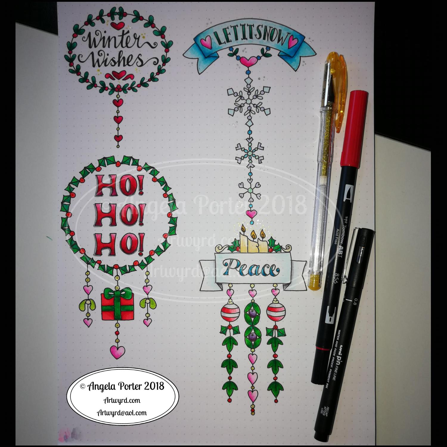
It’s Friday so it’s #dangleday. Today, I wanted to share a Christmas Dangle with you from my book ‘A Dangle A Day’. In the book I show how this design was drawn, step by step.
When I created this design, I first drew it in pencil on dot grid paper. The next step for me was to scan it in to the computer and then re-draw it step-by-step, saving each step as I went. For the book, the final step was to colour the design and then write the instructions to go with the images. My tools for this were a Microsoft Surface Book, a Microsoft Surface Pen and Autodesk Sketchbook Pro.
I wanted to include as many Christmas-themed charms to create the dangles as I could and still keep the design balanced. I also kept the length of the dangles uneven. The waviness in the ends of the dangles echoes the waviness of the fairy lights above the hand lettered word ‘Christmas’.
What I did this morning was to print the black and white line art design on an A4 sheet of paper. Then I used Chameleon Duo Tones and Color Tops markers to colour it in.
These pens make it easy to create gradations of colour, such as on the hand lettering. These gradations add ‘dimension’ to the charms and dangles. I keep the darker shades to the left and bottom of the designs so that there’s a consistency across the whole image. I also used a pale grey marker to add drop shadows to the left and bottom of the design elements; again this helps to add dimension to the design.
Finally, I added some highlights with a white Sakura Gelly Roll pen. I also added some sparkles around the fairy lights and individual stars with a gold glitter Uniball Signo gel pen. After all, it wouldn’t be Christmas without some sparkle!
Used individually with a monogram or Christmassy image the dangles would make lovely book marks. Printed at A5 in size, the design would make a fabulous BuJo page for the big day itself. It would also make a lovely design for greetings cards or note cards.
Of course, it would be easy to change the word at the top to, perhaps, Winter or Yule and use fewer dangles to suit the length of the word. Personally, I like to use an odd number of dangles wherever possible – it gives a more balanced design.
I did use some circle, oval and hexagon templates to help me design the wreaths and snowflakes. The dot grid paper helped me draw mostly straight lines for the dangles.
I did sketch them in pencil first before inking them in with a Uniball Unipin pen. Colouring was done with various Tombow dual brush pen markers and some sparkly elements added with Uniball signo sparkle gel pens.
These would look lovely as greetings cards. In fact, I’m thinking of redrawing them digitally and using them to make my own christmas cards this year. Printing out the black line work and then colouring them with traditional media. In the past couple of years I’ve designed my christmas/winter/yule cards digitally and had them printed professionally. This year, I think I’ll do it the way I suggest in my book ‘A Dangle A Day’.
They’d also look great as note cards or as pages in a BuJo, planner, scrapboook or journal. They’d lend themselves to cute bookmarks too.
These relatively simple and small dangle designs are perfect for practicing hand lettering too. And in these four dangles I’ve used four different lettering styles.
I’ve also kept the finished designs simple by not adding any drop shadows, except around the ‘HO! HO! HO!’. Not only that, a lot of the colouring is very simple too.
I do hope you’ll have a go at designing your own, maybe using these as a bit of a guide. If you do, I’d love to see what you’ve created.
Oh, it’s also #furbabyfriday over on the Angela Porter’s Coloring Book Fans facebook group. We’d love to see your furbabies there.
A busy couple of days
It’s been a nice way to spend a couple of hours this morning. A relatively easy and relaxing couple of hours too. I really need a day of self-care after a couple of crazy days for me.
Wednesday I had a very anxious kind of day. Anxious in a good way but it was also very emotionally draining. I spent the day on a media training course with Sarah Hibbert at the Mind Cymru offices in Cardiff. The day was all about learning how to be effectively interviewed by the media in reference to Time to Change Wales and it’s campaign to end stigma and discrimination around mental ill-health. A large part of the day was spent being interviewed and recorded on video camera then watching ourselves back and having feedback about how well we did and how we could improve.
It’s horrible seeing myself on video. I cringe so much. It provokes the inner critic so it rises up and attacks me, noticing every little flaw, mark, error, how the camera exaggerates features and so on.
It was a good day, the training was really excellent and gave lots of things to consider going forward.
I came home exhausted, barely able to string two words together. Having to travel in the rush hour so it took me nearly an hour and a half to get home, a journey that is usually less than half an hour, didn’t help at all.
I then tried to get to sleep early as I had to be up and into the shower at 5:15am so I could be dressed and ready to leave home around 6:10am to head out to Pembrokeshire College in Haverfordwest for around 8:30am, picking the lovely Russell up on my way.
The staff at the college had a wellbeing day and Russell and I were both involved for Time to Change Wales, with me giving two anti-stigma talks in the morning.
The day was lovely, the people were friendly and welcoming and some told me my talk was inspirational and I was brave for telling my story. The receptionist was an absolute darling; when I handed in my visitors badge she handed me a roll of papers saying ‘This is for you’. I had no idea what it was, thinking it may be a certificate for taking part in the day. When we had a look she’d gone online and found and printed loads of memes with wonderful words on that she thought would help me. I was really, really touched by her gesture.
The journey there and back again, a 200 mile round trip, went quickly as Russell and I chattered about all kinds of things. Russell did amazingly during the day as well, as he always does.
When I got home, I managed to empty the remains of the mocha in my travel mug over my handbag, and inside it. There’s no way I can salvage/clean the bag. It also went over my bullet journal, so I’ve ordered a new one as this one is wrecked. So today is a bujo-less day for me as the new one won’t arrive until tomorrow.
I had a very quiet evening, retired to bed earlier than usual and had a good 8 or 9 hours or so sleep. This is unusual for me, and I must’ve needed it.
I missed doing art over the last couple of days, but it’s been nice meeting new people, even though it does exhaust me, me being an introvert.
Digital or traditional art? My perspective.
Today, as I’ve said, it’s a self-care day, so art is definitely on the cards, as well as some flute practice I think.
I also have to think about, and ask for opinions on, digital drawing vs traditional drawing.
I love doing both. They both have their pros and cons.
I use a Surface Pen on the Surface Studio screen in just the same way I would use a pen or pencil on paper. I hold the pen the same way, I make lines and marks the same way. The only difference is that the paper is virtual and doesn’t exist unless I print it out.
With digital drawing I can make use of tools such as mirror and symmetry to help me with some elements of my art, particularly mandalas.
I rarely use tools like line smoothing and predictive lines (if anything predictive lines annoy me, they never end up as I want them). I do use line smoothing if I’m drawing a long straight-ish or curved line, but I still end up with wibbly bits.
I like to have the wibby bits, and I’ve carefully set up the pen ‘brushes’ I use so that they mimic Sakura Pigma Micron pens or Uniball Unipin pens in how the edge of the line is uneven due to ink bleeding.
Depending on what I’m doing, I do make sketches in pencil or pen on paper, scan that in and use it as a guide for my digital drawing.
The big advantage to working digitally, however, is the ease with which corrections and adjustments can be made.
I have, on very, very, very rare occasions, ‘copied and pasted’ a design element to create a design; so rare that I think I’ve done that once, maybe twice in the three years or so that I’ve been working digitally.
I love to draw traditionally too, with pen on paper. It’s a different kind of sensory experience, no better or worse than digital drawing. Just different.
It can be frustrating when an error is made or ink is smudged or the pencil line won’t erase properly. I then can use my digital tools to clean up the scanned in image, sometimes seamlessly erasing and re-drawing the area that needs correcting. No one notices when I do this as I’ve honed my skills and my pen ‘brushes’ so that they are as near the drawing pens I use on paper.
What can cause me problems digitally is that I lose sense of the scale of the patterns/designs I’m drawing and I can get way too intricate for traditional colorists to add colour to them. That’s why I often sketch at least an outline of the design out and scan it in draw the finished line work digitally. This is all because of the ability to zoom in to the area I’m working on. So, I often need that pencil/pen on paper guide to keep my drawing at the right kind of complexity.
Before I worked digitally, I thought that it would be easier, simpler than working traditionally, that the skill level would be lower, that anyone could achieve fantastic results.
However, I’ve found that opinion is completely false.
Yes, digital tools make certain aspects of drawing a bit easier, such as symmetry. However, it’s just as difficult to draw digitally as it is traditionally. It’s taken me a long time to get my pen ‘brushes’ set up so they mimic my traditional pens. It’s taken me a long time to be able to draw on the screen with the same precision and smoothness of lines as I can on paper. It’s been like learning to write and draw again.
I’ve had to learn, and continue to learn, a whole new skill set that you don’t need with traditional pen and paper.
I can do things digitally that I could never do with traditional media.
Digital drawing, digital art is NOT traditional art’s poor cousin. Drawing digitally, as well as coloring digitally, does not mean I’ve gone over to the dark side at all.
I’ve had comments made about mandalas I’ve drawn digitally, taking as much time over them as if I’d drawn them traditionally, that it’s a pity that they’re digital, as if my skill, my creativity is less because I use the digital tools. That made me feel pretty worthless at the time, to be honest, and comments like that say a lot either about the tastes or prejudices of the person making the comment.
They liked the mandala until they saw it was digitally created, which meant they no longer liked it.
More recently someone showed me a comment about one of my coloring books where the person didn’t like it because I’d drawn the images digitally so I’d sold out and gone to the dark side. There was none of the human touches or faint lines where pencil had been erased (erm, there’s never any of that in my work as I’m asked to clean it all up!), that the lines are too perfect, too much copying and pasting was used (never – except in one template) and so on.
Again, this said a lot about their prejudices. I work hard to keep the human touches in my art work – the wibbly lines, the imperfect circles and so on. The pens that have the irregular edges.
It’s almost like those who choose to do digital art are somehow less than traditional artists – less skilled, less hardworking, less human, less creative, less talented.
I don’t think I am. I think I do a fairly good job with digital and traditional media, often mixing the two together such as when I digitally color a traditionally drawn design.
I don’t think I’m lazy by drawing digitally – it takes me longer, even when I use the symmetry tool for mandalas, to create a mandala as I’m able to add more details.
I like to think I have a good level of skill in traditional art and that I’m getting better with the digital art.
I’m sure I don’t take full advantage of the digital medium as I seem to try to work in it as I would as a traditional artist! I just treat it as a different brand of pen, a different kind of paper, and a different kind of coloring medium, with the ability to layer and use a huge color palette.
I work hard to keep my style of drawing quintessentially ‘Angela Porter’ no matter whether I draw traditionally or digitally.
In my next book for Creative Haven, Entangled Forests (available for pre-order), I actually have a mixture of digitally drawn and traditionally drawn templates in there.
That’s a reflection of me, how I like to work, and how I can get the effects that I want in the drawing.
However, even with the traditionally drawn images there’s some digital ‘art’ going on as I have to scan them in, clean up smudges and errors and make corrections based on suggestions from the editorial team at Dover Publications Inc, and you’d be hard pressed to find these corrections and clean ups, though you may work out which is drawn digitally and which is drawn traditionally if you look hard.
One of the things on my list of things to do is to start a YouTube channel where I can show how I create my art. Perhaps that will help to end the stigma and discrimination that exists around digital artists, so that I, and others don’t get comments such as ‘ I liked it until I saw it was digital’ or ‘I used to like them until they sold out and gone to the dark side of digital drawing’.
A couple of years ago this would get to me. I’d lose my confidence in myself, I’d doubt myself, I’d want to give up. But not now. I take it in my stride. You can’t please all people all the time, especially as art is such a personal kind of thing.
However, comments such these say far more about the person making them and their likes/dislikes than they do about my art. On the back of a comment about me having sold out, it turns out that my newest book ‘Entangled Butterflies’ was fully stocked in a Walmart on Monday; by Thursday it had sold out, and one of the members of the Angela Porter’s Coloring Book Fans facebook group had let me know they’d had the last copy.