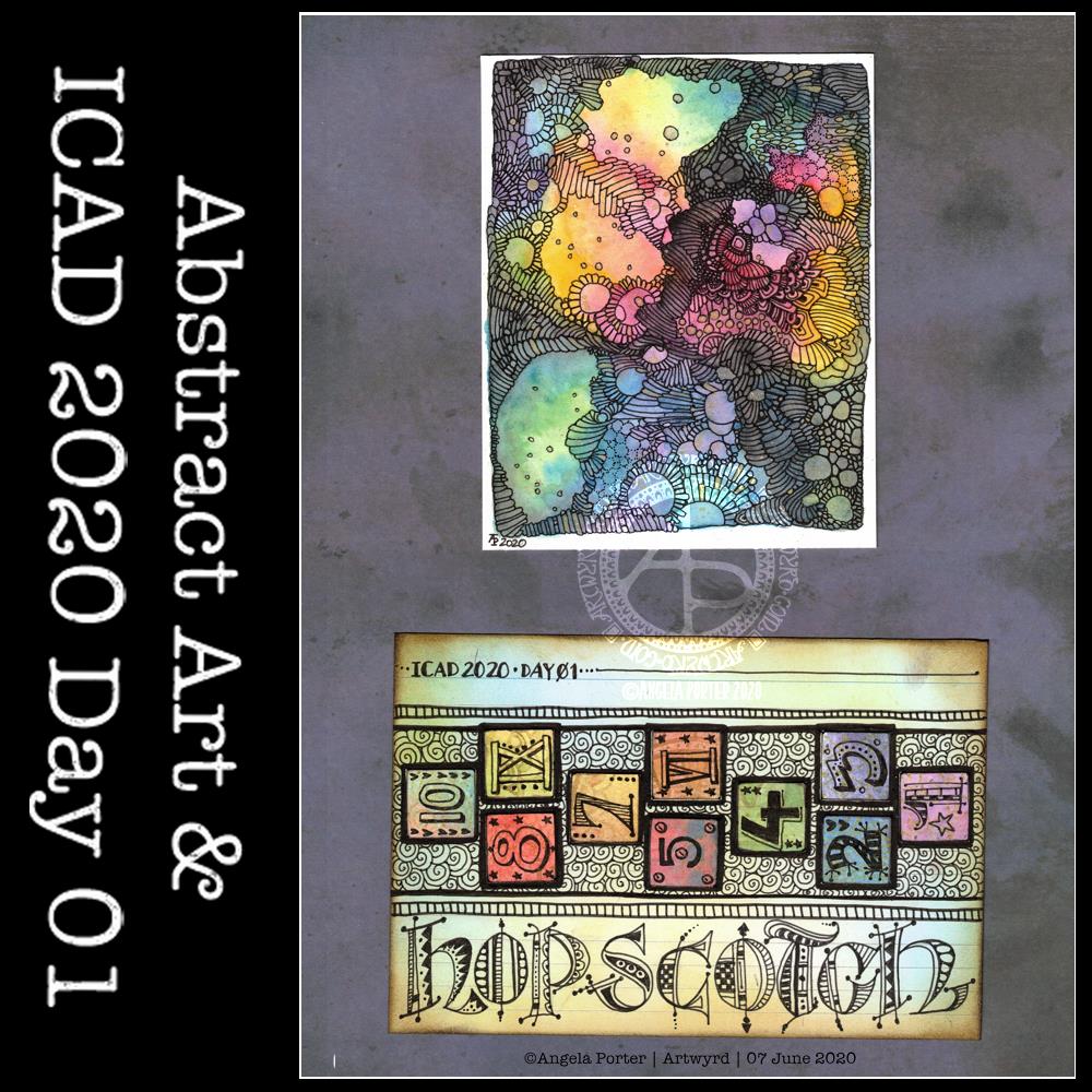
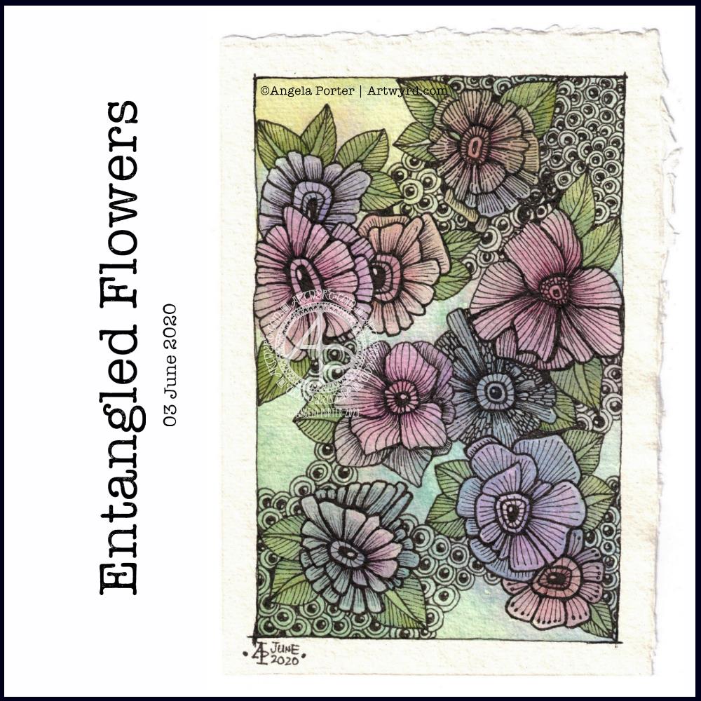
This index card #ICAD2020 #DYICAD2020 was a bit of fun to create.
I used a mixture of Distress Oxide inks to colour the 6″ x 4″ index card. The colours I used were Old Paper, Bundlesd Sage, Dried Marigold and Chipped Sapphire. I built the background up in two layers, with chipped sapphire lightly dragged across the texture that the spray of water from the first background created. A final spray of water, a dab with some paper towel to leave some bleached areas and the background was done.
I decided I’d go with the typography theme today, so hand-lettered monograms for each letter. I used pieces of Canson XL Bristol paper coloured either with Distress Inks or Distress Oxide inks. After spraying the paper with water, I squished some cling film onto the surface to create abstract patterns in the colour.
Anyway, I used 06 and 03 Sakura Pigma Sensei pens to draw the monograms. Once I was happy with the designs, I edged the monograms with Ground Espresso Distress Ink. Then, I glued them to some brown-ish card, and cut them out with a border. I edged the brown paper mat with Ground Espresso Distress ink.
I then set to adding pattern and colour with Paul Rubens metallic watercolour set. Tiny dots and highlights were sparingly added to the monograms. Then, I used the same 01 brush to draw patterns around each monogram in colours that picked up the background colours of the monograms.
My final step was to edge the index card with Ground Espresso Distress Ink.
This was a perfect little project to practice my hand lettering as well as trying out the Paul Rubens paints. It was also good practice at using a fine brush to draw patterns. I do think a finer brush would’ve worked better.
The scan hasn’t picked up the sparkly, shimmery gorgeousness of the metallic paints.
This was a really nice way to come round after I’d slept off yesterday’s migraine-y stress-come-down headache. It was a small project that I didn’t feel overwhelmed by and there was no pressure on me for it to be perfect, as would be the case for my contracts for coloring books. So, it helped me calm and settle and find that sense of contentment, for a while at least.
I took an index card and used Dried Marigold and Bundled Sage Distress Oxide inks to colour it. I spattered on water to create some bleached spots. Then, I edged the card with Ground Espresso Distress Ink.
I knew I wanted to draw a marigold, which is what I did. In fact, I drew a few. The large one is a French Marigold (Tagetes sp.). The others are pot marigolds (Calendula sp.)
All the drawings are quick, loose, sketchy ones using an 04 Sakura Pigma Sensei pen. I did use a pencil to roughly sketch out the flowers.
As the theme for week one of the ICAD2020 challenge is typography, I added some hand lettering. I also looked for a couple of quotes about marigolds, which I hand lettered.
Finally, I added a wash of iridescent orange and yellow watercolours to the flowers, sage-y green to the leaves. I also added some graphic lines in iridescent orange to the letters. And I couldn’t resist spattering some of the iridescent paint on the card itself.
I think I may add the ICAD2020 creations into my journal, or maybe make one from them as time goes along. No need to make a decision today, I’m not really thinking straight at the moment.
Experimenting with watercolours
I woke with another raging headache this morning. So, some art was in order until the pills kick in and I can sleep the dregs of it off.
I thought I’d try some ways of adding texture and interest to watercolour backgrounds.
Putting some clingfilm (saran wrap I think it’s called in the US) onto wet watercolour creates a lovely texture. It’s not easy to see but I used it on the pieces at the top middle and top right. This is something I will definitely be experimenting with going forward.
I also tried salt again, on fairly damp, less damp and almost dry. The darker pink tile under the Marigold ICAD was where I added salt to rather damp watercolour and the blooms are just beautiful.
I also tried using white gouache. I spattered it onto a couple of tiles, but I also used it mixed with water to paint into wet watercolour. It adds a really interesting effect, the opacity of gouache looking intriguing against the transparent watercolour.
Finally, I used a straw to blow drops of watercolour around. That was a lot of fun and really created random, abstract patterns.
I added these to my journal with notes on how I achieved the effects so I can reference them in future. Today, I may not remember much about what I’ve done, all thanks to the dratted headache. All due to stress/anxiety/worry yet again.
I wielded a 01 Sakura Pigma Micron pen on a colourful, abstract, nebula inspired watercolour background. There are metallic golden splashes and highlights on this drawing which don’t really show up in the scan all that well.
Sometimes, a lot of times, it’s nice to create something that doesn’t have to be anything in particular other than pleasing to myself, colourful, and pretty. And that’s what this artwork is.
The patterns formed by the lines are my way of trying to bring some kind of structure to things that have seriously unsettled me since Thursday. Art helps to settle me, once I’ve settled enough to settle to do it, that is.
Actually, creating this drawing helped me to make sense of bits and bobs. And this is a perfect example of how my inner monologue works, kind of.
It’s only recently that I became aware that there are two ways in which people have an inner monologue (read more about it here :
It made me realise that I have an awful lot of abstract, non-verbal thoughts. I’ve always thought that I wasn’t a thinker, that I didn’t mull over things the way others do. It’s always surprised me that if I’m asked a question, I have the answer,, I know what my views and opinions are, but I don’t know how I’ve come to those conclusions, or processed the information. I take in a lot of from the world around me, I notice a lot, it gets processed and stored away without me thinking about it in word-thoughts, and it’s only if I’m asked a question or talking with someone that this comes out verbally.
So, it’s not surprising, now I know about that, that I recognise what creating this kind of abstract art can be a way for me to gain insights into what’s going on with myself, others or situations.
It’s been a revelation to me to discover this about myself, the way my mind words. I mean, my mind can be a very noisy place at times when I’m ruminating about something I said or did, or something that was said or done to me in the past. This kind of rumination was out of control until just a year or two ago and it was a function of the depression/anxiety that I experienced as part of cPTSD.
Now that I’ve had EMDR therapy for a number of years, my mind is a much, much quieter place. I have thoughts, I notice things, but I just don’t have this constant voice in my head commenting very negatively about me.
With that very negative inner voice going on, it’s a wonder I ever had time to take in and process and understand information. But I did. I must have. I have a degree and a PhD. I worked for 28 years as a science teacher. Reading, learning, curiosity is part of who I am. But I’ve always thought that I was lacking as I didn’t stop to think and work things through to gain understanding the way others around me seem to.
Abstract thinking. Abstract thoughts that have no verbal form or structure until there’s a reason for me to voice them. Who would ever have thought it.
And that explains my need to journal to make sense of things, or to work out what’s going on with my emotions and so on, to catch my ‘thoughts’. It’s how I turn these abstractions into words.
An interesting realisation for me on a Sunday morning.
ICAD 2020 – Day 01 (bottom artwork)
I’d heard about ICAD in the past but never felt the need to give it a go. However, someone creating an ICAD for this year’s challenge, and it inspired me to take a closer look.
ICAD stands for “Index Card A Day” and the challenge is run by Tammy of daisyyellowart.com.
It’s an annual challenge that runs for 61 days betwixt 01 June and 31 July. The aim is to create something on an index card using the prompts, or going off-prompt. That’s it. To create something each day on an index card, max. size 4″ x 6″.
So, I thought I’d try, though I’m a week late to the challenge, but no doubt I’ll catch up. The challenge for day 01 was “hopscotch” and one of the themes for the week was “typography”.
I used a paper punch to cut ¾” squares out of Distress Ink and Distress Oxide ink coloured background papers that I have in my stash for journal making. I edged them with ground espresso Distress Ink, added patterns in gold to the ones that didn’t have any, and then used Sakura Pigma Sensei pens to add the numerals and little patterns to each tile. I adhered them to an index card I’d coloured with Distress Inks, and then outlined them in black. I added a pattern of spirals behind them, some borders. Finally, I did the hand lettering.
I didn’t try to be perfect in anything, though I did draw pencil outlines to make sure I could fit “hopscotch” across the card. It was a lot of fun to do and didn’t take up too much time either.
As to whether I’ll complete the challenge, I don’t know. However, it’s something small to do each day and I can use it along with watercolour practice I’m sure.
I’ve had a stressful couple of days to say the least and all my plans to edit templates and create new ones went out of the window. It was like I had ‘ants in my pants’ and I just couldn’t settle to anything that required concentration and focus.
Last night I was beginning to settle a bit. I’d had some news that had helped to calm me a little, but not enough. While I was attending an online talk, I drew this design on watercolour paper. I used a 05 Sakura Pigma Micron pen. I also scanned the finished drawing into the ‘puter. I really like this drawing, I have to say.
This morning, I wanted to start the day with something relaxing and meditative, so I broke out the watercolour pencils. I have a collection of Derwent Aquatone and Faber-Castell Albrecht Durer. I used them to colour the trios of large flowers at the bottom left and bottom right. For the small flowers, leaves, tendrils and the large flowers at the top I used White Knight watercolours.
I found the watercolour perncils slow and laborious on such a large scale, and I had to lay down layers to get the intensity of colour I like. However, they did mean I could control the gradients a lot more.
On larger flowers, watercolours frustrate me a bit. I can’t seem to get to the right amount of dampness so that colours will flow one into another.
I also found that by drawing the flowers to begin with, I felt compelled to paint each petal one at a time, and I found that may work against me in terms of making the most of watercolour.
Watercolour has always been a medium that vexes and frustrates me, and it’s continuing to do so at times, even as I explore adding colour. I think I’m realising that the best way for me to work with watercolor is by using it for backgrounds which I then draw upon and add more colour to the drawings.
Or, its where I make use of the randomness of loose watercolour, droping colours into a damp surface where they can bloom, flow and blend as they will, without me trying to make them anything in particular. Then, I can draw on this, picking out shapes and colours, bringing structure to where there is none, and I can get intricate with the details too.
Anyway, with the flowery drawing above, I tried to add details using some Paul Rubens metallic watercolours to add patterns of dots, as well as drawing more black or white lines onto the drawing. I really don’t feel they worked out at all well.
I knew this was going to be a bit of an experiment, and I have plenty of flowers to try out different media, such as Inktense pencils, and maybe adding more lines to to add more detail before I start coloring.
It’s been a nice way for me to spend Saturday morning, lost in art whilst listening/watching season 1 of The Clone Wars. I think I’ll continue to watch that this afternoon as I turn my attention to drawing.
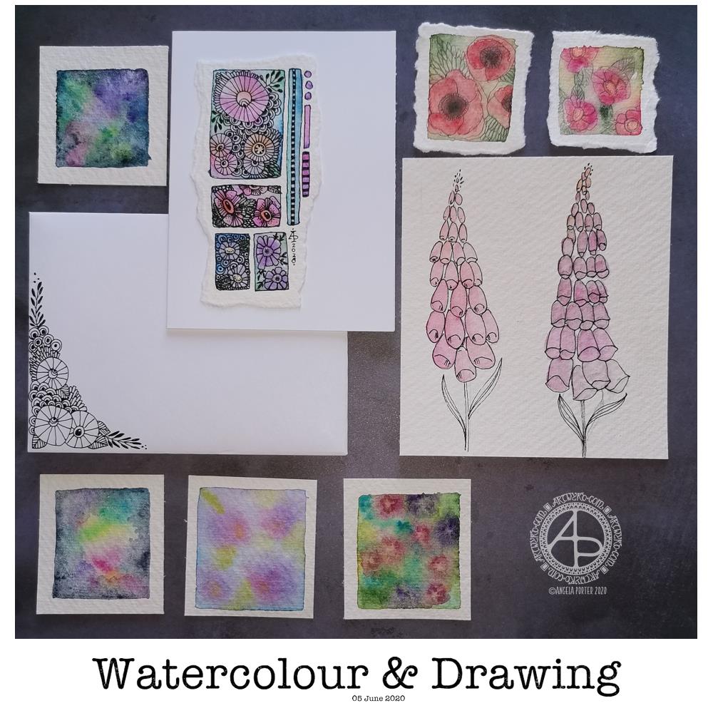
Today’s image is a collection of watercolors and drawings I’ve done over the past couple of days.
There’s a coordinating card and envelope (mail art), along with some small panels of watercolouring (approx 1.5″ x 1.5″, so a bit bigger than inchies). I’ve also included my foxglove experiments, which I did this morning.
Sometimes, black pen looks too harsh against the delicate but vibrant watercolours, so for the poppies, I tried pencil instead. I’m really not at all sure about them.
The foxgloves are symptomatic of how I feel today – out of shape, wobbly, ill-defined with harsh edges. I woke with a stinker of a headache again, definitely stress/anxiety/worry induced, as well as a lack of sleep last night. It will pass. In the meantime, I’m watching The Clone Wars on Disney+.
I don’t know if I’ll be doing any art for a few hours; my head and emotions are all bent out of shape at the moment. I’m dissatisfied with all the above; I know that’s me being so frustrated at the moment and it stops me seeing my art for how it really is. When I’m like this, I know that drawing will frustrate me, and the fact I’m not drawing will frustrate me more, especially as I have deadlines looming. However, I logically know that if I try to do things now, I’ll just prolong the feeling of frustration and I’ll end up having to do much more in the long run than if I’m kind with myself until the headache goes and my mood lifts.
The weird thing, however, is that I can sense that touchstone of contentment inside me. It’s very confusing; on one hand my emotions are really unsettled, yet there’s contentment within. My EMDR therapist mentioned that it’s a peculiarly Western view that you can only experience one feeling at a time when I mentioned this kind of thing to her. So I know it’s possible to be both discontent and content at the same time – discontent with some parts of life yet still have an inner contentedness.
So, I wander off now to sit with these paradoxical feelings, to try to relax and let the headache ease off enough that I can sleep off the extreme tiredness it will leave me with.
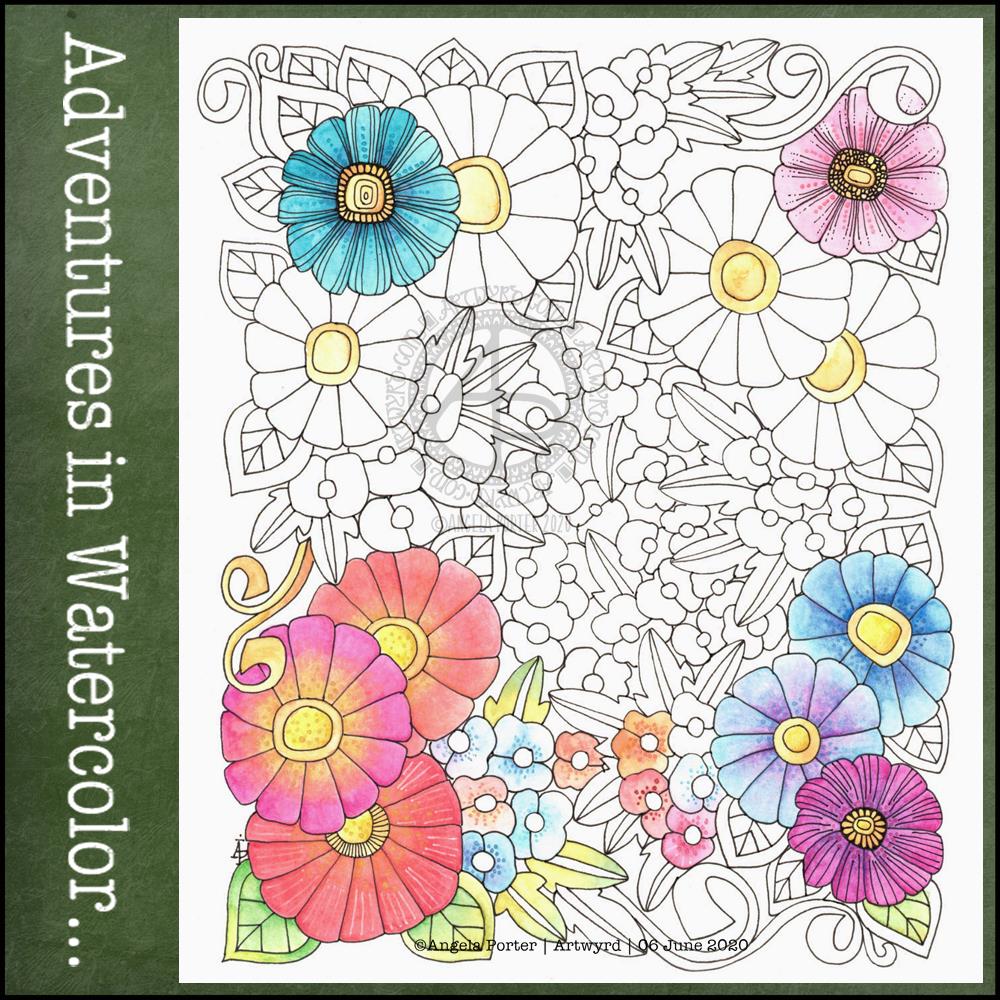
I enjoyed drawing last week’s one so much that I thought I’d do a similar one this week. Lots of tiny templates, or windows, in each one.
I drew the designs on dot grid paper using a 04 Sakura Pigma Sensei pen and scanned it in to clean it up. I used Autodesk Sketchbook Pro to colour some of the little drawings in.
I was awake before 6 am today, so I settled to do some ‘warm up’ art. I water-coloured a couple of pieces of 100% cotton rag paper. I lightly wet the paper and then added watercolour to it and let it work it’s magic – to spread and mingle as it will. The coloured area is approx 3.5″ x 5.25″, so it’s still quite a small drawing in size, but large in detail.
After letting the paper dry, I set to it with some Sakura Pigma Micron pens (01, 03 and 05) to draw the flowers and leaves. I added some more watercolor to these areas to help them stand out a bit, as well as to add a bit of extra ‘dimension’ to them. Finally, I added an outline and the ‘bubble pattern to some areas.
Mindful. Meditative. Calming. Soothing. Just the kind of activity I needed this morning. I was really irritable and frustrated and sad yesterday, all at once. I think I’ve just been overwhelmed by the events in the world over the past few days and yesterday it boiled over somewhat.
I do feel better today, so far, the cooler temperature and the refreshing rain is helping too. I hope I continue to feel better, emotionally; yesterday was was even angry at the templates I was creating for the Entangled Gardens book. Rather, I was angry and frustrated with myself as nothing seemed to be working out well. Hopefully I’ll feel better about it today.
Two fairly quick, small projects this morning – small botanical cards. Simple, cute, whimsical, darling. Little treasures.
These were fun to make, relatively quick too. They’d be darling little cards to receive in the post or in person. They’d also work nicely as an addition to a journal – a place to journal or keep little memory making bits and bobs in the envelope too.
Each card is 3″ x 4″ in size and the panels are approx 3.5″ x 2″ in size. I made the envelopes to fit and decorated them with one of the motifs from the designs on each card. I did a tiny bit of hand lettering on one of them too.
Dainty botanical illustrations in little windows, with quite soft colours used to bring them to life.
I cut a piece of Canson Moulin du Roy watercolour paper to approx 2″ x 6.75″; this would fit neatly across the 7″ x 5″ white card blank I wanted to use.
Next, I lightly drew some pencil lines for the margins I wanted to leave, before drawing the boxes using a 01 Sakura Pigma Micron Pen. I made sure I erased these pencil lines before adding colour. To do that, I used a water-brush and White Knight watercolours to add soft gradients to the windows.
Once dry, I could then draw in the botanicals with the same Sakura pen. I gave the drawings a chance to dry before adding layers of watercolour as well as dots of gold to the windows. Finally, I used a 0.3mm pencil to add some details.
While the panel was drying, I drew some of the botanicals around the bottom of the envelope, again using the 01 Sakura Pigma Micron pen.
I decided I wanted to put some kind of layer behind the watercolour panel. I thought of collaging some paper or card there, but I settled on adding a strip of soft colour there. I used some masking/washi tape to mark out the area I wanted to colour. Then, I used a mini foam blending tool along with Tumbled Glass and Peacock Feathers Distress Inks to softly colour the panel. Once I was sure the Distress Ink was dry, I carefully removed the washi tape.
Finally, I adhered the watercolour panel in place with 3-in-1 glue.
I’m quite happy with this card and envelope. It was a nice way to spend the hour or so before having breakfast this morning. It’s also a very practical way of using these little bits of art.
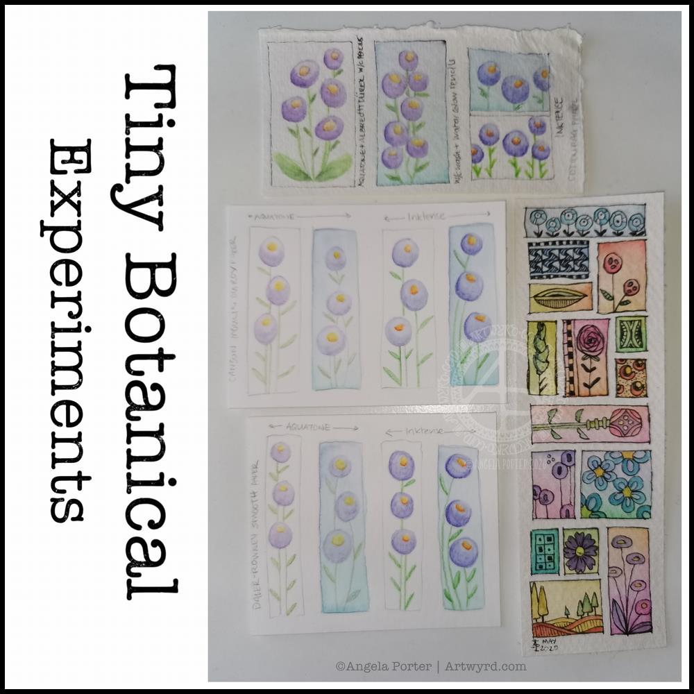
I thought I’d start Sunday morning off with some experiments with my tiny botanical drawings.
I apologise for the photograph quality – I’m really not a good photographer, something I really do need to work at! The pale colours really don’t help at all.
The artwork on the bottom right is one where I applied rectangles of watercolor on 100% cotton rag paper. Then, I used Sakura Pigma Micron pens to draw designs in the windows. Finally, I added some watercolours to the designs to help bring them forward from the background.
I don’t think I messed the drawings up at all, which was my worry. Mind you, I do have to be careful what colours I do add so I don’t make weird colours.
That led to me wanting to try watercolour pencils and Inktense pencils on different watercolour papers: top – 100% cotton rag paper middle – Canson Moulin du Roy paper bottom – Daler-Rowney Smooth watercolour paper.
On each paper, I drew four rectangles, two of which I coloured with a wash of watercolour.
I used the same colours of Derwent Aquatone and Inktense pencils to draw the stylised/abstract floral design and a waterbrush to activate the pigment. I did my best to apply the same amount of pencil in each case. However, I noticed that the papers grabbed different amounts of pencil even though I was using the same kind of pressure.
The amount of pigment grabbed, however, wasn’t at all indicative of how vibrant the colours would be.
The 100% cotton rag paper seemed to have the smallest amount of pigment from the pencils, yet it gave the most intense colours of them all. This paper is quite ‘hard’ in feel and very textured and I was surprised it didn’t seem to take as much pigment. Appearances are deceiving it seems. This paper also allowed me the longest ‘wet’ time to move the coloured pencil pigment around, and to lift some of it where it had got too intense.
The Moulin du Roy paper was a softer texture and it was lovely to colour with the pencils on it. The resultant drawings have a soft quality to them too that I rather like.
The Daler-Rowney seemed to grab the most pigment, yet the colours are not as vibrant, except the for the Inktense on the watercolour background. I think that’s because the watercolour background was still very slightly damp and Inktense pigment activates with the tiniest amount of water. I also think that’s why this one was the hardest to blend the colour smoothly. This was the paper that was the hardest to add the watercolour background to as it dries so darned quickly, or water just puddles on the surface with a tiny bit more water.
The cotton rag paper is, again, my favourite for working with watercolour and Inktense pencils. The vibrancy of the noticeable too – much less pigment is needed to get a rich colour on this paper.
For the other two papers, I did enjoy drawing the flowers on the plain paper and activating the pigment with a waterbrush. I partiuclarly like the Moulin du Roy paper for this technique, though the Daler-Rowney gave a pleasing result on the plain paper.