Entangled Cards and Envelopes

Entangled Cards and Envelopes © Angela Porter | Artwyrd.com

I’ve woken to a grey, wet, fresh day here in the Welsh Valleys. The coolness is actually quite delicious on my skin. The rain is freshening the air and world up, clearing the dust away. What a way for the weather to see out August!

It’s a perfect morning to do some artsy crafty stuff. For me, that meant finishing off a pair of cards with coordinating envelopes.

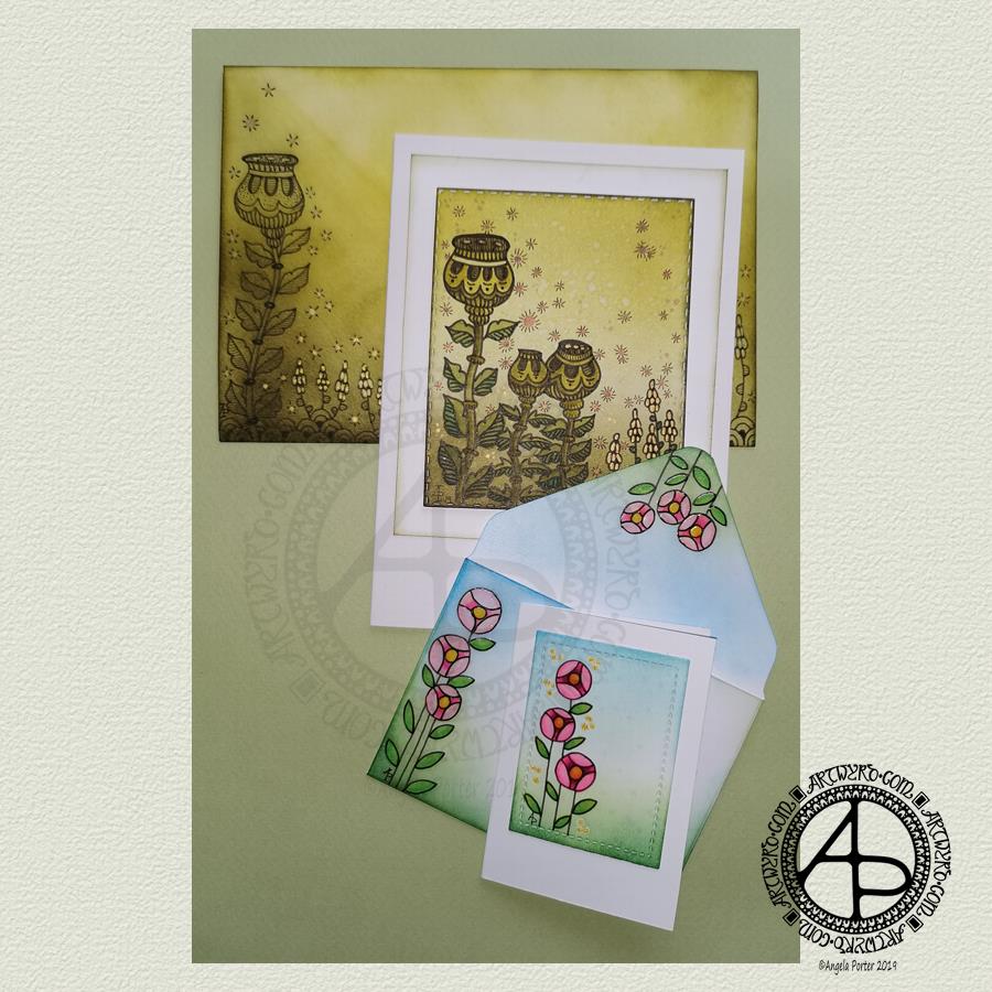
Making the larger entangled seed pods card.

The top panel measures 3″ x 3.75″, mounted on an A6 card (UK sizes). 

I coloured The envelope, top panel and the border of the middle panel envelope and the edge of the middle panel with Crushed Olive, Forest Moss and Shabby Shutters Distress inks. I used a mini foam blending tool to achieve a gradient. 

I sprayed water onto the top panel. Distress Inks react with water and results in some interesting textural patterns. I didn’t spray water onto the envelope; the paper is too thin to take such treatment.

My next task was to draw the entangled designs; I chose to go with some seed pods, leaves, a geometric pattern and some little flowers too. I added some ‘sparkle’ patterns around the main elements to give the illusion of little things floating in the air.

Next, I added some sparkle and shine with some gold and copper ink. I placed ink inside the sparkles, the seeds inside the larger seed pods and the flowers too.

I used a brush and Distress inks to add some depth of colour to the design on the card. I decided not to do this on the envelope, again because of the quality of the paper.

Once I have someone to send the card to, I will address the envelope and seal it with Distress Micro Glaze so that moisture won’t damage the envelope.

The colour choice on this card is unusual for me, but it’s worked out nicely, particularly with the gold and copper accents.

The tiny floral card.

This card is tiny, measuring just 2.25″ x 3.25″. It’s envelope is a little larger than needed, but the We R Memory Keepers Envelope Punch Board didn’t have measurements on it for a card this size, so I just used the closest available.

The panel on the card measures 1.75″ x 2.375″. It is one of the panels from the Foursquare background frames I messed up while making yesterdays cards.

I used one of my ideas from yesterdays musings on the cards I’d made. I drew a simple design on both the card panel and the envelope front and flap using Uniball Unipin pens and then coloured it with Copic markers. I added some gold glitter dots with a Uniball Signo gel pen.

Once all was dry, I used a Versamark Pen to colour over the flowers, leaves and gold sparkles. Versamark ink is colourless and sticky and is made by Tsukineko; it comes in ink pads but also in double-ended pens – a bullet point at one end and a brush tip at the other. The ink takes a little while to dry. 

I covered the sticky areas with WOW super fine clear embossing powder and used a heat tool from Ranger to melt it, giving the design elements a glossy, protective and slightly raised finish. It also intensifies the colours somewhat, which I rather like.

So, I could now colour the background and envelope with Distress Inks without affecting the colours of the flowers, leaves and gold dots. I used a mini foam blending tool along with Pine Needles, Mowed Lawn, Tumbled Glass and Salty Ocean Distress Inks.

The final task was to glue the card panel to the card blank as well as the envelope flaps.

Again, once I’ve addressed the envelope, I’ll use Distress Micro Glaze to seal the inks and prevent any damage to the artwork while journeying to the recipient.

Reflecting on the cards.

I enjoyed making these cards. I particularly like the simplicity of the small card and the effect of the embossing powder. There’s something about teeny-tiny cards that really pleases me. I think it’s that their size makes them just so darned cute!

The larger card I am also pleased with, particularly in my use of colours that are unusual for me. I’m glad I added colour to the seedpods on the card; it helps them to stand out. I do love the copper and gold ink on this darker background too and how well they stand out.

Making envelopes that coordinate with the card is also something I enjoy doing; hopefully, the recipients see them as something a bit special dropping through their letterbox.

So, what’s on the cards for today?

It’s the last day of August, so I need to get a wiggle on to create a September colouring template for the Angela Porter’s Coloring Book Fans facebook group. I feel the need to include some autumn imagery in this one as we are in the dog days of summer for sure.

Tell me, Angela, how are you feeling today?

I’m tired but feeling quite content and optimistic again. I slept well last night; the weighted blanket really is working wonders for me as far as sleep is concerned. One problem is that I don’t want to get out from under it in the morning, so it must be comforting or soothing me.

I seem to have turned in a magnet for people who have escaped narcissistic abuse of all kinds. It’s nice to be able to help others by giving them space where I will believe their experiences, and I can help them, hopefully, to understand that they are not at fault but are victims.

Synchronicity pointing out to me how much I have learned and understood and healed and am now able to help others, perhaps?

Dangle Design Greeting Cards

Dangle Design Greeting Cards © Angela Porter | Artwyrd.com

Today I have two card designs for you, both featuring dangle designs, but in different ways.

If you like dangle designs and you’d like to give drawing them yourself but need a little help or inspiration, then you may find my book “A Dangle A Day” of interest. In the book, I take you, step by step, through how to draw over 100 dangle designs, along with some ideas of how you could use them. 

Love Ya and With Love Card.

I started by using the Foursquare Backdrop: Portrait die from lawn fawn to cut the frames and panels from a piece of Winsor and Newton Bristol Board. I purchased this die, and the one in the second card, from Seven Hills Crafts here in the UK.

Next, I used Stormy Skies and Broken China Distress Inks to add a subtle colour gradient to the panels.

My idea was to draw four different dangle designs for each small square panel. I also wanted to include some hand-lettering, which I did.

So, I used Unipin pens from Uniball to do the drawings and lettering. I did use pencil outlines for the ribbon banners and lettering to make sure their placement was just right.

I coloured the design elements and charms using Copic markers. As the individual design elements were so small, I just used two colours to achieve shading in the bigger ones.

I also added a drop shadow around the designs using a BV marker that is a greyish-violet. It’s a very subtle drop shadow.

I had to add some sparkle and shine to the card, so I used a clear Spectrum Noir Sparkle brush pen along with a gold glitter Signo gel pen to do this.

To assemble the card, I glued the frame to the card base using Tombow Mono adhesive. Then, I glued the square panels into place.

I managed to get glue onto the front of the card and trying to rub it off while wet just left a dark, dirty smear. I’ve ordered some Tombow Sand erasers to see if they’ll remove the mark. If not, I’ll have to either work out another way to cover it up or just consign the card to the pile of things not to do again!

Black and white floral card.

Again, my first job was to cut out the frame and panels using a die. For this card, I used the Foursquare Backdrop: Landscape die from lawn fawn along with Winsor and Newton Bristol Board. I also decided to use this die in portrait mode.

To draw the design elements, I used Unipin pens from Uniball. I hung dangle designs from the top of each card to fill in some of the space that was there. I wish I’d used a slightly thicker pen than the 01 though. They look almost like an afterthought.

Anyway, once I finished the drawings, I wasn’t sure whether to add colour or not. So, I’ve left the pictures as black and white line art for now.

I used Tombow Mono glue to attach the frame and panels to a 5″x7″ piece of Winsor and Newton Bristol board. I did this as I realised that the dies are made to fit card blanks made from half a sheet of US letter-sized paper folded in half. In the UK, we use A4 sized paper, which is different enough in size to make it awkward to cut the paper to fit the card. I have ordered some 5″ x 7″ card blanks with envelopes, and then I can finish assembling this card. I’m likely to trim the foundation panel down a little and maybe try to carefully add some colour around the edge. Maybe.

It’s at this point I’ll decide whether or not to add colour and to see if I can thicken the lines around the dangles without messing it up. Mind you, if I do mess it up, it’s another experiment I can learn from, hopefully remembering not to do this again.

Things I’ve learned and techniques I want to try.

The lawn fawn dies work great! They come with smaller dies – heart, cloud, small star, large star, sun, small sun and speech bubble – which may be useful in the future. I had made my mind up that I’d limit myself to die sets that are simple in shape to for cutting out panels to draw on and maybe for layering. 

I rolled my eyes at myself when I worked out that dies from an American company would work best with American sized paper for card bases. However, I can work around that now I’ve realised that. I’m comfortable working with inches; most of my craft tools have both inches and centimetres on them. However, the inches are visibly the most dominant measurement system. 

Glue. Me and glue. Not sure how I can avoid smearing in the future. Hopefully, the sand eraser will help to remove my gluey, sticky, dirty-looking mistakes.

I like using Distress Inks for backgrounds. However, the pale colours of markers that I prefer to use are translucent and so combine with the background. I could use other media such as coloured pencils for colouring. Or I could use distress inks or water-based marker pens with a damp brush to add colour. I could also use a damp brush to remove some of the distress inks. In that case, I may have to use watercolour paper instead of Bristol Board.

I could also use a Versamark pen – which contains transparent, sticky ink – to colour over my design elements once coloured and then use clear embossing powder and a heat gun to protect the colours. I could then add the distress inks after heat-setting the embossing powder. The embossing powder would add some dimension and shine to the cards. If I used a sparkle pen or gold gel pen, for example, the embossing would encase it and highlight these embellishments Ieven more, I think. I need to try this idea out!

So, there are lots of possibilities for going forward with this.

So, Angela, how are you feeling today?

I’m feeling the more content and optimistic than I have for the past two or three weeks.

I’m still feeling out of kilter; changes are happening in my perceptions around my emotional/mental wellbeing. I’m also aware of shifts that are happening in other parts of me.

I’m still poop-scared about what is going on in the world. I can’t see that ending anytime soon, however. This, and the rest of the emotional rollercoaster I seem to be on, are still upsetting my digestive system, so I’m not feeling too well much of the time. 

Yesterday, I was so unsettled and scared that I couldn’t settle to do much art, and I became so dissatisfied and frustrated with whatever I did. I couldn’t settle to anything else either – not crochet, reading, nothing. 

As I’ve said, today I do feel better, so I need to turn my attention to trying out Affinity Publisher to create some materials I’ve been commissioned to do (the artwork and inserts for a CD by a band!). I’ll see about setting the templates up first and go from there. I’ve not tried to do this the past couple of days as I know my head and my emotions weren’t in the right place. I’m not sure that they are today; it’s only by doing that I will find out whether they are or not.

Entangled Parchment Craft Cards

Entangled Parchment Craft Cards © Angela Porter | Artwyrd.com

Entangled in blue – a greeting card.

Yesterday, I mentioned some things I’d like to try out after my experience creating a greeting card using vellum and Distress Inks along with some die-cutting.

So, rather than take the nap I’d said I was likely to, I endeavoured to make another card in the same kind of entangled art style. This time, the two Distress Inks I used were Peacock Feathers and Mermaid Lagoon. 

I used these inks to colour the reverse of the vellum and to add colour to the card base – Mermaid Lagoon at the top, Peacock Feathers at the bottom and blending them in the middle.

I used the piece of card I’d cut the frame from as a stencil for the addition of colour, so I was sure it wouldn’t bleed out of the edge of the frame. 

After dry embossing the design on the vellum, I passed it just once through a hot laminator. The vellum became flat without losing too much of the definition given by the dry embossing.

I trimmed the vellum panel so it would fit neatly under the frame. I adhered the vellum to the frame using strong double-sided tape.

I wanted to lift the vellum above the card base. I doubled up some double-sided foam tape, using thin strips. In hindsight, I would’ve been happier with just one thickness of the foam tape. 

By applying the Distress Inks to the card base the colour has been intensified, and the dry embossing stands out better. I’m quite pleased with the result of this card.

I do wish I hadn’t added the gold dots around the frame though; I thought I needed some to complement the gold dots that I added to the entangled design. 

On the whole, I’m much happier with the entangled in blue card. 

I’ve just thought that it could be relatively easy to turn that panel into a shaker card by making sure the space beneath the vellum is completely sealed by the foam tape at the edges and then adding some sequins and/or glass beads — something for me to try another time maybe.

Comfort art.

The drawings in both of these panels are an example of me slipping into ‘comfort art’ mode. I tend to draw this way when I’m feeling emotionally vulnerable or fragile. Entangled art like this is familiar to me, like a comfortable pair of old slippers, and it soothes me somewhat.

Entangled art is very much my ‘style’ of art. Digitally, I’m pushing my boundaries with it by not using black outlines or outlines in any colour. When I feel the way I have in the past few weeks, it can be tough for me to settle into art that challenges me even a little bit and digital art has been doing that. That’s why I’ve started many projects and not finished them; I get dissatisfied with what I’m doing and just stop it. That’s a sign that I really am not feeling as balanced as usual. 

In the past, I’ve mentioned that redrawing my favourite patterns and motifs in a zibladone ( a mixture of journal and random notes or interesting things) is comforting, soothing to me. I have only just noticed that drawing in this way is also so.

The challenging thing in these cards is the die-cutting and the use of various adhesives. And scissors. Scissors always cause me problems. Although I’m mostly right-handed, I use scissors in my left hand. I use right-handed scissors, and I find that problematic, but left-handed scissors are even worse for me! Craft knives have their own added issues for me.

A little more of a challenge.

Today I received two die sets in the post, both from Lawn Fawn and from Seven Hills Crafts. They’re the foursquare landscape and portrait backdrop die sets.

I want to try to make a pair of dangle design cards with these for tomorrow. So that’s one of my tasks for this afternoon.

So, Angela, how are you feeling today?

I’m OK. I’m tired; I drove for over four hours yesterday, and when I got home, I was not only exhausted but cold as well. I didn’t sleep all that well as I didn’t warm up until around 6 am and I kept waking up shivering.

I’m experiencing a lot of anxiety and even fear about the current state of the world; I feel tearful about this a lot of the time and not very optimistic. 

Other than that, I think my life is settling down into a new kind of ‘normal’ after spending time with my friend and his partner last week. I still have lots of things to sort out that were stirred up from the pandora’s box of trauma within me. But now they’ve been identified they can be processed in EMDR.

Being tired makes me a lot less resilient to all this.

Entangled Vellum Greetings Card

Card Making

Today I thought I’d make a little greetings card.

Card Dimensions.

The card measures 4½” x 5½” (approx. 10cm x14 cm). The outside of the frame measures 3″ x 3¾” (approx. 7.75cm x 9.5cm).

The vellum panel.

I started with a piece of vellum die cut to the size of the frame. To add colour to the vellum, I applied Twisted Citron and Pine Needles Distress Inks with a foam ink blending tool to what would be the reverse side of the vellum panel.

This was something new to me and a bit of an experiment to boot. The inks blend very smoothly on vellum, though you do have to be extra careful not to bend the vellum. That leaves a noticeable crease in it that can’t be removed or easily disguised. I managed to bend a corner; however, as I was going to trim the vellum down later, I wasn’t at all concerned.

I was surprised at how quickly the inks dried on the vellum, and I was soon able to work on adding my embossed design.

To do this, I used some ball ended embossing tools on the reverse side of the vellum. I drew an entangled art design with them as I would when using a pen on paper.

Once I’d drawn my design, I added some shading using a Pergamano shading tool as well as some dots in the upper part of the image.

Dry embossing on vellum causes the vellum to curl somewhat. So, I passed the piece through a laminator. That corner that I’d creased while ink blending got firmly creased during this process. However, I knew I’d be able to hide it with the frame I’d planned to make.

At this point, I added some gold dots to the ‘sky’ part of the design. To do this, I used a Uniball Signo gold glitter gel pen. I can’t resist adding sparkle when I can.

My last step was to trim the vellum to ¼” (7mm) smaller than the frame.

Making the frame.

To make the frame, I used some stitch edge rectangle dies from Gemini by Crafter’s Companion along with a Sizzix Big Shot machine along with some white card. I cut three frames out, doing my best to centre the inner die to the outer die.

I used some Tombow Mono Liquid Glue to stack the three frames. It was then I noticed I’d not centred the inner die precisely the same on each frame. I can see where they don’t quite perfectly match up.

I decided to use them and learn from the process. I’ve never made a frame like this before, and this card really was, in many ways, an experiment.

Assembling the card.

The next task was to attach the vellum to the frame. I carefully applied a very thin layer of the Tombow glue just inside the inner edge of the frame. I carefully added the flattened vellum to it.

The vellum, though, had started to curl again and try as I might to flatten it out, it just wasn’t going to play ball. In hindsight, it may have been better if I’d trimmed it and run it through the laminator just before attaching it to the frame. Then, to keep the vellum flat on my worktable and apply the frame to the vellum.

The last step was to use glue to attach the frame to the card base.

Thoughts on the card.

Even though I’ve bungled a couple of things, I’m quite pleased with how the card has turned out.

Flattening the vellum through the laminator has decreased the intensity of the white embossed lines. However, I didn’t pass it through once, but a few times to see if I could get the corner to stay down. When the vellum got stuck in the laminator, it took me a while to dig out a pair of tweezers to pull it through. That introduced a bigger curl in the paper than I had to start with! I decided then that the only way to flatten the vellum this way was to use a folded piece of paper to act as a carrier for it.

It was a good idea in principle. In practice, I made mistakes and will learn for the future.

Die-cutting and stacking multiple frames. How to get the inner die centred the same as the others? I don’t know. Maybe I should try washi or craft tape the dies together. I will work it out as I like the look of the frame!

I do like the look of the embossing on the coloured vellum. The white lines are quite soft, though less prominent than I wanted them to be as I reduced them by trying too often to flatten the vellum through the laminator. It’s a rather ethereal looking design, and I like that. Sometimes I find my usual black line-art too stark against colour.

The white background of the card doesn’t help the white to stand out. Maybe I’ll try to add colour to the card base and then apply the coloured vellum over it. That’s an experiment for another day, perhaps. Or maybe soon when my mind is still on it. I think I have time before I need to head off out this afternoon.

So, Angela, how are you today?

I’m feeling tired and a bit spaced out, yet contented.

Therapy yesterday was emotional and distressing. No EMDR was done as I was too emotional for it, and I needed to talk about somethings that I’ve touched upon in recent blog posts.

My weighted blanket arrived yesterday, and it is rather lovely. I don’t know about making you feel you’re being hugged; I’ve only laid down under it so far. However, it feels so lovely that I just wanted to stay there this morning. I will try wrapping it around my shoulders and so on to see how it makes me feel that way.

I mention this as I slept in the evening under it, and through the night. Although I still feel tired, I know I had a good sleep. I may get in another sleep before I need to head out later today, depending on how lost in art I get. I do have a relatively long drive (around 2 hours) to where I need to be, and another 2 hours home, so a good sleep is perhaps in order.

Despite some good sleep, I’m still quite tired. The emotional rollercoaster of the past two weeks or so is taking it’s toll on me, even though I’m making sure I’m practising self-care and self-soothing.

Doing a short art project this morning – the greetings card – is a self-soothing activity. The style of art I created – my entangled art – is familiar enough to me that it is comforting to do. It’s comfort art, which is healthier for me than comfort eating.

Talking of eating. The emotional upsets of the past few days have taken their toll on my digestive system too. I had a badly upset stomach yesterday, and I’m still feeling quite tender in my abdomen today.

This is not an uncommon side-effect of either therapy or emotional rollercoasters for me. As I feel emotions so much in my abdomen, particularly fear and anxiety, then it’s no surprise I end up with sudden trips to the loo!

As I settle down, so my digestive system does, and things return to normal, eventually.

I’ve said this before, and no doubt I’ll say it again, this is part of the healing journey. Events sometimes seem to conspire to shake up the next layer of trauma from the past so it can be processed and I healed.

A few days or a few weeks of painful emotional turmoil is a small price to pay for the eventual years and years (I hope) of a life untroubled by and not held back by my past. A future where I can form those healthy relationships of all kinds with others that I yearn for, a yearning that has recently been reawakened, along with its attendant traumas.

The dos and don’ts of self-care.

The do-s and don't-s of self-care © Angela Porter | Artwyrd.com
The dos and don’ts of self-care © Angela Porter | Artwyrd.com

Dos and Don’ts

Yesterday was a quiet yet busy arty day. I worked on some projects, but by the evening, I had a hankering for ‘comfort art’ to soothe my fragile emotions. I’d seen a similar list on facebook and thought it would be nice to do one of my own. Naturally, I just had to add some embellishment in the form of my style of drawing. The drawing then needed some colour. So, I started to add colour.

After typing out the list using Affinity Publisher and printing it out, I used a 08 Uniball Unipin pen to add the drawing. Next, I scanned the design in and then started to add colour in Autodesk Sketchbook Pro using my trusty Surface Pen and Surface Studio, both from Microsoft.

My lines are a little less than perfect in the drawing. I’ve noticed a few tiny smudges and some places where the lines have overrun each other a little. I’ve left them as they are, this time.

I thought it might be a good idea to make the colouring a little less than perfect too; so I added a background texture.

About my art and my emotional state.

I seem to have started a lot of projects and not finished them of late. I’m not quite sure why that is. I know I’ve had a really tough time of it emotionally speaking over the last couple of weeks. I think that has a lot to do with it.

I have managed to settle down to get work done for a commission. The main artwork is now done, it’s just doing all the other stuff to go with it. Today isn’t the best day simply because I’ll soon have to sort myself out to go off to EMDR therapy; that’s likely to be emotionally distressing as there’s been a confluence of events in my life that have all triggered emotional reactions. I’ve also not had that much time to let the emotional waves calm. There have also been changes that need to become familiar too.

Today is the first time in a few days I’ve felt anything like settled. Yet I’m not settled fully. I keep having waves of fear followed by tears rising up for no apparent reason.

I think I know what the fear is about. The way I think and feel about a part of my life is changing. It had started to change before the experience, but now it’s really settling in. A yearning in me to ‘belong’, to have that sense of companionship, has been awakened once again. I’ve been given a taster session of what it’s like. So, I’m grieving the lack of that in my life, and fearful I won’t find it going forward. Kindred spirits are few and far between.

This is all part of the journey towards releasing trauma and healing from cPTSD. It’s also about replacing old, unhealthy outlooks with more positive and healthier ones. Grief is involved; even if the old beliefs are harmful, they have been a part of my life, and it’s still a loss. But go they must so something healthier can replace them.

Change is never easy, but it is necessary; for growth, for healing, for a better life.

You Matter by Nikita Gill – Artwork WIP

You Matter by Nikita Gill | Artwork by Angela Porter

After a few very tricky days with emotions and time away with a friend and his partner I finally got some work done on this, and also another project I have on the go.

Digital art – Autodesk Sketchbook Pro, Microsoft Surface Pen, Microsoft Surface Studio.

I’m really very emotionally fragile at the moment. Lots of things have stirred up things and it’s taking time for a settling to happen and me to find the new place of balance. The contentment is still there, but the waves on the surface are strong at the moment. Changes are happening and it takes time to settle into the new state of things emotional and mental. But settle they will, as will I. I have EMDR therapy tomorrow …

Mail Art – sneak peek

Mail art – sneak peek © Angela Porter | Artwyrd.com

Making the mail art

I woke this morning and had a fancy to make a card along with a coordinating envelope. I’m going to be sending these to someone, so I didn’t want to show the whole design, so a sneak peek it is. I don’t think it gives much away about the mail art. I hope it doesn’t spoil the surprise for the recipient.

I used a pre-made card blank and envelope. The card is nearly 8½” x 4¼” in size and is plain white.

I cut a piece of Winsor and Newton Bristol board to 3½” x 7½”. I added some score lines ⅛” in from each edge and let them overlap to form little squares at the corners. To do this I used a score board and bone folder. I’ve never done this before, but it actually adds a nice touch. It also gives me an even border to work within, which is always useful.

My next step was to add colour to the top layer and the envelope. I decided to do some ink blending with Distress Inks. Here’s a list of the colours I used:

  • scattered straw
  • wild honey
  • crushed olive
  • candied apple
  • evergreen bough

Once I was happy with the colour gradient, I broke out my Uniball Unpin pens and started to draw the design. As I had a coloured background, I made use of lines and patterns to add texture and dimension.

When I was happy with the design, it was missing something. It needed some colour or shading. I decided to add some colour with Copic markers, being mindful of using colours that would work harmoniously with the background.

My final step was to add some dots of gold glitter to add some ‘bling’ to the card.

My attention then turned to the envelope.

First, I added some pencil lines to help me keep my hand lettering level and neat. I then used a black Tombow Fudenosuke pen to brush letter the recipient’s name. I then used a grey Tombow Fudenosuke pen to add shadow to the letters.

I then used a Uniball Unipin 08 pen to add the address. For this, I used simple capital letters for the hand-lettering.

My next task was to draw the design on the envelope. I used some elements from the card for this, plus a couple of extra ones. I also added texture and shadow with lines.

My final task, after I’d written my name and address on the back of the envelope, was to seal the envelope art with a thin layer of Distress Micro Glaze, carefully avoiding the area where stamps will be affixed. The Micro Glaze creates a waterproof layer so the Distress and Tombow inks shouldn’t run if they get wet.

Once the recipient has the card, I’ll post a full image of the mail art, carefully obscuring their information.

So, Angela, how are you today?

I’m ok today. I’m a tad tired, but I don’t seem as emotionally fragile as I have been. There’s still a bit of ‘flatness’ or ‘heaviness’ inside me, but the contentedness is of equal or greater intensity.

Today I need a quiet day at home; the last week or so has been crazy busy with either emotional upsets occurring or commitments I have to keep. The next commitment I have is on Thursday evening, so I’m going to make the most of the time I have to myself. Creating mail art was one activity in self-soothing.

I doubted that I would find this more settled state any time soon. That it’s appeared today is a real bonus. How long it stays for I don’t know as I know what is in my diary.

I’m not going to worry about that, well not much. I’m going to enjoy the contentedness and Use my quiet time to soothe my still fragile emotions.

Yes, I feel mostly content, but I also know that it won’t take much to provoke me to tears and some emotional distress.

One thing we talked about in therapy on Monday was the need for me to protect myself in situations where I’m emotionally vulnerable. I’ve had a lot of time interacting with people over the past few days. I now need time to relax, breathe, re-energise.

I enjoy being with people, but it also drains me. That’s one of the consequences of being an introvert. When I’m socially exhausted, it makes me more emotionally vulnerable than I usually am. So, I need time to recover from this.

I will recover. Nowadays, I always do given enough self-care and self-soothing time.

I also am self-aware enough to know that to start important projects is not a good idea at this time. It becomes all too easy for me to find fault with everything I do and for me to end up spiralling downwards into a mood where I am harsh to myself.

It is still hard to be kind to myself on days like this. There’s a nagging voice that I should be doing this or doing that and not indulging myself in activities that help me to heal. Other inner critics join in, telling me I’m worthless, useless, a failure, unloveable then join in, sensing the vulnerability in me. So, I’m learning to ignore that voice, even if I still feel a little guilty. As I feel better, refreshed and re-energised and more emotionally resilient, the inner critics become inaudible once again.

So, as hard as it is to accept that I need to be kind and to spend today doing what will help me heal, this is precisely what I am going to do. And that starts with me writing a letter to accompany the mail art. I also want to create some designs that I can print to colour and use to create greeting cards.

You Matter – a poem by Nikita Gill

You Matter by Nikita Gill; Artwork by Angela Porter | Artwyrd.com

The poem.

I was reading ‘Your Soul is a River’ by Nikita Gill this morning and this particular poem struck a chord with me. I thought it would be nice to use it to create some art to frame it.

It’s taken me a few attempts to get this far today; and I’m not entirely happy with what I’ve produced. However, I shall persevere later today; first I need to go out to do some provisions shopping and to have a very late breakfast. Actually it’s more like a very late lunch!

I produced the words with the border in Publisher. I’m using Autodesk Sketchbook Pro, a Microsoft Surface Pen and a Microsoft Surface Studio to do the artwork.

So, Angela, how are you today?

The poem reflects rather well how I’m feeling about myself in the moments when my emotions overwhelm me. I am rather emotionally fragile and vulnerable at the moment.

I am exhausted – emotionally and mentally. I’ve had a heck of an emotional week and yesterday was perhaps the most emotional day of all. No EMDR was done in therapy, but lots of tears were shed as I tried to work my way through what has caused the upsets.

Some of it is very obvious. But some of the triggering events have no apparent link to the past.

No apparent link; there’s something there which I can’t bring up or face at the moment. I’m fearful of it because it is something either unknown or something I have to face the truth of. It’s a difficult truth as I’ve told myself a story to deal with the painful experiences I’ve had throughout my life. Discovering I’ve been lying to myself is not easy, even though it has been a coping strategy, trying to make things more pleasant than they really are.

It’s a common coping strategy amongst survivors of trauma.

It’s a necessary process, for how else can I heal from the past?

It’s another one of those processes that is like surgery, but instead of removing or fixing a physical part of oneself that is damaged or broken it’s all about the mental and emotional processes that are damaged by trauma in the past.

No surgery is without some kind of pain, but the pain is endured as the result will be a better life with less pain.

Therapy is surgery for my damaged emotions and beliefs about myself; this surgery is necessary for me to heal from CPTSD.

My touchstone.

Yesterday, I talked about a lot of things with my therapist. One of those things was the recognition that I now have a mental and emotional state that I know I can return to. It’s that state where I feel content and optimisitic, a state of mind and emotions that I’ve not really experienced much in my life.

I know how that feels; even though my emotions are all higgledy-piggledy at the moment I can still sense that inner contentedness and hints of that optimism.

Where do I go from here?

Self-care and self-soothing is the order of the day today. I do need to sleep, but I don’t know if a nap will help or just throw my sleep out tonight.

I know this will pass; it has before, it will again.

It’s all just a bump in the road I’m travelling in my journey to recovery from CPTSD. This is NOT my destination; it’s just the wrong leaves on the tracks.

Monday Mandala

Or, mandala Monday?

Monday Mandala 19 August 2019 ©Angela Porter | Artwyrd.com

I’ve spent a little time this morning working on this rather sunshiny mandala. It’s not finished yet and I’ll think I’ll keep the sunrise (or sunset) colour theme for the rest of it.

Digital art using Autodesk Sketchbook Pro, Microsoft Surface Pen and Microsoft Surface Studio.

So, Angela, how are you feeling today?

I am feeling tired today. I woke with a headache and tried to sleep it off and woke again with it still there. I’ve taken some Anadin extra, but it’s still faintly there.

I’m feeling tired emotionally too. I’ve had a couple of things happen this past week that have caused some quite visceral emotional reactions. Some of these events I’ve mentioned in previous blogs, others I’m not at all comfortable to share, not even with my therapist, not yet that is.

I constantly feel on the point of tears, and I know what has been the trigger for that. I also thought I’d got past it, but obviously not. That disheartens me a little. It may be there are different facets to this particular collection of relatively recent events.

Oh, the joys of living with CPTSD. It’s not described as complex for no reason at all.

Despite the tearfulness and some fearful anxiety, I can still touch that inner contentedness that I have cultivated. The contentedness is the ocean; the tears, anxiety, fear, the stupidity I feel, as well as other emotions I can’t label yet, are the waves on the surface.

Waves come and go. Sometimes the ocean surface is as calm as a millpond on a still day. Sometimes it’s as turbulent as tsunami rising onto a beach.

The surface of my ocean of contentedness is somewhat choppy, perhaps verging on stormy, but far away from being at the level of a tsunami.

I do have EMDR therapy soon; there’s a very good chance it’s going to be a rather emotional session. I just hope it doesn’t add energy to the waves that are currently forming upon my inner ocean. Given how emotionally fragile and vulnerable I feel at this time, I won’t hold my breath!

Mandala 15 August 2019

Mandala © Angela Porter | Artwyrd.com

This is definitely a ‘not sure about it’ verging on the ‘I hate it’ work.

It was doing great until I added that grey area, and it all went to pot I think. I do struggle with colours at times that’s for sure, and it’s gone downhill from there.

I’m kicking myself for combining all the layers at that point. I’m working digitally, as is my preference for mandalas. I could leave the various ‘rings’ as separate layers until I’m finished. Or I could just save versions of the work as I go along. However, I didn’t. Maybe I’ll remember to do this in the future. Mind you, I won’t be holding my breath on that one.

I don’t want to go and change the grey areas; I really don’t have the motivation to do so. Also, to edit that digitally would be really fiddly and awkward and I know I’ll just get myself into a bit of a state. I’m frustrated with myself for being a twit and not saving the mandala in layers.

On reflection, I now know that my emotional state last night affected my work.

The bright purple, pink, yellow and green central section really reflected my contented, optimistic mood rather well. Then, I went out to visit friends in the evening, and something happened that triggered me into full flight mode. I almost ran (and I don’t do running, ever), straight to the safety of my car and I drove away.

One of them phoned me as I was driving home and persuaded me to return. I had to sit in my car for a long while, just crying until I was ready to return. When I did return to them, floods of tears happened again.

I’m self-aware enough that I now understand what my flight was all about. Also, I’ve gained an insight into what I’m processing in EMDR, which is going to be of value in next week’s session.

I can’t believe how suddenly I flew away. I had no chance to ground, breathe, think through things logically. It was a very visceral reaction.

An hour or so later and I was laughing and smiling once more. However, I can see from this mandala that my mood was severely affected as I worked on those grey areas last night before bed.

I don’t think I can save this mandala now.

Whatever I have added to it just doesn’t work. I’ve tried changing the background colour and darkness/lightness with no luck as well. So, it’ll be one of my rare pieces of art that won’t be finished.

Working on the mandala did help to soothe my emotions before I retired to bed, so it’s not all negative. I think that’s why I can now leave this as it is. It’s served its purpose for me.

Actually, thinking about it I have quite a few pieces that I’ve not finished and am now not likely to do so for various reasons. This particular mandala, however, is one that shows me just how much my art can reflect my emotional state.

That is something new for me; it’s not often, if ever, my emotional state is reflected in my art. Looks like that’s changed! Or, at the very least, I’m just aware of it now.

So, I’ll start with a clean state, metaphorically speaking. I also think I’ll create a limited palette to use with the next mandala. That may help me with my colour issue at the moment.

Also, I’m awaiting delivery of my Chameleon Fineliner pens in a couple of hours. So, I know I’ll want to ‘play’ with them. I suspect some art with pen and paper will be appearing on the blog tomorrow, even if it’s just a sheet of experiments with the fine-liners both in drawing and hand-lettering and handwriting. Maybe there’ll be a dangle design too. At the moment I don’t really know myself.

So, I’m going to get myself another mug of tea and ponder what I want to do artistically/creatively for the rest of the day. I also need to write about last night’s flight and process it as best as I can.

Oh, I used my favourite digital art tools for this – Autodesk Sketchbook Pro, Microsoft Surface Pen and Microsoft Surface Studio.