Custom Sketchbook

The sketchbook

Last weekend, I made a small sketchbook that would hold approx 4″ x 4″ pieces of paper that was held together by book binding rings. I thought this would be a good idea as I like to work on small pieces of paper.

Then, last night I tried taking some prints from alcohol ink designs on A5 paper. I really didn’t want to cut them up to fit into the smaller custom sketchbook. I also didn’t want to use the metal binding rings again.

I woke this morning with the idea to use a disc binding system to create a custom sketchbook-come-art-journal.

I have been using an A5 Arteza mixed-media sketchbook for this, but it has rapidly become very, very wedge-shaped. I also realised that I want something where I can add a variety of sizes and types of paper, as well as move them around to suit my needs. A disc bound system seems to be the best way for me to do this.

I’ve yet to work out a way to make a hard cover for the sketchbook. For now, I made each cover from two sheets of A4 pearlescent card glued together. They’ll be sturdy enough until I work out how to reinforce them in some way.

I decided to place the disc binding on the landscape edge, just for a bit of a change, no other reason. I’ll be able to take the paper out of the binding to work on. This actually suits me just fine as the spines of sketchbooks really irk me when I work in them, be they sewn or spiral bound.

What I also like about the disc binding system compared to the book binding ring is that the holes in the paper are much closer to the edge. It’ll be much easier to leave a ‘margin’ on the paper.

Of course, there’ll be plenty of times when I’ll work in a commercially produced sketchbook still, especially as I’ve now rediscovered the joy of using one again. However, the ability to colour paper, use different kinds of paper and sizes of paper really appeals to me as a variation on the sketchbook theme.

The different sizes of papers also add a bit of intrigue to the sketchbook. There are glimpses of other designs and backgrounds further on that add to curiosity.

I can choose to add notes either to the back of the work or on sheets of dot-grid or squared paper I’ve added.

Nor am I precluded from adding journaling elements such as envelopes and pages with pockets, for instance.
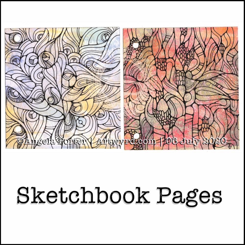
Abstract art

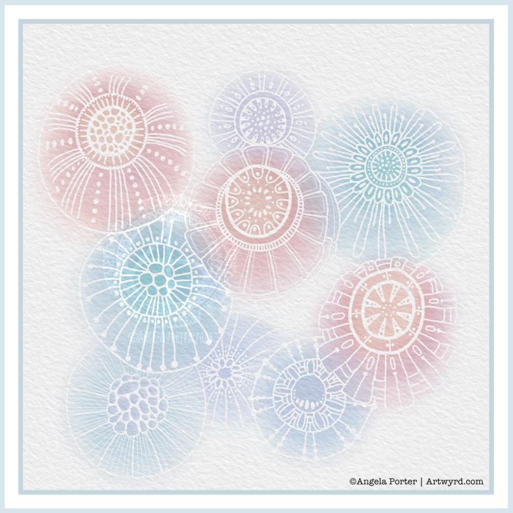
The top page is an abstract drawing I completed this morning. The colour and pattern on the paper (a piece of ClaireFontaine Paint-On mixed media paper) was added by taking a print from alcohol inks on Yupo paper.

I spent some time yesterday evening experimenting with alcohol inks on Yupo paper (a synthetic paper). Once I was happy with what I’d made, I added some Alcohol Lift-Ink and used a brayer to spread it over the design. Quickly, I placed a sheet of mixed-media paper on top and allowed the alcohol inks to be transferred. If you’d like to know more about this technique, pop over to the Lavinia Stamps YouTube channel; they have lots of videos showing how this is done.

The inks lose their vibrance and become more muted when this is done, but it means it’s much easier to draw on the design without wrecking pens in the process.

I used Pitt Artist Pens by Faber-Castell to draw the abstract design on the paper. Once I was happy with the design, I added some metallic/pearlescent paints in shades of orange and yellow to some of the white/pale circles in the design. Sadly, the photograph hasn’t picked this up.

I decided to not to cover the whole paper with the drawn design. I wanted to leave some areas of the background as they were.

I really enjoy working like this – creating a colourful, textured background which I then use as inspiration for the line-work. It is, for me, a very meditative process. Of course, patterns and forms appear that I can then use in future artwork.

Of course, I could choose to intensify the colours in select places using any variety of media. Today, I have chosen to leave this as it is. I may scan it in and try this out digitally at another time.

Digital or Traditional Art?

Both! For me anyway. I do love working in both ways, and using them in concert too.

I love the portability and smaller scale of paper and pen/pencil, as well as using other traditional art and craft media.

I also love creating art digitally, sometimes using backgrounds I’ve created using traditional media or pen and ink drawings.

Each has their pros and cons. Each allows me to do things that the other can’t.

One thing I do know, however, is it takes time to become skillful in each and also to find your own artistic voice (or voices) for each medium used.

Which I use at any given time depends on the style of art I need to do, what kind of ‘finish’ I want with it, and also what my arty heart and soul requires at the time to be content and happy.

No matter which I use, I’m constantly trying new things out, or revisiting old techniques with fresh eyes and ideas. Of course, changing media and methods also freshens up my art and recharges my motivation when it’s in ebb rather than flow.

Stress, motivation and inspiration

This week has been dominated by stress from venturing forth from my home for the first time since March. When I’m anxious/stressed it can be incredibly difficult to settle to anything. Also, I can easily feel overwhelmed by even the simplest tasks. Activities that usually soothe me can irritate me. My ability to focus on anything approaches a vanishing point rather rapidly.

Working in a sketchbook has helped; there is then no pressure to create a finished piece of work, or even to finish any sketch or artwork. It’s just about doing and enjoying and exploring. I let go of my expectations of artistic success and replace them with expectations of finding some peace and contentment in the whirl of emotions I experience at times like this.

I find it hard to be motivated to create, and even more difficult to find inspiration. I tend to slip back into old, familiar and self-comforting styles of creating art.

Hence this style of abstract art.

Even when I do slip into a familiar style, the art produced may be familiar, but it’s moved along, altered either subtly or more noticeably showing the progress I’m making artistically. It also reflects the current variations in the particular fugue that my artistic voice wants to sing to satisfy it. My artistic voice, song, doesn’t have one tune, it has many, plenty of which are yet to be discovered.

Friday Flower

It all began with a drawing in my A5 sketchbook. I then wanted to use it for digital art, and this is the result.

I’m really happy with the flower design. The black lines work in this instance; they give a stained-glass feel to the design.

I’m not at all sure about the background, however.I think I’ve just gone over the top, again. I just can’t seem to leave ‘white space’ in my art.

As a result, I tried some gold patterns on a rich, dark colour. Whatever I tried, just didn’t seem to work. Perhaps I could’ve created the line art in gold instead of black before adding colour. That may have worked out OK.

I’ve left it as it is, for now, as I’m tired and hungry. I’ll look at it with fresh eyes at some point. For now it’ll do, even as an example of art to remind me to work out when enough is enough!

Even though I’ve ended up a bit frustrated with my efforts on the background, I still enjoyed the process of creating this morning. It does make my inner light shine that bit brighter, and we all really need that extra bit of shine at this time of pandemics and more going on in the world.

I wanted a quote that went with the art, so I chose one about blooming and that sums up how I feel when I create, be it art or crafty pursuits. Even when the art goes in a direction I’m not happy with, there’s still a happiness inside that comes from just creating. There’s also a positive feeling about things not working as I want them to, artistically. It’s an opportunity to learn something, either artistically or personally. Today, the lesson is a reminder that I need to learn to leave ‘white space’ in my art.

And with that, it’s time for some tea and lunch!

Coloring Page / Template

Colouring page / template

It’s Thursday. The pandemic is still in action. That means it’s time for a new coloring page or template for members of the Angela Porter’s Coloring Book Fans facebook group.

It’s free to join the group, and the template is a freebie for members of the group.

This week, I created a mandala design with a background of geometric, repeating patterns.

I’m still recovering from the stress of my first trip out since March 2020. Drawing (and colouring) mandalas is an incredibly peaceful, relaxing and mindful activity. So, it was natural that I drew one.

The mandala design is based on some of the abstract art I’ve been doing of late. It’s a bit unusual for my mandalas, but I really do like the organic flow of the lines.

Even though the design is abstract, the repeating symmetry of a mandala bring some structure to the design. I am looking forward to seeing how members of the group add colour to the design.

The geometric patterns in the background also result in a soothing, repetitive rhythm for colouring; a rhythm that results in soothing and calming ones mind and emotions.

De-stressing

I have been totally shaken by the level of anxiety/stress that resulted from my trip out on Tuesday. I am beginning to feel more my contented and calm self. However, I find I’m still irritable and grumpy and have withdrawn from social media and the like for most of the day.

It was a sobering thought when I realised I’d lived most of my life constantly at elevated stress levels, often as higher than what I experienced in the past couple of days.

It’s also a wonderful realisation that I can recognise this now, and I also am able to allow myself self-care time to let all the stress hormones leach from my body. It’s been a long time since they peaked in this way.

It makes me extremely grateful to my therapist for her years of patient work with me. Experiences like the Tuesday Trip remind me of how I used to be and show me how far I have come in recovery from cPTSD.

Yesterday, after my social media post, I binged watched the Harry Potter films from The Order of the Phoenix. I found I was irritated by crochet. I tried cross-stitch, which irritated me too. Eventually, I settled on knitting, which, oddly, soothed me. I think it’s because I could knit and watch the film. Knitting allowed me to channel my irritability into something creative. As I can knit without looking at the knitting, I could also watch and immerse myself in the films at the same time.

My fingers are itching to knit again, now I’ve thought about it.

Even though I slept well last night, I’m still feeling really tired today. This happens as part of the post-stress come-down. It can last a few days. I’ll not be rushing to nap, however. Napping has a knock-on effect on my ability to sleep at night when I’m like this. My naps tend to end up as periods of deep sleep, so I try not to take them unless it’s absolutely necessary.

Watercolour greeting cards

Greeting cards

It was a morning for some simple art. Art just for fun, relaxation and self-soothing. So, I thought that small watercolour gradient panels with really simple drawings on them and metallic and pearlescent paint highlights would be perfect.

For the first time ever I managed to create smooth colour gradients with watercolour. The secret, for me, was using a mix of water and gum arabic to wet the paper before applying the colour. Of course, working on such small pieces of watercolour paper helped. Still, it’s a personal achievement!

Once the panels were all done, itseemed a good idea to mount the little panels on some 4″ x 4″ blank cards. So I did just that and added a few more cards to my stash.

Stress and self-care

I had a really poor night’s sleep after the stress of my trip out to the pharmacy yesterday. I woke around 2:30am with a splitting headache and found it hard to get back to sleep. When I did, my alarm went off and woke me with quite a jolt.

I’d set my alarm last night as Wednesday is my delivery day with Able & Cole, and I like to get the deliver in and stored asap.

Once the delivery had come, around 6:30am. I had breakfast and then went back to bed to sleep.

I’m feeling a bit more centred and content now, but I’m still exhausted. So, today will be a quiet, self-care kind of day for me. I’ll be doing my best not to give in to the temptation to take a nap this afternoon so that I can sleep myself our properly tonight.

Sketchbook Pages

Yesterday, I made a pair of covers for a custom sketchbook. I also spent some time cutting up watercolour and mixed media paper to go into it. Each piece of paper is approx. 4″ square.

I then added colour to both sides of four of the pieces of mixed media paper (Claire Fontaine brand) using PaperArtsy Fresco paints, Daler-Rowney gold acrylic paint and a piece of Cut’n’Dry foam from Ranger.

I also added watercolour to four pieces of watercolour paper, just on one side. I used this as an opportunity to just play with colour, no idea in my head of what to create.

Later on in the day, I wielded Faber-Castell Pitt artist pens on one of the Fresco paint coloured pages (the one on the right). I just wanted to draw. No preconceptions of what would appear on the page.

It’s been quite a while since I’ve created art like this and I actually got a great deal of satisfaction out of the process. That surprised me, as black lines on colour had really not felt right to me for a long while now. It may be that I just needed a break from this style of art.

This morning, I took another piece of the Fresco paints coloured paper and drew a different design. Again, it was something I really enjoyed doing.

I’m really quite pleased with both designs. I think I’ll be using them for inspiration for some watercolour pieces in the near future. My only problem is whether to draw the designs out in black ink, dark pencil or faint pencil before adding watercolour! I think I’ll need to try these out before settling on a method.

What I also really like is working on a small scale. I’ve always been a ‘dainty’ artist; I find it hard to work on large scale artworks. It’s the fine, intricate detailed drawings and paintings that I enjoy creating, as well as abstract art.

Also, I really like the texture the Fresco paints leave on the paper – both for drawing on and the visual interest they create in the background. I’m so glad I haven’t done that destash and tidy-up yet as I know these paints were some of the items that were due to go. Now, they’ll be kept. I’m also glad I have a good supply of the Cut’n’Dry foam too.

I wish I’d placed the holes in the covers of my custom sketchbook closer together. That way I’d be able to add rectangular pieces of paper more easily. That’s something for me to consider the next time I make such a sketchbook.

I have some discs and a punch for disc binding in my stash. This may be something to consider using for another custom sketchbook as it would easily allow the inclusion of different sized papers in the sketchbook. Now my mind is working on using that! I think I need to jot my ideas down in my journal.

What I like about these kinds of systems is the ability to add different papers in where I want them – to shuffle things around as needed.

Abstract Watercolour WIP

What a grey, cool, windy and showery/rainy, changeable day it is here in the Valleys of South Wales, UK. Such a huge contrast to the three days of a heatwave earlier this week. Mind you, I’m one of those people who prefers to be cool rather than too hot, and on Wednesday and Thursday it really was too hot for me!

I’m still not quite right in terms of mental focus and emotional balance. After the rollercoaster rides I’ve had over the past month, it takes a while for the stress hormones to leach from my system. Each time they had started to lower, I found myself on that rollercoaster once more.

This is nothing that is affecting me directly, other than emotionally. However, it’s the emotional stuff that makes it difficult to deal with, despite me meditating and self-soothing and losing myself as much as I can in creativitity. That’s hard when I can’t settle to anything.

I do find I can settle somewhat more today, but I am still tired and my mind still feels fuzzy and unfocused. So, I won’t be chancing doing any work that requires my absolute focus, not today.

I was up early-ish this morning for a delivery. While waiting for it, I cut up a sheet of St Cuthbert’s Mill Bockingford watercolour paper and washi taped a 5½” x 4″ piece of it to an old cutting plate. I then took a 3mm mechanical pencil and sketched out an abstract design based on clouds, believe it or not.

I’m now part way through adding colour to it with White Knight’s watercolours and a size 2 Graduate round brush by Daler-Rowney.

Yesterday, I thought that this Bockingford paper was the one I’d used for the first of these abstract watercolours. It turns out it isn’t. I’m begininng to wonder if it was some mixed media paper as it is a brighter white than either Bockingford or Canson Moulin du Roy. It definitely wasn’t Daler-Rowney aquafine paper nor Tim Holtz’s watercolour paper. Nor was it the 100% cotton paper either. How curious.

I have enjoyed the process of drawing the design and starting to add colour. The colours are softer than yesterday’s watercolour, but more vibrant than the one I did earlier this week. Perhaps the change in colours is a sign I’m continuing to settle back to my usual chilled out, calm and content state.

So, I’m going to take a break from arty stuff for a little while. My concentration is wavering and I’m tempted to go back go sleep. However, I know that will prevent me from sleeping well tonight.

Template Thursday

Another week has gone by with the pandemic still occurring. That means it’s time for another template for members of the Angela Porter’s Coloring Book Fans facebook group.

This week, I’ve created a rather abstract but typically entangled ‘Angela’ kind of template.

If you’d like to download the template to colour, you do need to be a member of the facebook group – it’s free to join and free to download the template (terms and conditions of use apply).

Watercolor Greeting Cards

About the artwork

I needed a quiet morning, again, today. So, I thought I’d dig out my Caran D’Ache Supracolor Soft watercolour pencils and try some stuff with them.

I wanted to use them to draw a flower, or two, and then use water to create a watercolour effect. The result you can see on the left-hand side card. I’ve left loads of white space on this card, which is unusual for me. I couldn’t resist, however, adding some gold dots around the flowers. The colour of the petals was so delicate that I used a 2H 3mm pencil to outline them and the leaves. Just for info, the piece of watercolour paper measures 4″ x 4″.

For the other cards, I just wanted to work with the pencils to create gradients and abstract patterns in colour. I drew on the little panels using a 0.25 Copic Multiliner SP pen and added some lines and details with metallic gold watercolour. These cards are approx 3″ x 4″ in size.

Watercolor pencils are nice to use when it comes to drawing in colour with them, then activiating the colour with water. They really glow on 100% cotton rag paper (bottom right) compared to the other cellulose papers.

Cute and whimsical cards, some very detailed, one not quite so. But a nice way to spend my morning.

Self-care time, again.

There’s a situation going on around me that is draining my emotions greatly at this time. I’m doing my best to not become overly emotionally involved in it, but it’s difficult when it’s to do with people you care about.

It all has a knock on effect with me. I’m anxious, tired verging on exhausted, really grumpy, irritable, and lacking patience at this time. I’m also not able to concentrate too well. These are all behaviours I could do without in dealing with this situation. Yet I’m exhausted by it.

I have been meditating, making sure I take time to do self-calming and self-soothing activities, such as my morning art, Though I have work to do for contracts, I need to take a day away from everything, if I can.

I know there are lessons for me to learn about myself in how I’m reacting ot the situation, stuff from my past that wasn’t processed during my EMDR therapy. If I can work out what it is, I can work through it myself now. Organising EMDR therapy isn’t possible at this time, with lockdown still very much in operation and me being very nervous of going out into the world as well.

So, I’m going to make time today to drink tea, meditate, journal and try to get to the bottom of my own issues and start doing what I can to work through them and heal the past traumas that are causing my reactions at this time.

I think I’ll also take time to crochet (I started a mosaic blanket earlier this week) and watch films or crafting shows on the TV. Eat healthily – I have a yearning for brussel sprouts, of all things! And take time away from social media and news. I may even pick up my flute and play it, for the first time in months and months.

Template Thursday

Another week has gone by, so it’s time for a new template for members of the Angela Porter’s Coloring Book Fans facebook group.

This week, it’s another of my collections of little windows. Yesterday was a day where I needed to draw a template that wouldn’t overwhelm me, and a collection of tiny drawings and patterns is a way to break the task down into bite-size, cute, whimsical pieces. As I result, I enjoyed the process and found some contentment and peace too.

In fact, some of the colorists in the group have told me that the really like the way the page is broken down into pieces that can be finished quickly if they are limited for time. The different sizes allow them to choose something that can be coloured in the time they have available. That part can then be left finished, freeing them of the worry of leaving something unfinished.

Coloring, like any creative activity, can help calm, relax, soothe and give a break from negative self-talk, to name a few of the benefits. I know that scientific studies have shown this to be the case and that losing yourself in coloring has a similar effect on brain activity as mindfulness meditation.

I use art to help me with times when my emotional weather is stormy, dull, unsettled. As I said earlier, drawing a collection of small designs was far less overwhelming than drawing a full page illustration yesterday. Yet, I still end up with a full page of mini-templates to colour.

I feel I struggle with colours. I tend to try to put all colours available to me into one template. Every now and then I do work with a limited palette, which also has it’s own problems. My window templates take away any pressure I put on myself regarding colour. Each window is a unique image in it’s own right and I can use whatever colours I wish in it without worrying about the overall cohesiveness of the project.

These window templates are also great fun for trying out different colour combinations, for blending colours, and even for trying out new techniques. You could make notes on the template, or cut out the pictures you want to keep and start an art journal where you note down the media, colours and techniques used to get the effects/blends you like. No longer any need to remember what they are, just refer to the journal!

Talking of cutting the designs out, that is a perfect way to make use of a finished coloring page like this one. The individual images, or groups of them, can be used to make greeting cards, bookmarks or to embellish art journals, journals, scrapbooks, diaries, planners and bullet journals!

As always, I love to see what people create using my templates – share with and/or tag me on social media :
f: @artwyrd
t: @artwyrd
i: @artwyrd

Digital watercolours?

Another morning, another play around with watercolours, this time digitally.

Soft balls of watercolour, fuzzy edges, with white ink details added on top. Layers of transparent colour.

I overlaid a watercolour paper texture, which helps give the right ‘feel’.

This is my favourite attempt at digital ‘watercolours’ so far. I definitely like using white ink in this instance; black ink was just too harsh, hard and jarred uncomfortably with the softness of the watercolours.

I tried lots of ways of adding colour; not just brushes, but different brush effects. In the end I was happiest with white ink.

A nice way to spend a couple of hours as I wake up.