Butterflies

Butterfly 3 patterned_AngelaPorter_16June2017Butterfly 8 patterned_AngelaPorter_16June2017

I used Autodesk Sketchbook Pro on my Microsoft Surface Book along with my Surface Pen to add patterns and shading to two of the butterfly outline designs I drew yesterday.  I’m happy with the results.

Today I’ve also created two more dot mandalas, each around 5″ in diameter.  I added some gems to those, as well as to the small dot mandalas I created over the last couple of days.  The sparkle really adds something special to them, and helps to emphasise the circularity of mandala designs.

DotMandala1_16June2017_AngelaPorterDotMandala2_16June2017_AngelaPorterDotMandalaCards_16June2017_AngelaPorter

Intricately Yours-Mandalas now on Colorist

coloristIntricatelyYoursMandalas_AngelaPorter_1

I have a new book of coloring templates available on Colorist from Faction Apps.  This one is called Intricately Yours – Mandalas, and the image above is one of the mandalas partly coloured.

I used the flood fill to add base colours to the patterns, and then added shading/highlights with the pencil tool.  The patterns in the bottom were drawn using the gel pen tool.

Updates to Colorist

While test driving one of my templates on the Colorist app, I discovered a new feature, which I love – pre-set color palettes.  I used the Easter palette to colour the above mandala.

I may be an artist, but I do sometimes get overly fussy with my colour choices, so being able to use a pleasing and limited colour palette makes life a bit easy for me!

I also discovered settings that allow you to turn touch colouring off, which is great for me as I use my surface pen, and a setting that keeps you automatically inside the lines, or not.


Chameleon Color Tones, Color Tops and a Coloured Mandala

SixColoured_AngelaPorter_3June2017

Yesterday, I recieved a big box filled with goodies – a full set of the Chameleon Color Tops to go with my Chameleon Color Tones markers, as well as a full set of ink refils for them

I couldn’t wait to try them out, and did on a couple of small fungi I’d drawn, which you’ll see in another blog post as I want to use them on some mixed media index cards.  I loved using them, and so wanted to do something a bit bigger, and the mandala above was the result.

What I love is the ability to create smooth gradations between one colour and another, with out the fuss of using two color tone pens to achieve this.  Of course, I still love the original colourless to full colour color gradation, and have used this in the mandala on parts of the butterflies.

However, I love strong, bright colours, and the Chameleon Color Tops are fab for doing this!

Now, I do have a full set of Copic Ciao markers, which are great.  However, achieving a smooth colour blend is quite difficult, especially with colours that are far apart in intensity or colour.  You can use the tip to tip method of transferring colour from one pen to another and use the pen to blend the colour a bit better, but I still struggle, even on specialist marker paper.

Not any more!

What I haven’t done is to look at how the pens blend when the colours are from different colour groups, such as blending a green to a red, but you can guarantee I’m going to try them out.  Apart from them maybe creating some mud where the colours overlap (which would happen anyway), I have confidence they’ll do this just fine and dandy.

Today’s Mandala

DotMandala_9May2017_AngelaPorter

I’ve spent much of the day working on this, and it’s been a pleasure to create as it has combined many of my favourite techniques.

First, I coloured the background with Distress Inks, starting at the centre with a pale pink, follwed by a pale blue, a sea green and finally a blue with a hint of green around the edge.

A light spray of water and a dry and the sheet was ready to have the black line design drawn on it, once I’d put a pencil grid down.

Next, the colours in the various sections were intensified using Zig Clean Colour Real Brush Markers from Kuretake, along with a brush and water to fade the colours out.

Finally, all the dots were addded using pearlescent/iridescent watercolour paints.

I’ve smudged some dots, others insisted in running into each other, but I’m fairly pleased with the outcome.  As I’ve already said, I really enjoyed doing this one.

More mandalas

Mandala3AngelaPorter26April2017

Mandala4AngelaPorter26April2017

Two more completed over the past couple of days.

Background colours done using Distress oxide inks and a light spray of mica infused water.

I have inky fingers…

img_0574
An ATC or ACEO card made earlier today.

Mixed media experimentation is a tad addictive!

I spent yesterday creating more inchies and betwinchies, as well as shopping for some supplies.  This morning, I created the ACEO/ATC above.

The card itself is made by Strathmore and is some of their 400 Series Watercolour paper with a cold pressed surface.  I added layers of Distress Oxides, spraying with water to get the textures.  I also added patterns through stencils and stamps, followed by a final spray with gold Perfect Pearls.  I edged the card with Ranger’s Archival jet black ink.

It took a little while to rifle through my growing collection of inchies and other art tiles to find one that suit the background.  This tile has a faint crazing pattern and an aged/distressed look achieved by the use of Tim Holtz’s Collage medium – crazing followed by some distress ink rubbed on to bring out the crazing.  A layer of 3D Crystal Lacquer added a gloss finish to the tile.

Once the tile was stuck in place, I used a Pitt artist pen to draw patterns around it, added the words, more patterns and highlights using a gold gel pen. Finally, I added some small gems using Glossy Accents as a glue.

I do have a couple of things left for me to do with the ACEO/ATC – to add a layer of Micro Glaze to seal the surface so any water/moisture won’t affect it, and to add information to the back of the card.

I am really chuffed with this ACEO, as well as the background created with the Distress Oxides; I’ve achieved something I never, ever thought I could!  Before Distress Oxides I struggled to make backgrounds.  I don’t really get along with acrylic paints, spray generally are too messy for me, the original Distress Inks would run into one another and the colours become really poopy.

However, the Distress Oxides are a completely different medium, one that really seems to suit me and work for me and with me.  They are opening up doors for me to express and explore my creativity in ways I’d given up on with the failures (well, what I consider failures) with the arious paints and other media I’ve used in the past.

All it took was for me to find the right medium for me to use.


img_0576

Yesterday , I also I made two beautiful backgrounds that I just can’t bear to cut up or cover over, yet.  I’m sure I will. The photo doesn’t do them justice.  There are many layers of colour, all made using Distress Oxides on some really heavy and smooth waterolour paper (300gsm I think it is).  Patterns have been added using water, stencils and stamps.  Finally, the backgrounds have been sprayed with copper Perfect Pearls, which shimmer and also really bring out the depth of colours in the layers.

Distress Oxide Inks – my first play.

angela-porter20170217_0022

Today, I picked up the first 12 colours in the new Distress Oxide inks from my fabulous local art shop – Dandie Crafts. I’ve been looking forward to getting them since I saw them launched by Tim Holtz just prior to and during the Creativation 2017 craft show.

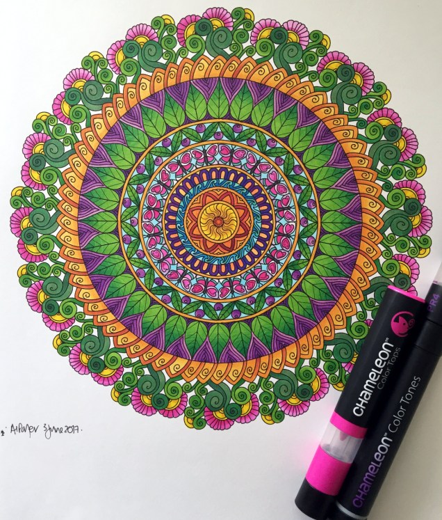
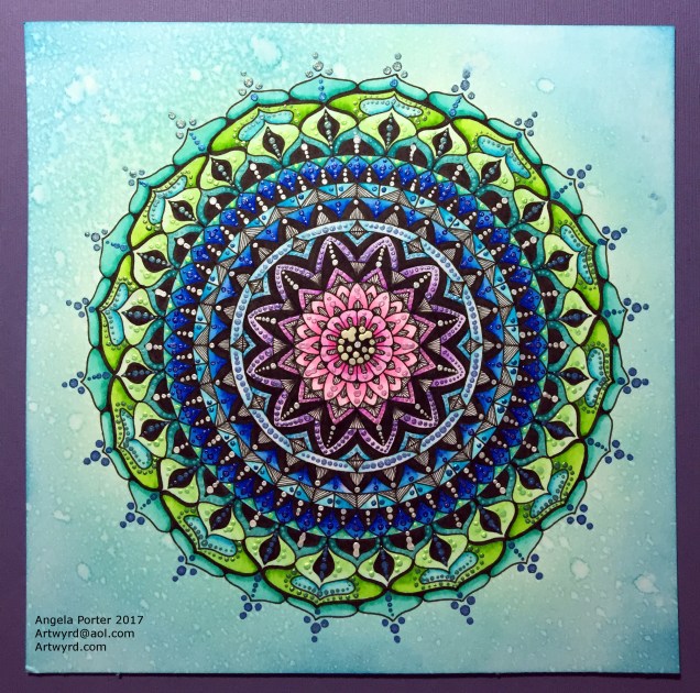
The above image is a typical ‘Angela-doodle’ drawn using Sakura Micron and UniBall UniPin pens on a background prepared using the new Distress Oxide inks.  Before I let you know what I think of them, here’s a little bit about them.

The Distress Oxide inks are designed by Tim Holtz and made by Ranger. This is the description of them from the Ranger website:

Tim Holtz Distress Oxide Ink Pads are water-reactive dye & pigment ink fusion that creates and oxidized effect when sprayed with water. Use with stamps, stencils, and direct to surface. Blend using Ink Blending Tools and Foam. Re-ink using Distress Oxide Reinkers.

My first job on opening my ink pads was to test them out on different papers so I gained an idea of the colours they’d be, as well as how they react with water.  To create these test swatches I stamped two ‘feathers’ with each colour on the paper/card.  I then used an ink blending tool to smear some colour onto the paper.  Next, I used a wet paintbrush to add water to the second feather before swiping the paintbrush across the smear and adding droplets of water to it.

Here’s the inks on watercolour paper:

angela-porter20170217_0019

Secondly,  here they are on Kraft card:

angela-porter20170217_0020

Finally, I made test swatches on black paper:

angela-porter20170217_0021

The first thing I noticed was how easy it was to stamp with the Distress Oxide inks.  The original Distress Inks tend to stamp ‘blotchy’ – that’s the nature of them though!  These, because of the pigment portion of the formulation, stamp with a more solid line.  Not only that, the Distress Oxide inks are much more opaque than Distress Inks.

Blending the Distress Oxide inks using a mini Smoothie blending sponge by Crafter’s Companion was an absolute dream!  The inks went on so smoothly and, because they stay wetter for longer than Distress inks.  Admittedly, I may not have picked the best paper for applying the Distress Oxide inks to, and there was some unevenness in the blend/smear, but it was much better than I’d manage to get with Distress Inks, unless I used a stencil brush to apply the Distress Inks very thinly and build the layers up.

I don’t think I let the inks dry for long enough before adding water as I did note that some of the pigment moved when I brushed the feather with a wet brush, and the smear.  That may be because I used a brush rather than using a spray bottle to mist water on them.

It took longer for the Oxide effect to develop as I’d added more water than a misting would have, but the colours kind of soften on the white watercolour paper, and brighten on the Kraft and black papers.  The opacity of the pigment ink is increased by the addition of water, and the colours really seem to glow.

I then just had to go and create a background using the Distress Oxide inks.  I used mini ink blending tools this time, and I used Strathmore Bristol paper with a vellum surface.  The inks didn’t want to blend all that smoothly on this surface, however I wasn’t really too concerned as I just wanted a background to draw on.  When I was happy with the colour blend, I did mist the surface with water to bring up the Oxide effect, as well as to have a few small water splatters on the surface.

The Distress Oxide colours are much more ‘me’ than the original Distress Inks. They’re so creamy and rich in colour thanks to the pigment part.  I also love the suede-like feel that results after a light misting with water.

I’m really happy with these new inks and I look forward to experimenting with them more.  I plan to use them like watercolour paints, I want to try using stencil brushes with them to blend the colours out, and no doubt I’ll find other ways to make colourful backgrounds for me to draw upon.

Doodle, illustration from 11 Feb 2017

angela-porter20170211_0016-watermarked

I’ve done it!  I’ve worked out how to easily add a watermark to my scanned artwork to try to protect it as I share it online.

Autodesk Sketchbook Pro made it a doddle to do and so I’ll make sure I do this in the future.

To draw this one I found, after much searching, my Rotring Rapidograph pens.  It’s been a while since we were acquainted with each other, but yesterday was the day!  I’d forgotten what a joy they can be to draw with.  Also, unlike the UniBall UniPin or Sakura Micron pens I generally favour to draw with, I don’t wreck the nibs in a short space of time. I must press a lot harder than I think I do with them…

So, onwards to more art.  A lesson learned about protecting my ownership of my art and some control of it when I release an image of it into the wilds of the world weird web.

It’s been a while…

Untitled 8 March 2014 by Angela Porter


It has been a while since I last made a post to my blog.

I have been struggling with vagueness and lack of focus with the medication I’m taking, and this one I’m on now doesn’t suit either. As well as the vagueness, I’m constantly on edge and fidgety, and the medication is supposed to treat that not cause it.  Have to give it a couple more weeks before it’ll be changed though.  I’m still away from work as a result.

In spite of all of this I’ve still been busy with art, though the focus for the projects I’m involved in has been lacking at times, but just ‘doodling’ with no constraints or requirements does help me settle a little and also is something I can do that doesn’t need that focus.

In the summer I signed contracts to do the artwork for two books linked to art therapy.  In the last week I was approached by another company to do one book for them in the first instance, and if it goes well then there could be a whole series of them.   My hope is that I’ll have enough contracts and work lined up that I can go kind of part time at work.  That won’t be for a while and I need to get myself better first, but the part time may be a way of helping me remain ‘better’ in the future.  Time will tell.

Yet another mandala…number 6 of the month!

August Mandala 6 © Angela Porter 2013

This is approx. 17.5 x 17.5cm and was created by me using UniPin pens, Zig Art and Graphic Twin pens with water as a wash, coloured fineliner pens and coloured pencils on acid-free bristol board.

Art is my solace, even though at times I’m doing the work through tears.  Today was one of those days.  I’m really struggling with the inner critics who are beating me up so badly at the moment, and despite me trying my best to quell them, to soothe them, they are currently stronger than I am and are winning.  Art has soothed them a tad…just a tad.

Some days it’s hard to find anything to be proud of about myself, to feel I am as important and matter as much as every other person on this planet, that I’m a good person, a kind person, a caring person and so on.

On days like these, days like today, creating something pretty through my art reminds me that there is something in me, about me, that appreciates pretty things and can create pretty things and so there must be something pretty or even beautiful within me.

This one is ‘pretty’.

Astrologically pinks and greens belong to Venus, the planet of love, beauty and harmony, romance, relationships the urge to empathise and unite with others, pleasure, joy and sensuality.

The lilacs and sea-greens belong to Neptune, the planet of dreams and fantasies and helps to dissolve boundaries and change existing rules.  Neptune can also result in confusion, and confusion is often experienced during profound and/or subtle changes in thinking, rules, beliefs.  Change is never easy.

Interestingly, both planets are related to artistic pursuits and aesthetics and our own personal tastes.

Now, I’m a scientist as well as an artist and all round oddbod, so why the astrological meanings of the colours?  I find it helps me to understand the art that I create intuitively, especially the colours.  Perhaps the colours are telling me to allow the old rules of the inner critics to go and to change them, to let the boundaries they have created dissolve and in so doing let love into myself, first for myself …

Maybe … or maybe it’s just pretty!