Spectrum Noir Artline Pens – a review

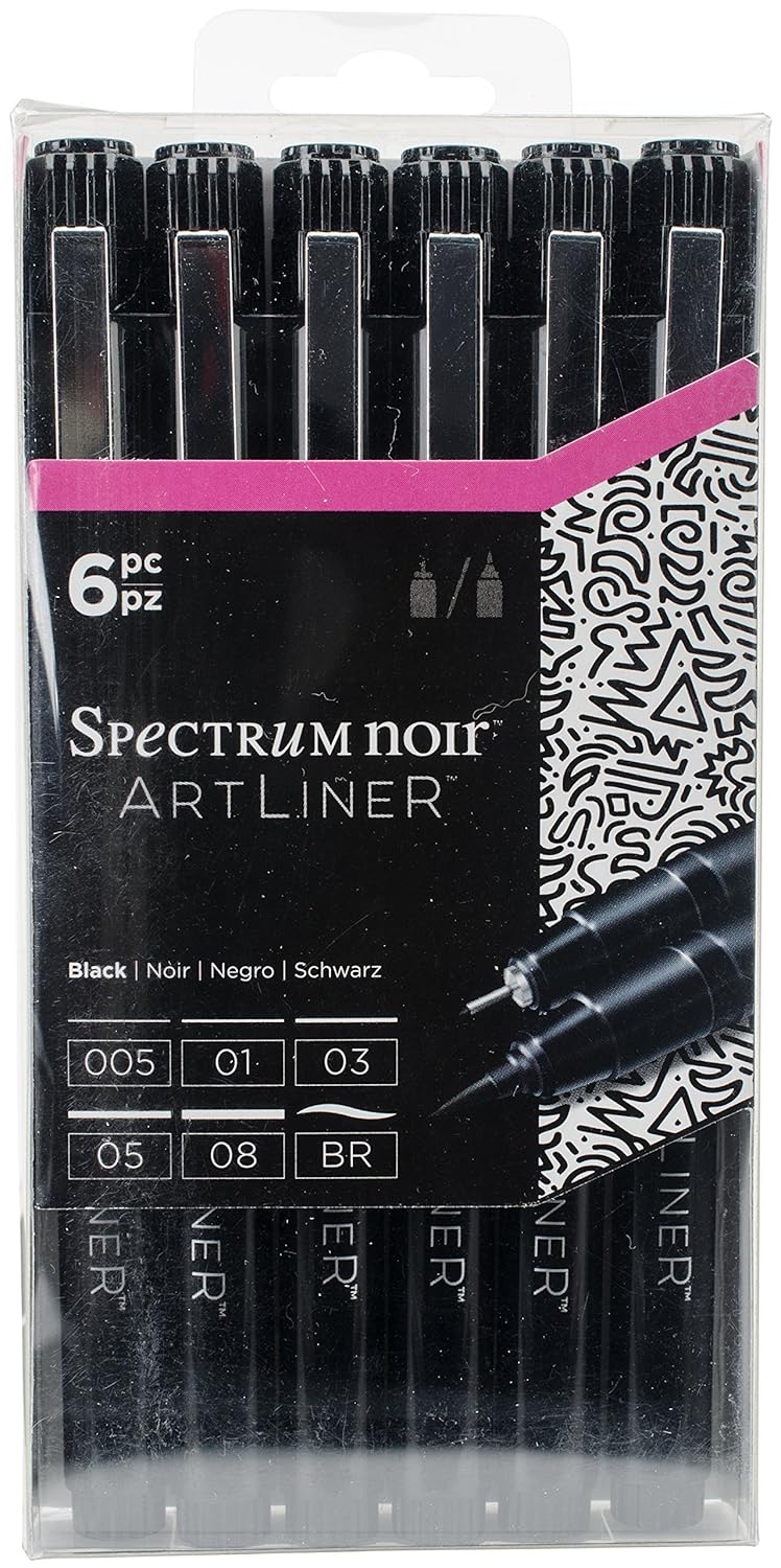
“These quality fine line pens are perfect for sketching, outlining and colouring fine detail.  Various line widths and colours.  Quality micro-pigment inks.  Light-fast and Water-proof.  Quick drying and smudge-proof.”

That’s what it said on the back of the pack of these pens.

After reading that information and watching a video on YouTube reviewing the pens, I thought ‘marvellous – I’ll give them a go’.

So, I ordered a set on Amazon and they arrived yesterday.

I was particularly interested in their waterproof and  quick drying smudge-proof claims. I tend to use a lot of water-based media in my work, my Sakura Pigma Microns and Uniball UniPin pens work perfectly adequately.

Naturally, I wanted to test them out.  In the back of my bullet journal (BuJo) I have pages set aside for testing media.  So, I drew some lines from each pen, and a pattern with the brush pen.  The pens wrote smoothly, though the nibs feel rather soft and I don’t know how they’ll hold up with  using them with my not very light hand.  Time will tell on that one.

The ArtLiner pens didn’t bleed through the Leuchtturm paper, though there was some ghosting, which happens with many pens.

The brush pen was not pleasant to use, but that’s down to personal preference.  I write/draw with quite a firm pressure, and this pen just doesn’t suit me at all.

However, I did manage to smudge the lines because the lines remained wet for quite a while.  I was disappointed with that.  Maybe these pens were a bit too ‘juicy’ to dry quickly, or maybe it was the smooth nature of the Leuchtturm paper that resulted in them taking a little longer to dry.

To test this out, I drew a design on some Canson Mixed Media Imagine paper using the 05 and 03 Spectrum Noir Artliner pens. Here’s a photo of part of the drawing.

cof

First thing I noticed was that the ink took a while to dry on this paper too, and though you can’t see it on this image, I did manage to smudge the ink on some of the leaves at the top.

I left the drawing to dry for a goodly amount of time (my cat, Cuffs, needed a long cuddle before he settled back down for big sleeps) and came back to colour it.

I started off using Faber-Castell’s Pitt Artist Pens, which I used to colour the top part of the image.  I noticed that the colours looked a bit duller than usual.  That signalled some warning bells in my mind.

I switched to Zig Clean Colour Real Brush pens with a Tombow Dual Brush blender pen.  I definitely noticed the black ink spreading.  You can see that in the rows of leaves dangling down, especially those on the right side.

I left this drawing overnight and went back to it not long ago.  I added just clean water to the bottom leaf on the right.  You can see how much the ink bled and smudged.

Not happy. But I wondered if it was the paper.  So I went back to the test I did in the back of my BuJo, and you can see here the results of that.

cof

The Tombow blender pen, Zig Art and Graphic Twin pens, Zig Clean Colour Real Brush and Pitt Artist pens all caused the ink from the ArtLiners to bleed.  All of these are water-based media.

So, from my little tests, these are not what they claim.  Maybe I had a dodgy set, but for all the pens to behave in a similar way?

I won’t be buying them again. I’ll stick to my trusty Sakura Pigma Micron or Uniball Unipin pens, and they are pens I would recommend to anyone.

Just to emphasise, I don’t have any connection with Spectrum Noir, I bought the product myself, and I just wanted to share my thoughts with you on these.

Distress Oxide Inks – my first play.

angela-porter20170217_0022

Today, I picked up the first 12 colours in the new Distress Oxide inks from my fabulous local art shop – Dandie Crafts. I’ve been looking forward to getting them since I saw them launched by Tim Holtz just prior to and during the Creativation 2017 craft show.

The above image is a typical ‘Angela-doodle’ drawn using Sakura Micron and UniBall UniPin pens on a background prepared using the new Distress Oxide inks.  Before I let you know what I think of them, here’s a little bit about them.

The Distress Oxide inks are designed by Tim Holtz and made by Ranger. This is the description of them from the Ranger website:

Tim Holtz Distress Oxide Ink Pads are water-reactive dye & pigment ink fusion that creates and oxidized effect when sprayed with water. Use with stamps, stencils, and direct to surface. Blend using Ink Blending Tools and Foam. Re-ink using Distress Oxide Reinkers.

My first job on opening my ink pads was to test them out on different papers so I gained an idea of the colours they’d be, as well as how they react with water.  To create these test swatches I stamped two ‘feathers’ with each colour on the paper/card.  I then used an ink blending tool to smear some colour onto the paper.  Next, I used a wet paintbrush to add water to the second feather before swiping the paintbrush across the smear and adding droplets of water to it.

Here’s the inks on watercolour paper:

angela-porter20170217_0019

Secondly,  here they are on Kraft card:

angela-porter20170217_0020

Finally, I made test swatches on black paper:

angela-porter20170217_0021

The first thing I noticed was how easy it was to stamp with the Distress Oxide inks.  The original Distress Inks tend to stamp ‘blotchy’ – that’s the nature of them though!  These, because of the pigment portion of the formulation, stamp with a more solid line.  Not only that, the Distress Oxide inks are much more opaque than Distress Inks.

Blending the Distress Oxide inks using a mini Smoothie blending sponge by Crafter’s Companion was an absolute dream!  The inks went on so smoothly and, because they stay wetter for longer than Distress inks.  Admittedly, I may not have picked the best paper for applying the Distress Oxide inks to, and there was some unevenness in the blend/smear, but it was much better than I’d manage to get with Distress Inks, unless I used a stencil brush to apply the Distress Inks very thinly and build the layers up.

I don’t think I let the inks dry for long enough before adding water as I did note that some of the pigment moved when I brushed the feather with a wet brush, and the smear.  That may be because I used a brush rather than using a spray bottle to mist water on them.

It took longer for the Oxide effect to develop as I’d added more water than a misting would have, but the colours kind of soften on the white watercolour paper, and brighten on the Kraft and black papers.  The opacity of the pigment ink is increased by the addition of water, and the colours really seem to glow.

I then just had to go and create a background using the Distress Oxide inks.  I used mini ink blending tools this time, and I used Strathmore Bristol paper with a vellum surface.  The inks didn’t want to blend all that smoothly on this surface, however I wasn’t really too concerned as I just wanted a background to draw on.  When I was happy with the colour blend, I did mist the surface with water to bring up the Oxide effect, as well as to have a few small water splatters on the surface.

The Distress Oxide colours are much more ‘me’ than the original Distress Inks. They’re so creamy and rich in colour thanks to the pigment part.  I also love the suede-like feel that results after a light misting with water.

I’m really happy with these new inks and I look forward to experimenting with them more.  I plan to use them like watercolour paints, I want to try using stencil brushes with them to blend the colours out, and no doubt I’ll find other ways to make colourful backgrounds for me to draw upon.